Readability under pressure
A battle screen carries a countdown, a star meter, three loot counters and six troop cards at once. None of it can compete with the tap target the player needs right now.
Mobile Game UI · Concept & Art Direction
Emberfall is a self initiated concept for a mobile base builder in the Clash of Clans family. Ten screens, a documented component library and an isometric world where every single asset, from the gem icon to the village itself, was produced inside Figma with nothing imported.
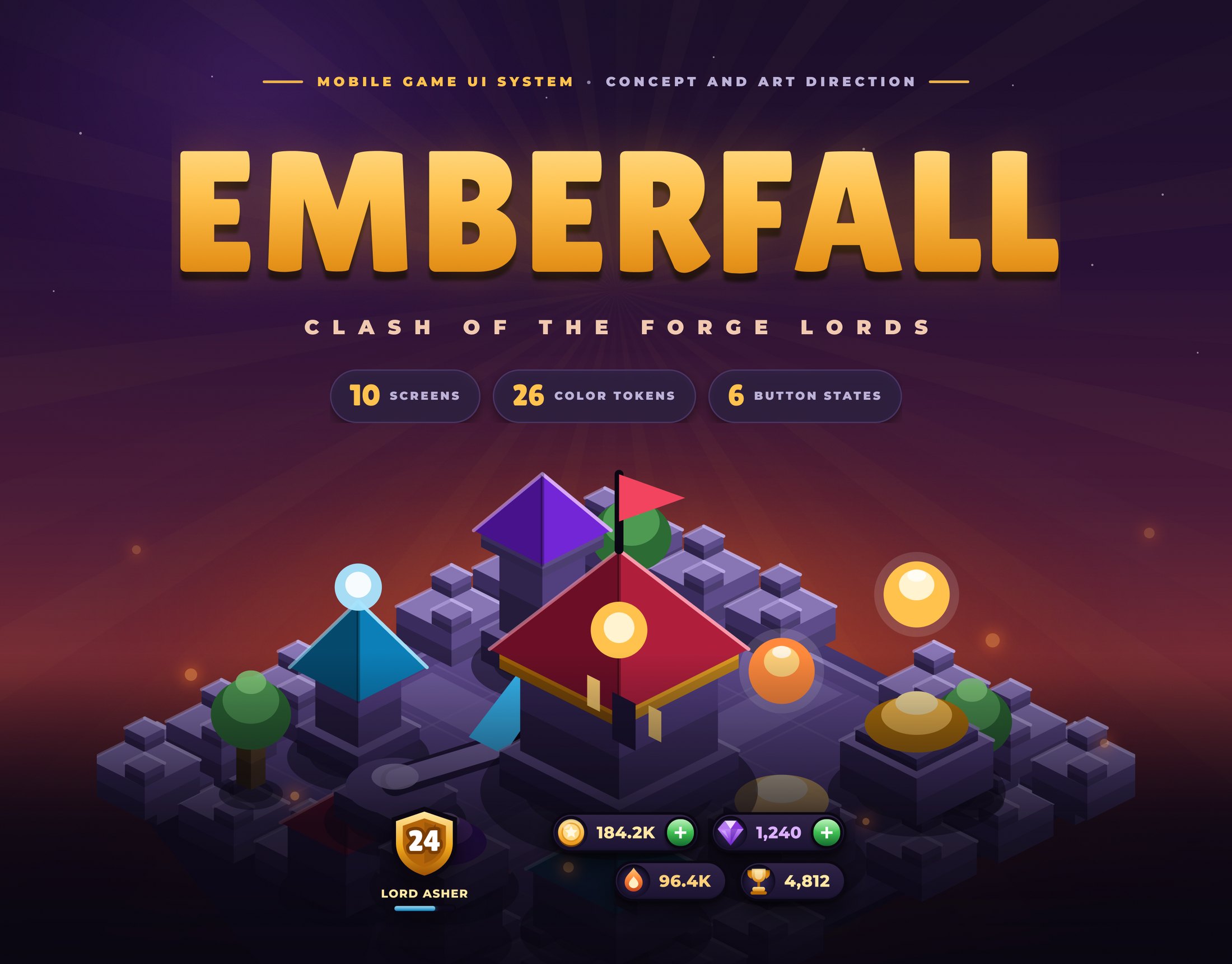
Emberfall started as a question rather than a brief. I wanted to see how far one designer can push a complete game interface when there is no illustrator, no 3D pass and no stock asset anywhere in the file.
The answer turned into a base building strategy game with a fiction behind it. Players are Forge Lords on volcanic islands who mine ore out of the rock, burn ember to train troops and raid each other for dark gems. Ten screens cover the whole loop, from the splash to the store.
No client, no ticket, so I wrote my own constraints first. Everything after this point was judged against these three.
A battle screen carries a countdown, a star meter, three loot counters and six troop cards at once. None of it can compete with the tap target the player needs right now.
Casual game interfaces live on the illusion of thickness. I had no 3D renders and no painted assets, so the depth had to come from a repeatable stack of gradients and shadows.
A concept that only exists as flat pictures is worthless to a team. Tokens, components and spacing rules had to be real objects in the file, not annotations on top of it.
“If I cannot explain why a surface is lighter at the top, the surface is wrong.”
Emberfall sits on volcanic islands. Players mine ore out of the rock, burn ember to train troops and raid each other for dark gems. Once the fiction was fixed the palette wrote itself: cold violet stone for everything the player owns, warm ember light for energy, gold for reward.
 Gold
Gold
Mined out of the rock. Pays for buildings and walls. The reward colour of the whole game, so it never becomes a background.
 Ember
Ember
Molten fuel piped up from below. Trains and upgrades troops. Used anywhere heat or production is happening.
 Dark Gem
Rare crystal formed in the crater. Buys time. Reserved for premium moments so the player learns to read it instantly.
I wrote the rule down before drawing anything. Every raised surface gets a gloss band across the top, a dark edge all the way around, a bright inner line at its upper lip and a soft shadow underneath. Every recessed surface gets the opposite.
After that, panels, buttons, pills and chips stopped needing individual decisions. There was one recipe to apply and one reason to reject anything that did not follow it.
 01 Flat fills2 solid, nothing else
 02 Base gradients3 at the top, s1 at the bottom
 03 Dark edge2.5px ink stroke, inside
 04 Top glosswhite 44 percent to 3 percent
 05 Inner lipinner shadow, white 40 percent
 06 Cast shadowy4 blur10 plus y1 blur2
 e1chip and badge
 e2card and button
 e3panel and tray
 e4modal and screen
 glowprimary action
 wellrecessed slot
Six properties, one order, no exceptions. The same recipe scales from a 17px count badge to a full screen tray, which is why the whole interface reads as a single material.
Every colour in the game is a Figma variable with a job description. Ramps run light to dark so a gradient can be written as two neighbouring tokens instead of two hand picked hex values.
GoldReward and primary action
GreenConfirm and progress
RedAttack and danger
GemPremium currency
EmberHeat and resources
AzureMagic and experience
It is the payoff colour. The moment it becomes a background it stops meaning reward.
Train, claim, upgrade, donate. Nothing else is allowed to be green.
The attack button and the surrender button share it, and that is on purpose.
If violet appears, real currency or premium currency is involved.
Lilita One carries anything the player reads at a glance: titles, counters, button labels. Montserrat carries everything that needs to be read properly. Nothing else is allowed in.
Titles run 64 down to 24, counters 28 to 17 and button labels 26 to 12, always with a 2.5px outline so they hold up on top of a gradient. Labels use Black at 9 to 15 with wide tracking, body text Medium at 14 to 19. Nothing sits below 9px anywhere in the game.
16px of screen padding left and right, 12 to 14 in grids and lists, 8 inside a card, and a 2.5px edge stroke on every raised surface. Those four numbers cover the entire layout.
Only the two pieces that repeat on every screen became real components. Everything else is a documented pattern with fixed numbers, which keeps the file light and stops variant sprawl before it starts.
HUD / top bar390 × 104
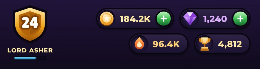
The player badge and the four counters. It floats over the world rather than sitting on a full width bar.
Nav / bottom bar390 × 108

Base, army, clan and shop, with the raised attack action breaking the bar in the middle.






Upgrade, buy now, attack, use gems, cancel and locked. Every screen picks from this row instead of inventing a seventh.
The village is not an illustration. I wrote a small isometric routine inside Figma that takes a grid cell, a footprint, a height and a palette, then returns the three visible faces, a rim light along the top edges and a soft contact shadow.
Roofs, domes, banners and collect bubbles follow the same idea, so repainting a whole village is a palette argument rather than a second drawing.
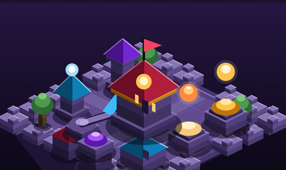
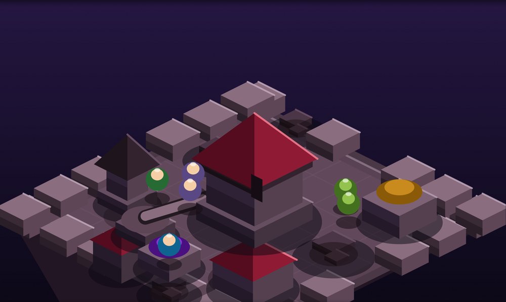
One palette argument apart, not one illustration apart. That is the whole reason the routine exists.
A player decides how a game feels in the first six seconds. The splash carries the fiction. The base screen has to stay legible while an entire world moves behind it.
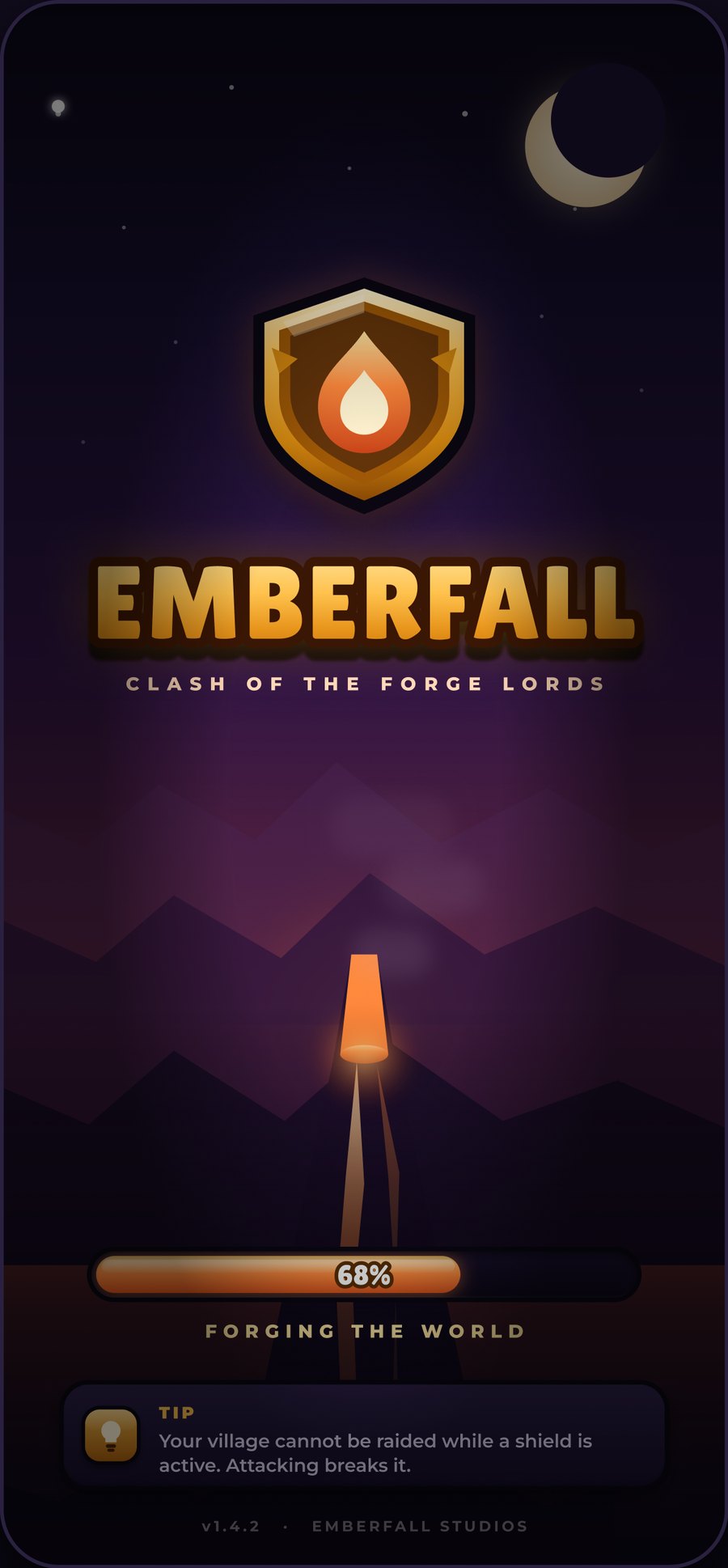
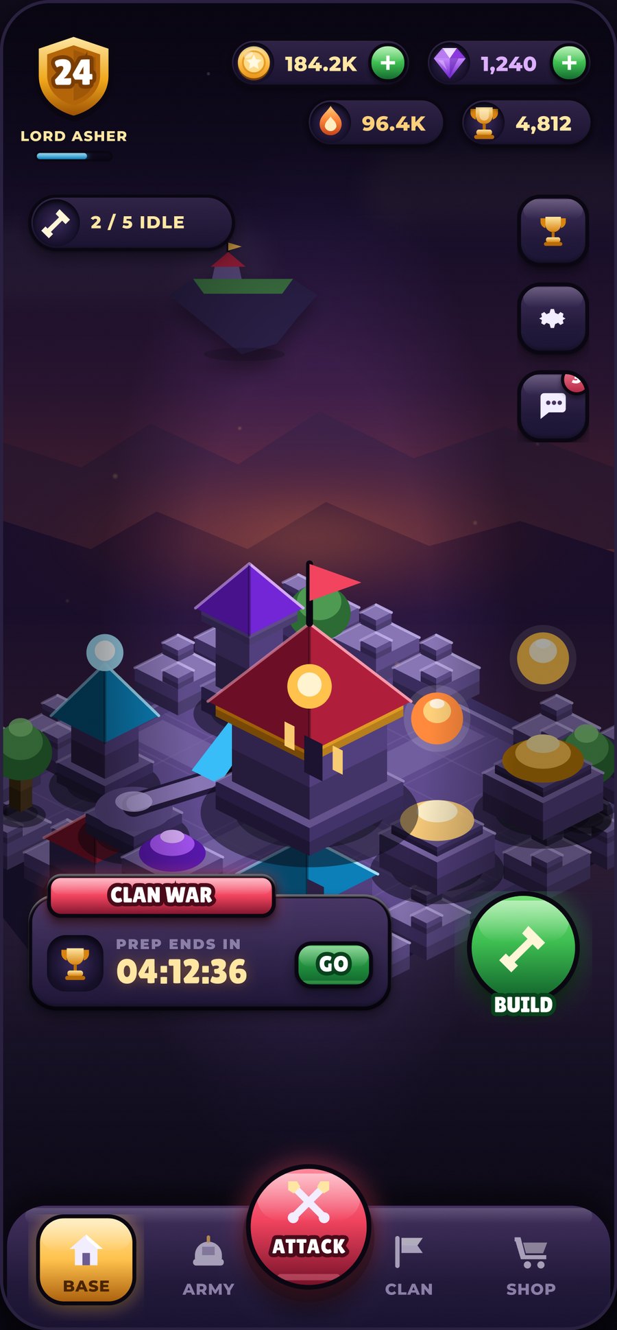
Header, content column, bottom navigation. The same three zones on every screen, which is why the tenth screen took an hour instead of a day.
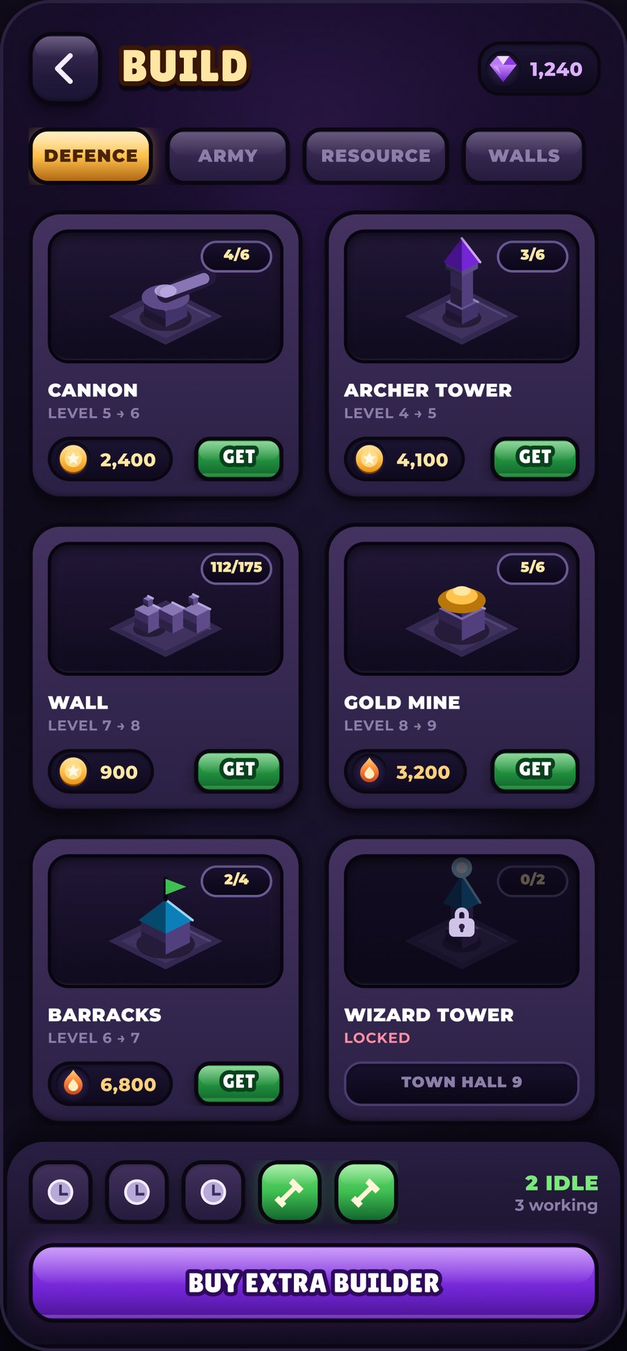
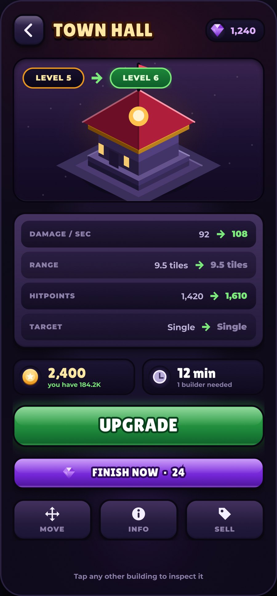
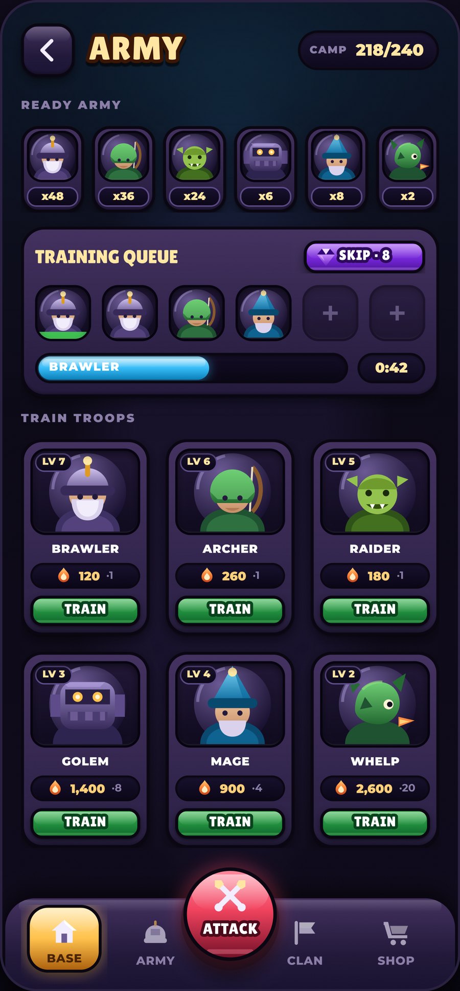
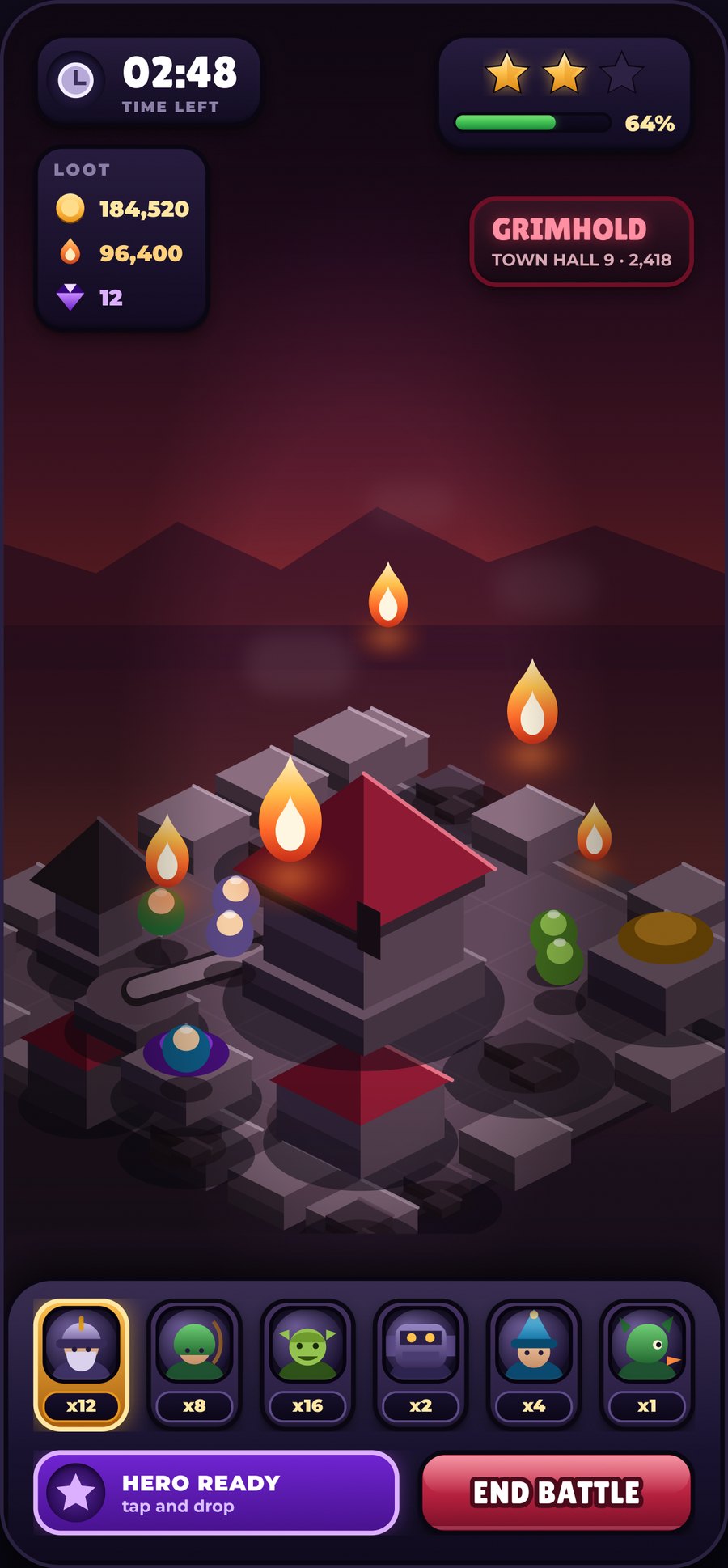
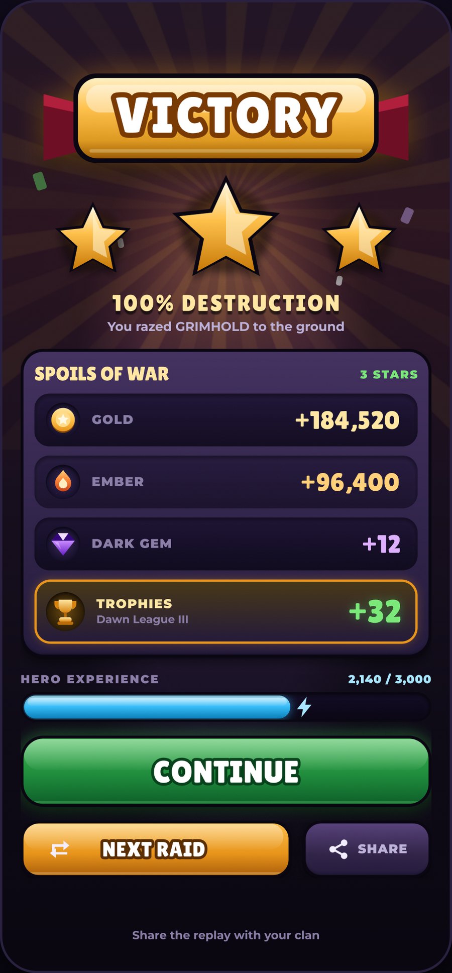
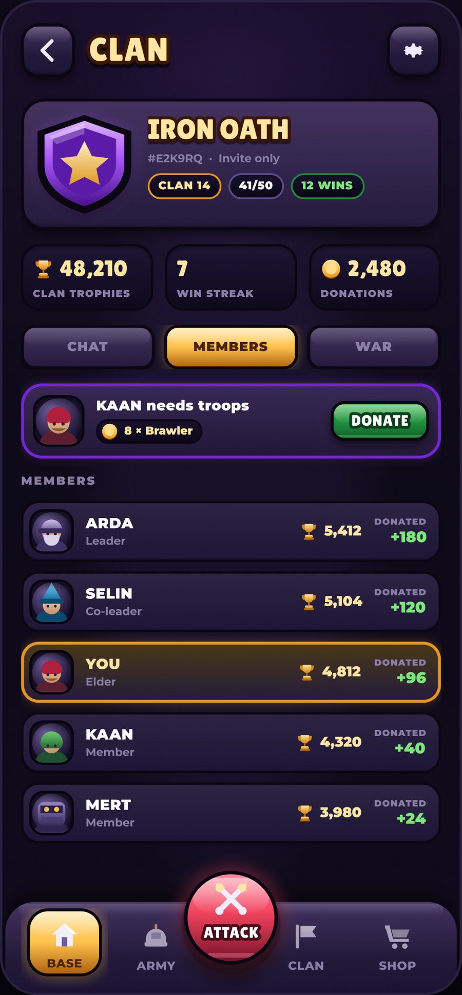
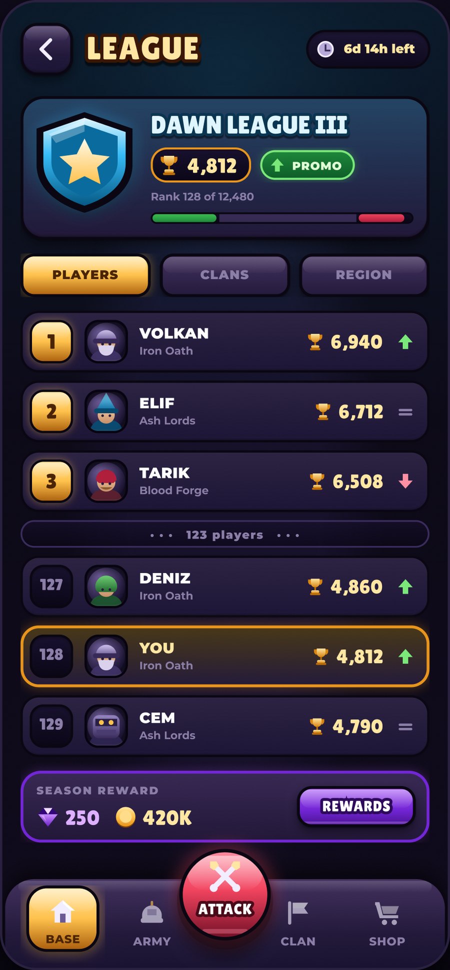
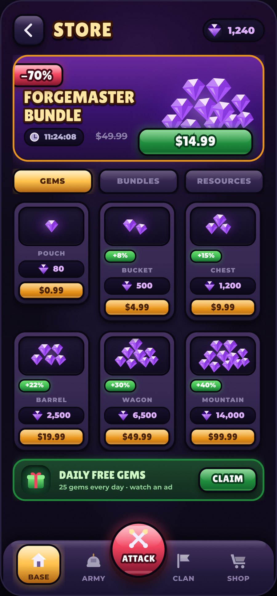
Defining the light recipe took twenty minutes and saved me from a hundred small arguments later. Every surface in the game was decided by that one paragraph, which is also why the whole thing reads as a single material.
I stopped treating it as a convenience. Once each screen became one column with fixed padding, overlap and drift went from unlikely to impossible, and I could move a whole section without checking anything below it.
Because the village is a routine and not a drawing, the enemy base cost me one palette instead of a second illustration. That is the part I will carry into the next project first.