State first, everything else after
Before a single label is read, the screen has to answer one question. Is the machine running, waiting, or in trouble. If that takes longer than a glance, the layout is wrong.
UX/UI · Human Machine Interface
At Noyatech I worked on a lot of web projects, ran UX research, designed interfaces and wrote the reports that came with them. But the part I keep wanting to talk about is the human machine interface work. Laboratory instruments, production machines and the panels that operators touch every single day. This page is about that side of the job.
Noyatech builds and sells laboratory and production equipment. A good part of my time went into the digital side of the company. Websites, product pages, UX audits and the reports that explained what needed fixing and why.
The other part, and the one that taught me the most, was the screens on the machines themselves. When a device costs more than a car and runs for eighteen hours without stopping, the panel on the front of it is not decoration. It is the only way anyone can tell what is going on inside.
I worked on control panels across a lot of very different instruments. The ones on this page are only a handful of examples, an electrospinning system, a syringe pump, a rapier loom, a scanning electron microscope and a water purification unit. Different worlds, same problem underneath. Somebody has to look at a screen and know, in under a second, whether things are fine.
This sounds obvious until you sit down and start drawing one. Almost every habit that serves you well on the web works against you on a control panel. I had a few things to unlearn.
None of these were handed to me. They came out of getting things wrong on the first version and watching somebody struggle with the result.
Before a single label is read, the screen has to answer one question. Is the machine running, waiting, or in trouble. If that takes longer than a glance, the layout is wrong.
A reading like flow rate lives in exactly one spot and never moves. Operators build muscle memory fast. Moving a number is worse than making it small.
Green, amber and red were reserved for machine state. Nothing else on the panel was allowed to borrow them, however good it would have looked.
Starting high voltage, emptying a tank, resetting a batch. These got a second step. Everything else stayed a single tap, because friction where it is not needed is its own kind of risk.
Every touch target was drawn for a hand in a nitrile glove pressing a little too hard on a resistive panel. That one decision reshaped several layouts.
If a reading is three seconds old, the screen says so. A stale number that looks fresh is the most dangerous thing a panel can put in front of somebody.
None of these screens were designed in a quiet room with a big monitor. The floor, the lighting, the panel hardware and the person in front of it had already made most of the calls before I drew anything.
The panel is read from about half a metre away, usually while the hands are busy with something else. Body text that works fine on a phone simply disappears at that range.
Nitrile, sometimes two layers of it. Small targets, tight spacing and anything that asks for precision were ruled out before the first sketch.
Lab lighting is harsh and it comes from above. Dark panels with strong contrast held up far better under a reflection than light ones did.
Fixed resolutions, limited colour rendering and touch layers that are nowhere near as forgiving as a phone. The design had to fit the panel rather than the other way round.
Numbers are entered with an on screen keypad or with plus and minus. That changes how you design an input field from the ground up.
Some processes take a full working day. The screen has to stay readable and calm for all of it, not just for the length of a demo.
Every panel I touched used the same small vocabulary. Once somebody learns it on one machine, it carries over to the next one without a single line of training.
Red and orange never appear next to each other on the same screen, and the hazard colour is the only one that is allowed to take over the whole panel.
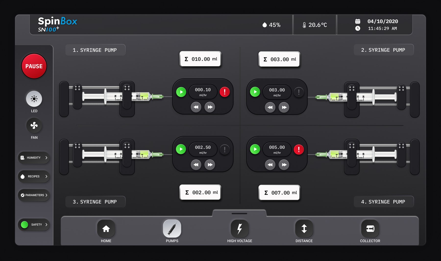
Electrospinning is a slow and fussy process. Four syringe pumps push polymer solution towards a collector while a high voltage field pulls it into fibres. If one pump drifts, the batch is gone, and you often do not find out until hours later. So the whole panel was built around a single idea. Four pumps, four identical blocks, laid out the way they physically sit inside the cabinet. Left is left, right is right, and nobody has to translate between the screen and the machine.
The two pumps on the left face left and the two on the right face right, exactly like the hardware does. The totals sit on the outside so the eye can compare four numbers in one sweep.
Pause, LED, fan, humidity, recipes and safety live in a fixed column on the left. They never move, never scroll, and the hand reaches them without crossing the working area of the screen.
Pumps, high voltage, distance and collector each get a tab instead of a settings tree. Four things to learn, and after the first day nobody reads the labels any more.
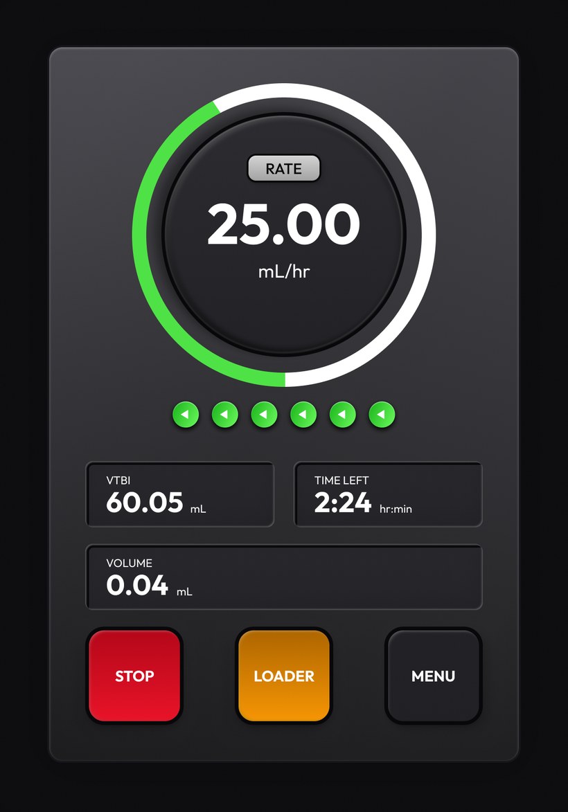
The same pump also ships as a standalone unit, with a small portrait panel on the front. Here there is no room for context. One number matters more than everything else on the device, so it took the middle of the screen and roughly a third of the surface.
The ring around it is the part I like most. It shows how far the run has gone without anybody reading a thing. From the doorway of the lab you can see whether a pump is close to the end of its volume.
Stop is red, wide and on the left where the thumb naturally lands. Loader is amber because it moves the mechanism. Menu is quiet on purpose, since during a run there is nothing inside it that anybody needs.
A weaving mill is a different kind of place. Nobody stands in front of one loom. They walk a line of forty and glance at each one on the way past. So this screen had to work as a status board first and a control panel second. It also went light rather than dark, because the mill floor is bright and the panel sits behind glass at an angle. The dark treatment that helped so much in the lab would have turned into a mirror here.
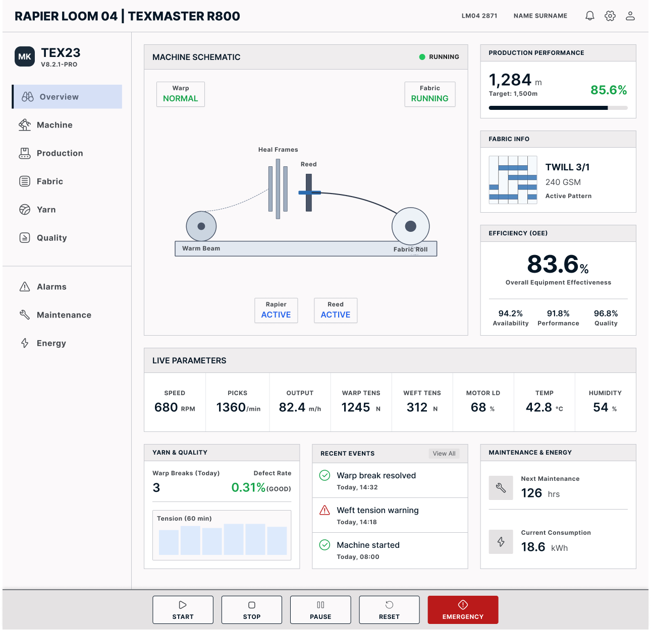
Warp, heal frames, reed, rapier and fabric roll are each drawn where they actually are, and each changes colour when its state changes. A supervisor walking past reads the picture, not the words.
Eight readings in a single row, all the same size and the same rhythm. Nothing competes for attention, because in normal running none of them is more important than the others.
Every entry has a timestamp and a state icon next to it. When a shift hands over, the last three lines are the whole story of the night.
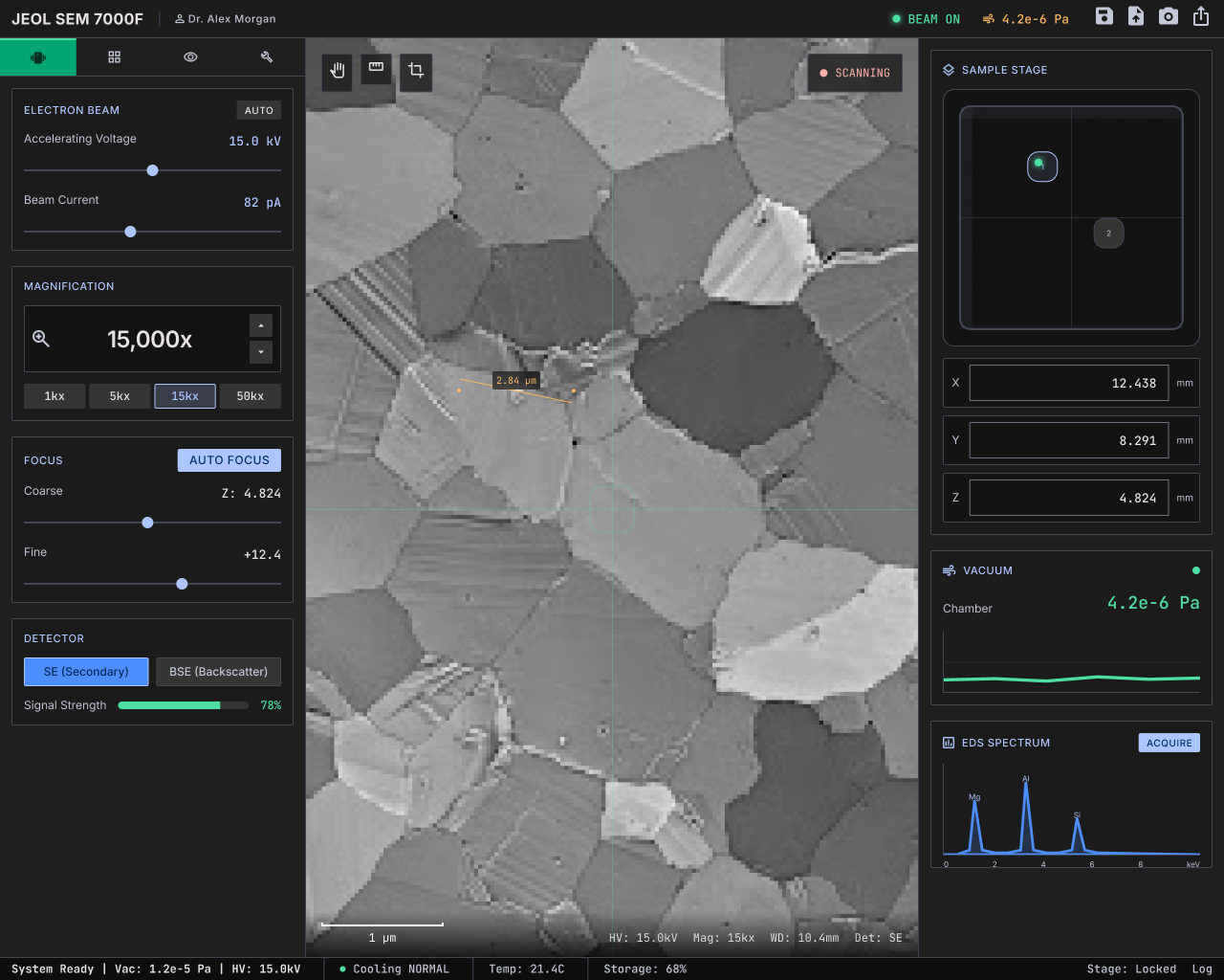
A scanning electron microscope is the opposite problem. One person, seated, for hours, changing a dozen settings while watching a single image. Here the image is the product and everything else exists to serve it.
The live view got the middle and the most space on the screen. Beam, magnification, focus and detector went to the left rail in the order a session actually happens. Stage, vacuum and spectrum went right, because those get checked rather than adjusted.
Sliders sit next to their numeric value instead of replacing it. Researchers write these numbers down and put them in papers. A slider on its own would have been useless to them.
Water purification looks simple from the outside. You press a button and water comes out. The complexity is behind it, in five filtration stages that all have to be alive for the number in the top left to mean anything at all.
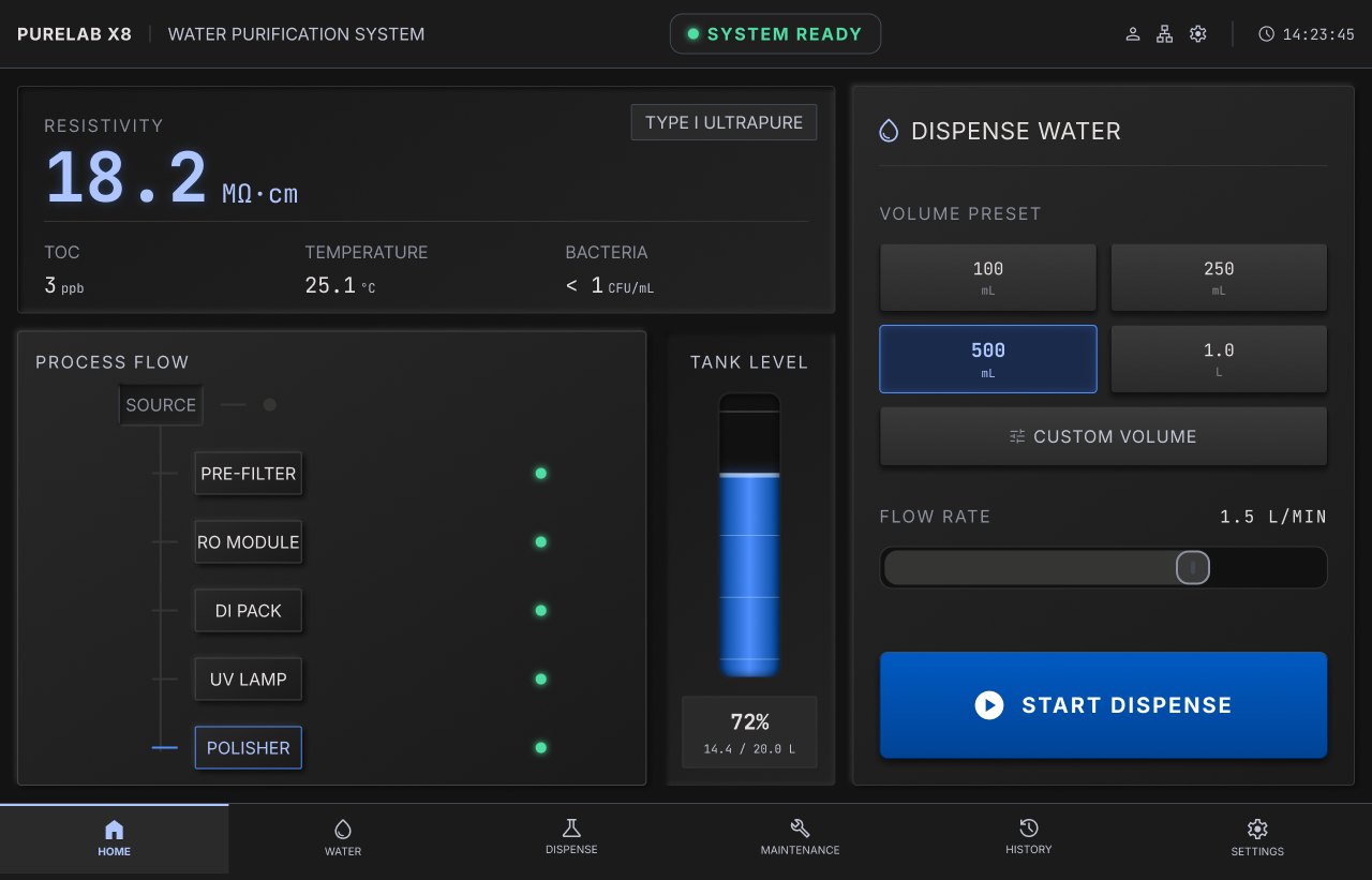
Source, pre filter, reverse osmosis, deionisation, ultraviolet and the final polisher each carry their own indicator. If resistivity drops, the operator sees which stage let go without opening a manual.
The volume buttons match the containers people actually use. Custom volume is there for the rare case, so it sits under the four buttons that cover most of the day.
Resistivity, total organic carbon, temperature and bacteria count sit above everything else. In a lab, water that is not clean enough quietly ruins results days later.
Alarms are the part that goes wrong most often. Too loud and operators start ignoring them within a week. Too quiet and nobody notices until it costs something. I settled on four levels and refused to add a fifth.
Something happened and it is worth recording. It goes into the event list and nowhere else. No sound, no colour, no interruption.
A value left its normal band. The field turns amber and stays that way. The process keeps running, because stopping a batch over a small drift costs more than the drift does.
The machine stopped itself. The screen says what stopped it in one sentence, in the operator’s own language, with the affected part highlighted on the schematic. No error code goes on screen without words next to it.
A physical hazard. The panel drops everything and goes to one full screen state with a single instruction on it, because at that moment nothing else matters.
None of this was validated in a meeting room. The useful feedback came from the floor, and most of it came from watching rather than asking.
I watched full process runs instead of asking people to imagine one. Half of what I changed came from noticing where somebody hesitated, not from anything they told me afterwards.
Before anything reached a panel, the layout got printed at actual size and taped onto the machine. It is the cheapest test there is and it caught touch targets that looked perfectly fine on a laptop.
The people who repair these machines have seen every failure mode there is. They told me which alarms actually happen in the field and which ones only exist in the specification.
A simple check I ran on every screen. Stand at the door of the room and try to tell what the machine is doing. If you cannot, the state indicator is not big enough yet.
The line that stayed with me came from an operator who had used the old panel for years. He said the new one did not teach him anything new, it just stopped hiding what he already knew.
Designing for machines changed how I look at everything else. On a website, a confusing screen costs you a visitor. On a panel, it costs a batch, a night of work, and sometimes a finger. That difference in stakes makes you honest very quickly.
It also made me far more comfortable with restraint. There is no room for a flourish on a control panel. Every element has to earn its place by answering a question somebody genuinely asks while standing in front of the machine. Once you get used to working that way, going back to decorating feels strange.
I still do web work and I still write the reports. But the habits I picked up in front of these machines are the ones I carry into every project now. Ask what the person needs to know, put it where their eye already is, and take away everything else.