Traditional banking apps
Strong on coverage and on making a transaction feel safe. Bill information tends to be spread across menus, and cash flow visibility stays limited.
Mobile Banking · UX/UI
Rivo is a concept mobile banking app built around bills and cash flow. It pulls due dates, auto pay rules and the money left after payments into a single view, so people can see what a payment does to their account before they make it.
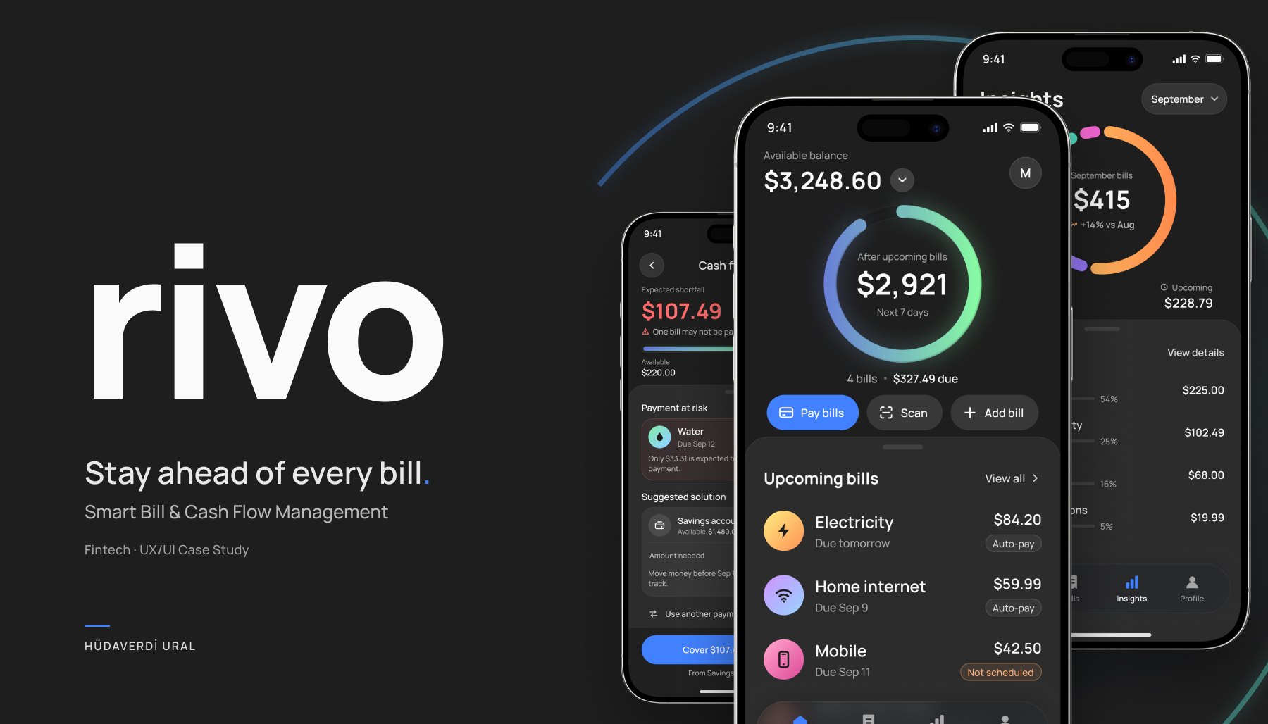
Paying a bill is one of the most familiar things people do inside a banking app. The harder part happens earlier. Due dates land on different days of the month, some payments run automatically, and the money that has to last until payday gets tracked somewhere else entirely.
Rivo is a concept project that brings all of that into one cash flow experience. Instead of showing a balance and leaving the rest to the user, it shows what will be left after the upcoming payments, which bill is at risk, and how the automatic rules are going to behave.
Having enough money in the account today says nothing about the payments that clear four days from now. Most banking apps still put the current balance front and centre and push the upcoming obligations into a second layer.
So I moved the focus away from the payment step and onto the decision that comes before it. When someone opens the app, they should be able to read where the account will stand after the bills, not only where it stands right now.
The difficulty with bills is not that paying them is hard. It is that the information sits in different places, and the user ends up doing the forecasting in their head.
Each of these looks small on its own. Together they leave the user checking and recalculating all month.
The aim was not to show more financial data. It was to show the right piece of it at the moment a decision gets made.
I started by breaking the bill payment flow into steps, from opening the app to the moment after the money leaves the account. For each step I wrote down what the user needs to know and where they are likely to hesitate.
Then I went through the bills, auto pay, transaction history and budgeting screens of widely used banking and finance apps. Most of my attention went to the awkward states: a duplicate payment, a shortfall, a due date coming up, an amount that suddenly grew.
Strong on coverage and on making a transaction feel safe. Bill information tends to be spread across menus, and cash flow visibility stays limited.
The visual language is lighter and easier to read. Auto pay, though, usually comes down to a single on and off switch.
Good at making spending make sense. Paying the bill and editing the standing instruction almost always happens in a different product.
The opening for Rivo was to put the paying and the understanding in the same flow.
What people actually need to see is the amount that will be left once the upcoming payments clear.
Auto pay saves effort, but the date, the amount limit and the low balance behaviour have to stay in the user's hands.
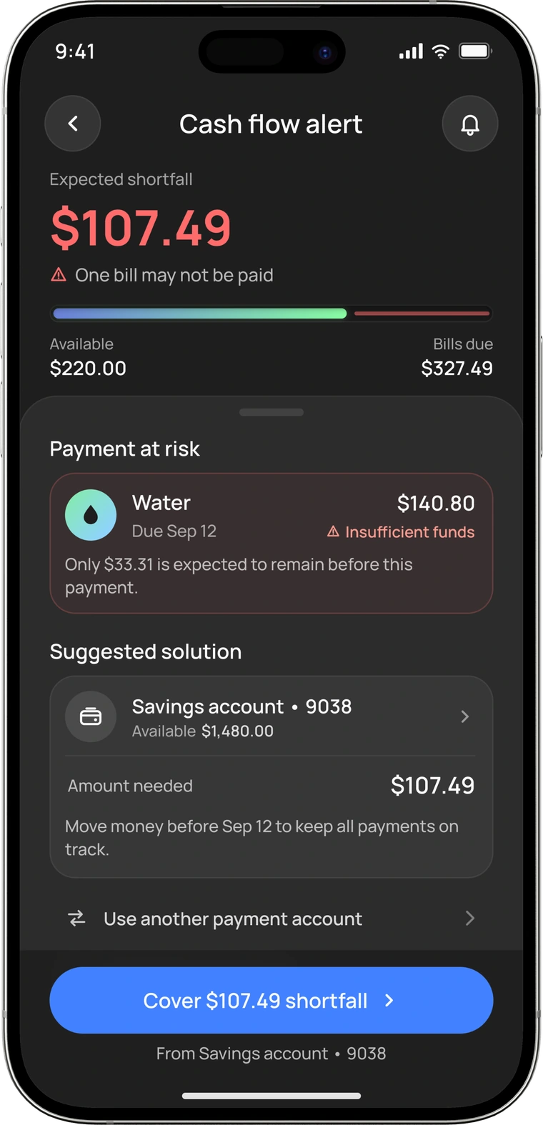
A shortfall message should name the bill at risk and show a way to close the gap.
Category colours need to stay apart from each other, and success, risk and spending colours should only ever mean those things.
Rivo is aimed at people who manage a handful of recurring payments on a salary or on freelance income. They already use banking apps often, yet the upcoming bills still get tracked through reminders, messages and mental arithmetic.
Both personas are scenario based. They gather the behaviour patterns I found while mapping the flows, so the design decisions have a person to answer to.

“I want the bills to pay themselves, but I still want to know when the money leaves and how much of it goes.”
Elif pays six or seven bills a month and lets most of them run automatically. A few days before payday she opens the account and works out on paper how much is really free to spend.

“Money in the account today is not the point. I want to know whether it will still be there on the due date.”
Mert works freelance, so the money arrives on different dates every month. He moves funds between accounts when a payment is close, and would rather hear about a risk a few days ahead than on the day itself.
The journey follows one month of bills, from the first glance at the balance through to editing the rule that handles the next one.
Show the current balance together with the bills that are about to clear.
Select several bills and settle them with one confirmation step.
Catch a double payment or a shortfall before the transaction starts.
Let the user set the date, the amount limit, the account and the notification.
The structure follows the order in which someone decides to pay. Home answers where the account stands, Bills holds the detail and the rules, Insights explains the pattern over time, and the payment flow keeps its own confirmation steps.
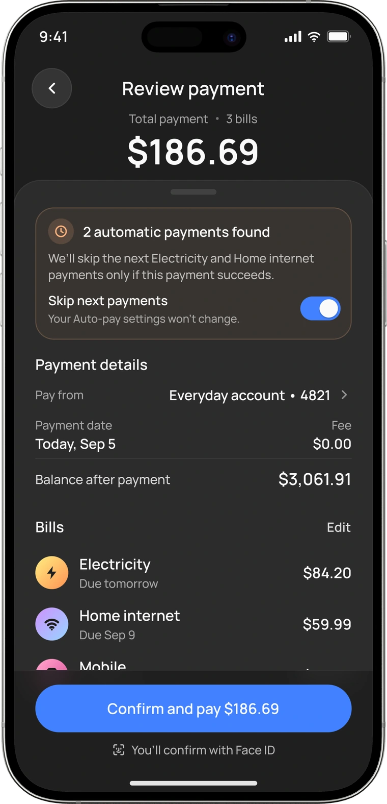
In the main flow the user picks three bills and sees the total while they are still selecting. The review screen does more than repeat that summary. It notices the auto pay runs that are coming up and explains the risk of paying twice.
With the protection switched on, only the next scheduled run is skipped. The auto pay setting itself is left alone, so if the manual payment fails the standing instruction is still in place.
I built the interface on layered dark surfaces rather than pure black. The base, the raised sheets and the floating navigation are separated by small steps in tone.
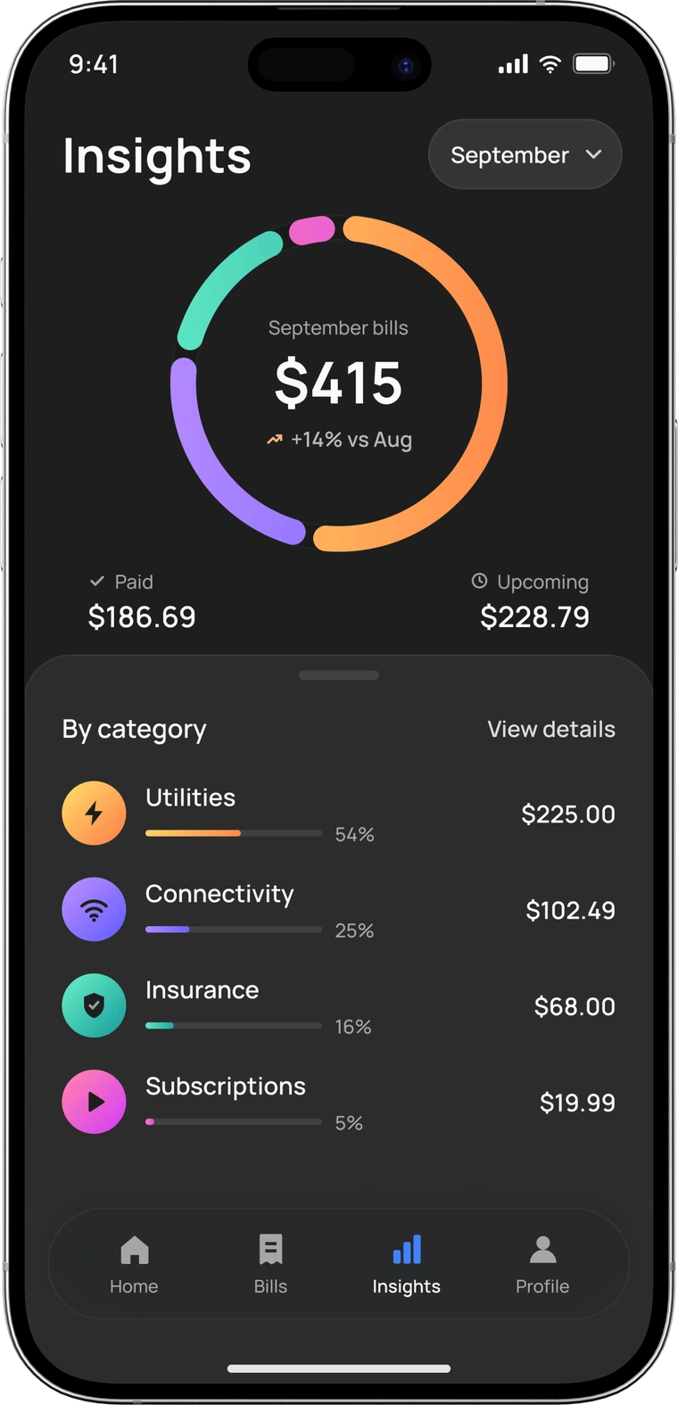
Colour is used sparingly. Blue means interaction, green means success, and the warm tones are kept for real risk. Bill categories get four clearly separated colour families, which ties the chart and the list together visually.
Electricity, water and gas. The warmest family in the set, and the one that appears most often.
Home internet and mobile. Sits far enough from the accent blue to stay readable next to it.
Health and home cover. The green family is reserved for this group and for a completed payment.
Small recurring charges. Bright enough to show up as a thin slice on the donut chart.
The most important number on the home screen is not the available balance. It is the amount that will be left once the upcoming bills clear. The cash flow ring holds those two values together in one glance.
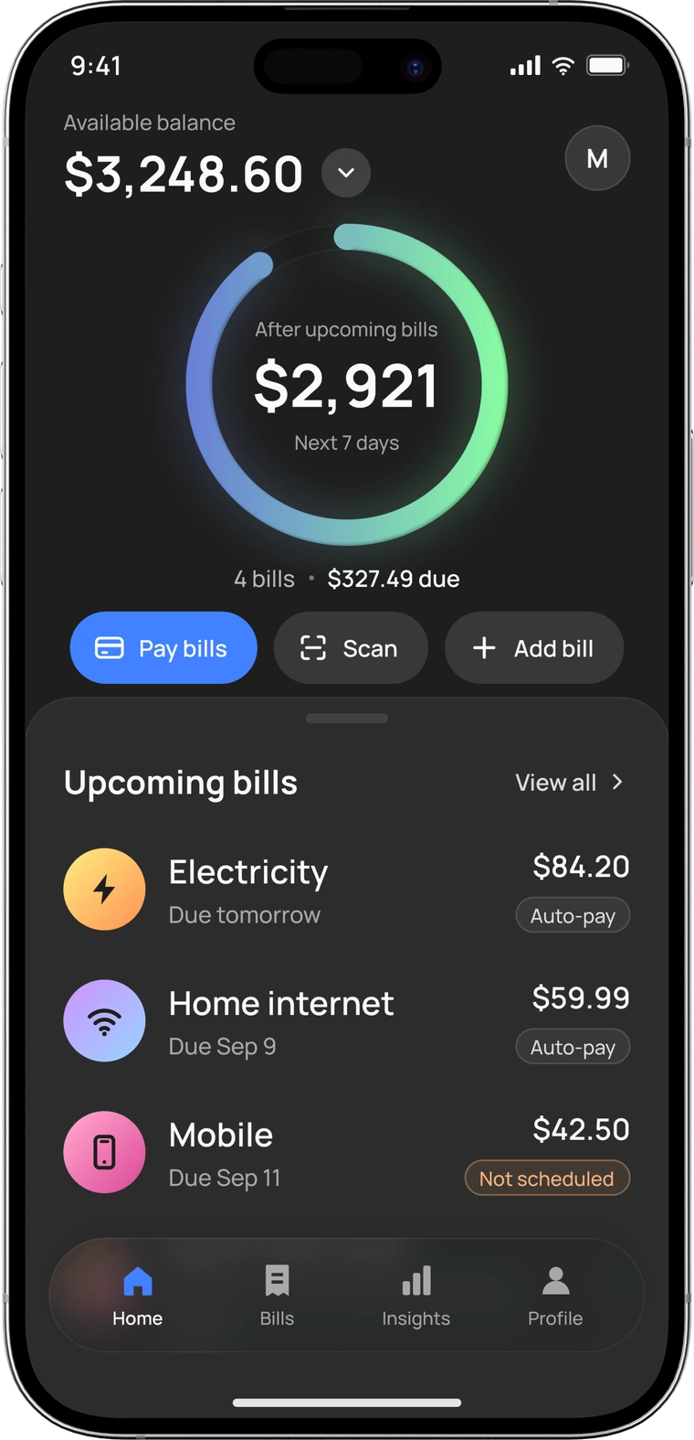
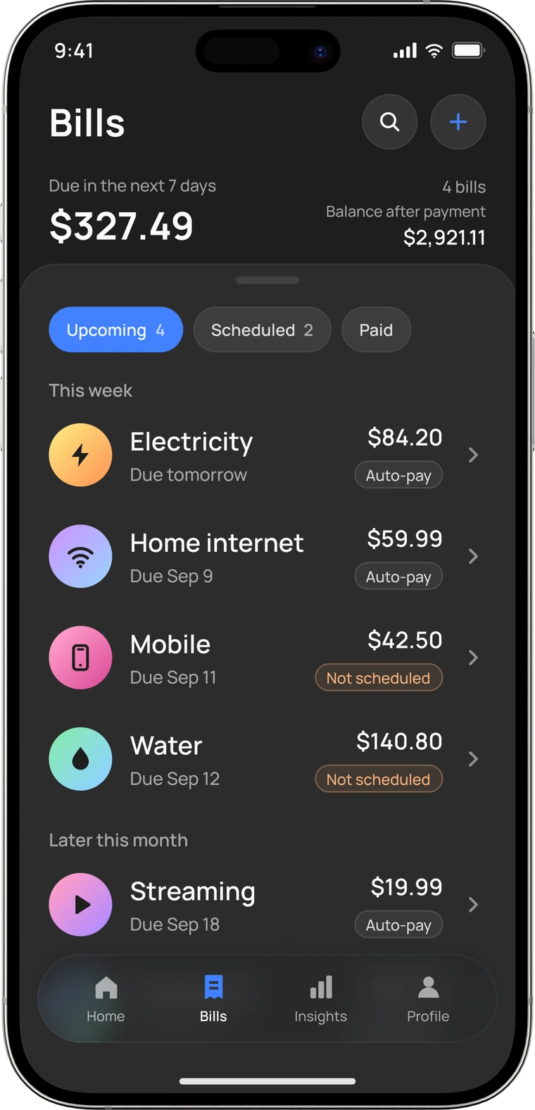
The bills hub keeps upcoming, scheduled and paid bills in the same place. Provider icons and status labels make the list quick to scan, while the amounts line up on the right so they can be compared.
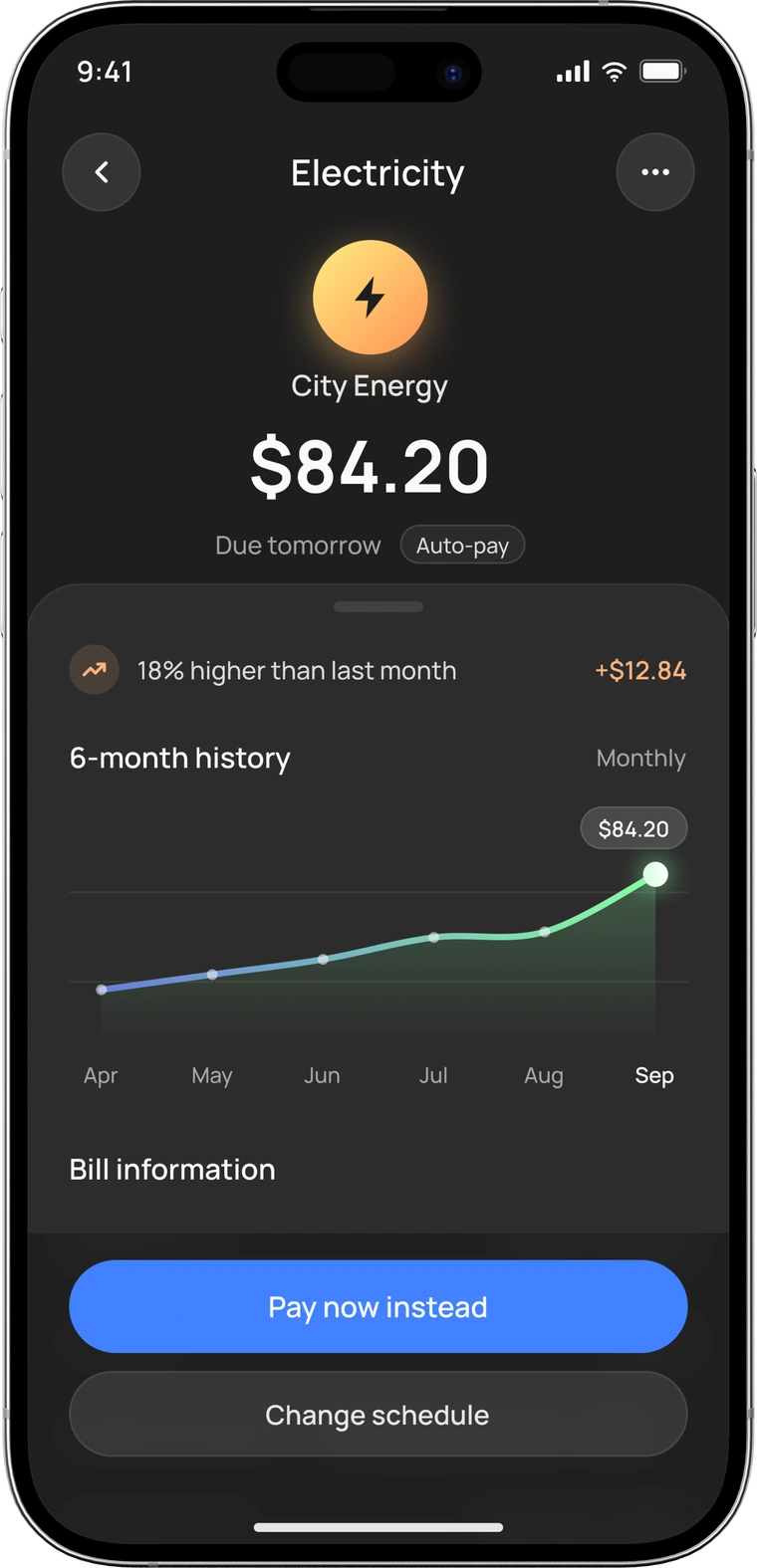
The electricity bill detail does not stop at the current amount. It plots the last six months, so the 18 percent increase has somewhere to come from and the chart explains it without a paragraph of text.
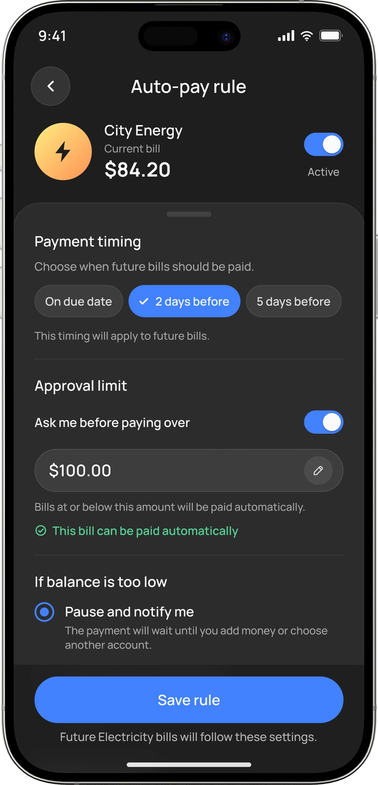
In the smart auto pay rule the user sets the payment timing, the approval limit, the low balance behaviour and the notification separately. The automation speeds things up while the control stays with the user.
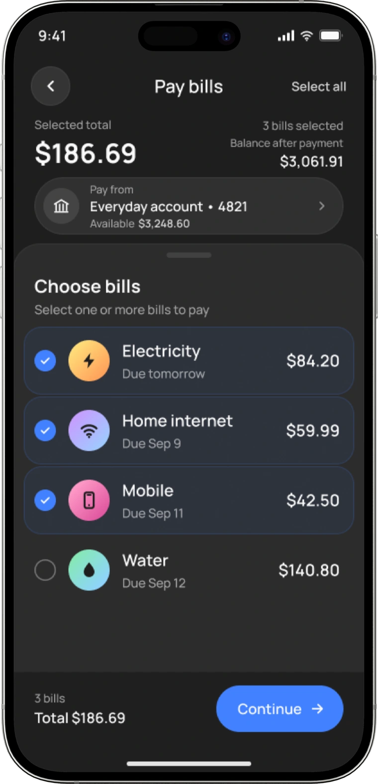
As soon as the three bills are selected, the total and the balance after payment update together. The effect on the account is visible before the review screen even appears.
On the review screen the upcoming auto pay runs for Electricity and Home internet are picked up. The user can skip just the next run for those two. Nothing else about the setting changes.
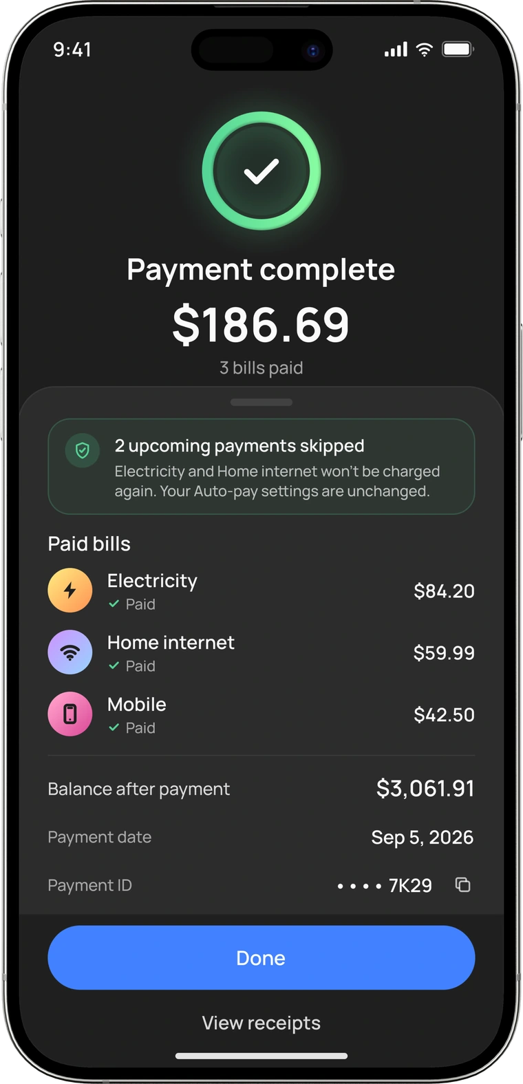
The success screen confirms the bills that were paid, the new balance and the runs that were skipped, all in one place. There is nothing left to go back and check.
In the low balance scenario the app does more than warn. It names the bill at risk, shows how much is missing and points at the account that can cover the gap.
The insights screen puts the monthly total, the paid and upcoming amounts and the category split in the same context. The donut colours match the list underneath exactly, so the weight of each group is easy to read.
I started this project meaning to design a bill payment screen. The further I got into the flow, the clearer it became that the problem was not the pay button. People needed to understand the balance ahead of them, to steer the automatic payments, and to see risk before the due date.
So Rivo was built around those needs. The main flow, the edge case screens and the insights area all run on the same data structure. I kept the consequence of a decision visible in the step that follows it.
The project reminded me that a good financial interface has to do more than look trustworthy. The relationship between amounts, dates and automatic actions has to be explained just as carefully.
Stronger visibility through a projected balance
A shorter flow through multi bill payment
User controlled protection against double payments
Early warning and a way out when the balance is short
Category based insights that read clearly
Auto pay rules that can be personalised