Problem
Planning a holiday with family or friends involves building an itinerary, managing a budget, finding attractions, booking accommodation, and arranging transportation. Bringing all of these pieces together can become complicated and tiring.
UX/UI · Travel App
Vera is a user-centred mobile app that brings the whole travel process together in one place, from discovering new destinations to building personalised routes and managing travel expenses and preparation lists.
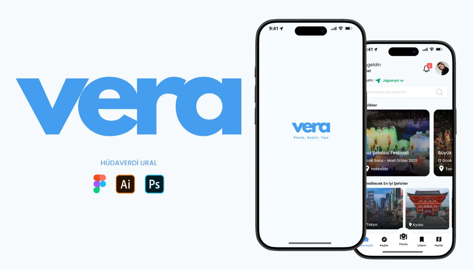

Vera is a mobile app that brings all your travel needs together in one place. It offers destination search, maps, itinerary planning, travel companion management, preparation lists, expense tracking, and a gallery for your travel photos and videos.
The name “Vera” comes from Latin and represents trust and truth. It reflects the app’s goal of guiding people at every stage of their journey and creating an enjoyable experience from planning through discovery.
Planning a holiday with family or friends involves building an itinerary, managing a budget, finding attractions, booking accommodation, and arranging transportation. Bringing all of these pieces together can become complicated and tiring.
Vera brings itinerary management, expense tracking, destination discovery, accommodation booking, and transportation planning into one app. It simplifies the process and helps families and friends organize a more relaxed trip together.
The user journey follows each step from discovering the app to managing a trip. In Vera, it covers key moments such as destination search, itinerary planning, preparation lists, and expense tracking. The experience is designed to make travel planning feel smooth and enjoyable.
Design Thinking is essential for showing how problems encountered while shaping the user experience are understood and resolved. Throughout this process, I used a User Centered Design approach focused on understanding user needs and creating solutions that respond to them. This method keeps the user in mind from beginning to end and supports highly usable outcomes.
As part of the quantitative research, participants were asked a set of questions to understand their travel needs and expectations. The questions were designed to reveal the difficulties they experience and what they expect from a travel app. The findings helped identify key problem areas and guided the product toward meeting user expectations more effectively.
Travelers struggle to identify reliable accommodation and find suitable local transportation options.
Searching for information about routes and activities makes planning feel long and tiring.
Using several booking apps makes it harder to find the best price, while some offers turn out to be invalid.
Users struggle to find a reliable app that brings travel planning and ticket booking together.
As part of the quantitative research, an Excel survey was designed to collect measurable data about travelers’ habits, preferences, challenges, and needs. The findings were analyzed to identify shared behaviors, needs, and patterns that could improve Vera’s features and user experience.
Competitor analysis examines competitors’ strengths, weaknesses, strategies, and market positions. It covers direct, indirect, and potential competitors together with the features they offer. By reviewing other travel apps, key opportunities were identified to improve Vera, increase user satisfaction, and encourage regular use.
| Feature | Polarsteps | Tripadvisor | TripIt | Wanderlog | Visit A City | Tripoto | Lambus |
|---|---|---|---|---|---|---|---|
| Accurate routing | × | × | × | ✓ | × | × | × |
| Search within every category | × | ✓ | × | × | × | × | × |
| Sort locations by distance | × | ✓ | × | × | × | × | ✓ |
| Nearby location suggestions | × | ✓ | × | ✓ | ✓ | × | ✓ |
| Website | ✓ | ✓ | ✓ | ✓ | ✓ | ✓ | ✓ |
| In-app map | ✓ | ✓ | × | ✓ | ✓ | × | ✓ |
| Invite people to a trip plan | ✓ | ✓ | ✓ | ✓ | × | × | ✓ |
| Offline access | ✓ | × | ✓ | ✓ | ✓ | × | ✓ |
Personas were developed to represent different types of travelers. Each one captures details such as travel habits, goals, and common challenges. Understanding these people helped shape Vera around real needs and expectations, making the app more useful and easier to navigate.

“Travel turns ordinary days into unforgettable moments.”
Asya works as a chemistry teacher at a private school in İstanbul. She travels twice a year, using those trips both to relax and reconnect with the people she cares about.

“Travel far, live fully, and enjoy every moment.”
Okan works as a UI/UX designer at an IT company in İstanbul. He usually plans two trips a month to visit his family or travel with friends.
At Vera, empathy mapping helps summarize insights gathered through user interactions and gives us a clearer view of travelers’ feelings, frustrations, and needs. By focusing on what people say, think, do, and feel, this process guides the design and helps the app respond more thoughtfully to their challenges.
Ideation involves exploring a range of ideas and developing creative ways to solve user problems. At this stage, I turned findings from the empathy map into user stories and used brainstorming to identify possible solutions. The following requirements were shaped around those stories.
The user spends several days putting together a balanced travel plan.
Ready made itinerary templates for popular destinations let users quickly adapt a plan to their own preferences.
With so many booking apps available, finding the best price in one place is difficult, and many advertised offers are no longer valid.
Prices from different trusted booking sites are listed together. Selecting an option takes the user to the relevant website to complete the reservation.
The user has difficulty finding transportation options within the city.
The app presents vehicle rental options alongside user reviews, ratings, and contact information.
The traveler struggles to find routes between locations without relying on Google Maps. Switching between different apps creates friction and interrupts the travel experience.
The app lets users choose a destination and see how to reach it. They can also download the map and continue using it without an internet connection.
… and many more ideas!
Information architecture arranges content and functionality in a clear, consistent hierarchy that reflects how users think. Vera’s structure makes essential actions easy to reach, including discovering places, saving favorites, searching the map, and creating a trip. Once a trip is created, route planning, travel companions, media, expenses, and preparation tools are brought together in one connected flow.
The user flow is designed to understand how people move through the app and how they behave along the way. In Vera it maps the whole journey, from discovering new destinations to building trip plans, managing travel expenses and reaching essential information, making sure every single step feels intuitive and effortless.
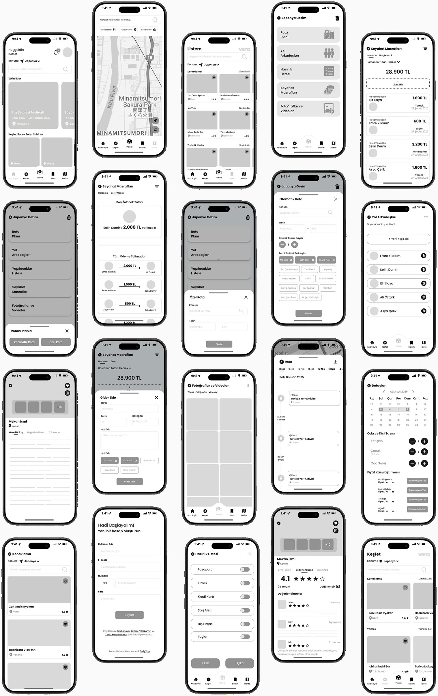
Mid-fidelity wireframes are the step that follows the paper sketches. They add more detail to the layout while still focusing on structure and user flow, without any final design elements. Building on new ideas, refinements were made that set them apart from the low-fidelity versions.
Vera's colour palette was built to create a balanced visual language that supports feelings of trust, calm and discovery. Blue, the primary colour, stands for reliability and calm throughout the travel experience, while green adds a balanced, supportive presence. Coral red highlights key actions and the points that need attention. Light, neutral tones keep content comfortable to read, producing a clean, airy and user-focused interface.
Primary colours carry the app's brand identity across text, active buttons, links, important states and highlighted areas. They build a consistent, easily recognisable visual language throughout the interface.
Secondary colours are used for supporting text, icons, backgrounds, dividers, placeholders and inactive states. These neutral tones let the primary colours stand out while keeping the interface visually balanced.
The typefaces were chosen with care, to lift the user experience and push readability as far as it will go. Poppins leads with its modern, clean design and helps the app present a visually appealing, intuitive interface.
Light / 14px, 24px
Regular / 14px, 16px
Medium / 12px, 14px, 16px, 18px, 24px, 32px
Bold / 14px, 16px, 18px, 24px
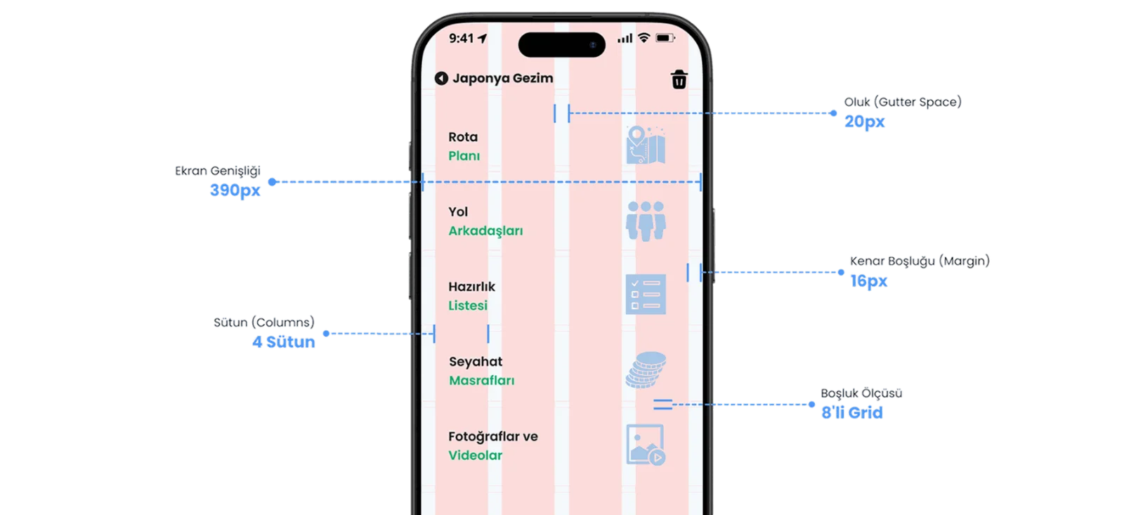
The four-column layout grid and the 8pt spacing grid used across Vera keep the layout clean and orderly with consistent spacing, which lifts the overall user experience of the app.
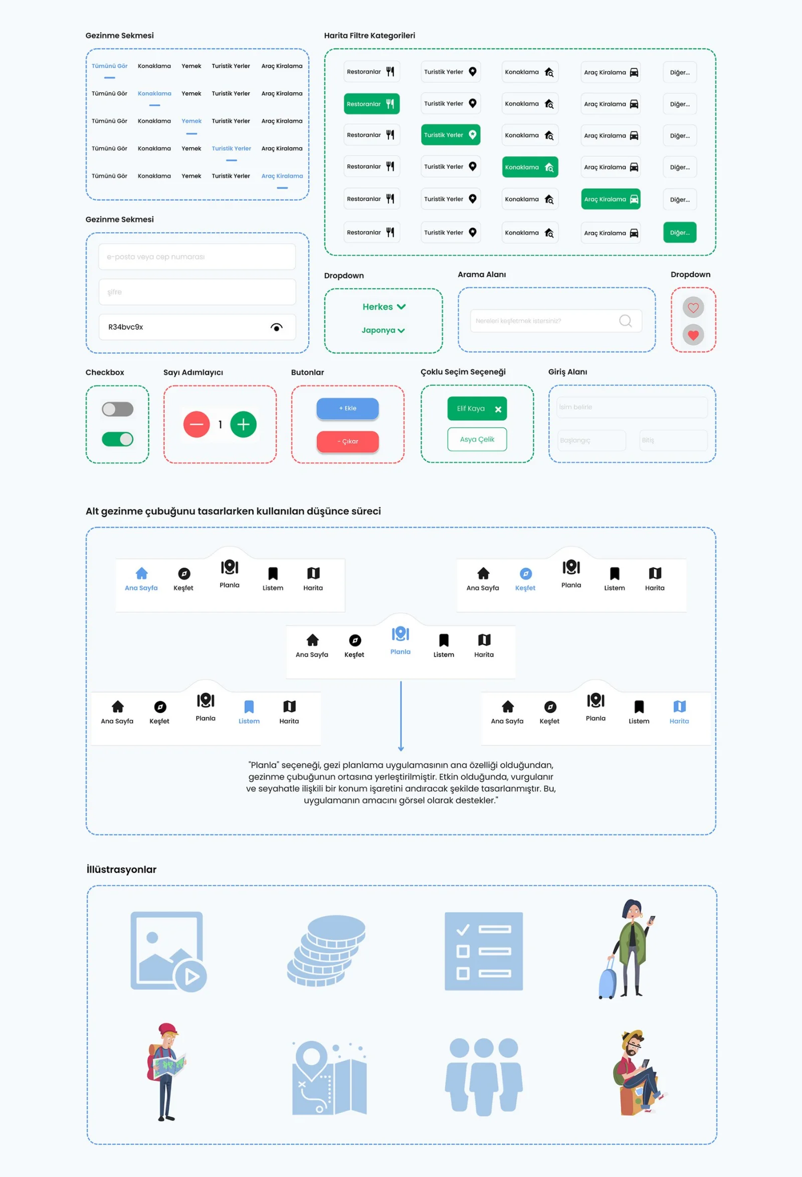
The components section covers the core UI elements used across the app, among them buttons, cards, text fields and navigation bars. Making these elements look and behave the same everywhere is what keeps the design consistent and easy to use.
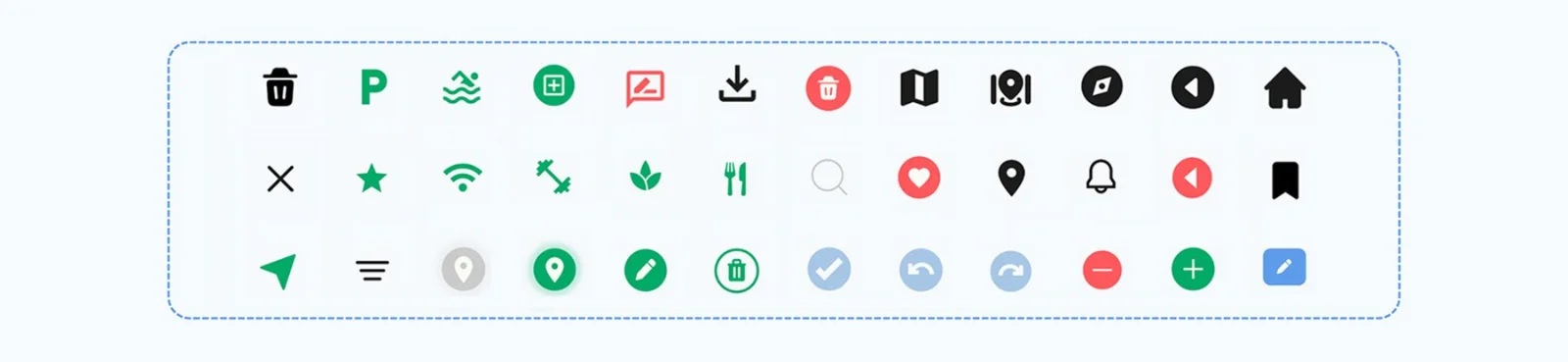
Icons play an important part in improving the user experience, standing in visually for actions, features or content inside the app. They bring clarity and sharpen the overall aesthetic, which makes the app more intuitive and friendlier to use.
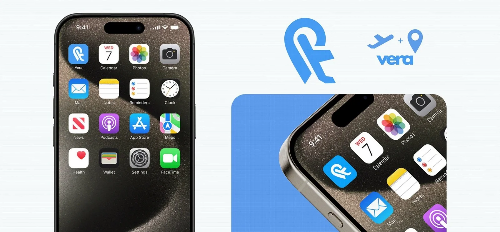
Logo design is about building a unique, recognisable visual symbol for a brand or a project. Vera's app logo brings a location pin together with a plane, so the mark carries the travel-focused nature of the product.
The UI screens represent the final design stage, with the focus on detailed visual elements such as colours, typography, icons and interactions. They sit very close to the finished product and make sure the design is user-friendly and ready for development.
When the app is launched, the splash screen shows the project logo and title, giving people a warm welcome and introducing the identity of the app. It helps set the tone and makes the move into the next part of the app feel seamless.
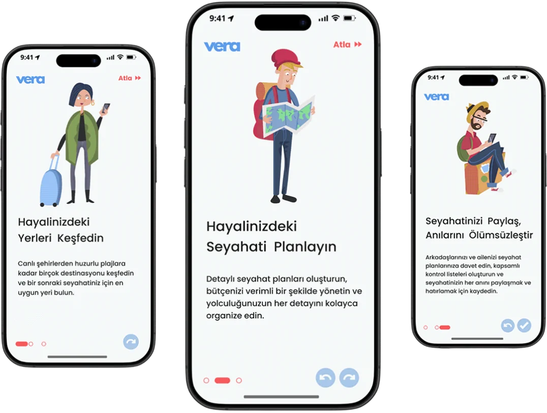
The onboarding screens introduce the core features of the app and guide people on how to navigate it and use it effectively. They help users get to know the purpose and the functions of the app before they step into it.
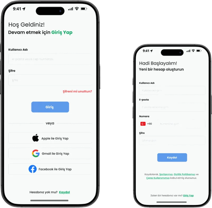
The log in and sign up screens give people a simple interface for signing into an existing account or creating a new one. These screens provide easy, secure access to the features of the app.
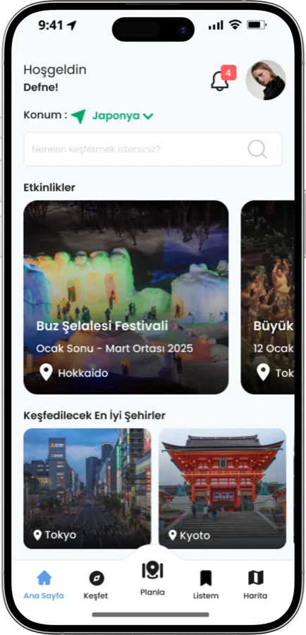
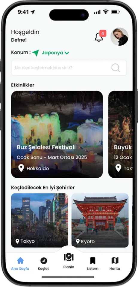
The home screen acts as a central hub with quick access to the core features: discovering new destinations, viewing saved places and reaching the maps. People can also search for locations, browse the top cities to explore, check events and manage their profile, all from one fluid, intuitive interface.
The explore screen brings options together in one place: finding accommodation, discovering popular restaurants, browsing tourist attractions and locating rental agencies.
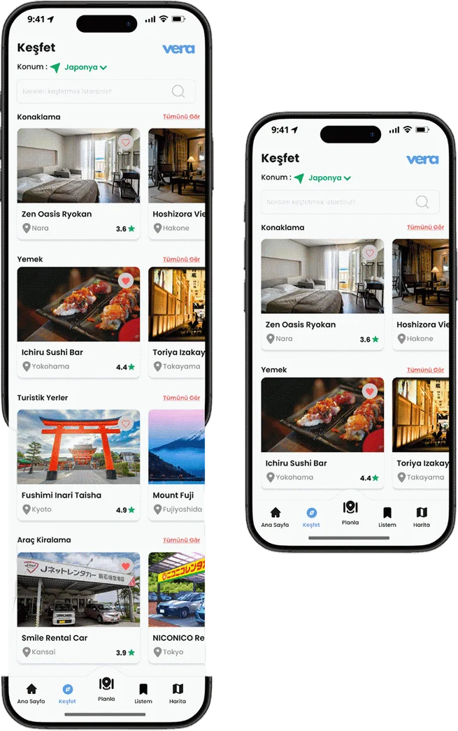
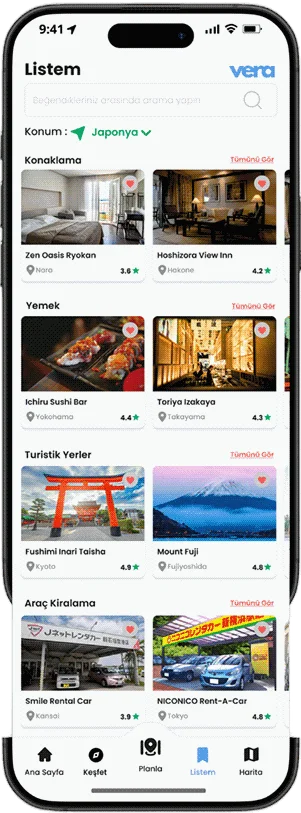
The saved places screen lets people bookmark and keep their favourite accommodation, restaurants, tourist attractions and rental services, so everything is within reach while they plan a trip.
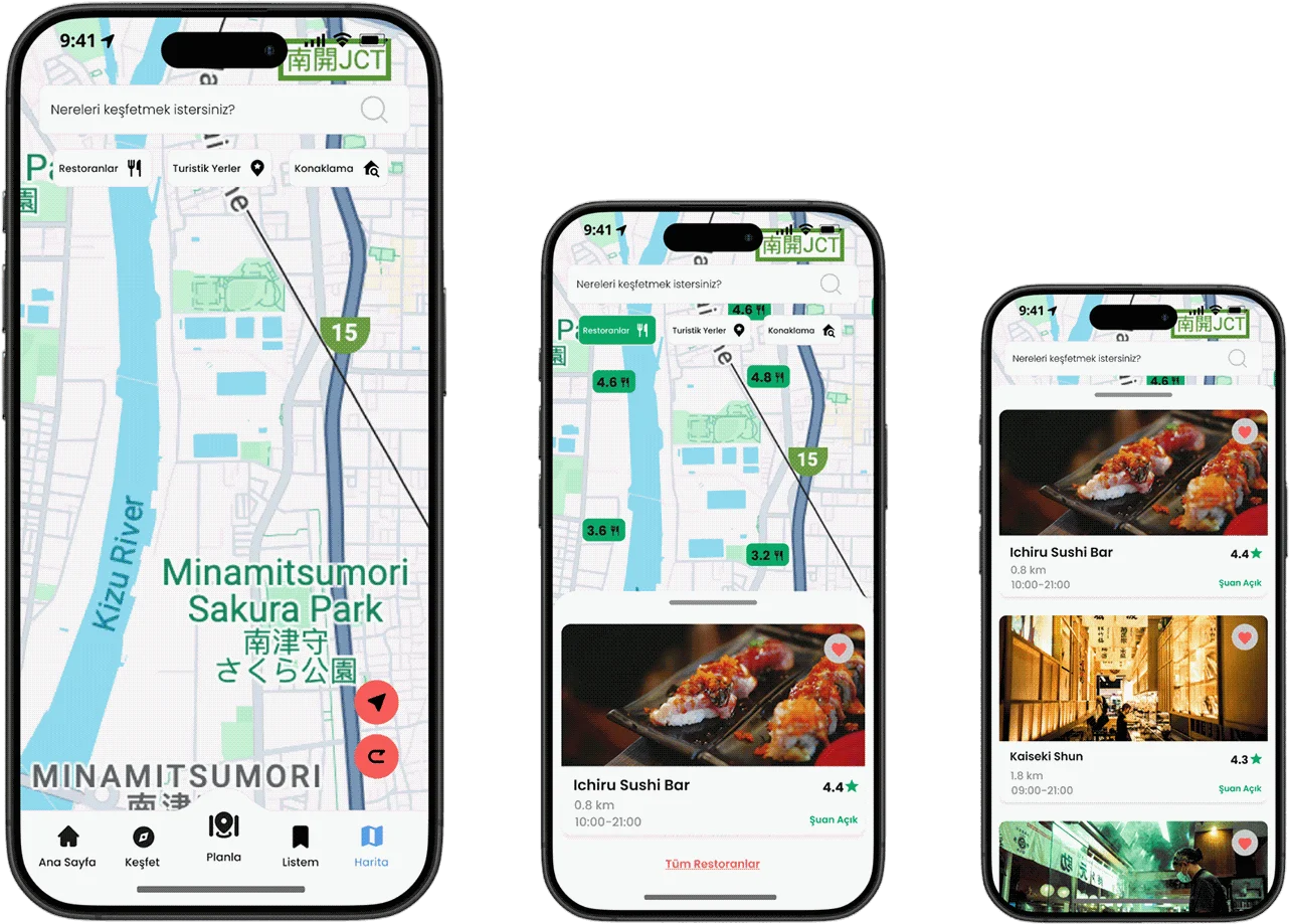
The map screen lets people search for destinations and apply filters such as restaurants, accommodation and tourist attractions. Once a filter is picked, the map shows nearby options for that category, giving a personalised view of the surroundings.
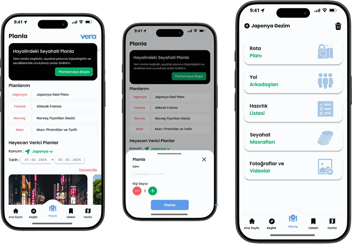
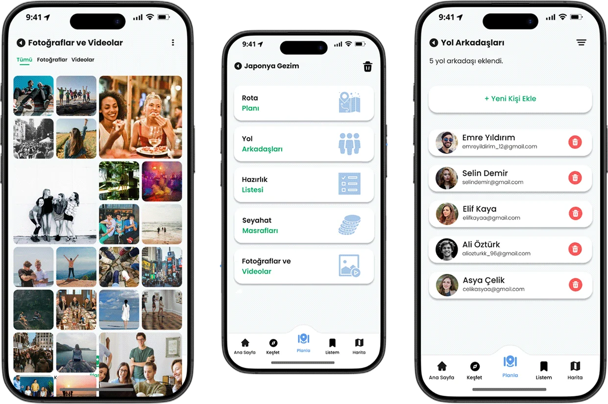
The plan screen shows a list of all the existing trips and also offers the option to plan a new one.
Before the trip is created, people enter a trip title and set the size of the group.
Once the trip is created, users can build an itinerary, invite friends, put together checklists, track travel expenses and view the photos and videos uploaded by the members of the group.
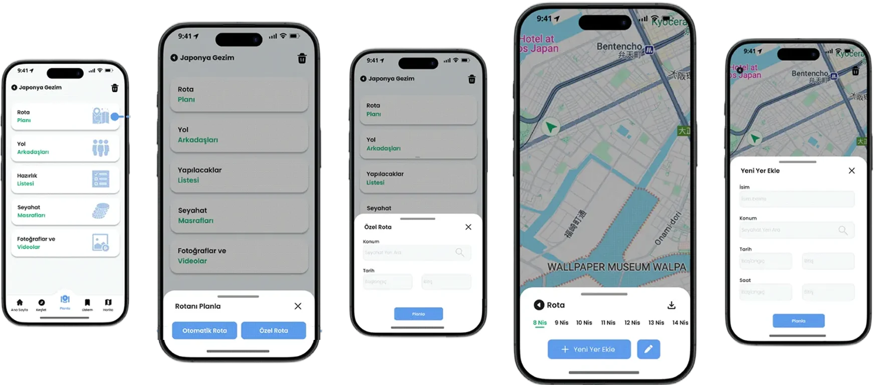
When the route plan option is chosen, people are asked either to build a custom route plan or to have one generated automatically from their preferences.
Users enter their travel destinations and dates, after which the trip plan screen is created for the planning that follows.
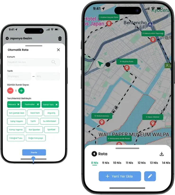
Users enter the destination, the travel dates, the number of stops per day and their travel preferences. A personalised itinerary is then built from what they provided.
Users enter the destination, the travel dates, the number of stops per day and their travel preferences. A personalised itinerary is then built from what they provided.
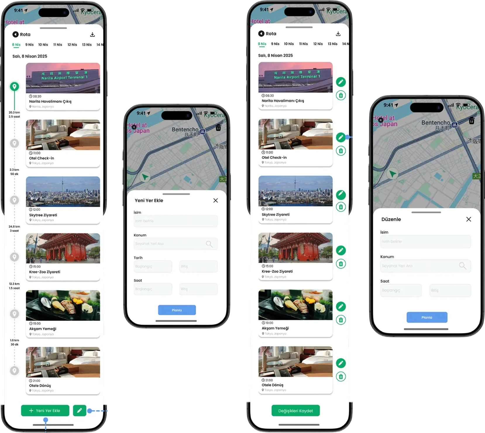
Users can add new destinations by giving a title, a location and the date and time of the visit.
In the list view the itinerary is laid out with time, distance and duration. Every location carries a map pin, and completed stops are highlighted in green.
Users can change the existing itinerary or remove specific places from it.
Users can view and manage the photos and videos shared by their travel companions.
Users can add friends to their trip or remove existing members.
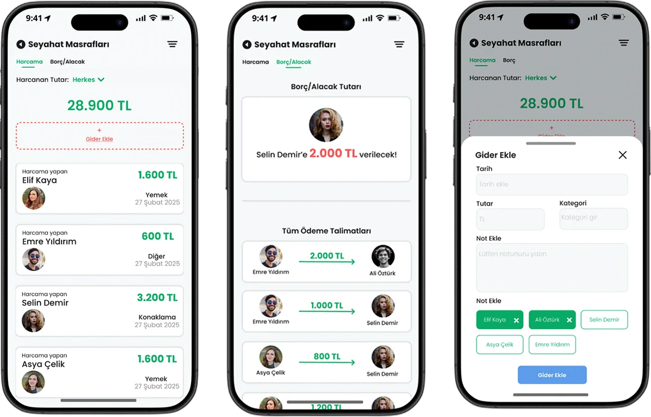
Users can add expenses and follow the group spending, showing who paid, what it was for and the date. It also lets them keep track of each person's individual spending.
Users can enter the details of an expense by choosing who paid, the date, the amount and a category such as food or travel. They can also pick the people involved to split the cost and, if needed, add the expense to the debts.
The debts screen states the amount owed and who it should be paid to. The app arranges the settlements so they take the fewest transactions possible.
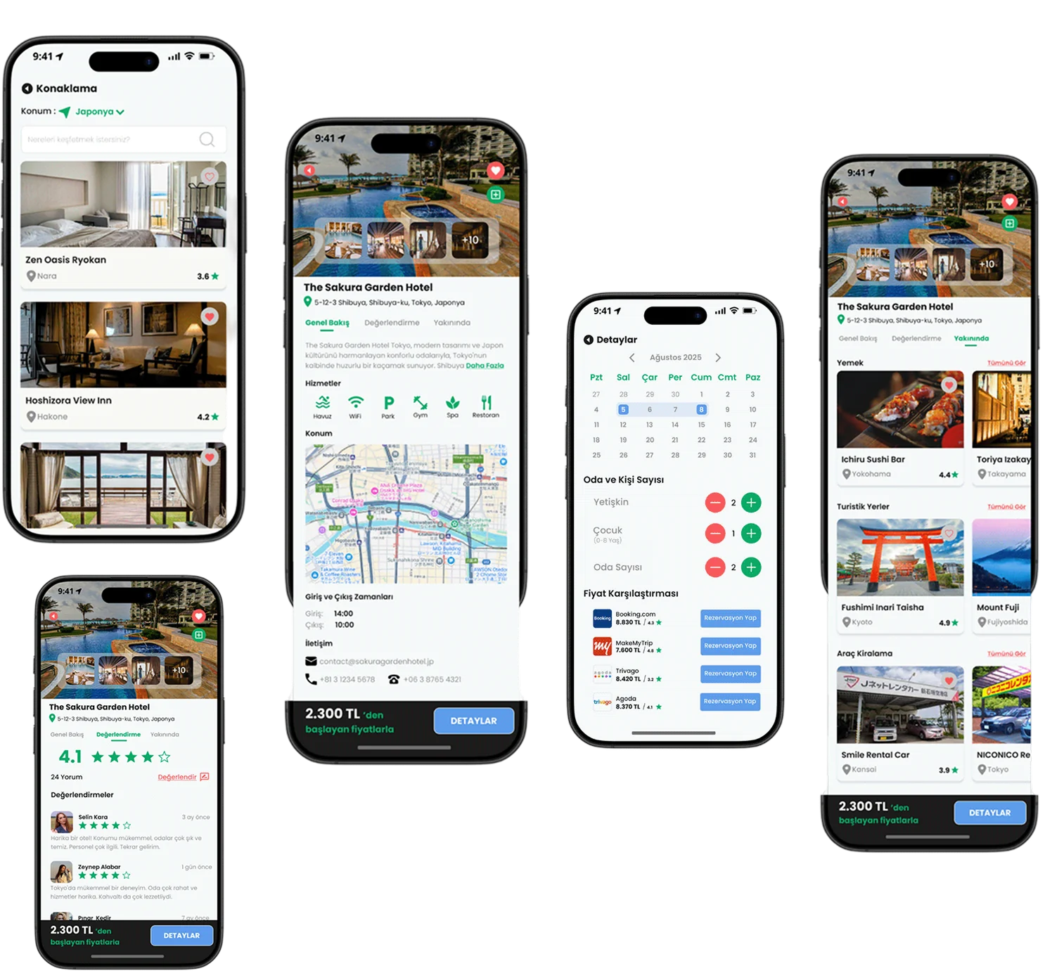
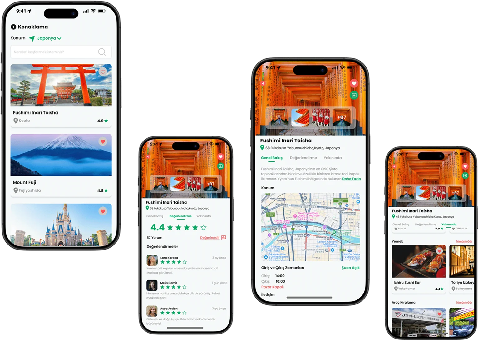
Travellers can browse nearby places to stay or search for a specific one. They can read the overview, go through the reviews and discover interesting spots in the area.
Travellers can pick a date range and set the number of guests.
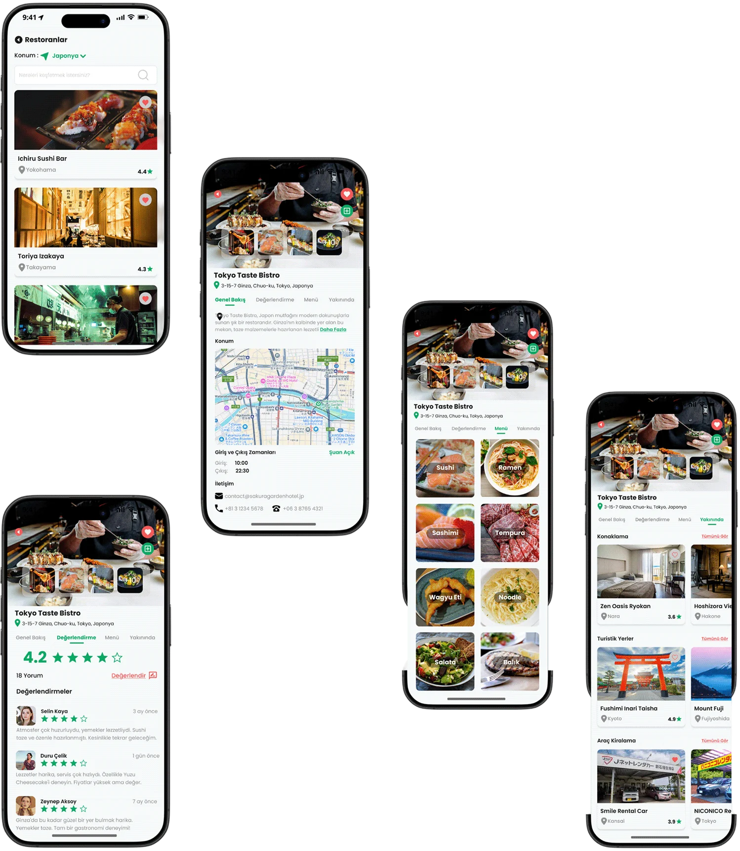
On the restaurant screens, travellers can get an overview, look through the menu, read the reviews and discover places nearby.
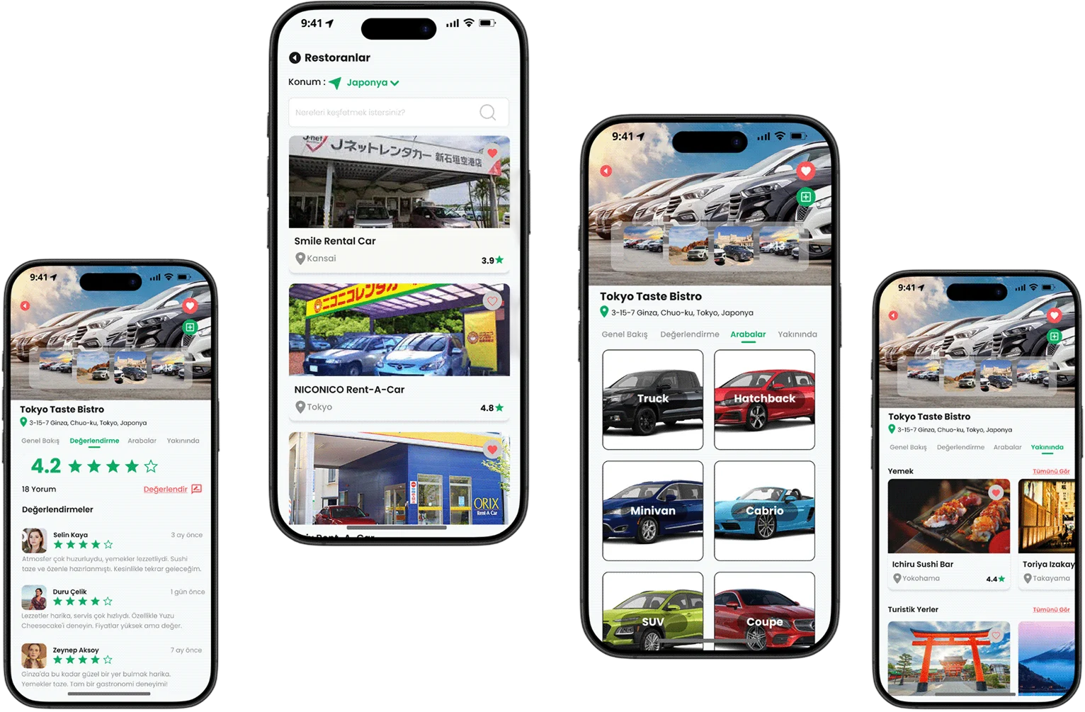
On the rental agency screens, travellers can read the overview, browse the vehicles on offer, check availability and discover places nearby.
On the tourist attraction screens, travellers can see the key details about a site, go through the reviews and look at the places nearby.
Usability testing means watching real people interact with a product, in order to spot any problems, understand how easily it is used and improve the overall design and functionality.