Product Design
IEMedia
I work on bringing IE Media's network of brands into one digital experience, positioning each one clearly and making the company's reach understandable to both everyday visitors and potential business partners.
Explore the Site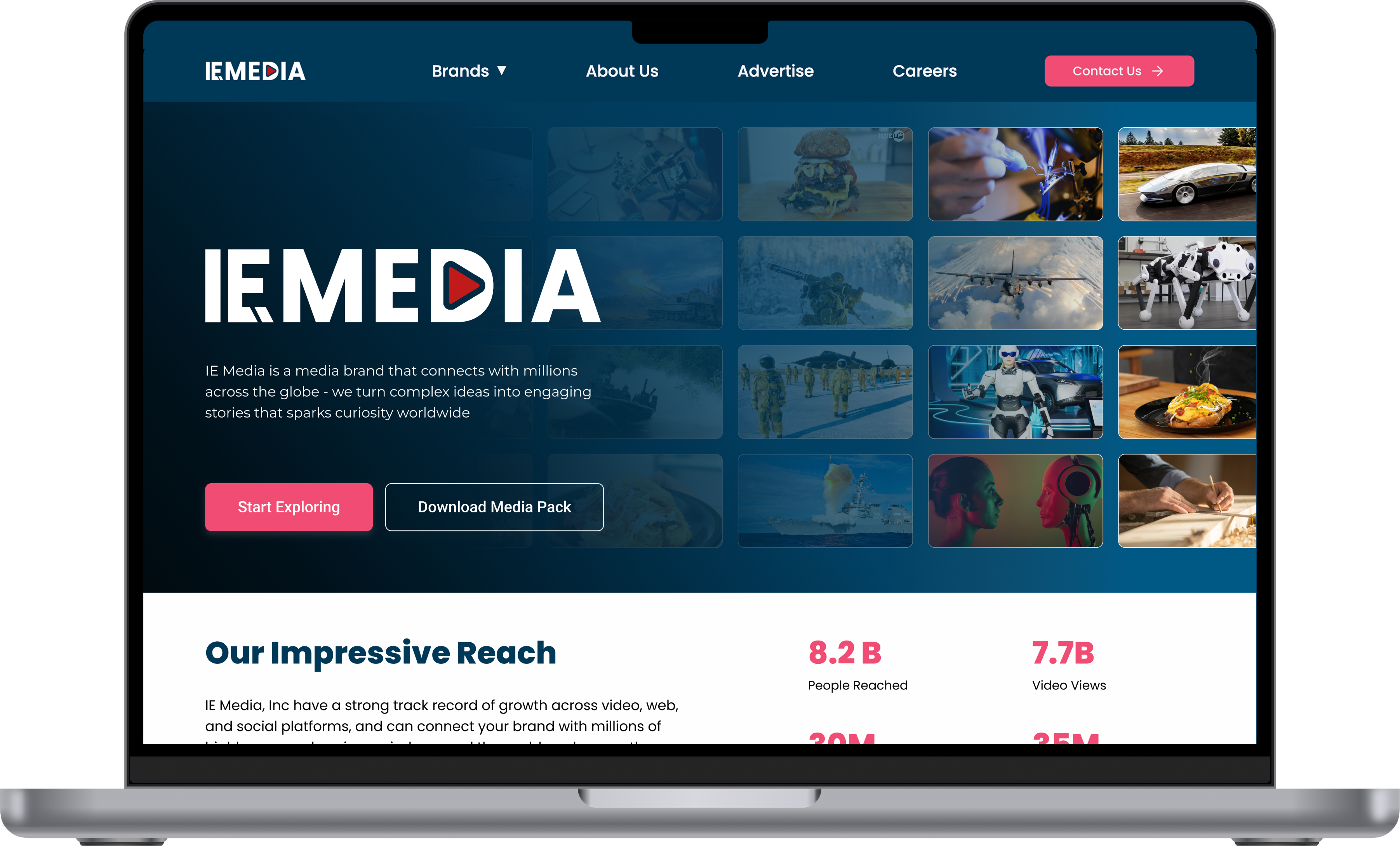
About the
Product
IE Media is a global digital media company that started with Interesting Engineering and grew to bring several media brands under one roof.
Today it reaches different audiences through Interesting Engineering, Military Mechanics, Crafty Engineer and Taste Lab, covering everything from engineering, science and technology to DIY, defense and lifestyle.
By the company's own numbers, its platforms have reached 8.2 billion people, its videos have been watched more than 7.7 billion times, and it has 30 million social media followers and 35 million monthly active users.
The challenge here wasn't just designing a company website. It meant making the whole ecosystem behind IE Media, its brands, its reach and its commercial opportunities, understandable in one place.
Role: UX/UI Designer
What I
Did
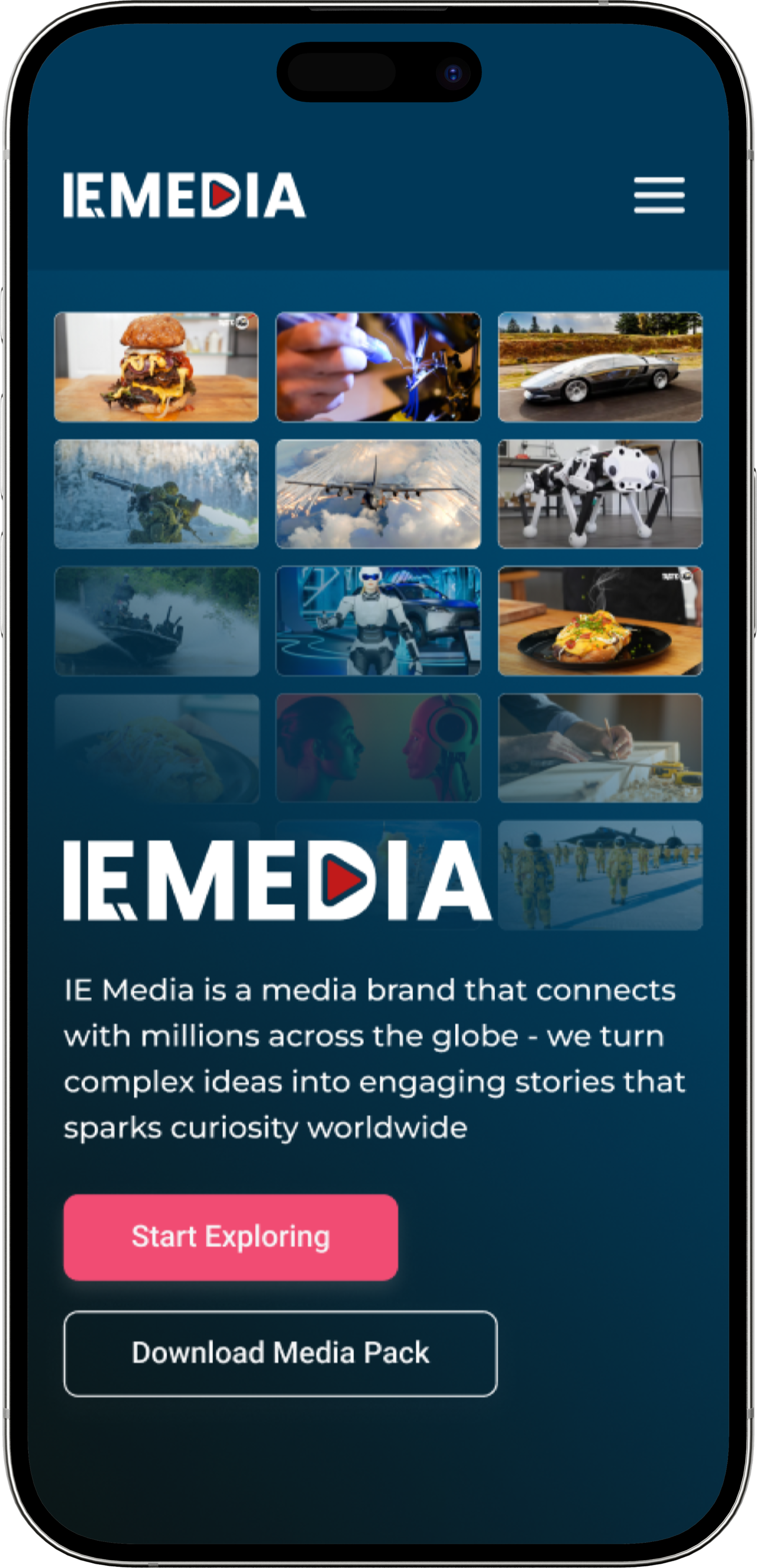
What I did for IE Media was a bit more than designing a handful of typical corporate website screens.
I brought the different sides of the company into one experience.
Corporate Website
I designed the core web experience that explains what IE Media is, which brands it owns, and what kind of media ecosystem it has built around them.
Brand Discovery
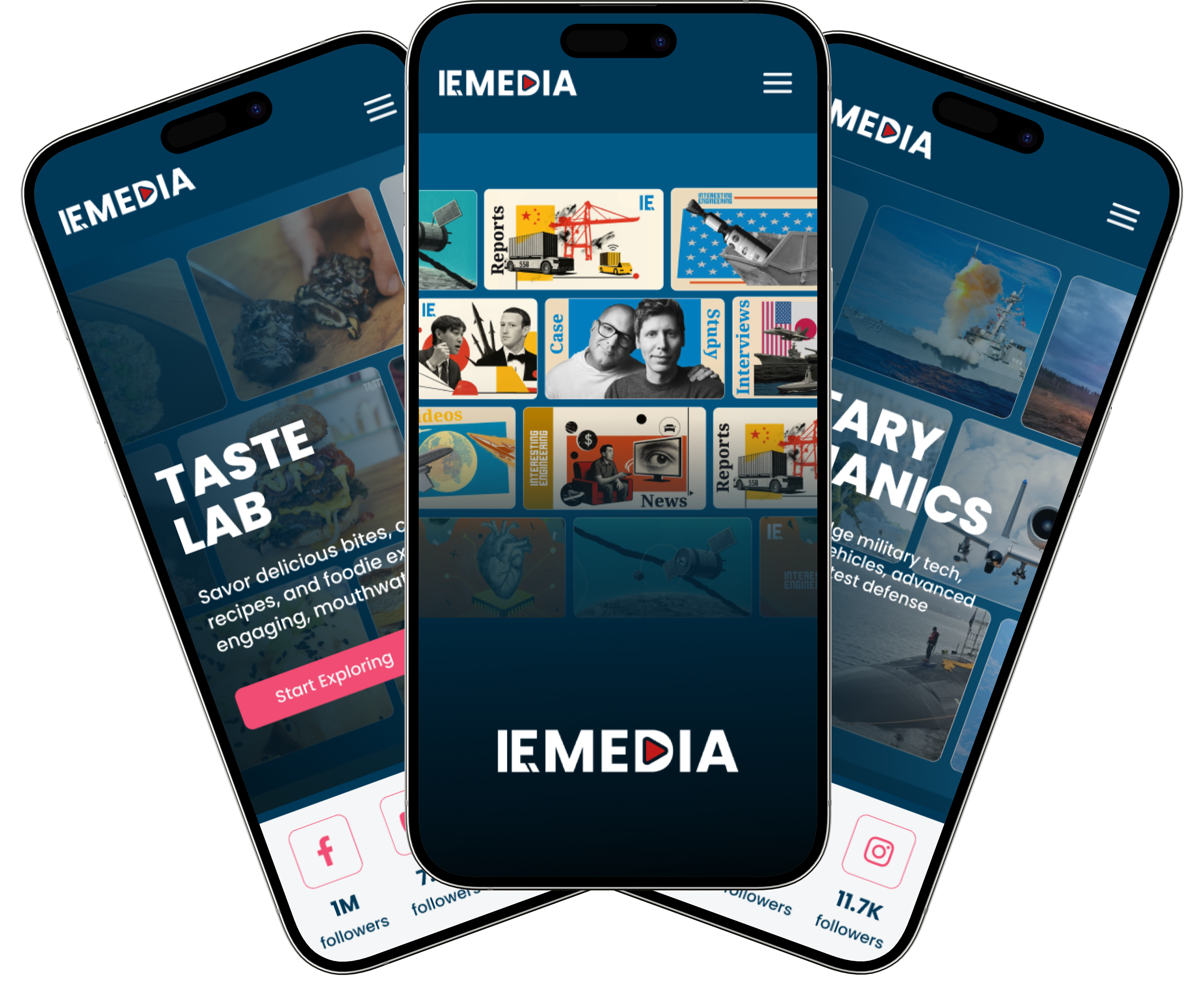
I organized the different media brands under one structure, building a brand discovery experience where a visitor can quickly understand what each brand actually does.
B2B Experience
I turned the Advertise side into an experience where potential partners can understand IE Media's reach, its ad formats, and the partnership opportunities available.
Lead Generation
I treated the Contact and Advertise flows as more than a form to fill out. They work as a lead generation process that carries the visitor to the right action.
Visual Design
I also built the images, mockups, cards and other visuals on the site, treating them as part of the same larger design system throughout.
Telling the
IE Media Story
The biggest problem with a corporate website usually isn't too little content, it's too much. IE Media has a lot to say too. Multiple brands, millions of users, billions of video views, different ad formats, teams, career opportunities and contact points. Putting all of that on the homepage is easy. The hard part is making sure the visitor doesn't get lost in it. So I built the homepage's information hierarchy to first define the company, then show its scale, then introduce its brands and the opportunities it offers.
At First Glance
What is IE Media?
A global digital media company that started with Interesting Engineering and grew from there.
What does it own?
Several media brands, including Interesting Engineering, Military Mechanics, Crafty Engineer and Taste Lab.
How big is it?
Billions in reach, billions of video views, and tens of millions of followers and monthly users.
What can I do here?
Explore the brands, look into advertising options, check career opportunities, or get in touch.
Organizing the
Brand Ecosystem
One of the biggest design problems on IE Media is that more than one brand lives under the same company. Interesting Engineering, Military Mechanics, Crafty Engineer and Taste Lab all have quite different content. So I didn't want to show them as just a grid of logos. I built a structure where each brand could show its own character while still feeling like part of IE Media.
Brand Architecture

Interesting Engineering
A global media brand focused on science, technology and engineering.

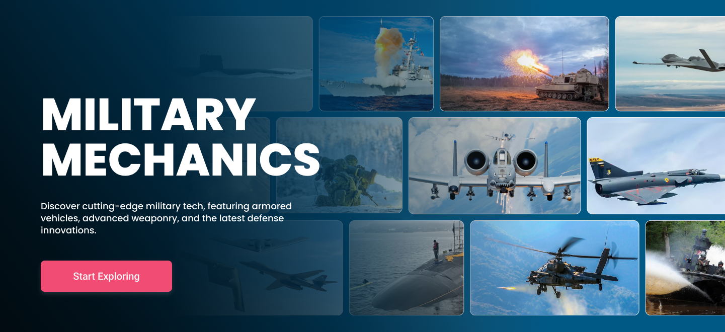
Military Mechanics
Military technology, defense and engineering content for a focused audience.
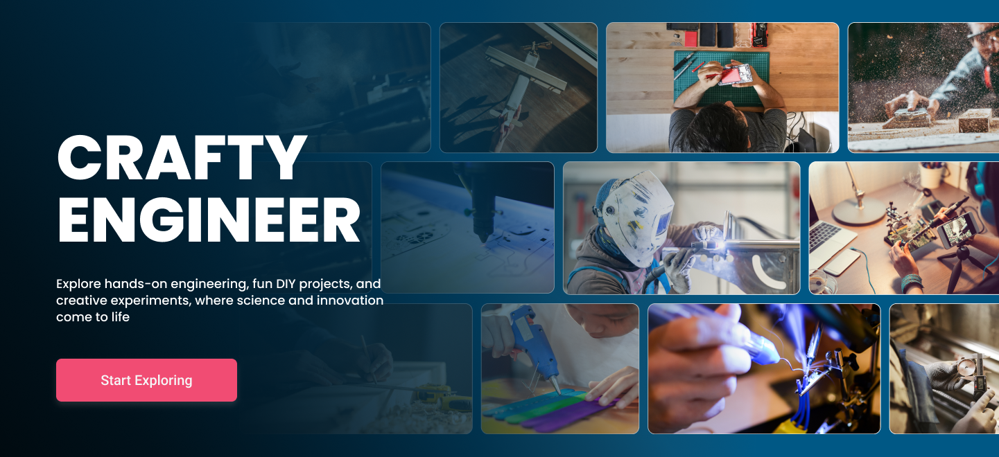
Crafty Engineer
DIY, making and hands on engineering content for everyday builders.

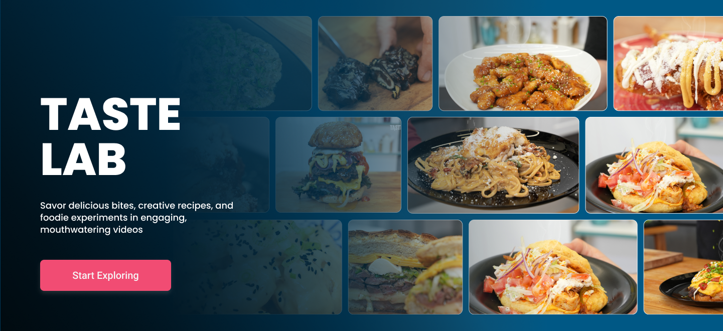
Taste Lab
A media brand built around food, lifestyle and visual content.
The brands may be different, but the relationship between them had to stay clear to the visitor at every point.
More Than Just
Showing Brands
The goal here wasn't to tell the visitor, "here are IE Media's brands."
When someone looks at a brand card, they should understand three things at once:
01
What is this brand about?
02
Who is it for?
03
Where can I go from here?
So I thought about card structure, visual choices, short descriptions and CTAs together.
The Advertiser
Experience
Not everyone who comes to IE Media is there to read content. Some visitors come looking for a media partner. So I treated the Advertise experience as one of the site's most important B2B flows. A potential partner should first see IE Media's reach, then understand who that audience is, then be able to explore which ad formats are available. And at the end, they should find a clear way to get in touch.
B2B Journey
01
Discover IE Media's scale
02
See the audience and brands
03
Explore the ad formats
04
See past partnerships
05
Get in touch
So instead of putting the visitor in front of a form right away, I explained the value first. The form became the action at the end of the story.
Making Data
Part of the Design
8.2 billion in reach, 7.7 billion video views, 30 million social media followers and 35 million monthly active users aren't just numbers. They're one of IE Media's strongest selling points. So instead of burying that information inside a small "about us" paragraph, I gave it visual weight through dedicated metric blocks.
Audience
8.2B+
Global reach
Video
7.7B+
Video views
Social
30M
Social followers
Monthly
35M
Monthly active users
(2024–2025 Data)
About
Us
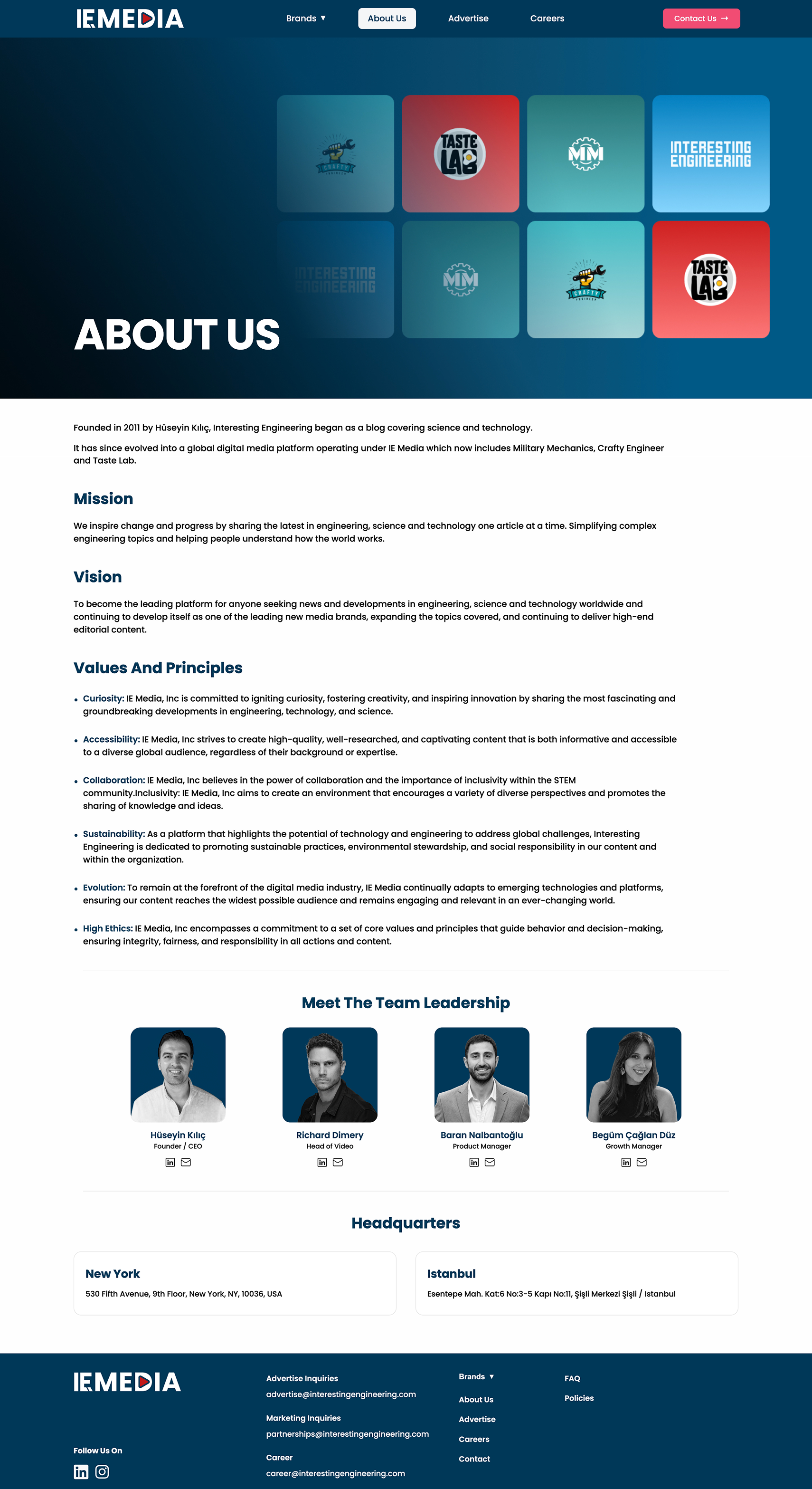
I didn't think of the About Us page as a classic corporate page that just recaps company history. I built a structure that shows where IE Media came from, what it has become today, and what kind of team is behind it. Company story, mission, vision, the team and the global way of working all come together in the same experience.
Company Story
I built a visual structure that shows how the story that started with Interesting Engineering in 2011 turned into the global media ecosystem it is today, covering several brands. The goal here isn't to show as much company information as possible. A visitor should leave the page remembering who IE Media actually is.
Careers
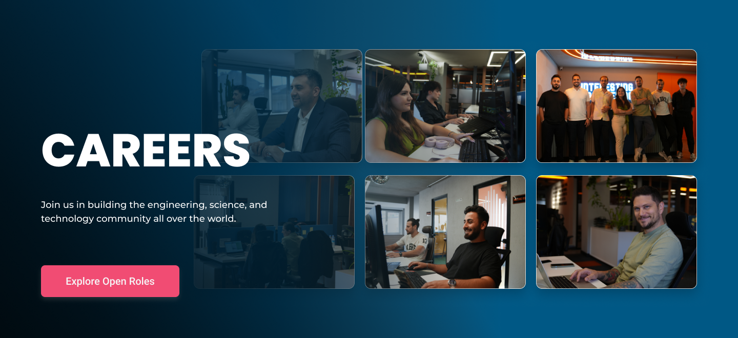
I didn't treat the Careers page as just a list of open job postings either. For someone to consider working here, they need to understand what kind of place the company is first. So I designed team culture, the way of working, the global structure and open positions as part of the same experience.
The User Journey
The goal here isn't to rush someone to the application form as fast as possible. It's to give them the information that helps them decide to apply, in the right order.
Contact
Page
I carried the same logic into the Contact page.
Instead of asking the visitor for unnecessary information, I used fields that help us understand the purpose of their message, creating a more controlled form experience.
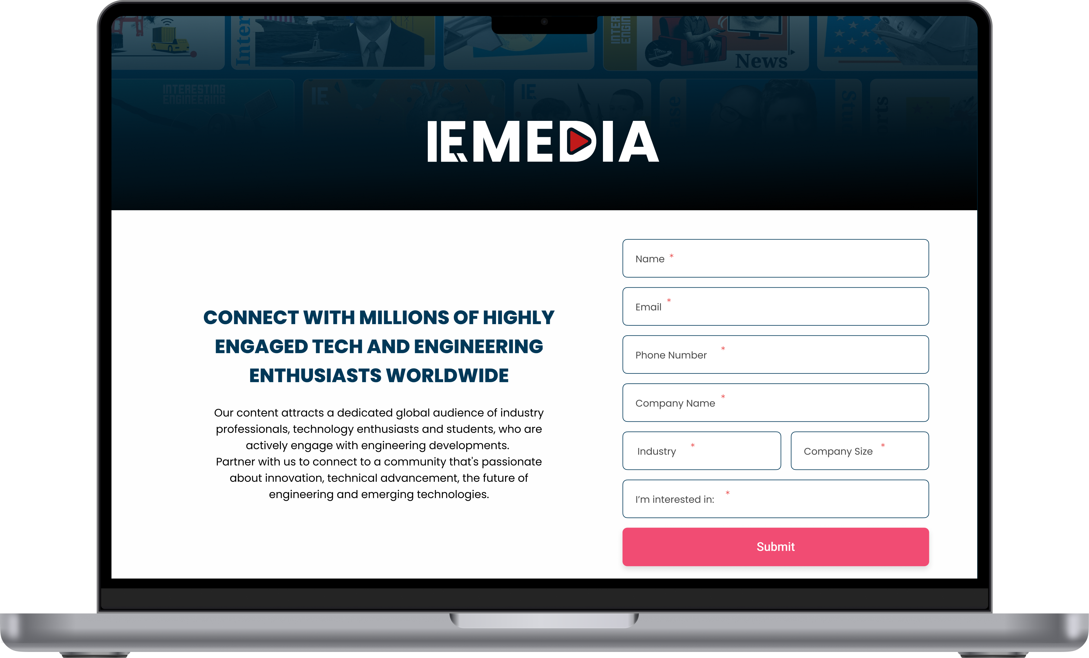
UX Decision
Fewer Fields
Not wearing the visitor out with unnecessary questions.
More Context
Understanding why the request is actually coming in.
Clearer Routing
Getting the visitor to the right point of contact.
The goal here isn't just to get the form filled out. It's making sure the right visitor reaches out for the right reason.
Visual
Design
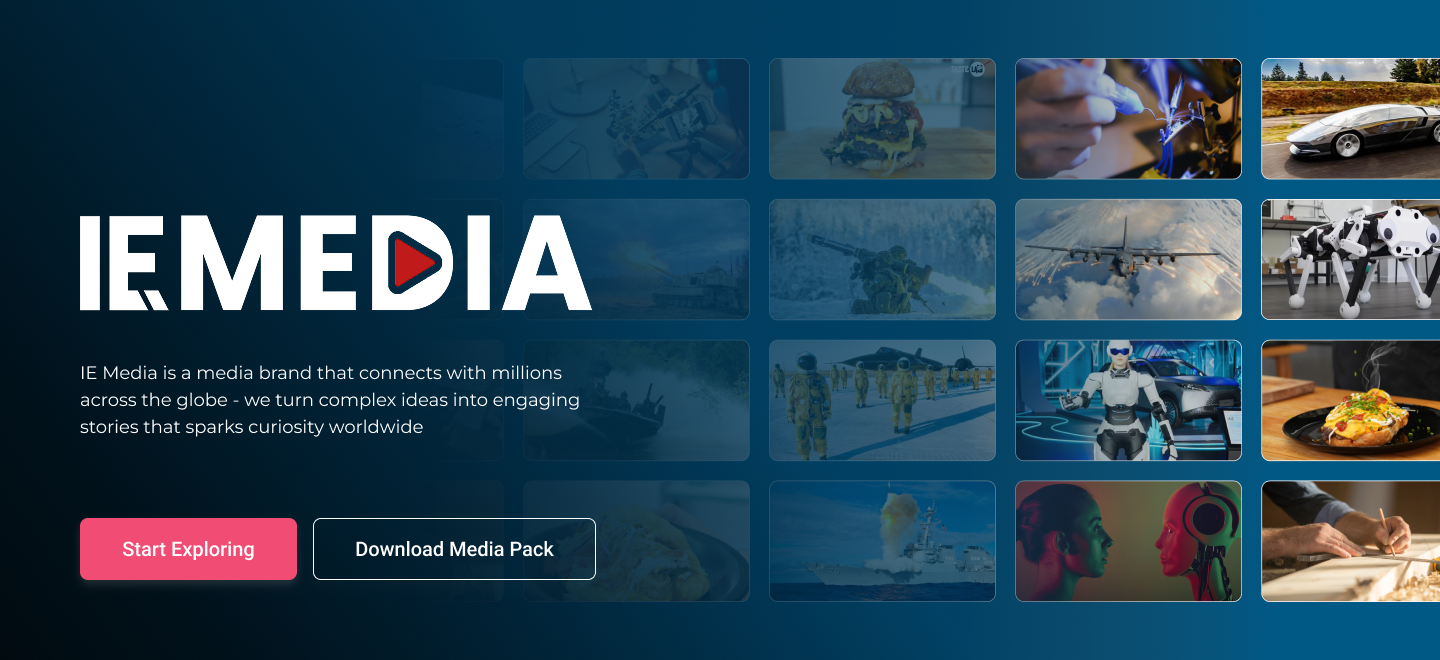
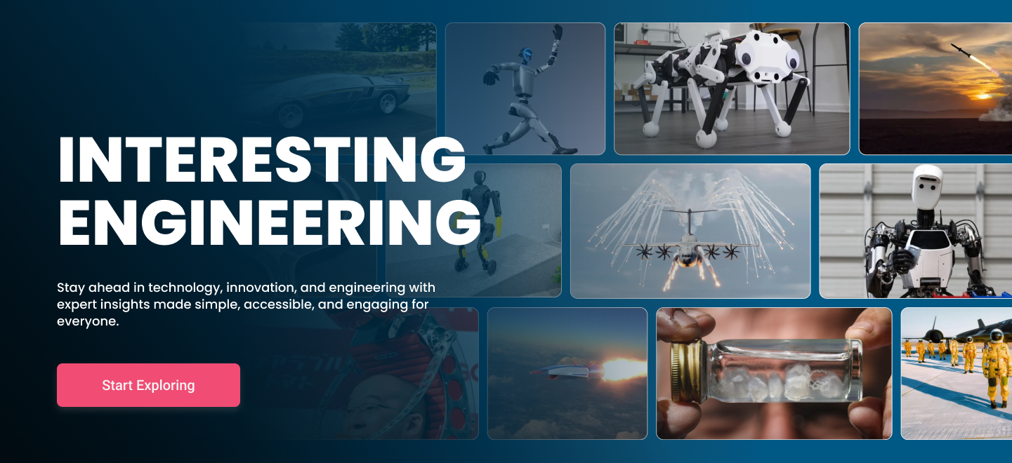
This project wasn't just about designing UX and UI screens. I also built the visual language used across the site. Hero imagery, brand cards, metric blocks, section illustrations, mockups and other visuals were all designed within the same system. Since IE Media is a media company, I didn't want the visuals to stay purely decorative. Every image needed to add something to the story on the page.
Visual Language
Editorial
Strong imagery that carries the real feel of a media company throughout the site.
Technology
A visual language that supports IE Media's engineering and technology roots.
Corporate
A more controlled, trust building structure built for the whole B2B side.
Brand
Different brands working within the same system without losing their character.
Responsive
Experience
Shrinking the desktop design down for mobile wasn't enough here. Brand cards, the big metric areas, hero imagery and navigation in particular need to behave differently on mobile. So I thought through the mobile version of every section on its own.
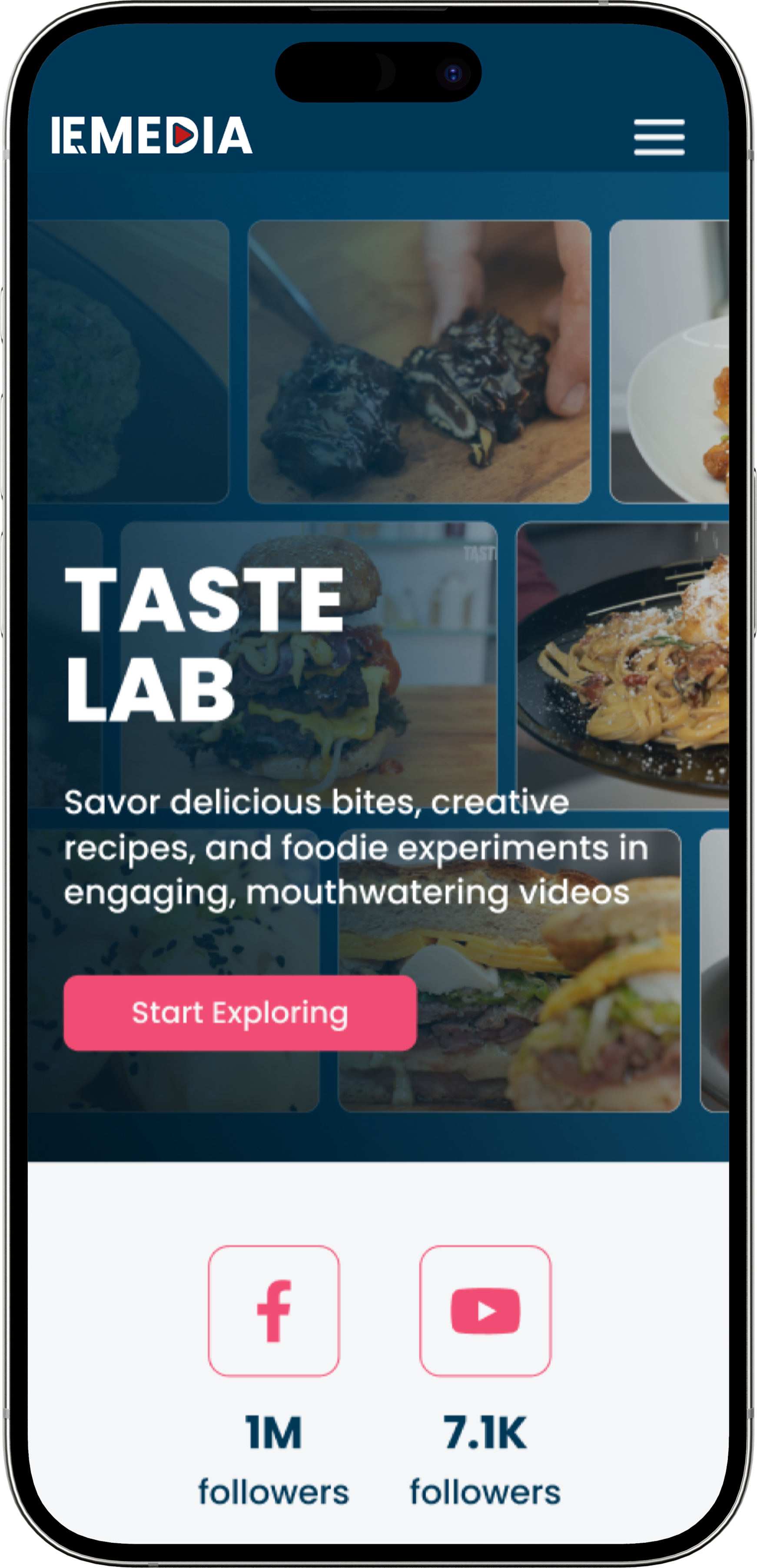
Desktop
A wide grid, large visuals, and more content visible at once.
Tablet
The grid and content density become noticeably more controlled.
Mobile
Content turns into a single column flow with a clearer hierarchy.
Design
System
I thought of the site as a system that can grow, not a one time design. Adding a new brand, a new campaign or a new section shouldn't mean redoing the design from scratch. So I built the core components within one shared system.
I kept the typography, spacing, grid and responsive behavior of all of these within the same system. That way, as IE Media grows, the site's visual language can grow with it without falling apart.
The Role of
UX Here
For me, UX on IE Media was really about giving the right information in the right order. A visitor shouldn't have to wonder, "what is IE Media?" A brand manager shouldn't have to search for, "which brands are here?" An advertiser should easily find the answer to, "how can I work with this?" A candidate shouldn't get lost in the site looking for, "where are the open positions?" And all of this needs to happen within the same website without the experience feeling disconnected. So the homepage introduces the company. The Brands section shows the ecosystem. About Us builds trust. Advertise explains the commercial opportunity. Careers guides people who want to join the team. And Contact carries the visitor to the right action at the end of all these journeys.
What comes out of it isn't just a corporate website that talks about IE Media. It's a platform that tells the story of the company's brands, its reach, its commercial value and its human side, all within one digital experience.