Product Design
Military Mechanics
A focused niche media platform in the same family as Interesting Engineering, built around a single subject: military vehicles, hardware, and mechanical systems. It's still in development, but the reading experience is already taking shape.
Preview the Site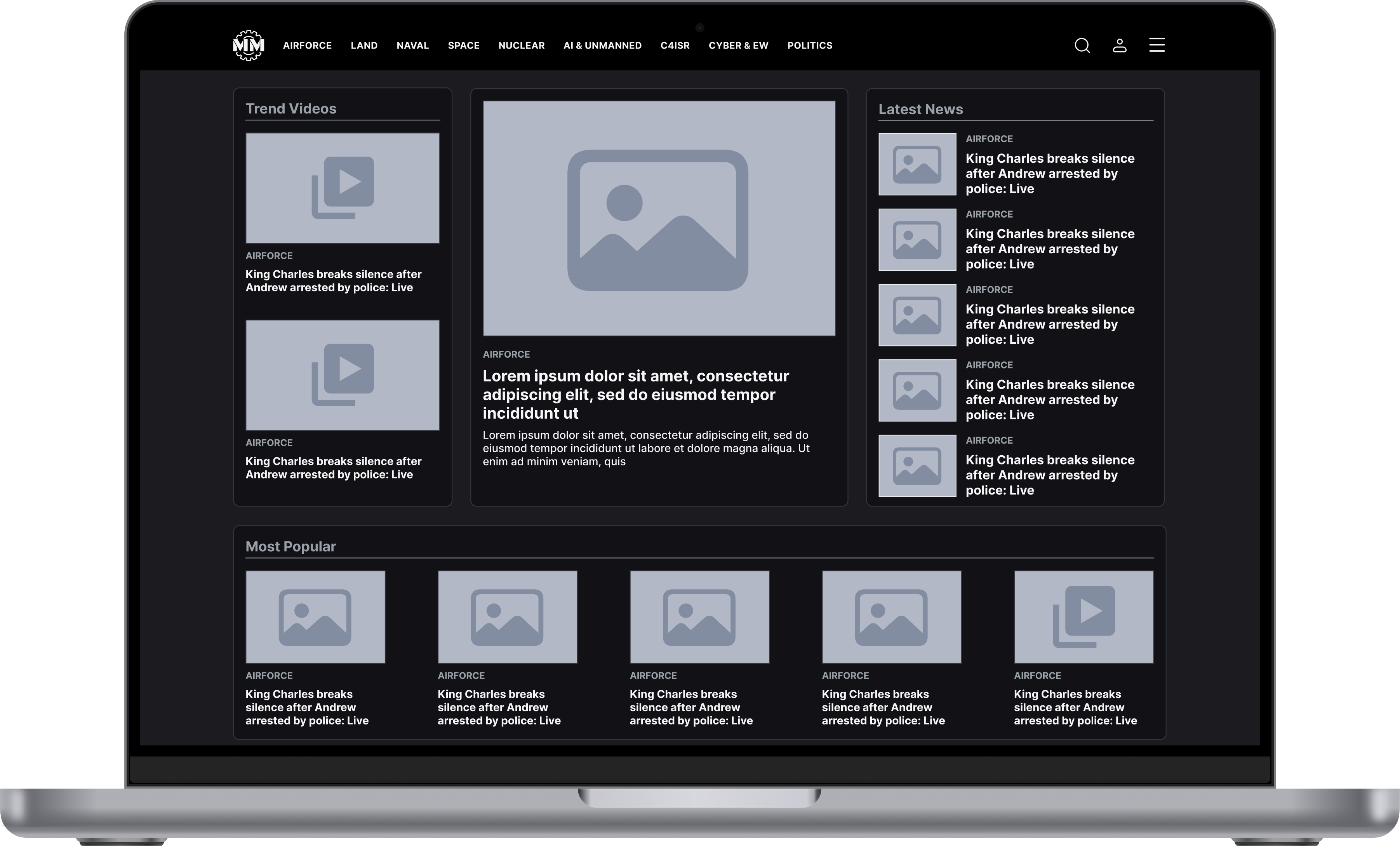
About the
Product
Military Mechanics is a spin-off from Interesting Engineering, aimed at a narrower audience that wants deeper coverage of military vehicles, equipment, and mechanical systems. It carries IE's editorial voice, but because the subject is so much more specific, the whole structure needs to get people to what they care about faster, with less pulling their attention away while they read.
Since the product is still early, I wasn't just designing the screens that already exist. I was also setting the foundation for the content hierarchy, the reading experience, the visual language, and the component structure it can keep growing into.
I designed the UX, UI, and every visual on the site myself, from the homepage down to the article reading experience.
Role: Product Designer (UX, UI & Visual Design)
What I
Did
Working on Military Mechanics wasn't about designing a handful of screens. Since it's a new media product, I thought through how the homepage gets organized, how people read an article, how images get used, and how the whole thing behaves on a smaller screen, together, as one experience.
Homepage
Designing how different content types get organized on the homepage, and what someone should notice first.
Article Experience
Building the page readers spend the most time on into something calm, focused, and easy to scan.
Editorial Design
Keeping technical and editorial content feeling consistent within the same content hierarchy and page structure.
Visual Design
Shaping the site's imagery and visual language around Military Mechanics' more technical, mechanical character.
Responsive Design
Rethinking content hierarchy and reading comfort for mobile, not just shrinking down the desktop layout.
Organizing the
Homepage
Military Mechanics covers one subject, but that doesn't make the homepage simple. Military vehicles, mechanical systems, defense technology, and different editorial formats all live on the same page. So the problem isn't showing as much content as possible, it's helping someone find what they're interested in quickly. I built the hierarchy so the featured story is impossible to miss, while the latest news and most popular stories stay easy to find as someone keeps scrolling.
At a Glance
What am I reading?
Military technology, vehicles, and mechanical systems.
What's it focused on?
A more niche, more technical reading experience.
What should I notice first?
Whatever's featured and most likely to catch my interest.
What can I do next?
Keep exploring the site and get into an article.
Building the
Content Hierarchy
Not every piece of content on a media homepage carries the same weight. Some stories are the story of the day, others speak to a narrower technical interest. On Military Mechanics' homepage, I used card size, image weight, and placement to make that difference readable, so the featured story sits front and center while the latest news and most popular stories stay one glance away.
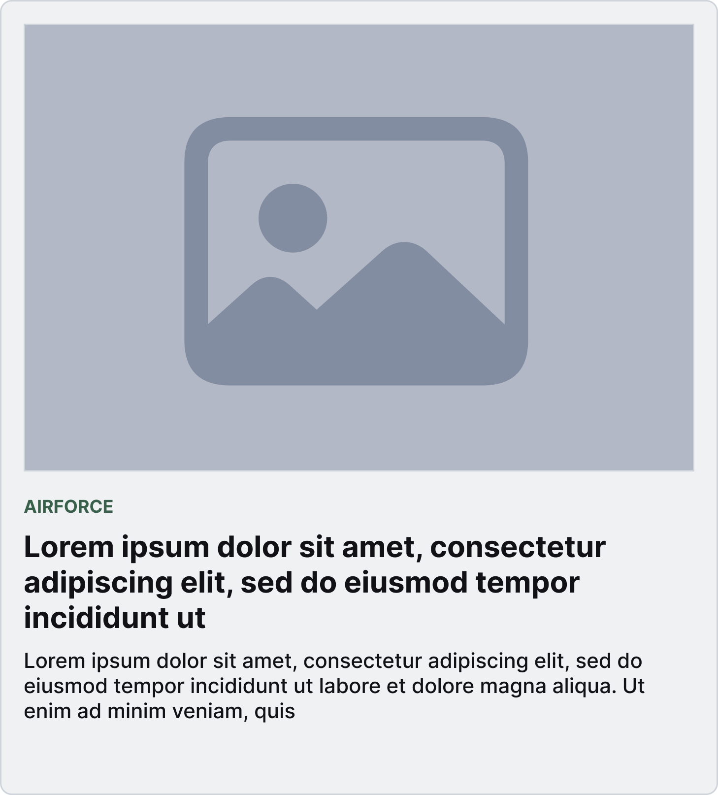
Primary
The story I want someone to notice first.
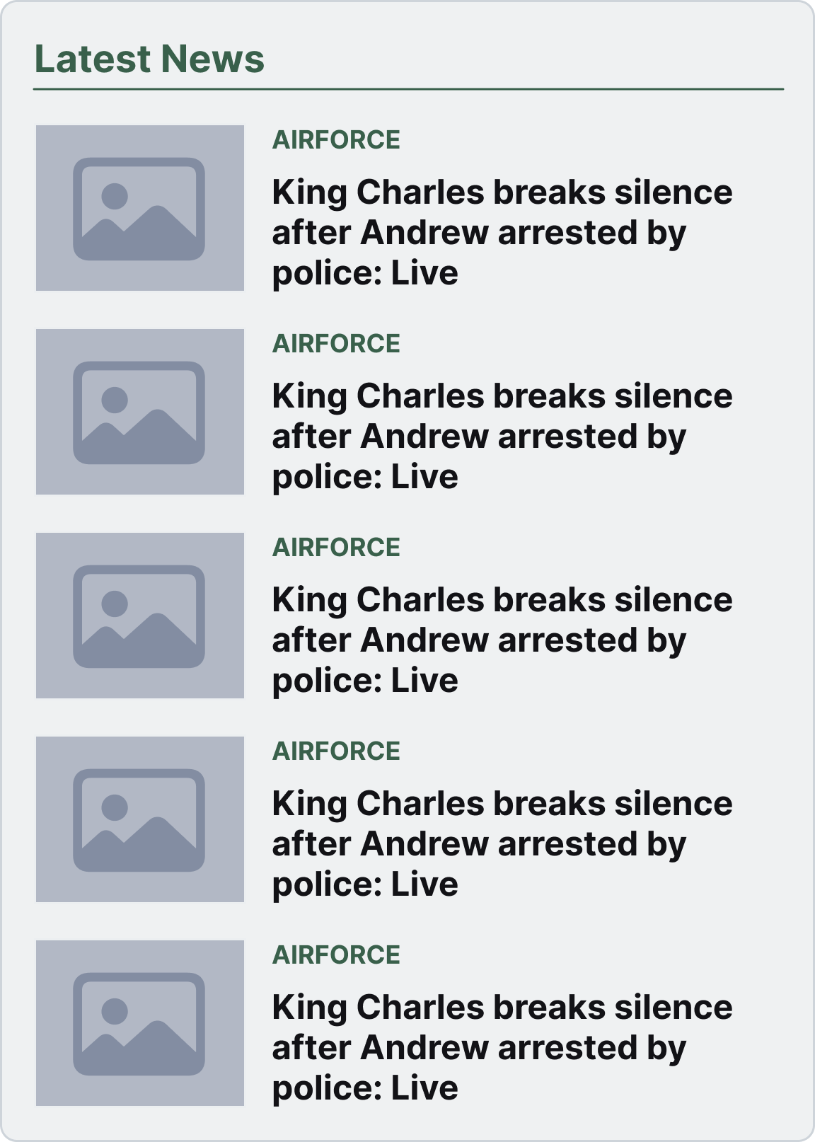
Secondary
Latest news, kept close by so exploring feels natural.
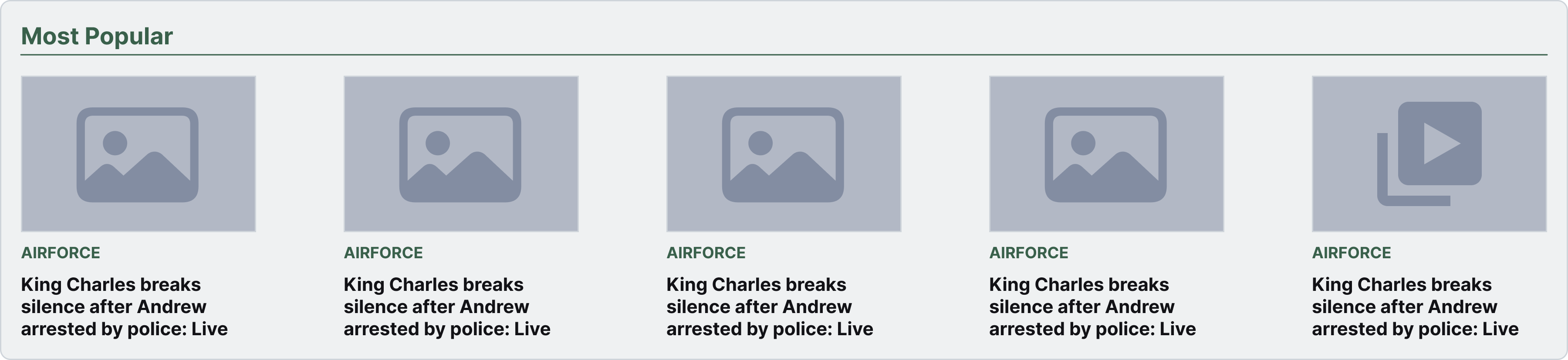
Supporting
Most popular stories, for people who want to dig further.
Designing the
Article Page
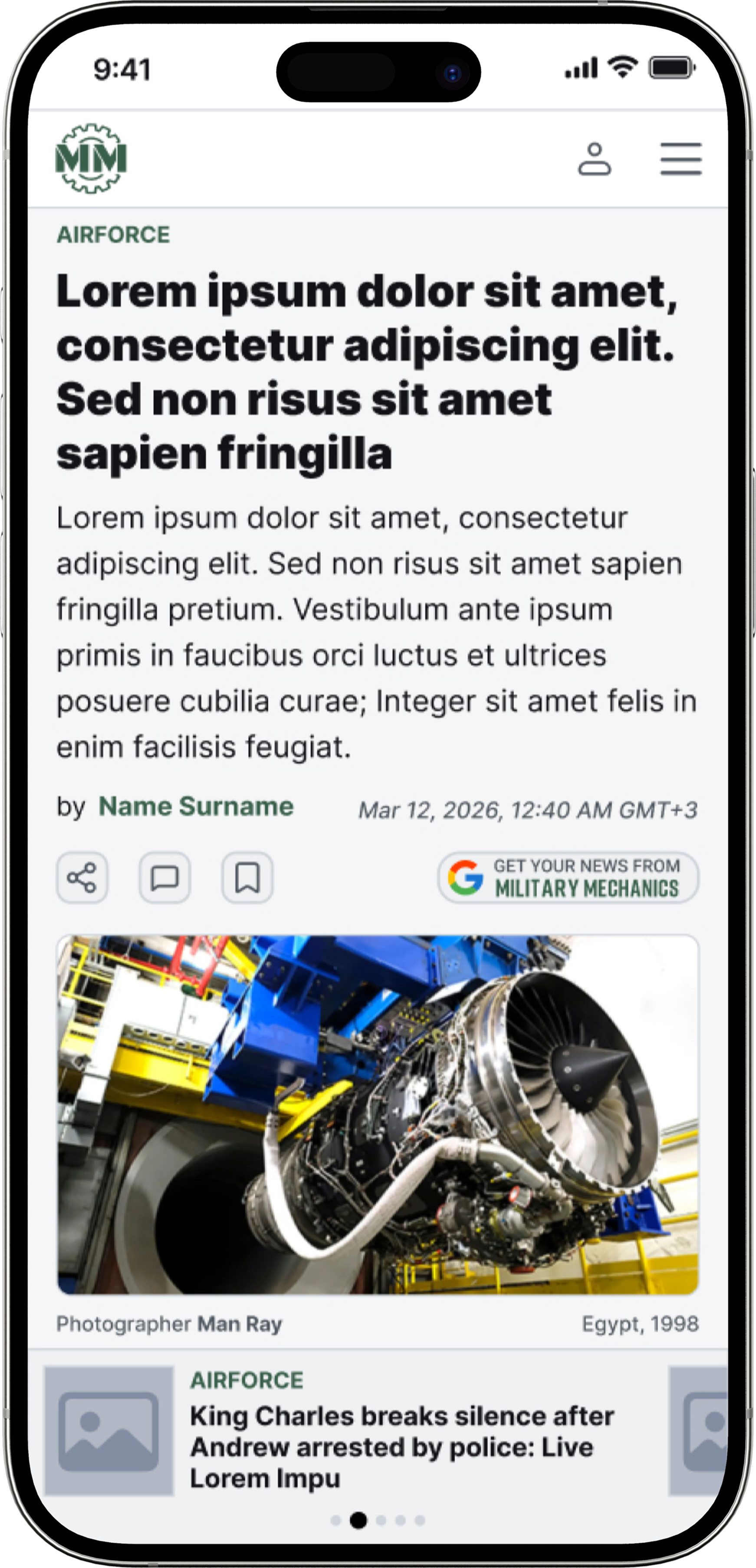
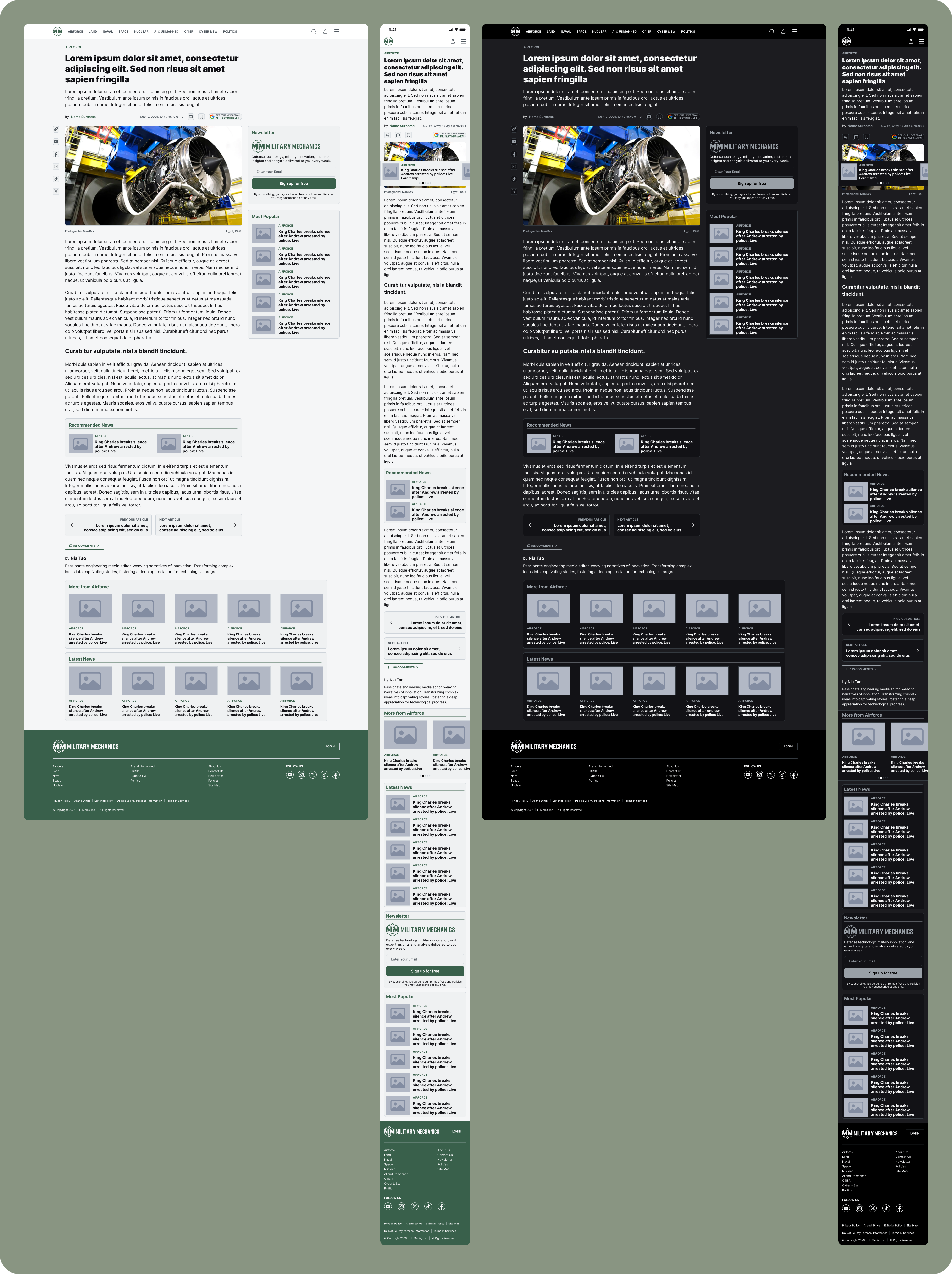
The article page is where readers spend most of their time, so the goal wasn't adding more to it, it was closing the distance between the reader and the content. I thought through how the headline, image, byline, body text, and everything around them relate to each other, so someone lands on the page, understands what they're reading right away, and can get into it without friction.
Reading
Experience
I paid particular attention to focus, hierarchy, and scannability on the article page. In a long piece, I didn't want the interface competing for attention once someone moves from the headline into the body. Giving the headline, metadata, image, and body copy enough room let the content set its own rhythm, and I treated the related content at the end of the article as a natural part of that same experience, not an afterthought.
Focus
Cutting UI elements that get in the way of the content.
Hierarchy
Keeping the headline, metadata, image, and body text clearly separated.
Scannability
Making long articles easy to scan at a glance.
Continuity
Giving someone a natural way into the next story once they're done.
Typography &
Reading Width
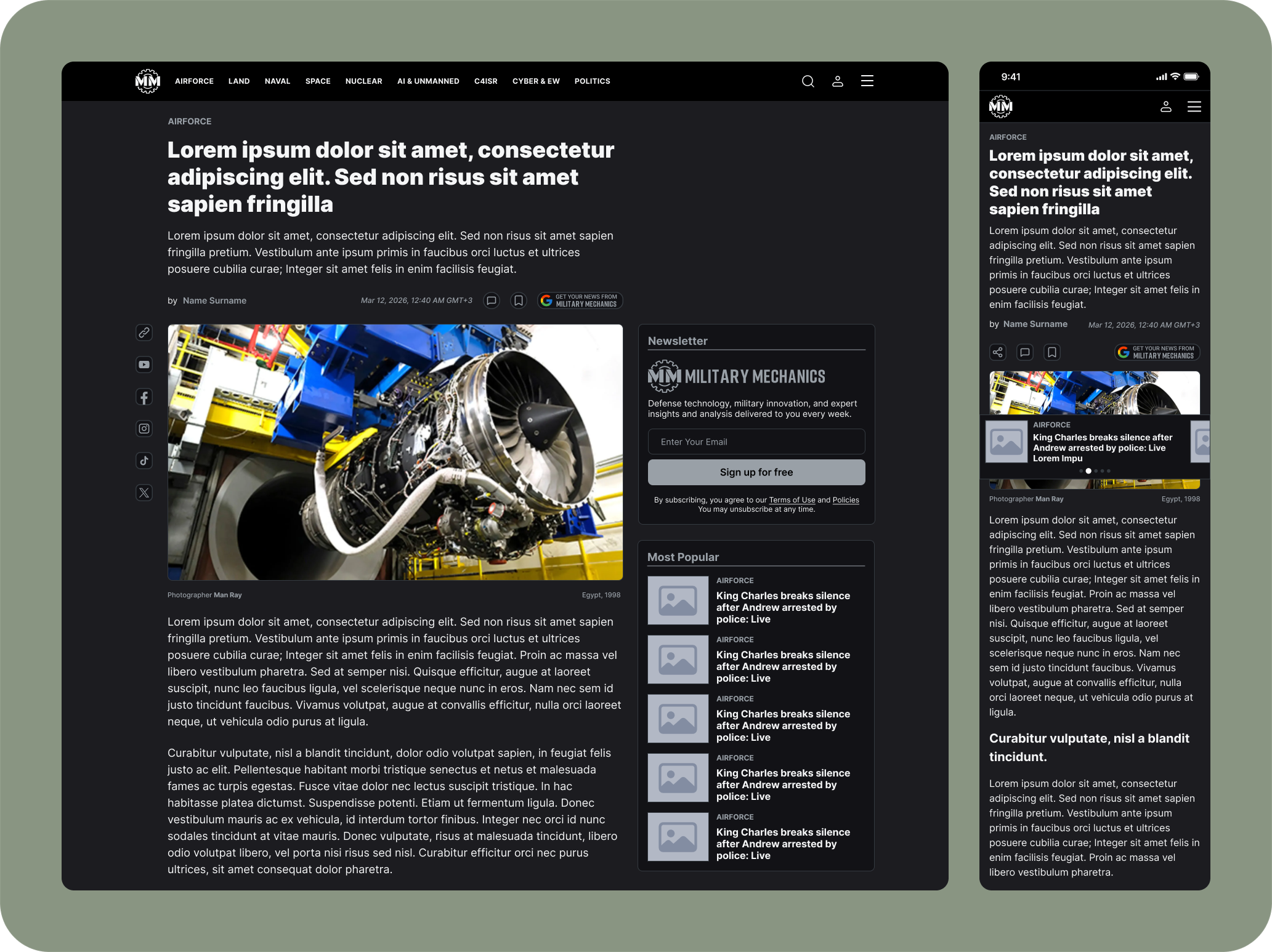
For technical and editorial content, typography isn't just a visual choice, it's part of the reading experience itself. I thought through type size, line height, paragraph width, and how headlines relate to the body copy together. A long article that stretches too wide on desktop gets harder to read, and a column that's too narrow drags the page out unnecessarily, so I kept reading width, type scale, and spacing balanced enough to support long-form reading.
Visual
Design
Military Mechanics sits in the same family as Interesting Engineering, and that matters, but I didn't want it to look identical. The subject is more niche, more technical, more mechanical, and I wanted the visual language to carry that. So imagery leans into vehicles, mechanical systems, and technical detail, treated as part of the story itself rather than something that just fills space next to the text.
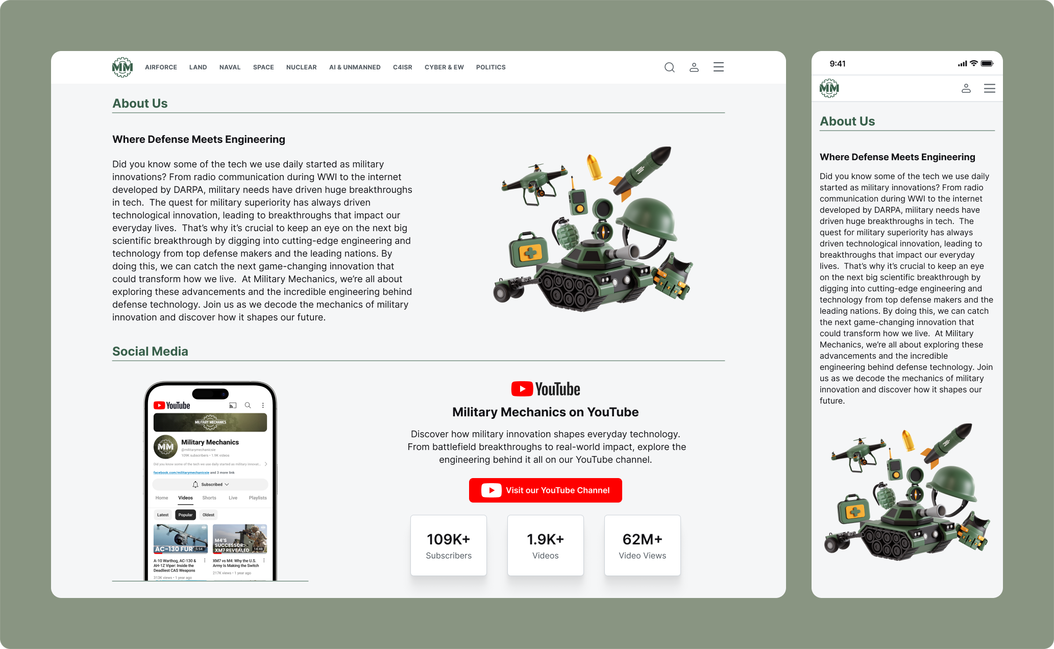
Visual Language
Technical
A visual approach that lets mechanical and engineering detail come through.
Editorial
A layout that keeps the news and media feel of the content.
Focused
Treating images as part of the content, not just decoration.
Consistent
The same visual system carrying through across different content.
Responsive
Experience
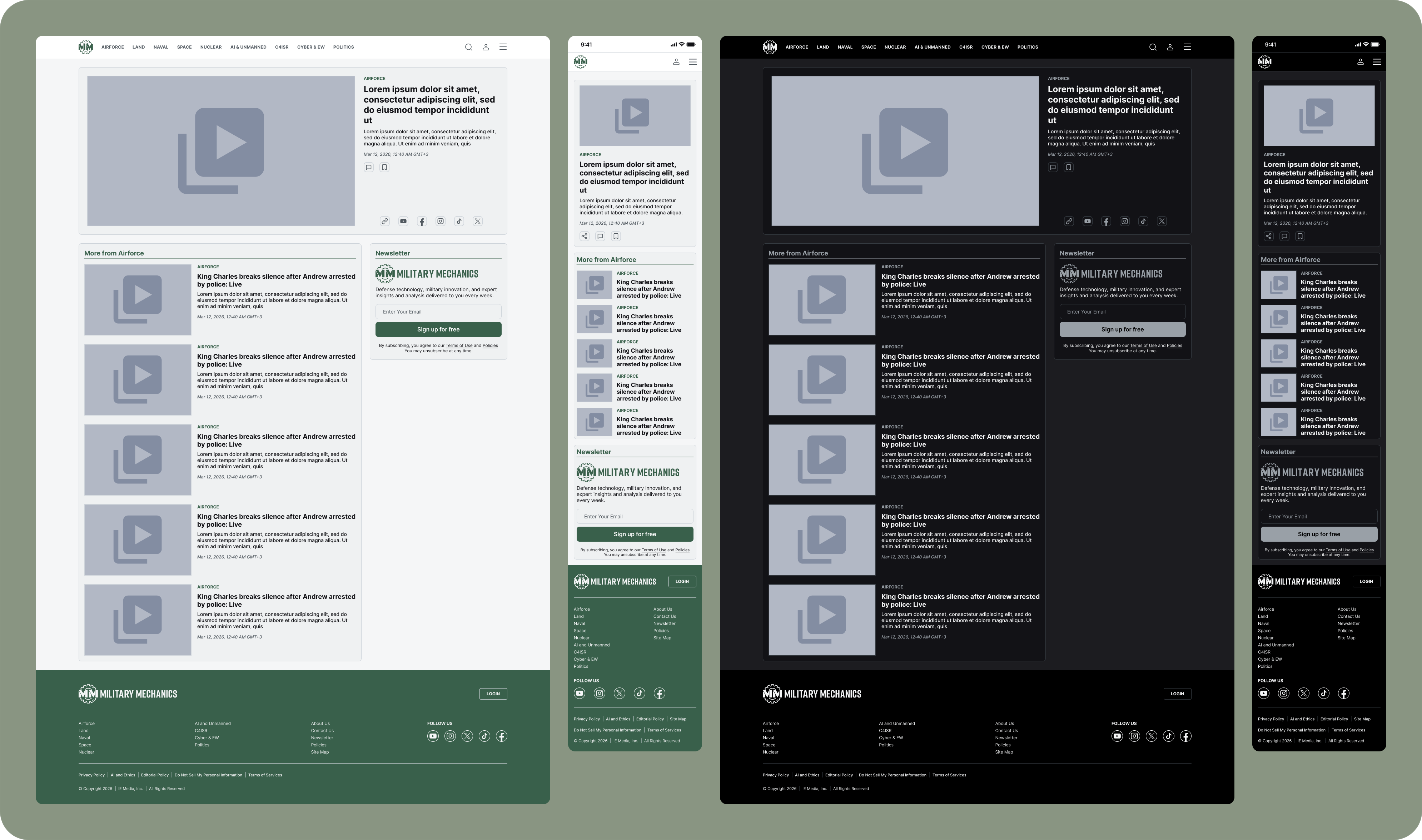
I didn't just shrink the desktop design down for mobile. Reading width, image sizing, and how content cards behave all needed to get rethought for a smaller screen. Long articles in particular feel denser on mobile, so I kept spacing, typography, and image proportions more controlled there. The goal wasn't moving the desktop design onto mobile, it was rebuilding the same reading experience for a smaller screen.
Desktop
Using the extra space for content discovery and larger imagery.
Mobile
A single column, more focused experience that's easy to scan.
Navigation &
Discovery
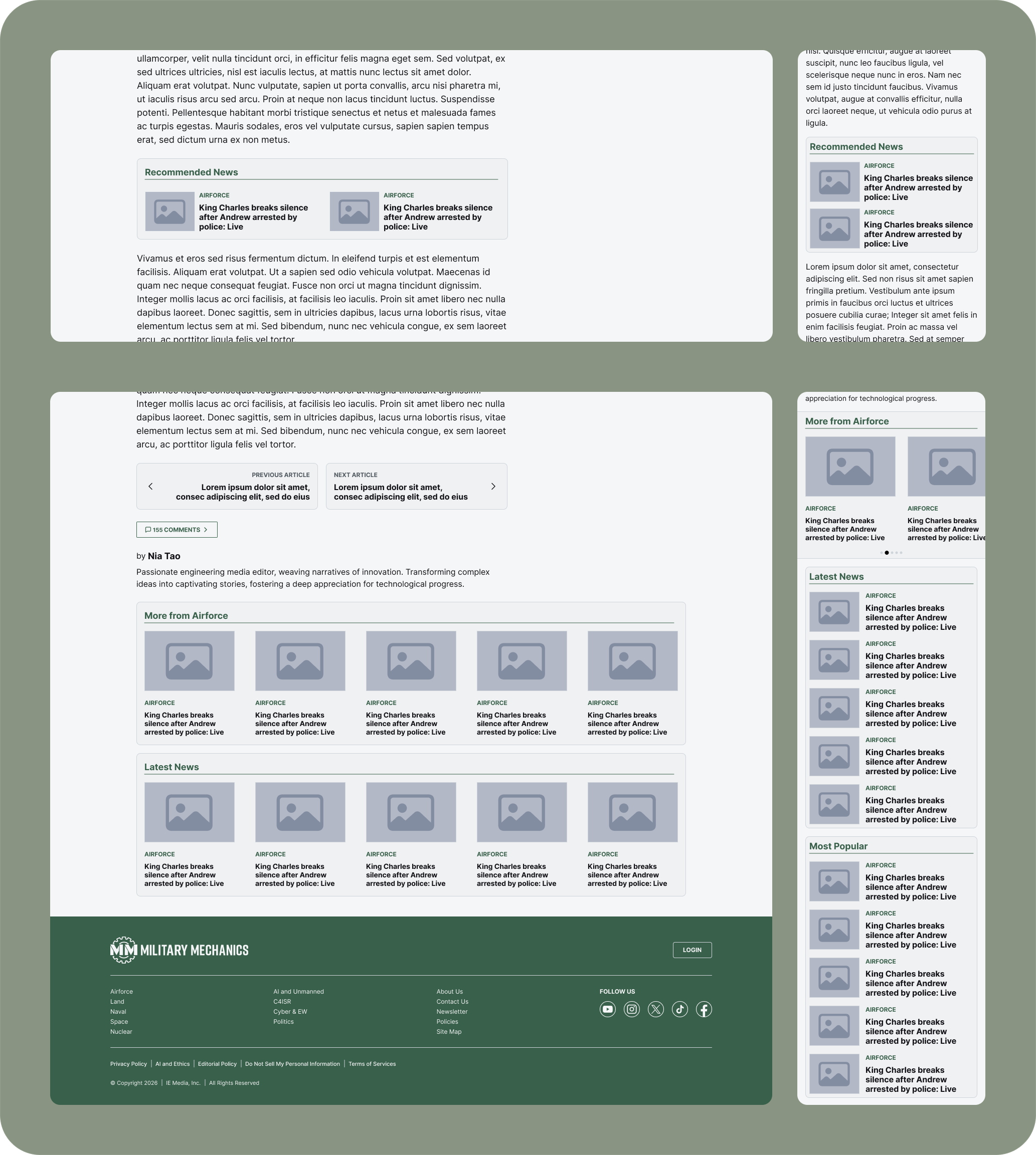
On Military Mechanics, someone shouldn't just land on the homepage, read one article, and leave. After finishing a piece, they should be able to move to another topic and keep exploring what interests them. So I treated navigation as part of content discovery, not just a menu, with the homepage, categories, articles, and related content working together to give someone a natural path forward.
Discover
Design
System
Since Military Mechanics is a new product, it was important to think through the design system from the start. I didn't want new content formats, categories, or pages to pull the design apart as the product grows. So typography, spacing, cards, buttons, navigation, article components, and responsive behavior all live within one shared system, which means new screens can build on the existing structure instead of starting over each time.
The Role of
UX Here
The core question for me on Military Mechanics was simple: how quickly can someone interested in something as specific as military technology get to the content they came for, and how comfortably can they keep reading once they're there? So the homepage focuses on discovery, the article page focuses on reading, the visual system carries the subject's more technical character, the responsive structure keeps that experience working across screens, and the design system helps all of it hold together as the product grows.
What comes out of it isn't just another version of Interesting Engineering. It's a more focused media experience, rebuilt around one subject and the specific audience that cares about it.