Product Designer
IMDb.com
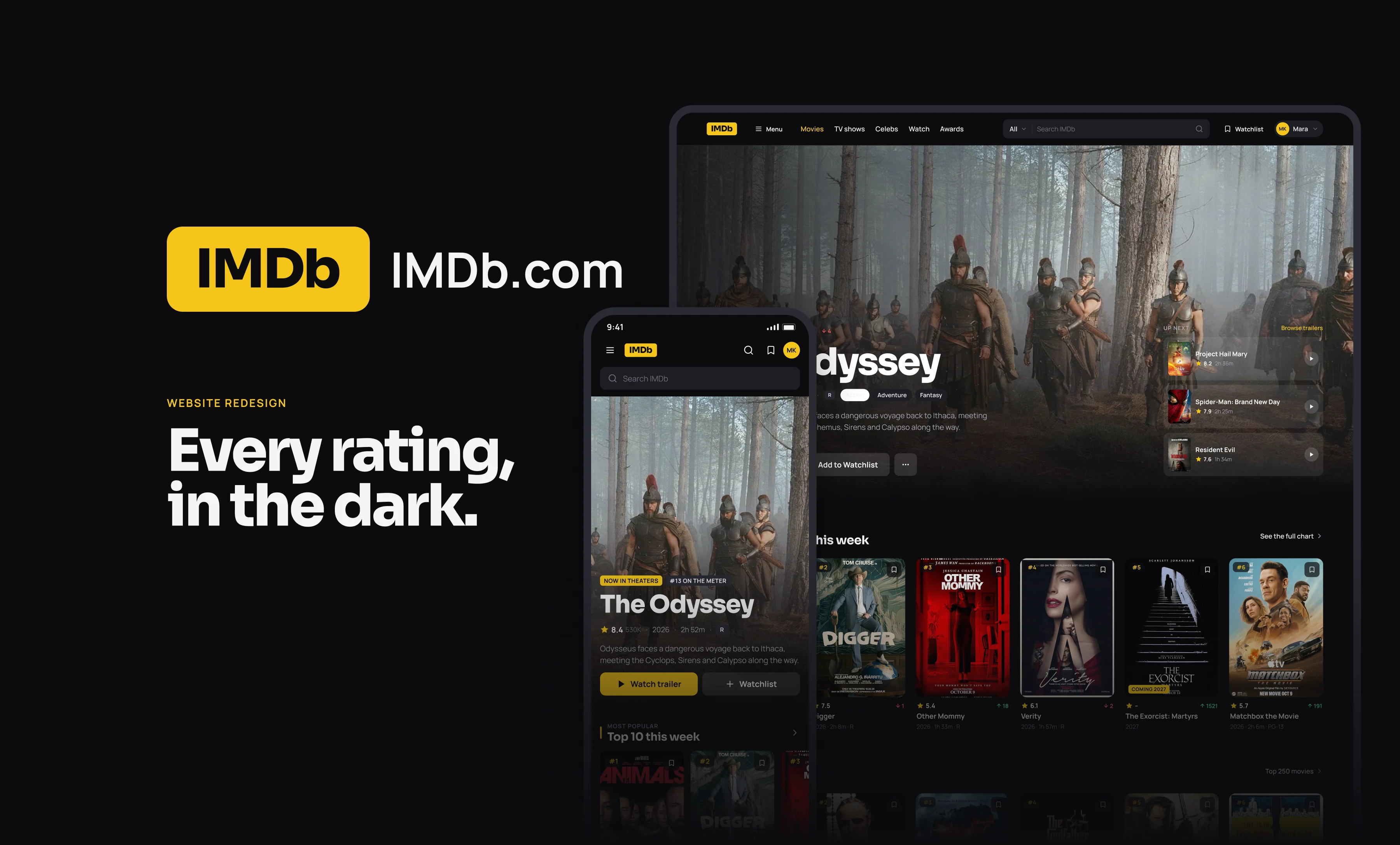
An unofficial dark mode redesign concept for IMDb.com. Fourteen screens, from the home page to the Top 250, the watchlist and showtimes, designed at desktop and phone size side by side. Most of us open IMDb for one number and leave. I kept that number front and centre, then gave every page a reason to keep scrolling: real posters, trailers that play in place, episode heat maps and a watchlist that knows what you have already seen.
Overview
IMDb is the place you check. I wanted it to feel like the place you stay. The redesign is dark by default, because people watch films in the dark. The palette is near black surfaces, three greys and one yellow, so the posters do the colouring and the interface stays out of the way. The star and the score travel with every poster, on the charts, in the watchlist, in search and on cast pages. Every screen was designed at 1440 and 390 at the same time, with one card system, one nav and one footer, so the phone gets the same page rather than a cut down copy of the desktop one. The data is real: the Top 250, the most popular titles, the box office, the news and the people are what IMDb was showing while I was designing, so every number on these screens was true on 17 October 2026. Sora carries the titles and the numbers, and Manrope carries everything you read.
Home Page
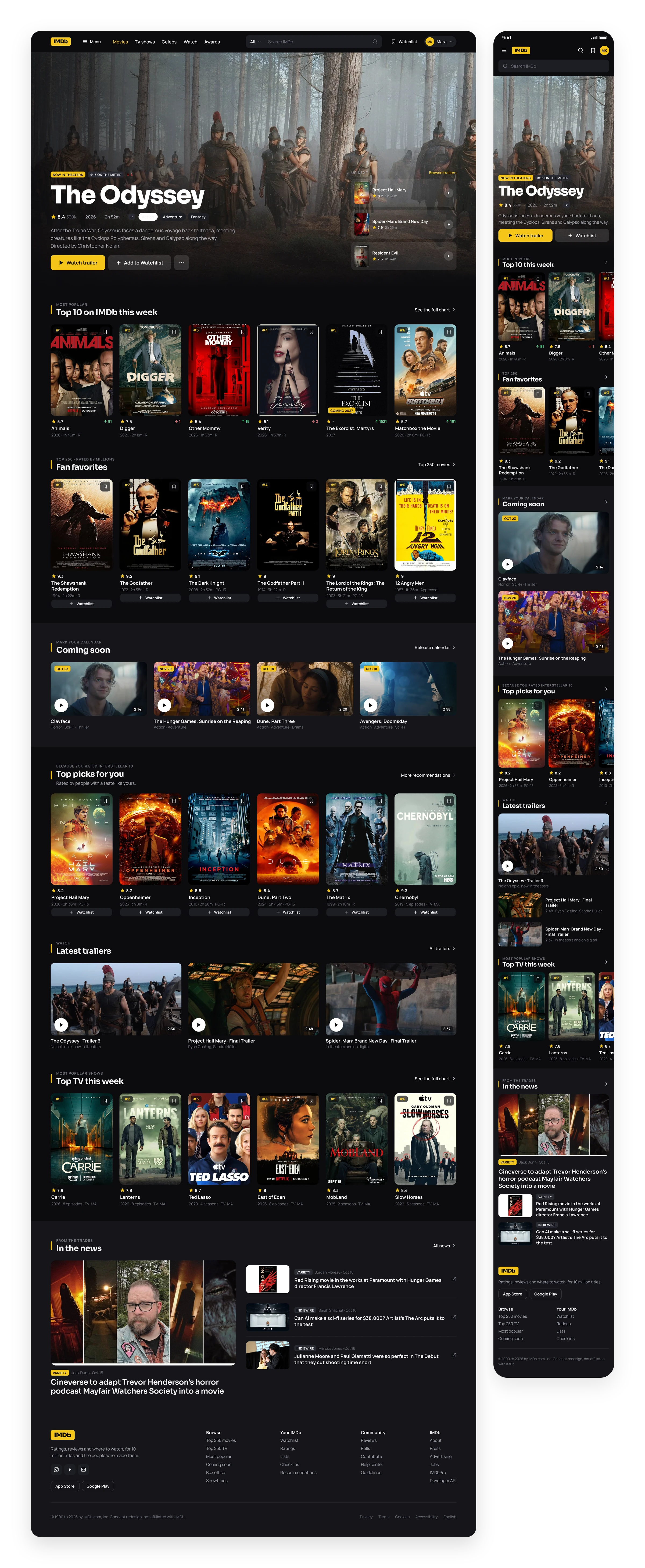
One hero, then the charts. The home page opens on whatever the world is watching this week, then goes straight into the Top 10, the fan favourites and what is coming. Every poster carries its rating, so you never have to click to find out.
Title Detail
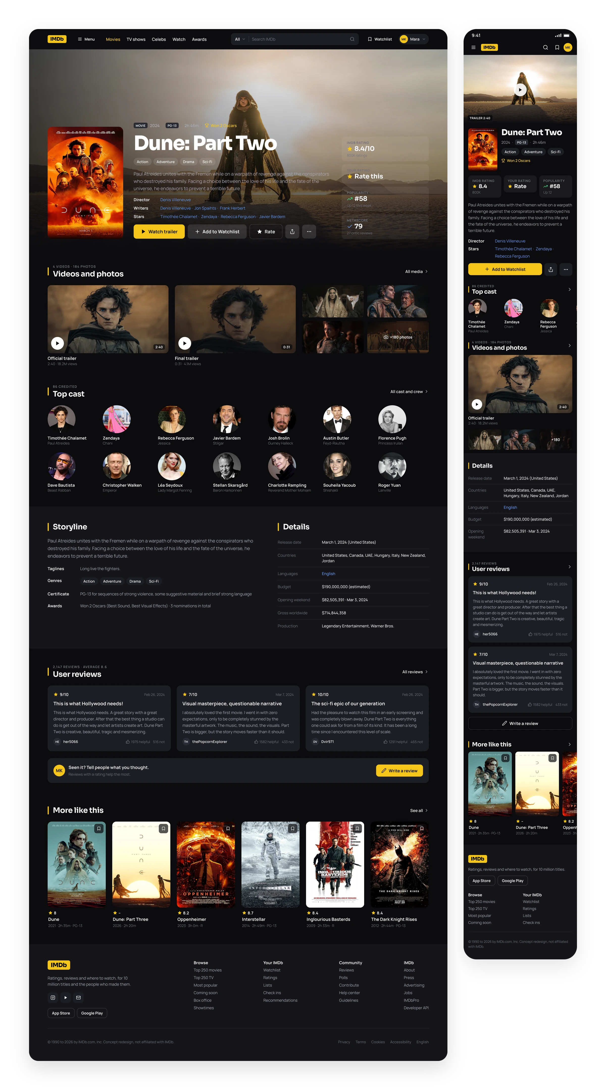
The rating sits where your eye lands. Poster, title and the IMDb score in one line of sight. The cast shows faces instead of names, the trailers sit next to the photos, and the reviews carry the face and name of whoever wrote them.
Discover
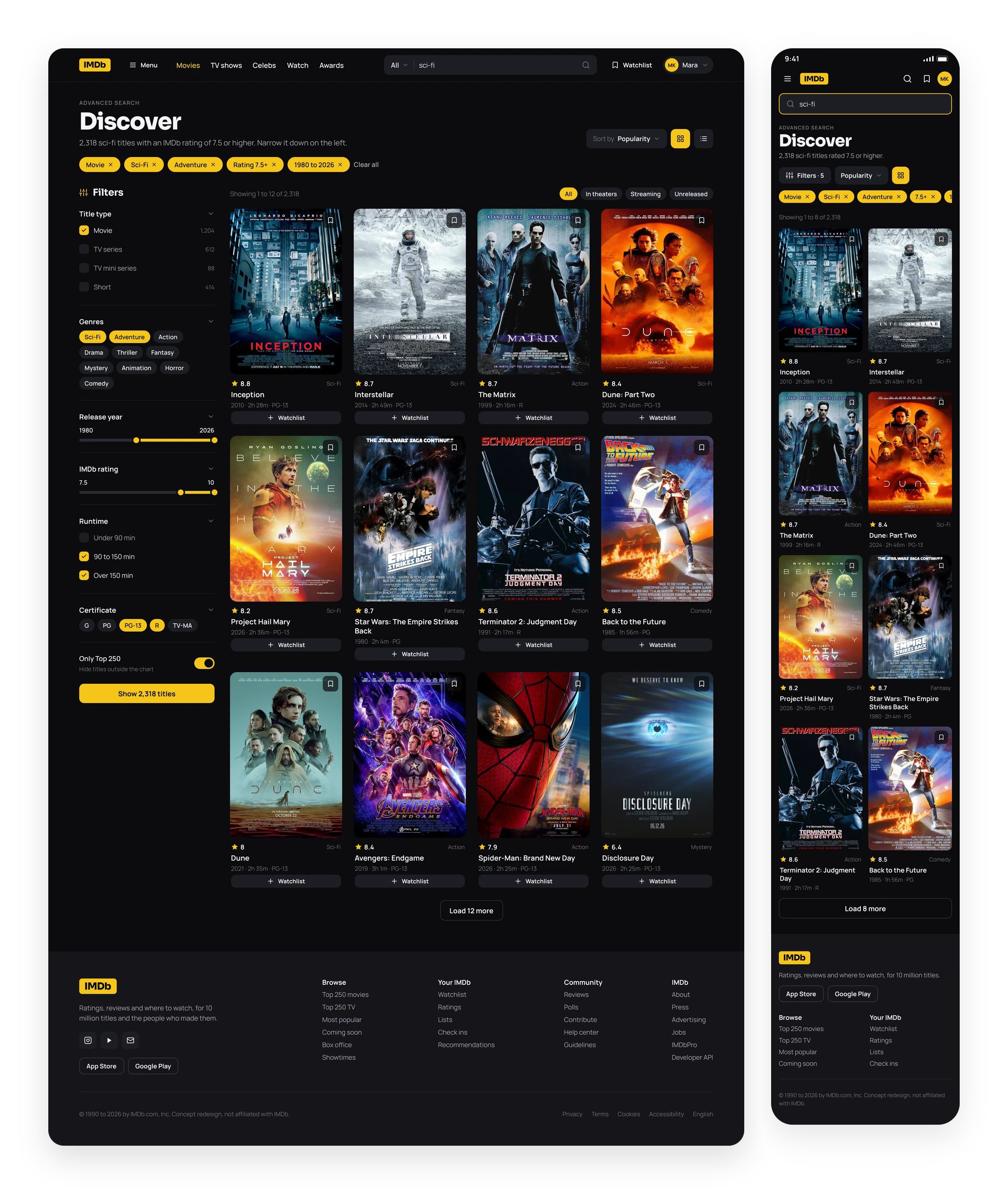
Filters with the answer already next to them. Film or series, genre, year, rating and runtime sit on the left, and the button at the bottom always says how many titles are left. The chips at the top tell you exactly what is narrowing the list.
Top 250
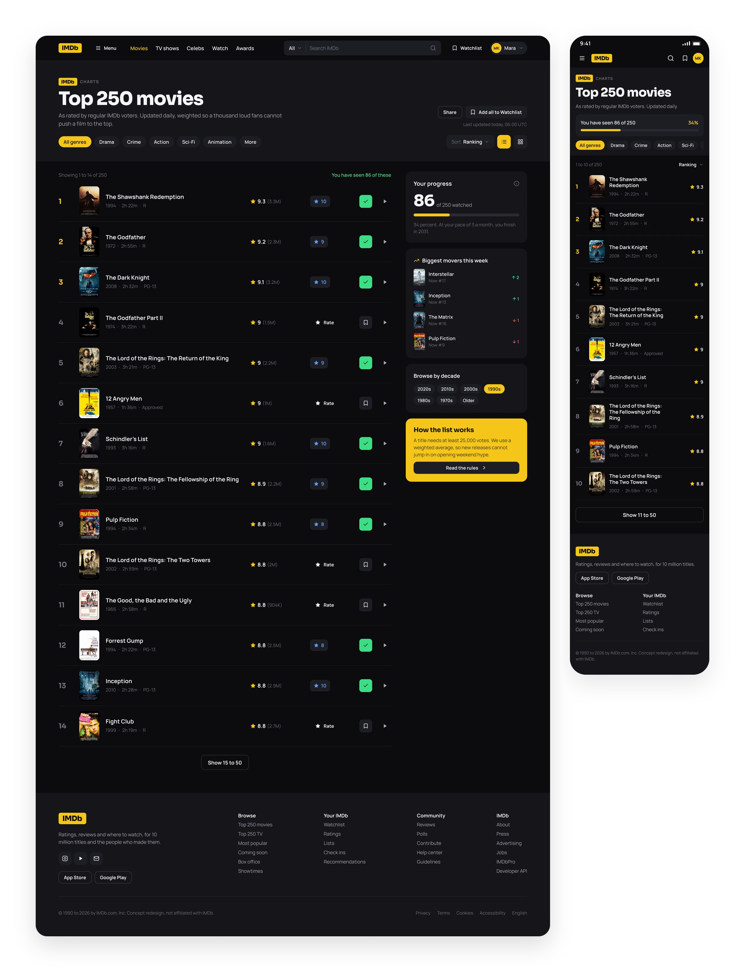
A chart you can actually read. Rank, poster, title, rating and your own score in one row. Your progress through the list lives on the right, because people do try to finish it.
Person Page
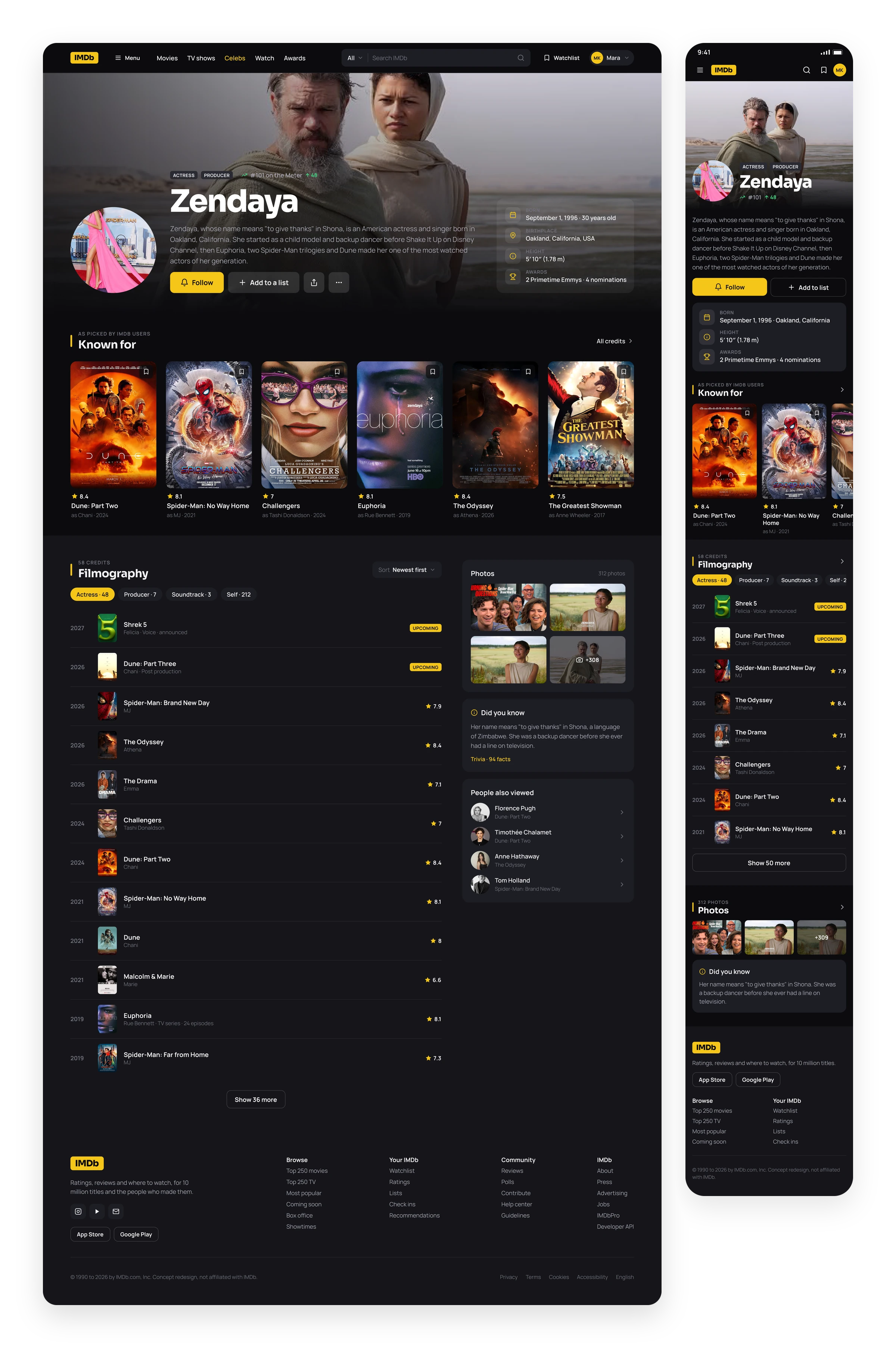
A profile, not a filing cabinet. Zendaya’s page leads with a photo and her place on the popularity meter, then what she is known for, then the full filmography in the order you would scan it.
Watchlist
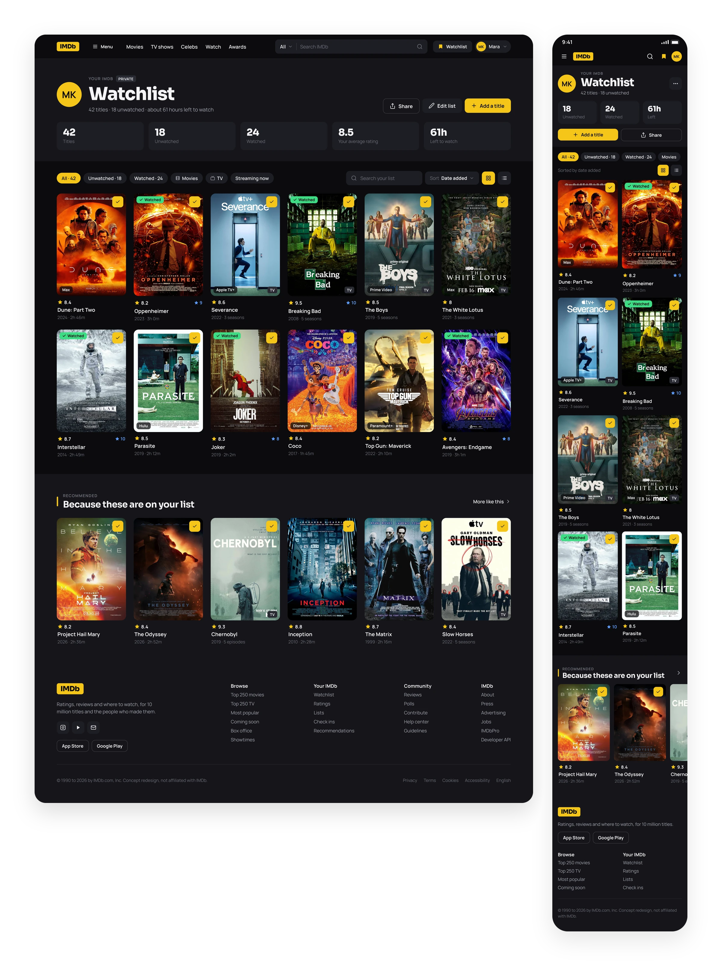
Your list knows what you have watched. Watched titles get a tick, and unwatched ones show where they stream. The numbers at the top turn a pile of posters into a plan for the weekend.
Video Player
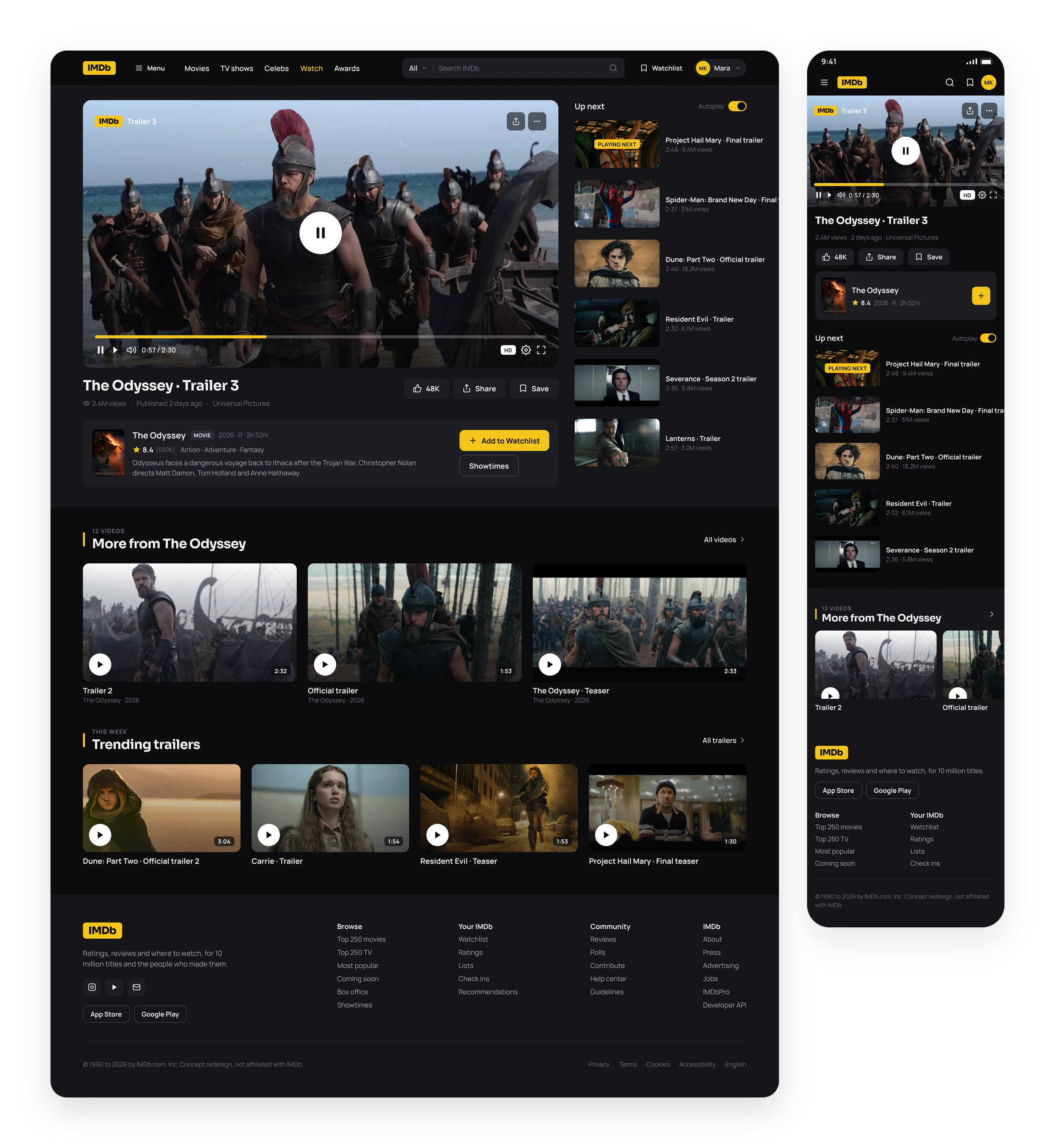
Trailers without leaving the page. A player with real controls, the title it belongs to directly underneath, and an up next column, so one trailer turns into five.
Reviews
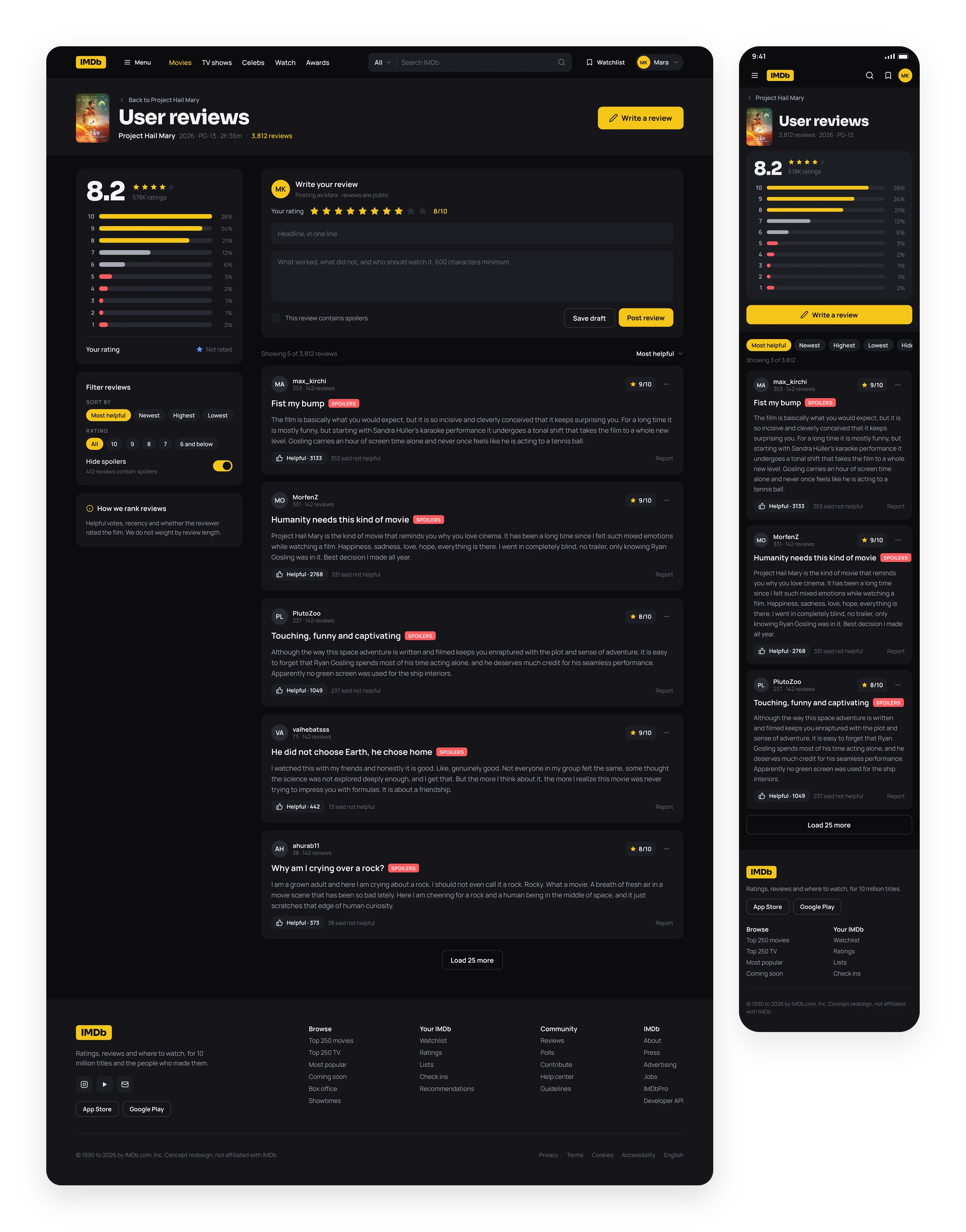
Opinions with context. The histogram shows how a score was built before you read a single review. Spoiler reviews carry a red tag, with one switch to hide them all. The form for writing your own sits at the top instead of the bottom.
TV Series
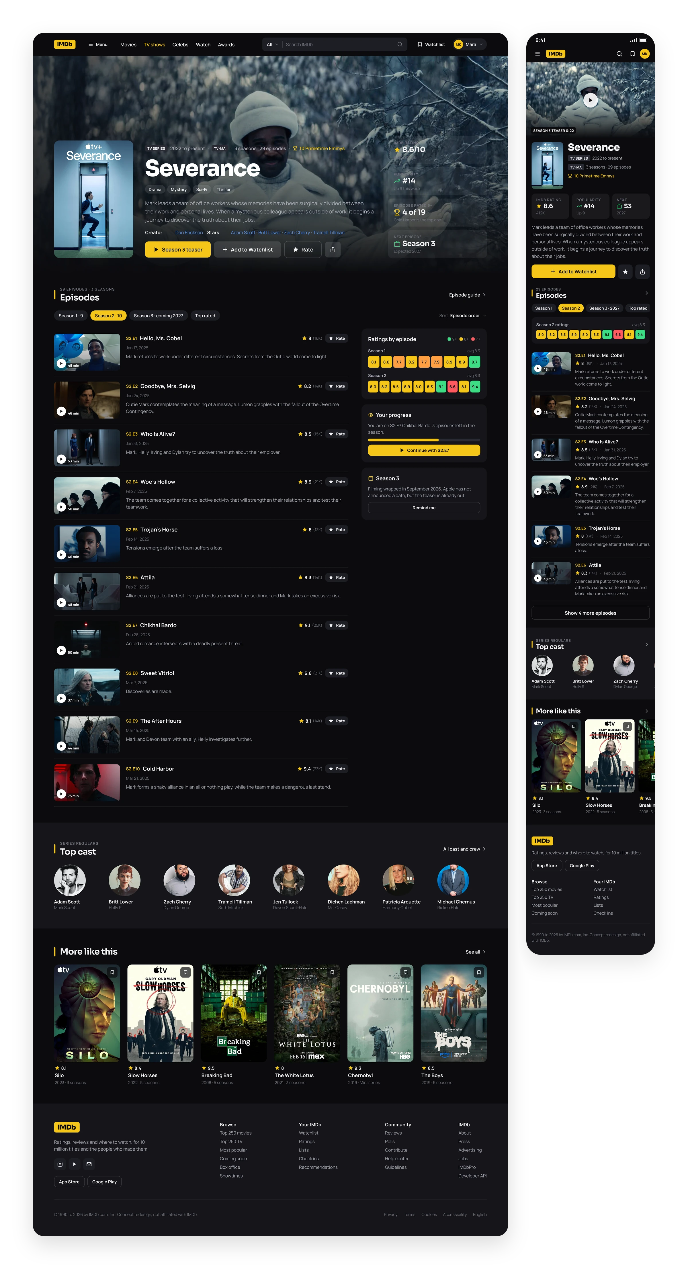
Episodes as a heat map. Severance gets a tab per season, a ratings strip that runs from green to red, and an episode list with thumbnails. Your progress and the next season sit on the side.
Showtimes
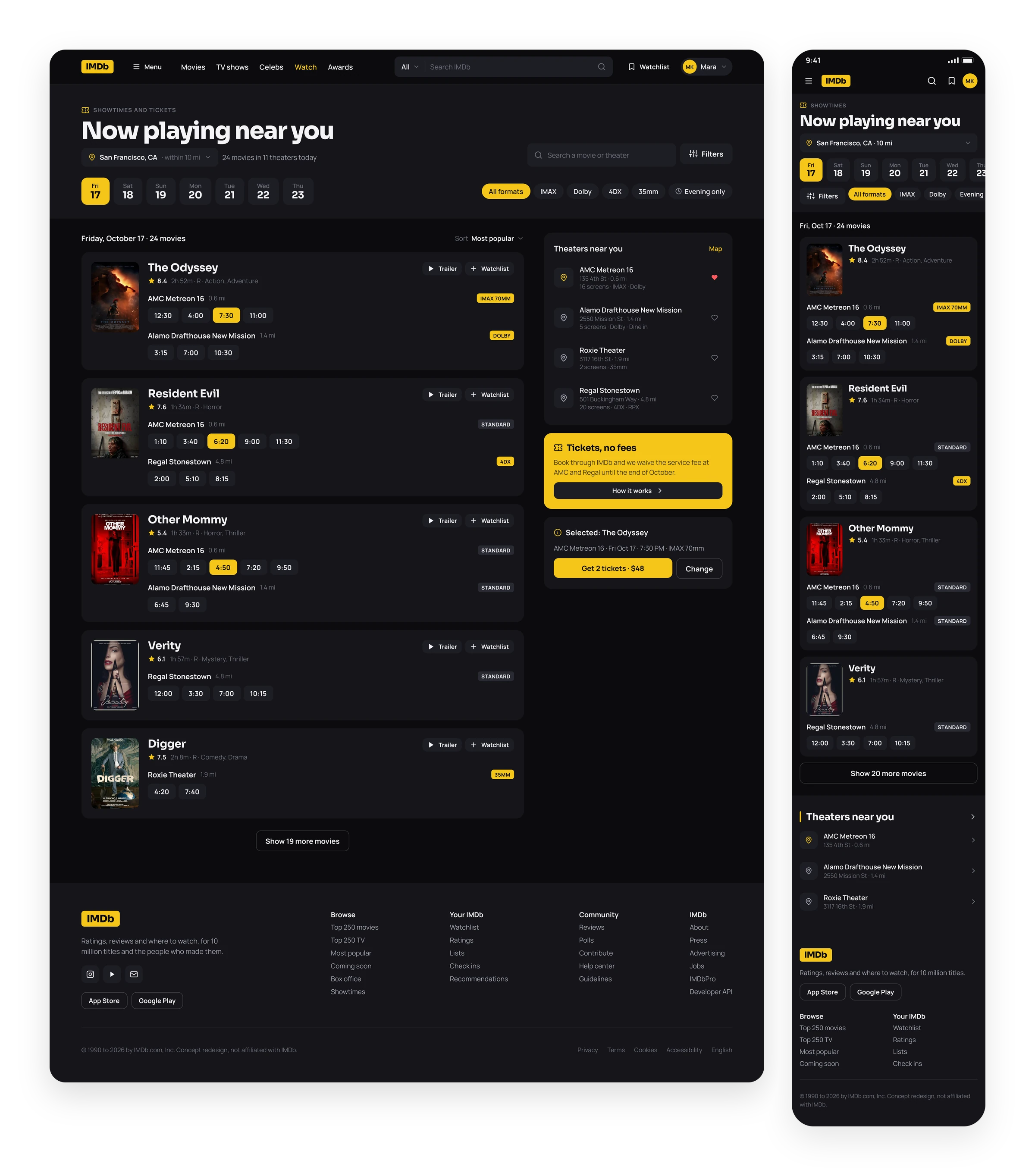
Pick a day, pick a seat. Dates as big tabs, formats as chips, times you can tap. The selected screening stays pinned on the right until you buy.
Box Office
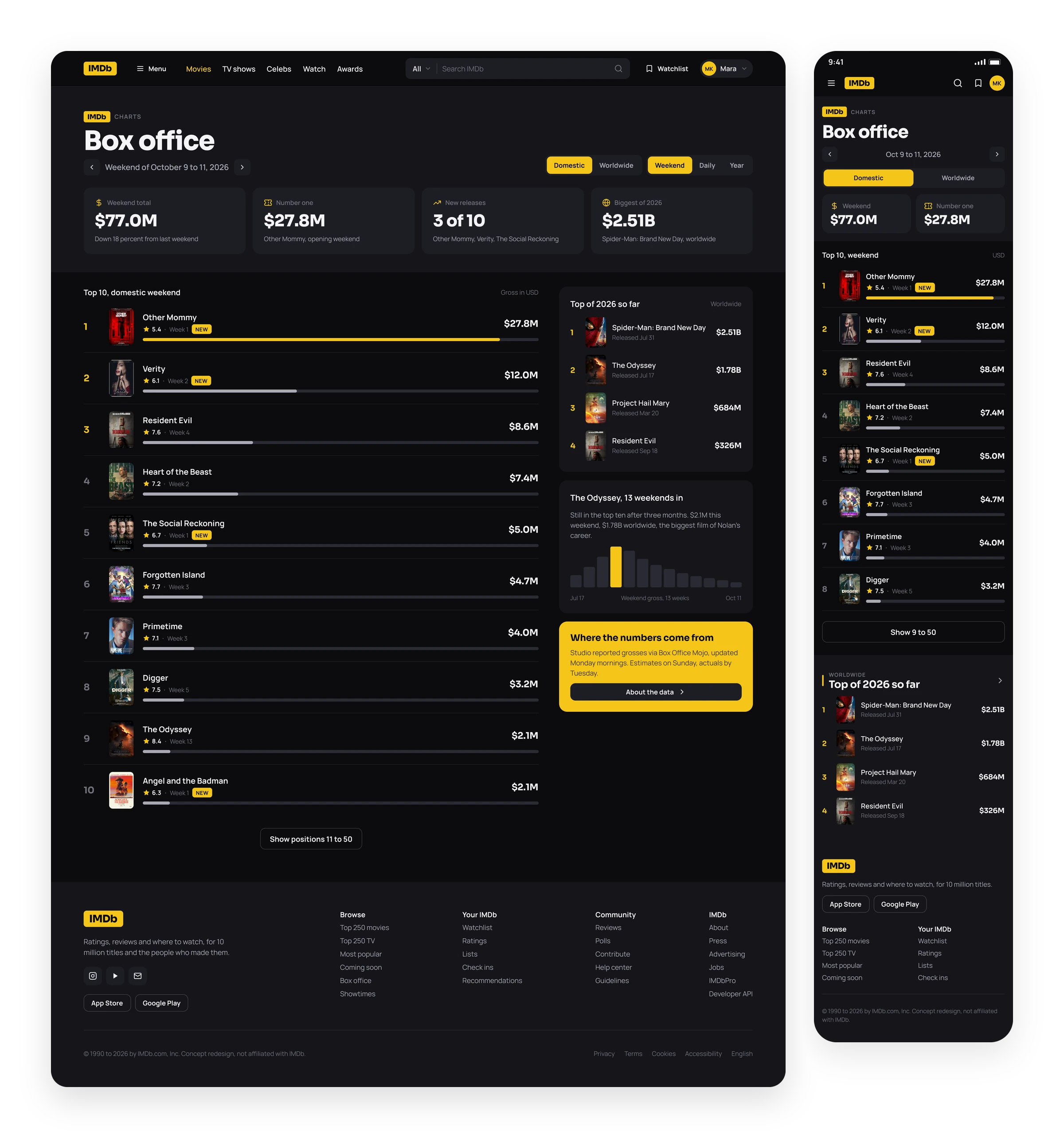
Box office as a chart, not a table. Bars make the weekend gross readable at a glance. The year to date list and a 13 week trend for The Odyssey live beside it.
News
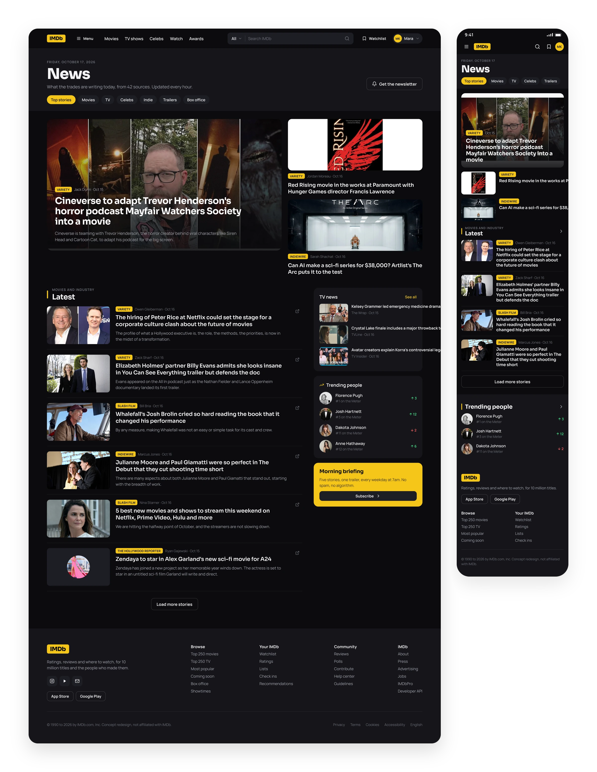
Industry news, filtered. One featured story, two beside it, then a list with sources and bylines. TV news and trending people sit in a column that never fights the headlines.
Awards
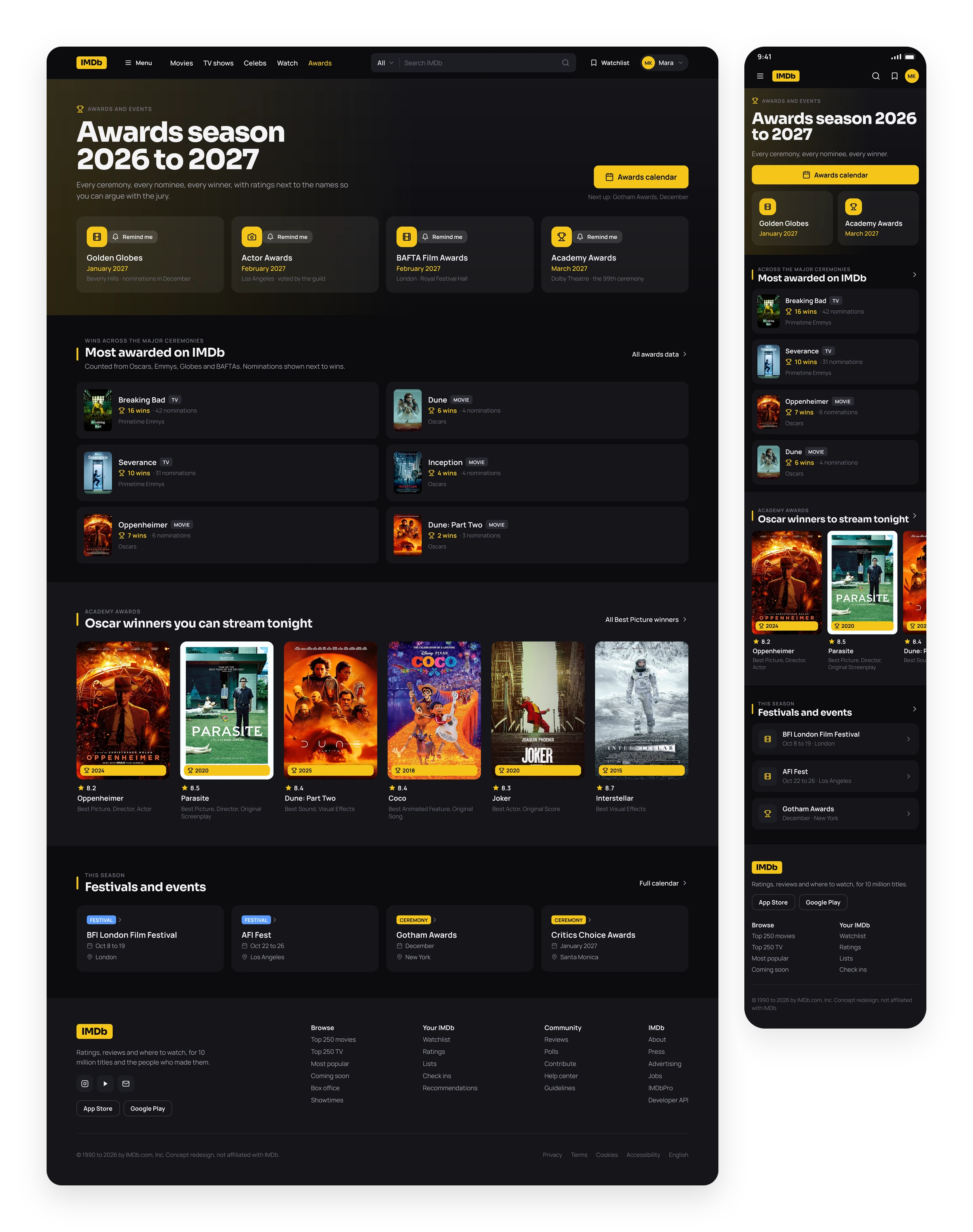
Awards season, in order. Upcoming ceremonies as cards, then the most awarded titles on IMDb with wins and nominations side by side, then the winners you can stream tonight.
Sign In
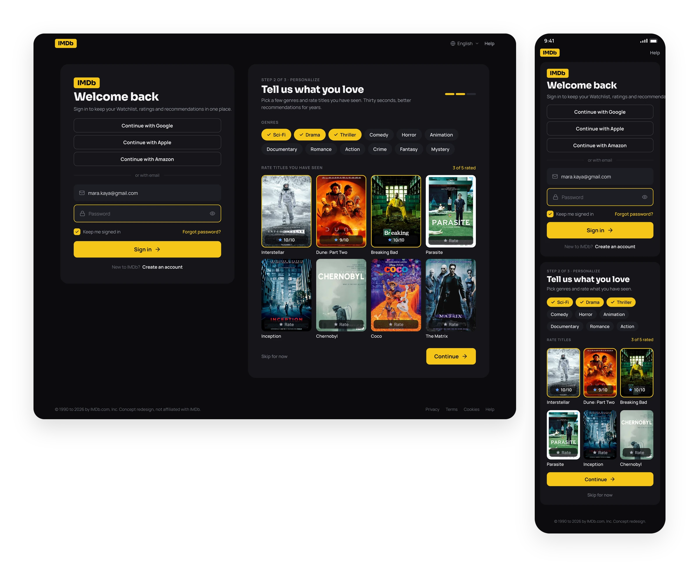
A sign in that asks what you like. Email or a social account on the left. On the right, three genres and five ratings are enough to personalise the home page before you ever see it.
Outcome
Redesigning IMDb.com taught me that a dark interface is mostly a matter of discipline. With near black surfaces and a single yellow, the posters carry all the colour, and the one number people came for is never more than a glance away. Working with real data changed the design more than I expected: real titles have long names, real charts have ties and real ratings do not line up neatly, so every card had to earn its layout. This is an unofficial concept I made for my portfolio. It is not affiliated with or endorsed by IMDb. The IMDb name, logo and ratings belong to IMDb, and the titles, posters, photography and news headlines belong to their respective rights holders.