Product Designer
LEGO.com
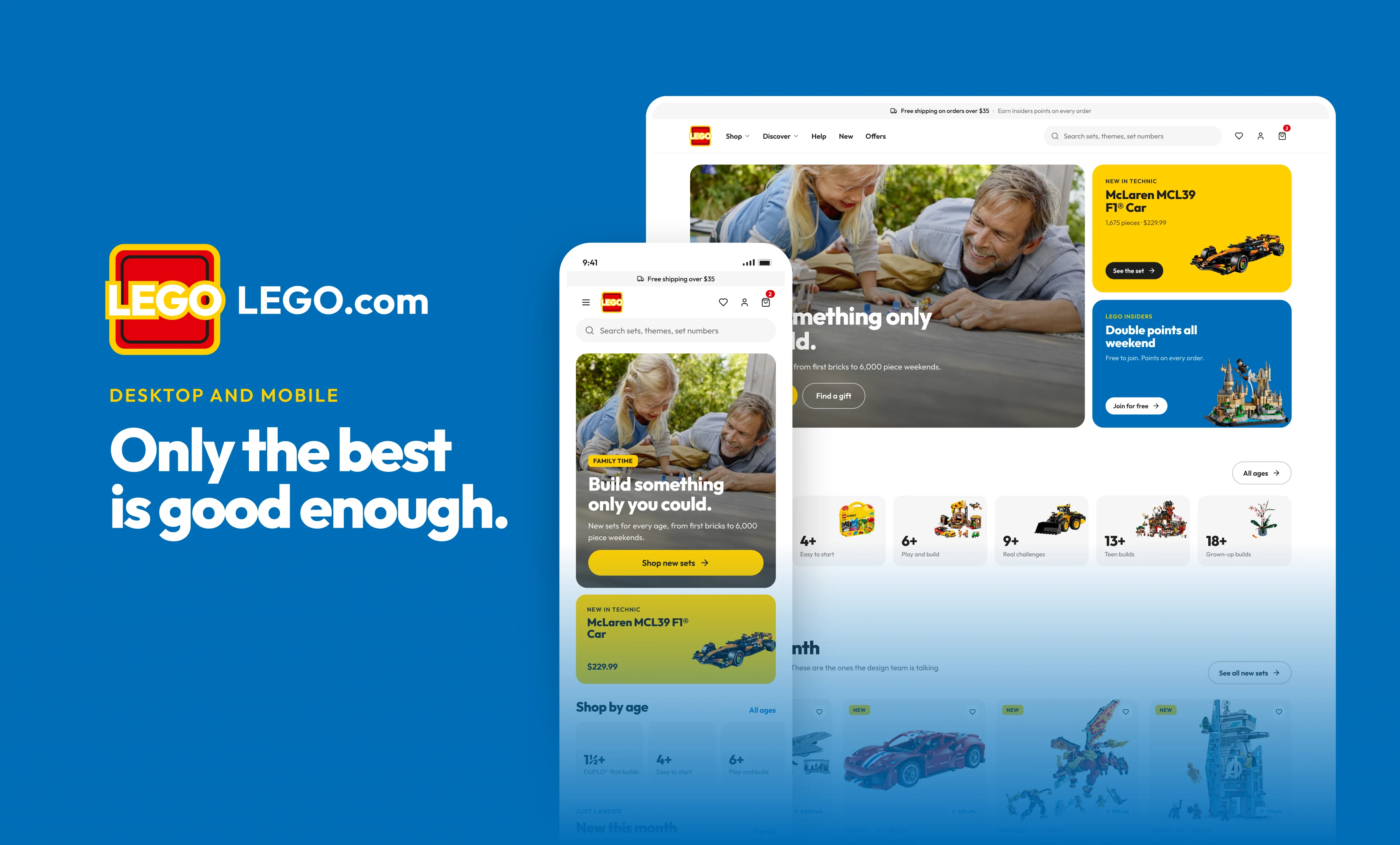
An unofficial redesign concept for LEGO.com. Fourteen screens, from the home page to checkout, Insiders and the kids zone, designed at desktop and phone size side by side. The site does a lot: it is a shop, a loyalty programme, an instructions archive and a place for kids. I wanted all of it to feel like one calm place where the sets are the hero.
Overview
LEGO.com does a lot, and today each part of it follows its own layout logic: the shop, Insiders, the instructions archive, the kids pages and the brand stories. I kept every one of them but put them on one 12 column grid, one type scale and one set of components, so a parent buying a birthday present and an adult building a Star Destroyer get the same calm experience. Product renders sit on neutral tiles, never inside a banner, with real prices, piece counts and ratings next to them. Every screen was designed at 1440 and 390 at the same time, so nothing is a desktop page squeezed onto a phone. The palette is LEGO Yellow, Red and Blue with a deep navy and an almost black ink, and Outfit carries everything from the extra bold headlines to the body text.
Home Page
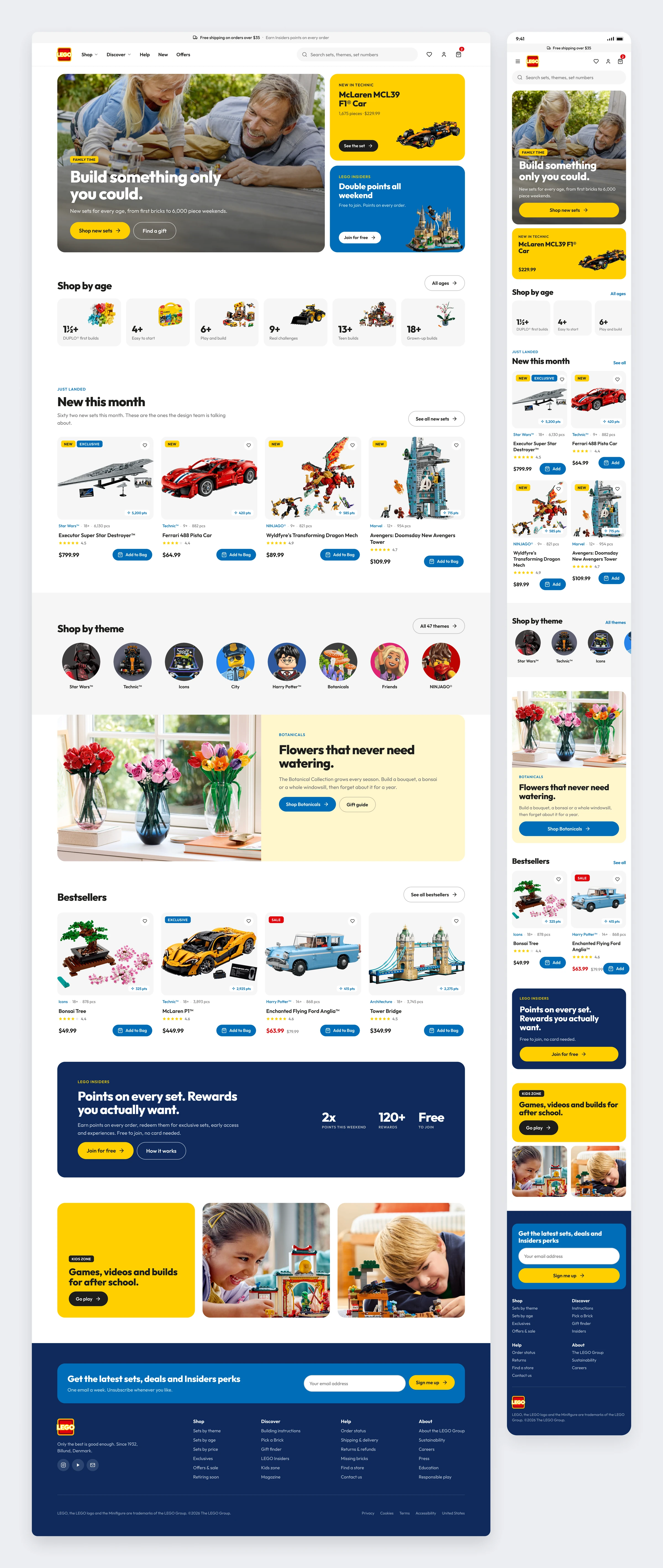
A home page that sells sets, not banners. The hero mixes a lifestyle photo with two live offers. Below it, age cards, the month’s new sets and the theme ring get people to a product in two clicks.
Sets by Theme
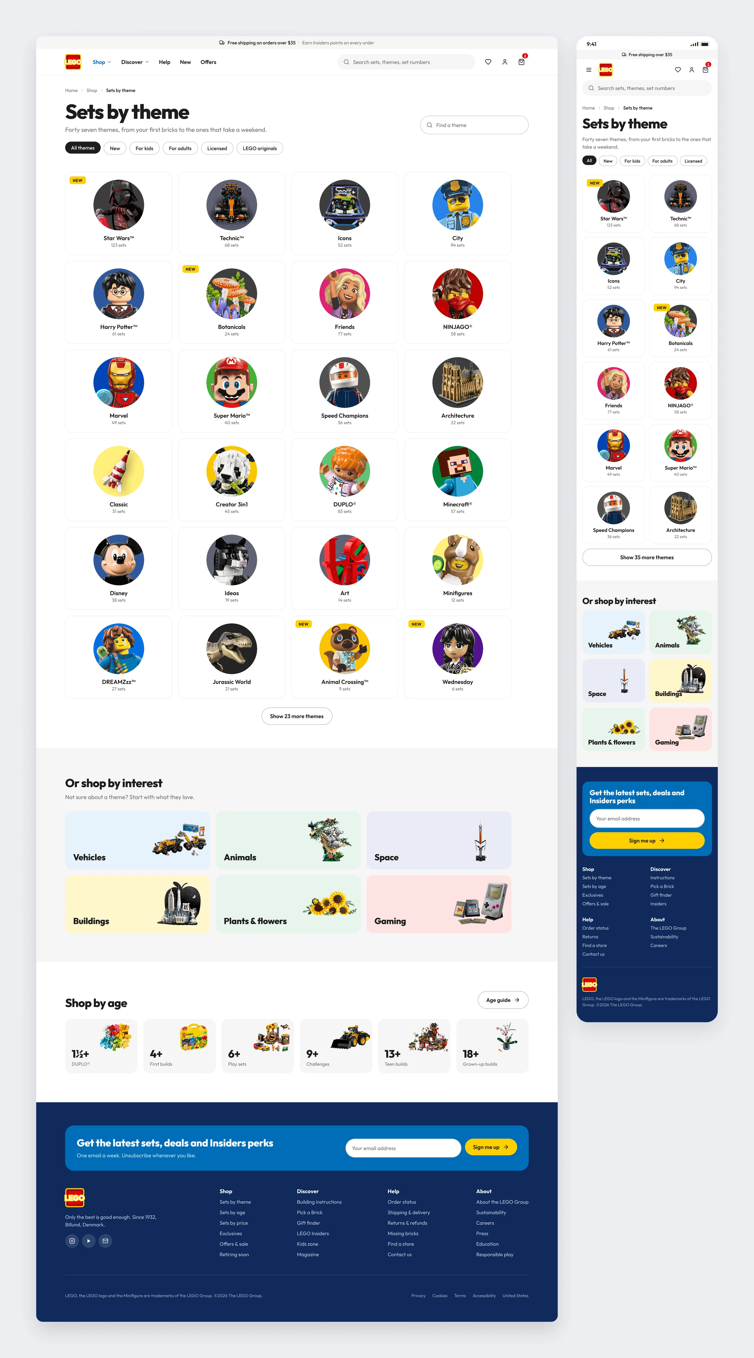
Forty seven themes on one calm grid. Every theme gets the same circle tile, so the licensed ones and the LEGO originals sit as equals. Shortcuts by interest and by age catch anyone who does not think in themes.
Theme Listing
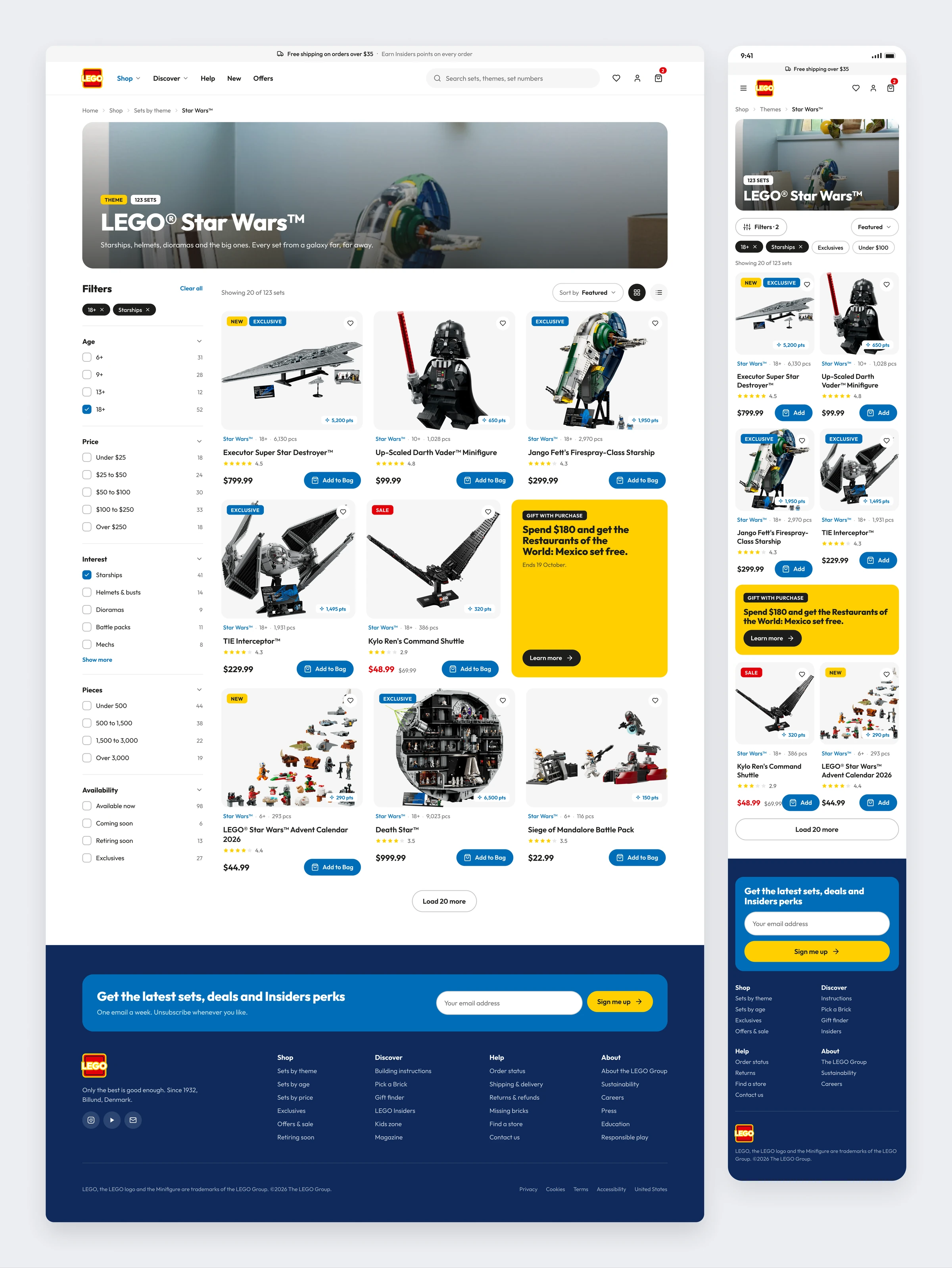
Filters that read like a conversation. There is a count next to every option, chips show what is active, and a gift promo takes a card slot in the grid instead of a banner above it.
Product Detail
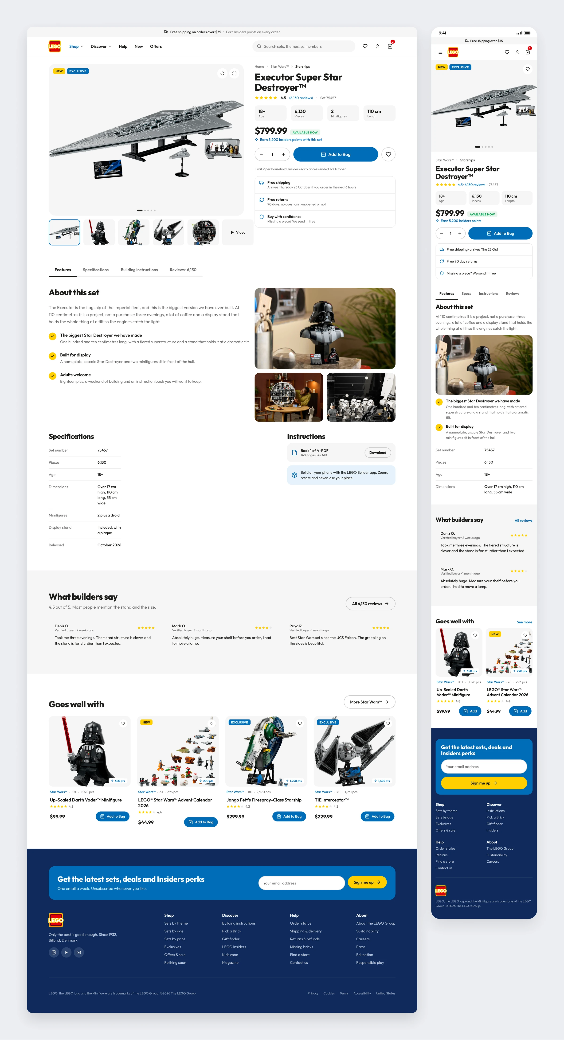
The buy box answers the four questions people ask first: age, pieces, minifigures and size, all above the price. Shipping, returns and the missing brick promise are stacked right where doubt usually happens.
Bag
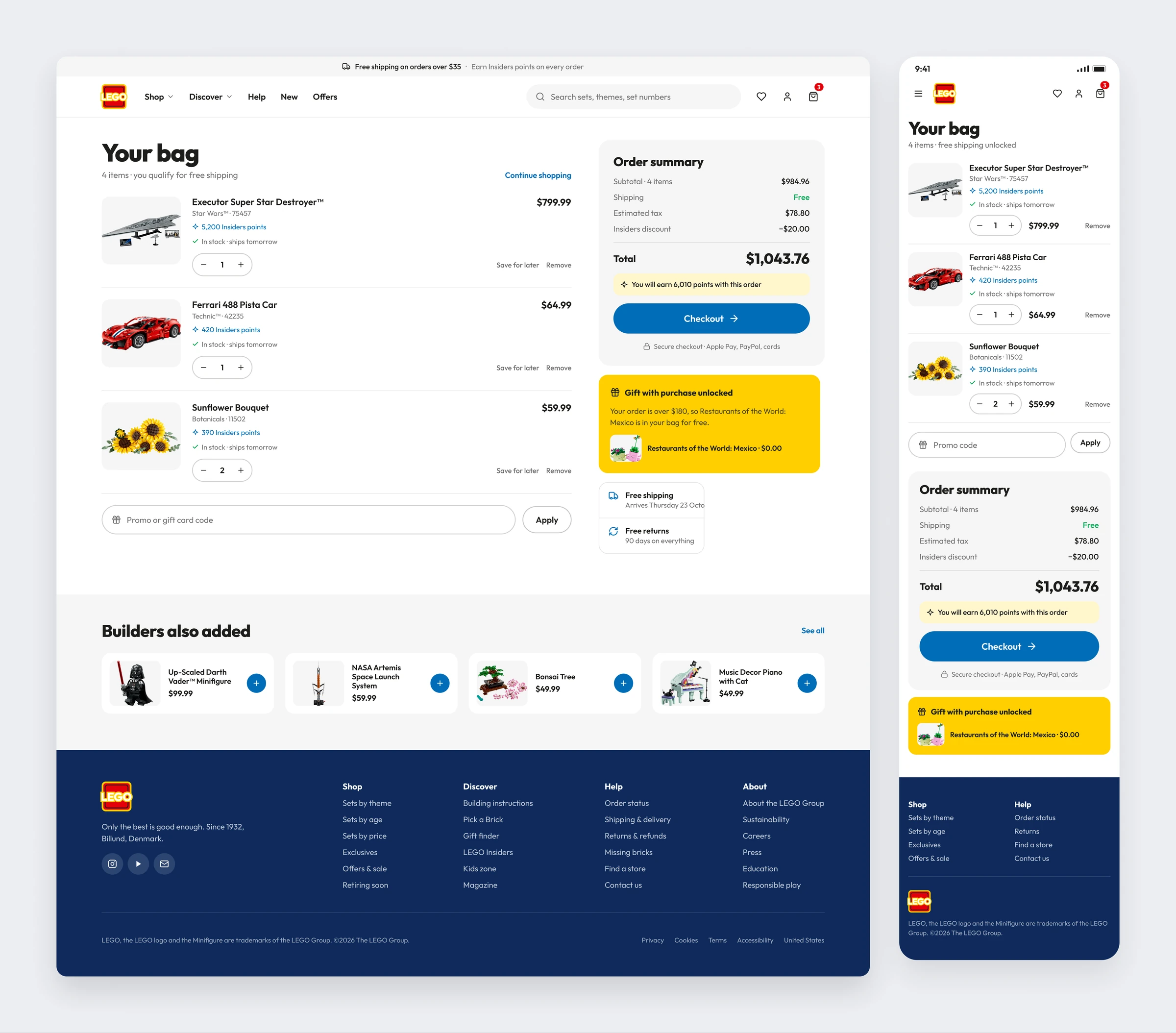
A bag that shows what you earn, not only what you pay. Insiders points sit on every line, the gift with purchase is already in, and the summary stays put while the list grows.
Checkout
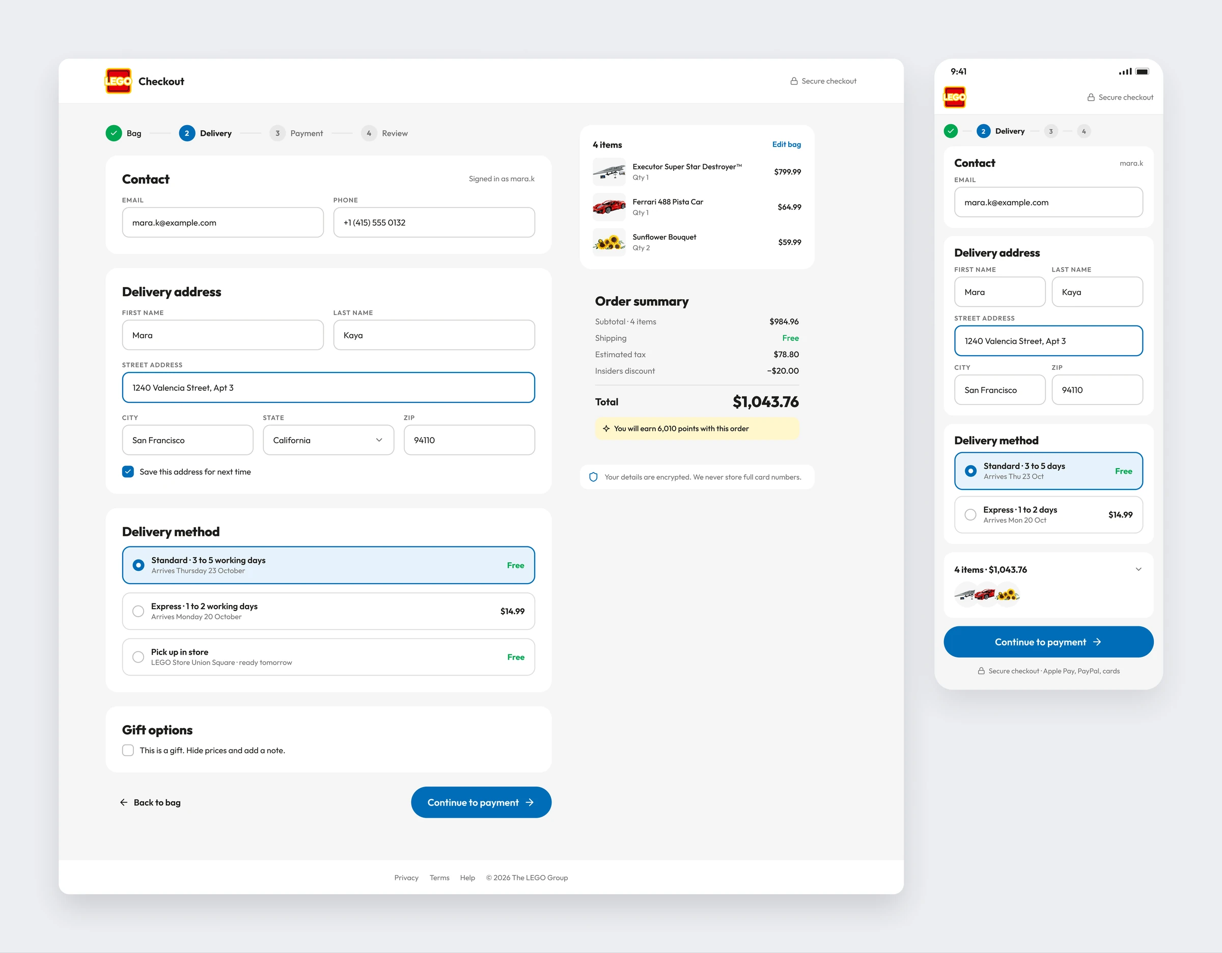
One page, four steps, nothing clever. Contact, address, delivery and gift options run down a single column, and the order rides along on the right, so nobody opens a new tab to check it.
Theme Landing
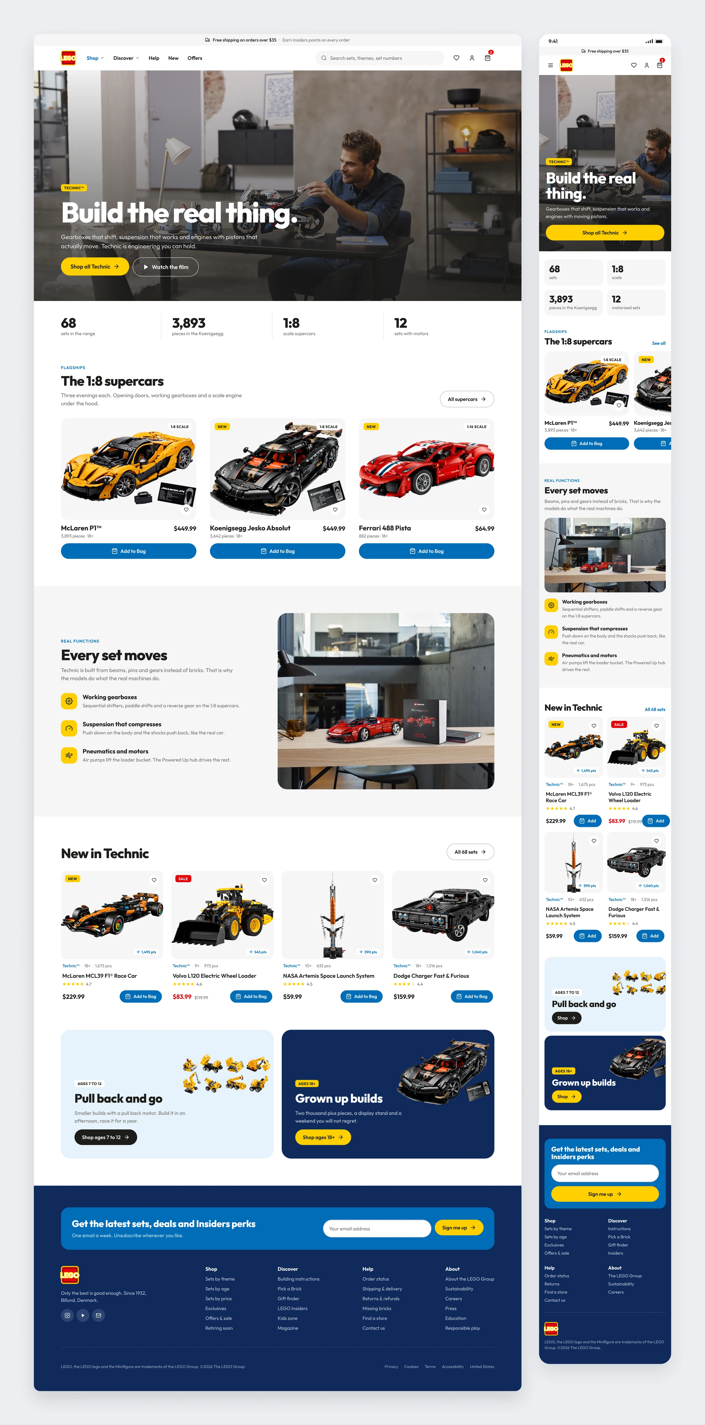
Technic gets a page that feels like Technic. Full bleed photography, the 1:8 flagships up top, and a section that explains what the functions do instead of listing the pieces.
Building Instructions
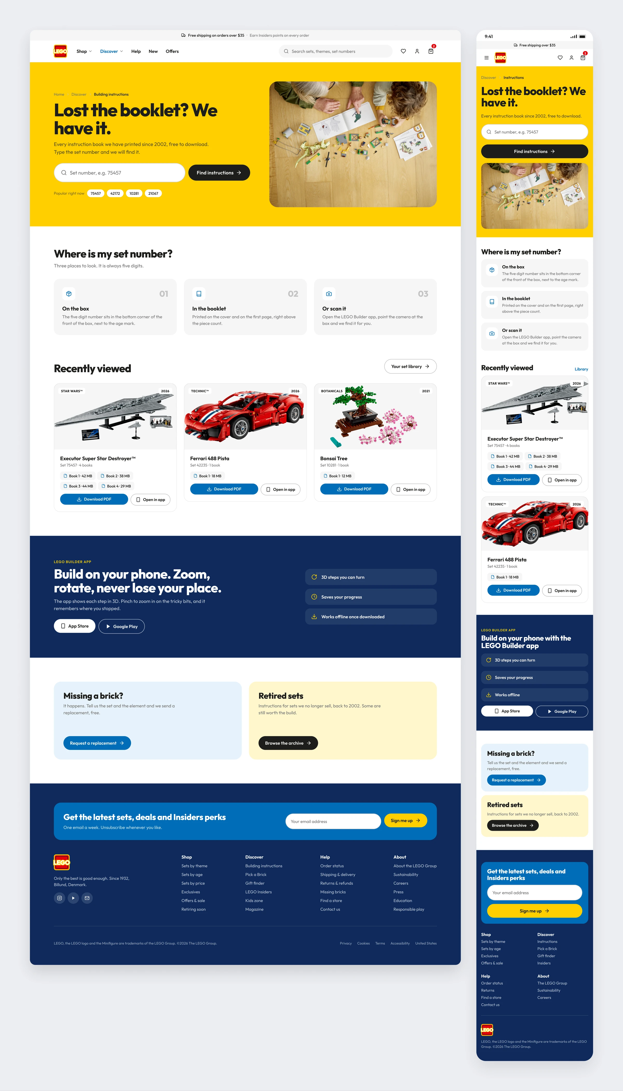
Lost the booklet? That is the whole page. A yellow hero with one input, then where to find the set number, your recent sets with every book as a PDF, and the app for people who prefer a phone.
LEGO Insiders
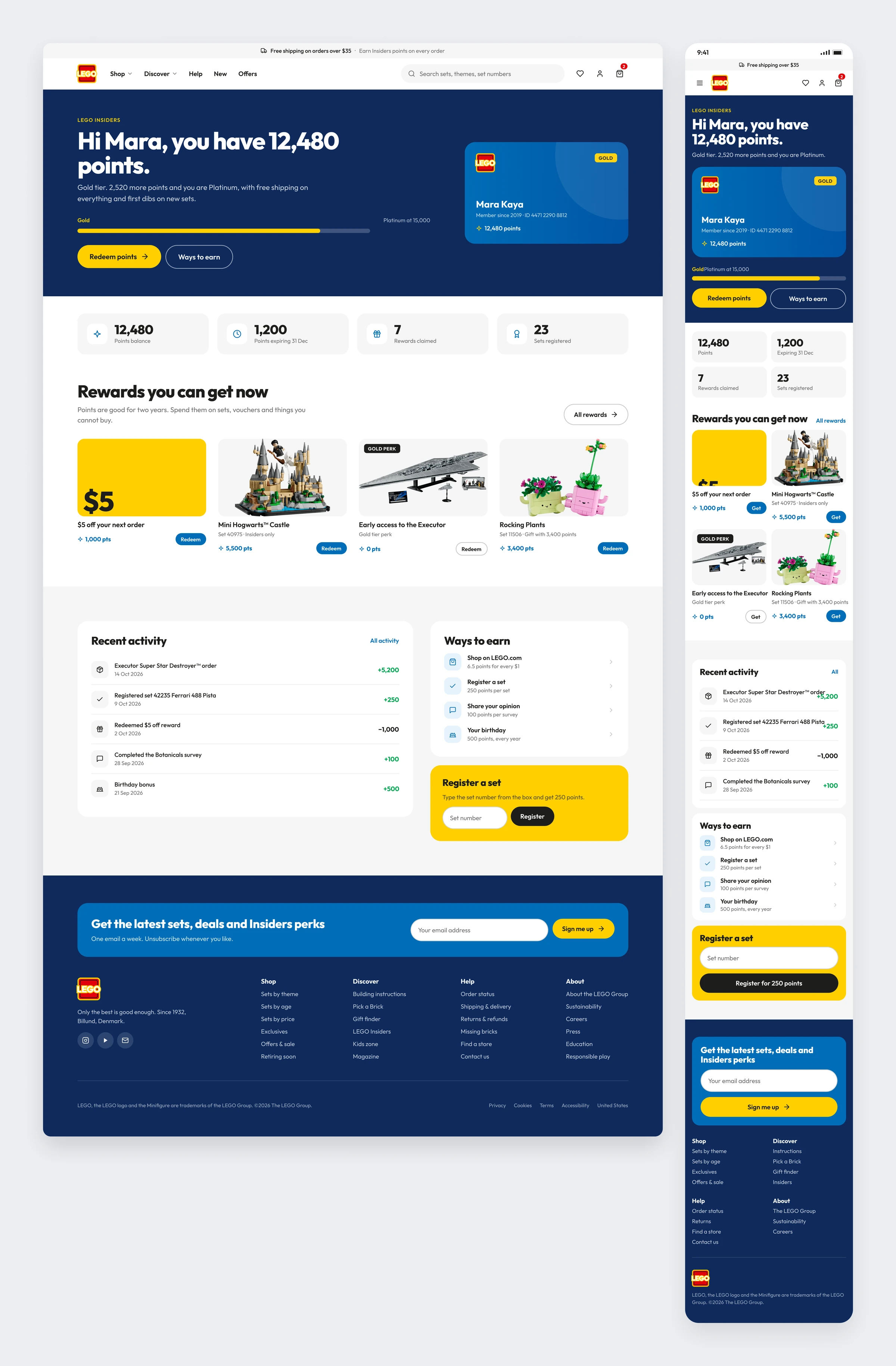
A loyalty dashboard you can read in five seconds. Points, tier and the gap to the next one sit at the top. Rewards you can actually afford today come before the ones you cannot.
Pick a Brick
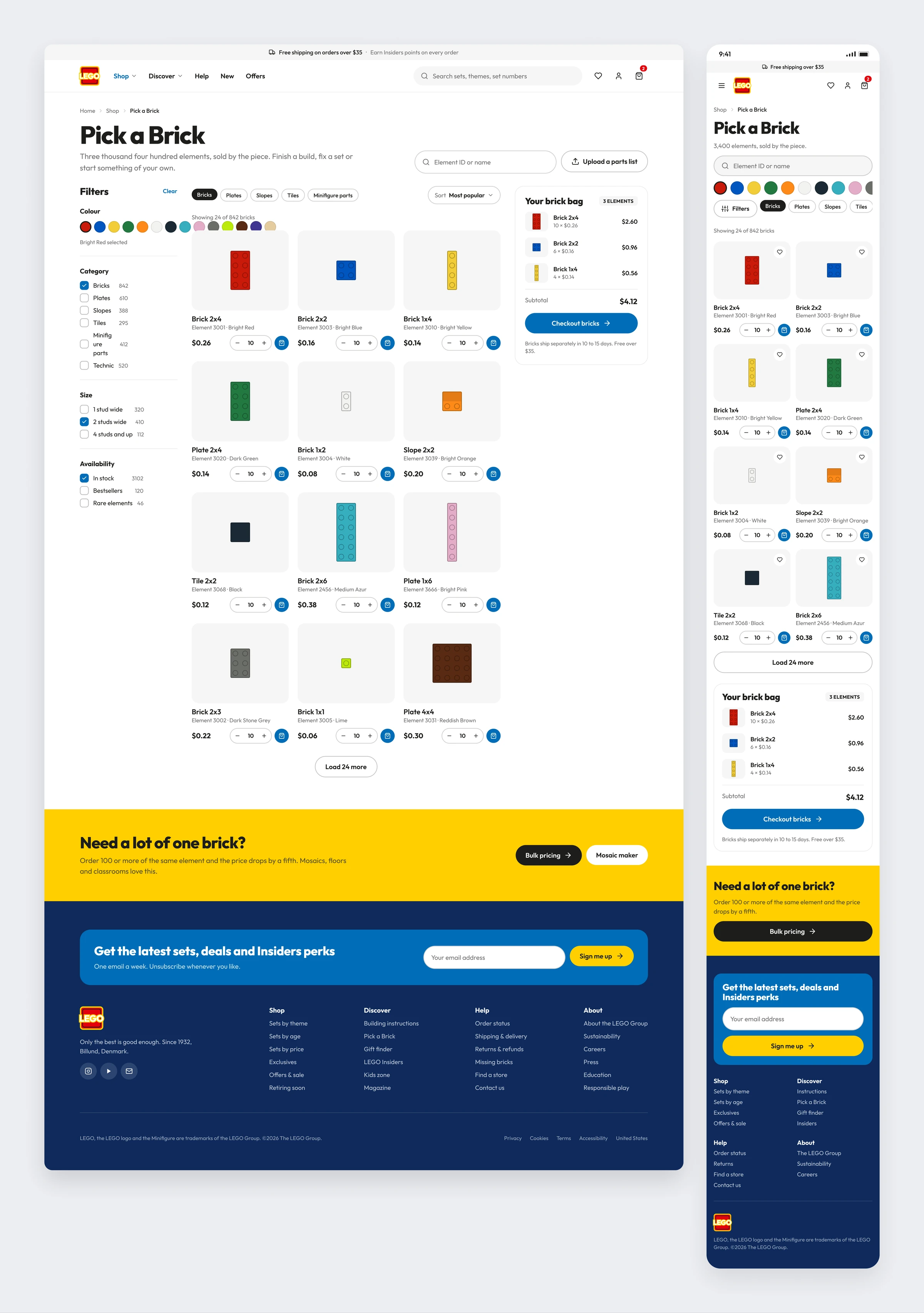
Bricks drawn as bricks. Every element is rendered from above, so a 2x4 and a 2x2 look different at a glance. Colour swatches come first, and the brick bag stays on the right.
Gift Finder
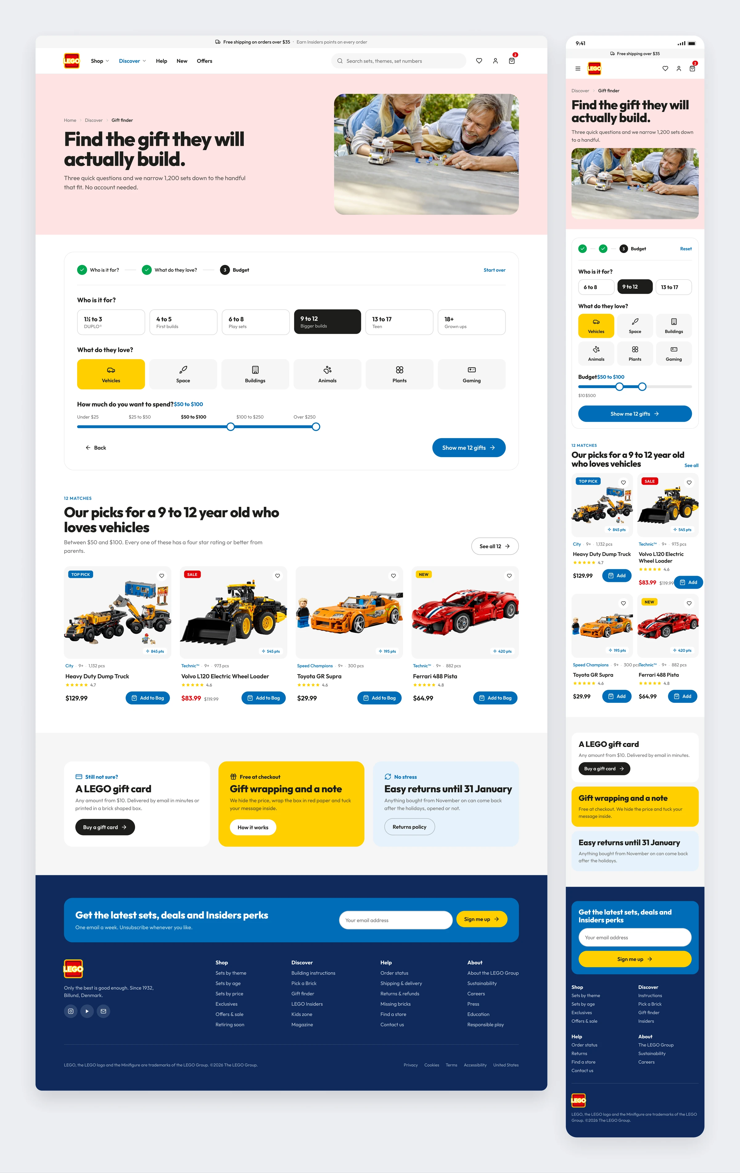
Three questions instead of a thousand filters. Age, interest and budget live on one card, and the results show up right under it, so nobody leaves the page they started on.
Store Finder
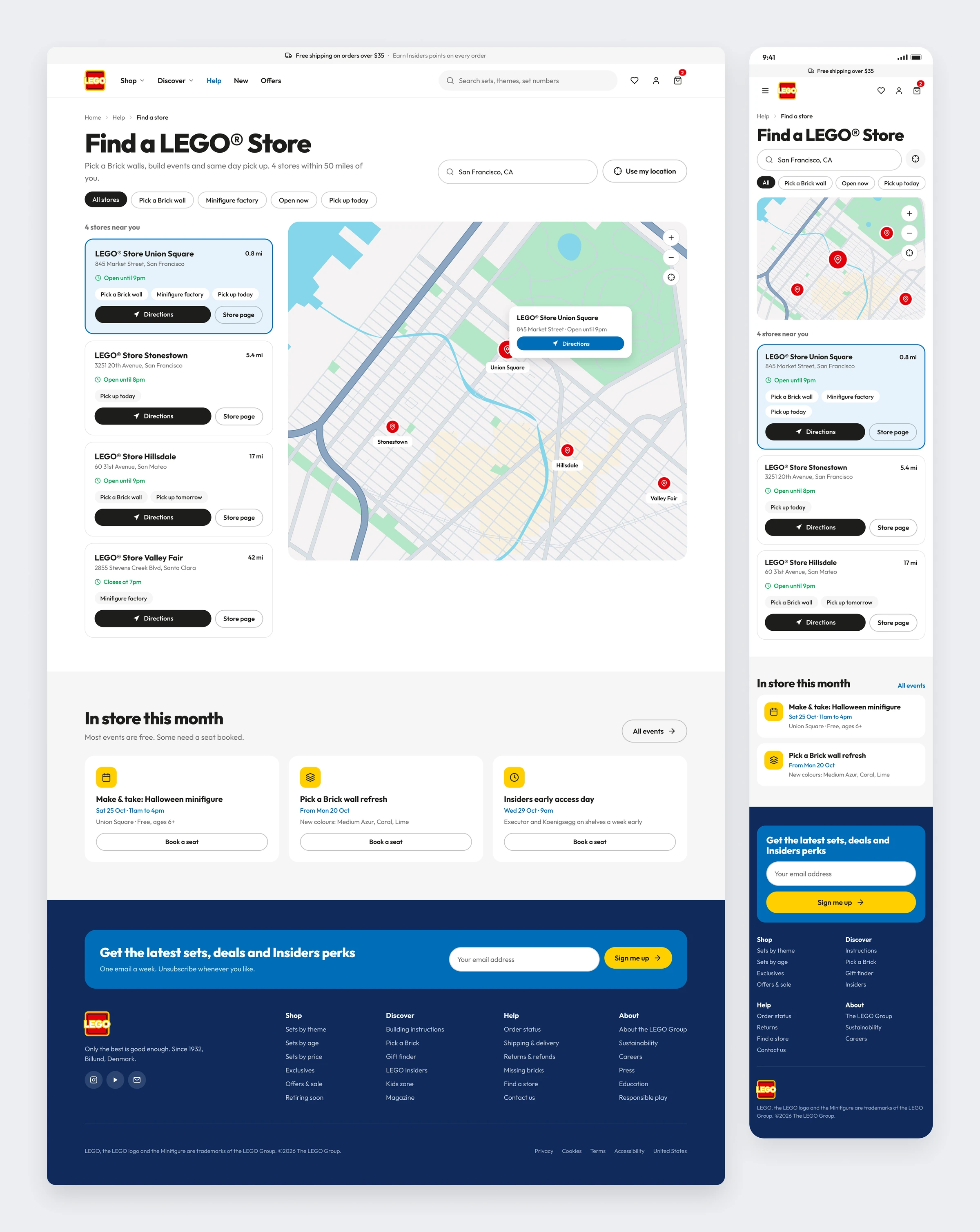
The map is the hero and the list is the detail. Stores sit on the left with what each one offers, the map is on the right with the nearest one open, and this month’s events live below.
Account and Orders
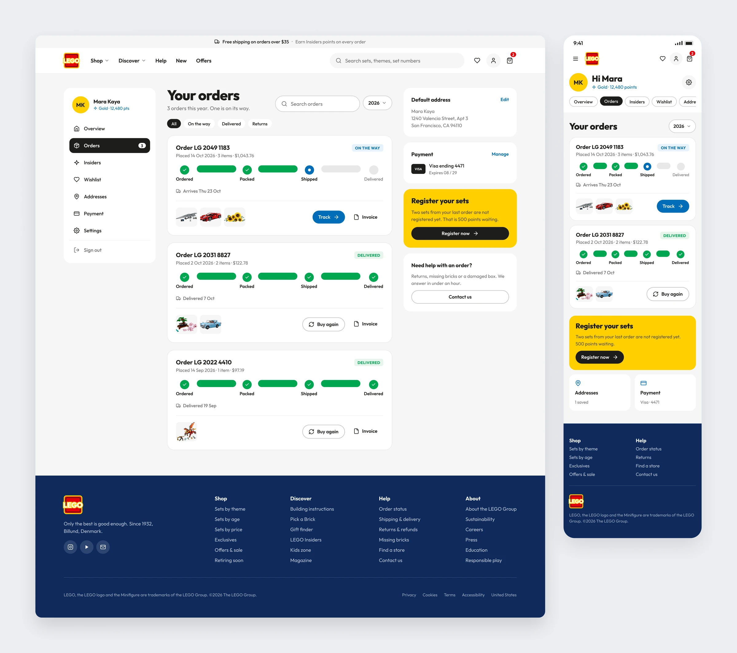
Orders first, everything else second. The tracker is drawn as four steps, so a parent can tell at a glance whether the box is coming today. Addresses and payment sit quietly beside it.
Kids Zone
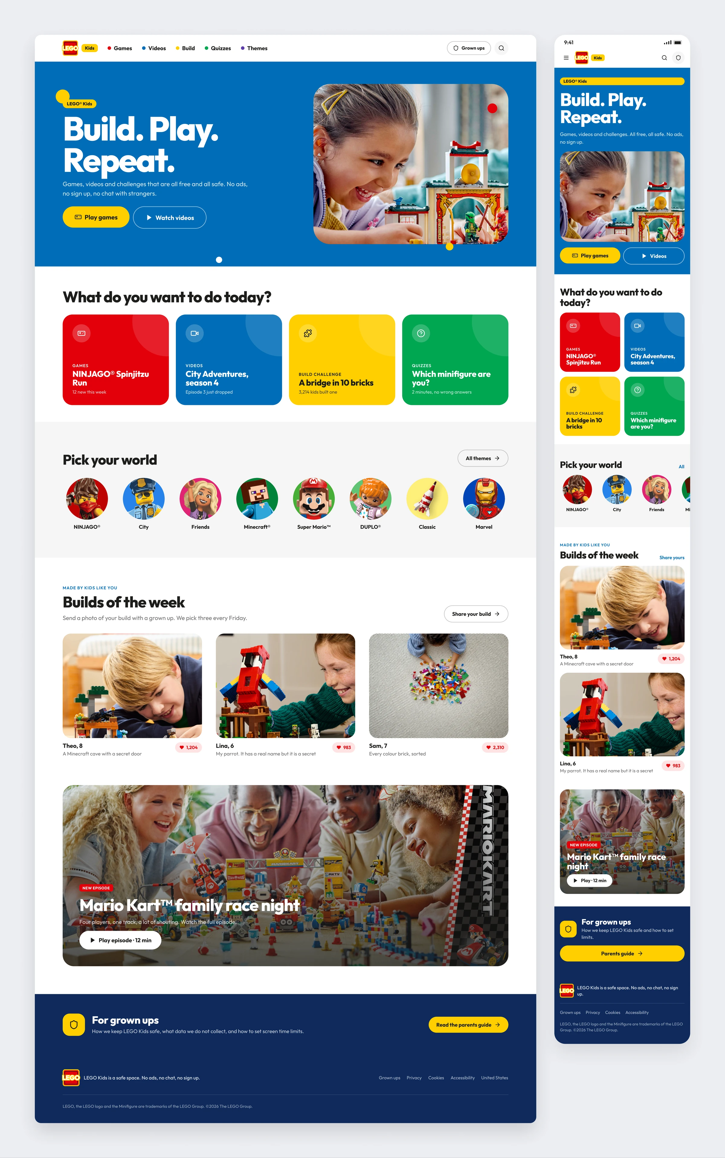
A corner of the site built for eight year olds. Bigger type, four colours and no shop. Games, videos and build challenges come first, and the link for grown ups is easy to find and hard to miss.
Outcome
LEGO.com showed me that a big site does not need a big idea. It needs one grid that every part agrees on. Once the shop, Insiders, the instructions and the kids zone shared the same cards and the same type, each page could focus on the one job it has. The copy mattered as much as the layout: buttons say what happens next, and headlines sound like a person at the LEGO Store, not a press release. This is an unofficial concept I made for my portfolio. It is not affiliated with or endorsed by the LEGO Group, and LEGO, the product images and the photography belong to them.