Product Designer
Orbit
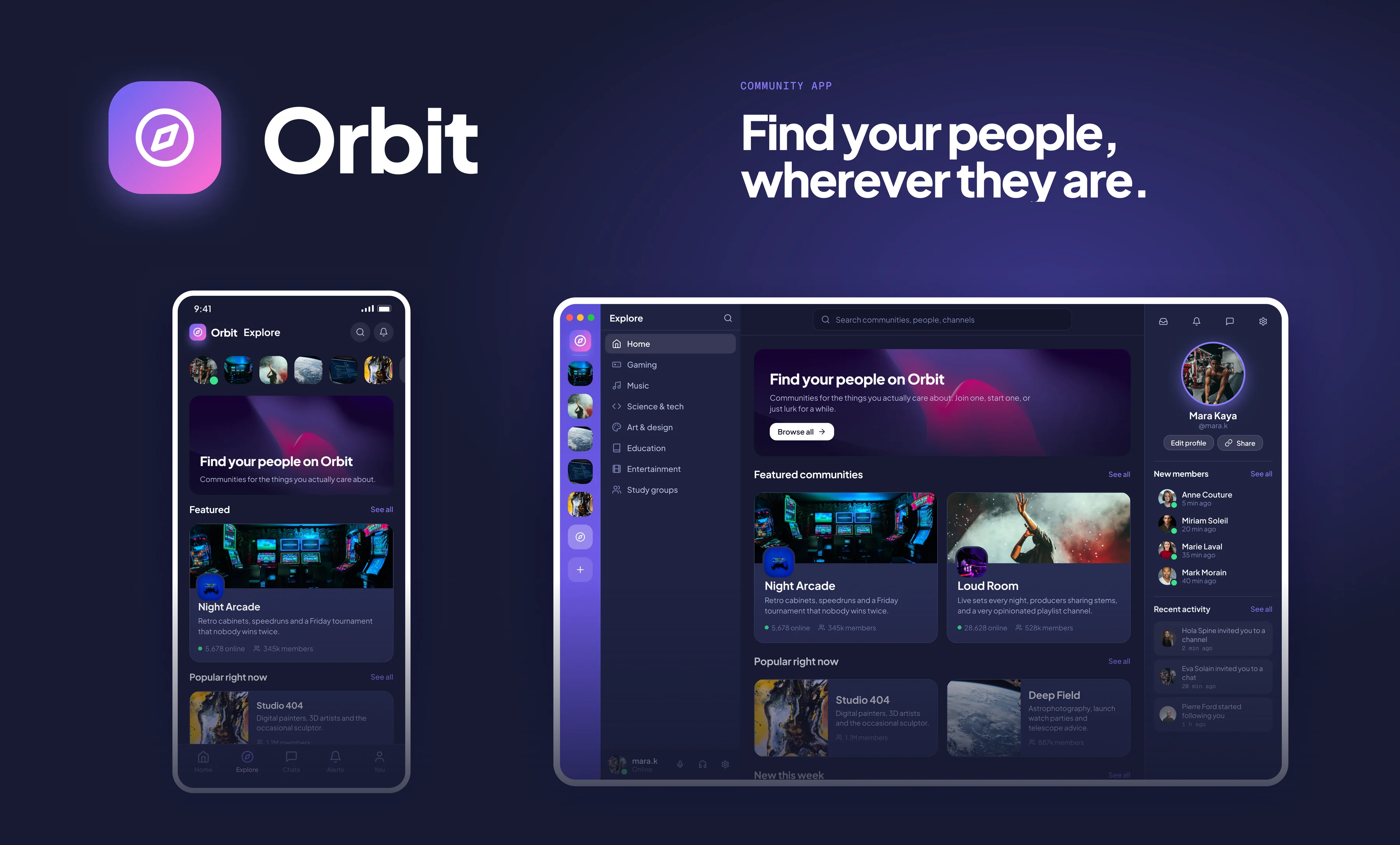
A community app concept in the spirit of Discord. Fourteen screens, from finding a community to setting up its roles and permissions, designed for a desktop window and a phone side by side. I kept the layout people already know and put the work into the part that usually feels like a spreadsheet: finding a community and deciding whether to join it.
Overview
Community apps share a layout everyone already knows: a rail of servers on the left, the channels next to it and the conversation in the middle. Orbit keeps that muscle memory. The palette is deep navy with a single violet accent, and a pink to violet gradient is saved for the main action on each screen, so there is never a question about what to press. Cards use a soft glass treatment that lets the photography carry the mood. Plus Jakarta Sans handles everything from headlines to body text, with Geist Mono for labels, timestamps and member counts.
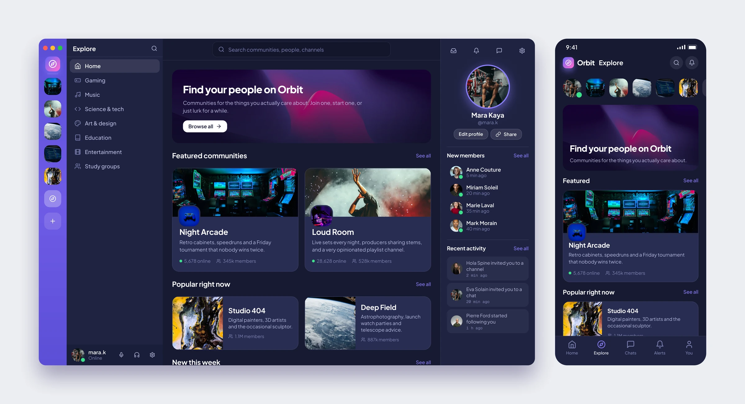
Explore
The front door. A search bar, a banner, featured communities that lead with their cover art, and a profile column that shows who just joined and who is talking about you.
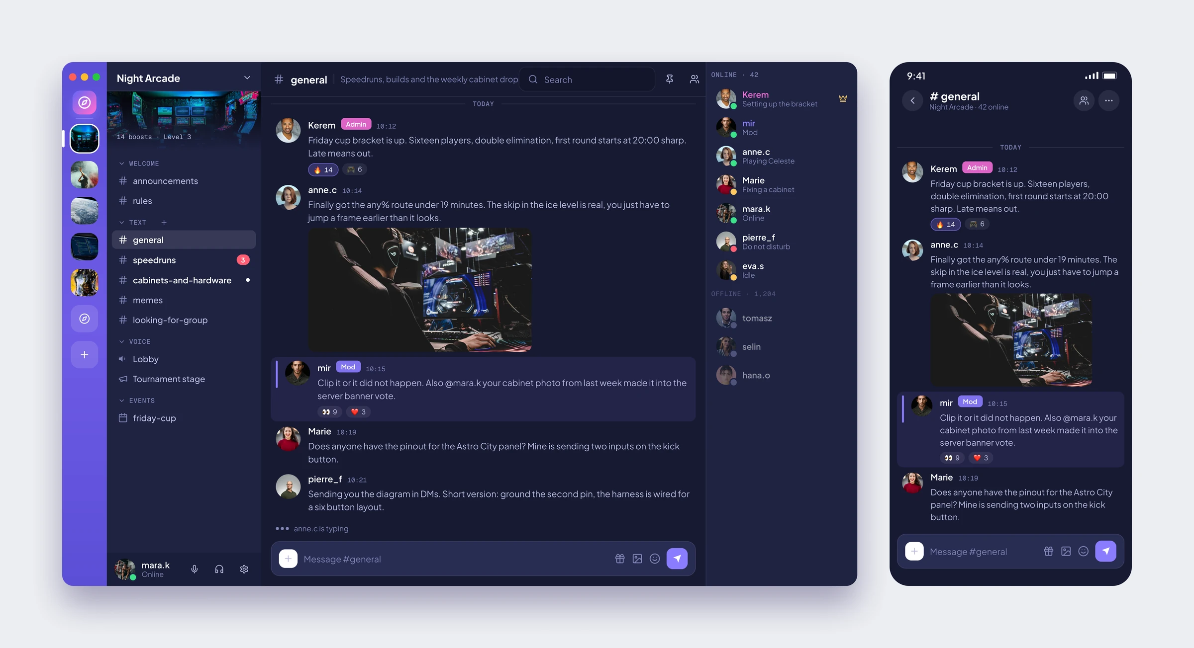
Text Channel
The classic three column layout: channels on the left, the conversation in the middle and members on the right. Mentions get a violet stripe, and replies and reactions stay inline.
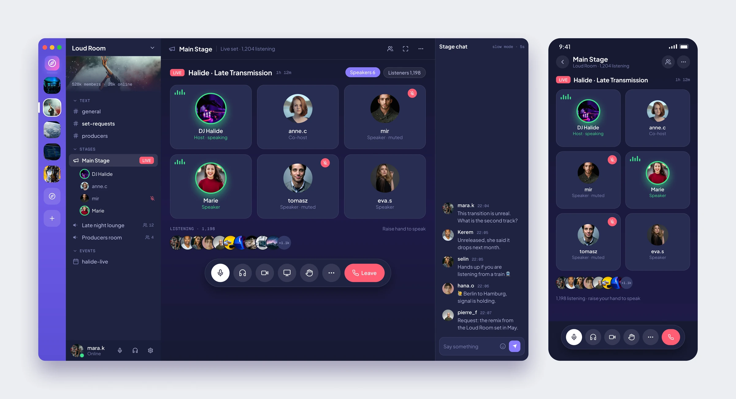
Voice Stage
A live set on a stage channel. Speakers are tiles with a green ring when they talk, listeners are a row of avatars, and the chat lives in the side panel so nobody misses the music.
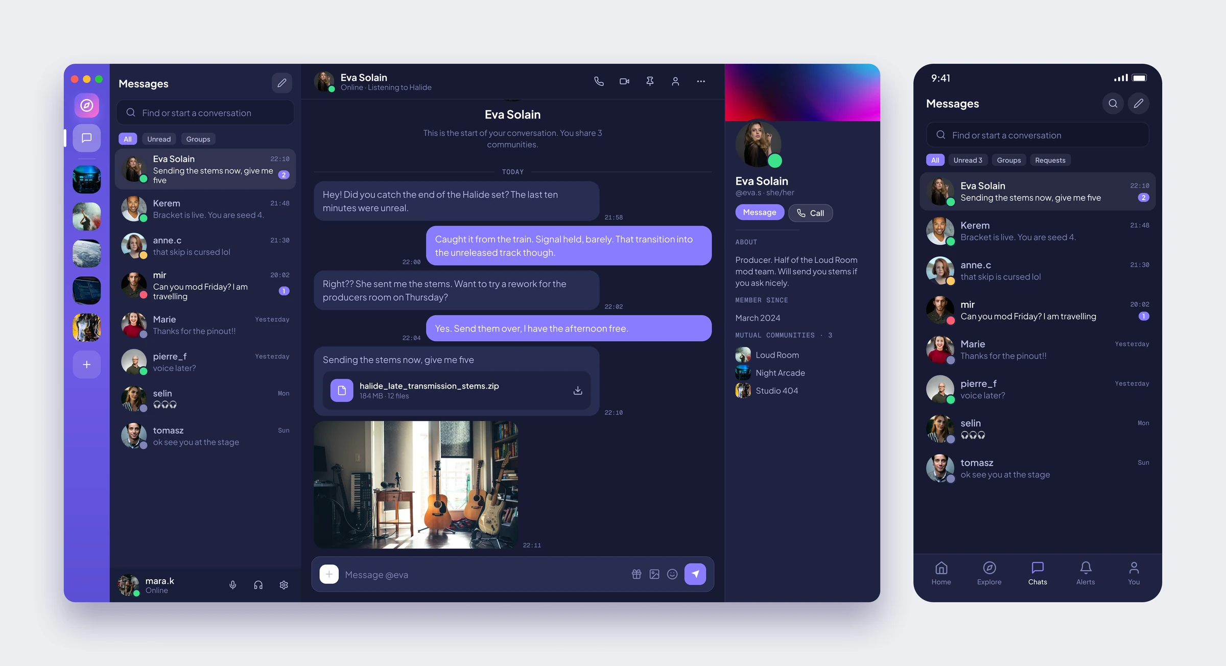
Direct Messages
One to one chat with a proper conversation list, file cards for stems and images, and a profile panel that shows the communities you share.
Community Page
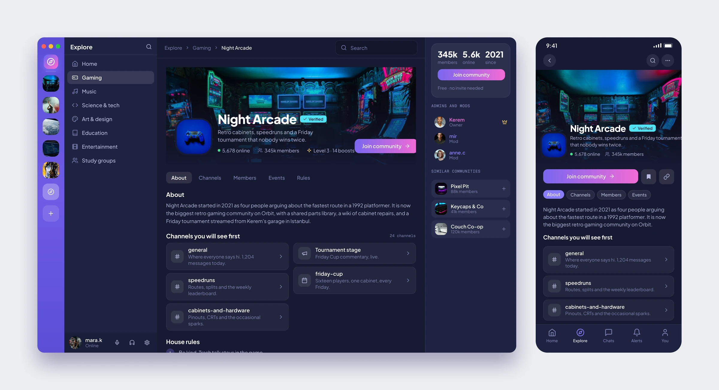
The page you see before you join: cover art, a verified badge, who runs it, the channels you will see first and the house rules. The join button carries the gradient, so it is never in doubt.
Events
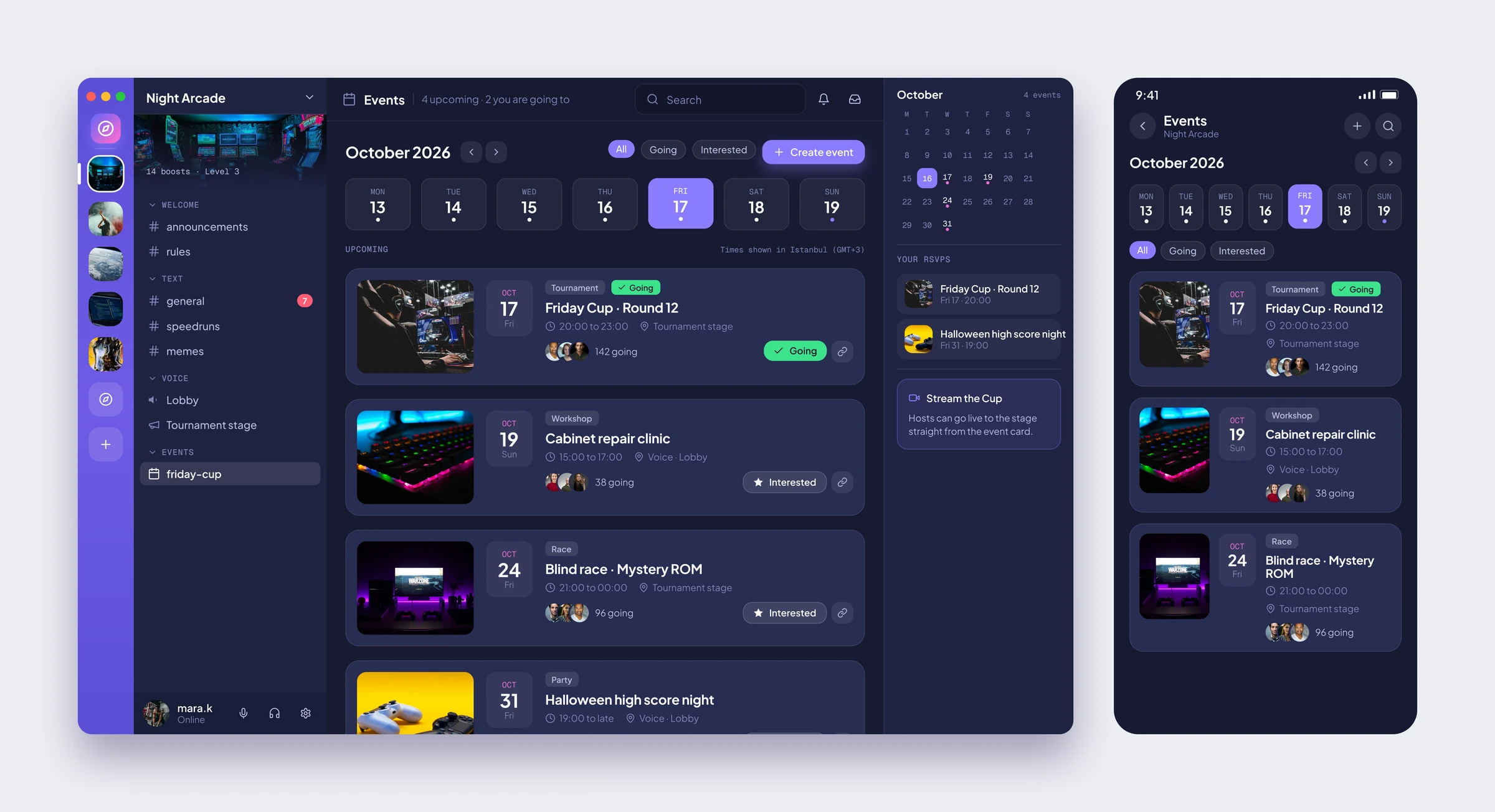
A month view, a week strip and event cards with a date block, the host, who is going and a one tap RSVP. The right column keeps your own plans in view.
Forum Channel
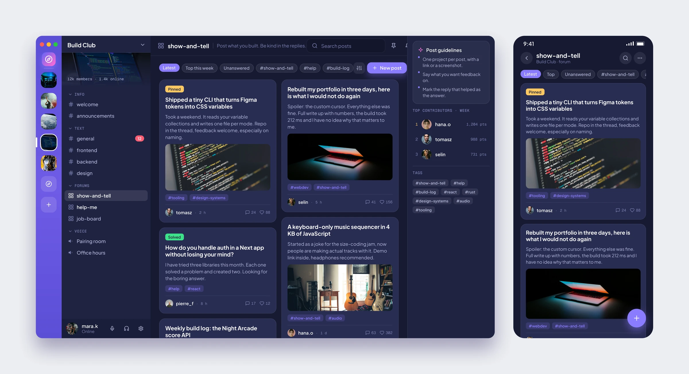
Threads instead of a scrolling chat. Posts sit in two columns with tags, reply counts and a pinned or solved badge, and the posting guidelines stay on the right.
Notifications
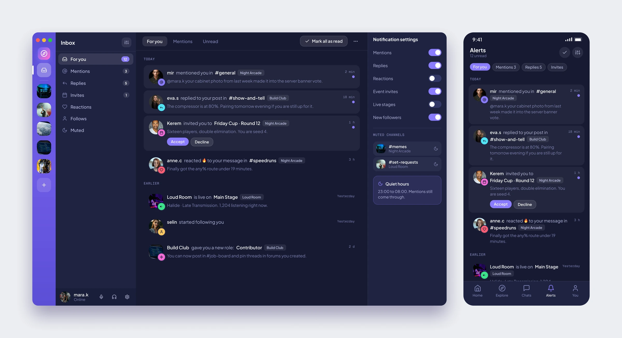
An inbox, not a bell. Mentions, replies, invites and reactions each get their own icon, invites can be accepted right there, and quiet hours are one toggle away.
Video Call
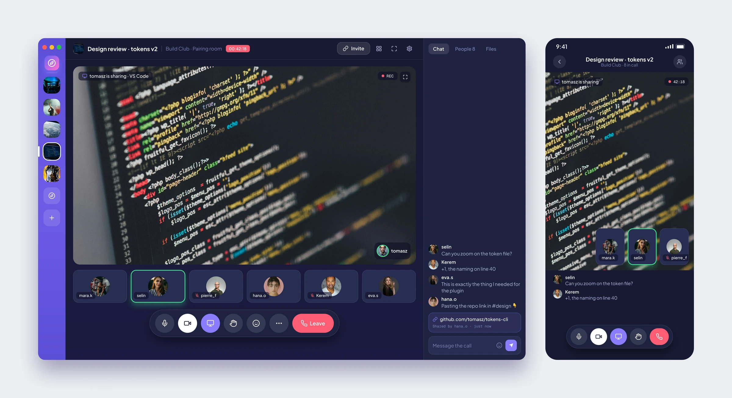
Screen sharing with the shared window as the main view, the participants as a strip below it and the call chat beside it. The controls float at the bottom in a single pill.
Search
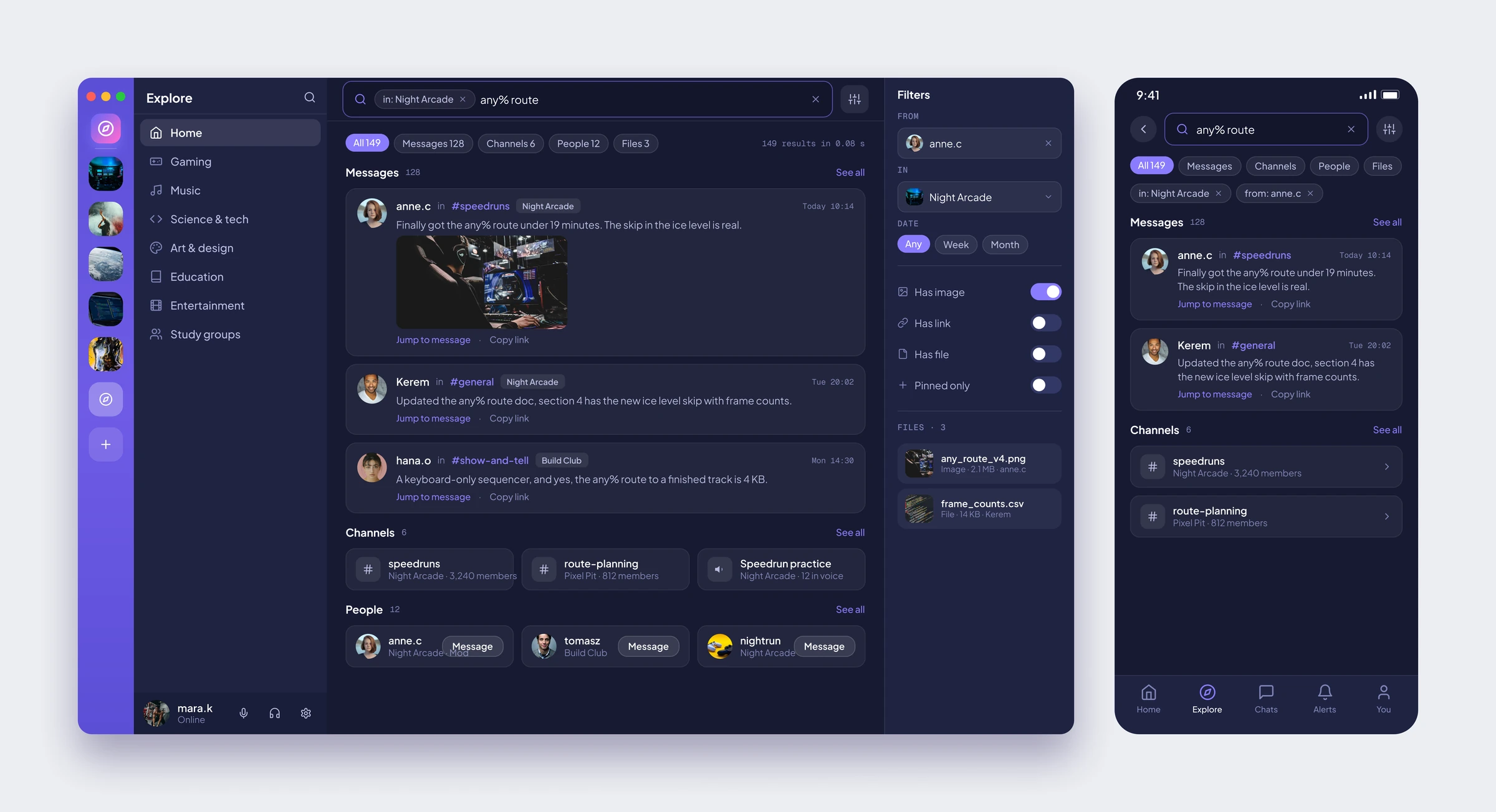
One search across messages, channels, people and files, with filter chips inside the box itself and a panel of toggles for the fussier queries.
Profile and Settings
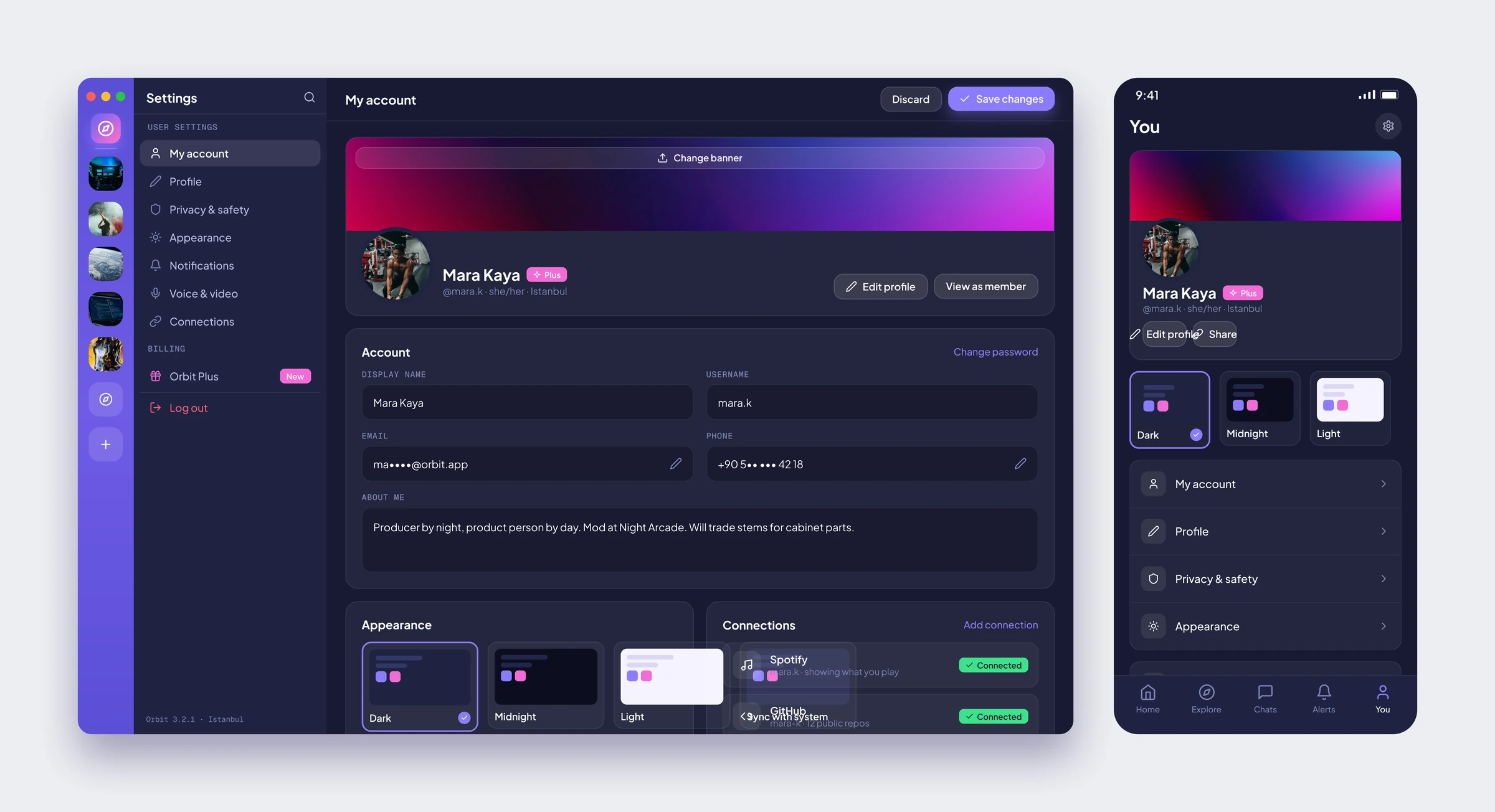
Account, appearance and connections on one page. The theme cards show the real colours, and every toggle has a sentence under it saying what it does.
Create a Community
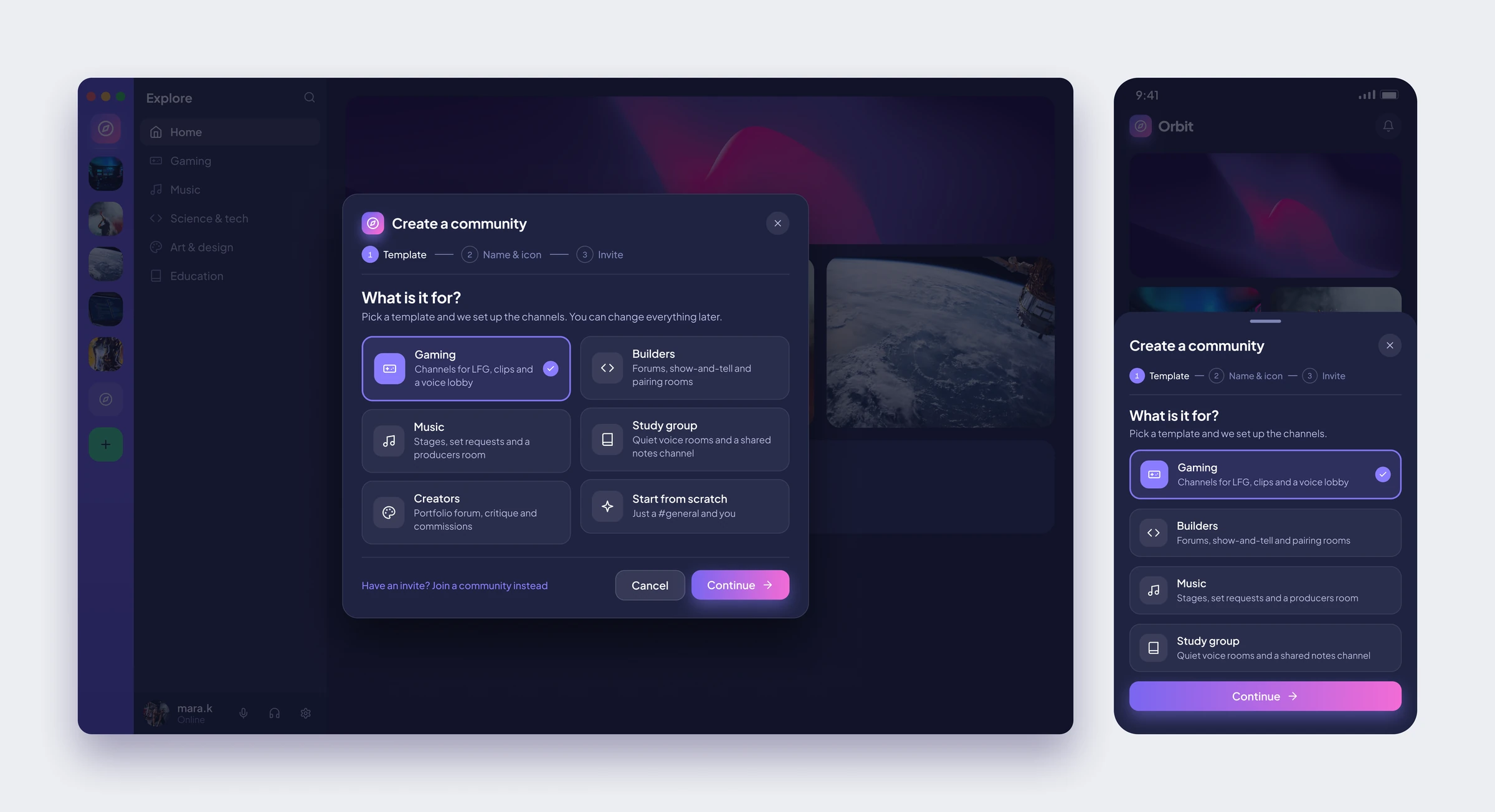
A three step window over a dimmed explore page. Pick a template and the channels are set up for you. On mobile the same flow slides up as a sheet.
Sign In
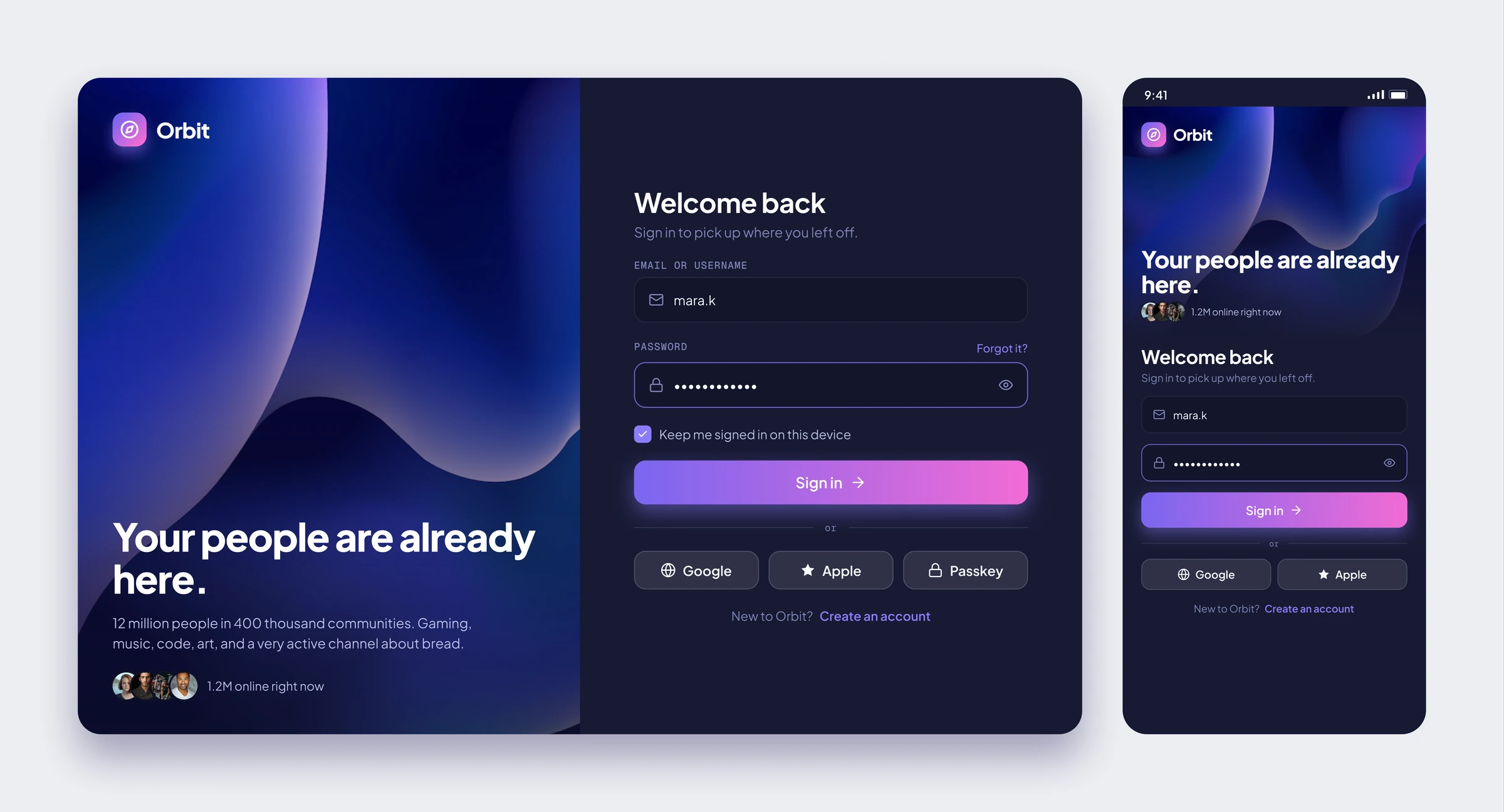
A split card with a headline and a little social proof on the left and a short form on the right. Passkey, Google and Apple sit under one divider, so nobody has to read a paragraph.
Roles and Permissions
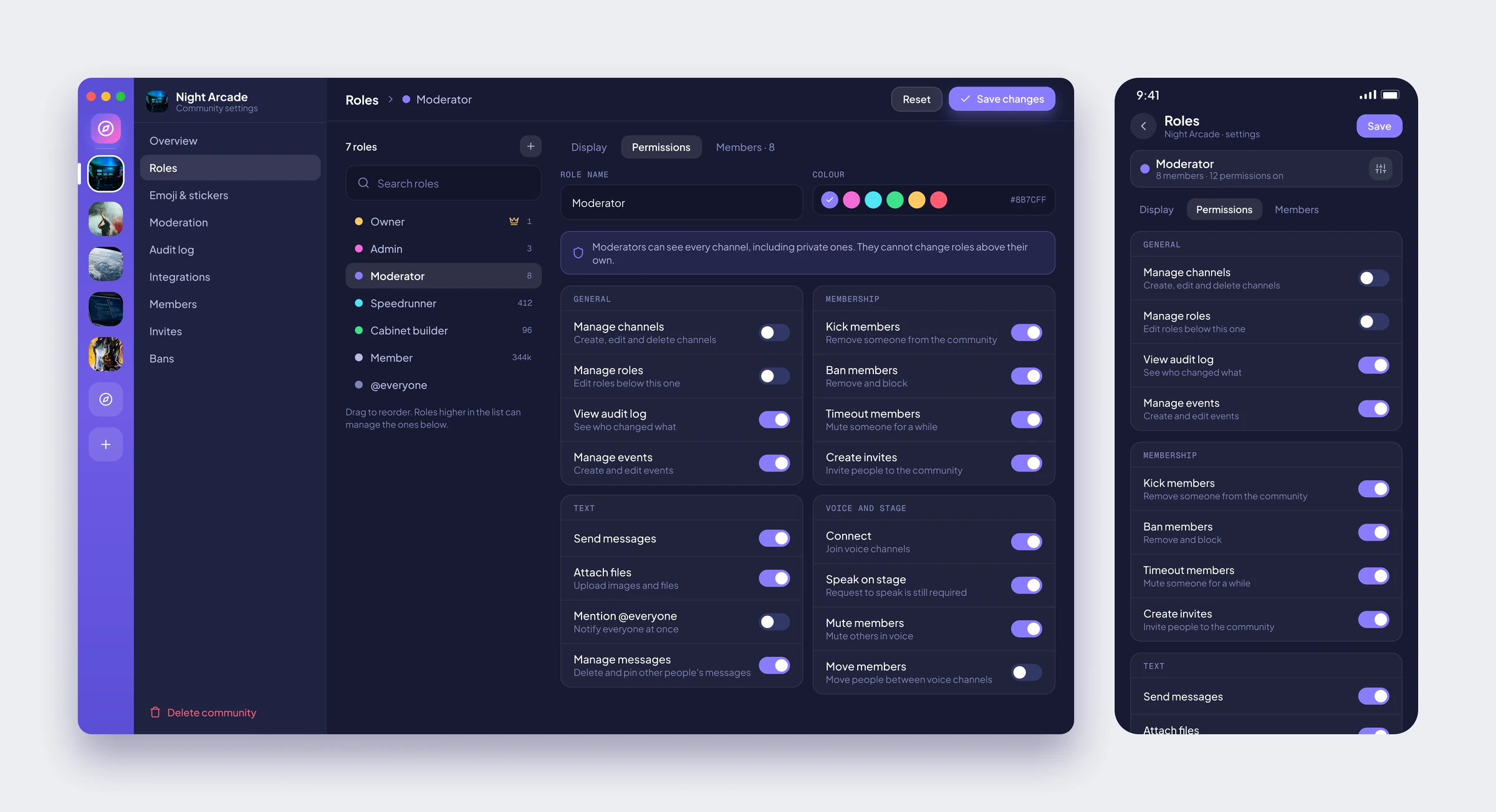
The admin screen most apps hide. Roles sit in a list you can reorder, each with its own colour, and permissions are grouped into four cards with a toggle and a plain sentence for each one.
Outcome
Orbit showed me how much room a familiar layout leaves for fixing the parts people complain about. Nobody has to relearn where the channels are, so the effort could go into finding a community, deciding to join and running it afterwards, from the community page all the way to the roles screen. Saving the gradient for one action per screen turned out to be the simplest way to show what to press next. Orbit is a personal concept: the communities, members and messages are invented, while the layouts and behaviours are borrowed from the apps people already open every day.