Product Designer
Carro
Rent a car in three taps
A car rental app for city trips and airport pick-ups, from the first search to the digital key.
Overview
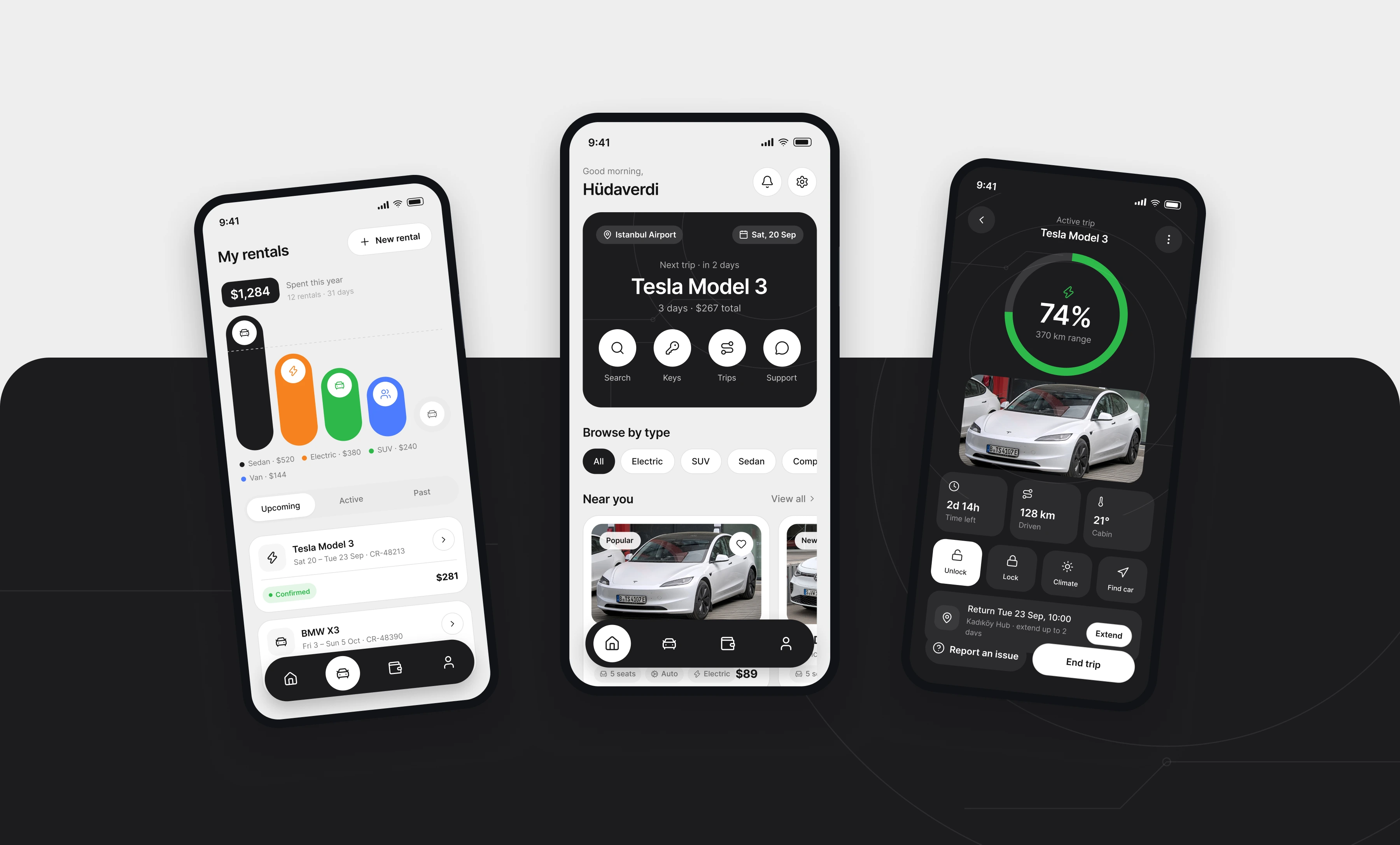
Most rental apps are a web form with a logo on top. Carro puts the trip first. The home screen has one dark card with your next car, the dates and the quick actions. Every price is shown per day and in total, side by side. The interface is a light grey canvas, white cards with soft borders, and a single near-black surface for the things that matter most.
Screens
Home
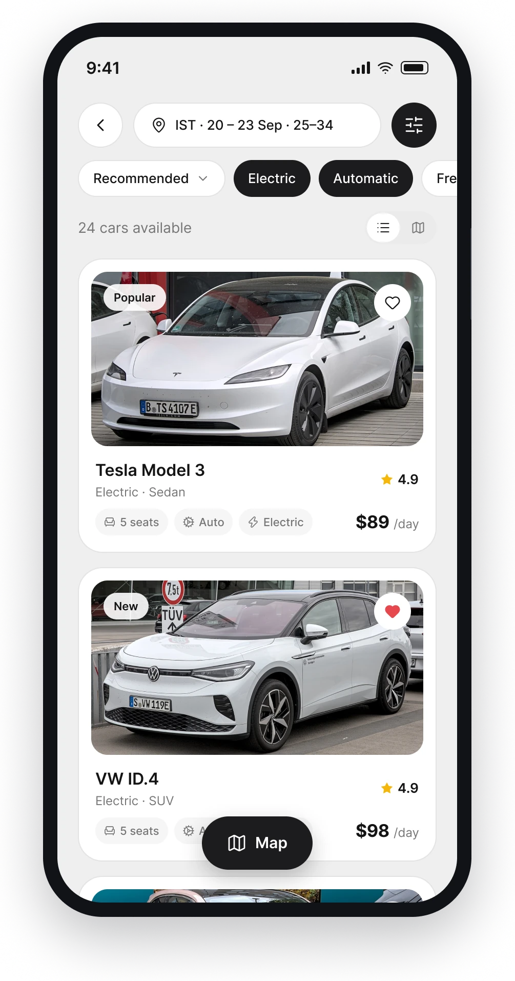
Your next trip lives in one dark card. Search, keys, trips and support sit right under the car name, one tap away.
Search
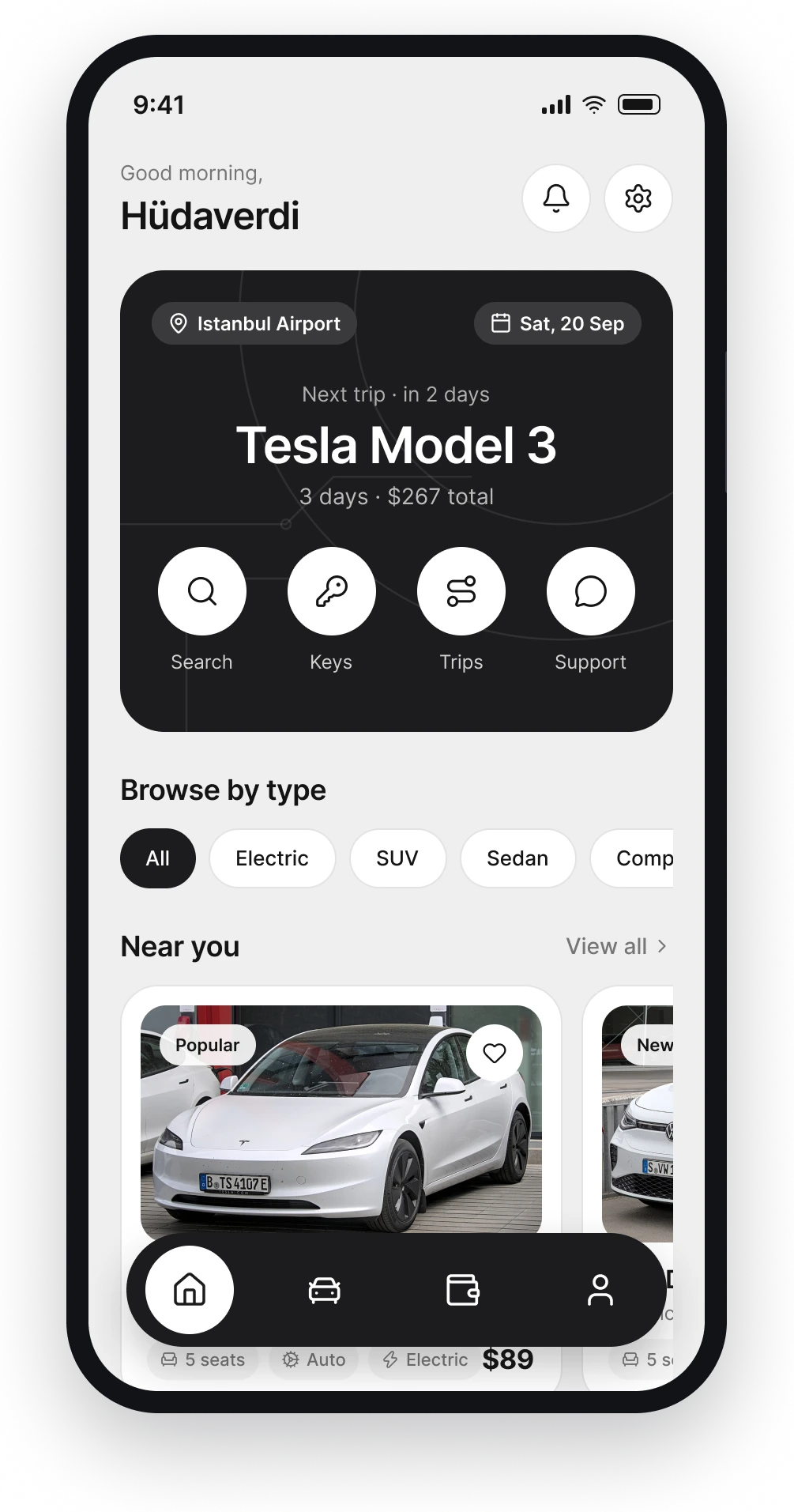
Location, dates, driver age and budget on a single screen. Vehicle type is a row of tiles, not a dropdown.
Results
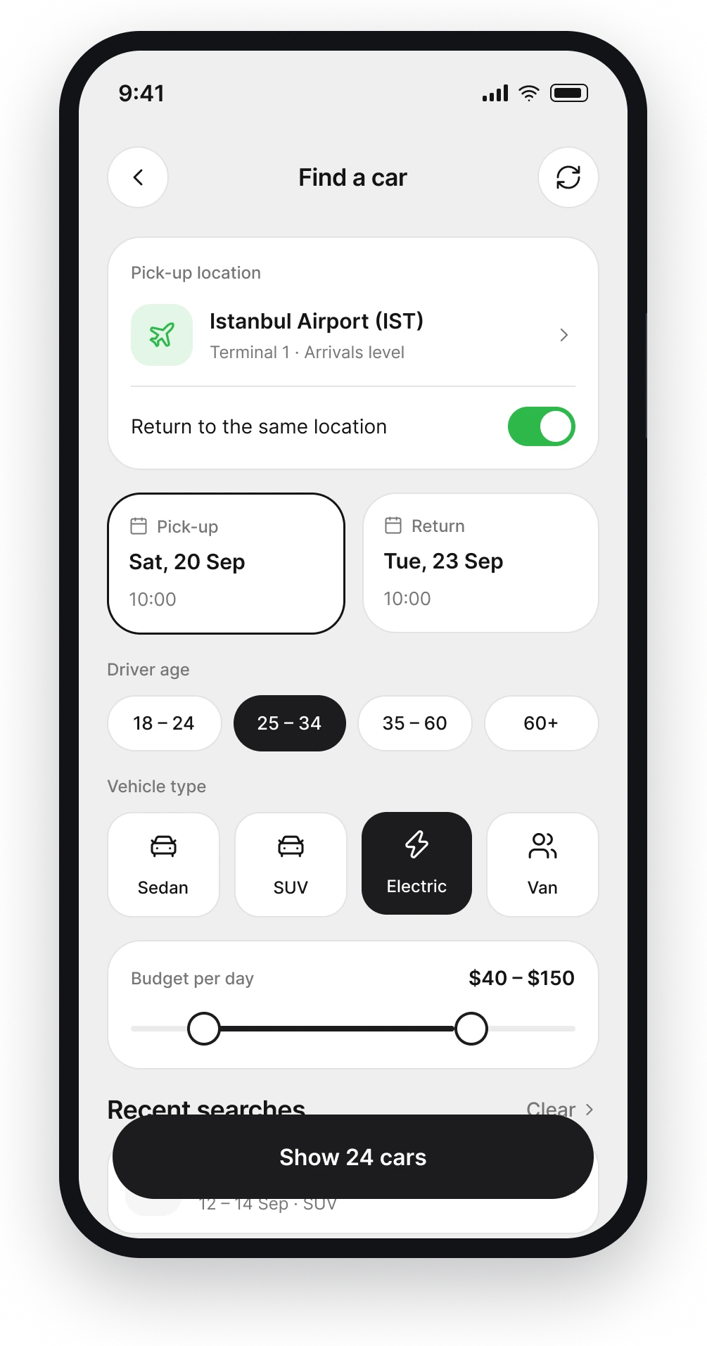
Cards show the four things people compare first: price, rating, seats and gearbox. Filters stay pinned on top while you scroll.
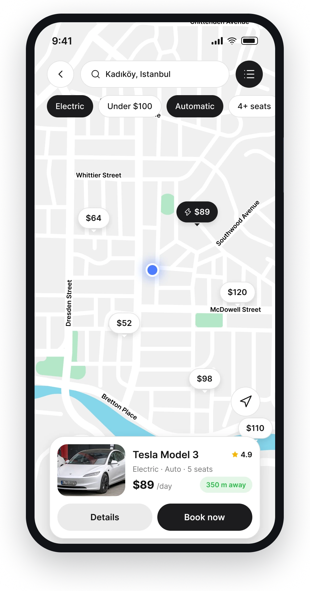
Map
Prices on the map instead of anonymous pins. The selected car opens as a small card without leaving the map.
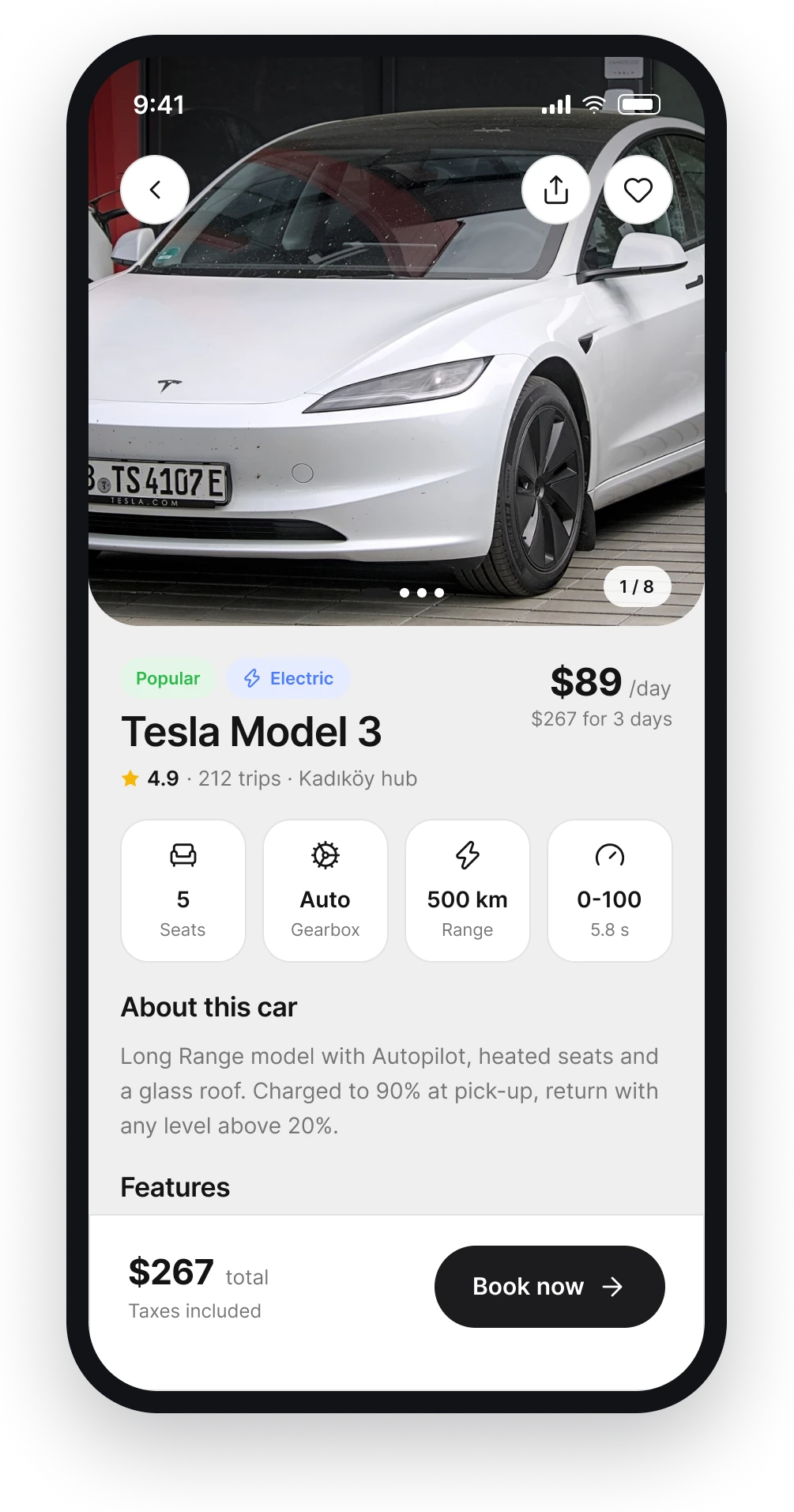
Car detail
Specs as tiles, features as chips. The daily price and the total for your dates are always visible at the bottom.
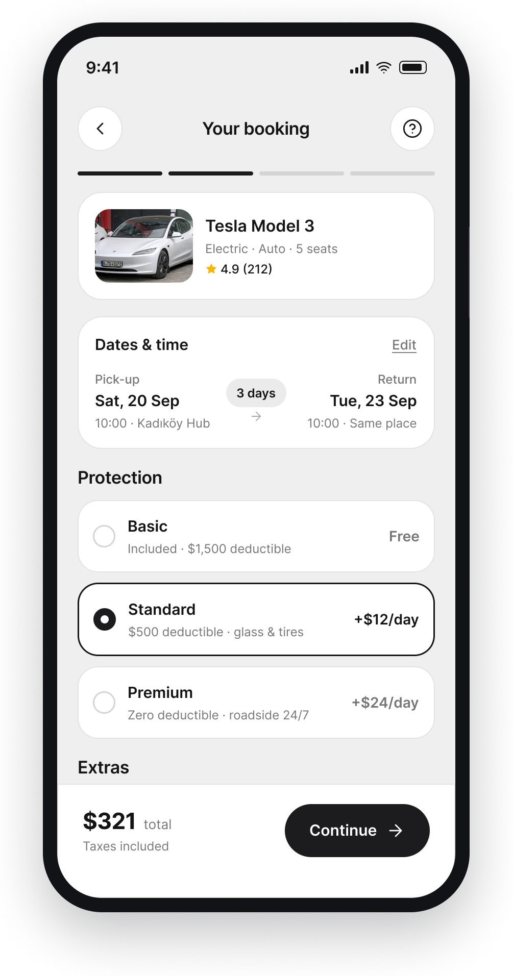
Booking
Protection plans and extras with clear per-day prices. The total in the bottom bar updates as you choose.
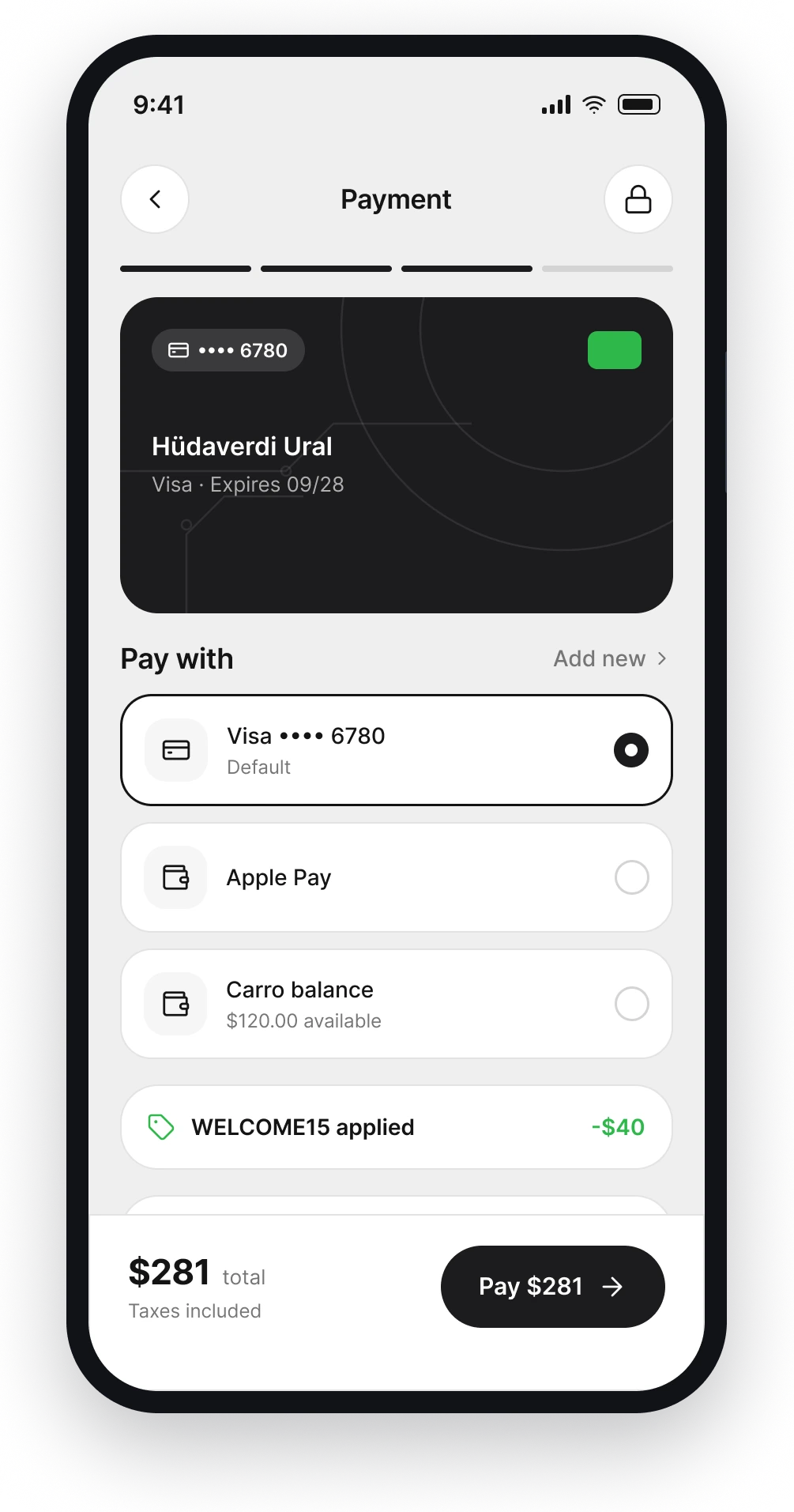
Payment
Saved card, Apple Pay or Carro balance. The summary lists every line, including the promo, before you pay.
Confirmation
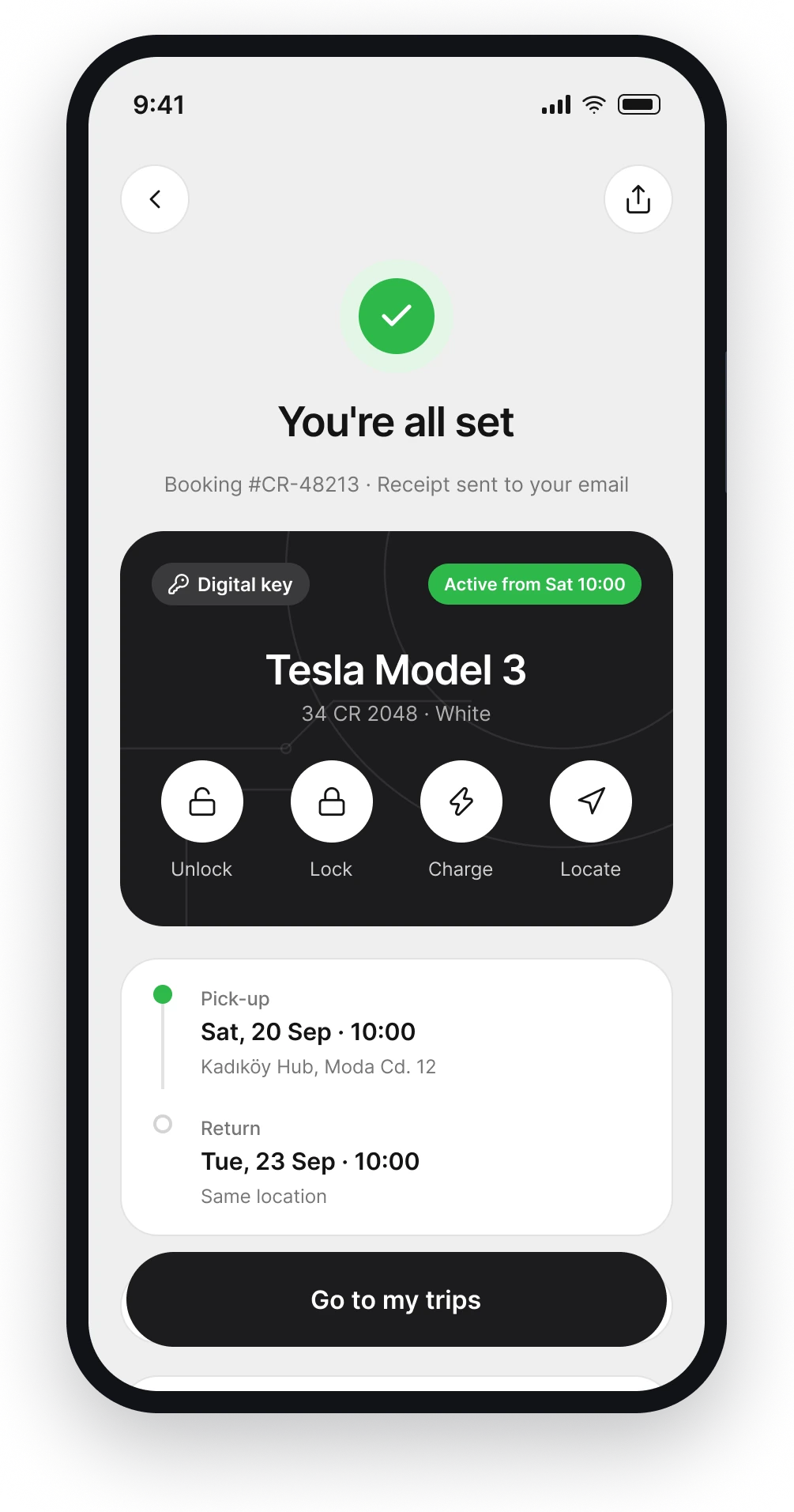
The digital key appears the moment the booking is confirmed. Unlock, lock, charge and locate from the same dark card.
My rentals
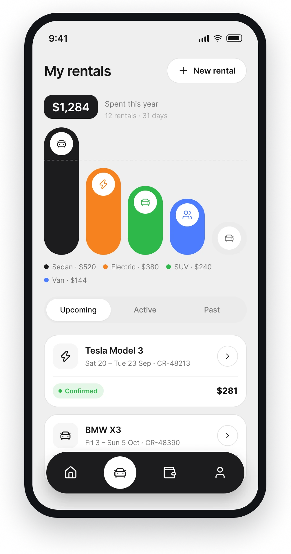
Yearly spend by car type as a soft bar chart, inspired by savings apps. Upcoming, active and past rentals sit below.
Active trip
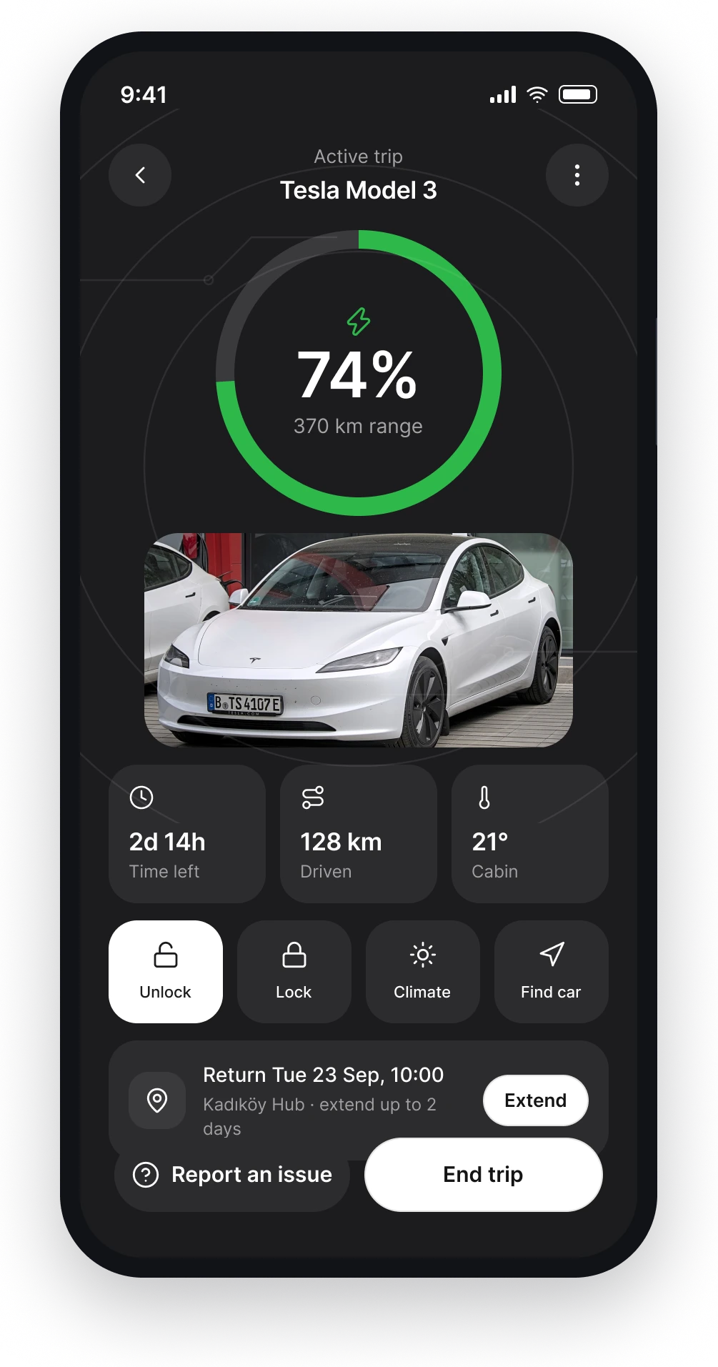
A dark screen for the road. Battery, range, time left and only the controls you use while the car is yours.
Wallet
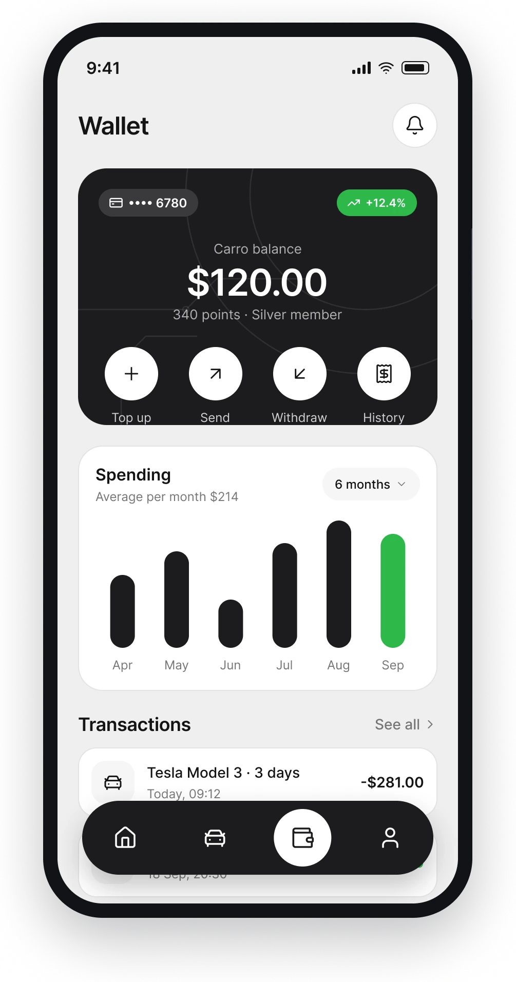
Balance, points and monthly spending in one place. Transactions read like a clean bank statement.
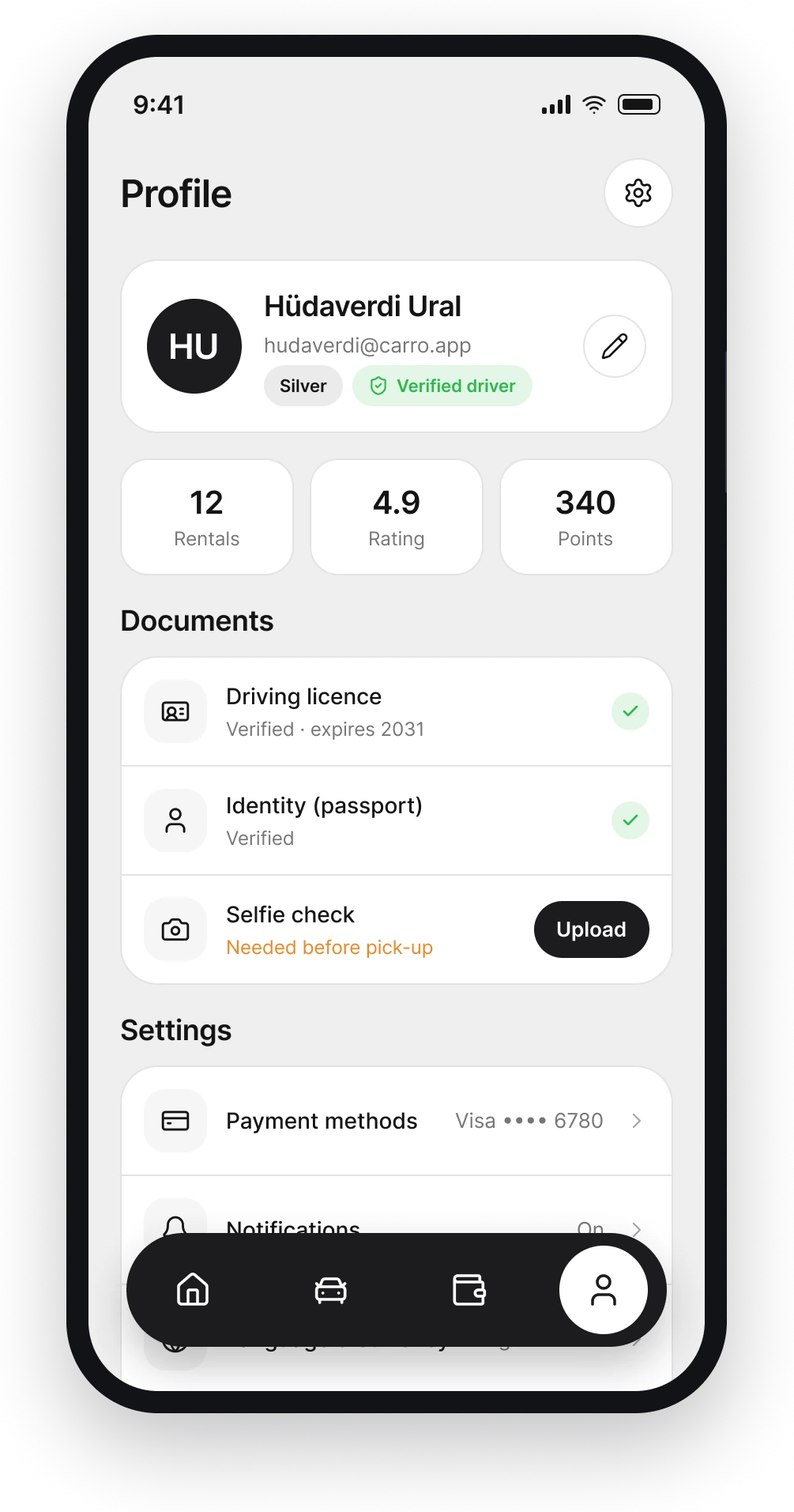
Profile
Documents with their verification status, so pick-up never fails because of a missing licence or selfie check.
Outcome
Carro is a concept project. All brands and prices are fictional. The goal was to make renting a car feel as light as ordering a ride.