Product Designer
Nexa
An end-to-end shopping experience for a premium tech store. Twelve flows, from browsing to checkout, designed for desktop and mobile in parallel. The goal was a calm, fast and trustworthy feel instead of the usual cluttered electronics store.
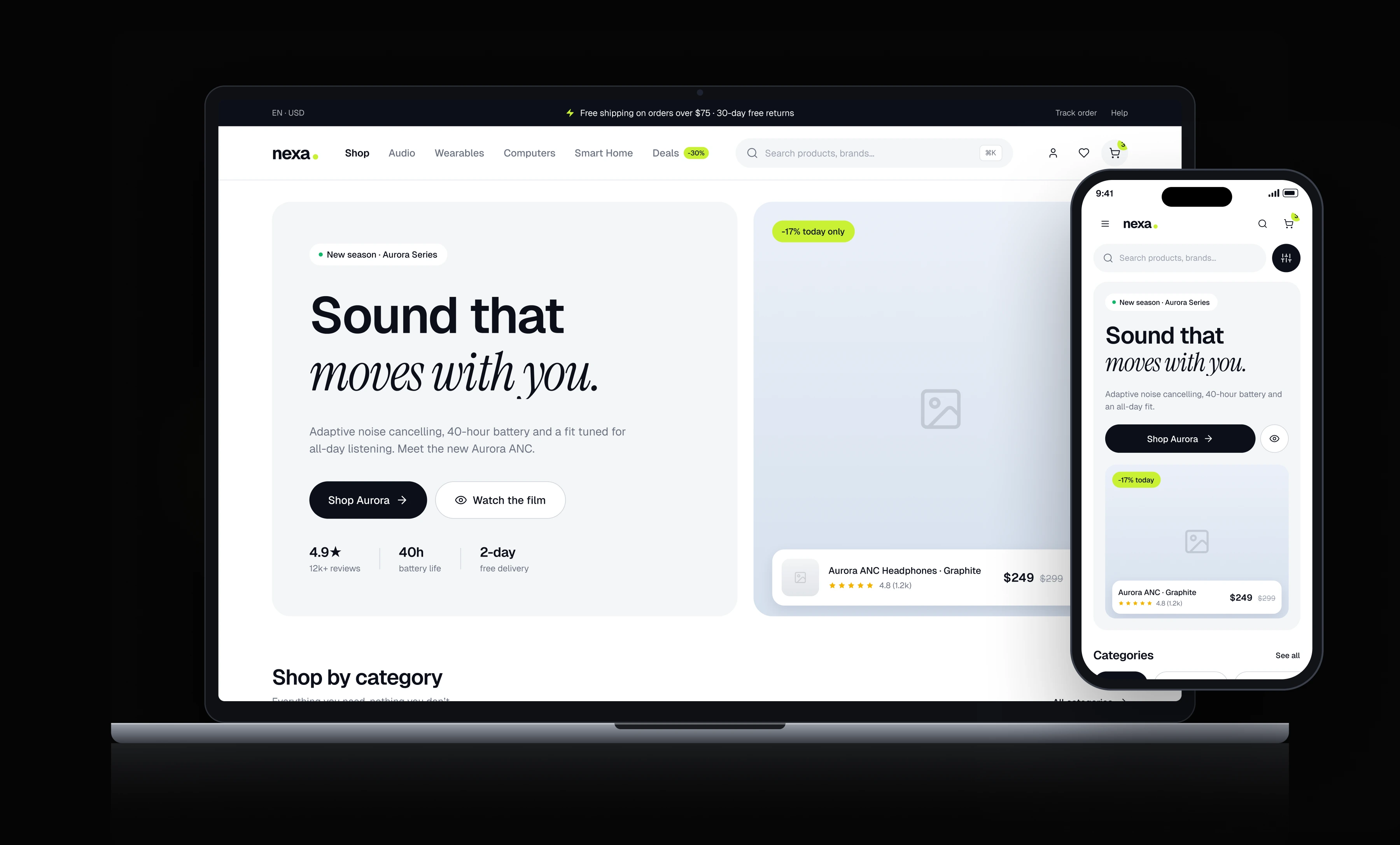
Overview
The visual language is built on a light theme, black primary buttons and a single accent, lime green. Type is Geist, with Instrument Serif for the display headlines. Before drawing any screen I built the design system in Figma: colour and type tokens, the repeating components and the grid. This page shows what came out of that system rather than the system itself, and every screen puts one clear action forward.
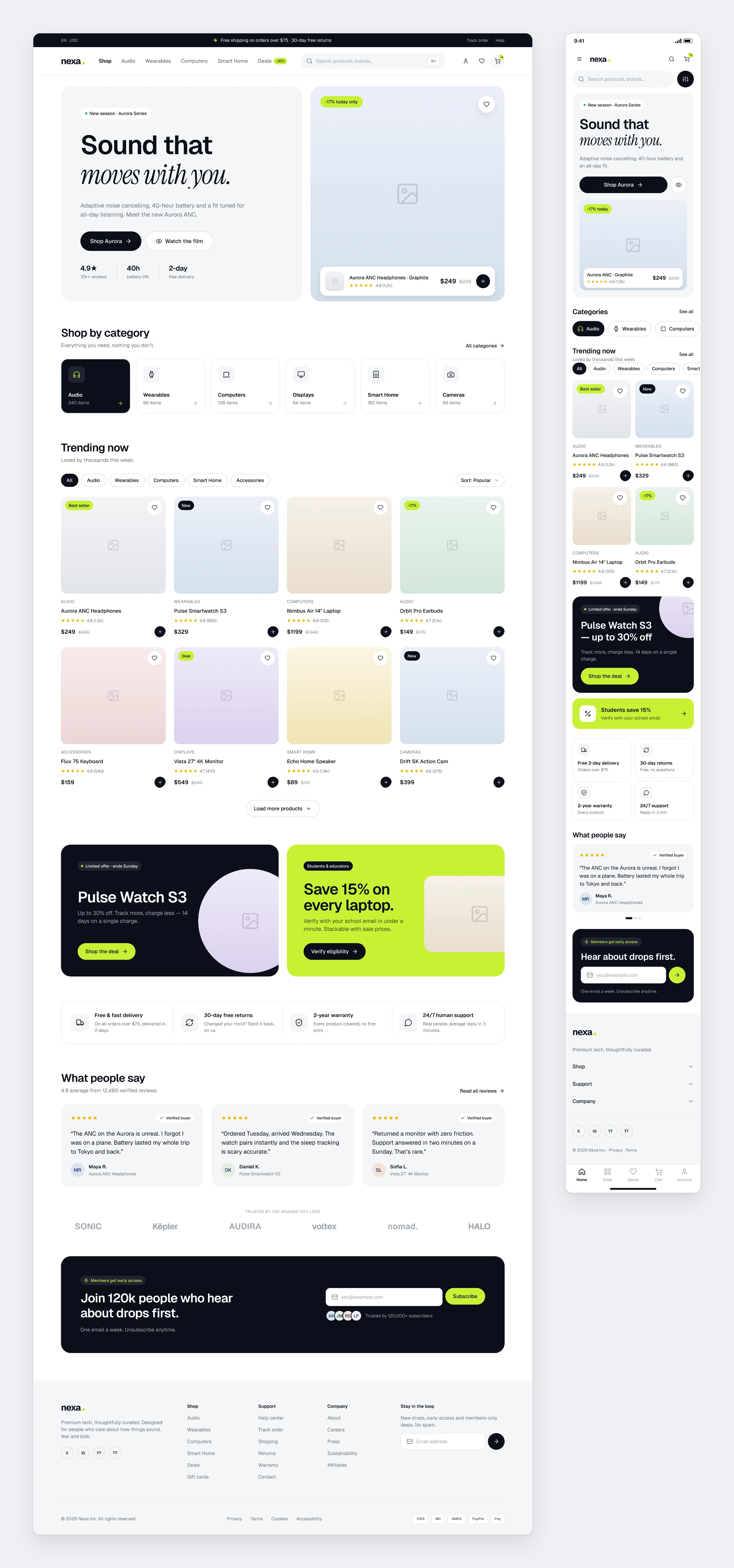
Home
The hero tells one product story, followed by categories, trending items and campaign cards.
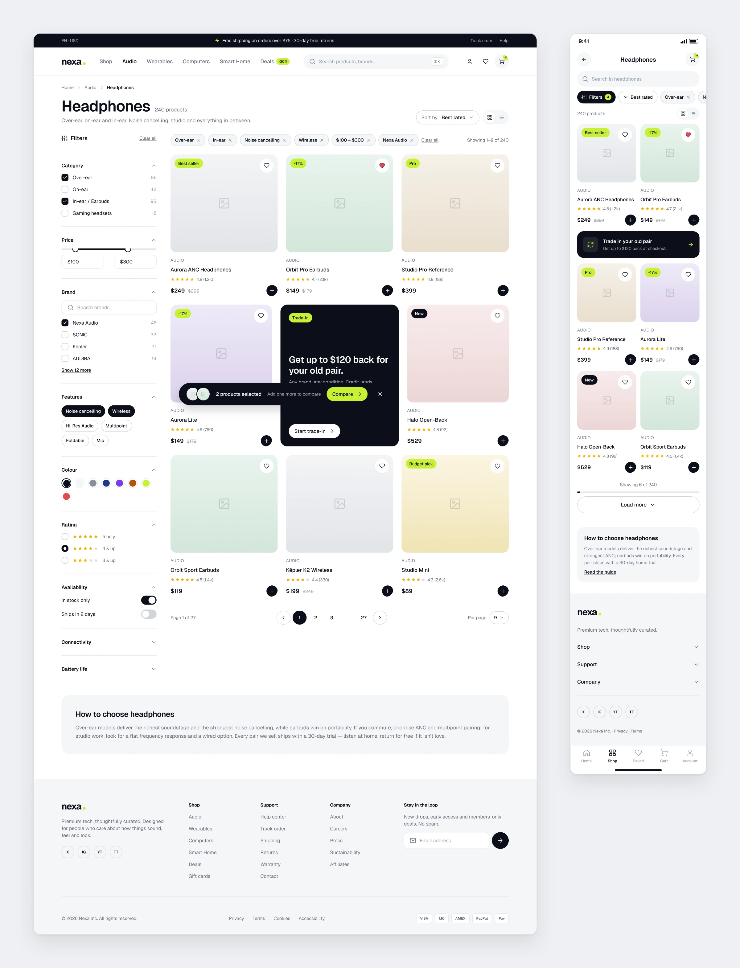
Category and Filtering
Filters on the left, a three-column product grid on the right. Active filters show as chips, and products can be compared side by side.
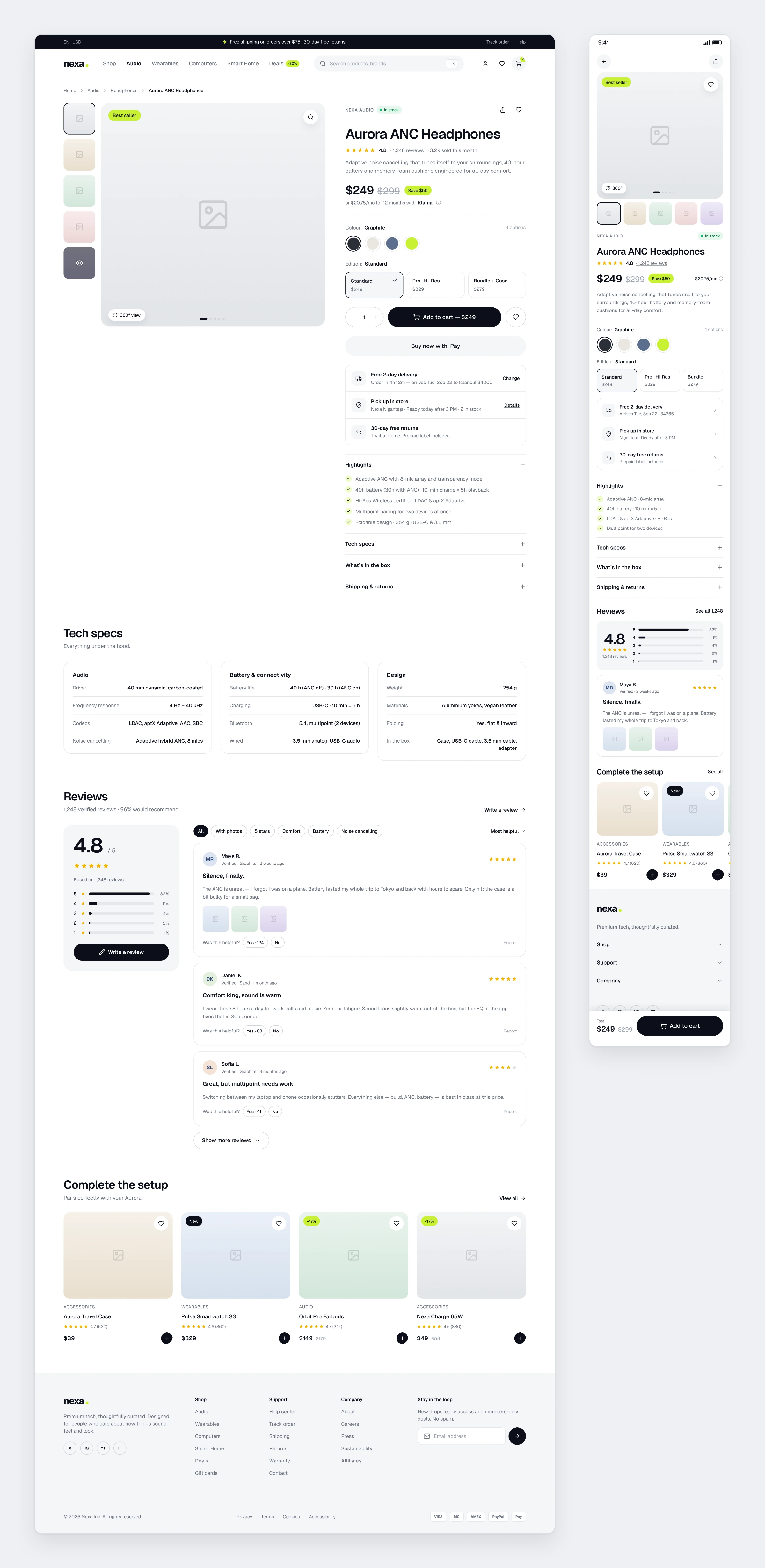
Product Detail
Gallery, colour and edition picker, delivery information and reviews on a single page. On mobile the add to cart button stays fixed at the bottom.
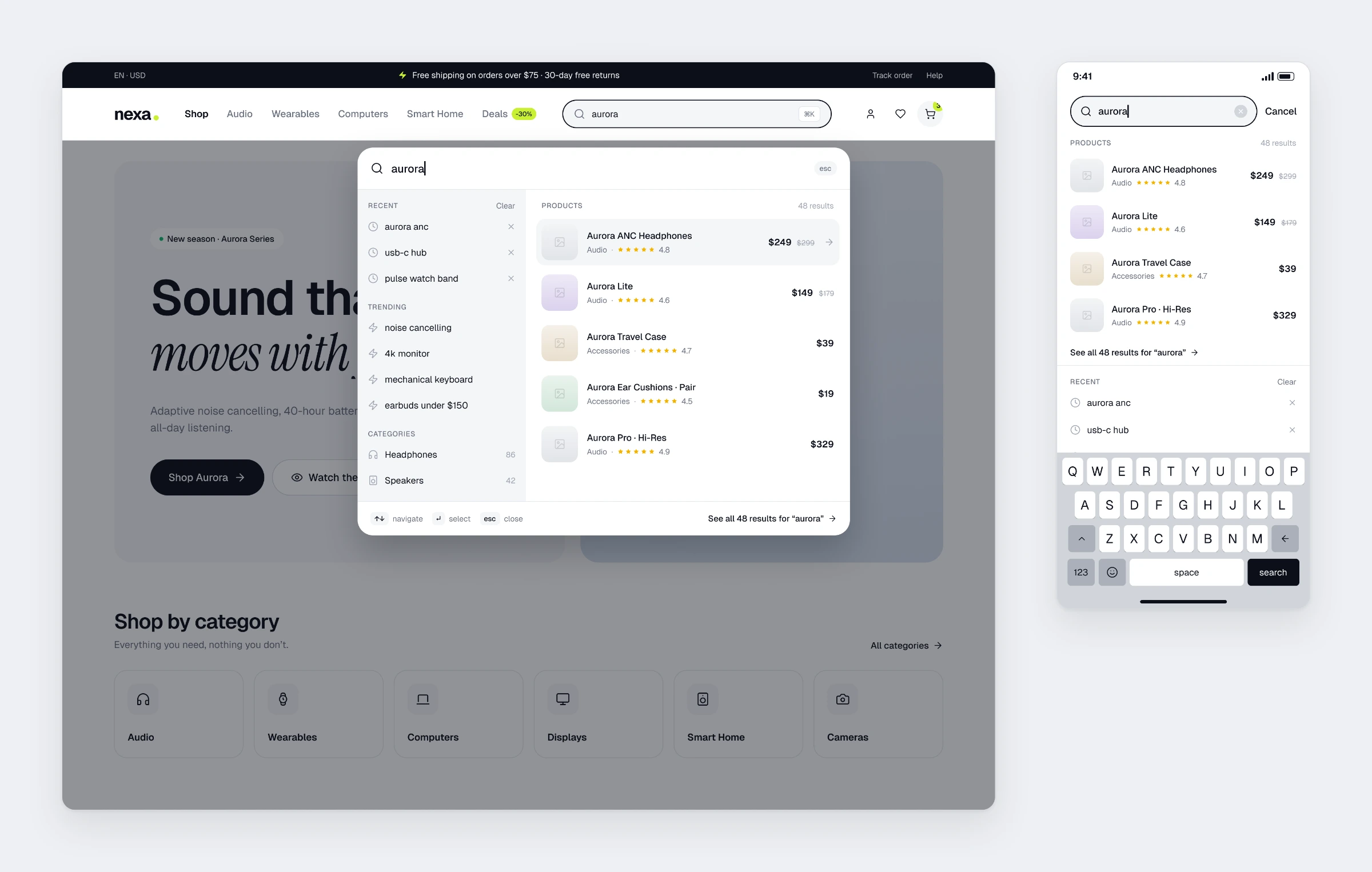
Search
A search panel that opens with a keyboard shortcut. Recent searches, trending terms and product suggestions appear together.
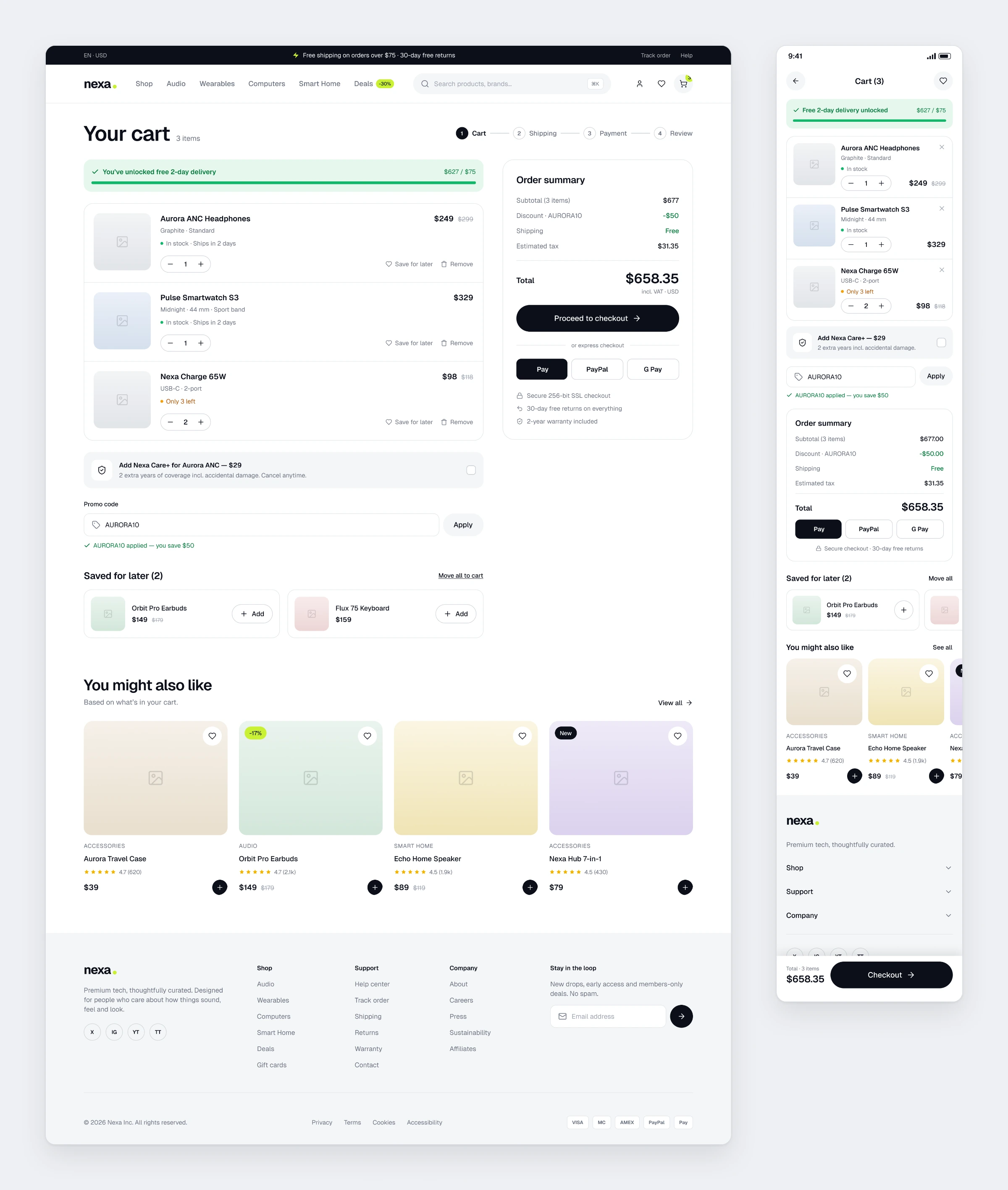
Cart
A free shipping progress bar, a coupon field and a protection add-on. The order summary and express payment sit on the right.
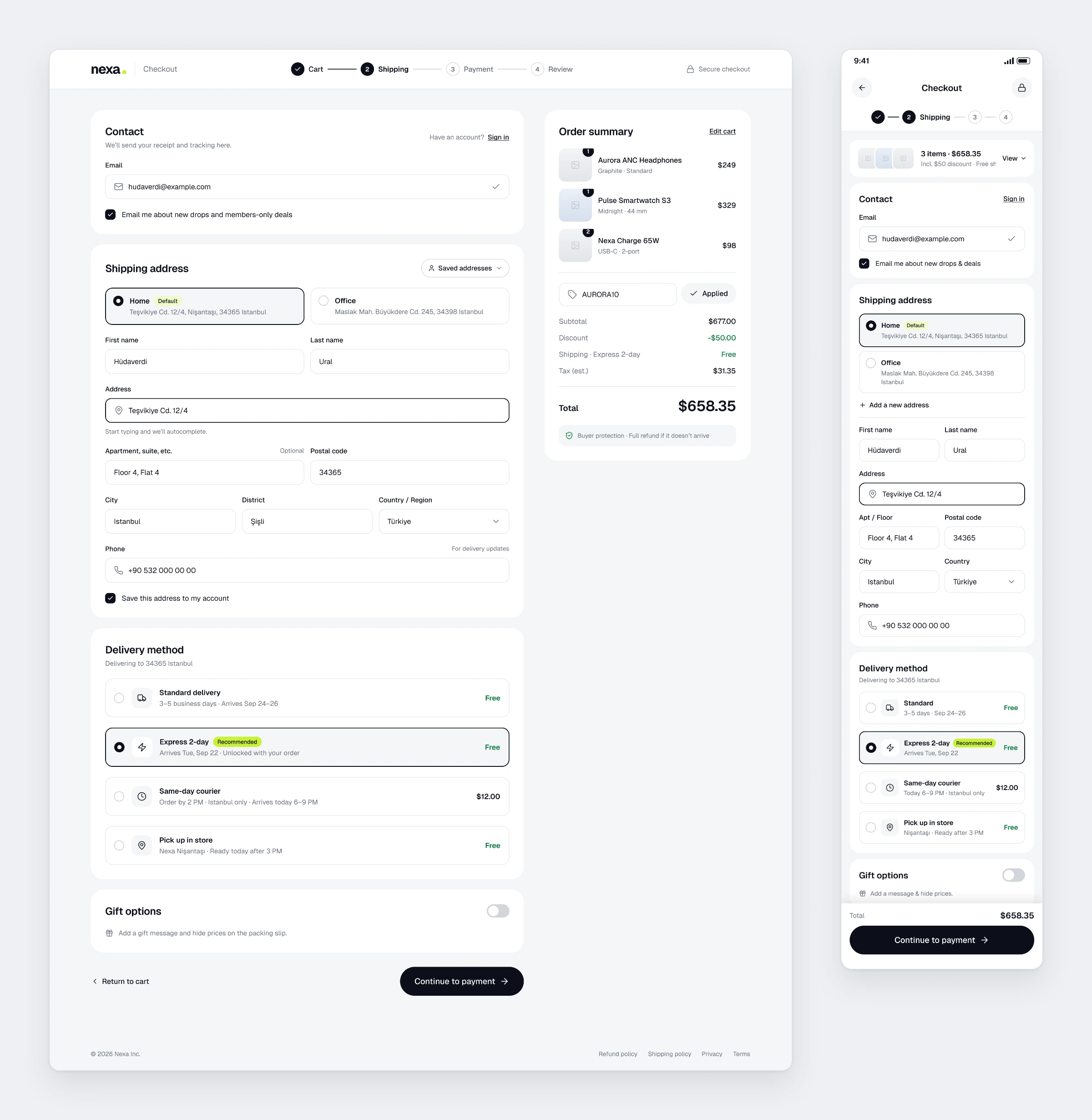
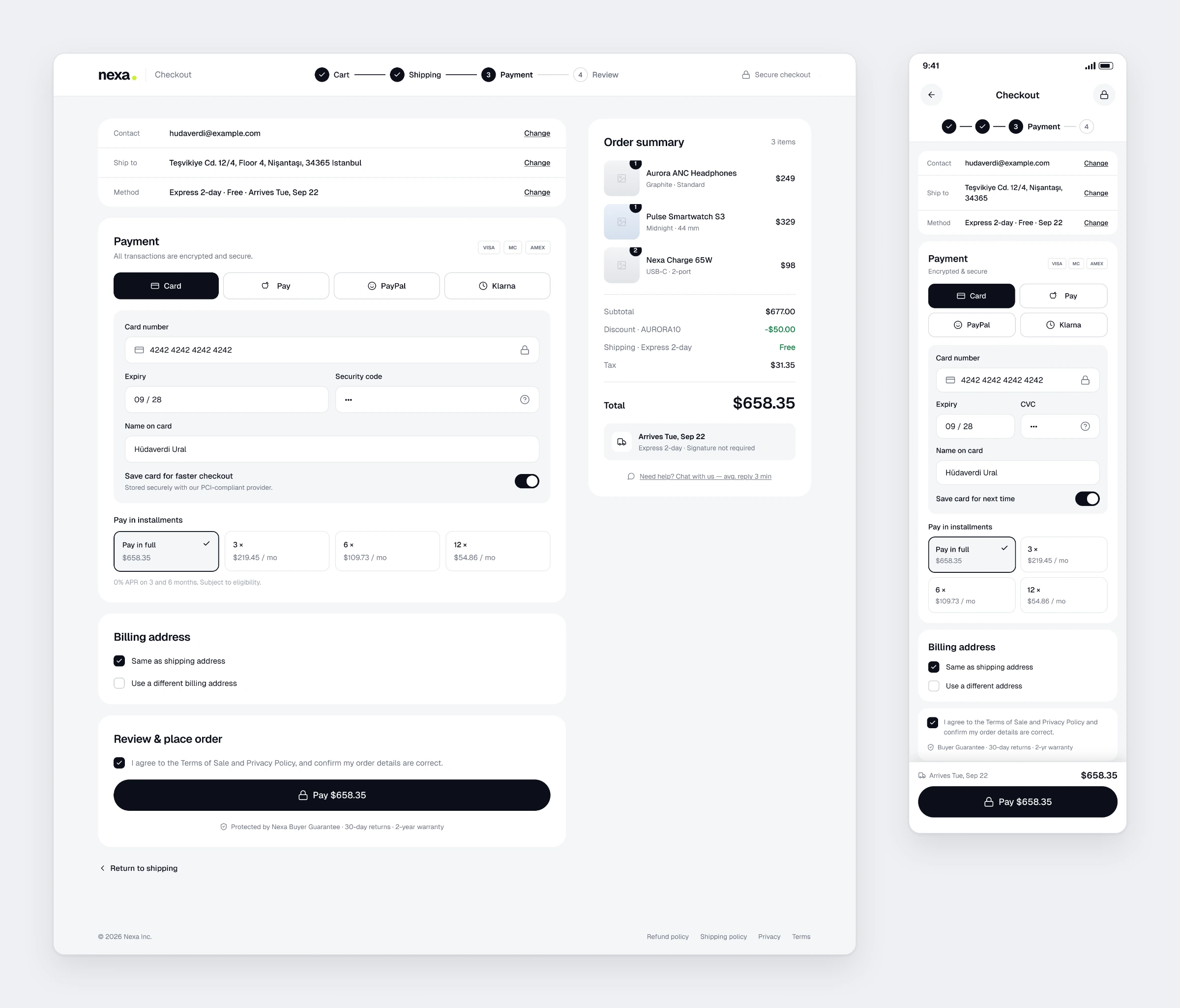
Checkout
Saved addresses, delivery options and the card form are split into two steps. Installment options live in the payment step.
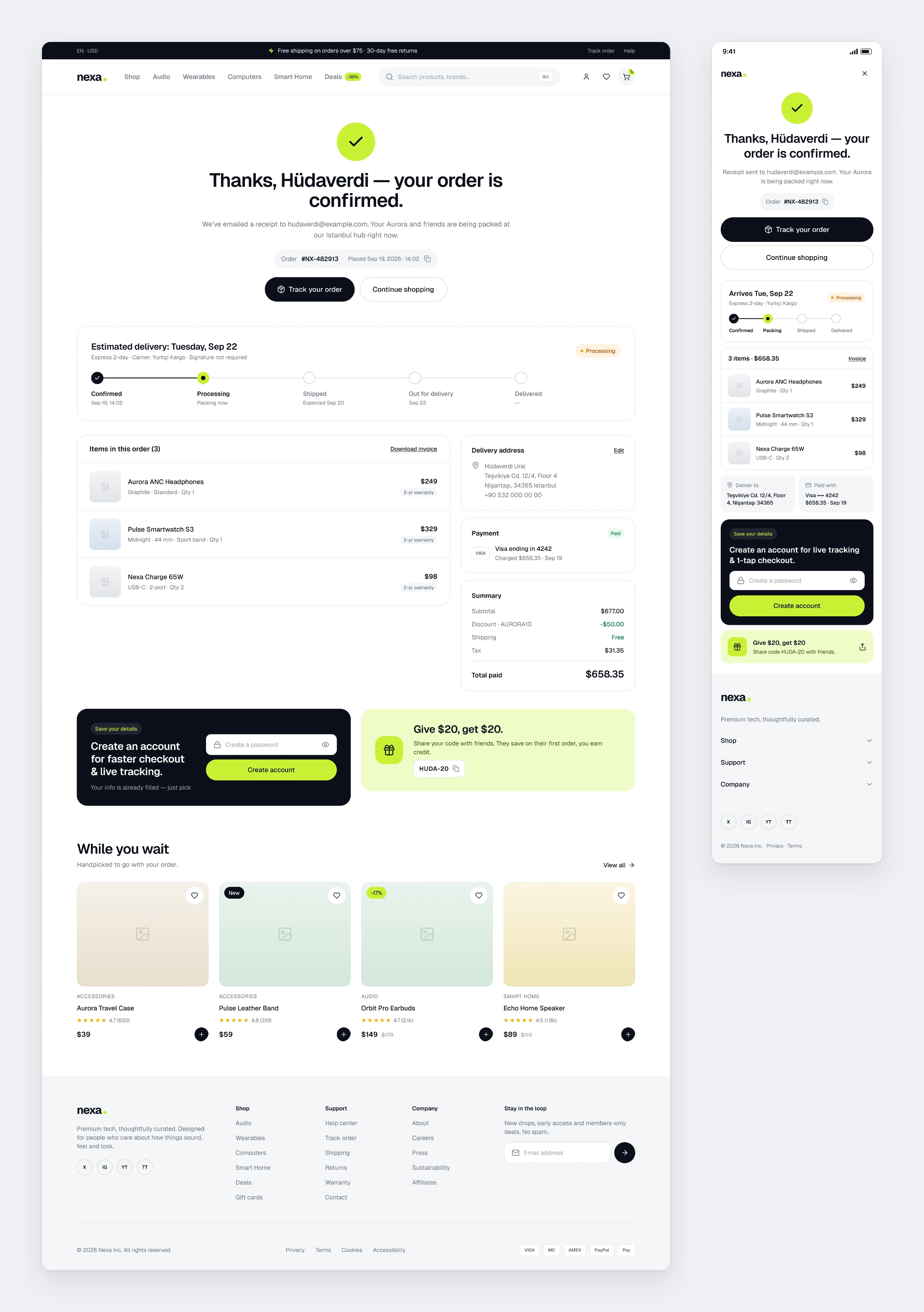
Order Confirmation
The confirmation does more than say thanks. It carries the shipping timeline and an offer to create an account.
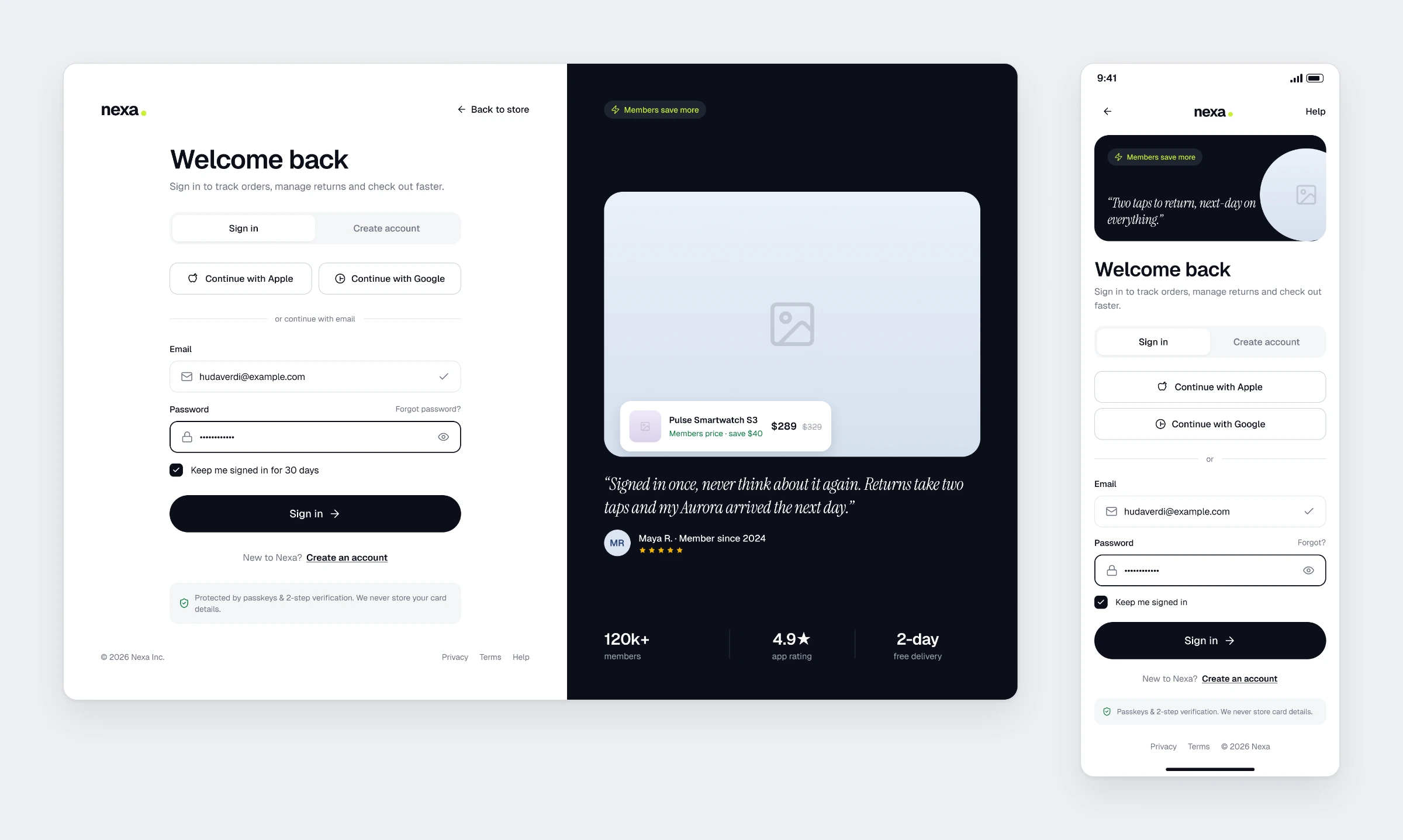
Sign In
Social login, email and password. The right panel carries member perks and a customer quote.
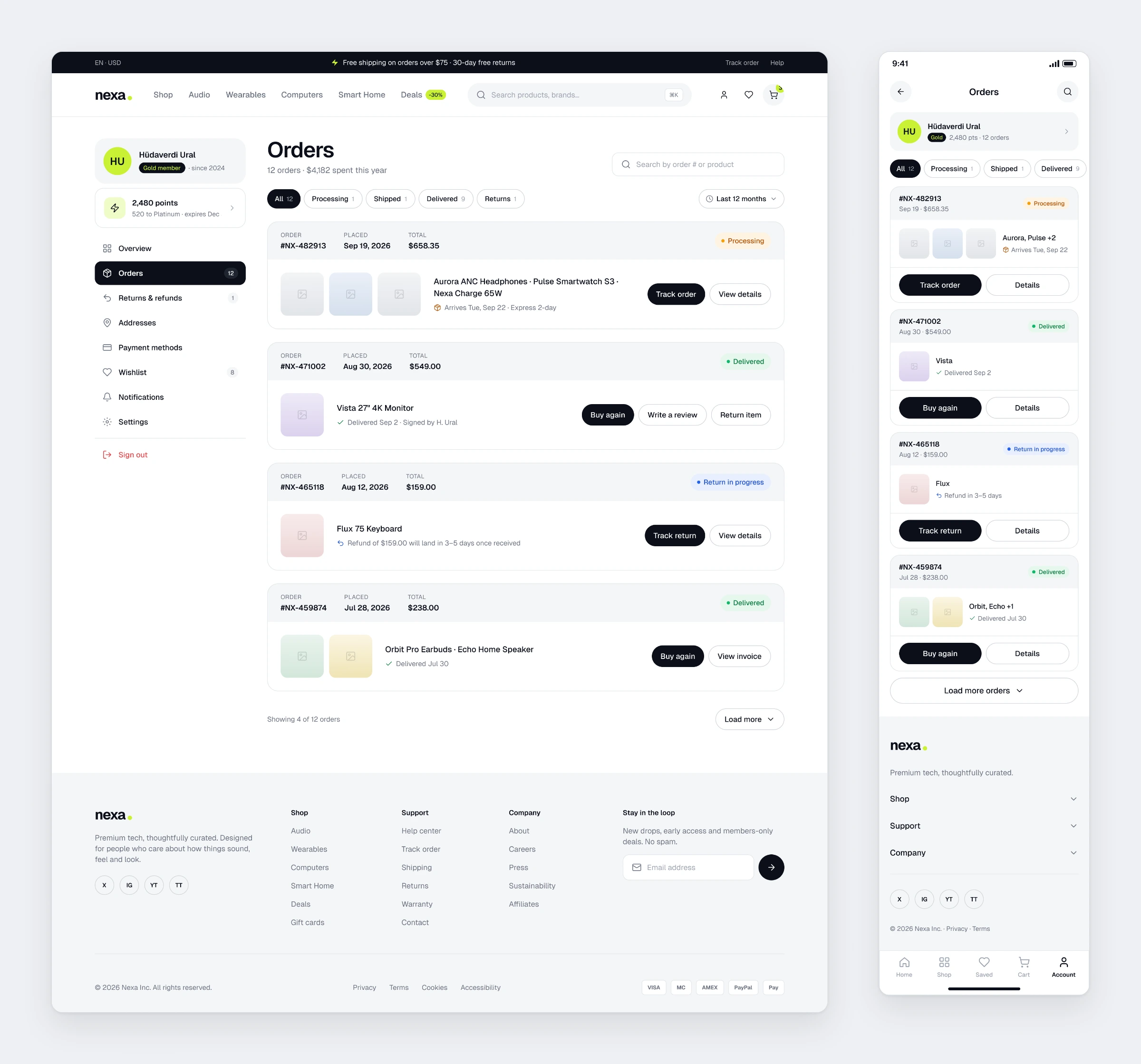
Account and Orders
Order history filtered by status. Each card offers tracking, invoice and buy again actions.
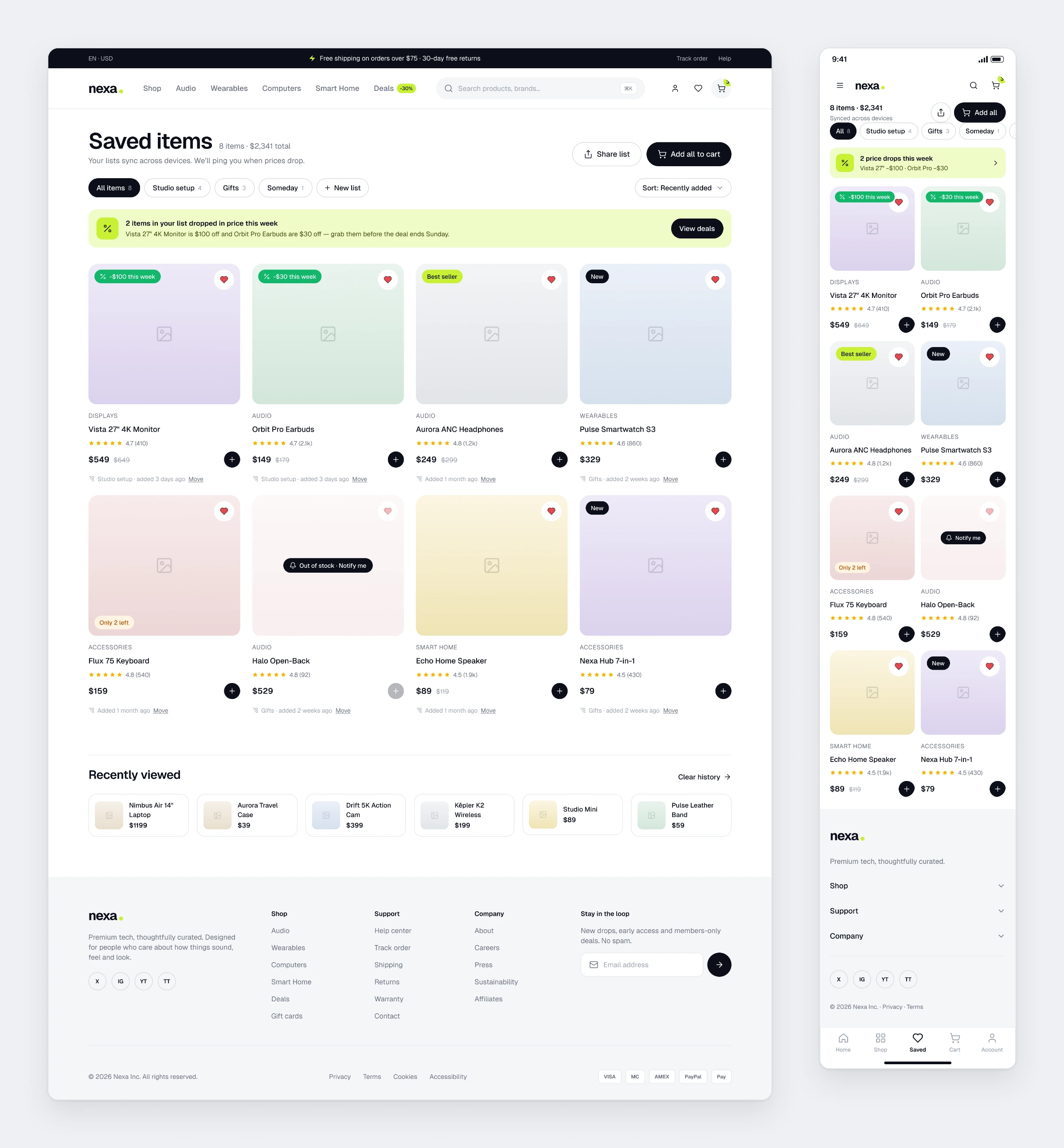
Wishlist
Lists, price drop alerts and a notify option for items that are out of stock.
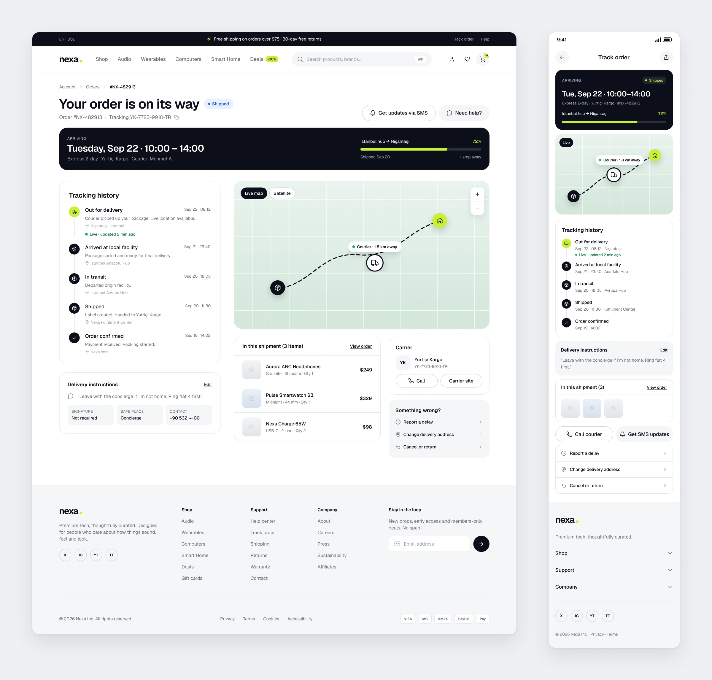
Order Tracking
A live map, step-by-step history and a way to reach the courier. The delivery note can be edited.
Outcome
The real work in Nexa was consistency. Twelve flows across two platforms came out as 24 screens, and holding one visual language steady across all of them is harder than designing any single screen. Thinking about mobile and desktop in parallel from the start, rather than adapting one into the other afterwards, was the lesson.