Product Designer
Handoff
Agency work, from brief to sign off.
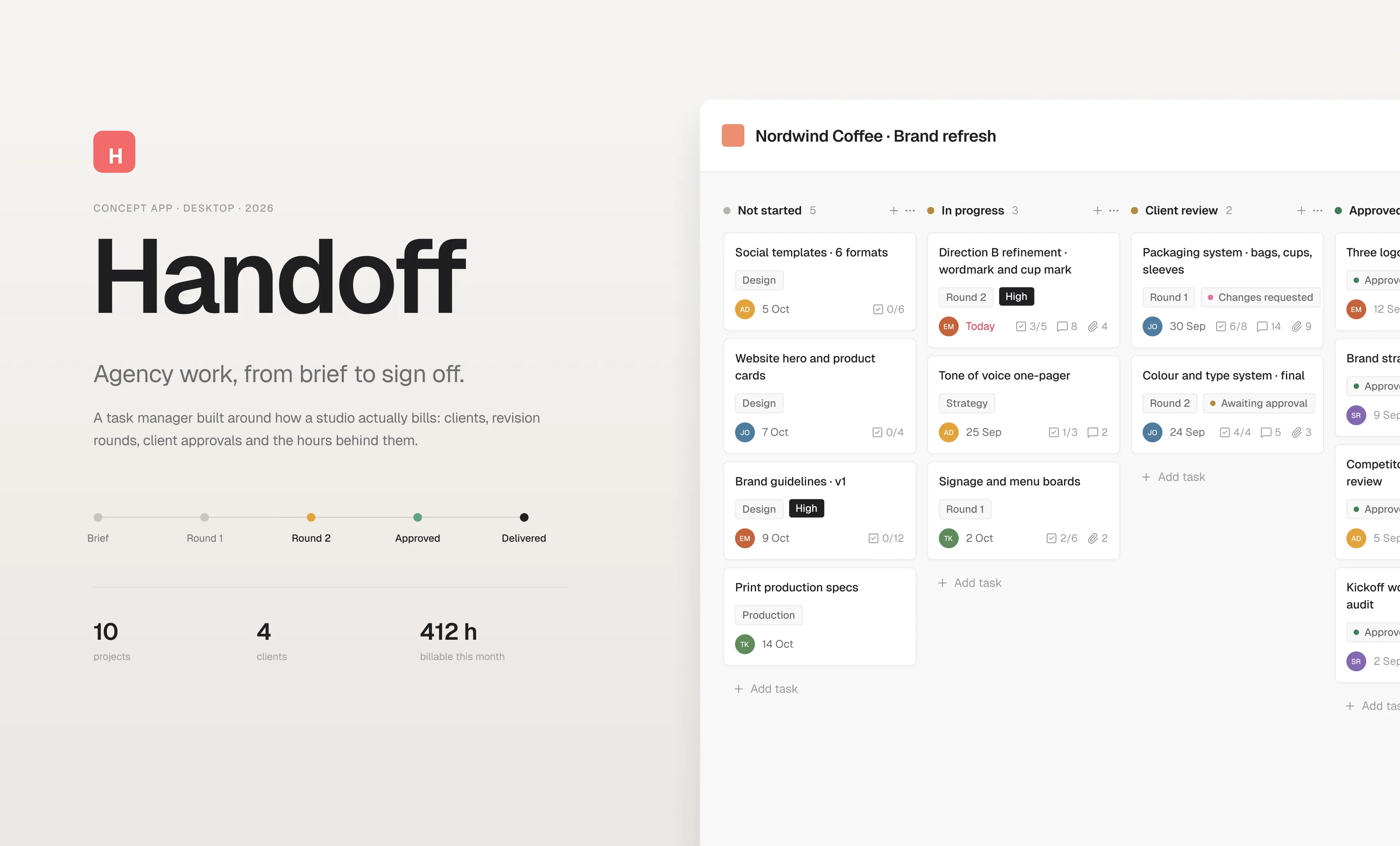
A desktop work manager for a design studio. Clients, revision rounds, client approvals and the hours behind them, in an interface that keeps the skeleton people already know and carries its own identity.
Overview
Studios rarely lose money on the design work. They lose it between the rounds: a comment that never became a task, a third revision nobody agreed to, an approval that sat unanswered for six days. Handoff is a task manager built around those gaps. It keeps the shape of the tool teams already use, and adds the four things a studio actually bills on: which round a deliverable is in, whether the client has decided, how many hours are on it, and what that leaves of the estimate.
The problem and the approach
The work is tracked, the money is not
Every studio already has a board. What the board does not hold is the state the client is in. It says a task is in progress. It does not say the client asked for a third round on Tuesday, that the round was never quoted, and that nineteen hours are logged against a twelve hour estimate.
The second problem is where that information lives. It arrives by email, gets repeated in a call and ends up in somebody’s head. When the invoice goes out at the end of the month, nobody can point at the moment the scope changed.
A familiar skeleton, a studio’s fields
The structure is deliberately familiar: projects in a left rail, view tabs across the top, dense forty pixel rows, a task panel that opens over the list. Nothing asks a team to relearn how to work. The new thinking sits in the columns, not in the navigation.
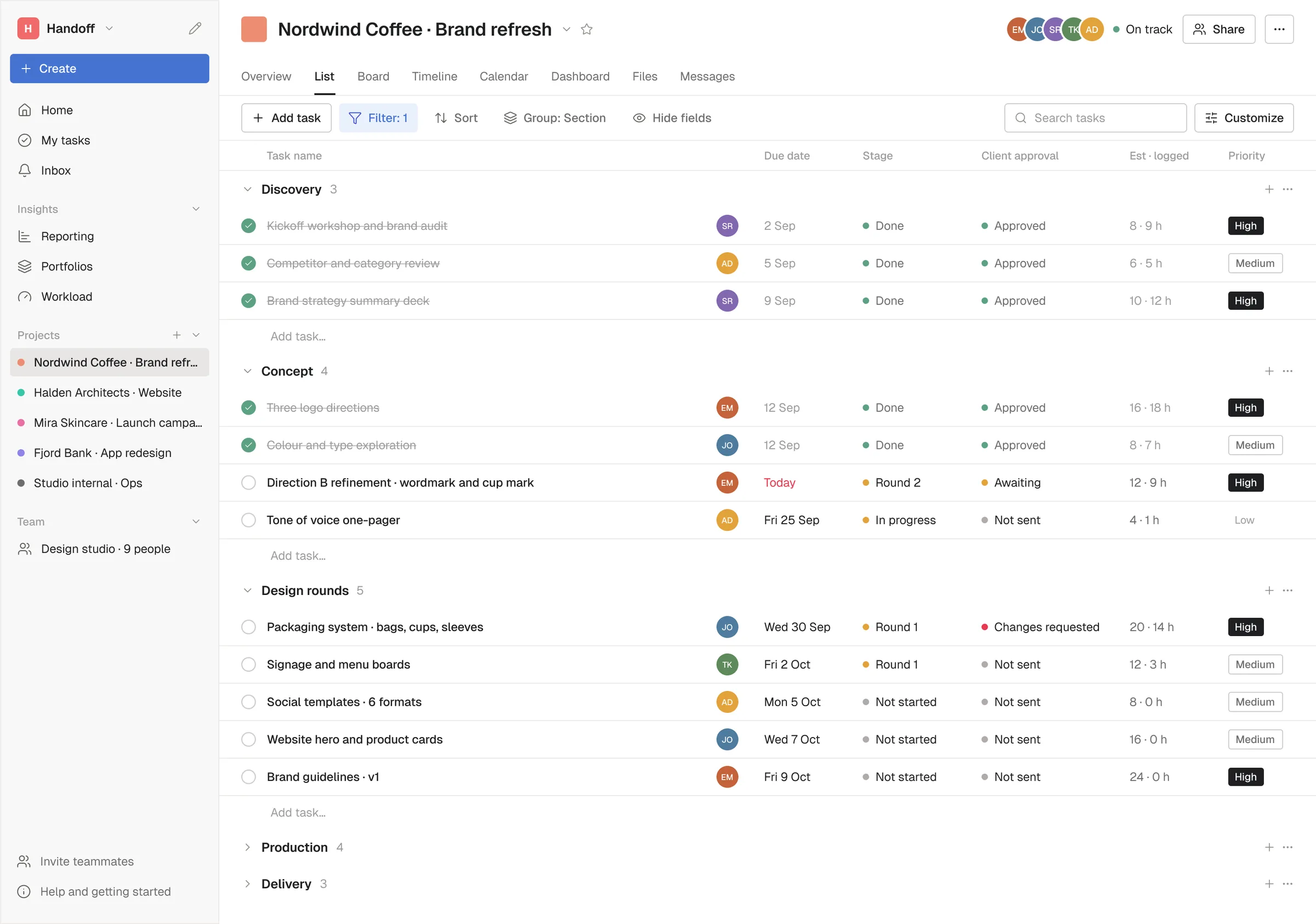
Every task carries its round, its client approval, its estimate and its logged hours. Those four fields roll up into the board, the dashboard and the portfolio, so the question of whether the project is still inside the fee has an answer on every screen instead of at the end of the month.
Design system
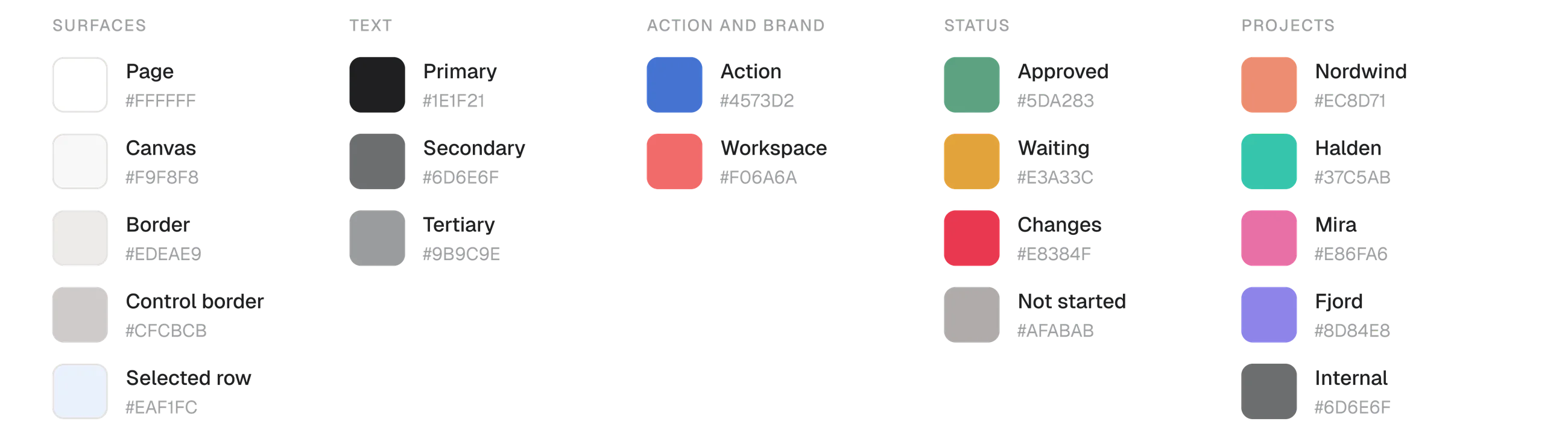
One typeface, one accent, and a palette that saves colour for meaning. This is a tool that stays open for eight hours, so it had to be quiet at full density: hairlines instead of cards where a card is not needed, and status carried by a small dot and plain words rather than a coloured pill.
Colours
Neutral surfaces do the work. One blue marks the thing you can press, coral appears once in the corner as the workspace mark, and the four status colours are muted on purpose: approved, waiting, changes requested, not started. Project colours are the only place the palette gets loud, and they carry identity, not severity.
Typography
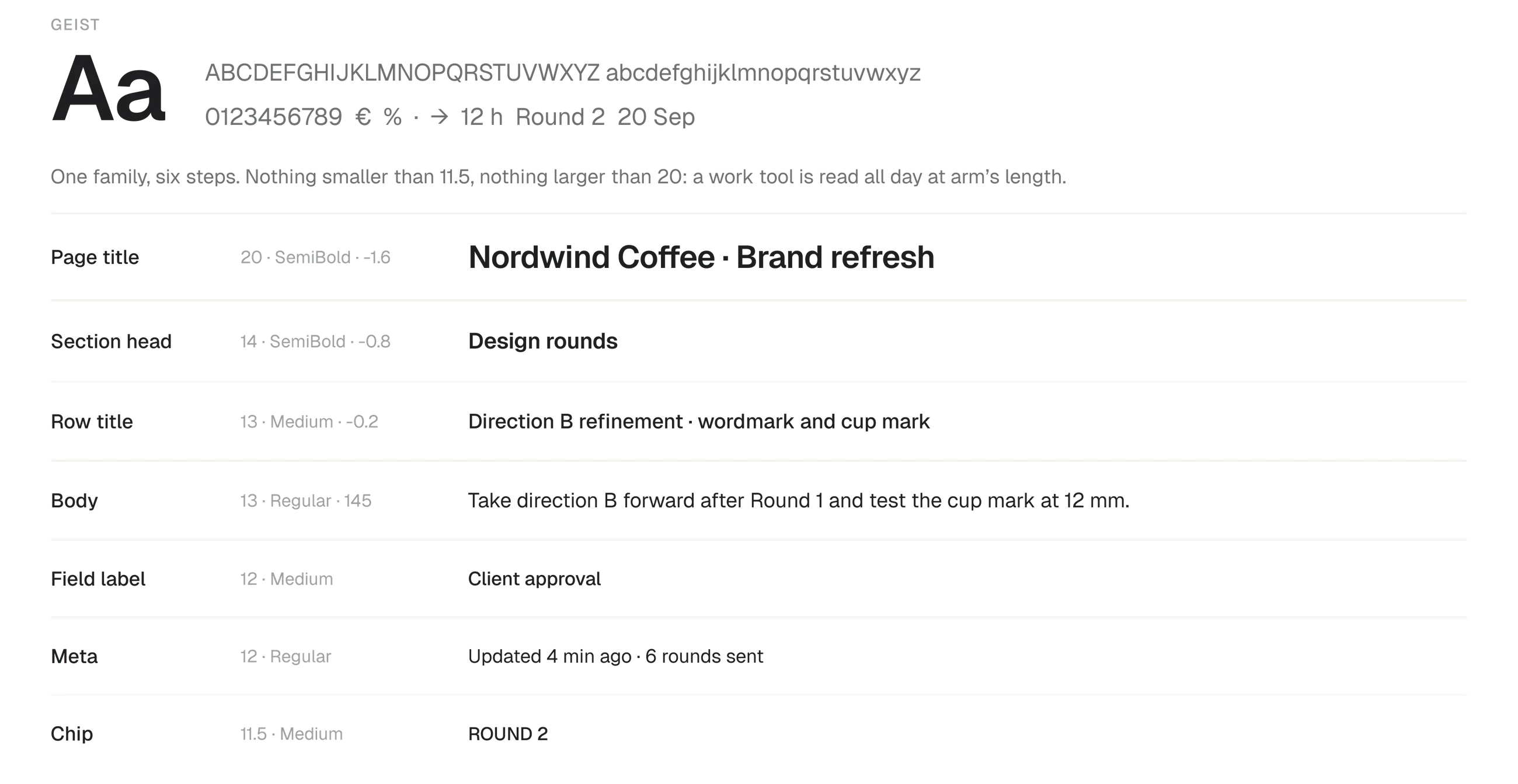
Geist at six sizes, from the twenty pixel project title down to the eleven and a half pixel chip. Nothing larger, because a page title competing with the work is wasted space. Nothing smaller, because a studio reads this all day.
Icons
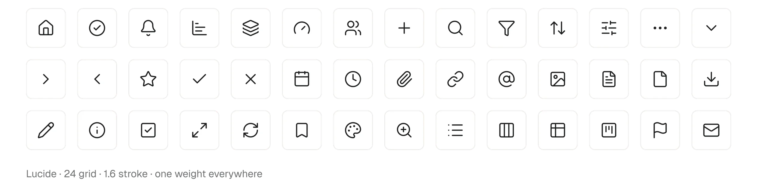
Forty two icons from Lucide, all on a twenty four grid at one weight. A work tool has an icon in almost every row, so the set has to disappear into the interface instead of decorating it.
Components
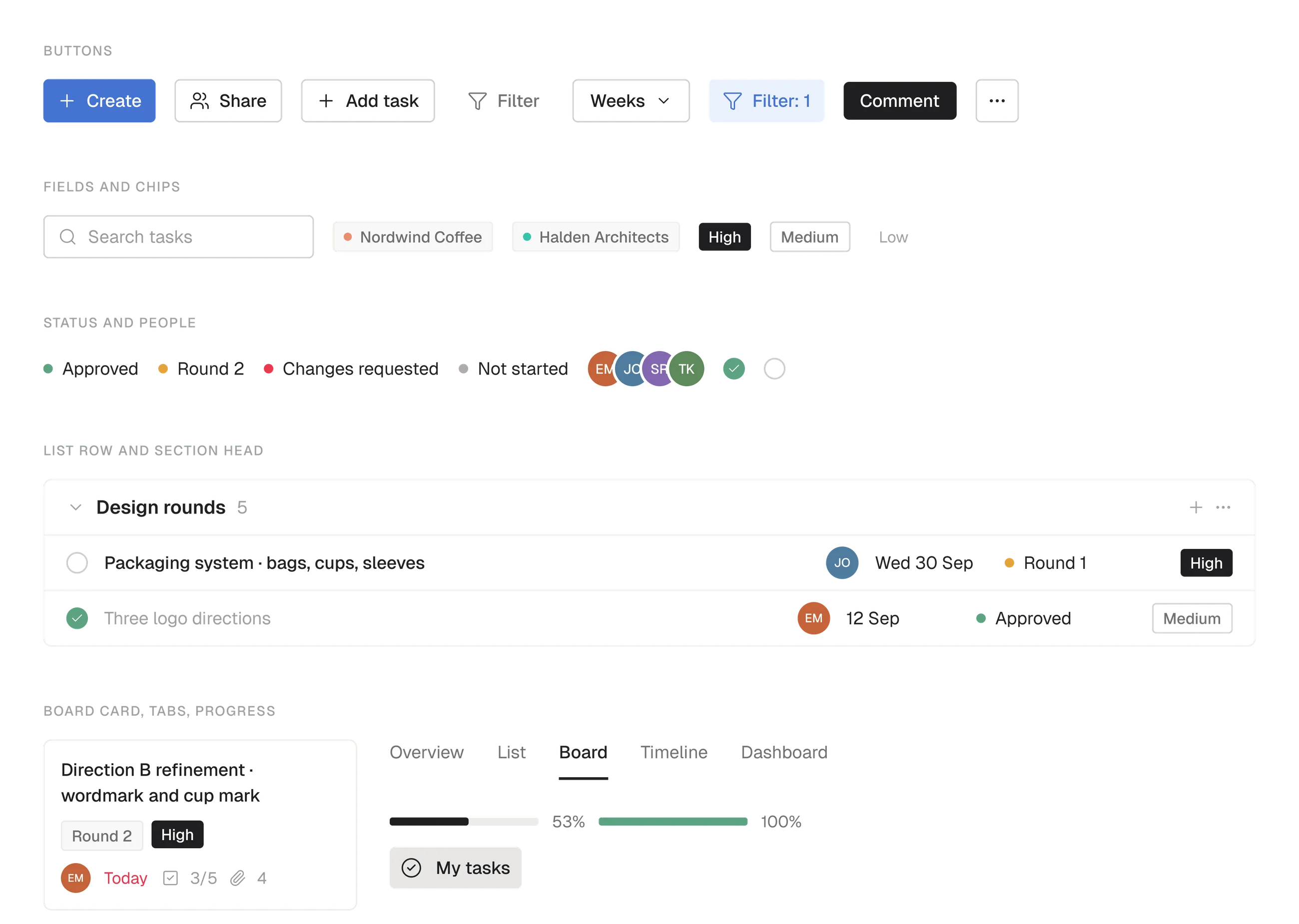
Buttons, chips, priority tags, avatars, the checkbox, the list row, the section head, the board card, the tabs and the progress bar. Eleven parts build all ten screens, which is why the timeline and the portfolio read as the same product as the task list.
Layout and density
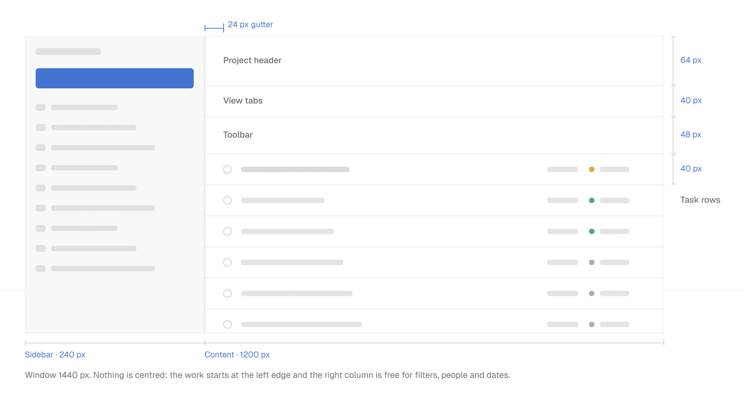
A 240 pixel sidebar, a 1200 pixel content column, a 24 pixel gutter and 40 pixel rows. Nothing is centred: the work starts at the left edge and the right side of the row is kept for what people scan, dates, status and people.
Screens
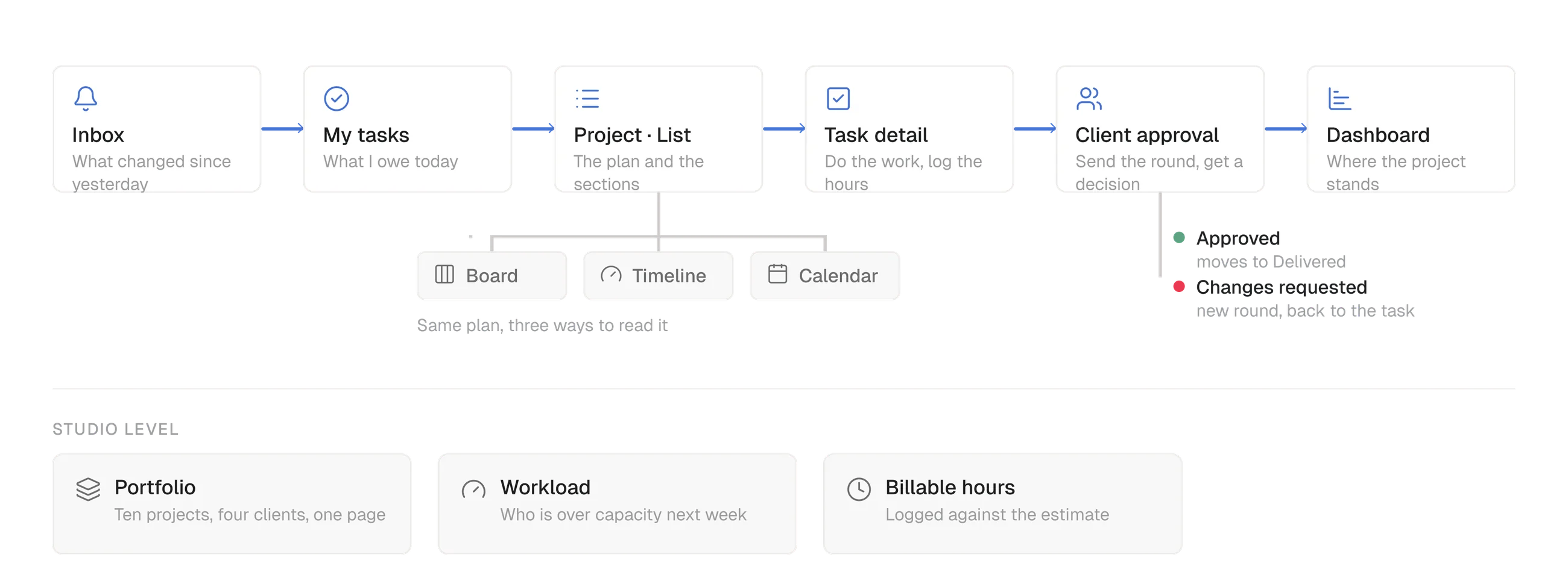
My tasks
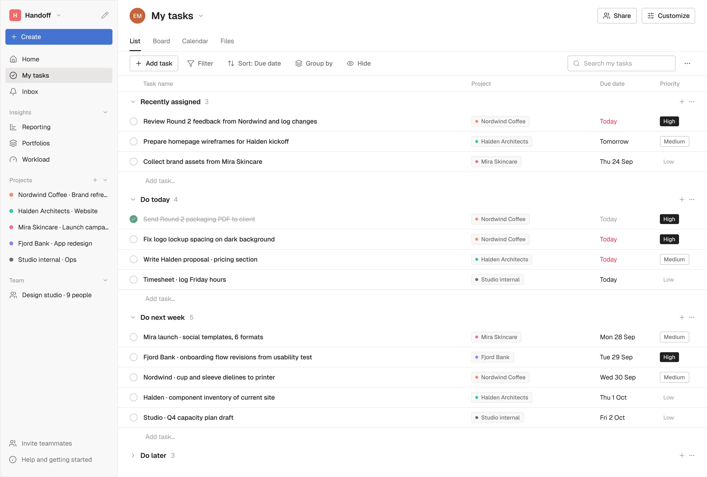
The first screen after login answers one question: what do I owe, and when. Tasks are grouped by when they are due rather than by project, every row carries the client it belongs to, and the only colour in the list is on a date that has run out.
Project list
The plan for one client. Sections follow the way studio work actually moves, from discovery and concept through design rounds, production and delivery. The columns are the studio’s rather than a generic tool’s: which round the deliverable is in, whether the client has approved it, and the estimate against the hours logged.
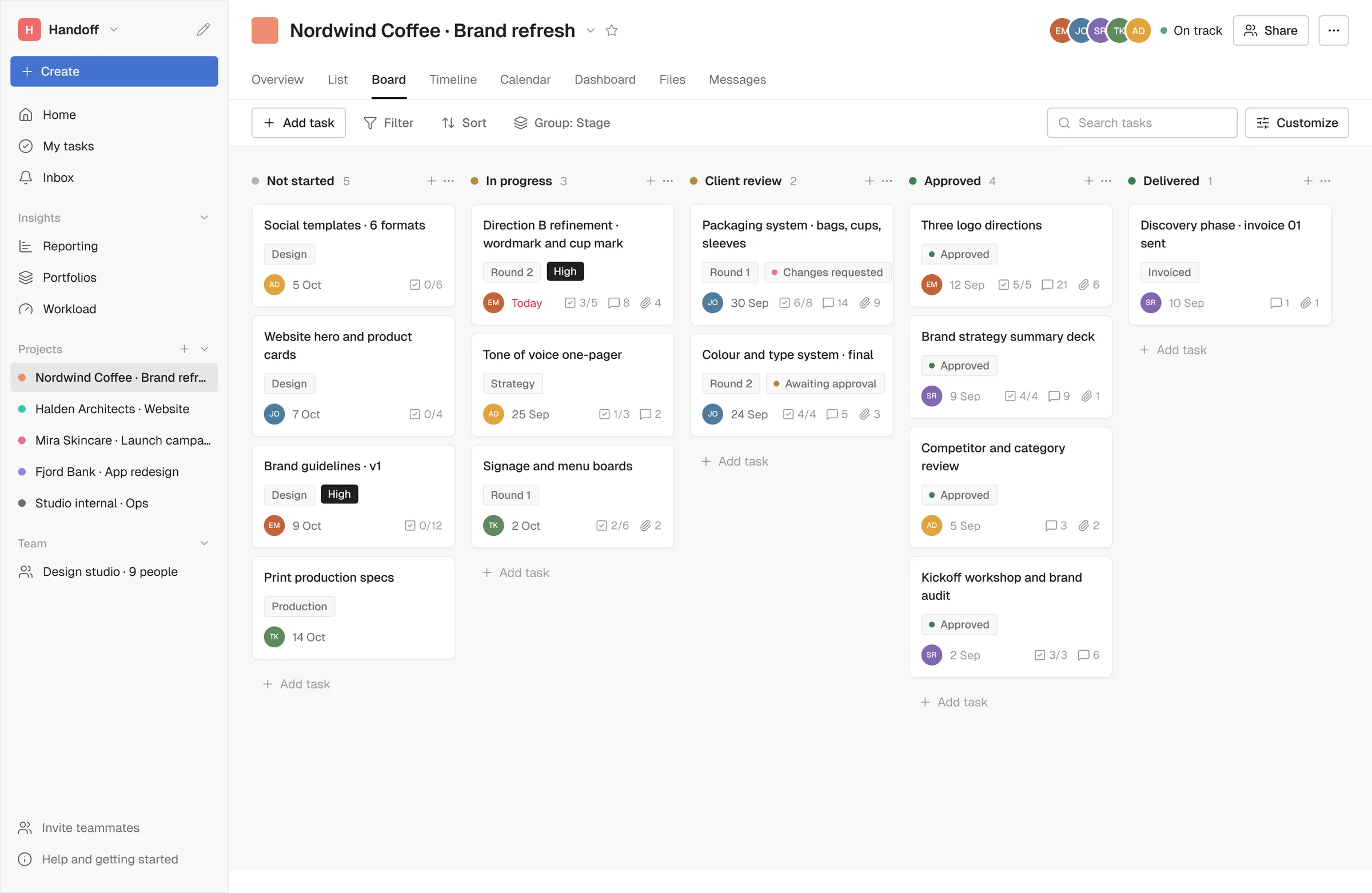
Board
The same tasks as a pipeline, from not started to delivered, with client review as a column of its own because that is where studio work actually waits. A card shows the round, the priority, the date and how many subtasks are done, which is enough to run a stand up from.
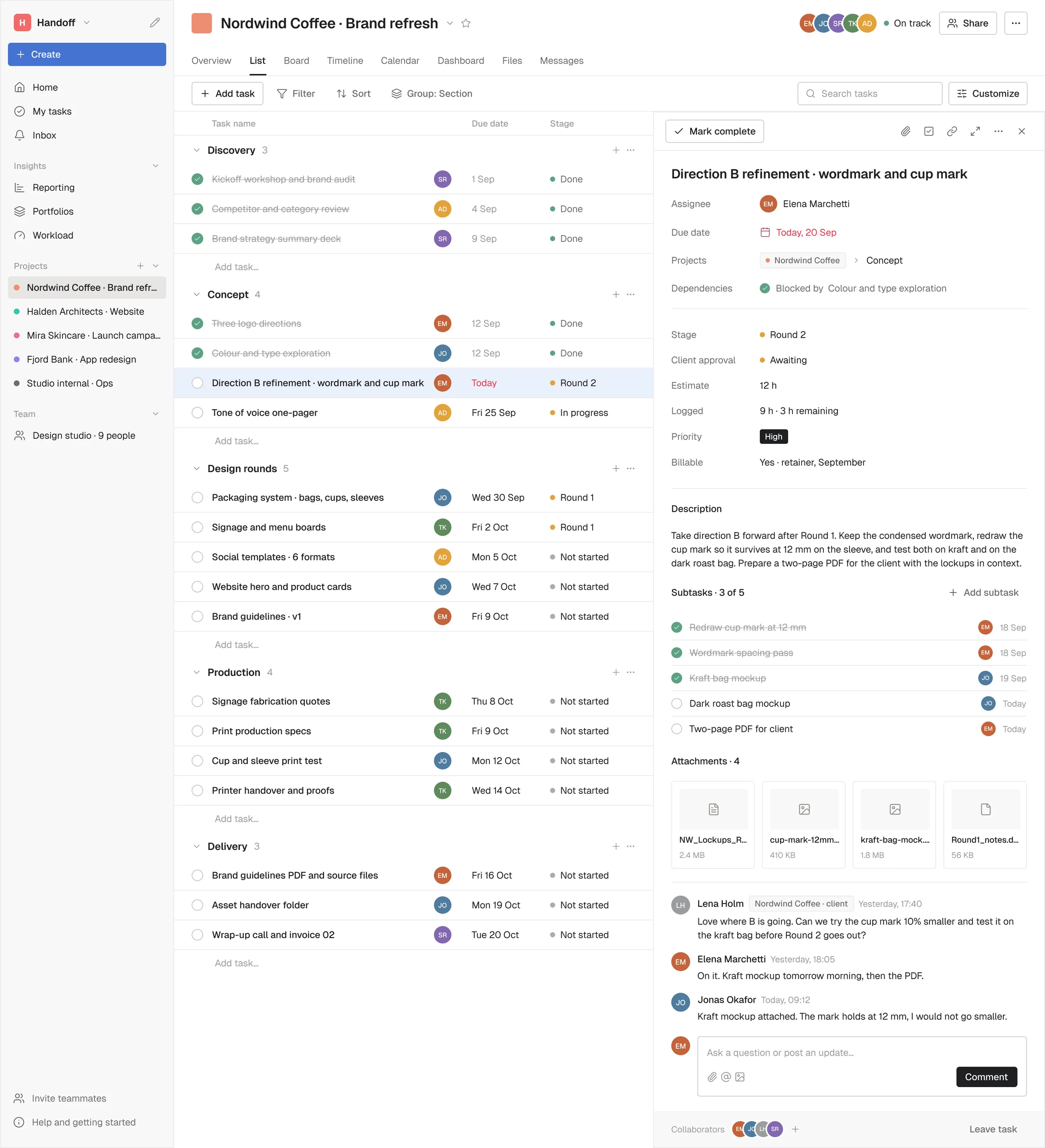
Task detail
The panel opens over the list so nobody loses their place. Above the description sit the fields a studio argues about later: stage, client approval, estimate, hours logged and whether the work is billable. Below it, the client’s comment lives in the same thread as the team’s, so the request and the answer stay in one place.
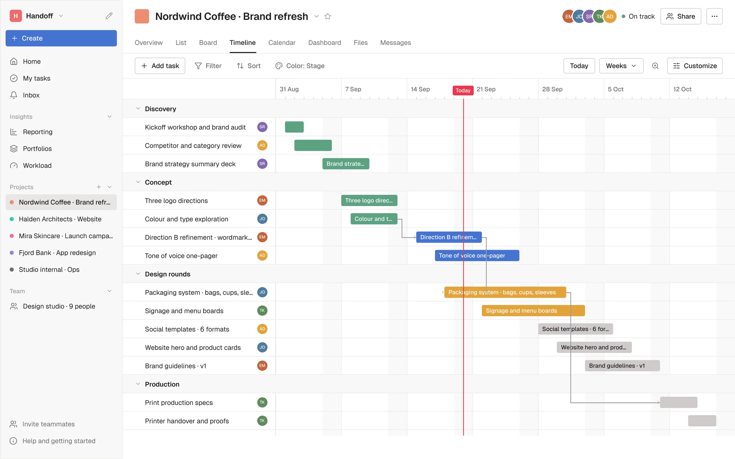
Timeline
The rounds laid over the weeks with the dependencies drawn between them. It exists for the scheduling question clients ask: if this round slips by a week, what else moves.
Calendar
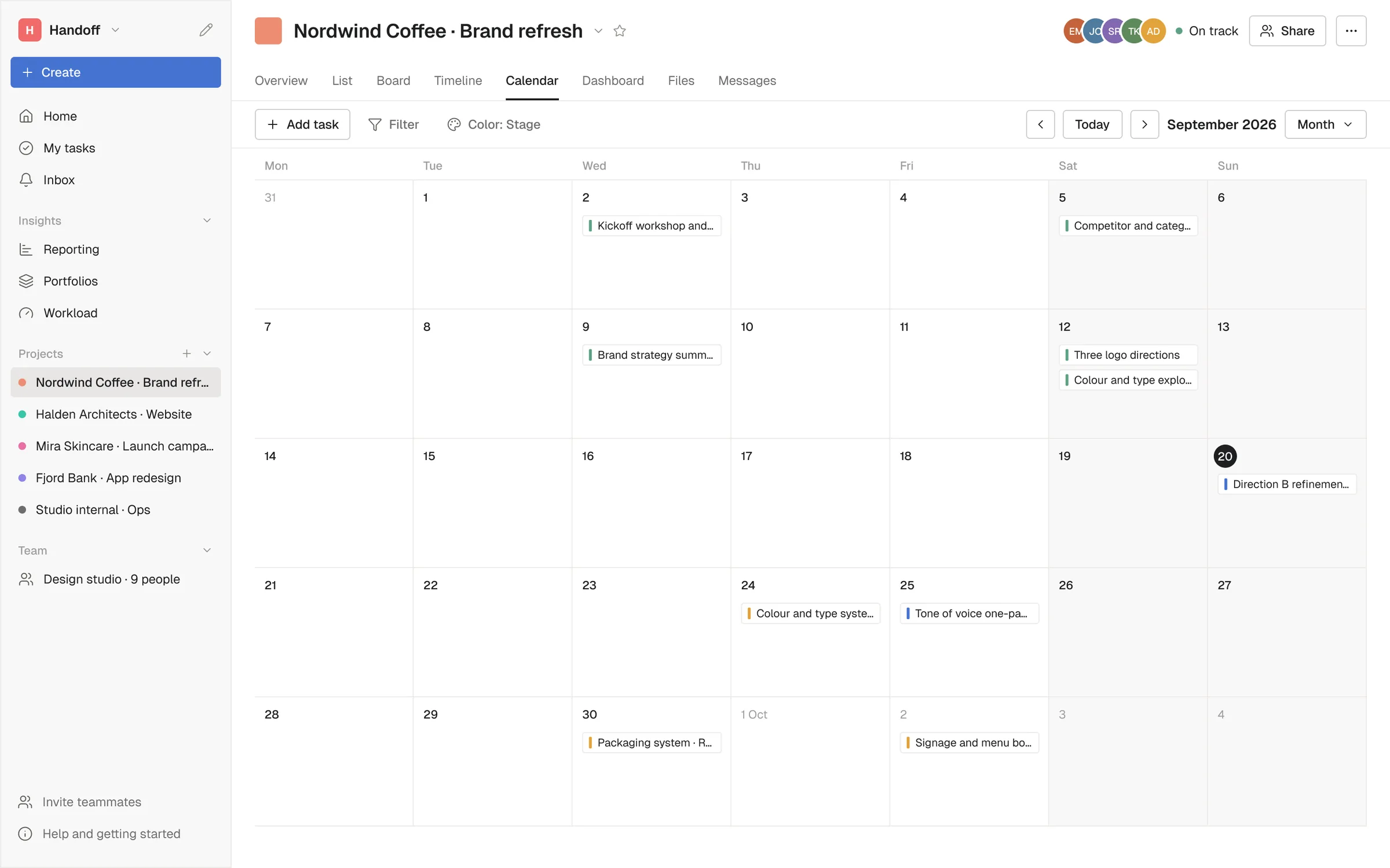
The month, for the people who think in dates rather than lists. Deadlines, review dates and sends share one grid, so a week with three client deliveries is visible before it turns into a problem.
Project dashboard
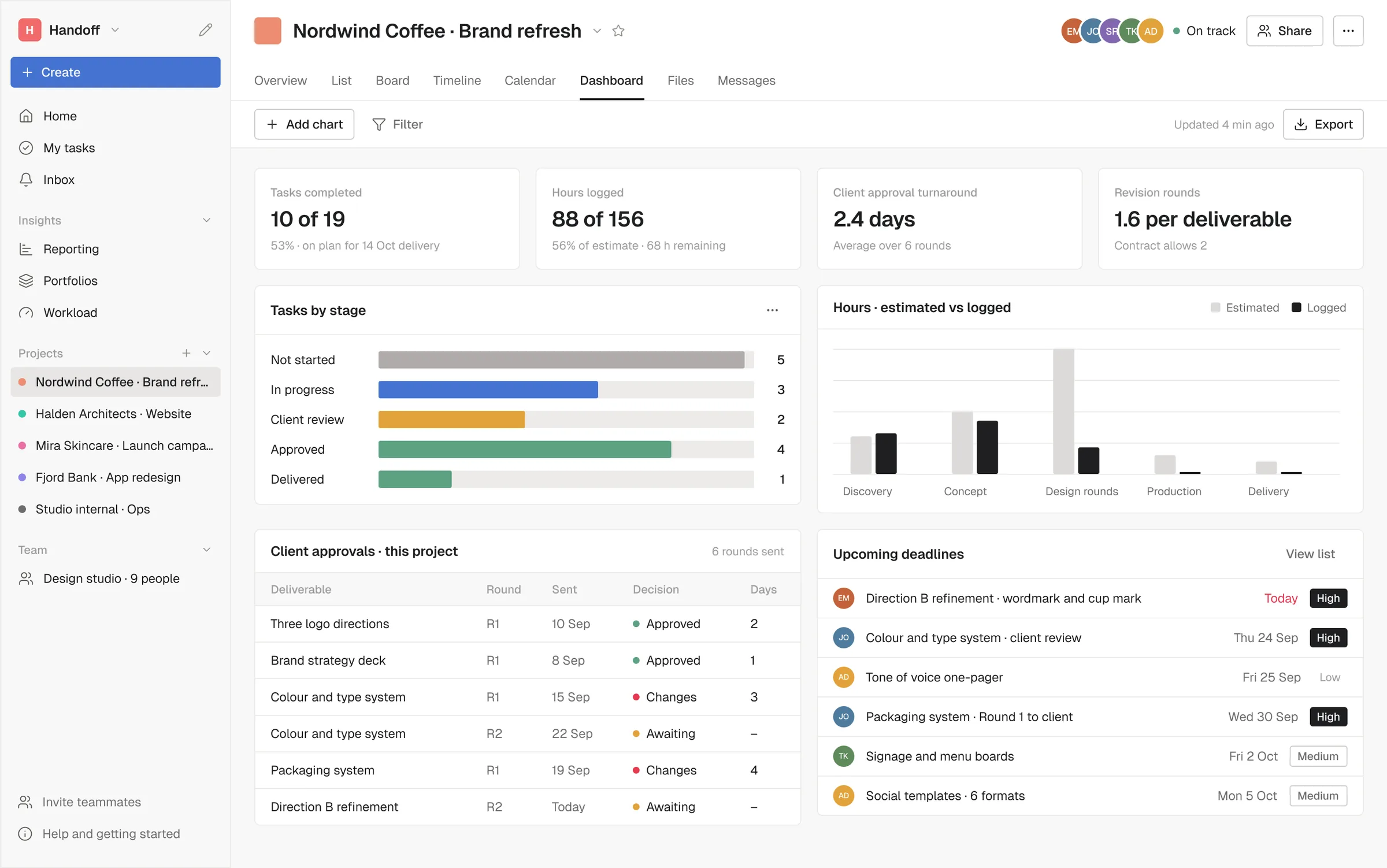
The health of one project in four numbers: tasks completed, hours against estimate, how long the client takes to decide, and how many revision rounds each deliverable is taking. The approvals table underneath is the receipt, what was sent, when, and what came back.
Inbox
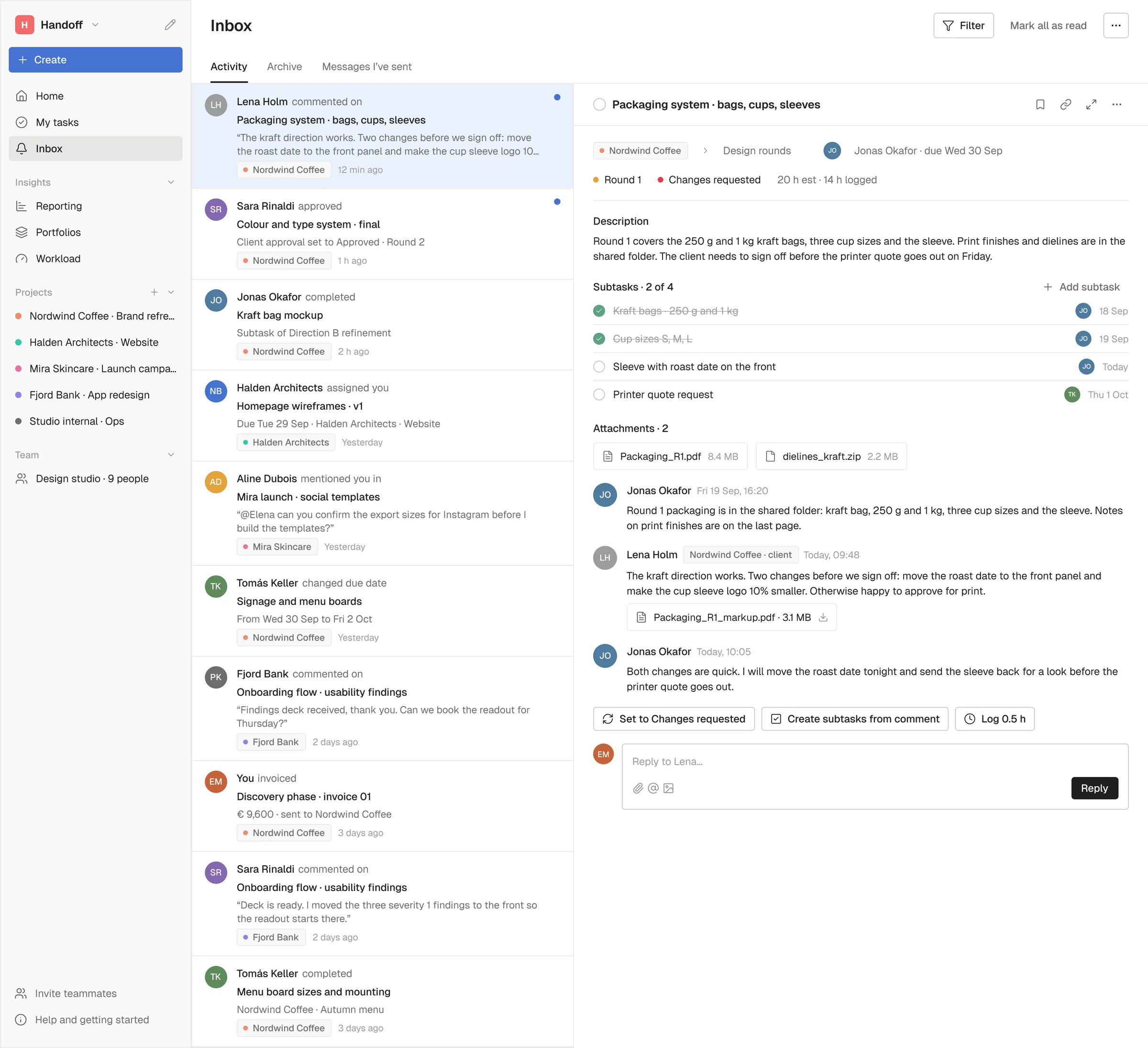
Everything that happened while you were working, in one list: a client comment, an approval, a date that moved. The right side holds the task itself with its thread, so a comment can turn into subtasks or half an hour logged without opening another screen.
Portfolio
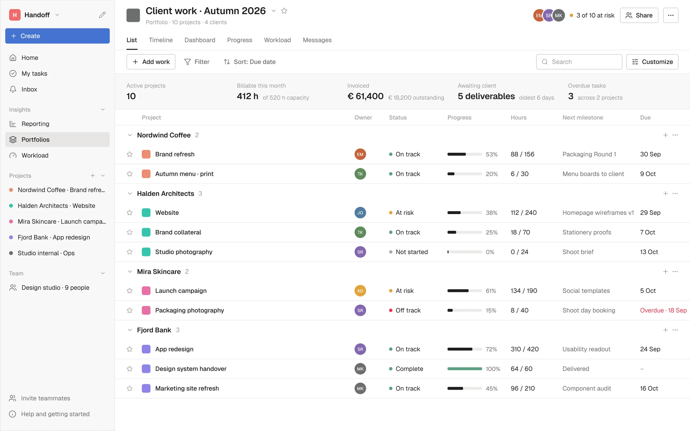
Ten projects and four clients on one page, grouped by client. Owner, status, progress, hours against estimate and the next milestone. This is the view a studio lead opens on Monday morning.
Team workload
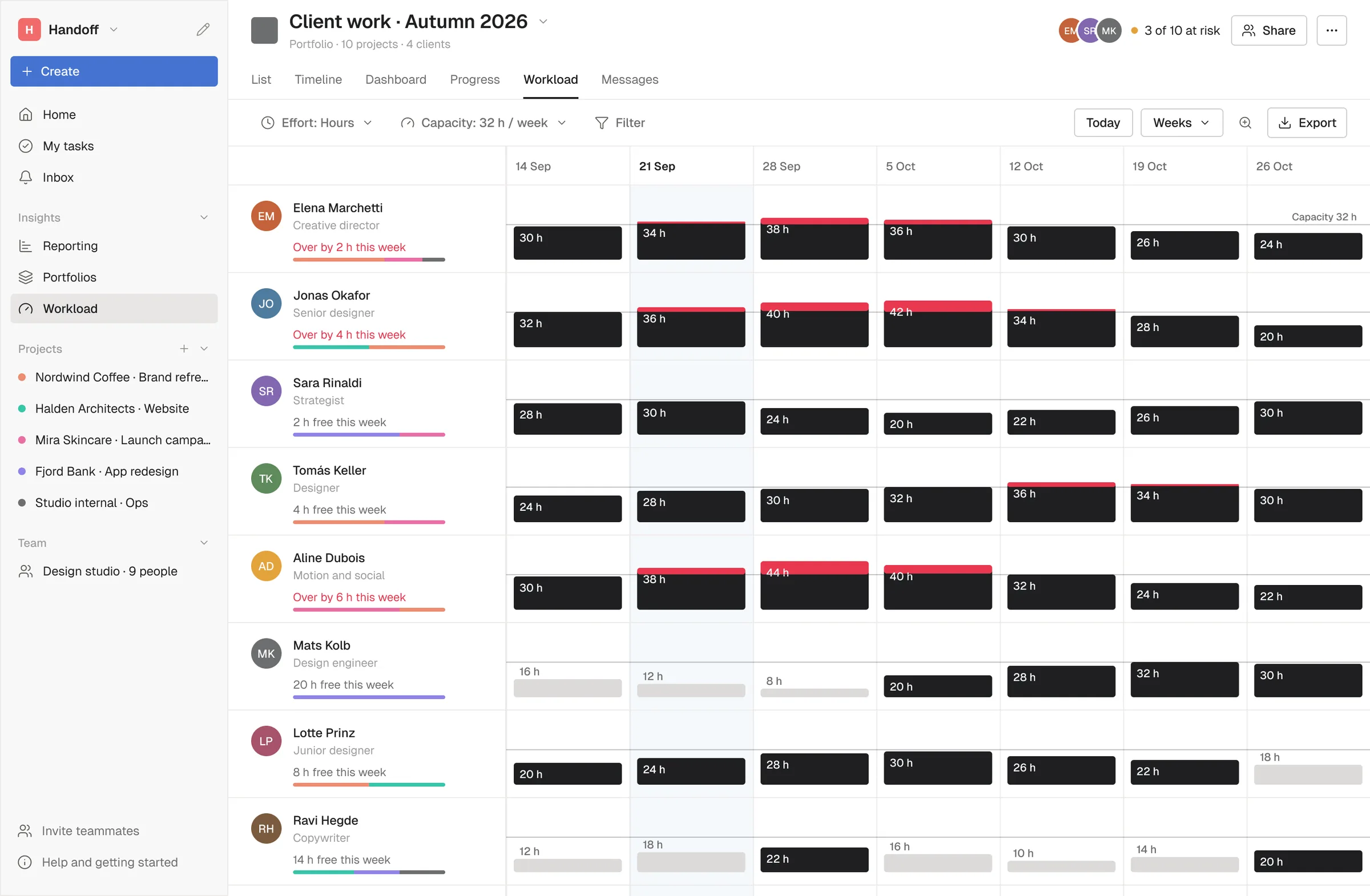
Eight people against a thirty two hour week. The dark bar is planned work and the red part is what goes over capacity, so an overloaded week is visible two weeks before it arrives. Under each name is the split between clients, because too busy usually means too busy on one client.
Outcome
Handoff is a concept project made for my portfolio and is not affiliated with any existing product. Keeping a familiar structure was a deliberate constraint: the difference had to be in what the tool tracks, not in where things sit. What I wanted to find out was whether the parts of agency work that usually live in email, the rounds, the approvals and the billable hours, could move into the task list without making it loud.