Product Designer
Helix
An editorial product concept for an independent science weekly. Twelve screens, from the home page to the reader's saved library, designed for desktop and mobile in parallel. I wanted it to read like a newsroom, not like a feed.
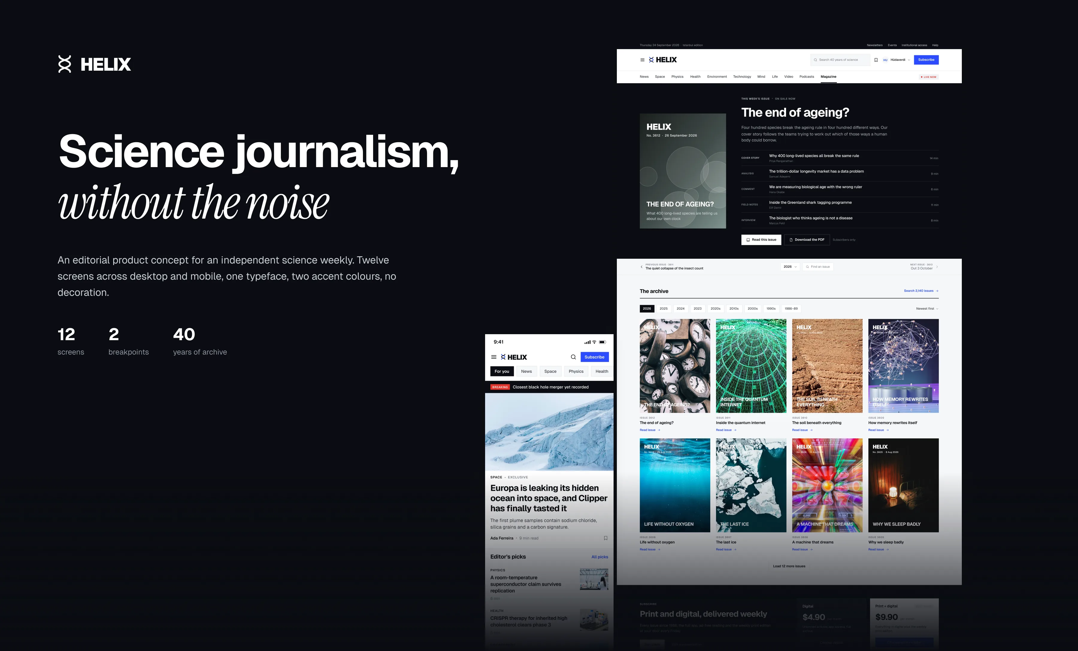
Overview
Science publishing online has started to look like everything else: endless feeds, engagement ranking, headlines written for the algorithm instead of the reader. Helix goes the other way. I kept the system deliberately plain: one typeface, square corners and no card shadows. Hierarchy comes from scale, rule lines and whitespace, so a story about an exoplanet and a story about a drug trial can share a page without fighting. Colour has only two jobs. Blue is for actions and links, red is for live coverage. Type is Geist, with Instrument Serif saved for covers and pull quotes.
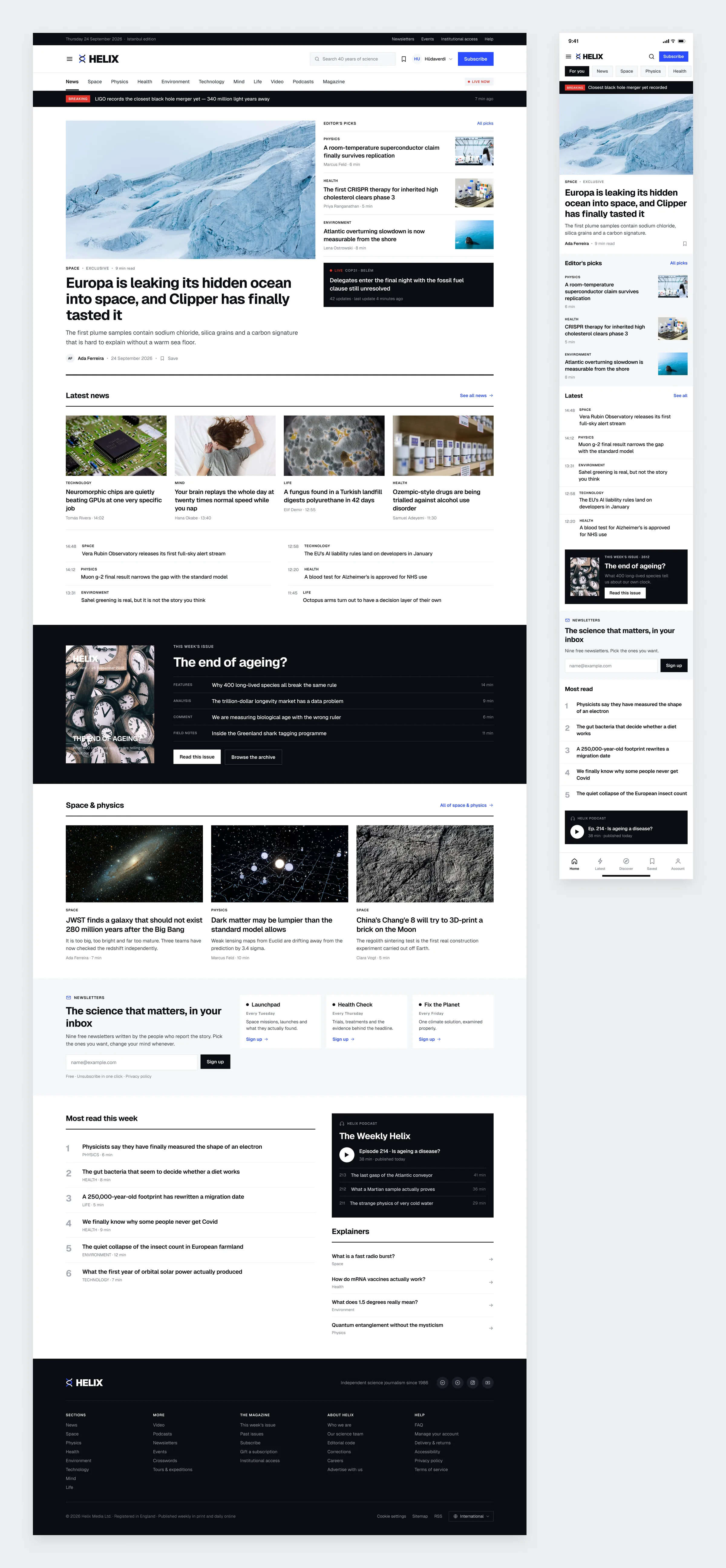
Home
One lead story with the editor's picks beside it, then the latest news, the magazine's cover story and a row for each section. Mobile keeps the same order, just stacked.
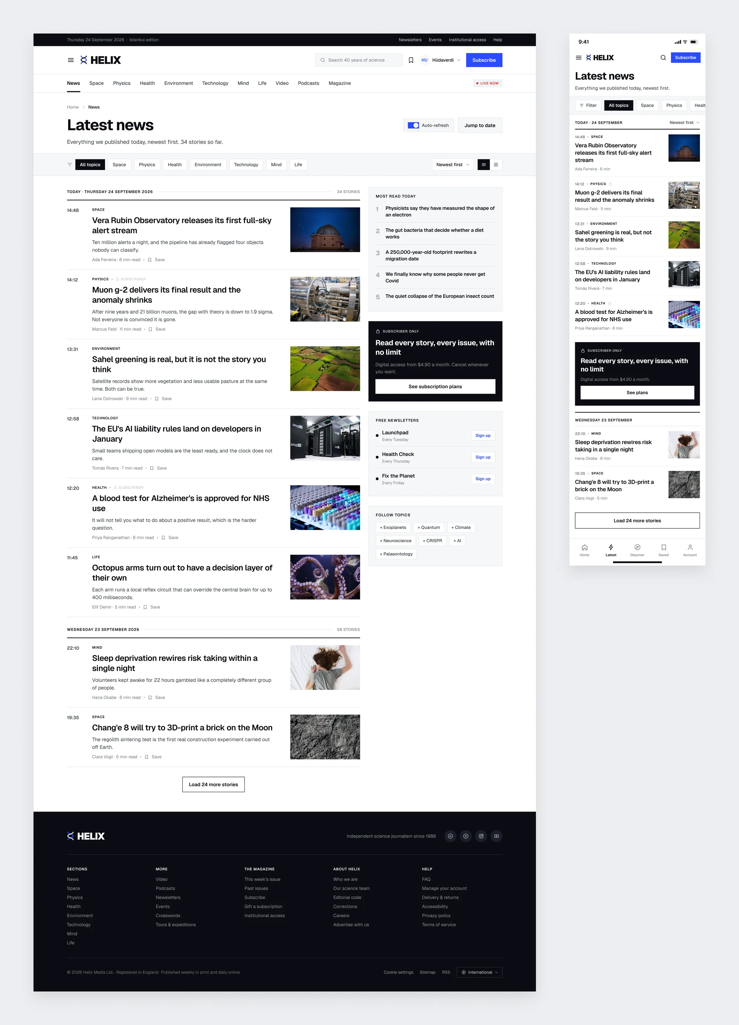
Latest News
A timeline grouped by day, newest first, with the time printed next to every story. Topic filters sit on top, and the right column carries the most read list and the newsletters.
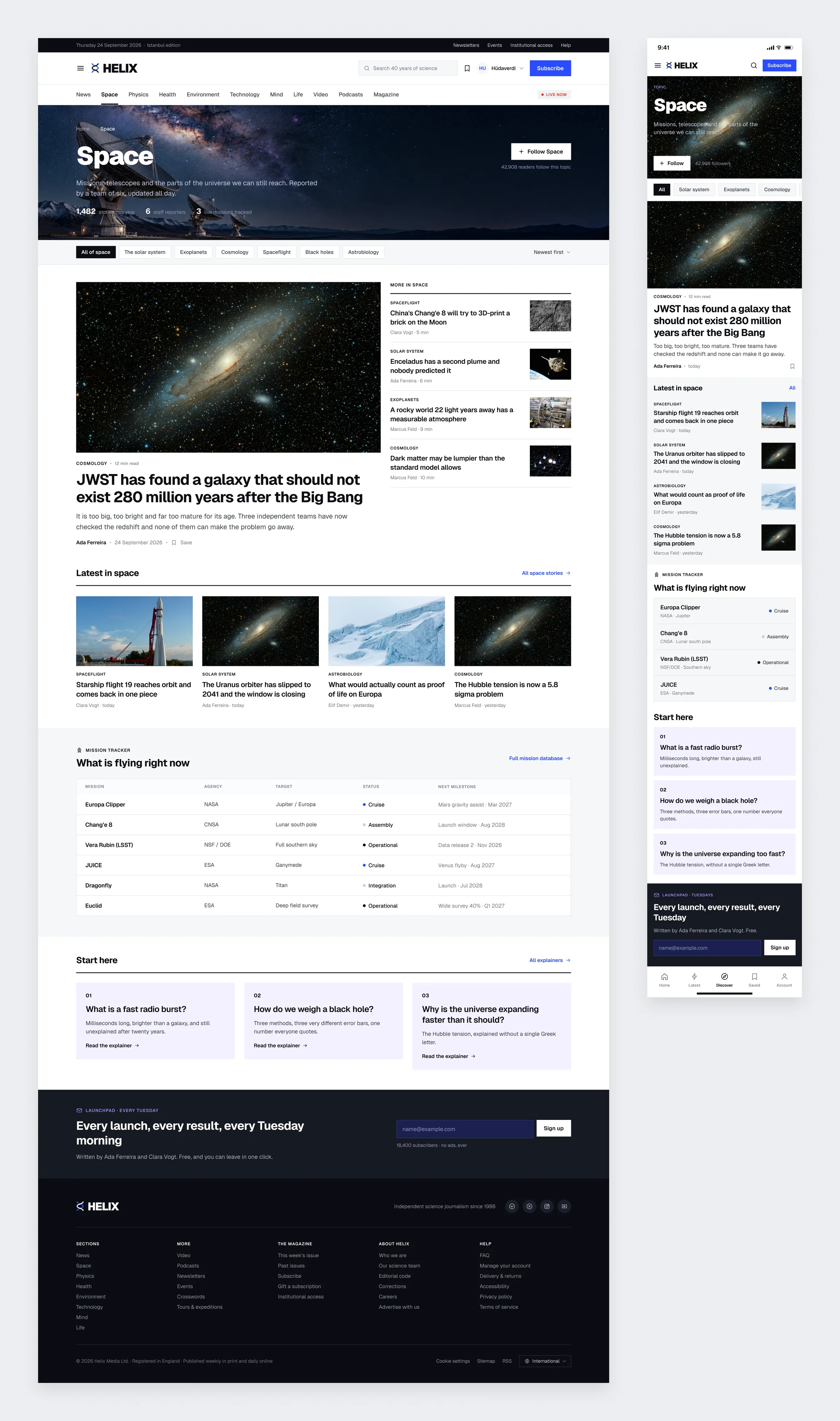
Topic Hub
Every section gets a page of its own. Space opens with a lead story, followed by the latest pieces, a mission tracker table and short explainers for anyone starting from zero.
Feature Article
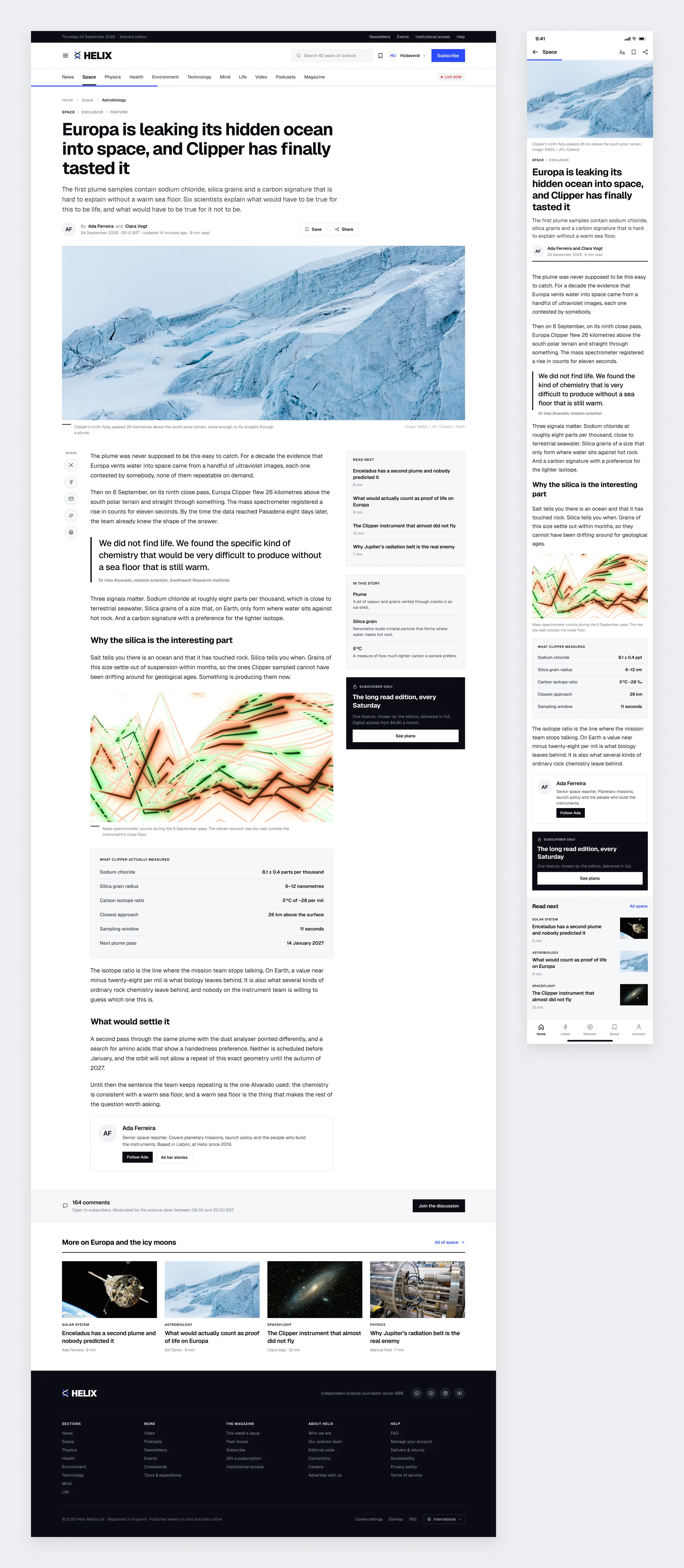
A long read laid out for reading. A wide text column, a pull quote, the chart and data table from the story, and a small glossary in the sidebar. The author card and comments come at the very end.
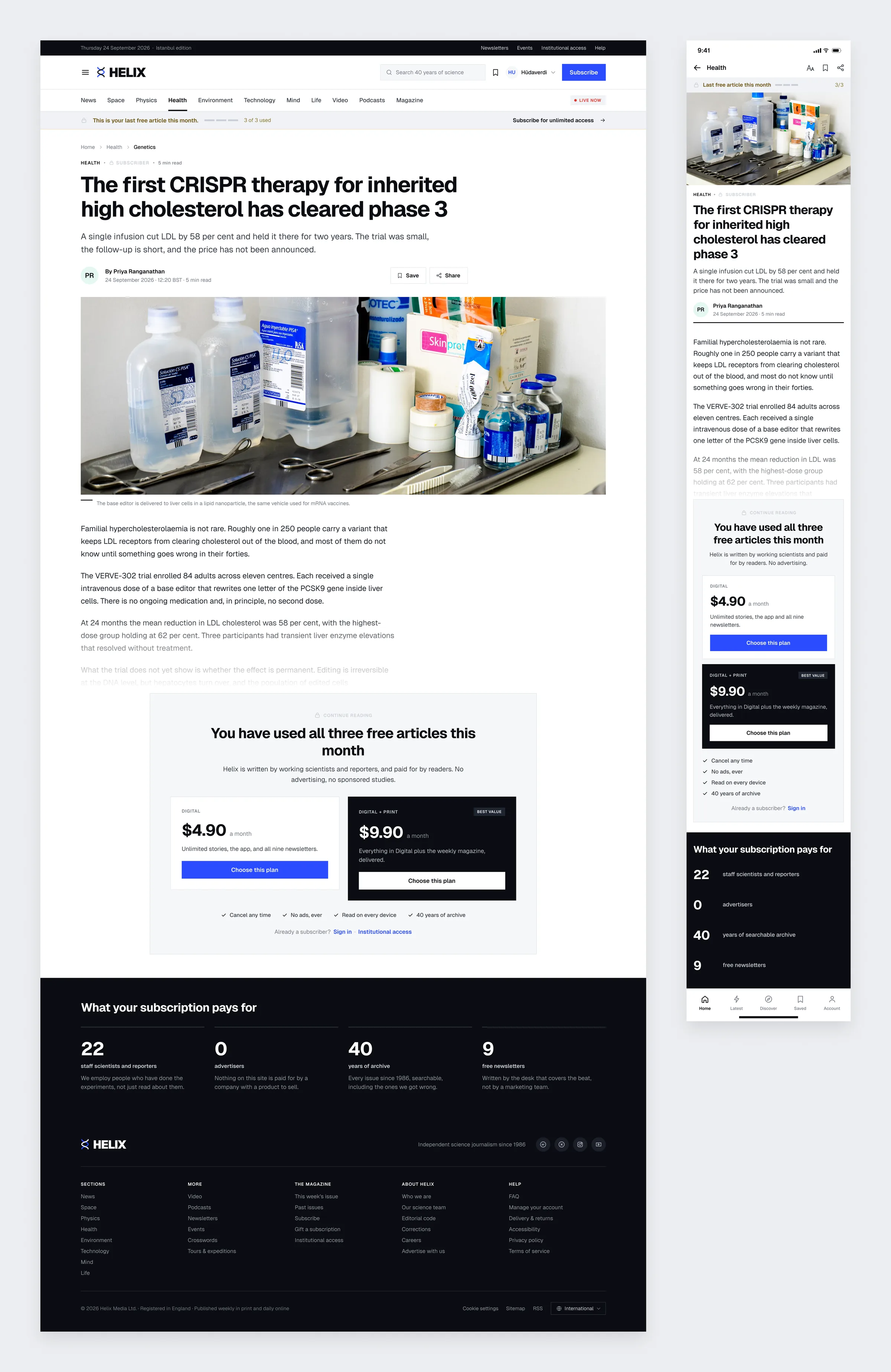
Metered Paywall
Readers can see how many free articles they have left long before the wall shows up. When it does, the story fades out, two plans take its place, and the reason to pay is written right below: no advertising, no sponsored studies.
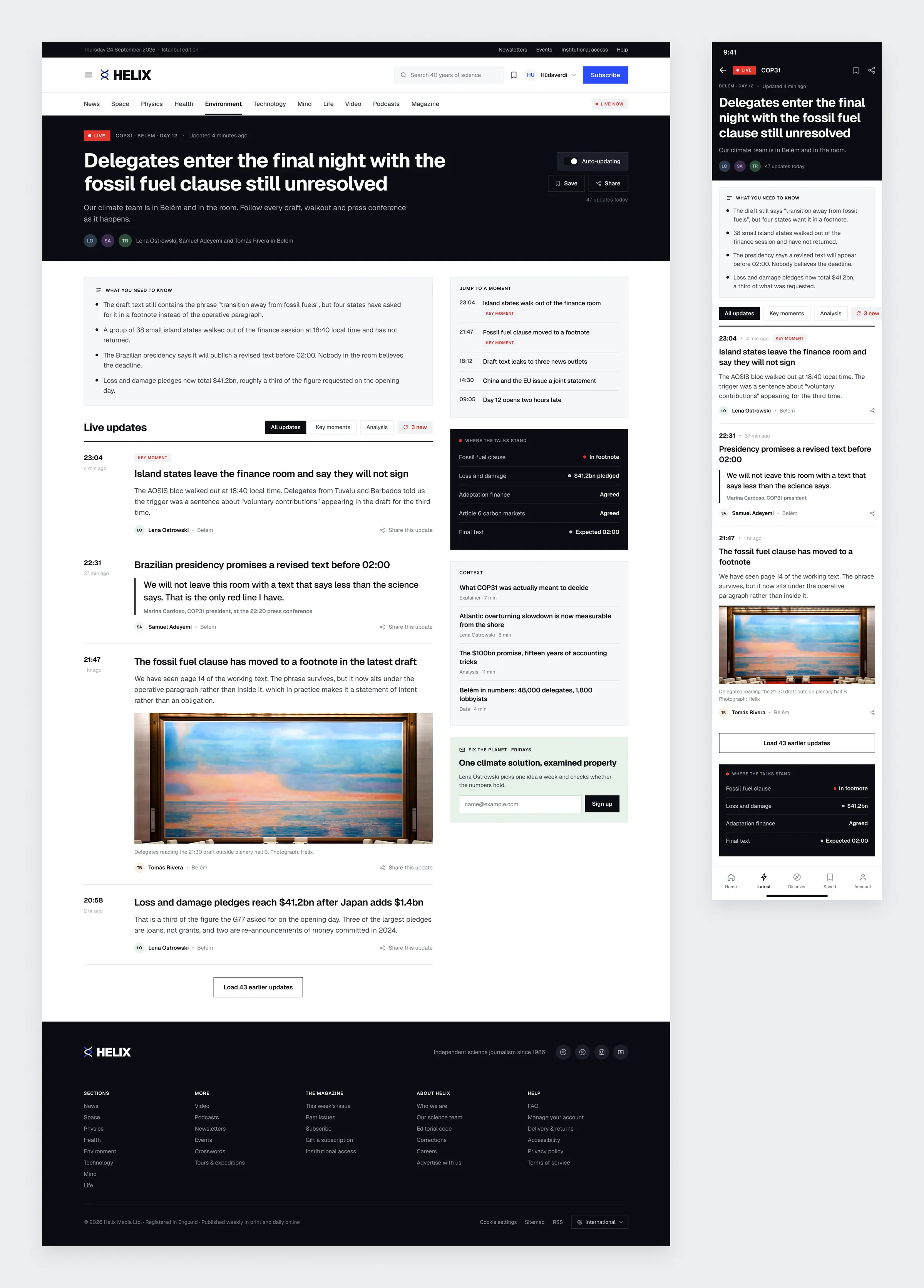
Live Coverage
Election night thinking applied to a climate summit. A short summary on top, then updates in reverse order with the key moments marked. On the right, a list to jump to any moment and a panel showing where the talks stand. This is where the red finally gets to work.
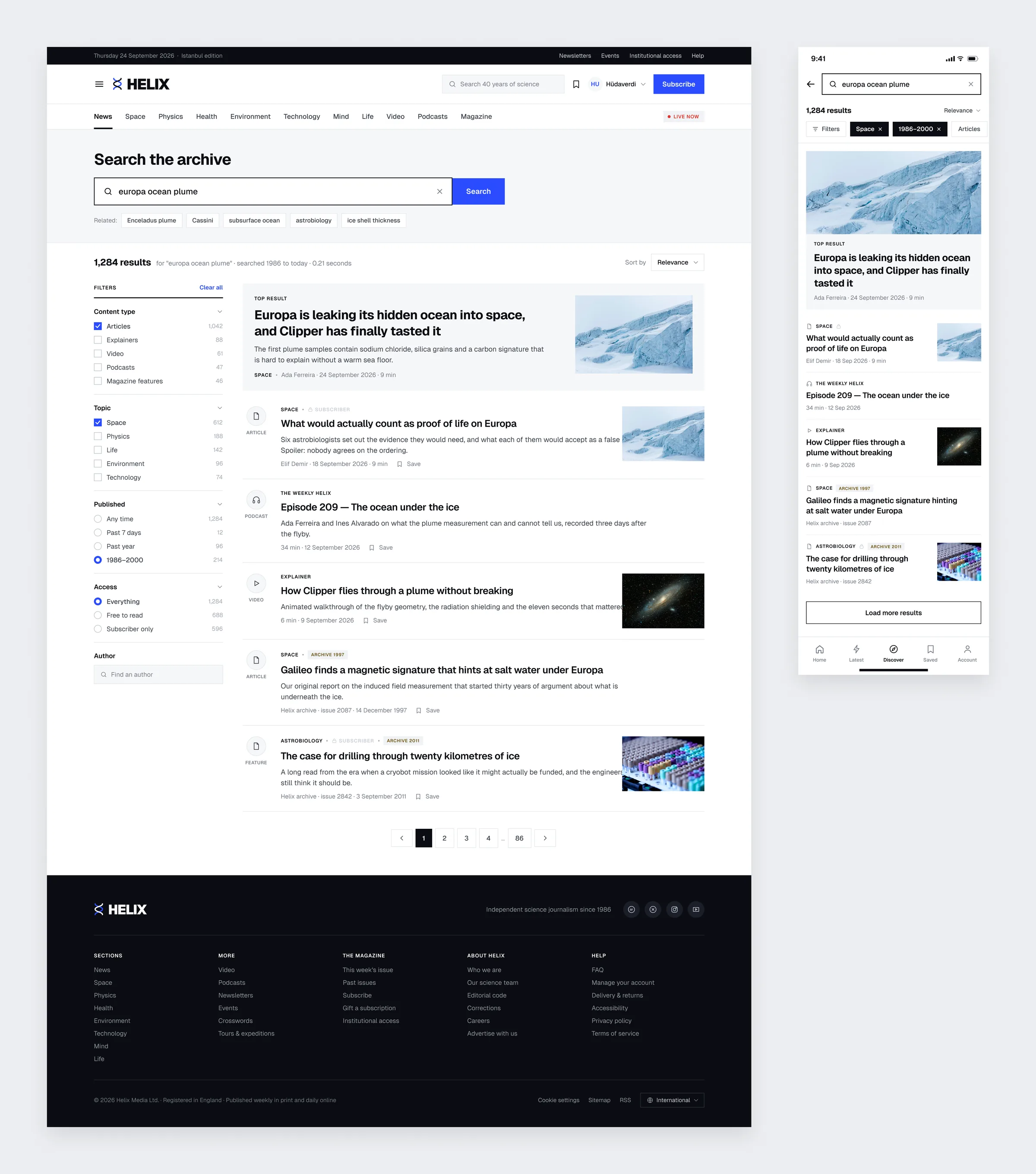
Search
Forty years of archive only matter if you can find something in it. Filters for content type, topic, date and access, a top result in its own block, and old pieces tagged with the year they ran.
The Magazine
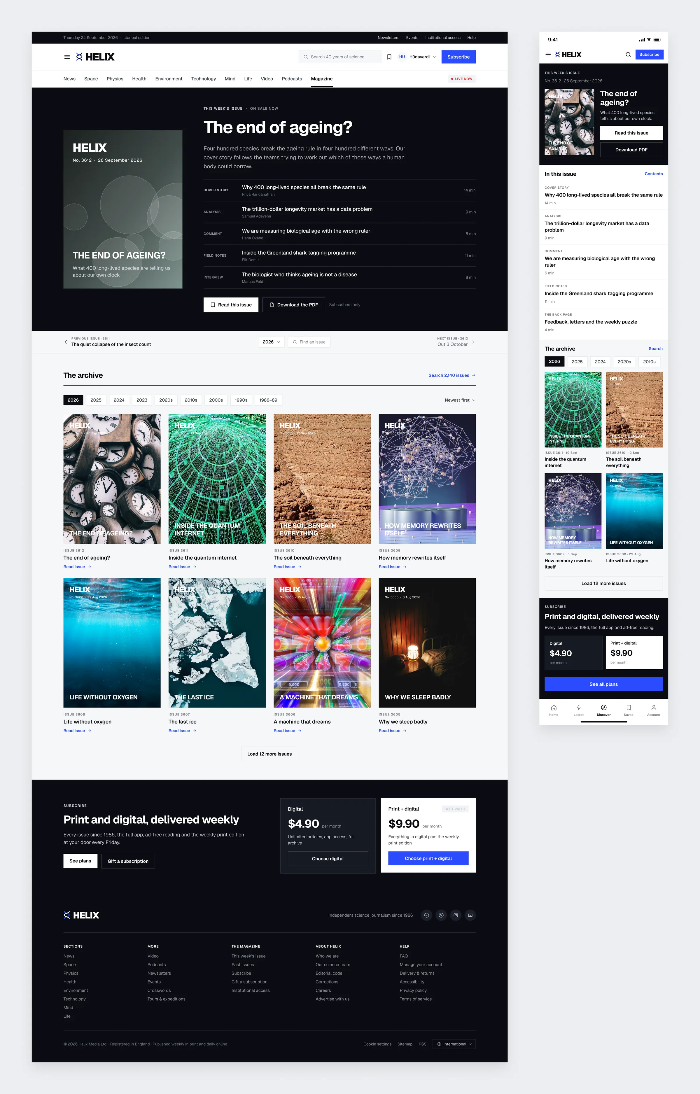
The weekly issue gets a print feel: the cover, the table of contents and actions to read it or download the PDF. Below that, the archive can be browsed by year all the way back to 1986.
Video and Podcasts
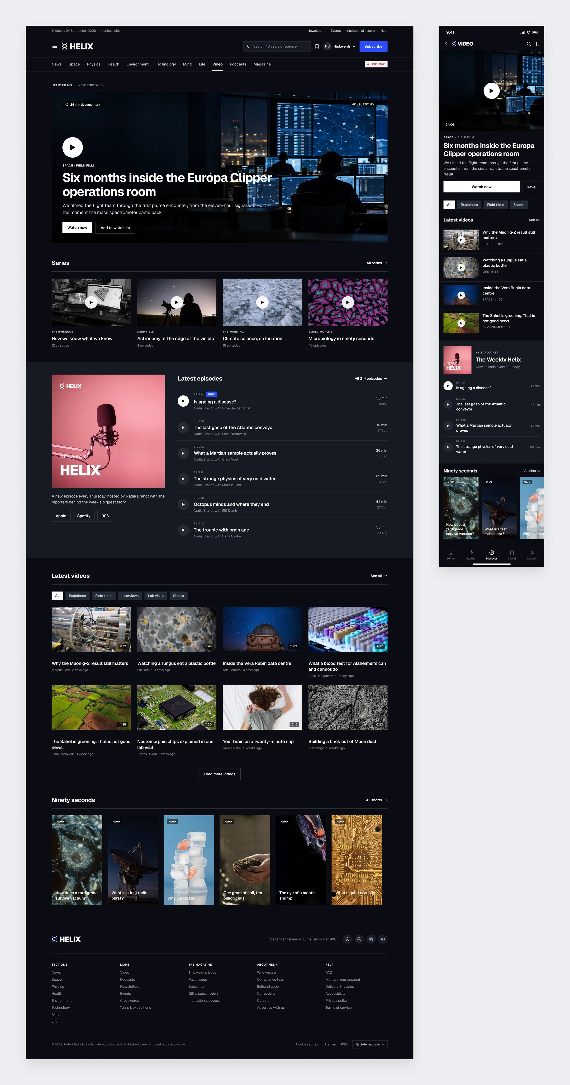
The only dark page on the site, so watching and listening feel like their own place. A documentary at the top, then series, the latest podcast episodes, videos and a row of ninety second shorts.
Newsletters
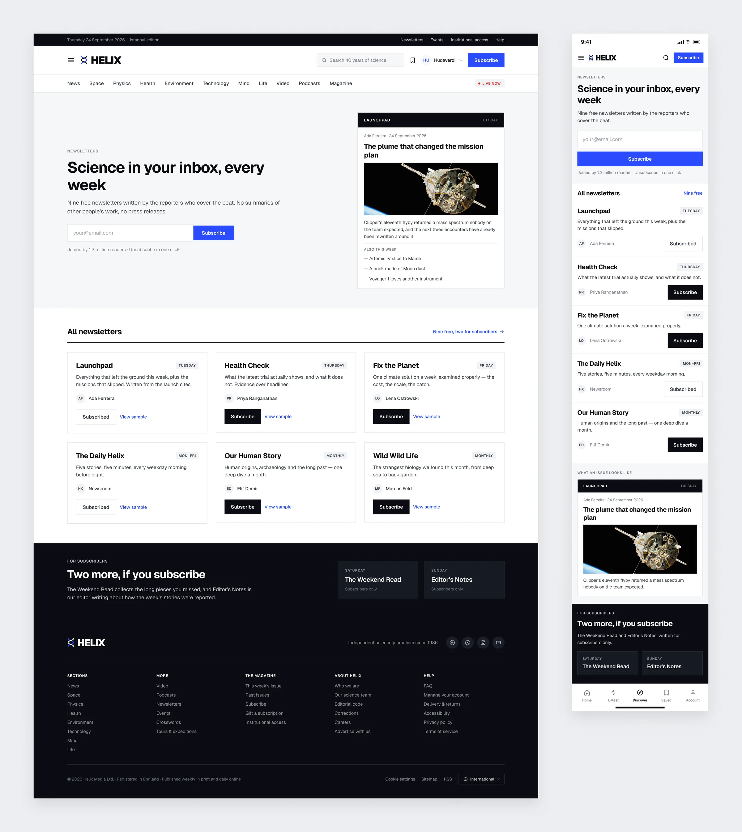
Nine free newsletters, each one showing the reporter who writes it, the day it lands and a sample issue. The two extra ones for subscribers are listed separately at the bottom.
Subscribe
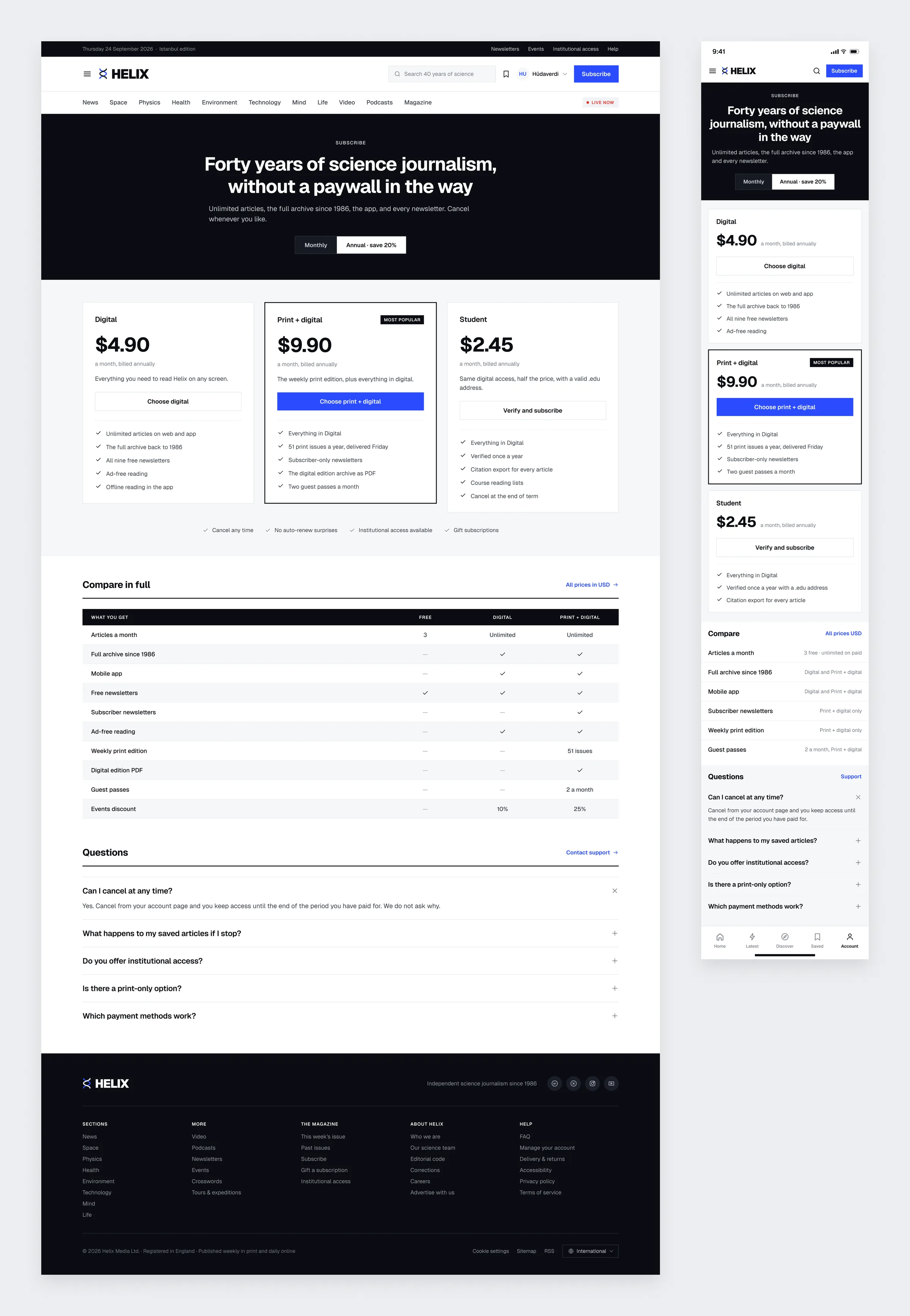
Three plans, a monthly and annual switch, and a full comparison table so nothing is hidden in small print. The questions people actually ask, like how to cancel, are answered on the same page.
Account and Saved
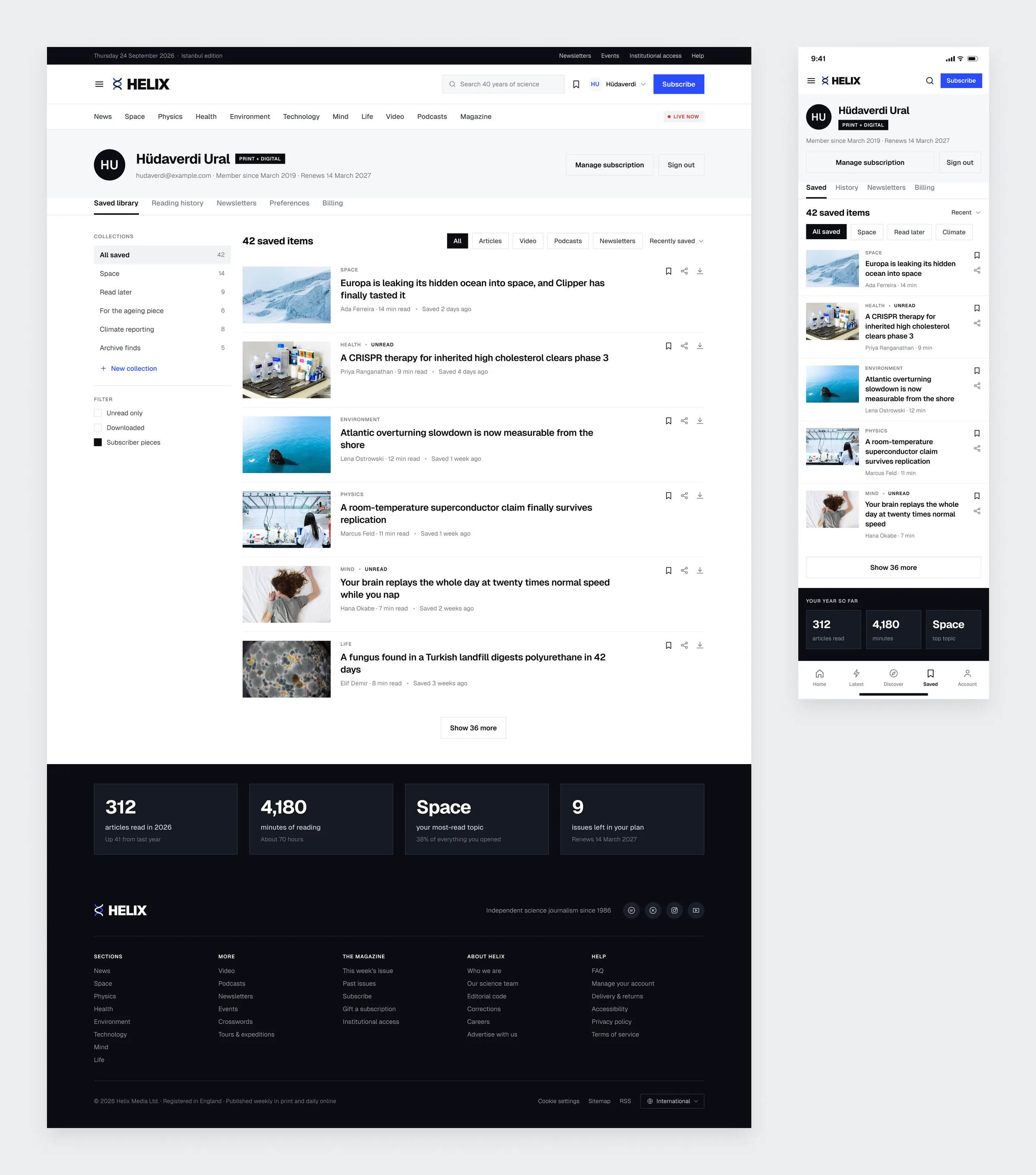
The reader's saved library, sorted into collections and filterable by format. At the bottom sits a small summary of how much they read this year.
Outcome
Helix showed me how much a plain system can carry. With no decoration to lean on, all the work falls on hierarchy and rhythm, and the same rules have to hold from a live summit page to a forty year archive. Keeping colour to just two jobs was the hardest rule to stick to, and it is also the one that makes every page easy to read.