Product Design, Growth & Digital Experience
Interesting Engineering
Designing products, subscription experiences, marketing campaigns, and digital experiences for millions of technology enthusiasts worldwide.
Explore Website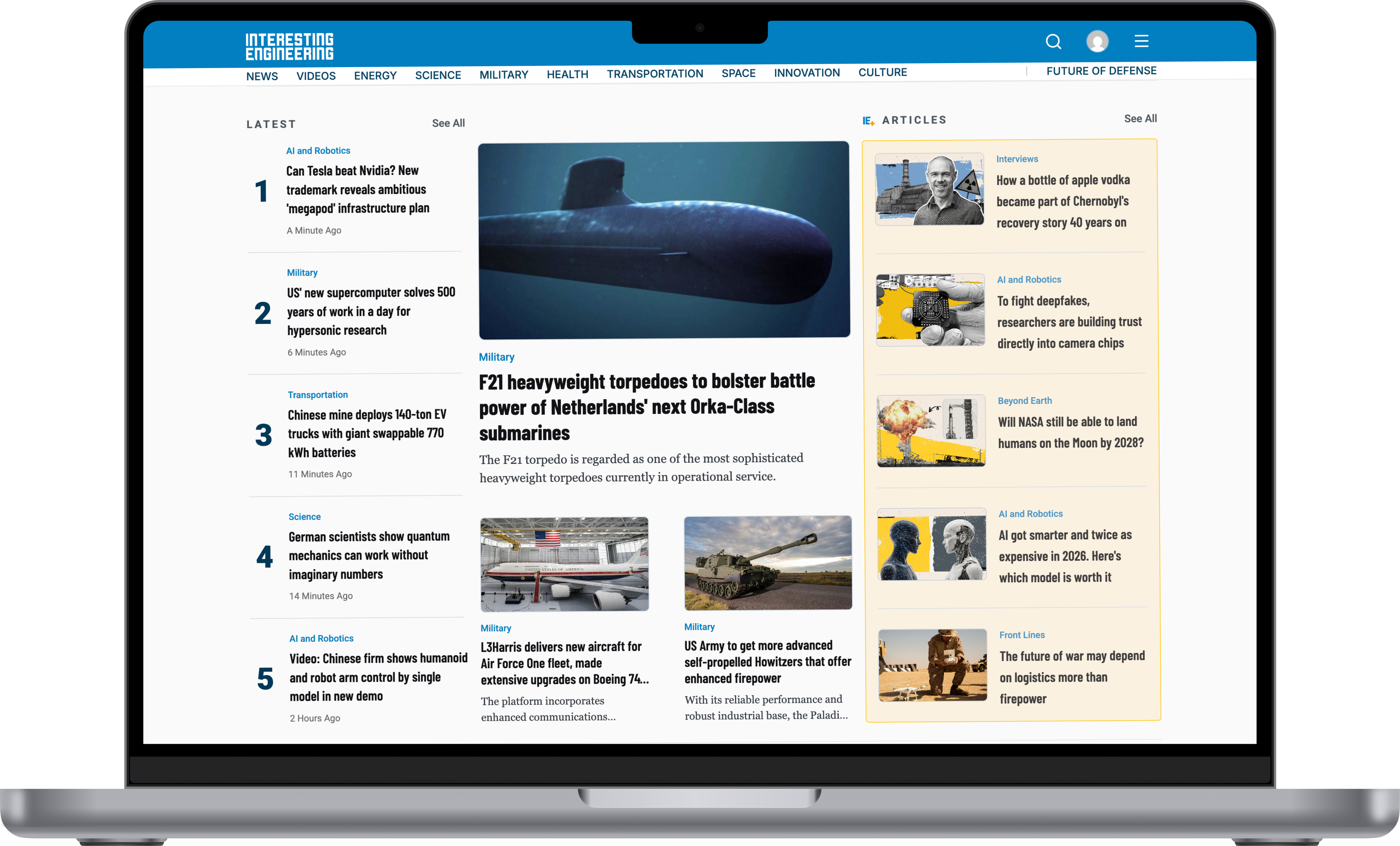
About the
Product
Interesting Engineering is the flagship brand of IE Media, a science and technology media company founded in 2011 and based in New York.
The platform reaches an enormous audience: over 8.2 billion people globally, more than 7.7 billion video views, 30 million social followers, and 35 million monthly active users across a site that mixes articles, videos, podcasts, photo stories, webinars, and quizzes. IE+ sits on top as the paid membership, an ad free and more personal way to read. The IE App carries that same experience to mobile, trusted by 25 million readers, with a 4.4 star rating across the App Store and Google Play.
Role: UX/UI Designer, sole design owner of the IE App
What I
Worked On
Working as a UX/UI Designer at Interesting Engineering does not mean handing a developer a few finished screens. My job is designing the user experience end to end, from someone landing on an article through Google, all the way to reading more, signing up for a newsletter, creating an account, subscribing to IE+, using the mobile app, and managing that subscription later. I work across all of these points.
Web Experience
Designing and evolving the reading experience on interestingengineering.com, from article layout to how people discover related stories.
Subscription Growth
Building the flows that turn casual readers into IE+ members, and keep them subscribed.
Email Marketing
Designing the promotional and lifecycle emails that bring readers back.
Campaign Design
Black Friday, Cyber Monday, and seasonal campaigns built to convert, not just look good.
The IE App
Sole UX/UI owner of the IE App, from onboarding to the game section. More on that below.
Organizing the
Homepage
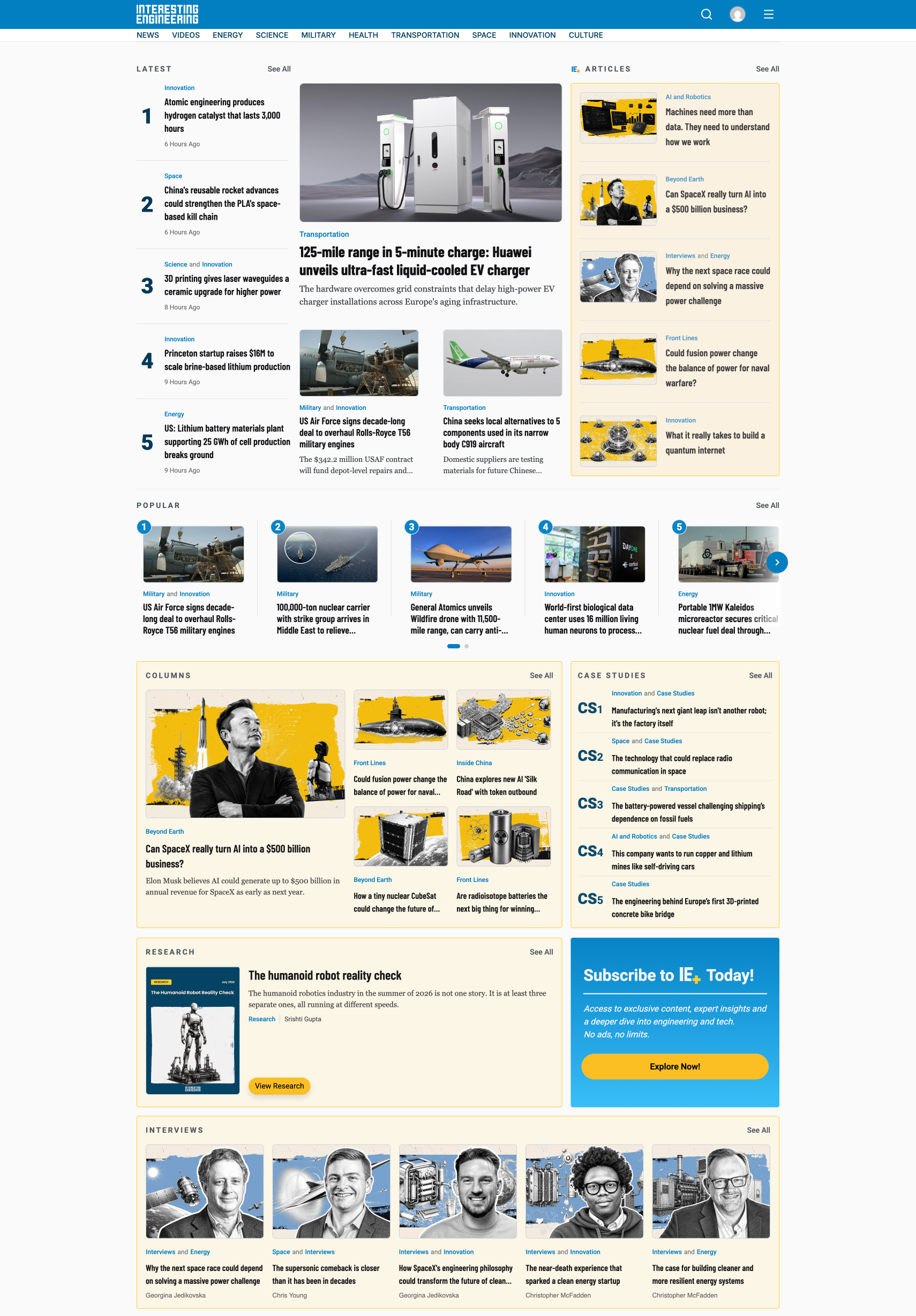
Interesting Engineering carries a lot of different content types at once: news, research, interviews, case studies, videos, and more, all inside the same platform. Showing all of that is easy. Organizing it in a way people can actually make sense of is the hard part.
On the homepage, category pages, search, and navigation, I work on information hierarchy, content grouping, and how a page guides someone's eyes. Someone landing on the site should understand what matters at a glance, and get to what they actually want with as little effort as possible.
Designing the
Article Page
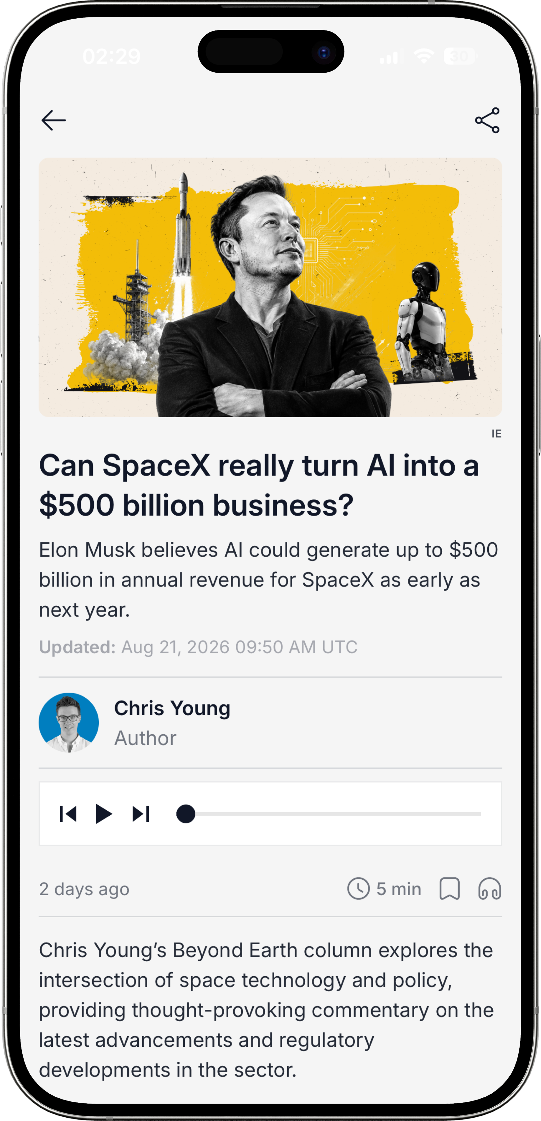
Most readers do not arrive through the homepage. They land directly on an article from Google, social media, or somewhere else, which means the article page has to work as a strong landing experience on its own, not just as a piece of a bigger site.
That means thinking through typography, reading width, spacing, where images and videos sit, related articles, author information, social sharing, and where newsletter or premium content prompts appear. Ads matter here too. They matter for the business, but an overly aggressive ad experience can make an article hard to actually read, so every one of these decisions has to hold both sides at once.
Desktop
Experience
Designed and optimized web experiences focused on content discovery, subscription growth, and user engagement.
Explore Website
Mobile
Experience
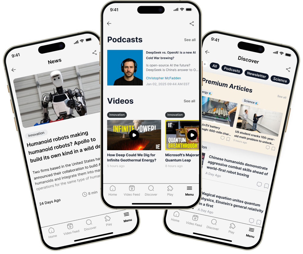
On the IE App, I am not just one of the designers. I am the only one. Every screen, every flow, and every visual decision in the app is mine, from the information architecture down to the smallest interaction, across iOS and Android.
That also means shrinking the website is not an option. Mobile habits are different, so navigation, content discovery, reading, and onboarding, down to where a single component sits, have to be rethought for a smaller screen and one handed use, not just resized.


Designing the
Subscription Funnel
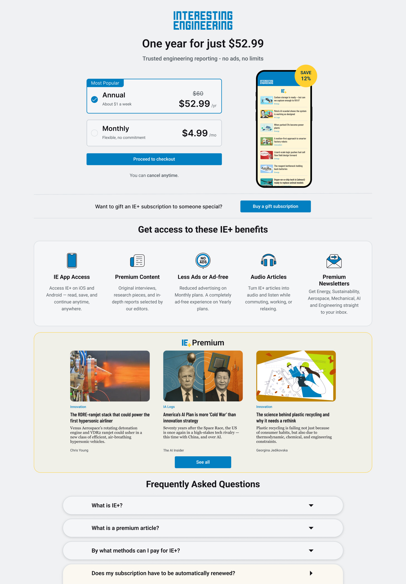
The paywall, subscription options, pricing, signup, login, checkout, and everything after payment are really one continuous flow, not separate screens. If someone lands on a premium article, I have to decide how to introduce the paywall, what message to use, how to explain what IE+ actually gets them, how to lay out the plans, and how to guide them toward buying without it feeling pushy.
The experience does not stop once someone decides to subscribe. Signup, login, payment, and confirmation all need to feel frictionless, because one confusing form or an unclear moment during payment can quietly kill a conversion. So I am not just designing screens here, I am thinking through the whole funnel: where people come from, what they see, where they decide, where they drop off, and how to carry them to the next step. Even after subscribing, people need to see their plan, manage payment details, upgrade, or cancel from their account, so that experience is part of this too.
Owning the
IE App
Onboarding & Personalization
Designing the first run experience, along with how people choose the topics and notifications they actually want to see.
IE+ & Paywall
The premium membership flow: paywalls and upsell screens that explain the value of going ad free without getting in the way.
Payments & Subscriptions
Plan selection, entering payment details, invoices, and the cancel, upgrade, and renew flows, including how errors and confirmations get communicated.
Multi-Format Content
Making news, podcasts, photo stories, and quizzes feel like they belong in the same app, not five different products stitched together.
Theming, Accessibility & Design System
Light and dark mode, accessibility, and the component library, typography, and grid rules that keep the app consistent as it grows.
Handoff & Iteration
Working closely with engineering to get designs into the app correctly, then using store ratings and reviews to decide what to fix next.
Building the
Game Section
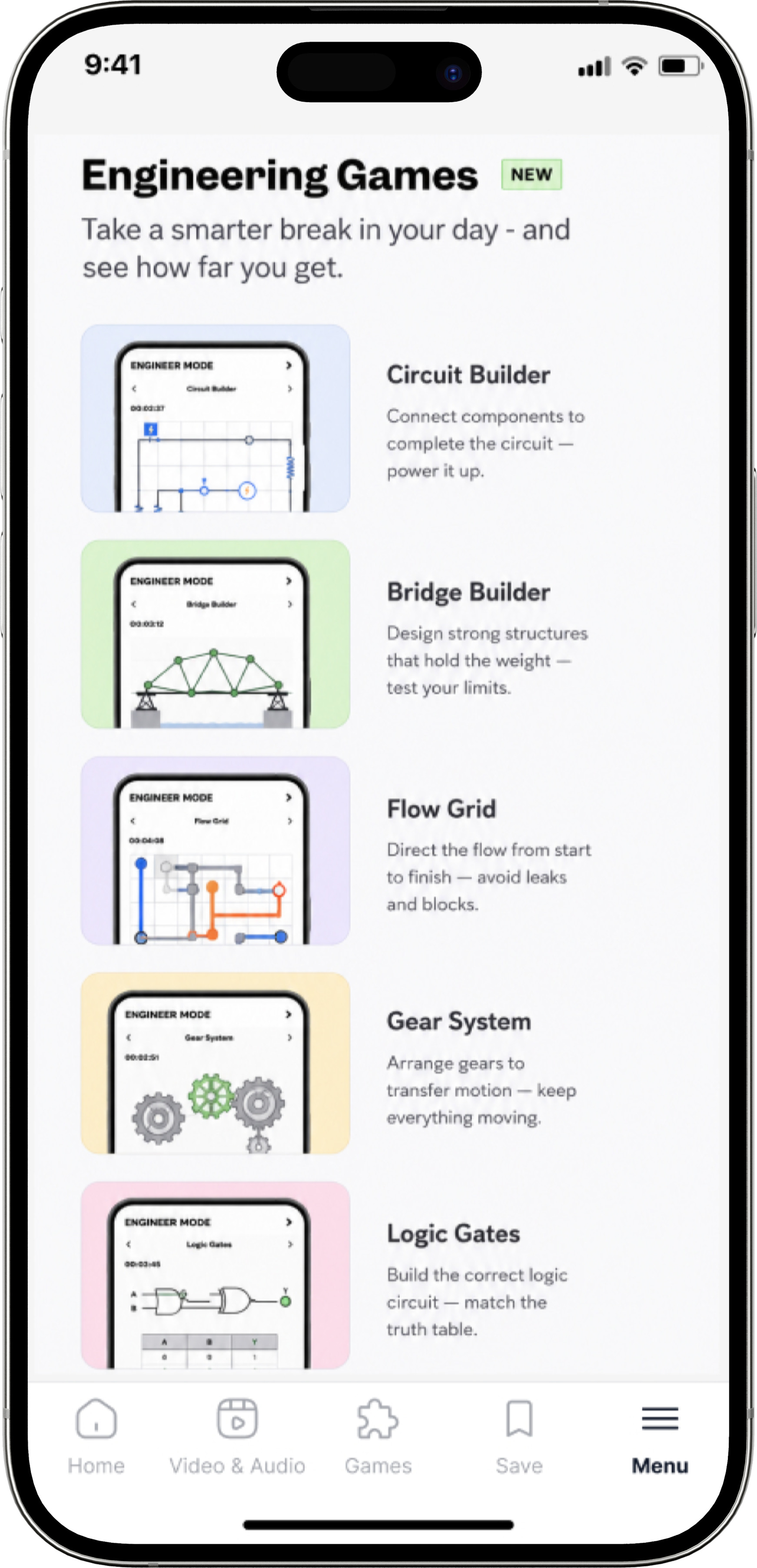
Alongside the core reading experience, I design the UX and UI for the game section inside the app. Right now that means a daily quiz and a Wordle style word game. I am also developing original game formats aimed at IE's own audience, people who are into engineering and science, where learning something new can double as the hook that brings them back every day.
The goal is to build an engagement layer that stands on its own, separate from news reading, so opening the app becomes a daily habit rather than something people only do when a headline catches their eye.
Design Backed
by Data
Newsletters are part of this same picture. Interesting Engineering runs several of them, so showing the right one at the right moment matters, whether that is a CTA at the end of an article, a signup block on the homepage, or letting people manage their own preferences. I think of newsletter signup as an acquisition and retention touchpoint, not just an email template.
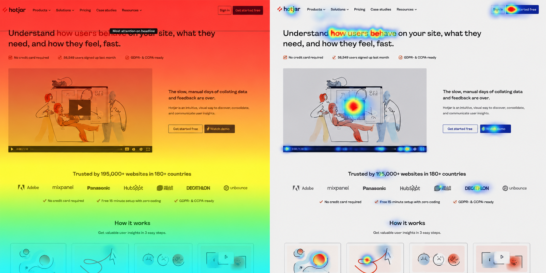
On a platform this size, a lot of my decisions come from behavior, not personal taste. Using tools like Google Analytics, Hotjar, or Microsoft Clarity, I look at where people drop off an article, how much a newsletter CTA actually gets clicked, where the subscription funnel loses people, or whether mobile users engage with a given component at all. If payment is where people are dropping off, I do not just note that conversion is low. I start asking whether the form is too long, whether we are asking for more than we need, whether pricing is clear, or whether people even know what to do next, then design around the answer and measure it again. That makes UX an ongoing loop of research, design, implementation, testing, and optimization, not a one time pass.
Branded &
Sponsored Content
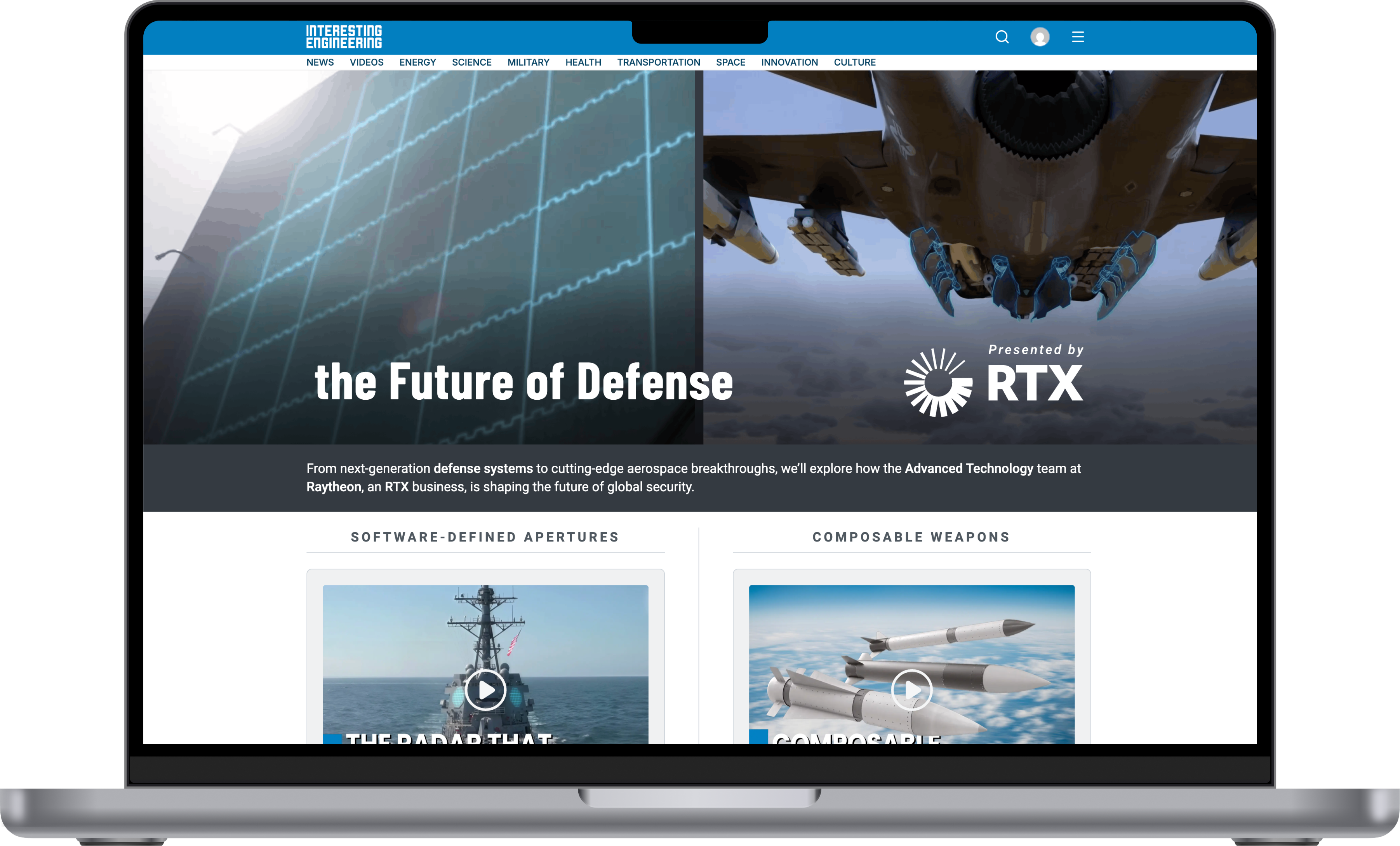
Some of my work sits outside the core platform entirely: sponsored campaigns for brands like Tesla, Microsoft, Siemens, Turkish Airlines, Lockheed Martin, RTX, Cambium, and General Atomics. Those need to work within Interesting Engineering's own visual language while still respecting the sponsor's brand guidelines, and the format changes every time. It might be a sponsored article, a landing page, a campaign page, an interactive piece, or a lead generation form.
That work also means sitting across marketing, editorial, growth, engineering, and the business side, since each of them looks at the product differently. Editorial thinks about how content should be presented, marketing looks at conversion and campaigns, growth focuses on behavior and metrics, and engineering weighs what is actually feasible. My part is turning all of that into one flow and interface that still makes sense to the person using it.
Behind the
Scenes
Not everything I built for Interesting Engineering lives on the core product. Some of it is tools that keep the editorial and marketing teams moving behind the scenes, like a newsletter builder for HubSpot, a social media content system, and an editorial thumbnail system used across articles. Some of it is seasonal campaigns like Black Friday and Cyber Monday, built to convert rather than just look good.