Product Designer
Luce
Everything you need before you open the door.
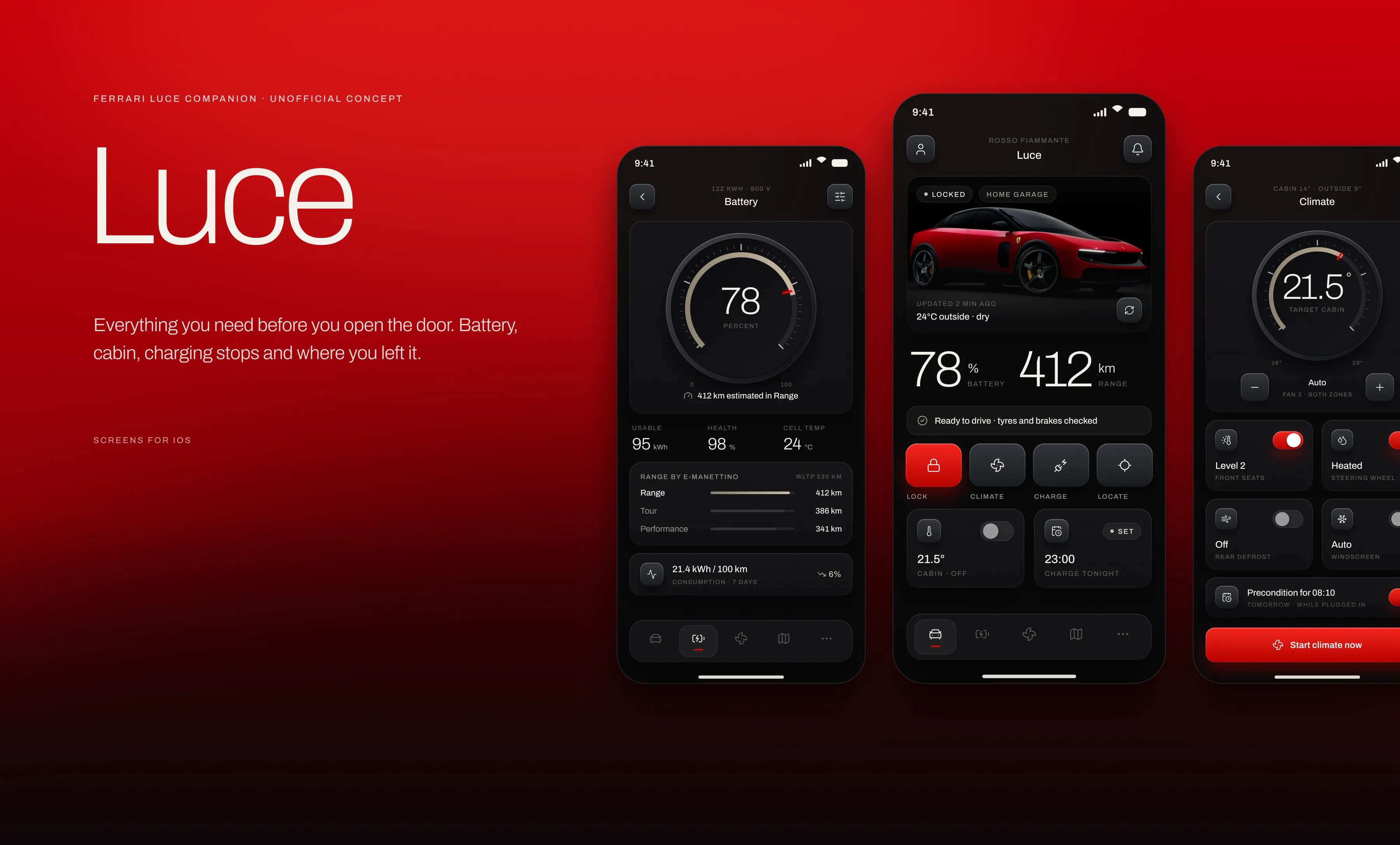
A companion app concept for the first fully electric Ferrari. Battery, cabin, charging stops and where the car is parked, all in one calm dark interface.
Overview
A combustion car asks almost nothing of its owner between drives. An electric one asks for planning. Charge level decides whether tomorrow happens, the cabin needs warming before a cold morning, and a long route needs a stop picked in advance. Most car apps answer all of that with a wall of numbers and a row of coloured warnings. Luce tries the opposite. Every screen opens with a sentence you can act on, and the numbers sit underneath it for when you want them.
The problem and the approach
Three screens for one question
Ask an owner what they actually want to know and the answer is short. Can I do tomorrow’s trip. Is the car warm. Where did I leave it. When will it be full. In most companion apps those four answers live on four different screens, so the owner has to collect the pieces and do the maths.
The second problem is tone. Charge states, tyre warnings and service notices all shout at once in red, amber and green, and the result feels like a dashboard fault panel. For a car people buy because of how it makes them feel, that is the wrong first impression.
One answer first, one accent
Each screen leads with a plain sentence. Ready to drive. Ready at 23:10. Parked two hours ago on Via Abetone Inferiore. The gauges, percentages and lists are still there, but they support the sentence instead of replacing it.
Ferrari red does exactly one job per screen: the primary button, the active tab, the lock tile and the live route on the map. Everything that used to be a coloured warning now reads in champagne, the same tone the gauges use. With only one accent in play, red keeps meaning something.

Design system
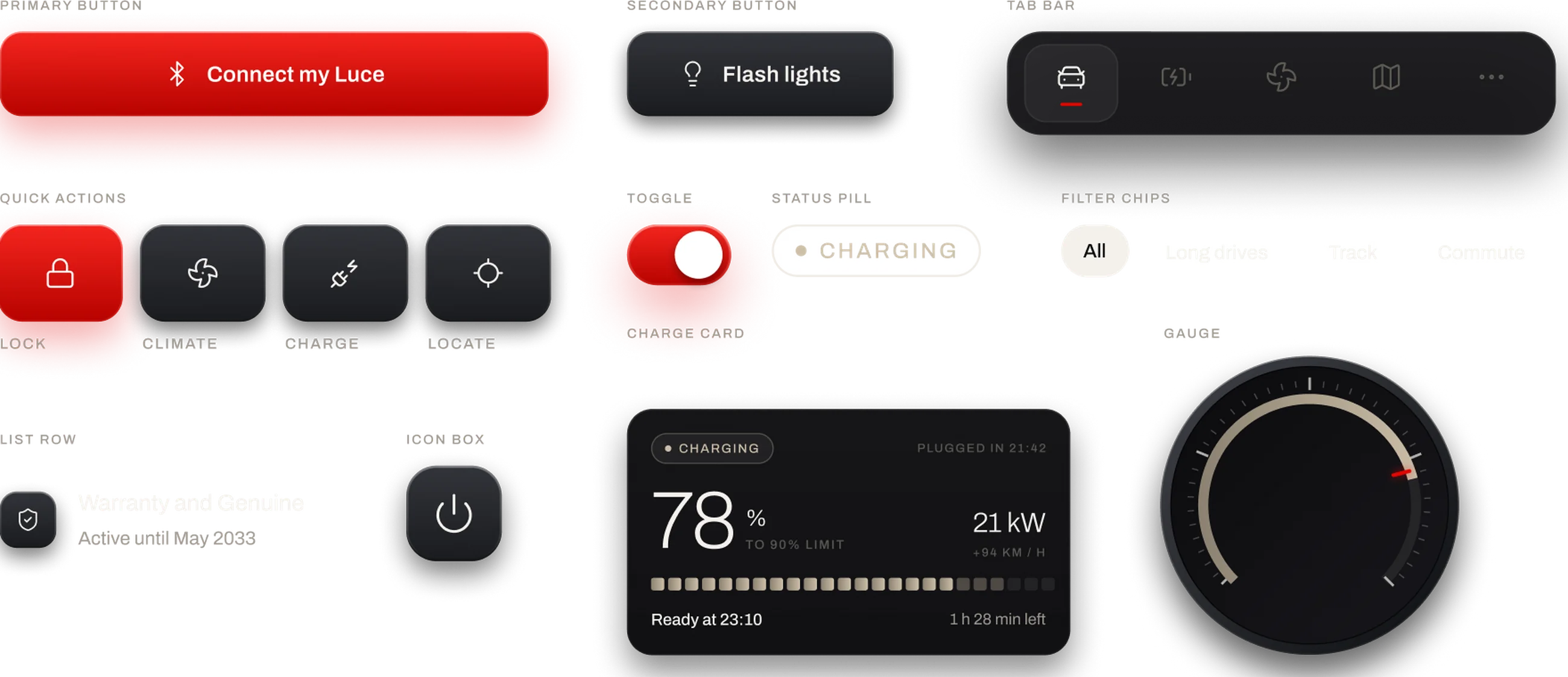
The interface is built from a small set of parts so that twelve screens feel like one object. Surfaces are graphite with a gradient hairline, controls borrow the brushed finish of the car’s own switchgear, and the type is one family at a few sizes.
Colours
Graphite and bone carry the interface, Rosso carries the action, and champagne carries status. There is no red, amber and green scale anywhere in the app. A low tyre reads as a champagne outline, a live charging session as a champagne dot, and that leaves Ferrari red free to mean the one thing you can press.

Icons
Fifty four icons, all from Lucide, all drawn on a 24 grid at a 1.5 px stroke. Keeping one library and one weight is what makes a set of switches look like it came out of the same car rather than out of three different apps.

Components
Buttons, the tab bar, quick action tiles, toggles, status pills, filter chips, list rows, icon boxes and the gauge. The gauge is the one that does the most work: it shows charge, cabin temperature, peak power and regeneration on four different screens, and because it is the same part every time, those screens read as one instrument.
Screens
Onboarding and connect
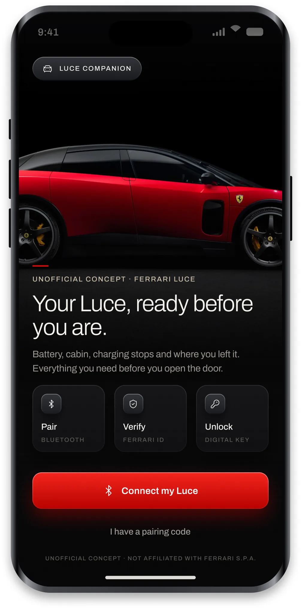
The first screen shows the car before it asks for anything. Pairing is three steps laid out in advance, Bluetooth, Ferrari ID and the digital key, so the owner can see the whole process before starting it.
Vehicle overview
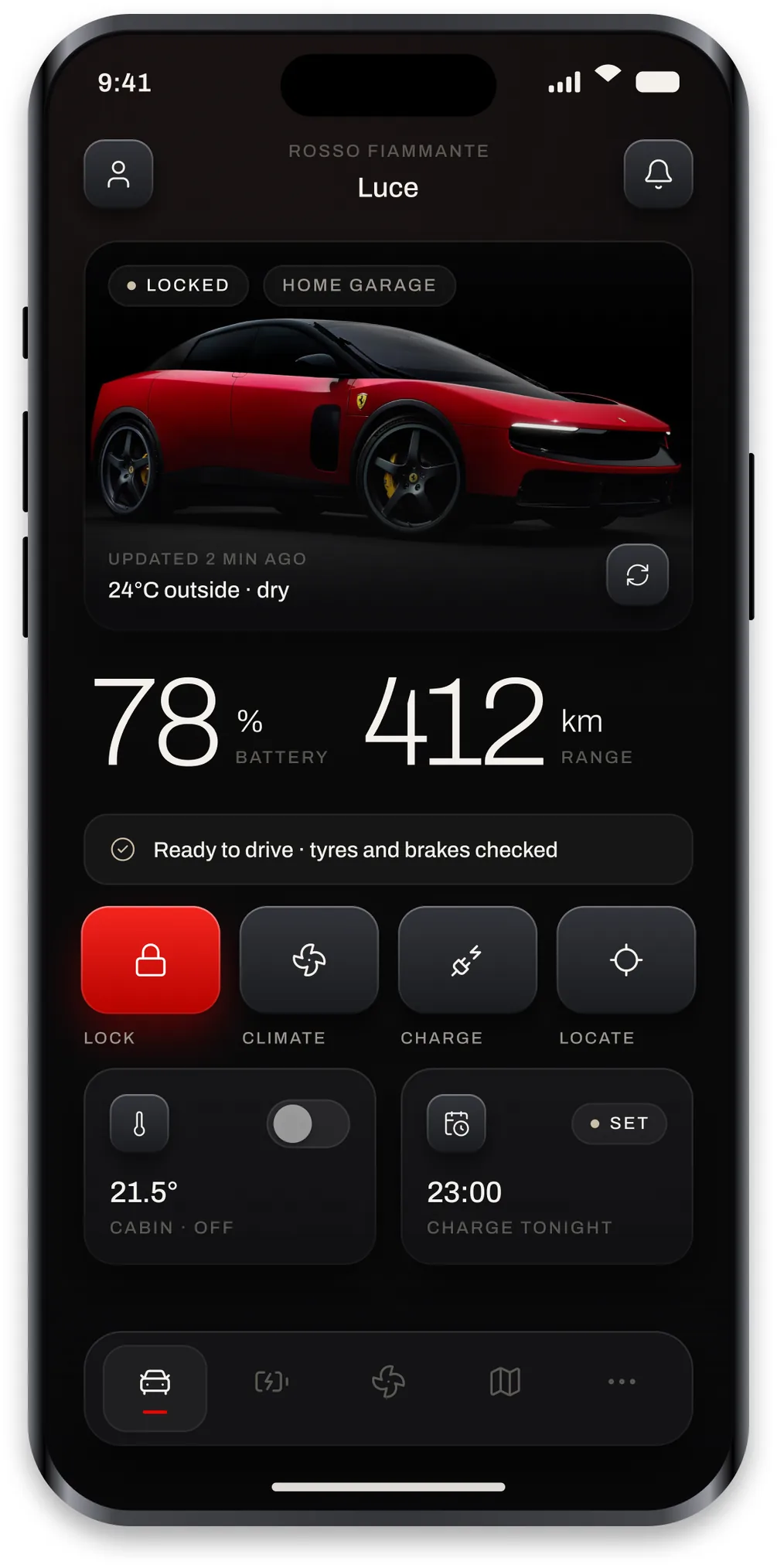
The home screen answers the four questions in one glance: the car is locked, it is at 78 percent, that is 412 kilometres, and it is ready to drive. Underneath sit the four actions people reach for most, with lock as the only red tile. The two cards at the bottom hold the cabin temperature and tonight’s charge time so neither needs a separate trip.
Battery and range
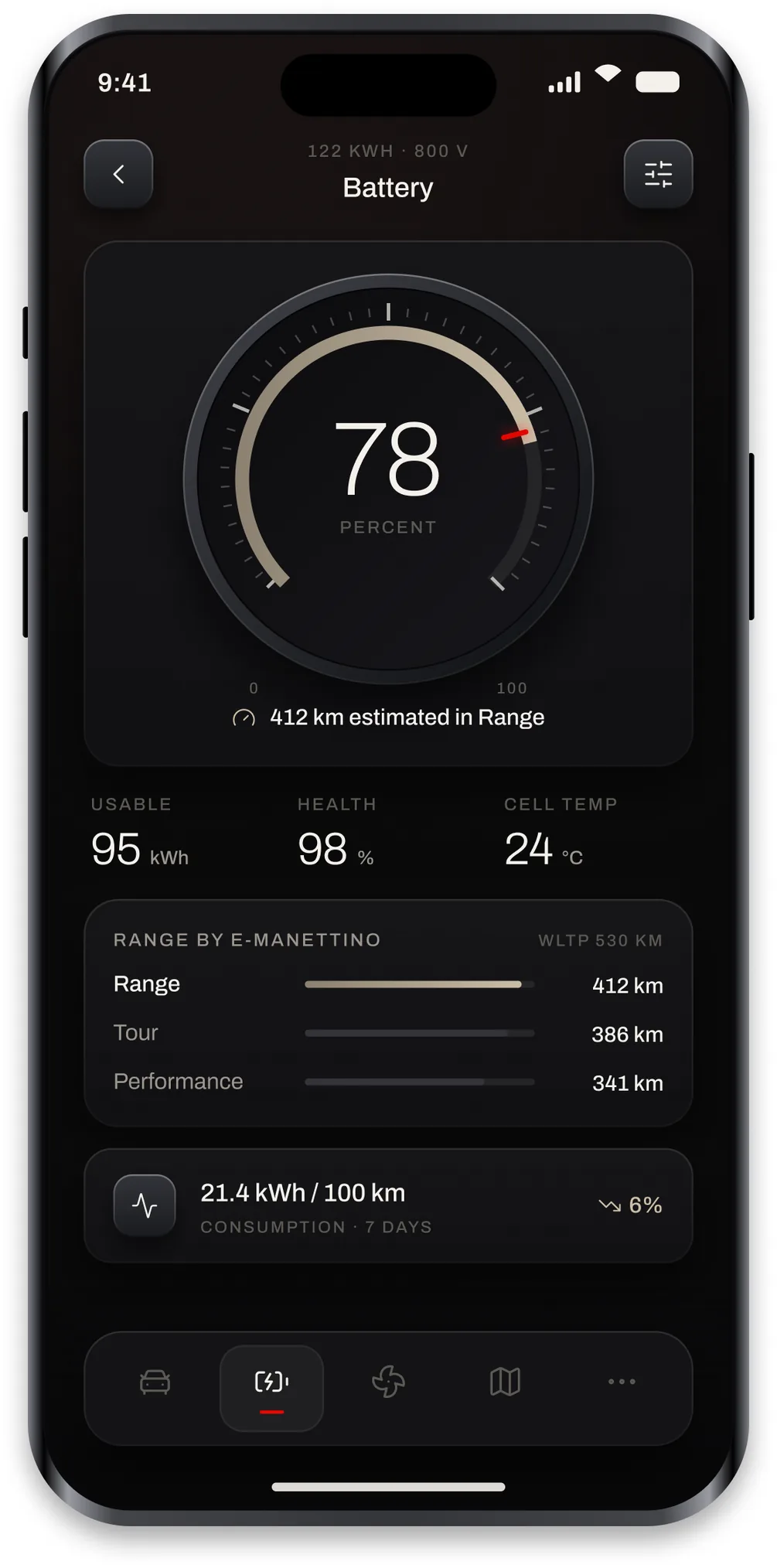
An aluminium gauge for the state of charge, then the things an owner of an 800 volt car actually checks: usable capacity, pack health and cell temperature. Range is broken out per e-Manettino mode, because the honest answer to how far can I go depends on which mode you plan to drive in.
Charging
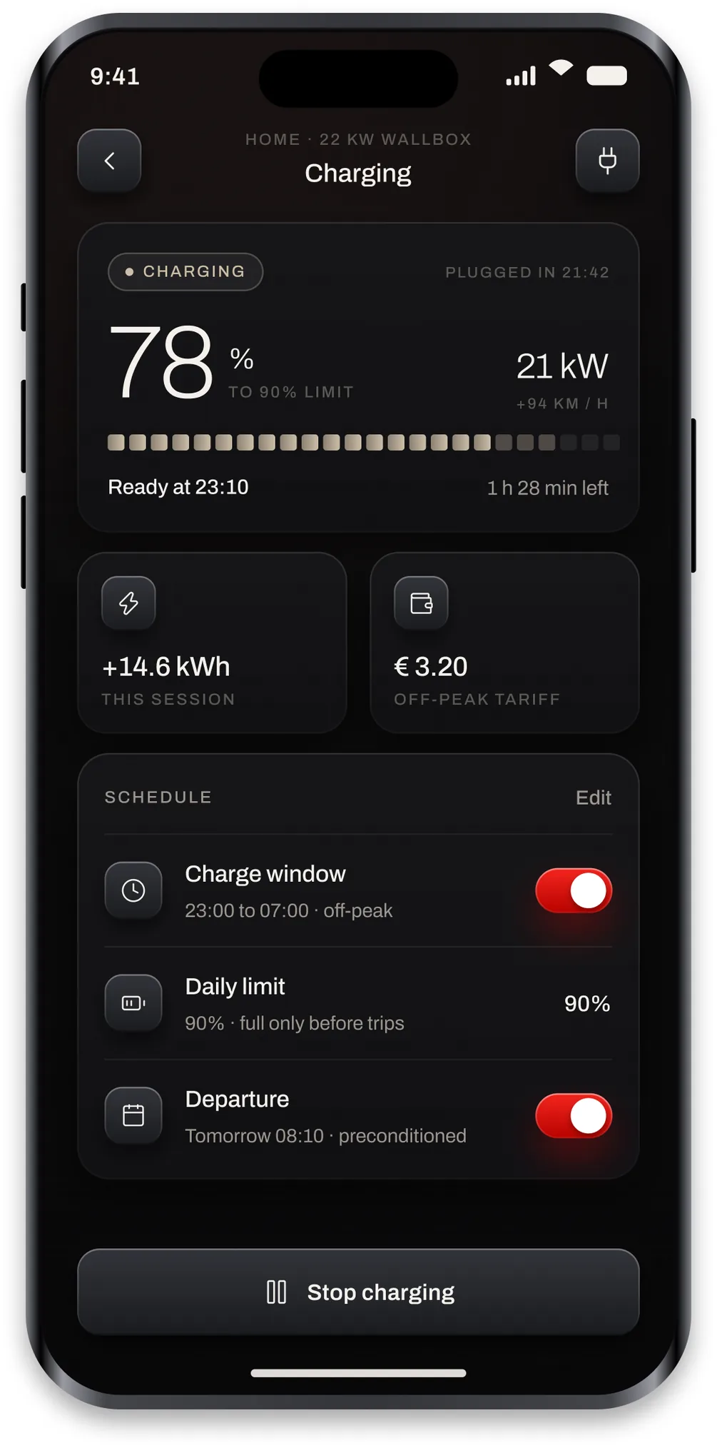
The headline is the time the car will be ready, not the percentage. Below it the session shows energy added and what it cost, and the schedule holds the three rules that matter: charge inside the off peak window, stop at ninety percent unless there is a trip, and precondition before departure. The charging state reads in champagne so it does not compete with the stop button.
Remote climate
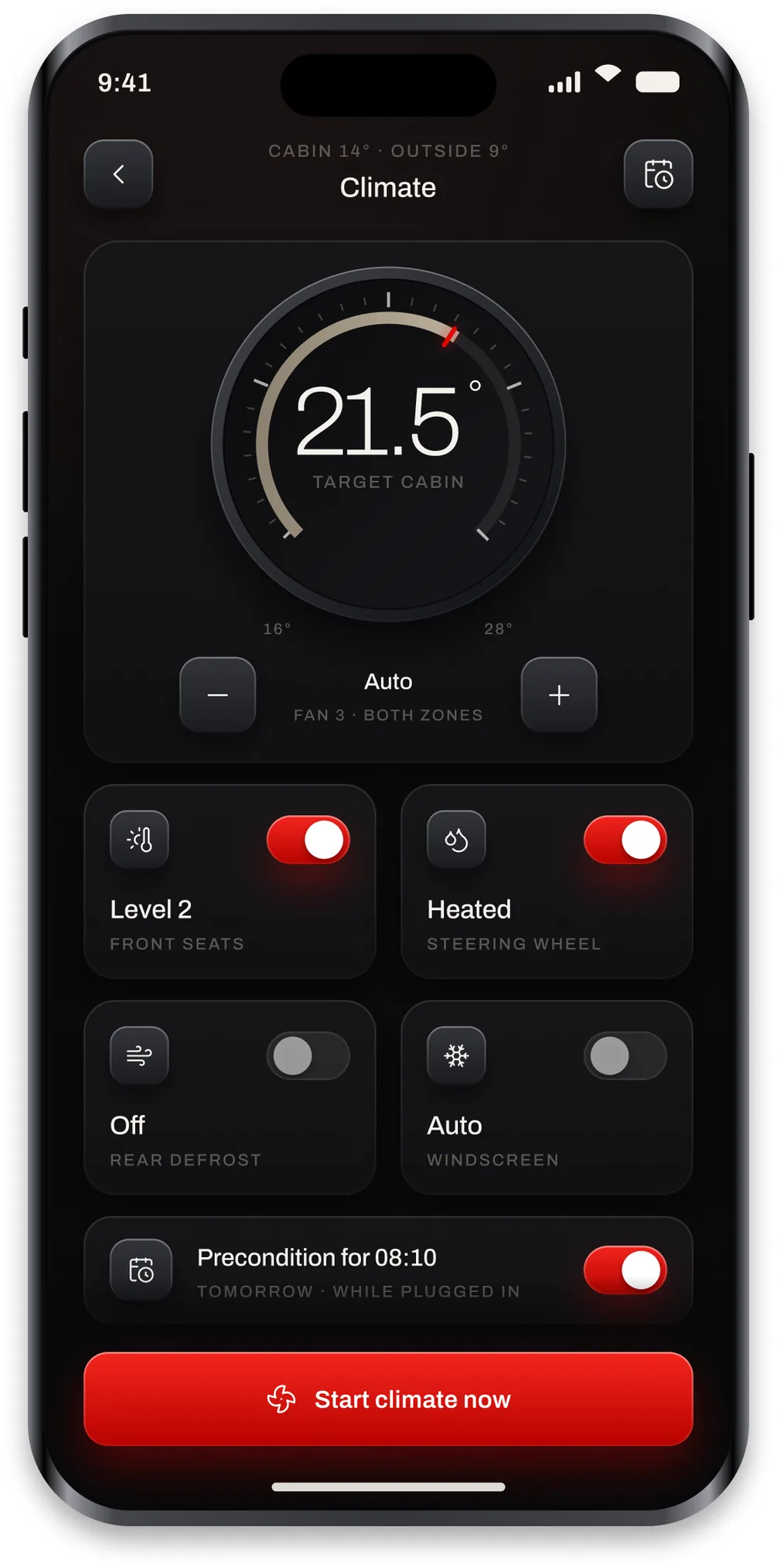
A dial for the target cabin temperature, with fan speed under it. Seats, steering wheel, rear defrost and windscreen are separate controls rather than one climate switch, because on a cold morning those are the four things people actually turn on one at a time. A precondition timer ties it to the departure already set on the charging screen.
Lock and controls
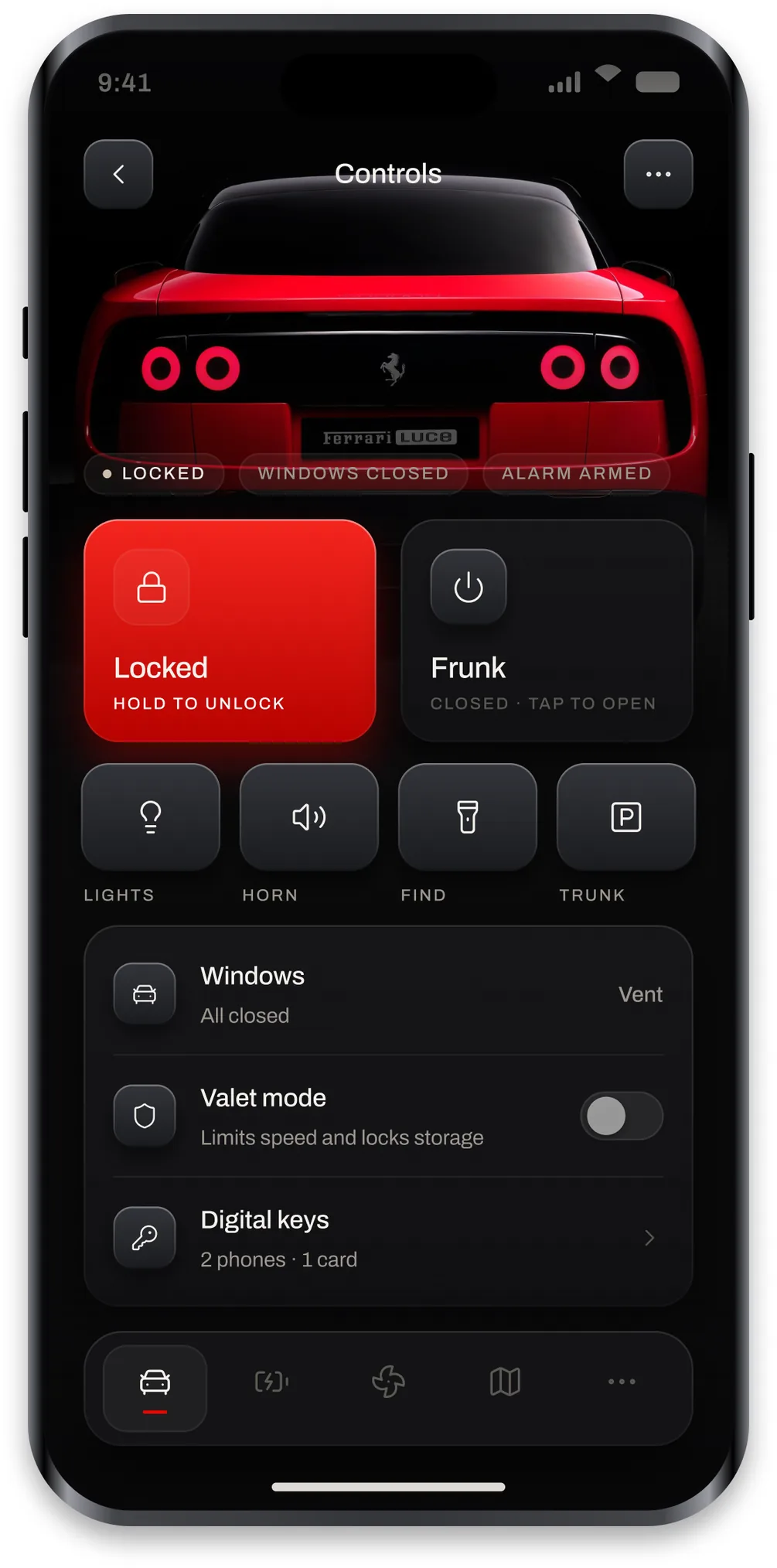
Everything the key used to do. Lock is the single red tile and needs a hold rather than a tap, since unlocking a car from a phone should take a deliberate gesture. Frunk, lights, horn, find and trunk sit in aluminium switch boxes, and below them windows, valet mode and the digital keys are list rows rather than tiles because they open something instead of firing an action.
Vehicle location
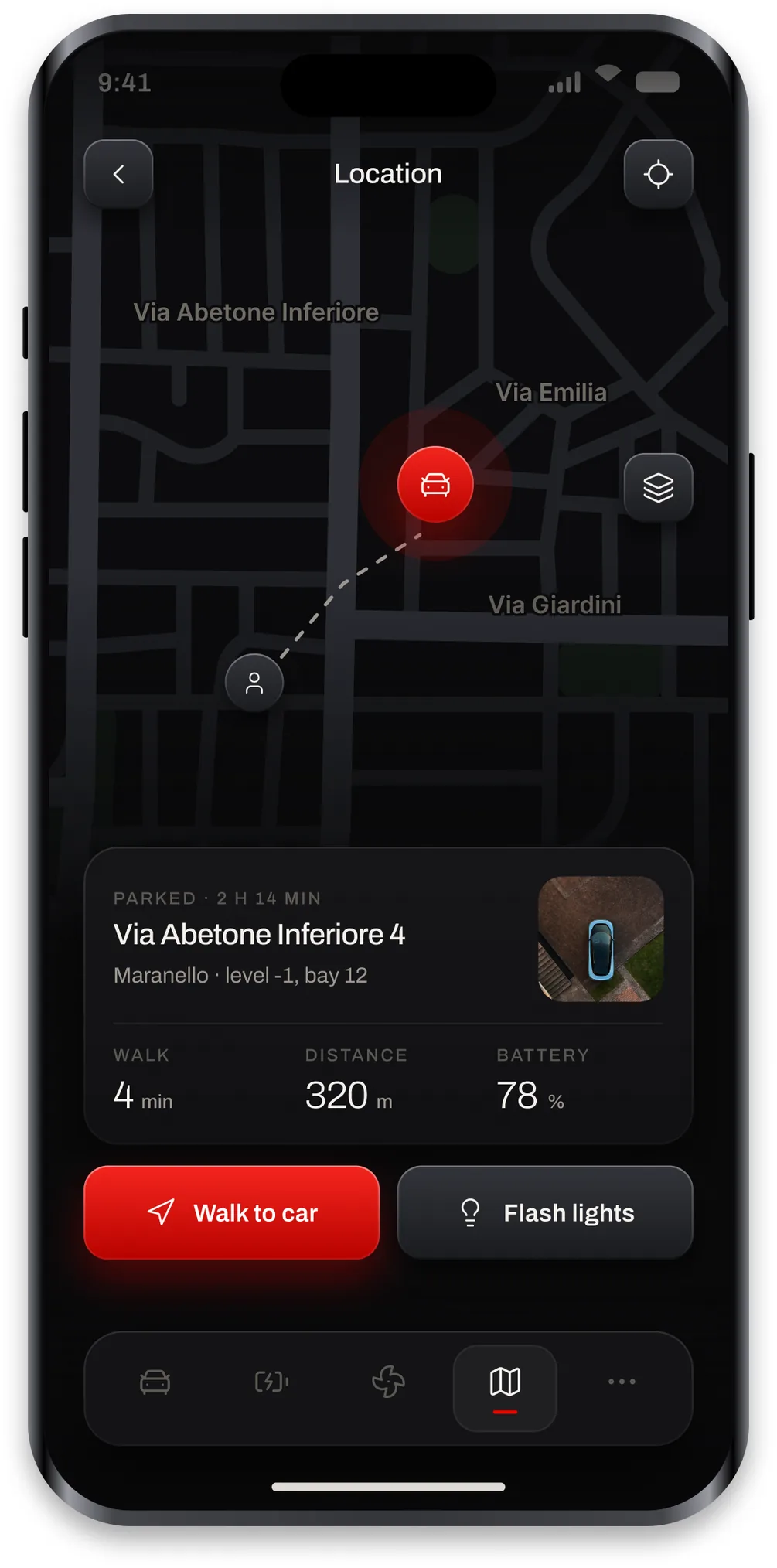
A real street map recoloured for dark mode rather than a drawn grid, so the distance between the pin and the car reads as a real walk. The card gives the address, the level and the bay, then the walk time, the distance and the battery. Two actions follow: walk to the car, or flash its lights if it is in a row of similar cars.
Route and charging plan
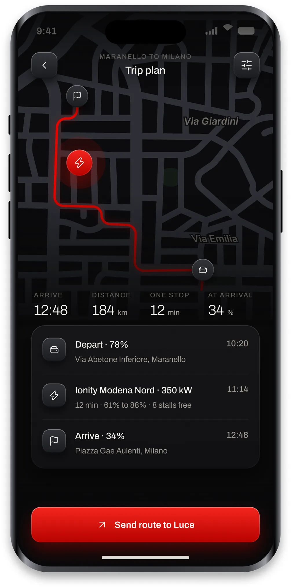
The route follows actual roads and the one stop is chosen while the trip is still being planned, not somewhere in the middle of it. Arrival time, distance, stop length and state of charge on arrival sit in a row above the plan, and the plan itself lists departure, the Ionity stop with its power and free stalls, and arrival. One button sends the whole thing to the car.
Drive readiness
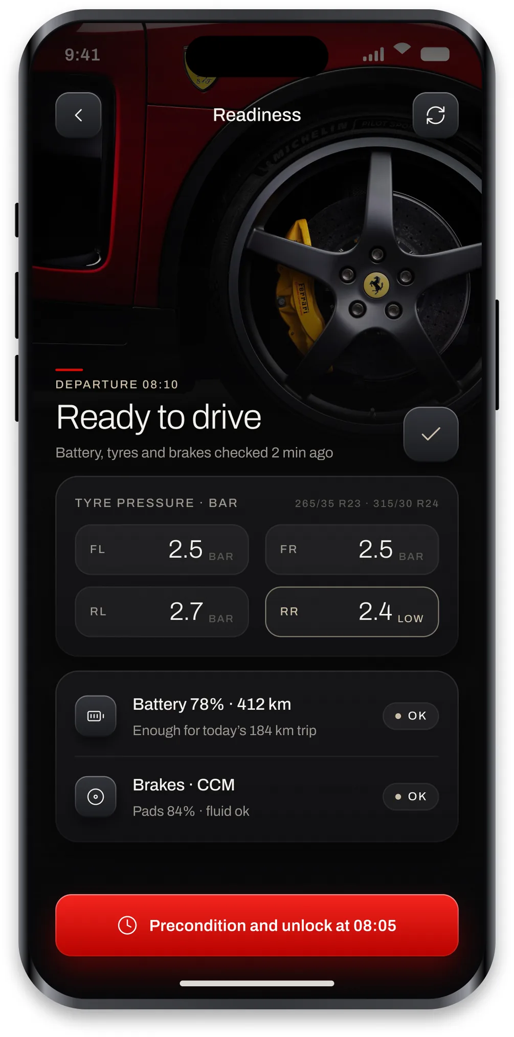
This is the screen the flow is built around. It answers can the car do tomorrow in three words, then shows the checks behind that answer: four tyre pressures, battery against the distance planned, and brake pad and fluid state. The single low tyre is marked in champagne rather than red, so it informs without alarming. The button preconditions and unlocks at the departure time.
Performance and energy
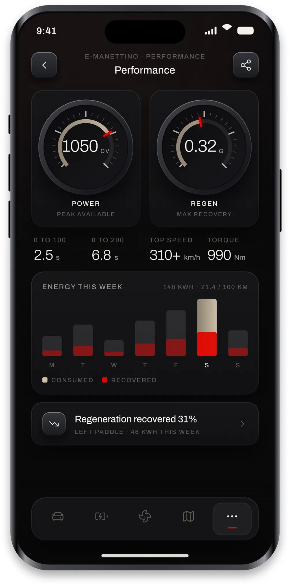
Two gauges built from the same component, one for peak power available and one for regeneration recovered. Under them the numbers a driver quotes, and under those a week of energy split into what was consumed and what the left paddle gave back. It is the only screen in the app that exists for enjoyment rather than for a decision.
Journey history
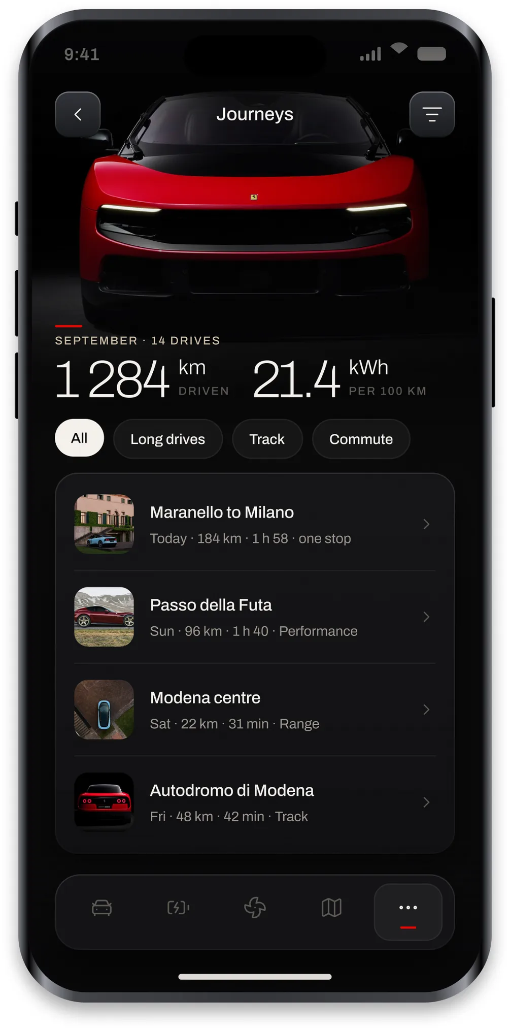
A month of driving with distance and consumption at the top, filters for long drives, track days and the commute, then the drives themselves with a thumbnail, time, distance and which mode was used. It is a log rather than a scoreboard, so there is no efficiency rating and nothing to beat.
Service and maintenance
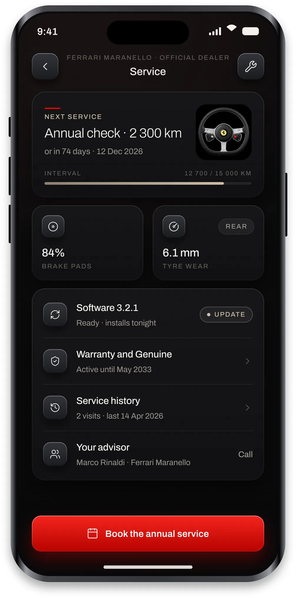
The next annual check by date and by distance, then wear on the brake pads and tyres, the software update waiting to install tonight, warranty status and the service history. At the bottom is the advisor at the dealership with a call button, because at this point in the ownership the useful thing is a person, not another screen.
Outcome
Luce is a concept project made for my portfolio. It is not affiliated with, endorsed by or connected to Ferrari S.p.A. Ferrari, Luce and the prancing horse are trademarks of Ferrari S.p.A., and the vehicle photography is © Ferrari S.p.A., taken from press material on ferrari.com and used only to illustrate this non commercial concept. What I wanted to find out was whether a car app could stay quiet, use its brand colour once per screen and still feel like the car it belongs to.