What Colors Mean in Industrial HMI Design
How color can make normal states, warnings, alarms, and missing data easier to understand on an industrial control screen.

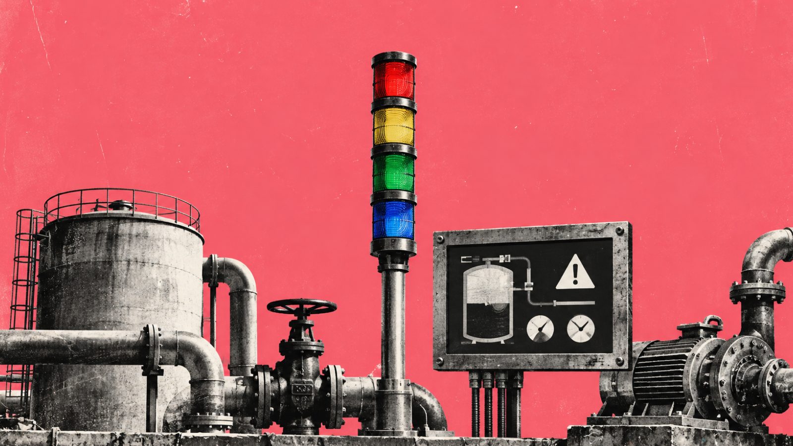
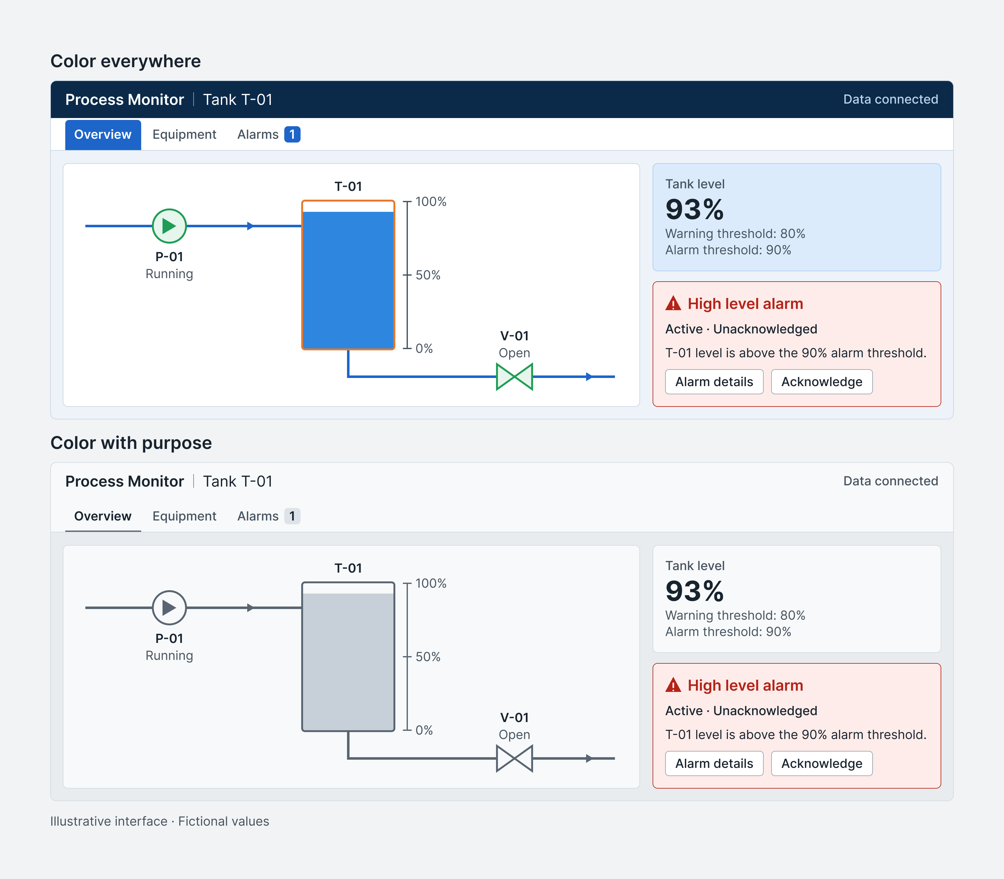
Picture an industrial control screen. The pumps are green, the pipes are blue, the tanks are orange, and several numbers sit inside colored cards. Then a red alarm appears in one corner. We expect it to be the first thing an operator notices. But when everything on the screen is already asking for attention, red has to work much harder than we think.
That is why color in HMI design is less about decoration and more about priority. Every color spends a little of the screen's attention budget. The more color we use for normal information, the less visual contrast remains when something actually changes.
First, what kind of screen are we talking about?
HMI stands for Human–Machine Interface. The term can describe many ways of interacting with a device, but in industry it usually refers to the screens people use to monitor and control machines or processes. A production-line panel, a pump overview, or a display showing the level inside a water tank can all be HMIs. Inductive Automation offers a useful introduction to the term.
This article focuses on industrial HMI and SCADA-style interfaces. A car dashboard, a medical device, and a mobile app may use some of the same colors, but their environments, risks, and user expectations are different. The meaning of a color has to be defined within the system in which it appears.
Familiar colors can have unfamiliar jobs
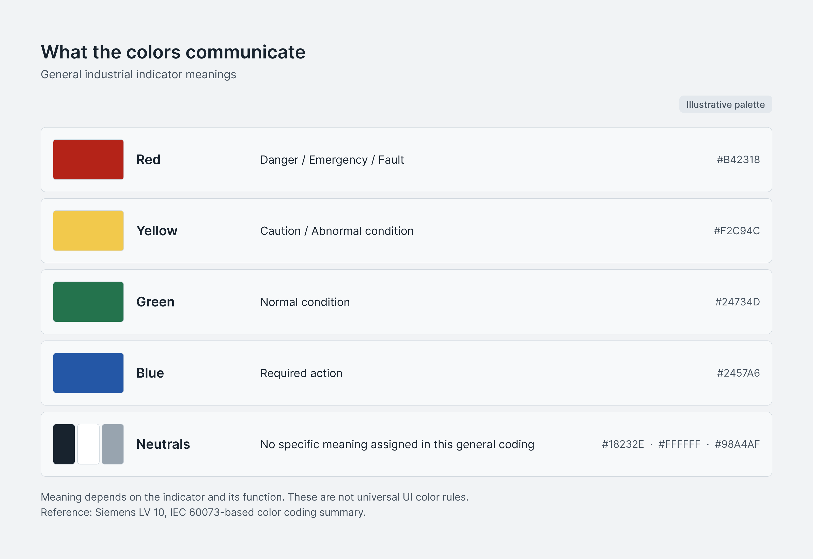
Industrial indicators commonly associate red with danger, an emergency, or a fault; yellow with caution or an abnormal condition; and green with a normal condition. Blue can indicate that a specific action is required. Black, white, and gray do not carry a special meaning in this general coding. Siemens includes this overview in an IEC 60073-based color-coding table.
The surprising one is often blue. In a consumer product, we may use blue for neutral information or a primary button. On a machine indicator, it can have a more specific operational role. A physical push button, a signal lamp, and a field inside a digital HMI are not automatically governed by the same rule. A useful color guide therefore explains the component, condition, and accompanying label—not only the HEX value.
When everything is fine, the screen can stay quiet
Making every running device bright green can seem sensible. Now imagine a plant overview with dozens of pumps, valves, and tanks. If each normal state carries a strong color, the everyday screen becomes the loudest version of itself. High-performance HMI practice often starts with a restrained or grayscale foundation and reserves stronger contrast for information that needs attention. The RealPars HMI color guide shows this approach through neutral process graphics and selective alarm colors.
A quiet screen should not become an ambiguous screen. “Running,” “Stopped,” “Fault,” and “No data” are different states. A pump may be intentionally stopped, so painting it red would suggest a problem that may not exist. A sensor that has lost communication should not look like an ordinary gray reading either. Clear text, symbols, and data-quality states still have to carry the meaning.
One tank, three different conditions
To make the idea concrete, I created a fictional display for Tank T-01. The warning and alarm thresholds below are design values for this example; they are not operating or safety limits for a real process.
| Condition | Example data | Presentation |
|---|---|---|
| Normal | Level 62% | Neutral tank graphic, status icon and “Within normal range” label |
| Warning | Level 82%; warning threshold 80% | Yellow marker, triangle icon and “Level high” label |
| Alarm | Level 93%; alarm threshold 90% | Red marker, alarm icon, “High level alarm” label and threshold information |
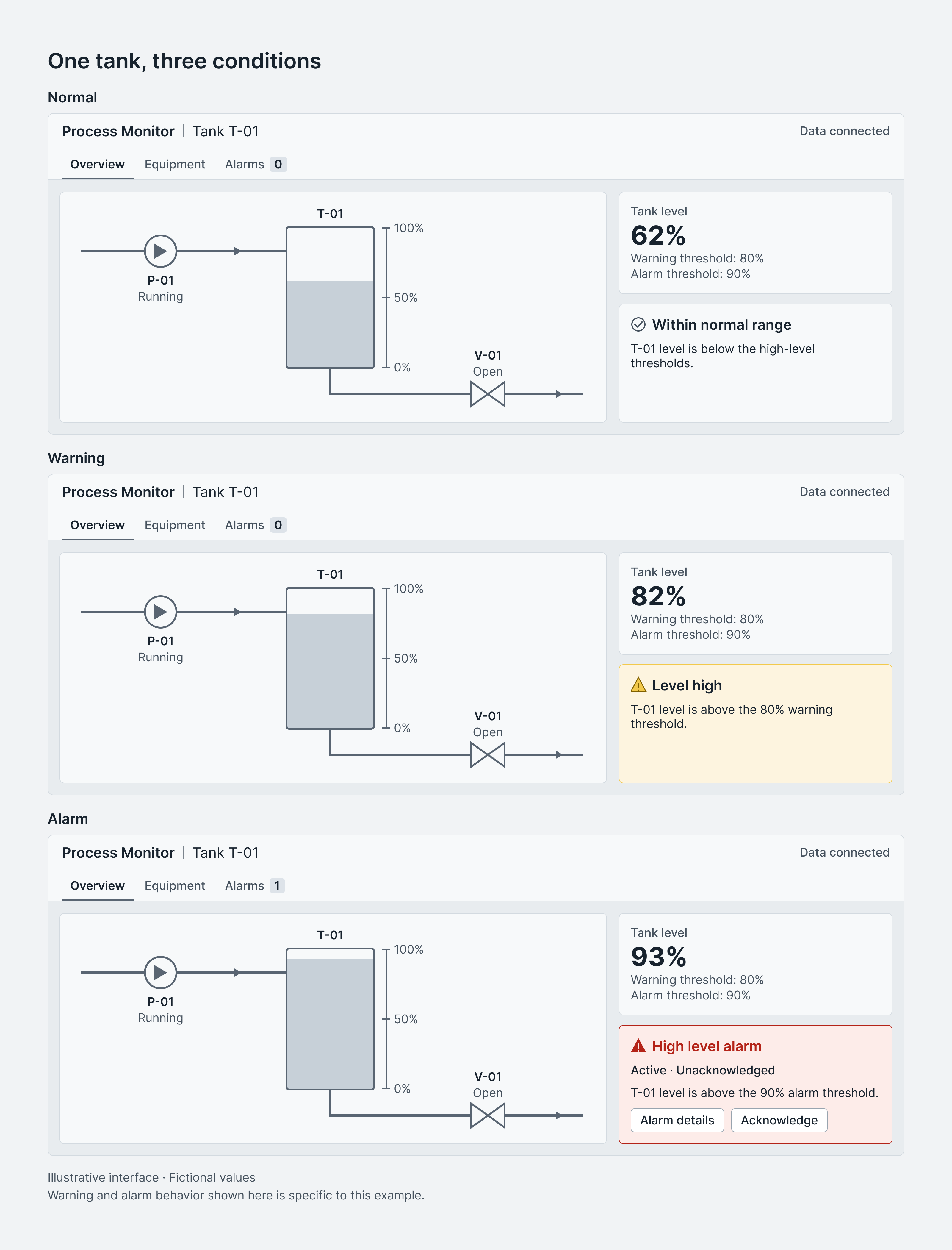
I would keep the tank, scale, and status area in the same positions across all three screens. The operator should not have to relearn the layout when the condition changes. At 93%, the alarm area can say “T-01 · Level 93% · Alarm threshold 90%.” The red marker now points to a message that already explains what happened and where.
Acknowledged does not mean resolved
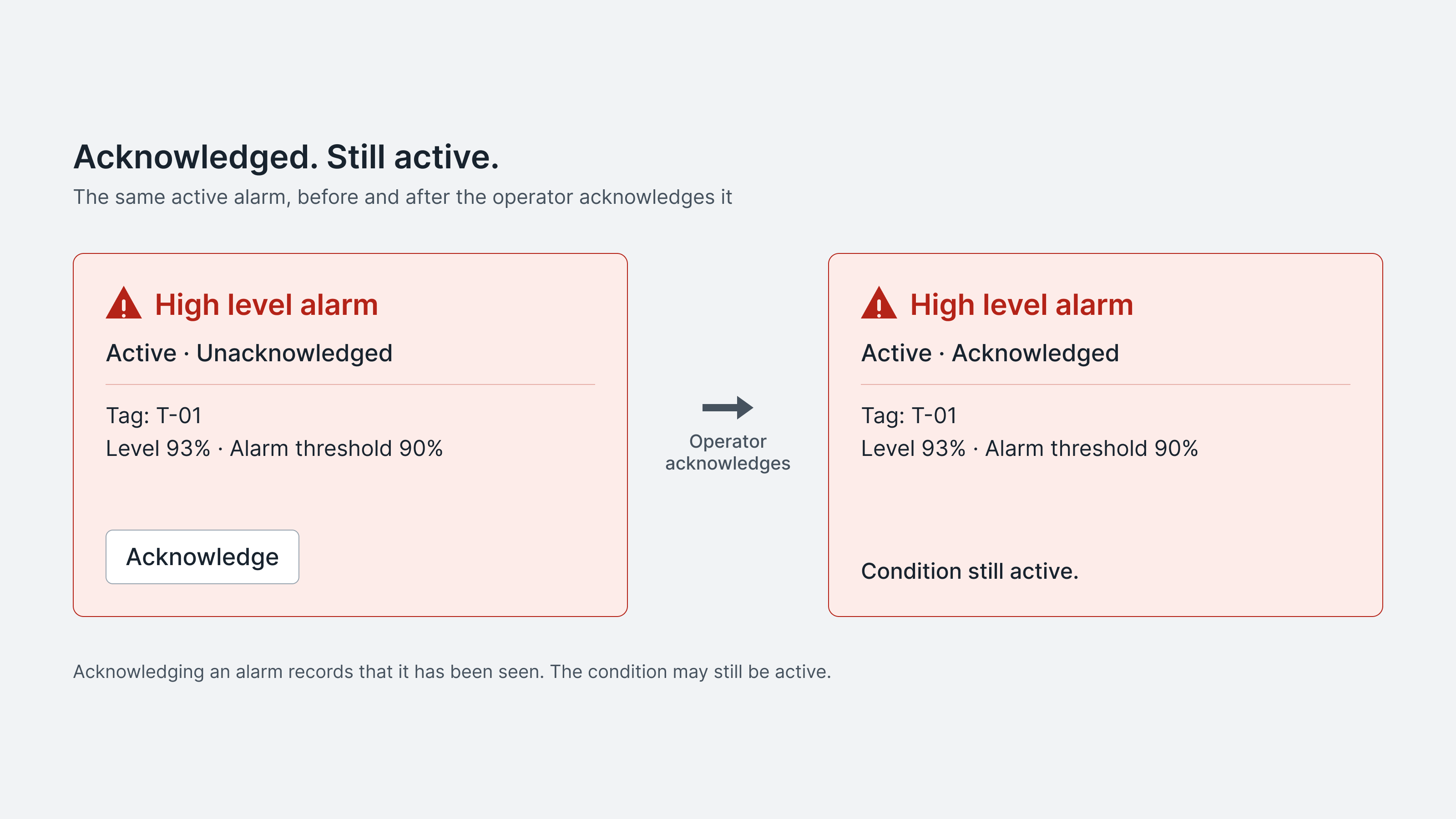
The tank is still at 93%. An operator sees the alarm and selects “Acknowledge.” The interface can record that interaction, but the water level has not changed. Turning the card green at this moment would suggest a very different outcome.
Ignition's alarm model treats “Active” and “Acknowledged” as separate conditions. An alarm can therefore be active and acknowledged at the same time. In this example, I would keep the red emphasis and change the label from “Active · Unacknowledged” to “Active · Acknowledged.” Ignition's alarm documentation explains these states in detail.
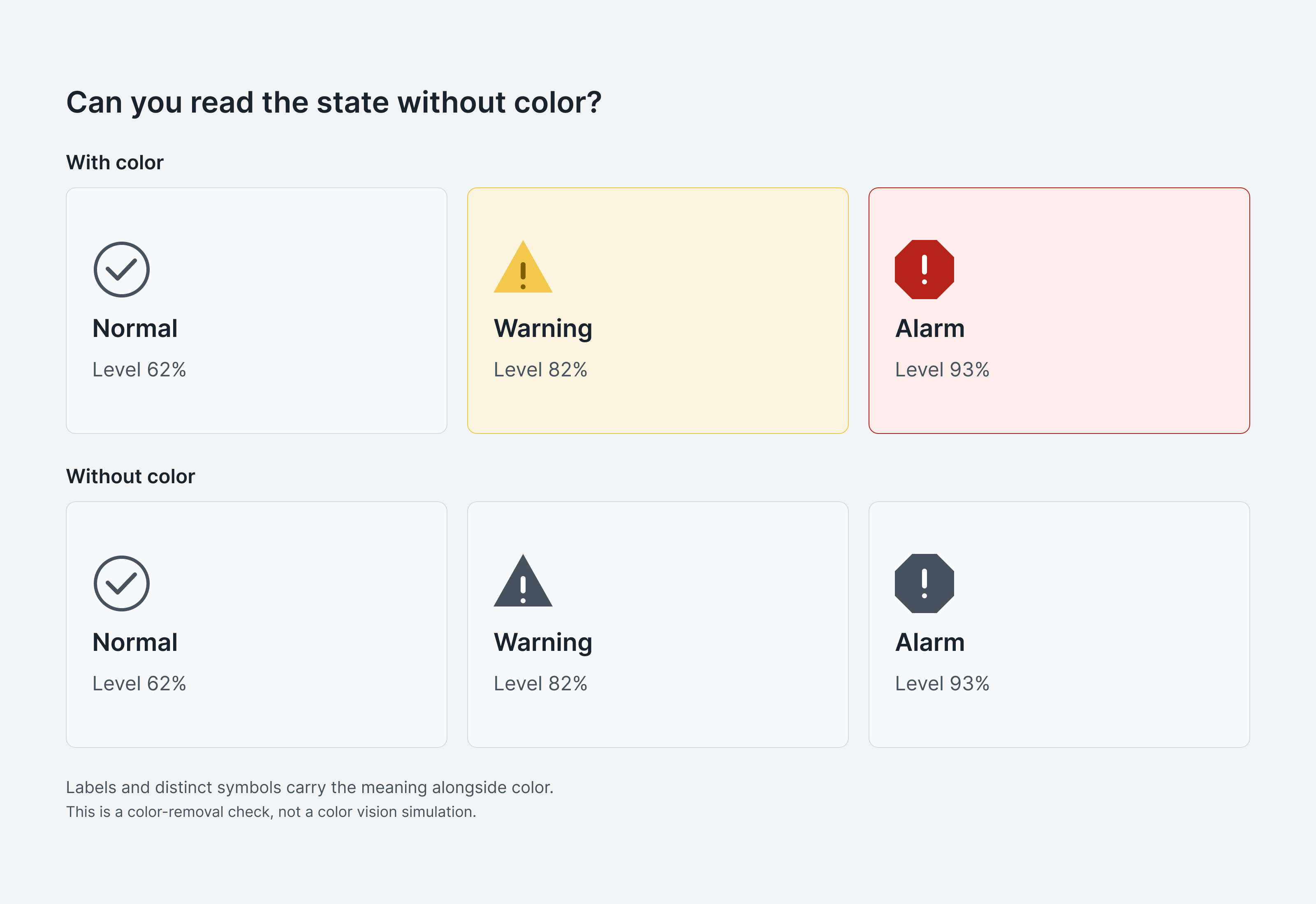
Would the interface still make sense without color?
If the difference between normal, warning, and alarm disappears when color is removed, the interface is asking color to carry too much meaning. W3C's Use of Color guidance says color should not be the only visual way to convey information. Text, shapes, and symbols can work beside it: “Level high” remains understandable even when yellow is difficult to perceive.
Readability is a separate check. W3C defines a minimum contrast ratio of 4.5:1 for normal text and 3:1 for large text in web content. These ratios are useful references for the article and web-based interfaces, but they do not validate every condition of an industrial installation. Screen hardware, viewing distance, ambient light, and the operator's working environment also matter. Read the W3C contrast guidance.
Design the meaning before choosing the palette
- List the states the interface needs to communicate: running, stopped, warning, alarm, acknowledged, and no data.
- Decide which conditions genuinely require immediate attention.
- Define how text, symbols, shape, and position will support each color.
- Document where each color may—and may not—appear.
- Review the design at its intended size and with the people who will actually use it.
The goal is not to make an industrial interface colorless. It is to make every color earn its place. The screen I want is simple: I can find the tank, read its level, understand why the alarm is active, and see what needs my attention. That same principle shapes how I approach other interface design work: reduce the noise until the important decision becomes easier to see.
Sources
- What Is HMI? — Inductive Automation Definition of HMI and its industrial applications
- Siemens — IEC 60073 Colour Meanings Meanings of red, yellow, green, blue and neutral colours in industrial indicators
- HMI Colors — RealPars Selective use of colour in high-performance HMI design
- Alarming — Ignition User Manual Distinction between active and acknowledged alarm states
- Understanding Use of Color — W3C Why information should not be communicated through colour alone
- Understanding Contrast Minimum — W3C Minimum contrast requirements for readable text