Product Designer
Ripe
Eat it while it’s good.
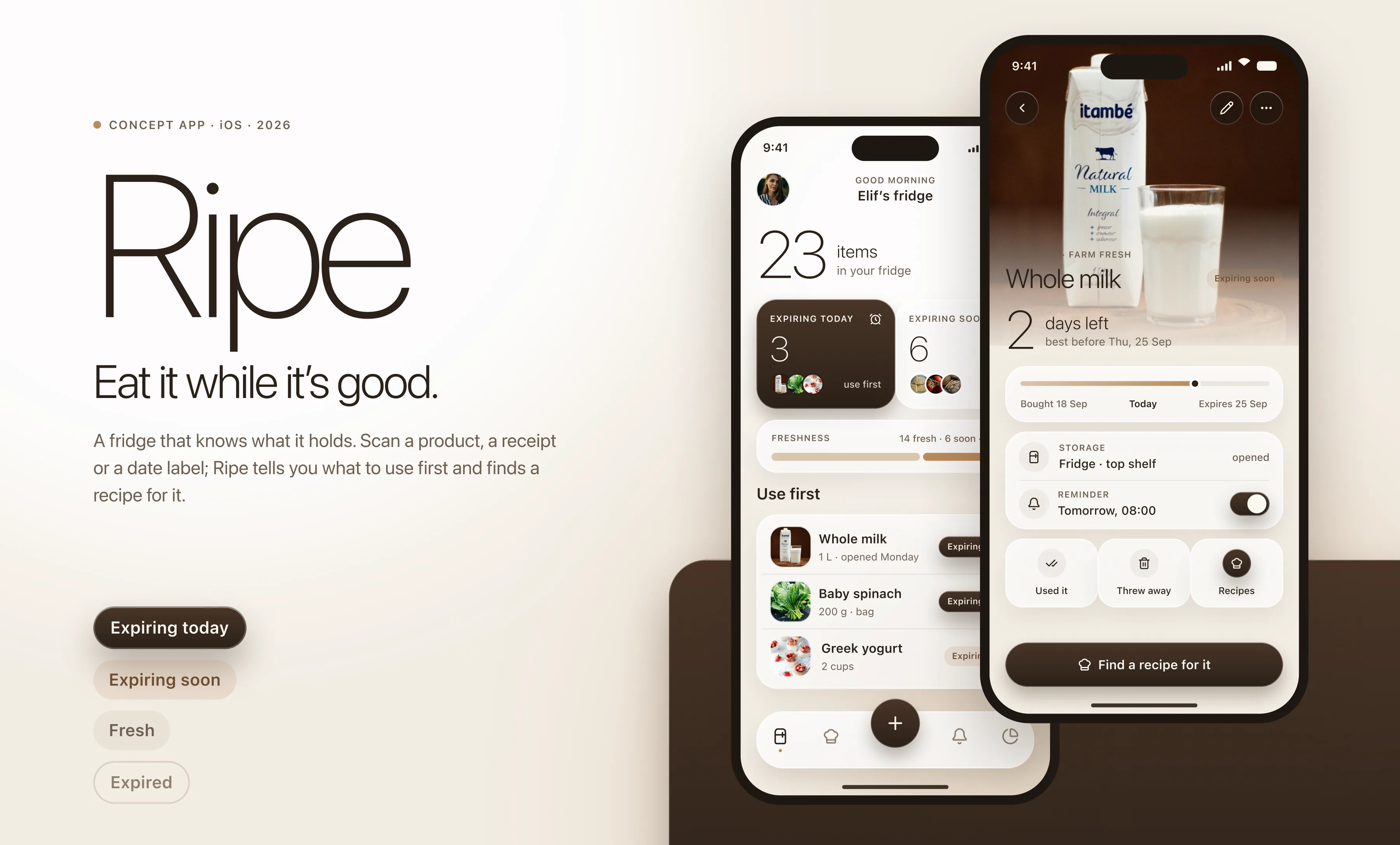
An iPhone app that gives your fridge a memory. Scan a product, a receipt or a date label, and Ripe keeps the list, tells you what to use first and finds a recipe for it before it goes to waste.
Overview
Most of the food we throw away was never bad when we bought it. It went off at the back of the fridge, behind the bag we opened yesterday, with a date printed too small to read. Apps that try to fix this usually ask you to type in every item by hand, and nobody keeps that up past the first week. Ripe starts from the camera instead. A barcode, a receipt or a printed date is enough, and from there it does the remembering: what is in the fridge, what turns first, and what you could cook tonight with exactly those things.
The problem and the approach
Why fridge apps get abandoned
The usual fridge tracker is a spreadsheet with a friendlier font. You come home with twelve things, the app wants twelve names and twelve dates, and by the second shop you have stopped. The list goes stale, the reminders fire for food you already ate, and the app quietly earns a place in a folder you never open.
The other failure is the traffic light. Red, amber and green feel like a warning system, so opening the app feels like being told off. People do not want to be scored on their fridge. They want to know what to cook.
One loop, four states
Everything in Ripe serves one loop: scan, confirm, get reminded, cook. Adding food takes a camera and a tap. The camera reads the barcode, the whole receipt or the printed best-before date; you check what it understood and it goes into the fridge with a date attached. From then on the app sorts every item into one of four states, expiring today, expiring soon, fresh and expired, and reminds you in the morning about the first two.
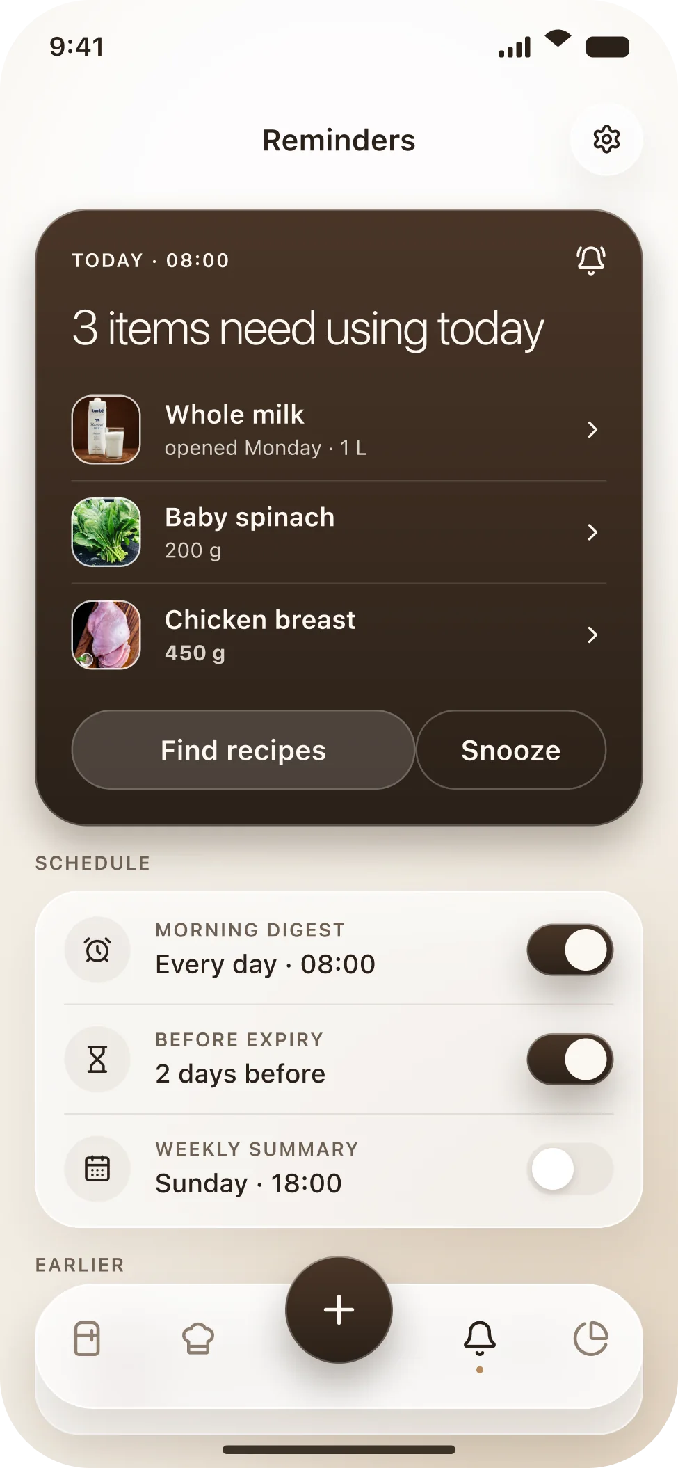
The reminder does not stop at the alert. It leads straight to recipes ranked by how many of your expiring items they use, so the answer to “the spinach is turning” is a dinner, not a chore. The weekly summary closes the loop with one number: how much of what you bought you actually ate.

Design system
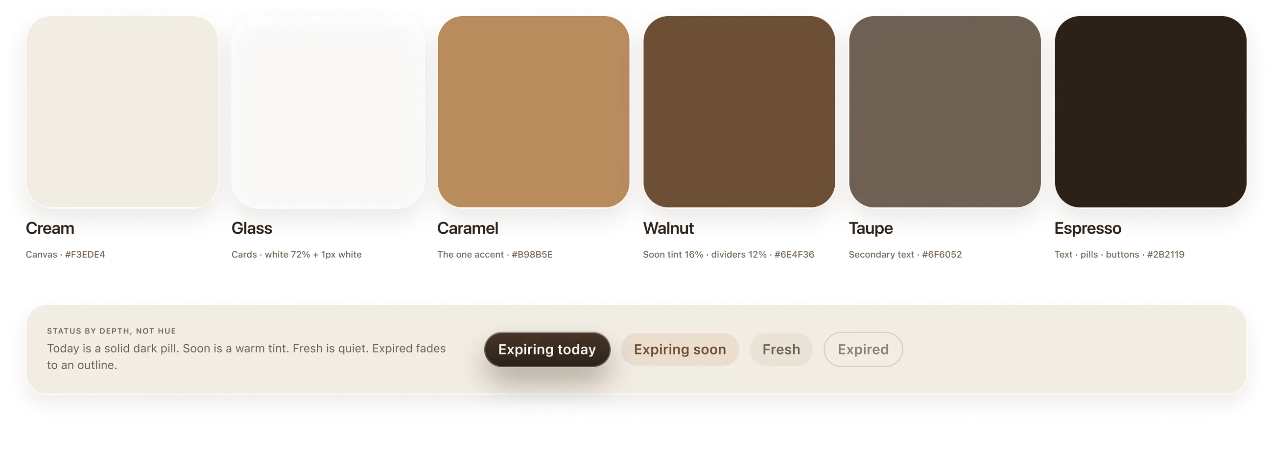
The palette comes from a kitchen counter rather than a dashboard: cream, taupe, walnut and espresso, with a single caramel accent. Cards are white glass with a hairline highlight and a warm shadow. Nothing on screen is pure white or pure black, so photographs of food sit on it naturally.
Colours
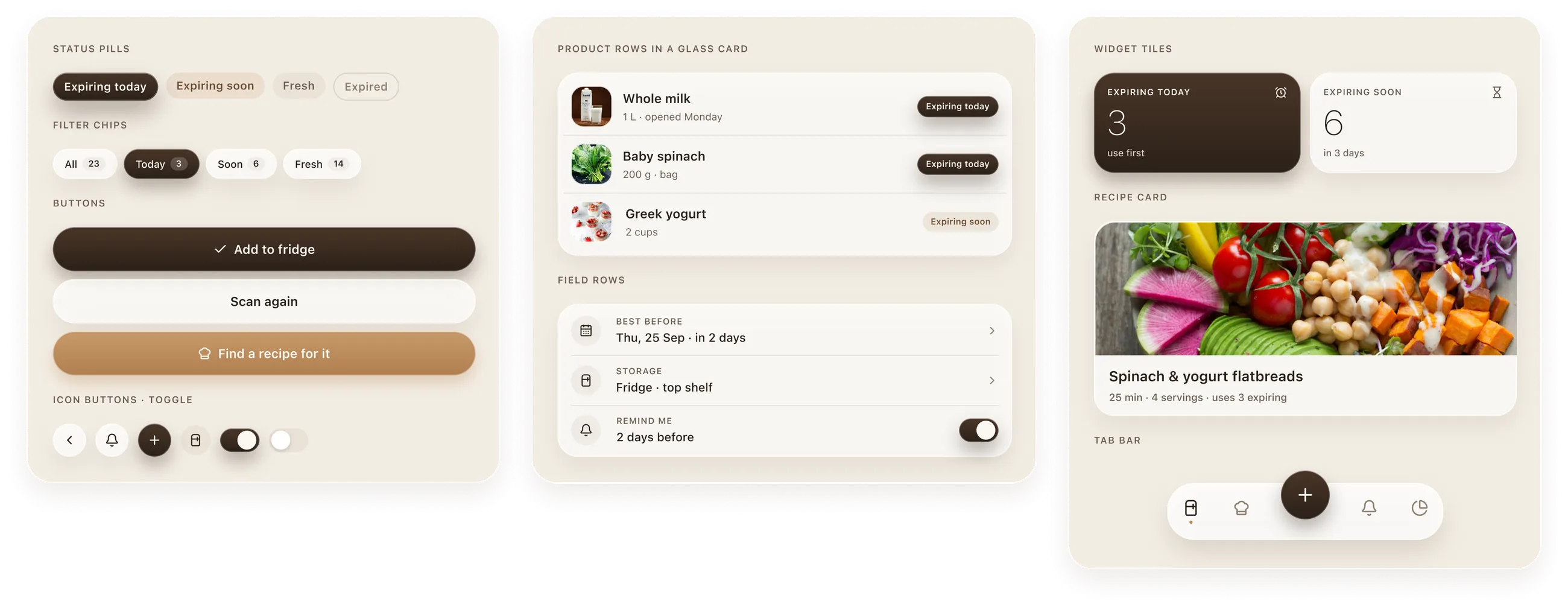
Six tones and no traffic lights. Urgency is carried by depth: expiring today is a solid espresso pill, expiring soon is a warm caramel tint, fresh is quiet, and expired fades to an outline. You can read the state of a shelf without reading a single label.
Typography
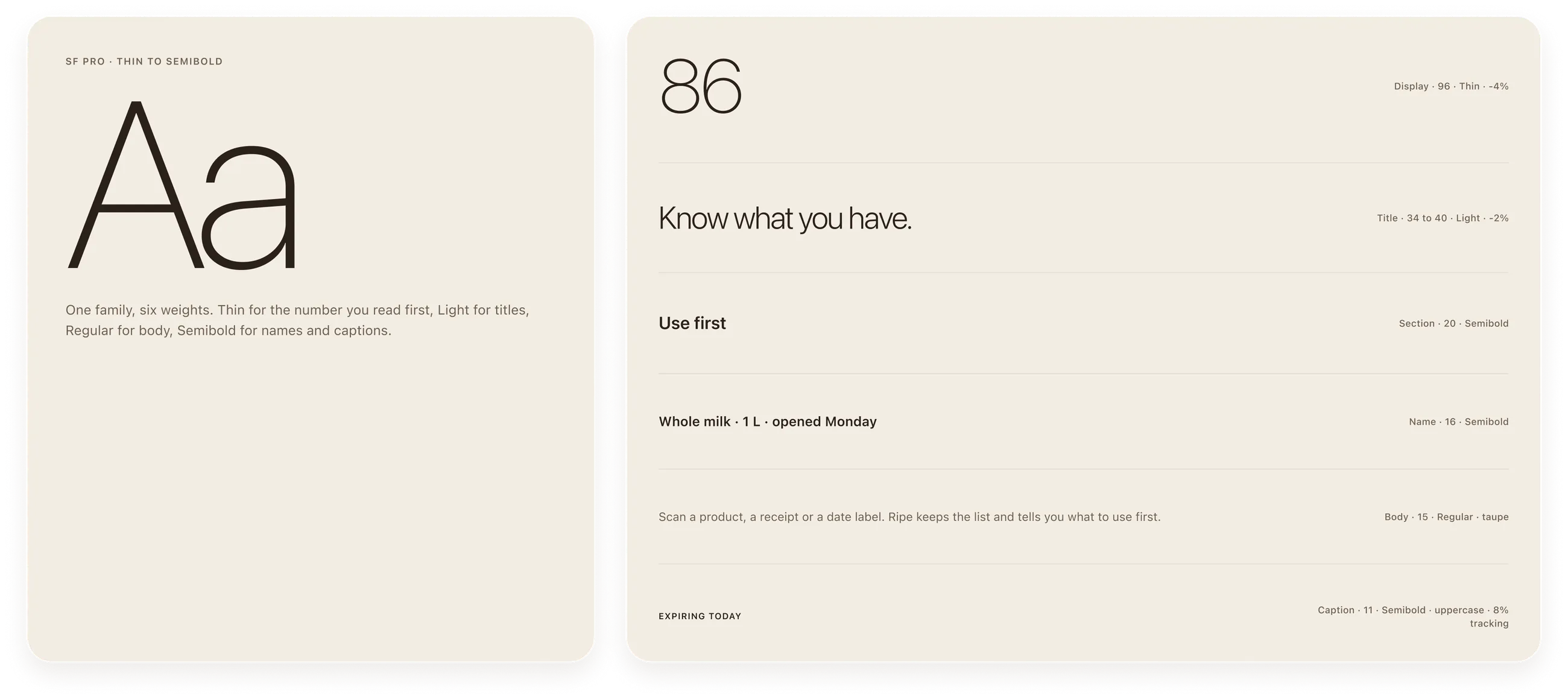
SF Pro from Thin to Semibold. The number you need first, days left, items in the fridge, percent eaten, is set in Thin at a size you can read from across the kitchen. Titles are Light, body text is Regular, and captions are small uppercase Semibold with wide tracking.
Icons
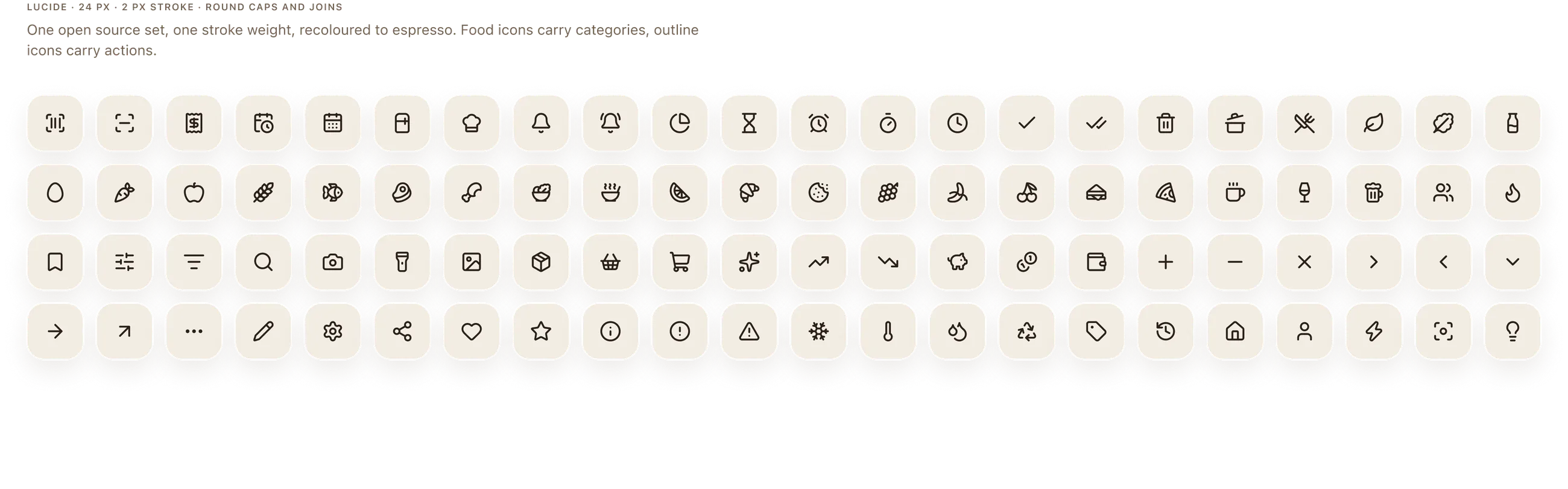
Lucide, 24 pixels, two pixel stroke, round caps, recoloured to espresso. Food icons carry the categories, outline icons carry the actions, and the same icon follows a product from the scan sheet to the inventory to the recipe list.
Components
Status pills, filter chips, three button weights, icon buttons and toggles, product rows, field rows, the two widget tiles, the recipe card and the curved tab bar with its raised plus. Each one is built once and repeats on every screen, so a product looks the same wherever you meet it.
Grid and spacing
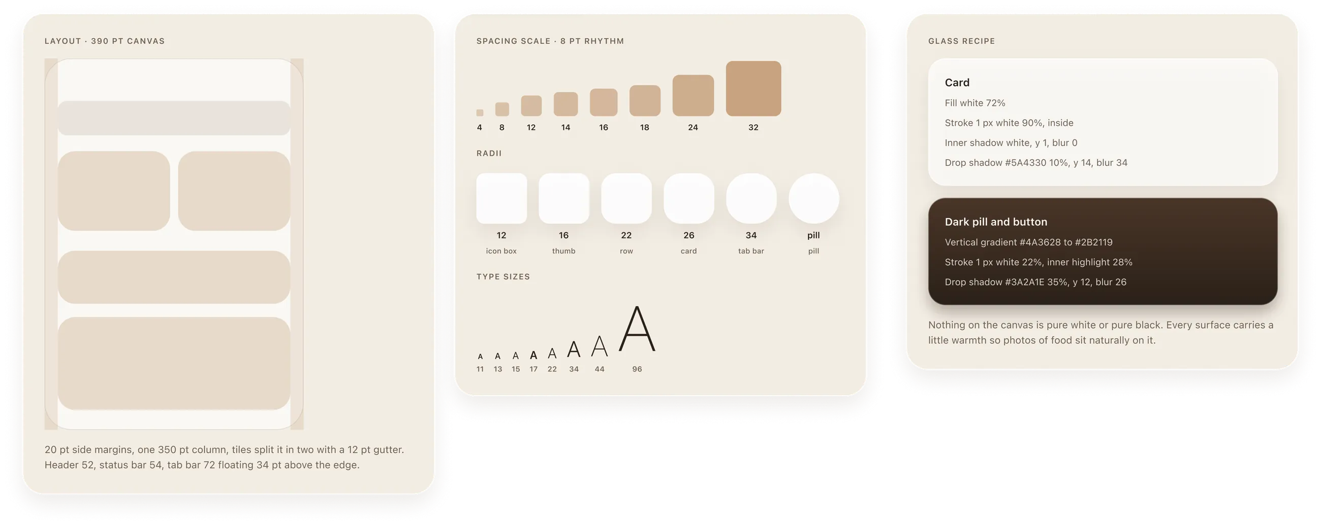
A 390 point canvas with 20 point margins and one 350 point column that splits into two tiles with a 12 point gutter. Spacing runs on an 8 point rhythm, radii step from 12 on icon boxes to 26 on cards and 34 on the tab bar, and the glass recipe is written down so the whole system can be rebuilt from one sheet.
Screens
Onboarding
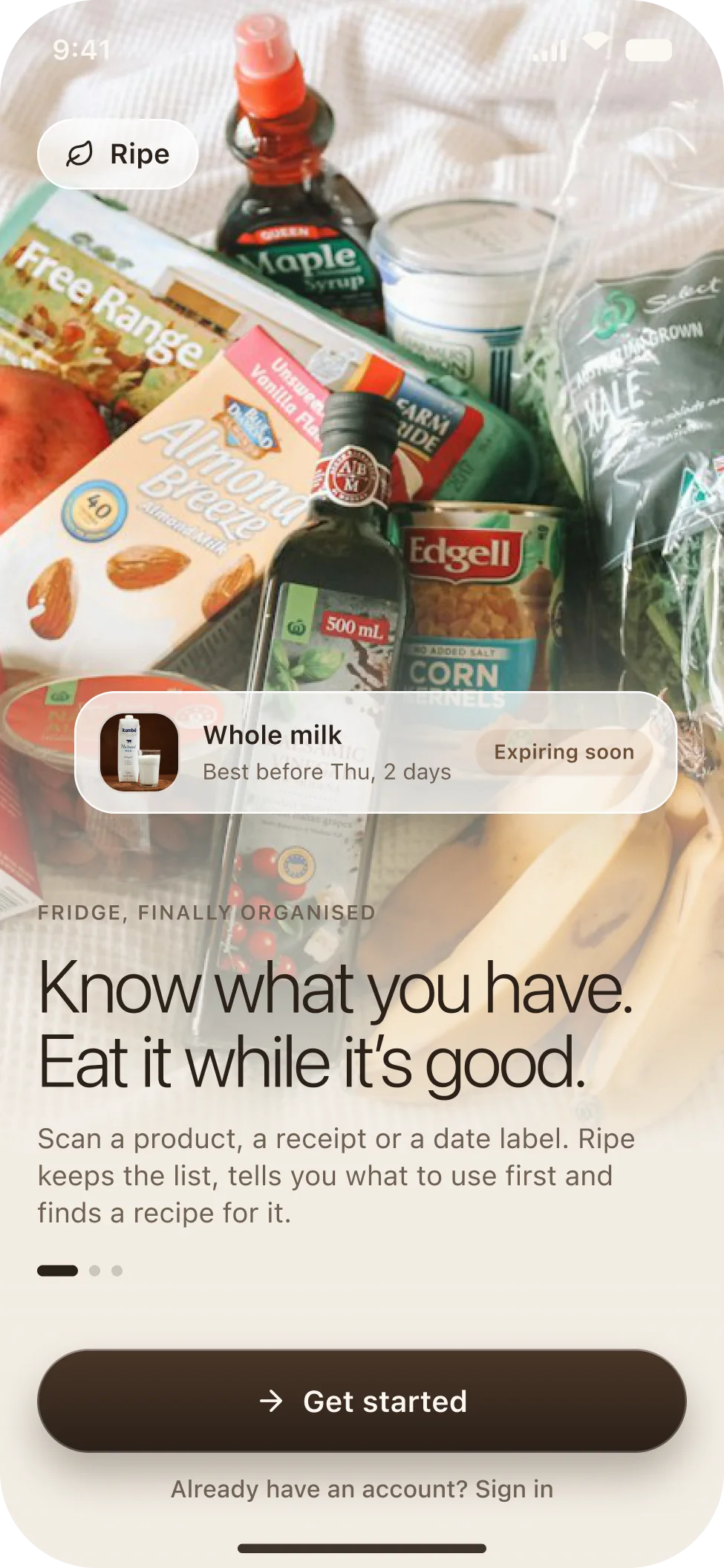
One photo, one promise and one real card. Before the app asks for anything, it shows a milk carton with a best-before date and an Expiring soon pill, so you already know what Ripe does before you tap Get started.
Fridge overview
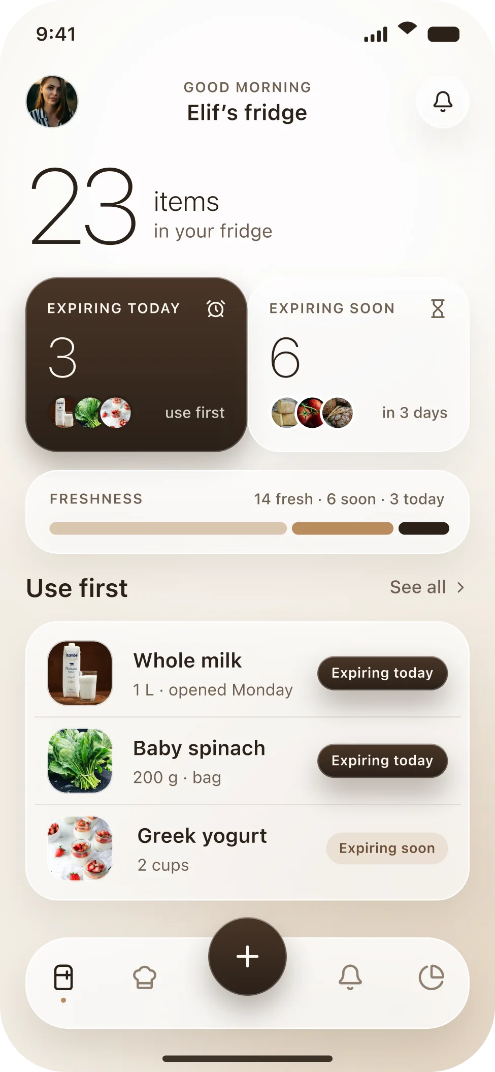
Home leads with the number that matters, how many items you have, then two tiles for what needs attention: three expiring today in a dark tile, six expiring soon in a light one. The freshness bar shows the whole fridge as one line, and Use first lists the three items to reach for.
Scan
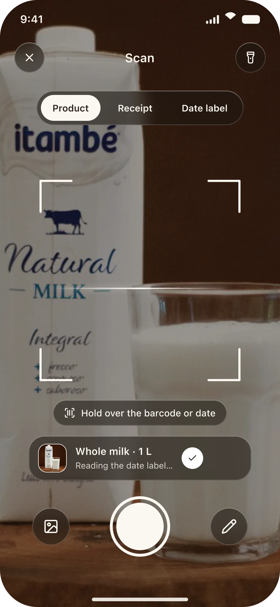
One camera screen, three modes: Product, Receipt and Date label. The brackets show where to hold the item, a thin line sweeps while it reads, and the moment a barcode is recognised a dark glass card appears with the name and a check, while the date is still being read.
Confirm details
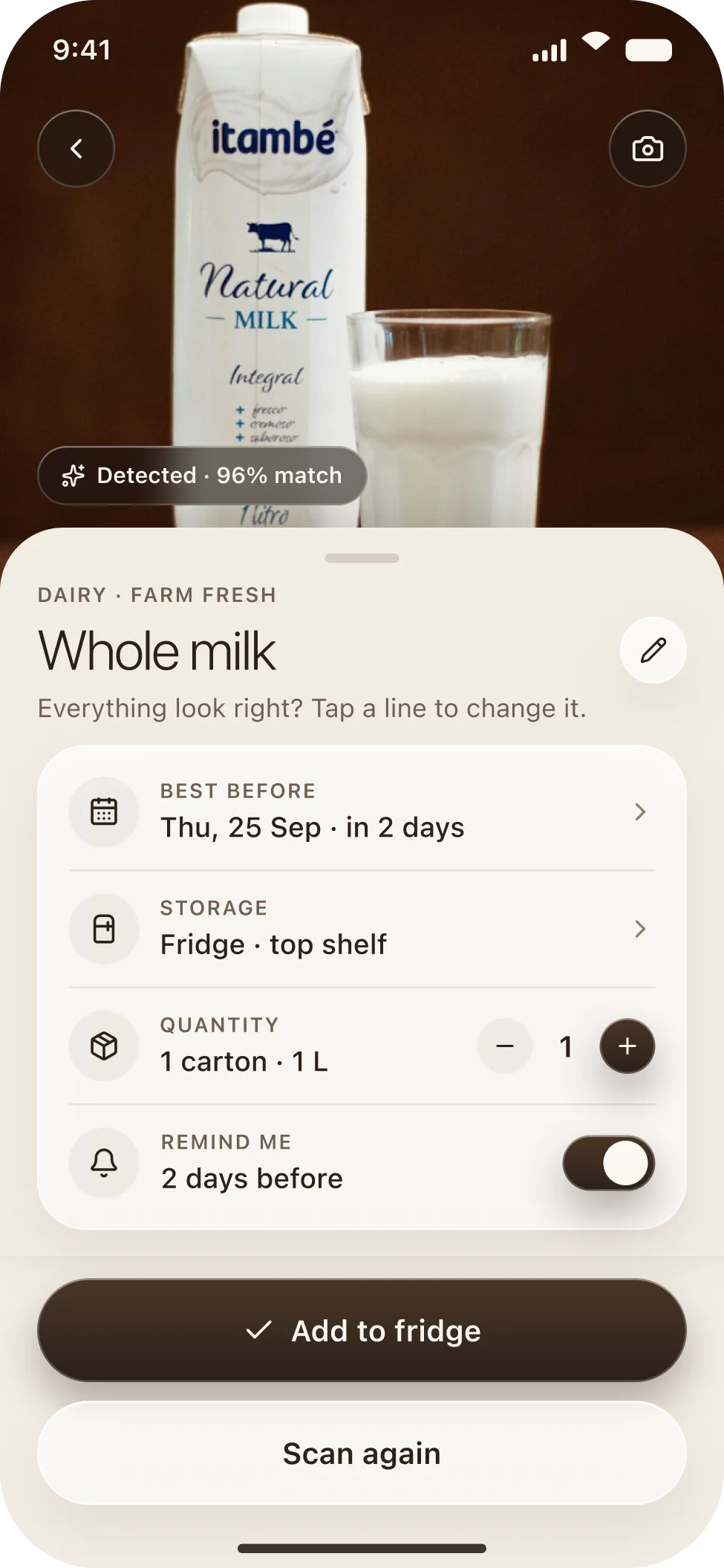
The photo stays at the top and a sheet rises over it with what the camera understood: name, best-before date, storage, quantity and the reminder. Each line is tappable, so a wrong date is a one tap fix rather than a form to fill in.
Inventory
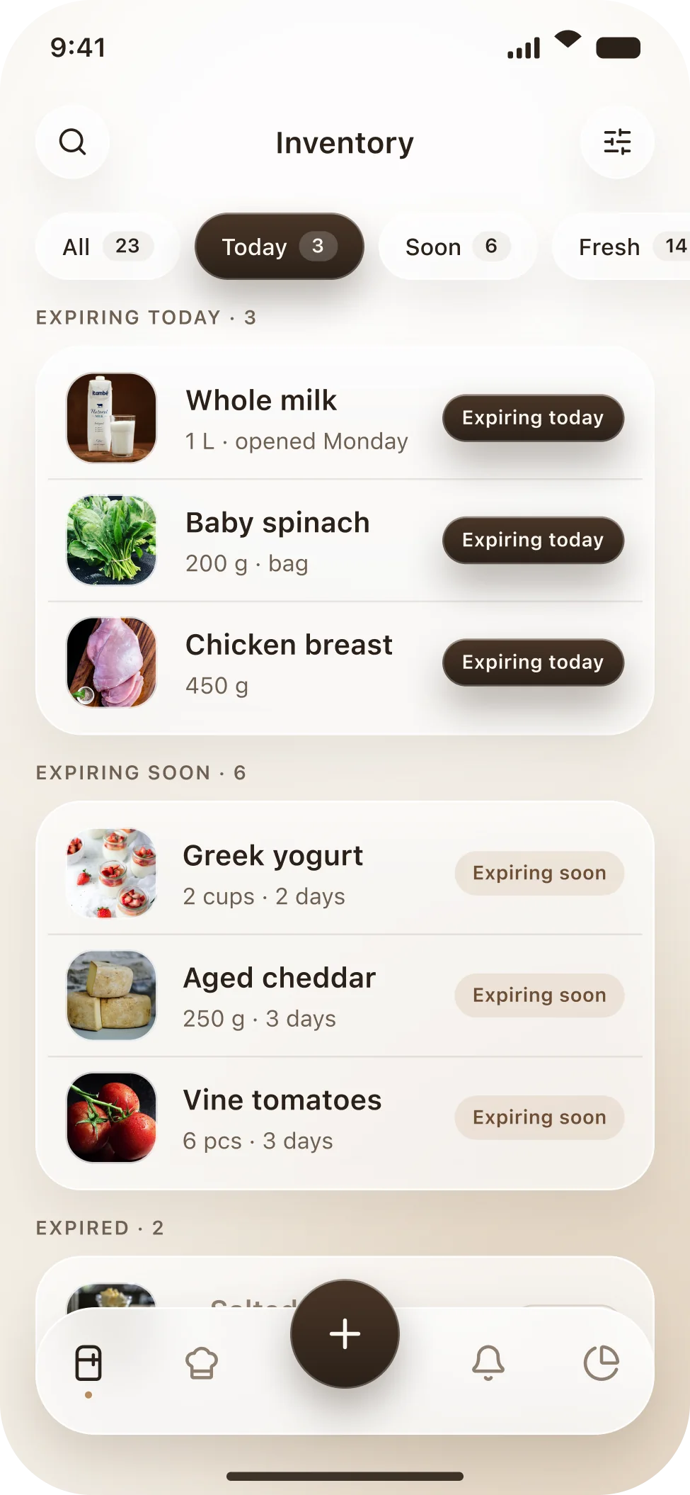
Everything in the fridge, grouped by state. Filter chips at the top carry their counts, and the groups below run in the order you should act: expiring today, expiring soon, fresh, expired. The same product row appears everywhere: a photo, a name, a quantity and a pill.
Product details
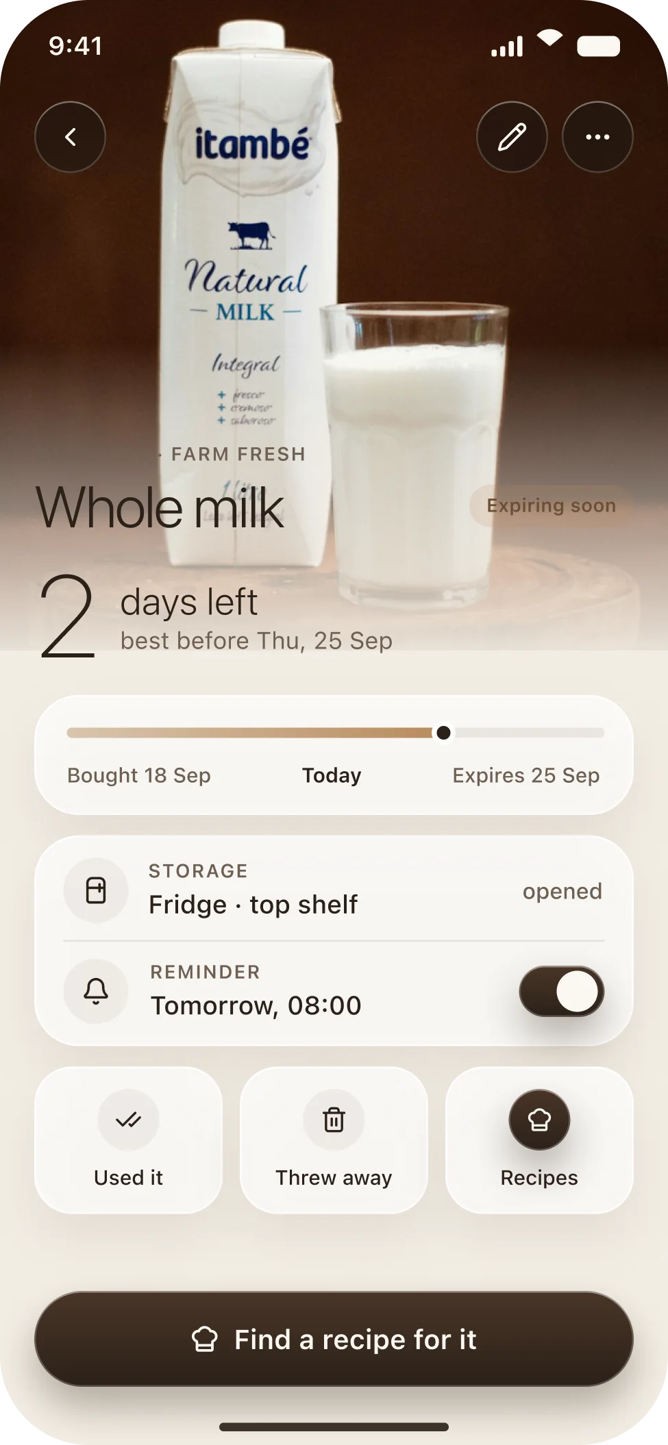
The product photo takes the top of the screen, then one number: two days left. A timeline runs from the day you bought it to the day it expires with today marked on it, so you see where you are without doing the maths.
Reminders
The morning digest is one dark card: three items need using today, listed with their photos, and two buttons, Find recipes and Snooze. Below it, the schedule: a daily digest, a nudge two days before expiry, and an optional weekly summary.
Recipe suggestions
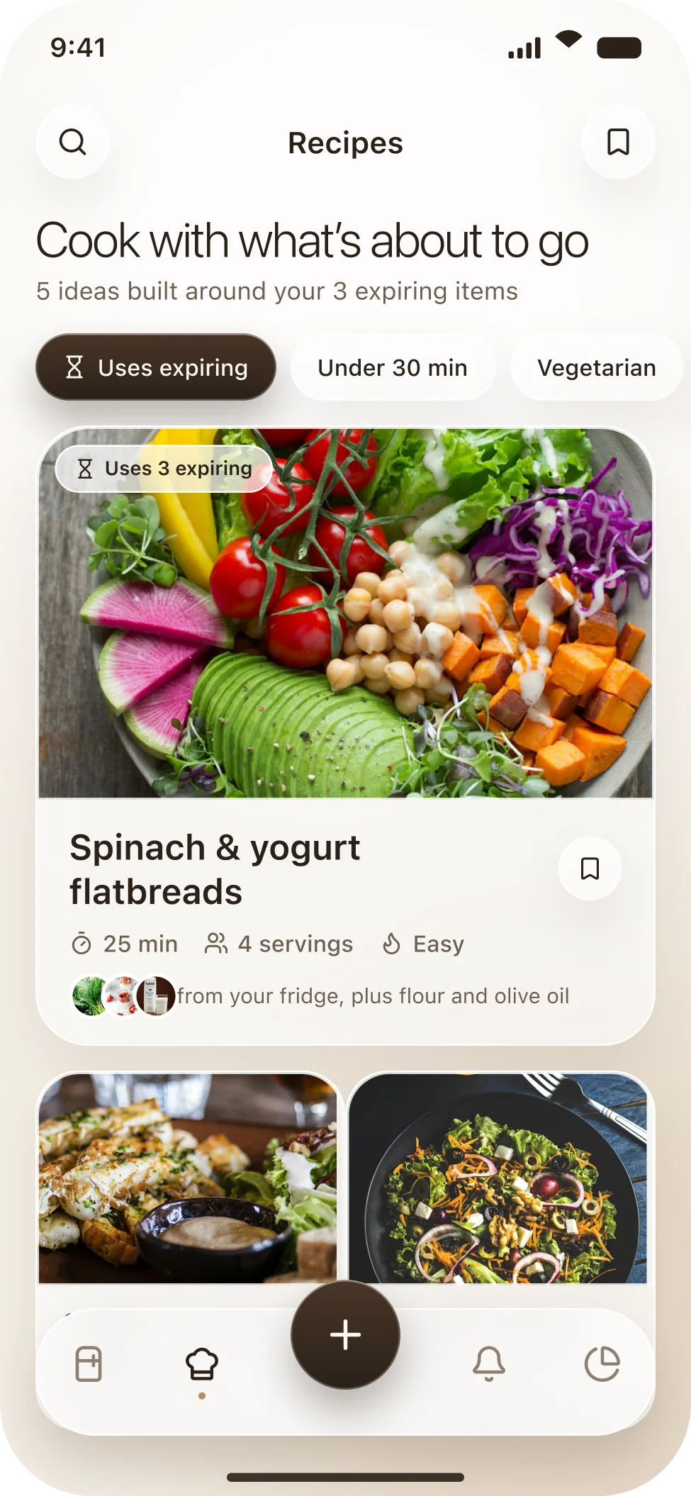
The recipes screen opens with a sentence rather than a search box: cook with what is about to go. The featured recipe uses all three expiring items and says so on the photo. Below it, smaller cards for the ones that use two.
Recipe detail
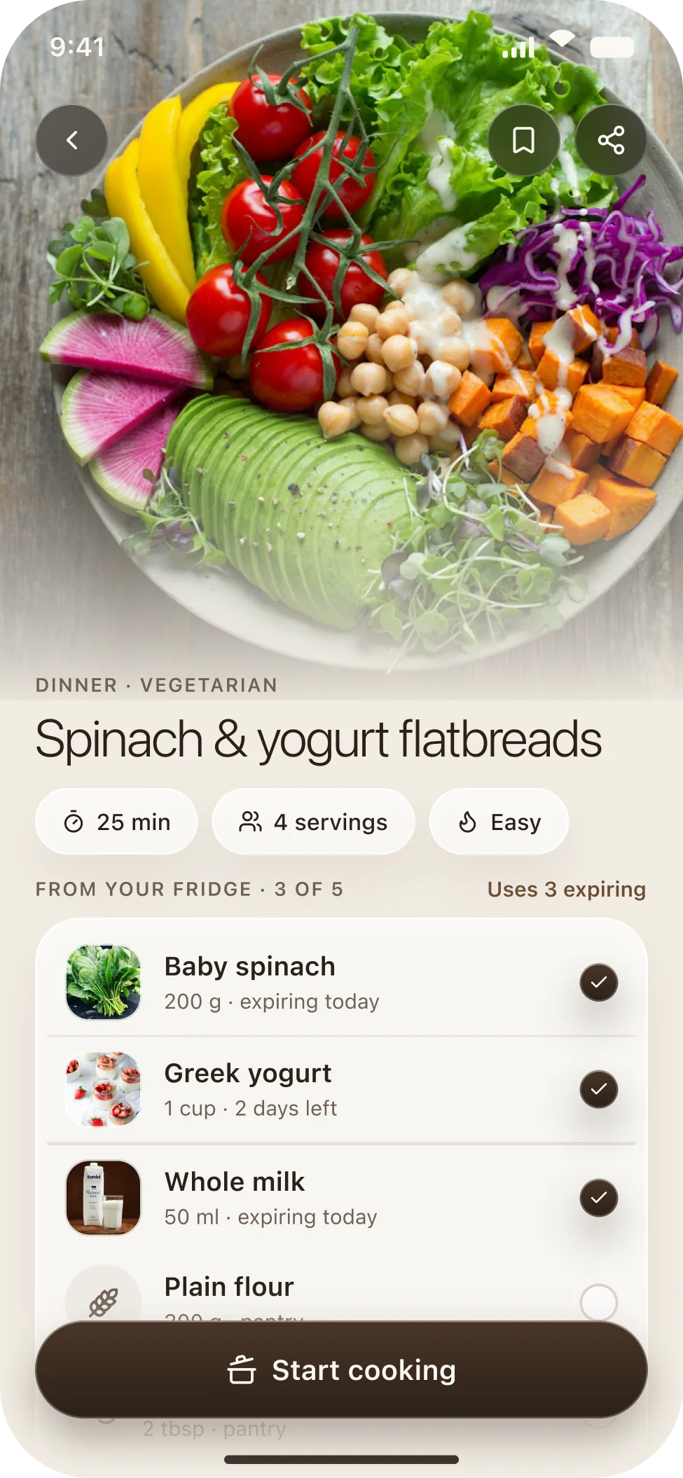
A full width photo, the time, servings and difficulty as chips, and then the part that matters: the ingredient list checked against your fridge. Spinach, yogurt and milk are ticked with their expiry noted; flour and olive oil wait as pantry items.
Weekly summary
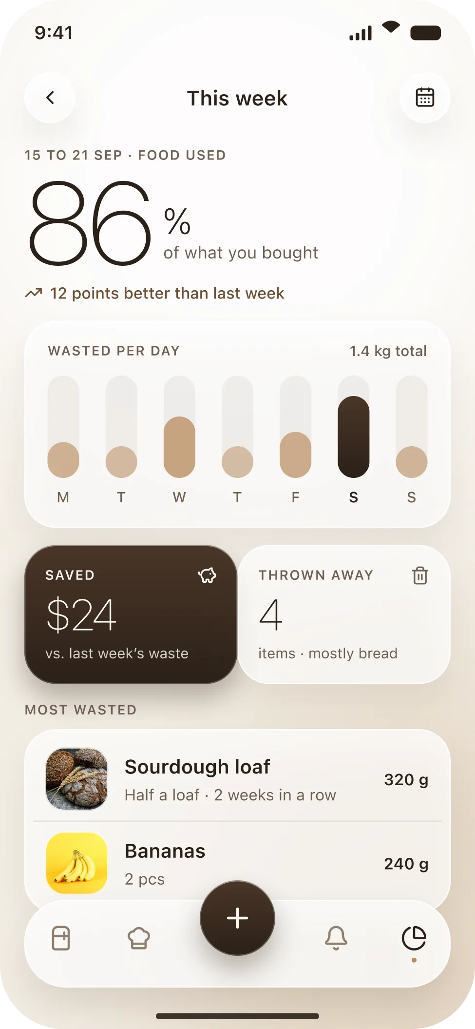
One number for the week: 86 percent of what you bought was eaten. A bar chart shows waste by day with the heavy day in espresso, two tiles show money saved and items thrown away, and a short list names the repeat offenders.
Added to fridge
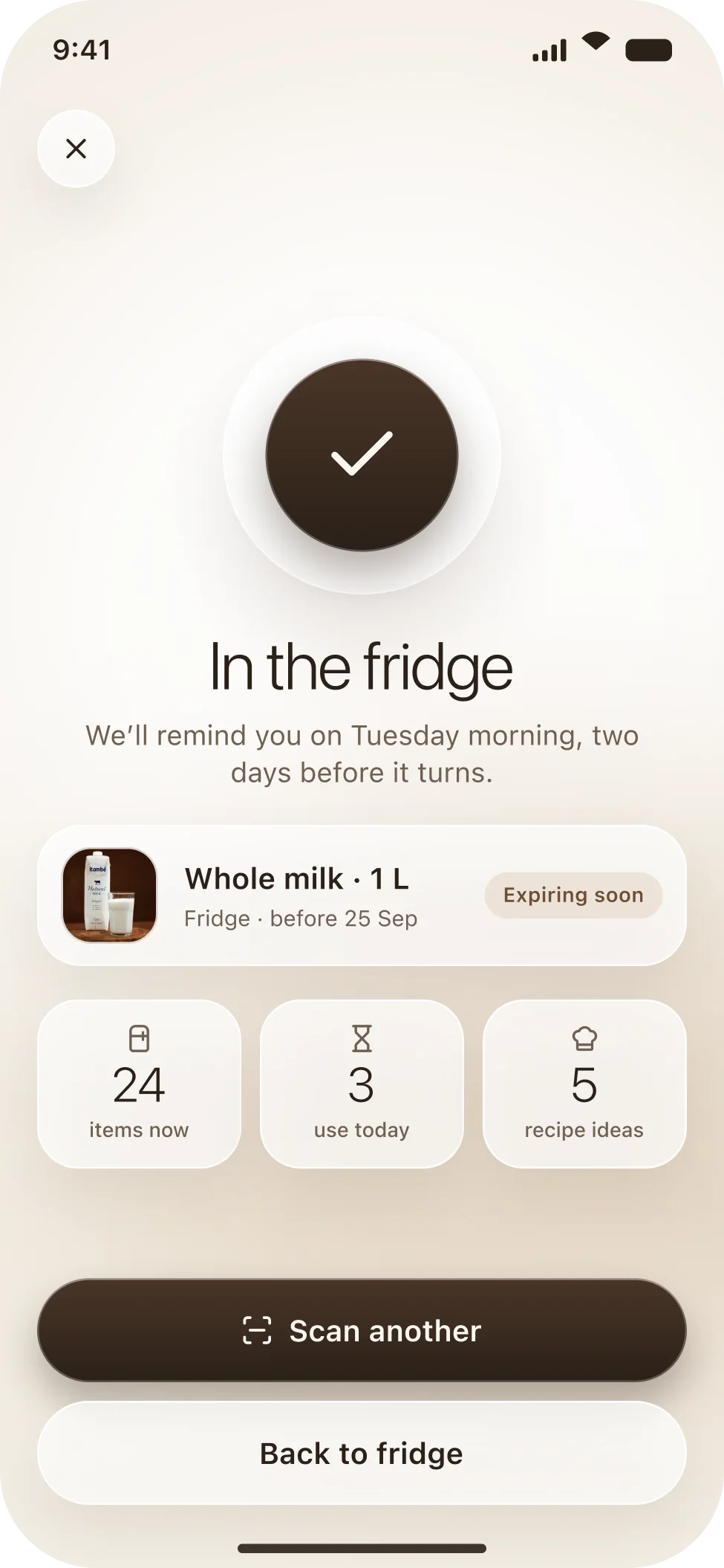
A calm confirmation: a large check, the product card with its date and state, and three small counts, items in the fridge, to use today, recipe ideas. Scan another is the primary button because people rarely come home with one thing.
Receipt results
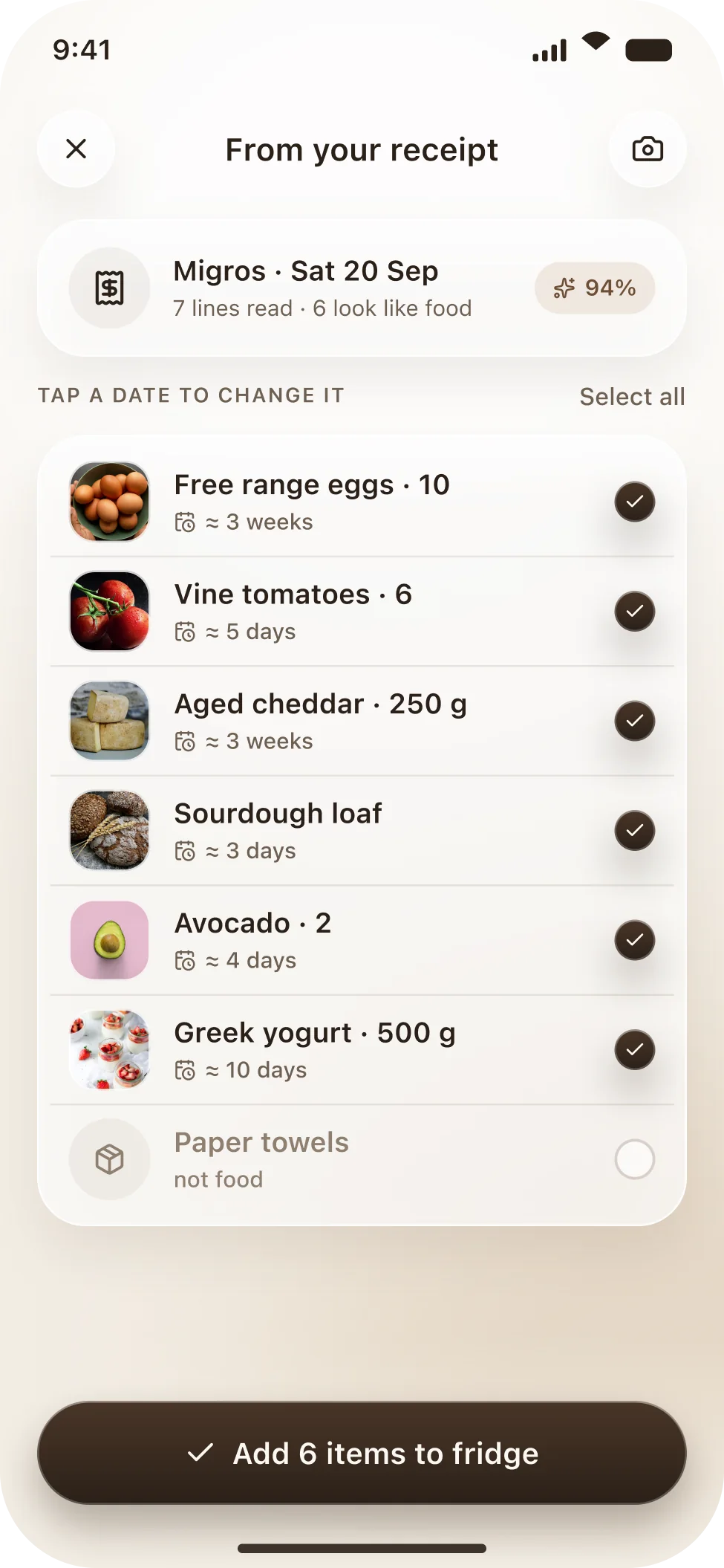
One receipt, seven lines read, six of them food. Each item gets a photo, a name and an estimated best-before date you can tap to change; the paper towels are recognised as not food and left unticked. One button adds the six.
Outcome
Ripe is a concept project. The photos are from Unsplash, the products and dates are invented and no brand is involved. What I wanted to test was whether a fridge app could feel like a warm kitchen tool rather than a nagging spreadsheet, and whether depth alone could replace the traffic light.