Product Designer
Sweep
Storage full?
A storage cleaner for iPhone that finds the copies, the blurry shots, the old screenshots and the huge videos, keeps the best photo in every group, and shows you everything before it deletes anything.
Overview
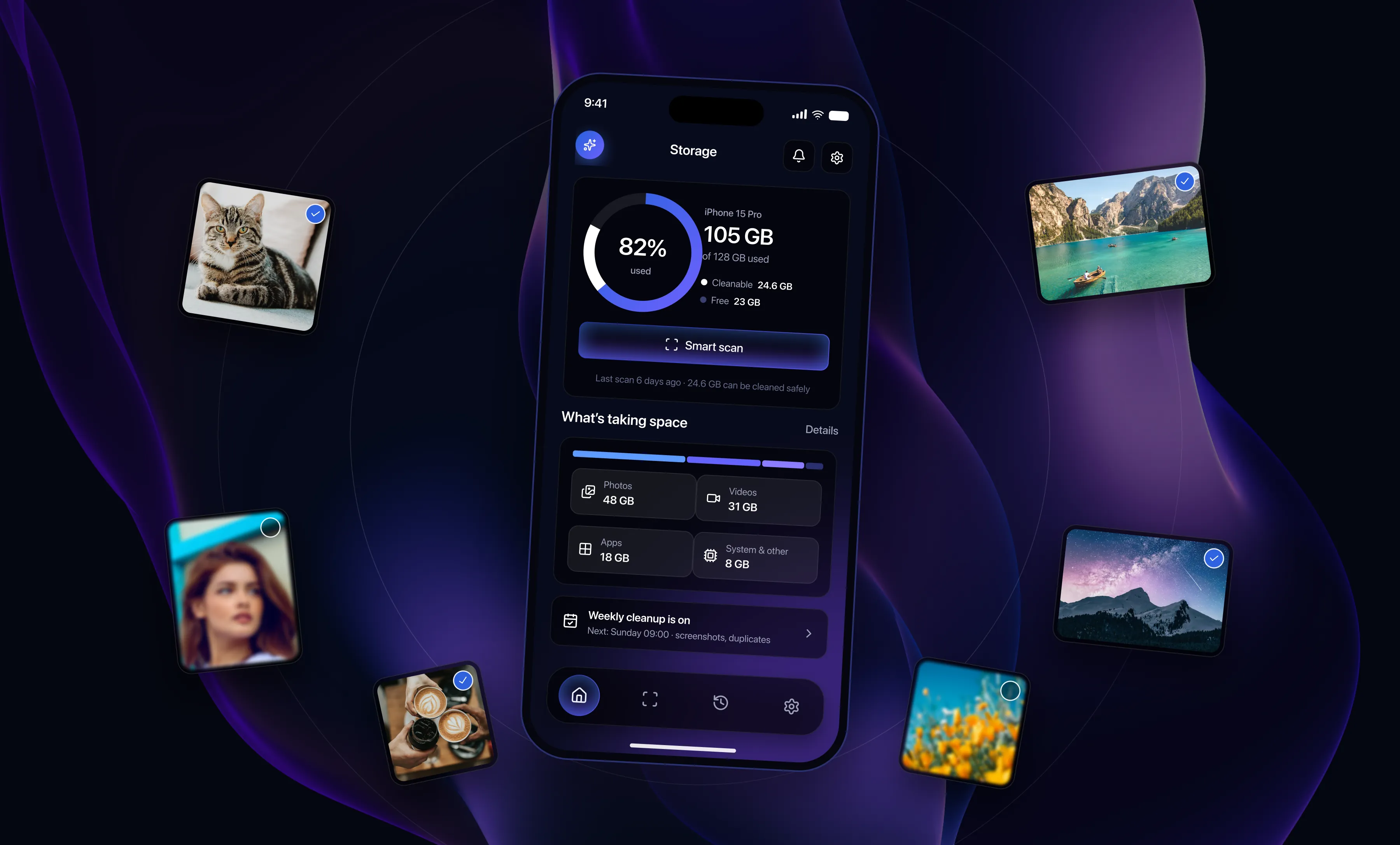
Almost everyone has seen the “Storage almost full” warning, and almost everyone swipes it away. The fixes on offer are clumsy: you either delete a whole album in a hurry or you pay for more iCloud. Nobody actually wants fewer photos. They want fewer copies of the same photo, fewer blurry ones, and that 4 GB screen recording from 2023 gone. Sweep was designed around that. It keeps the good shot, shows you what it found, and lets you change your mind for thirty days.
The problem and the approach
Why people are wary of cleaner apps
Most storage apps chase a big number. They select thousands of files, put them behind one Clean button and expect you to trust them. People open the app once, look at the list, get nervous and close it. The warning stays where it was.
The real job is smaller. Find the things that are genuinely junk, like exact copies, nine almost identical shots of the same lake, or the boarding pass screenshots from two summers ago, and leave every real memory alone.
Three rules for the whole app
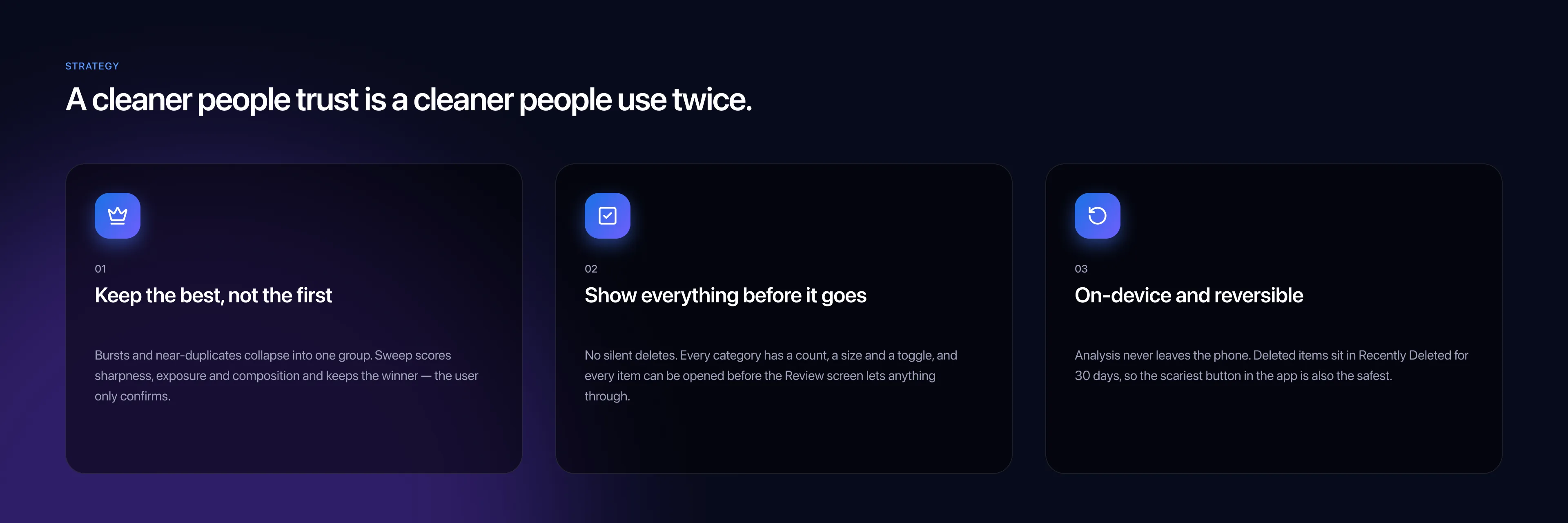
Keep the best one, not the first one. When Sweep finds a burst of similar photos it scores each shot for sharpness, exposure and framing, keeps the winner and asks you to confirm. Show everything before it goes. Every category has a count, a size and a switch, and nothing is removed until it has passed the Review screen. Stay on the phone and stay reversible. Photos are never uploaded, and anything you delete waits in Recently Deleted for thirty days.
The same rules shaped the visuals. Only one thing on each screen is bright, and it is the thing you should tap next. The delete button is not red, on purpose. It is the safest button in the app, so it looks like every other main action.
Design system
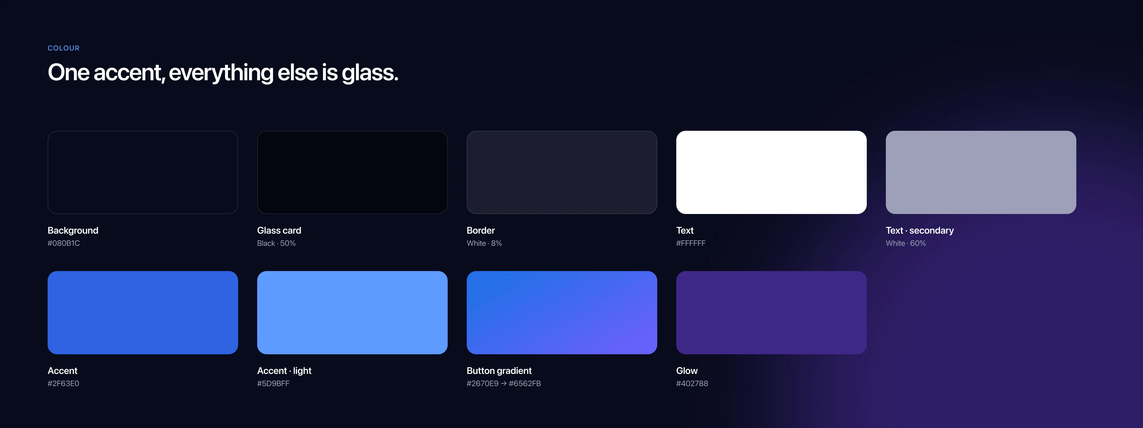
The look borrows from the phone at night: dark surfaces, cards made of translucent black with a thin white edge, one blue accent and a soft purple glow behind the main button. Depth comes from layering, so a screen full of categories still feels calm.
Colours
One accent colour and a lot of glass. Status is never shown with colour. A category you have switched off simply fades, it does not turn red, so the review screens never look like a warning panel.
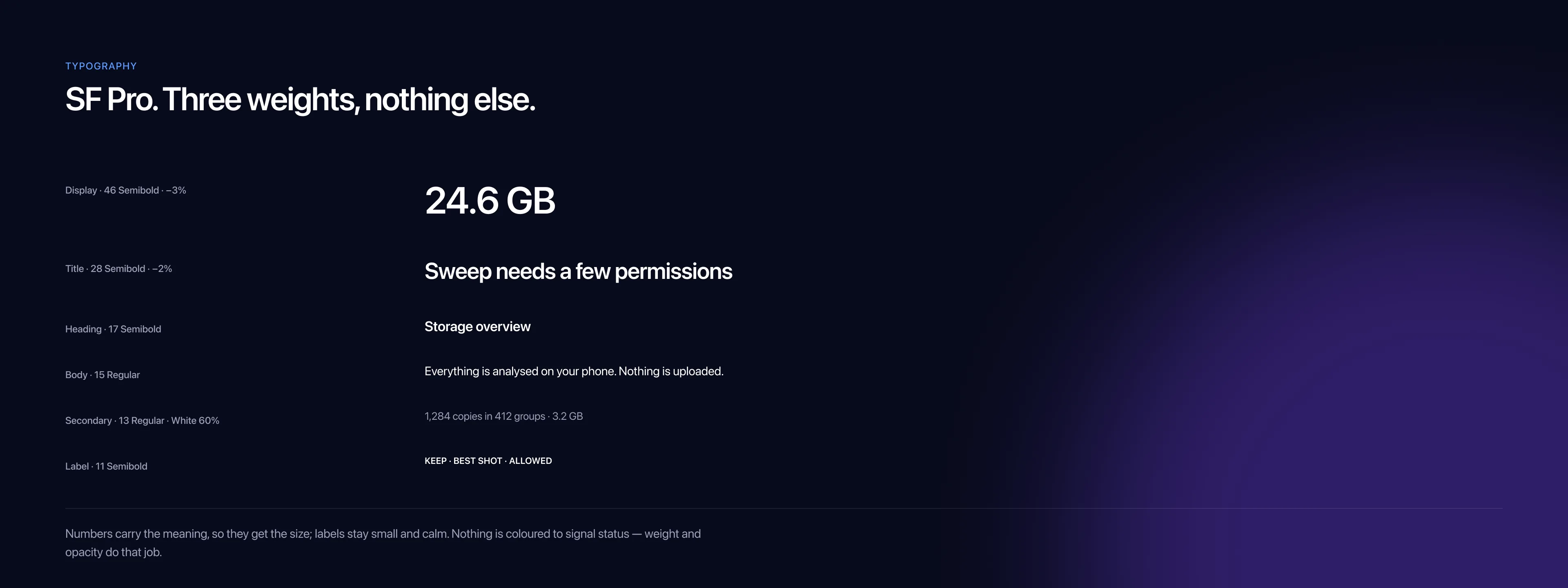
Typography
SF Pro in three weights. The numbers do the talking, so they get the size. The gigabytes you can free are the biggest thing on every screen, and the labels stay small.
Icons
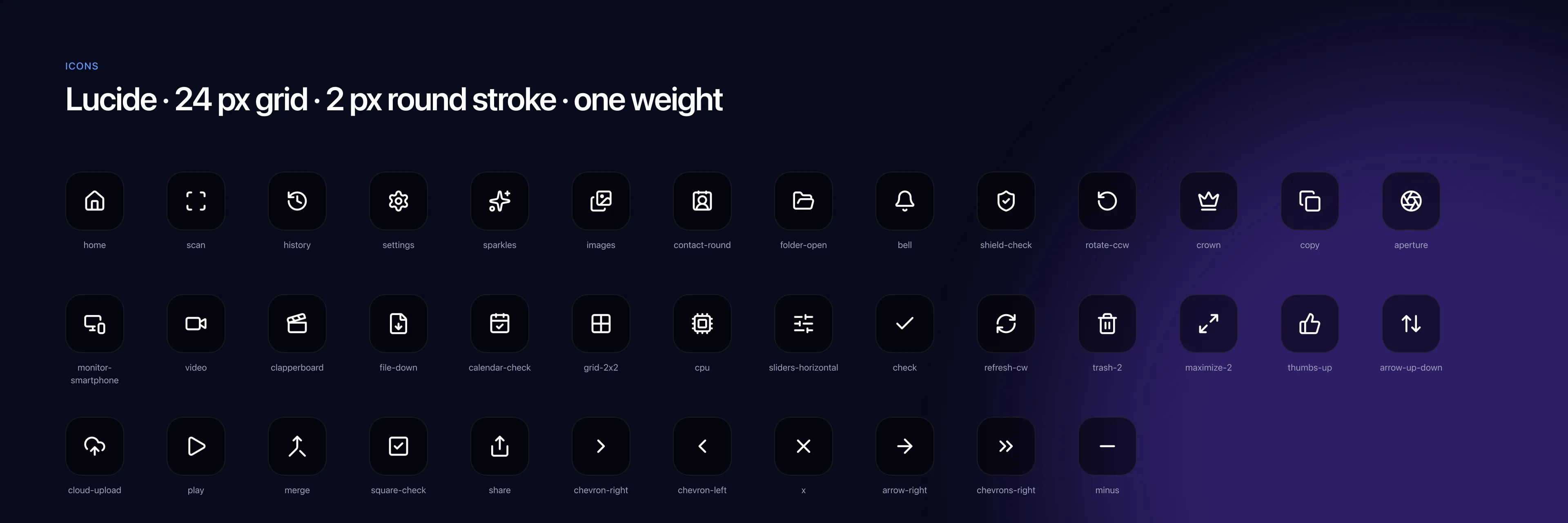
Lucide icons on a 24 pixel grid with a two pixel stroke, all one weight. Each category keeps the same icon from the results grid to the review list to the weekly rules, so you learn it once.
Components
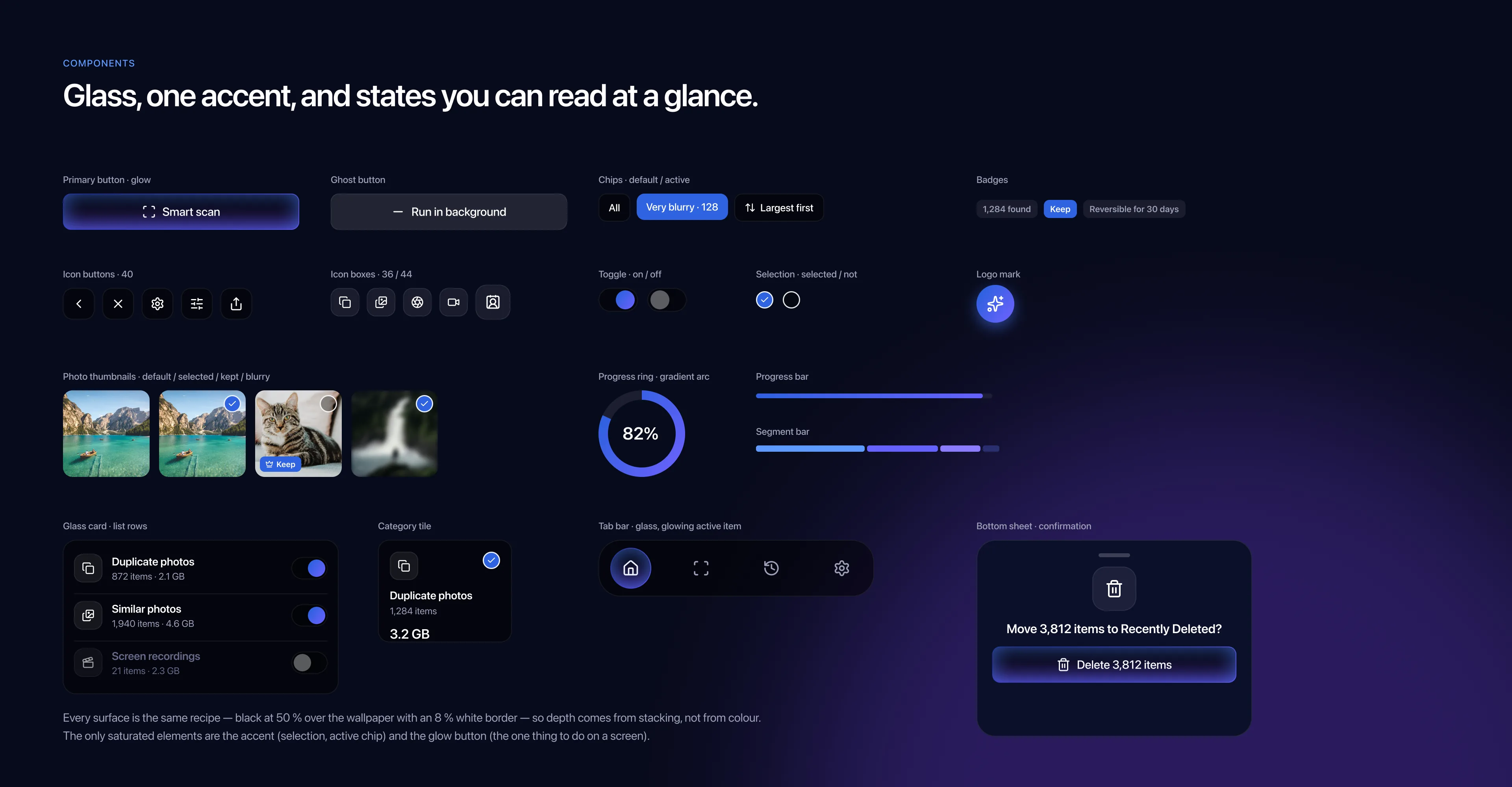
Buttons, chips, badges, toggles, selection dots, thumbnail states, the glass list card, the category tile, the tab bar and the confirmation sheet. Selected, kept and blurry are three different thumbnail looks, so you can read a grid without reading the labels.
Screens
Onboarding
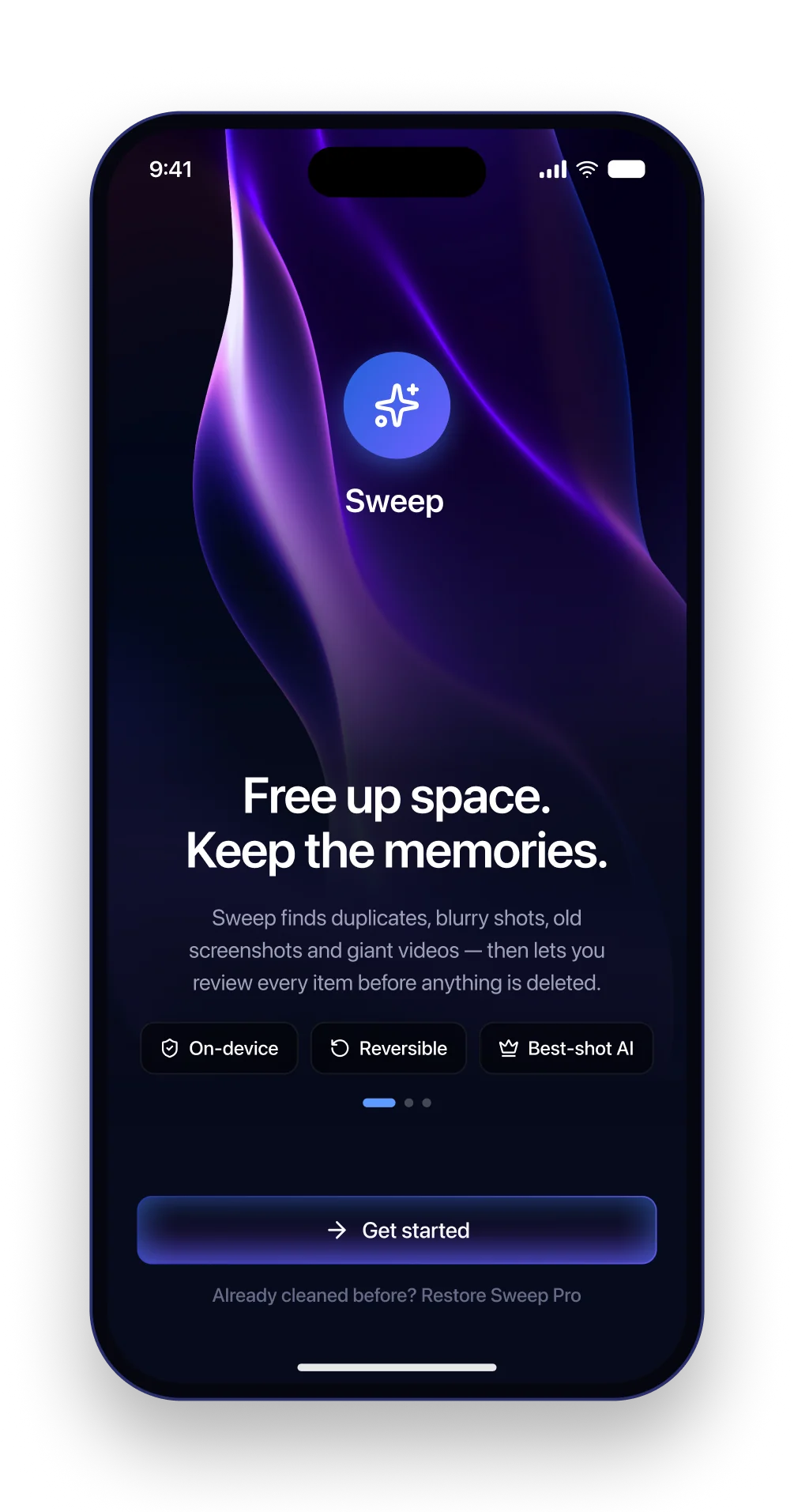
The first screen makes one promise, free up space and keep the memories, and then answers the three questions people bring to any cleaner: is it private, can I undo it, will it delete the good shot?
The three chips under the text are the three rules. They come back later as the structure of the results and review screens.
Permissions
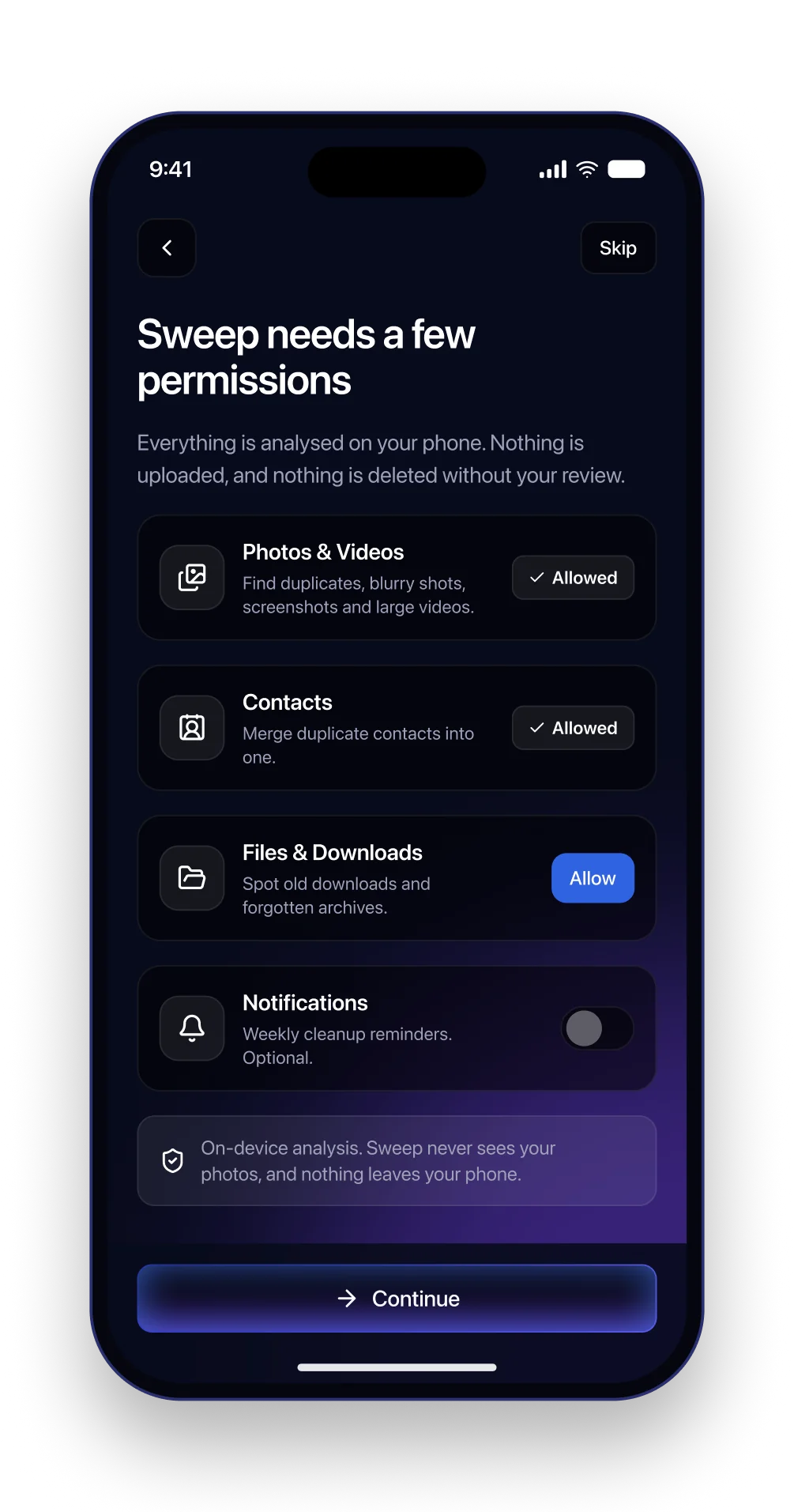
A cleaner needs a lot of access, and asking for it badly is where most of them lose people. Each card says what the permission is for and what Sweep will never do with it. The optional ones look optional.
Photos come first and get the longest explanation, because that is the one that worries people. Notifications are a toggle, so saying no costs nothing.
Storage overview
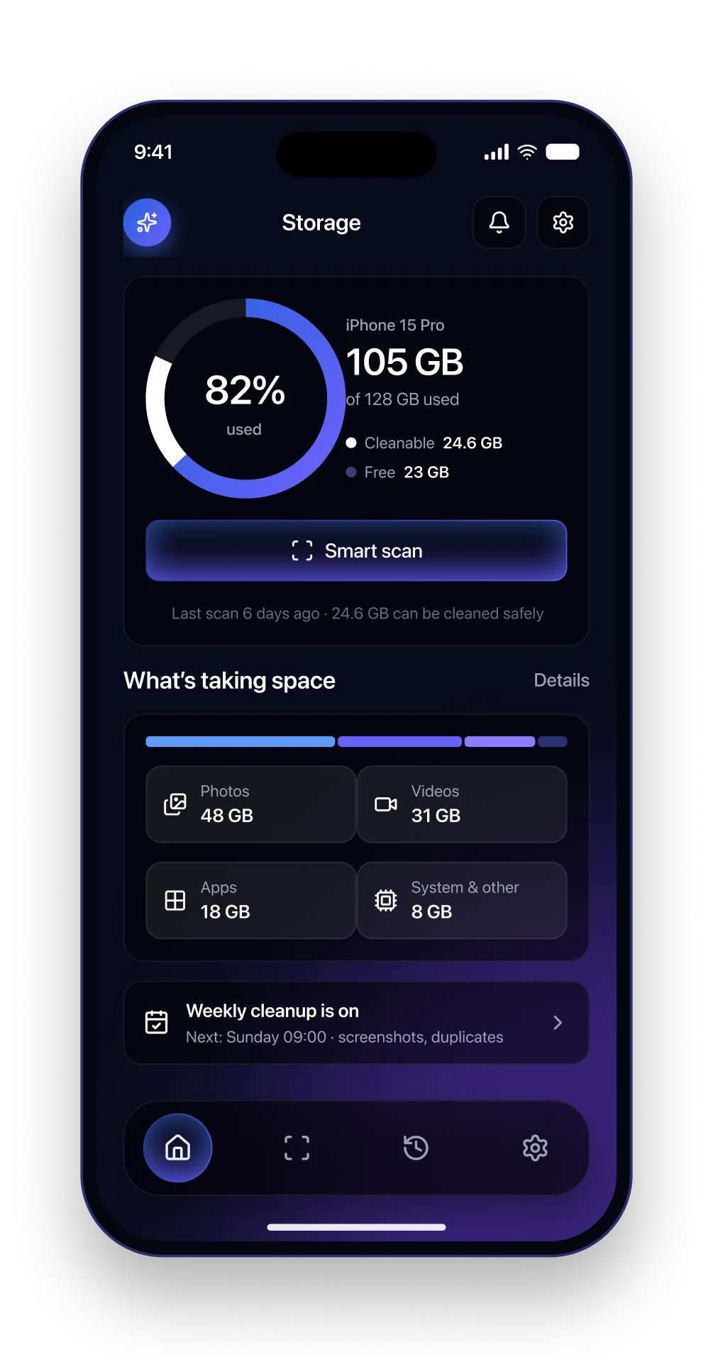
The home screen answers one question with one ring: how full is the phone, and how much of that can actually go. The cleanable part is drawn on the ring itself, so you see the size of the opportunity before you read a number.
Smart scan is the only glowing button. The breakdown below uses the same four icons as the results grid, so the categories are familiar by the time they matter.
Smart scan
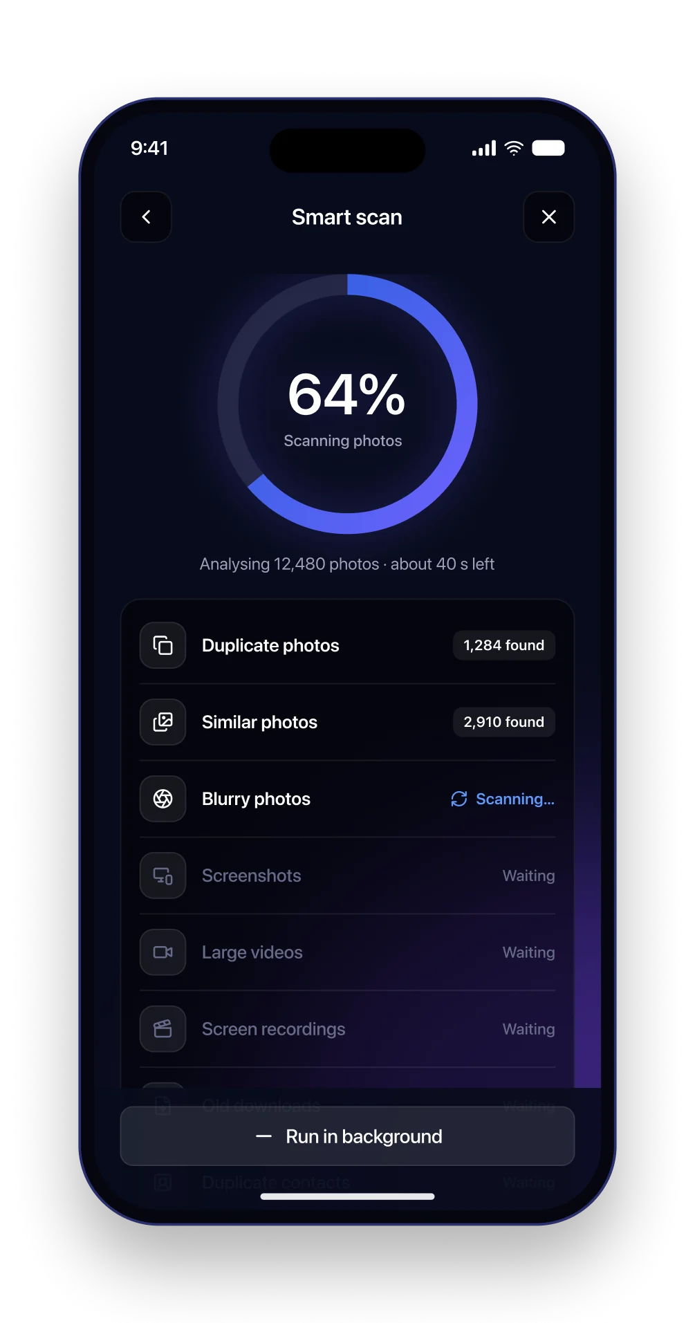
Scanning twelve thousand photos takes a couple of minutes, and a spinner would make that feel stuck. One ring shows the whole job, and the list below shows which category is done, which is running and which is waiting, with counts appearing as they are found.
Finished categories show their result right away, so the scan starts paying off before it ends. Running it in the background is a visible button, not a hidden gesture.
Scan results
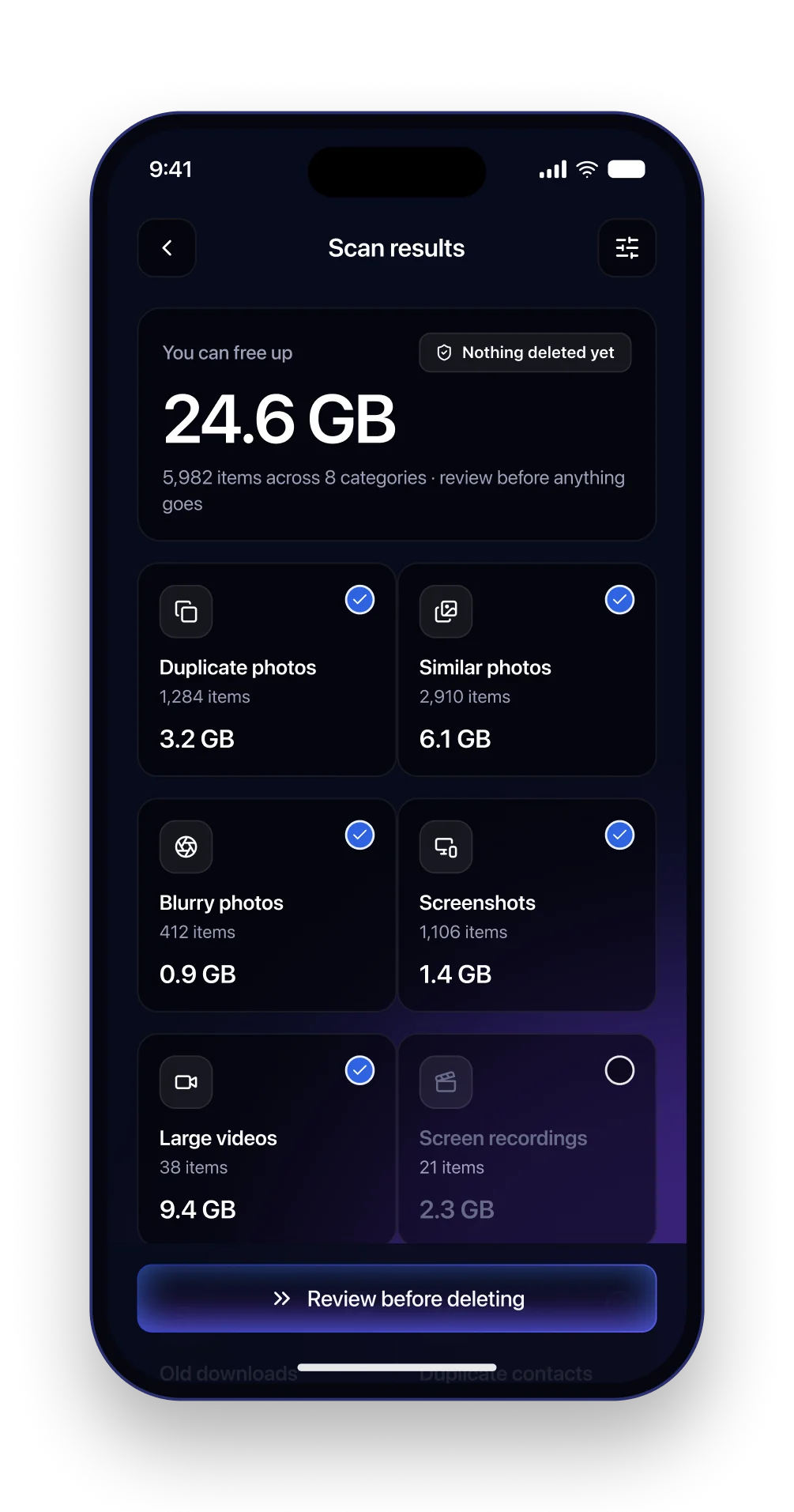
The headline is how much space you can get back, and right under it: nothing deleted yet. Eight tiles show a count, a size and a check you can turn off. The review starts here, at the category level, before you see a single photo.
Switched off categories fade instead of disappearing. The button says Review before deleting, not Clean. The words are part of the trust.
Duplicate photos
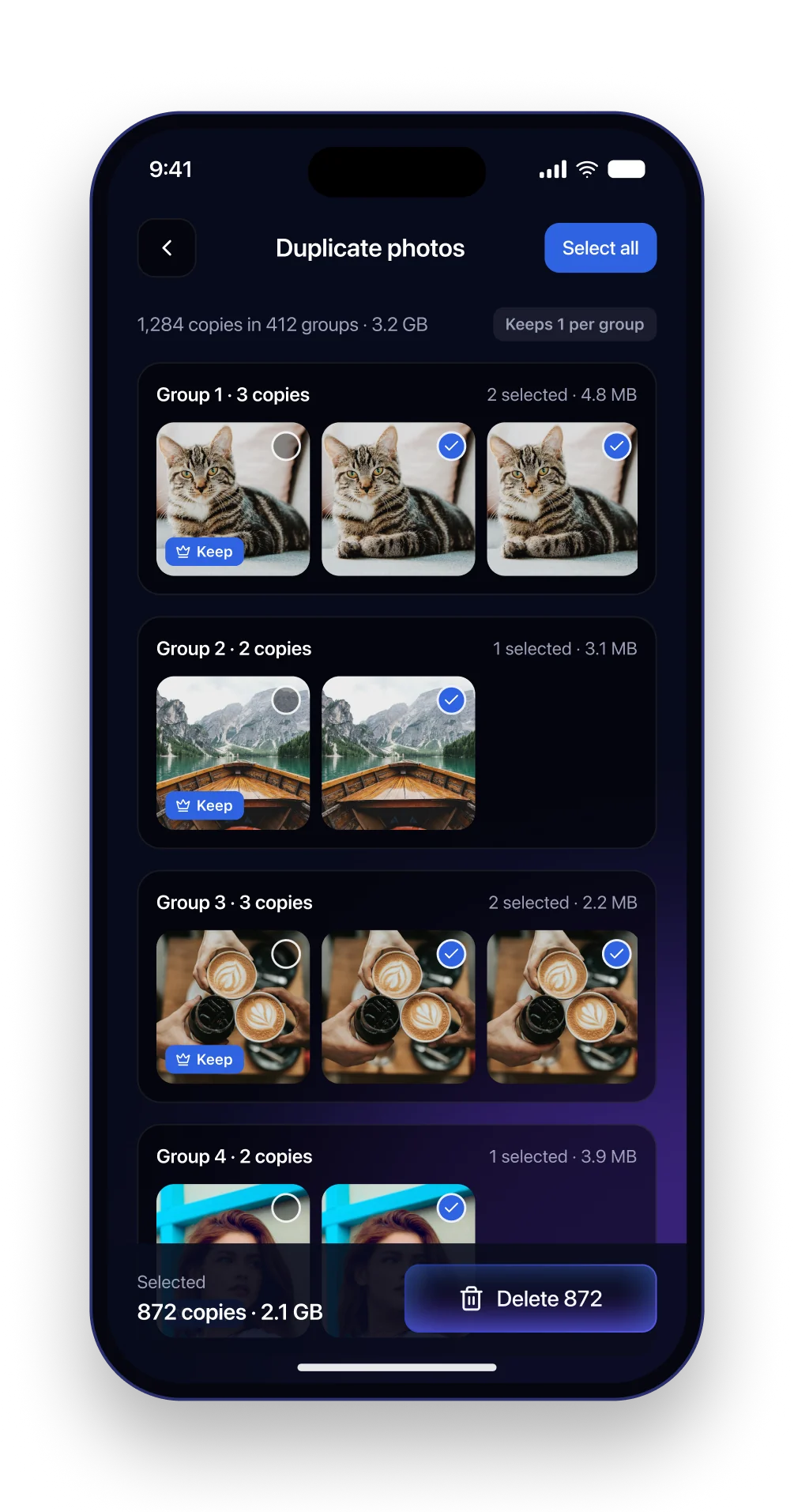
Exact copies are the easy win and the first stop. Each group shows the original with a Keep badge and the copies already selected. The group header tells you how many are selected and how much space they take.
The original can never be selected for deletion by accident. The Keep badge is not a switch, and Select all only ever picks copies.
Similar photos and the best shot
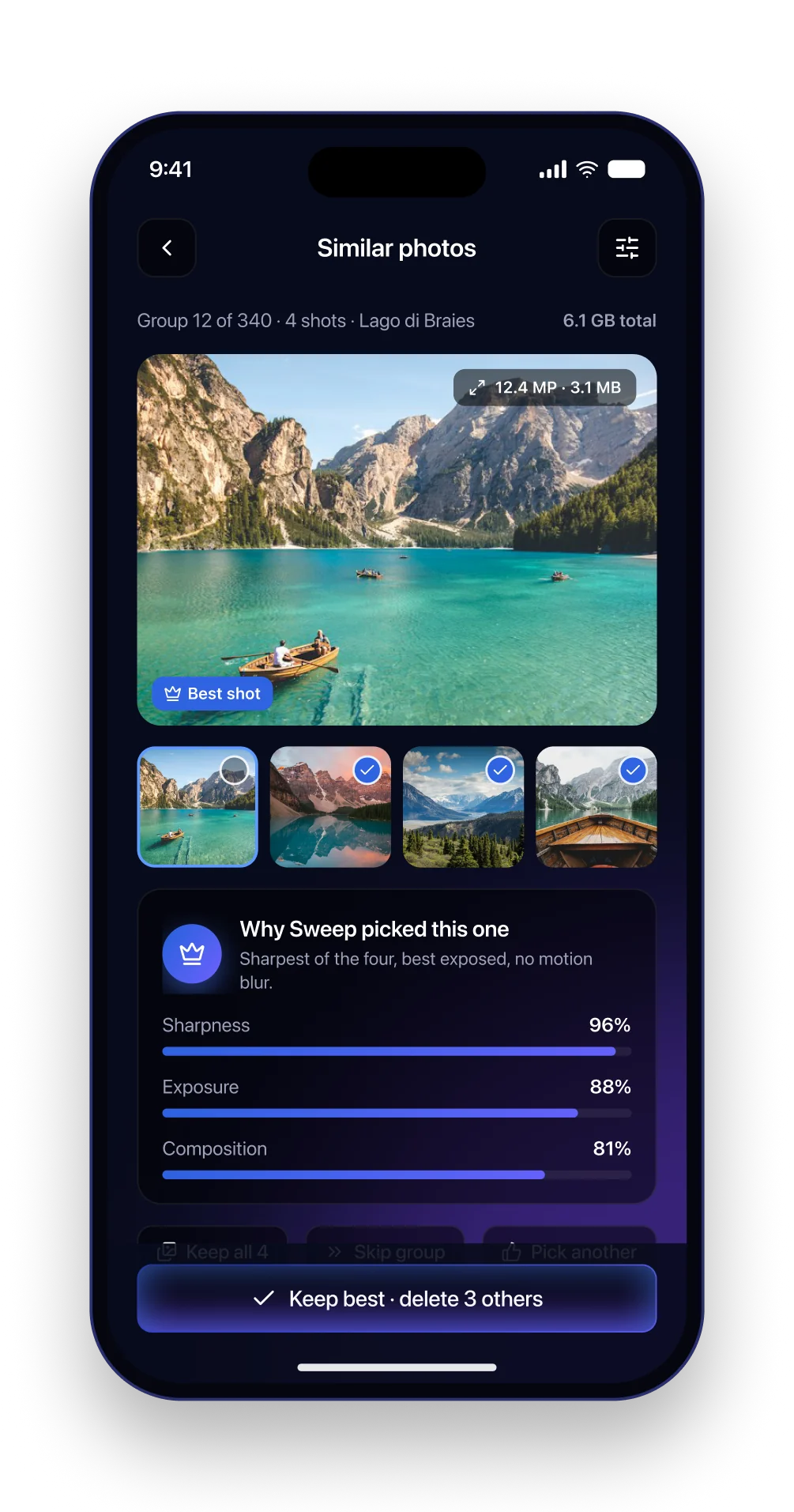
Bursts and near identical shots are where the space really hides, and where people are most afraid to delete. Sweep shows a large preview of the shot it would keep, the other three in a strip, and a card explaining why: sharpness, exposure and framing, each with a score.
Pick another and Keep all sit right next to the confirm button. Disagreeing with the app is as easy as agreeing with it.
Blurry photos
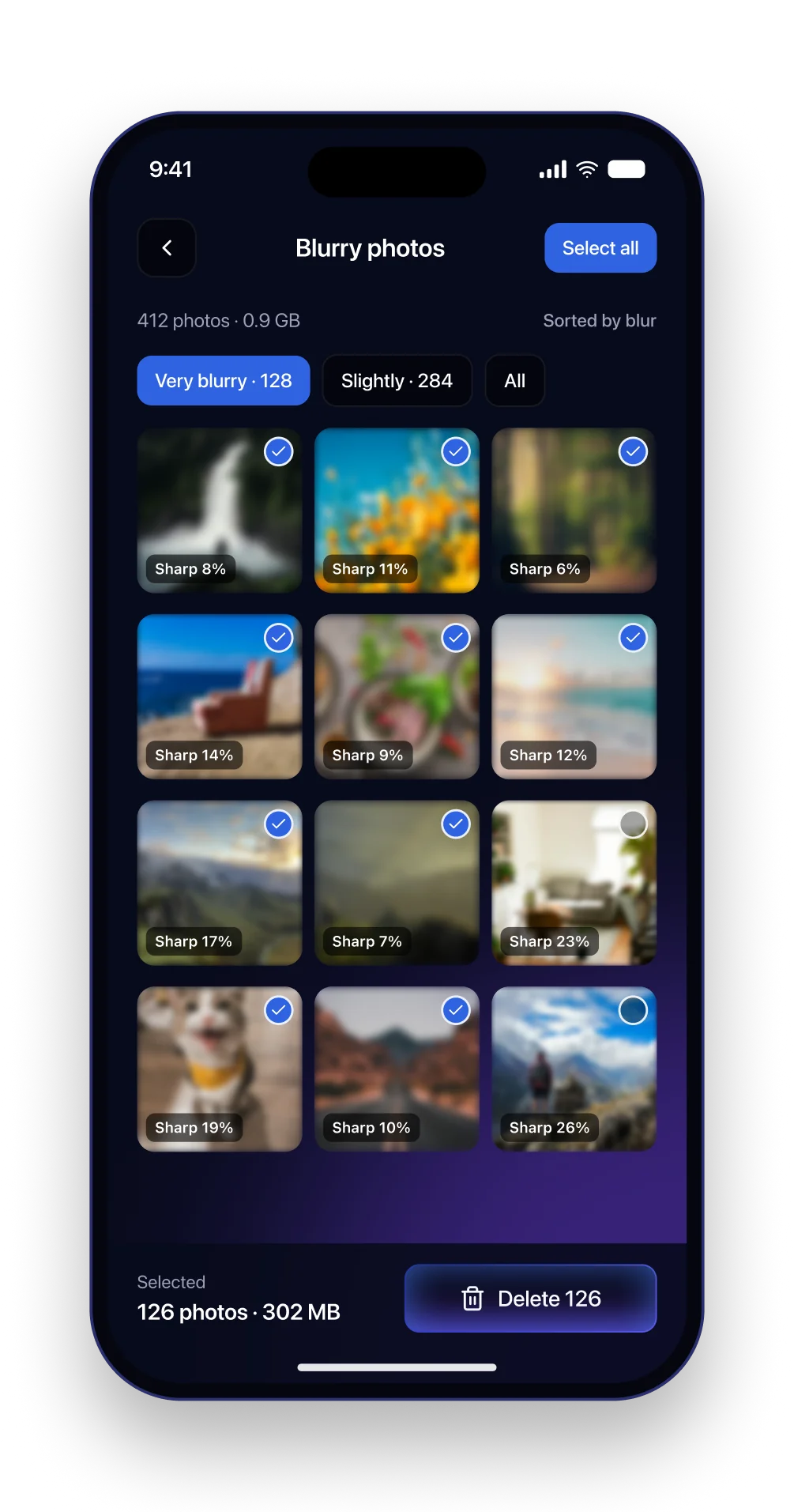
Blur is a spectrum, so the screen sorts by it instead of drawing a hard line. Three chips let you delete the obvious ones first and decide about the borderline shots later. Every thumbnail carries its sharpness score.
The two borderline shots in the grid start unselected. The default is cautious. Adding one more is a tap; losing a good photo would not be.
Large videos
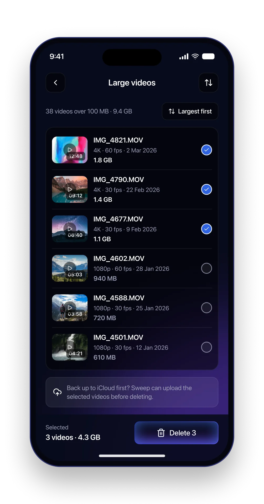
Thirty eight videos take more space than a thousand screenshots, so this is a list rather than a grid: thumbnail, length, resolution, date and size, largest first. The three biggest are already selected.
A quiet card under the list offers an iCloud backup before you delete. It is a suggestion, never a gate. A cleaner should not feel like it is selling you storage.
Duplicate contacts
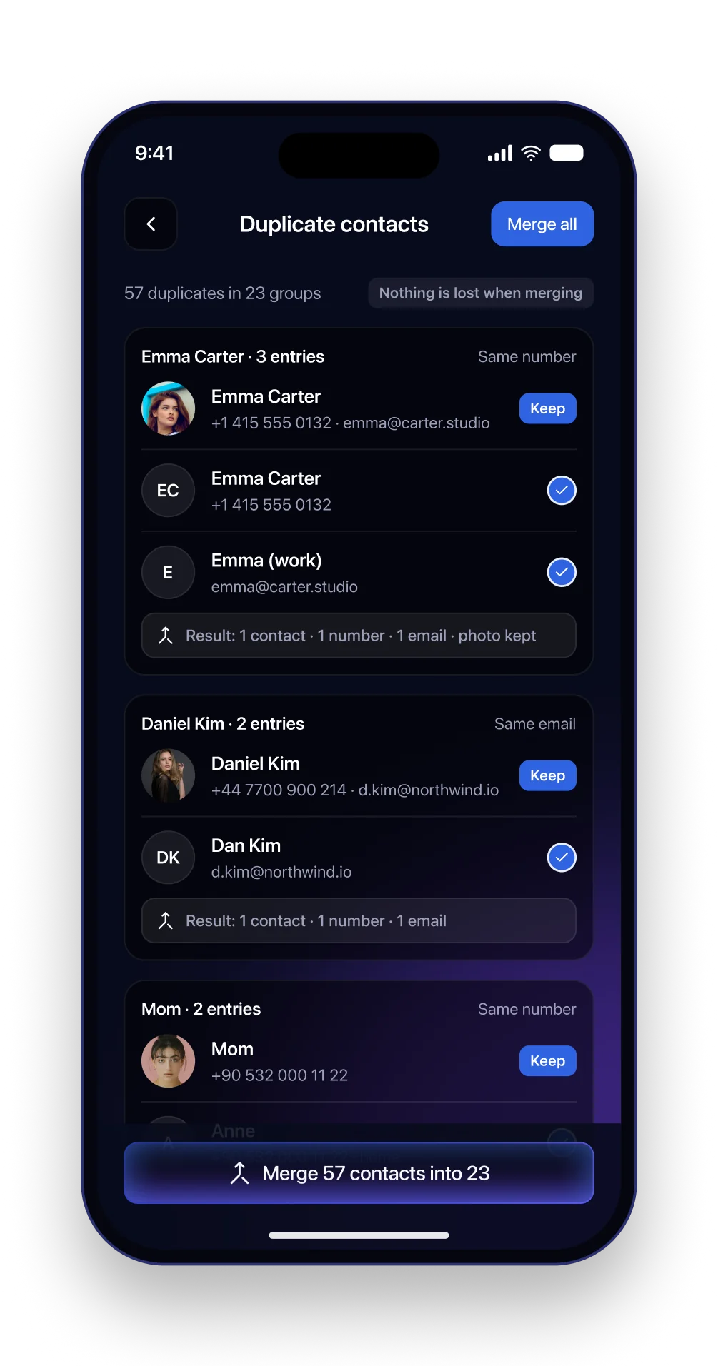
The one category about tidiness rather than space. Matching contacts are grouped with the reason, same number or same email, and one record is marked Keep. A line under each group shows what the merged contact will look like, so merge never reads as delete.
Nothing is lost in a merge. Every number and email survives and the photo stays. The badge at the top says so before you read the first group.
Review before delete
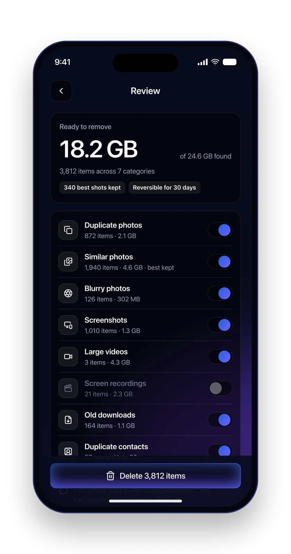
Every path ends here. One number for what will be removed, one for what was found, and a badge for what is being kept. Each category is a row with its count, its size and a switch, so you can change one decision without redoing the rest.
The similar photos row says best kept right there in the line. The note at the bottom repeats the thirty day promise right above the button that needs it.
Delete confirmation
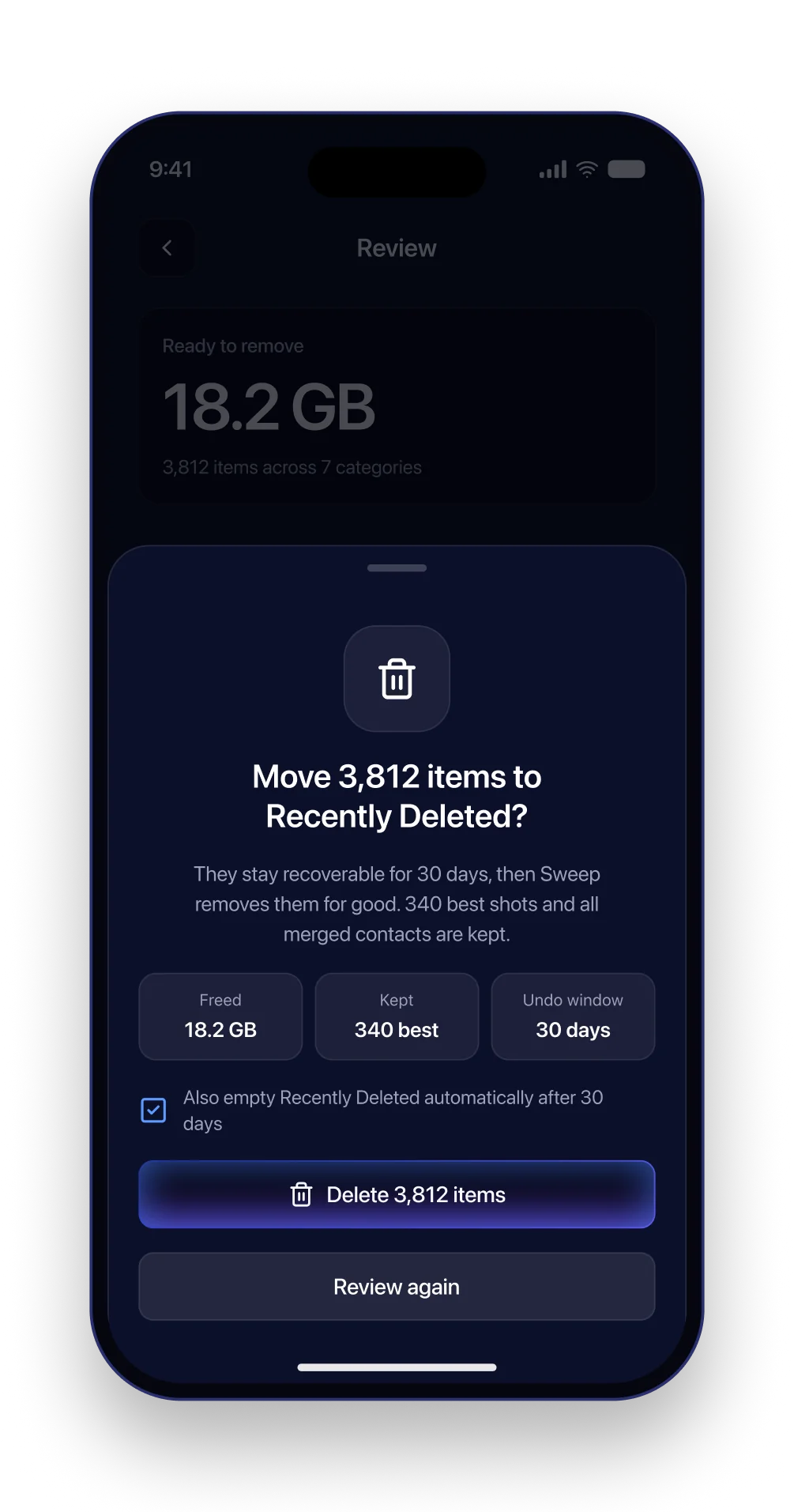
The sheet says exactly what happens: the items move to Recently Deleted, they stay recoverable for thirty days, and the best shots and merged contacts are kept. Three small tiles put freed, kept and the undo window side by side.
The delete button is not red. Everything before this point was there to make the action safe, and painting it as danger would undo that work.
Cleanup result
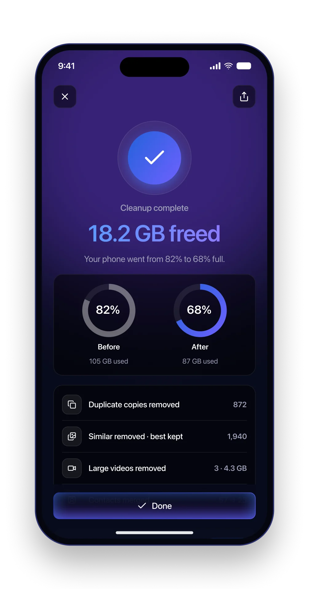
The reward screen leads with the space you got back and shows the phone before and after as two rings. Below that, the numbers: copies removed, similar shots removed with the best kept, videos removed, contacts merged.
The offer to turn on weekly cleanup shows up here, at the moment of relief, not during onboarding where it would be one more thing to agree to.
Weekly cleanup
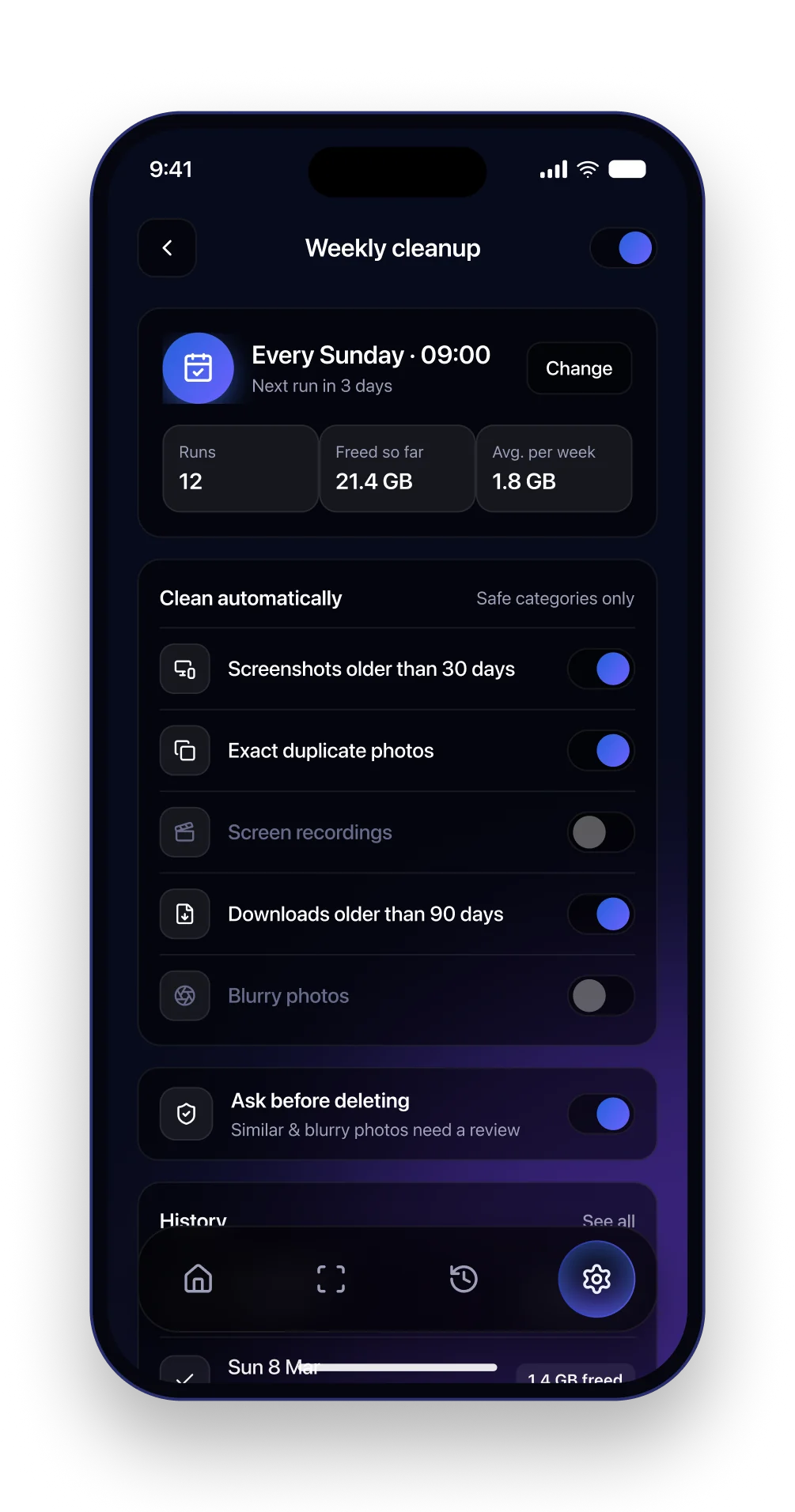
Set it up once and forget it, safely. It runs on Sunday mornings while the phone is charging, but only the safe categories are automatic: old screenshots, exact copies, old downloads. Anything that needs a judgement call still asks first.
The history list shows what each run freed, so the automation stays honest. The toggle in the header turns the whole thing off in one tap.
Outcome
Sweep is a concept project. The photos are from Unsplash and every number is made up. I wanted a cleaner that feels careful instead of pushy, the kind you are happy to open a second time.