Product Designer
VOLT
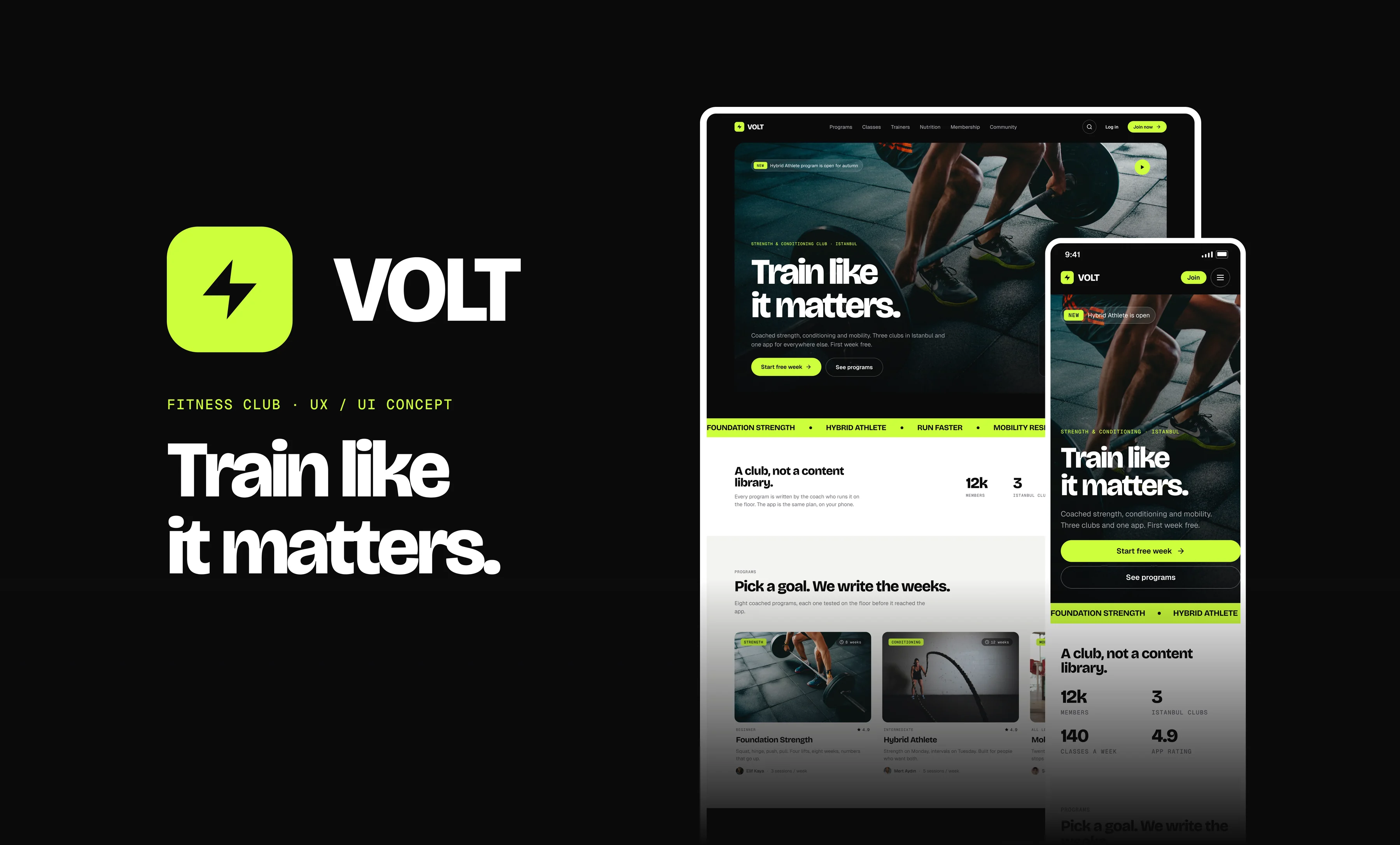
A website concept for a strength and conditioning club with three gyms in Istanbul. Fourteen screens, from the home page to the member dashboard, designed for desktop and mobile side by side. I wanted the site to answer what a good front desk answers: what is on today, who is coaching and how to get in.
Overview
Most gym websites are a wall of stock photos with a price list hidden behind a form. VOLT treats its site as part of the club instead. The whole system is built around one accent: lime marks only what needs attention right now, like the main button, the class that is live or the set you are logging. Everything else is black, white and two greys, so the photos carry the energy and the type carries the hierarchy. Bricolage Grotesque sets the headlines, Geist the body copy and Geist Mono the numbers and labels.
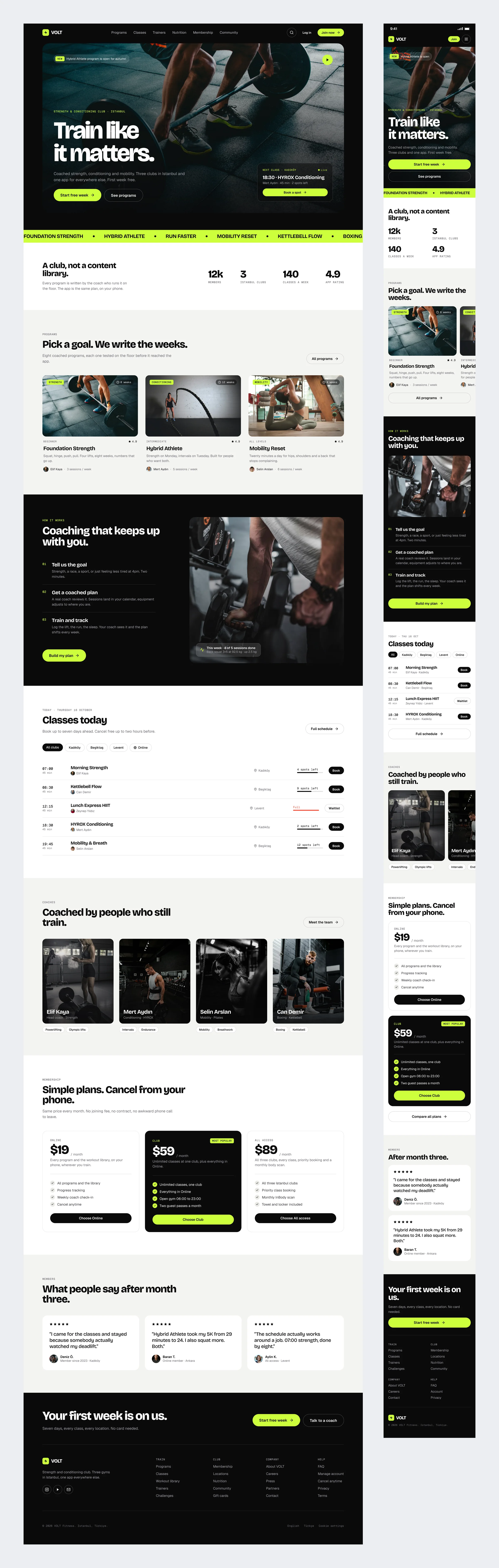
Home
One hero and one promise, then the club itself. Instead of a stock photo of a smiling stranger, the page leads with the classes you can actually book today, then the programs, the coaches behind them and the plans, with the cancellation rule in plain sight.
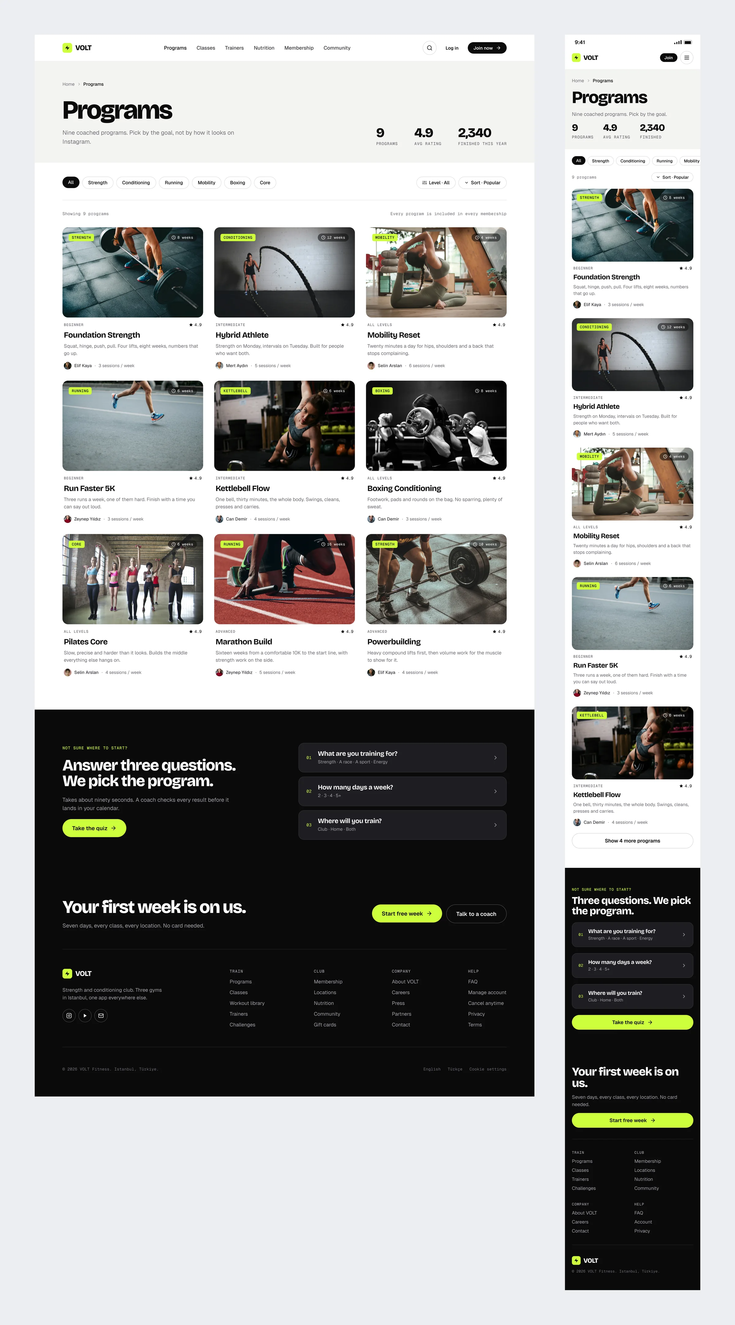
Programs
Nine coached programs you can filter by goal and level. Every card shows how many weeks it runs, who coaches it and how many sessions it takes each week. For people who would rather not browse, a three question quiz at the bottom picks one for them.
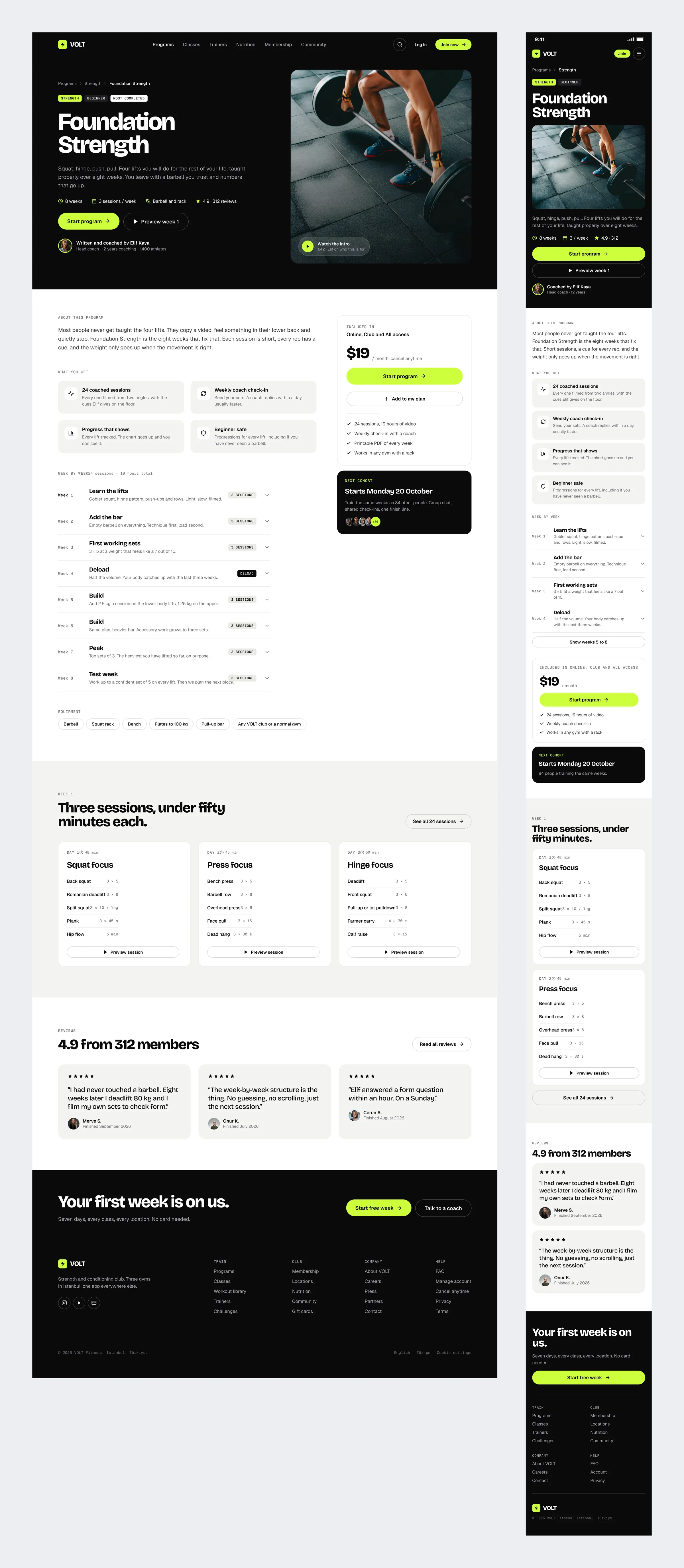
Program Page
Everything you need to decide fits in one scroll: who coaches it, what a typical week looks like, the equipment you need and what it costs. Reviews from members who finished it come at the end, and the start button never leaves the screen.
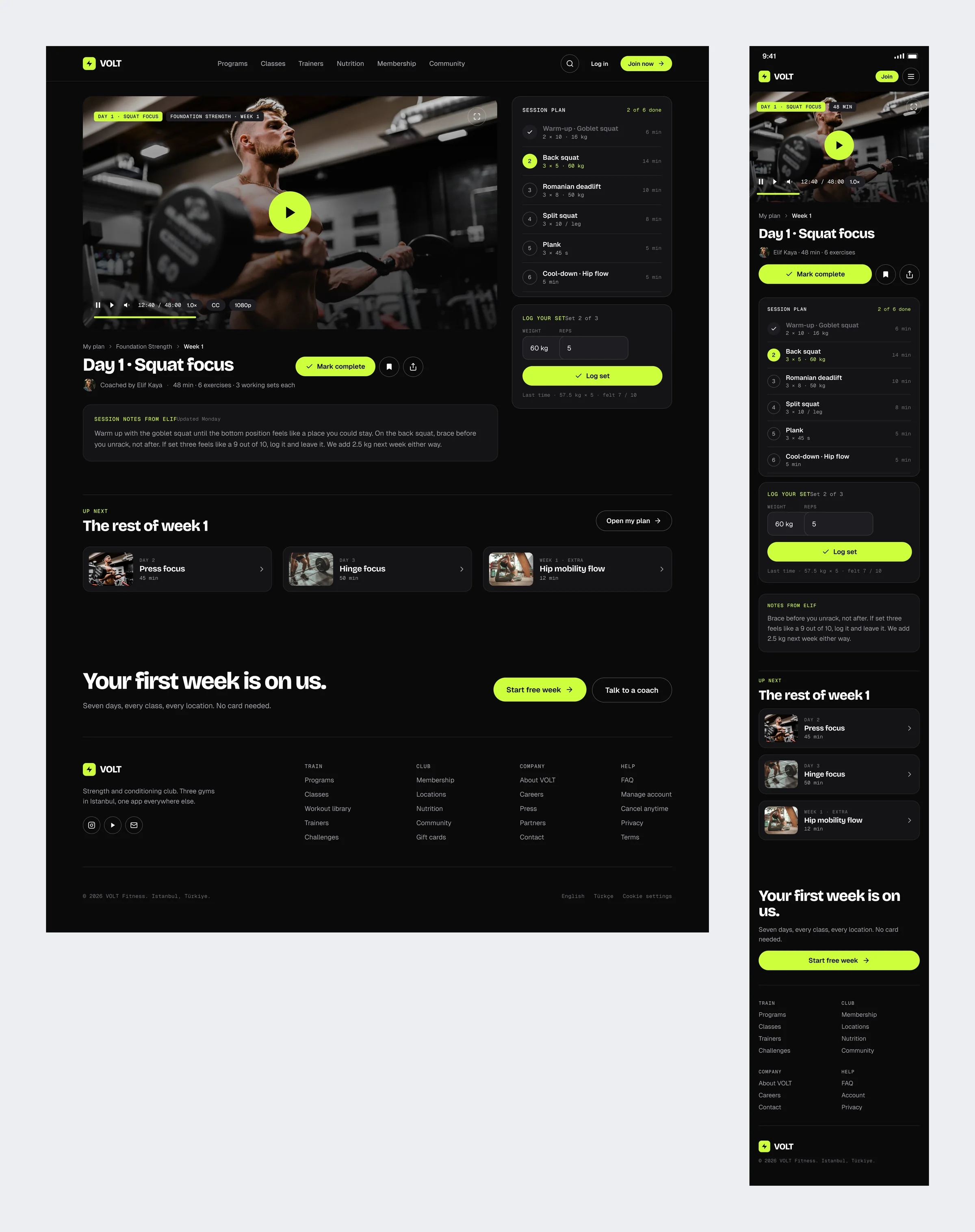
Workout Player
The only dark page in the product, because it is used in the middle of a session. Video on the left, the session plan on the right, and a set logger that remembers what you lifted last time, so you never have to look it up.
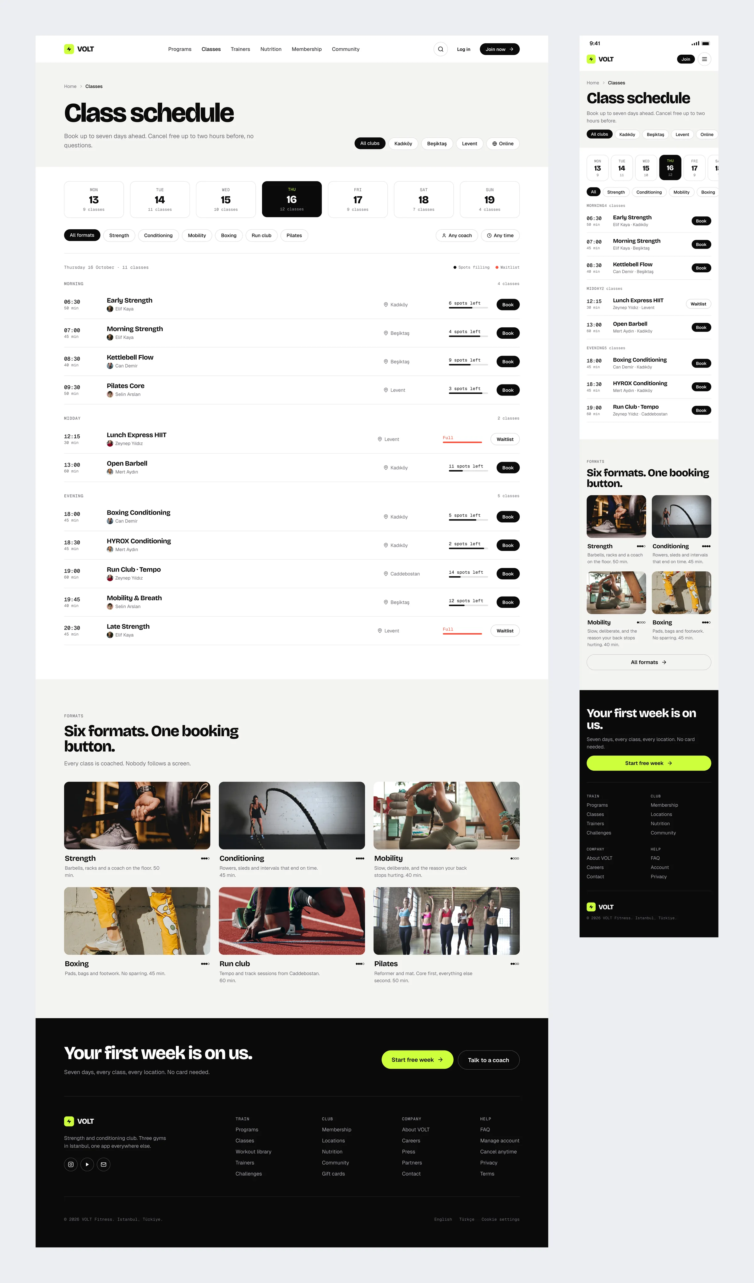
Classes and Schedule
A seven day picker and a filter for the three clubs. Spots left are shown as a short bar instead of a number, which is quicker to read at a glance, and a full class takes you straight to the waitlist.
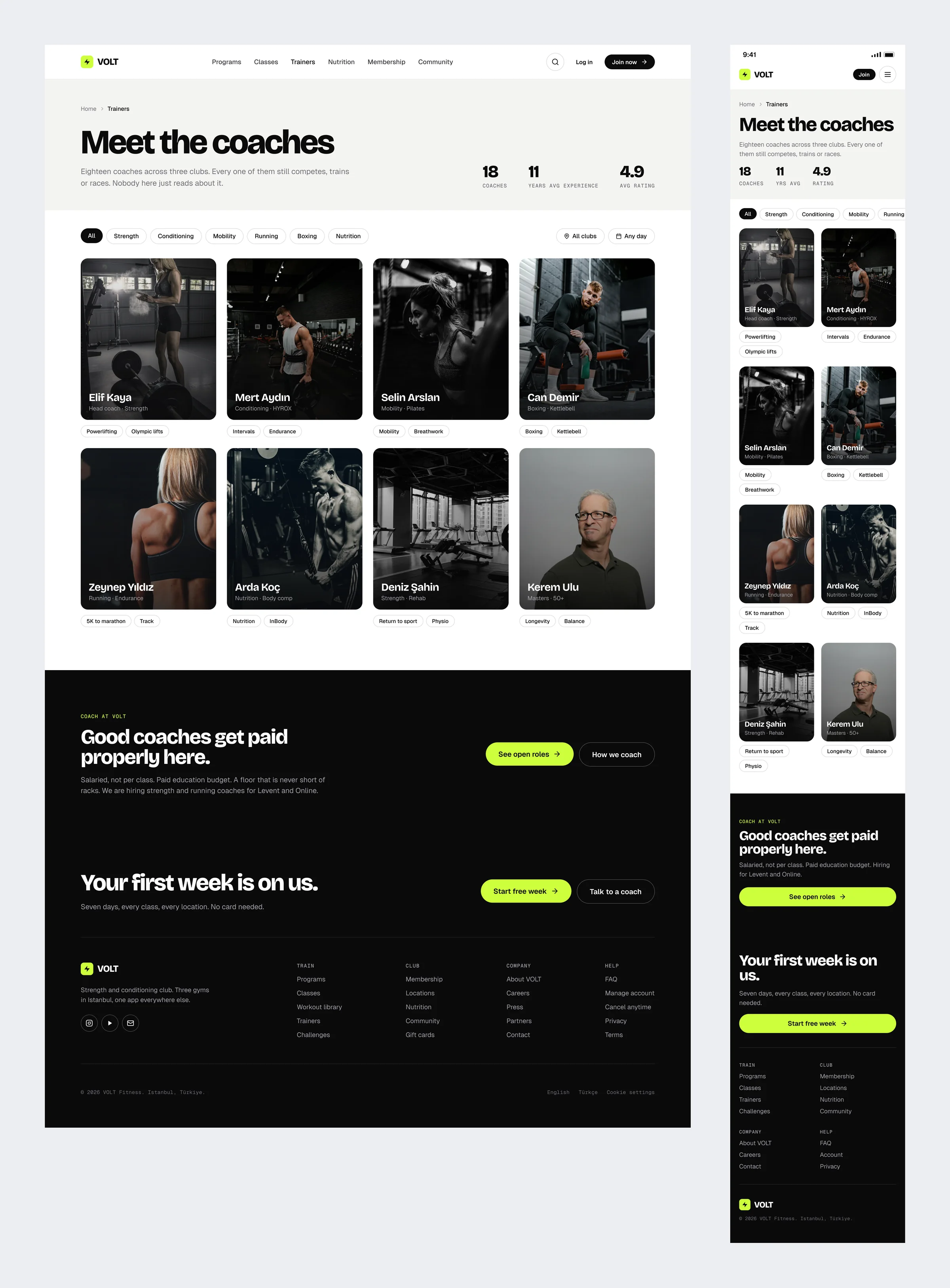
Trainers
Eighteen coaches across three clubs, and every one of them still trains or competes. The cards lead with the person, not with a list of certificates.
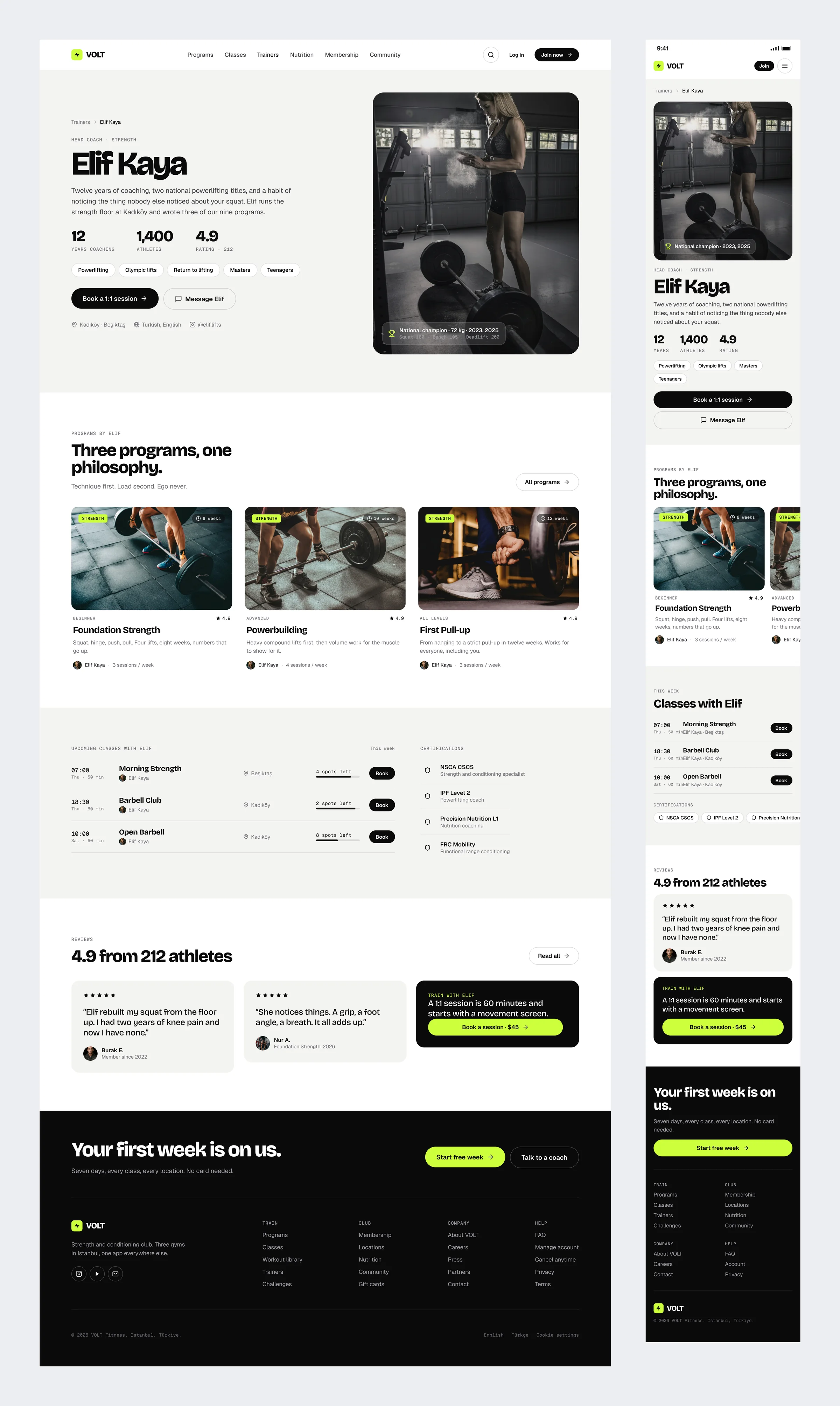
Trainer Profile
A coach page that reads like a profile, not a CV. Her lifts, the programs she wrote, the classes she runs this week and a button to book an hour with her.
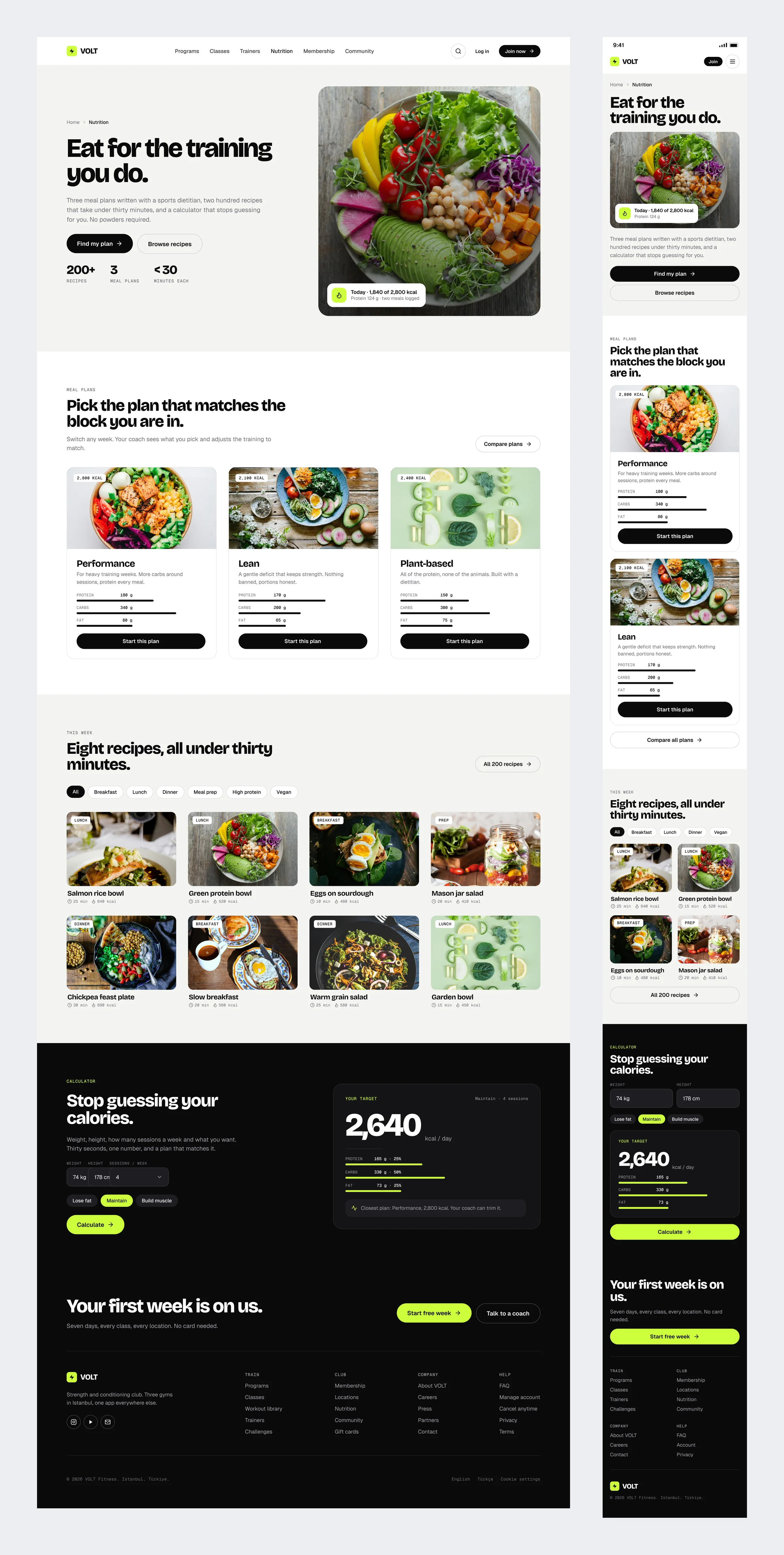
Nutrition
Three meal plans written with a sports dietitian, with honest macros and recipes that take under thirty minutes. A small calculator gives you one daily number and points you to the plan closest to it.
Membership
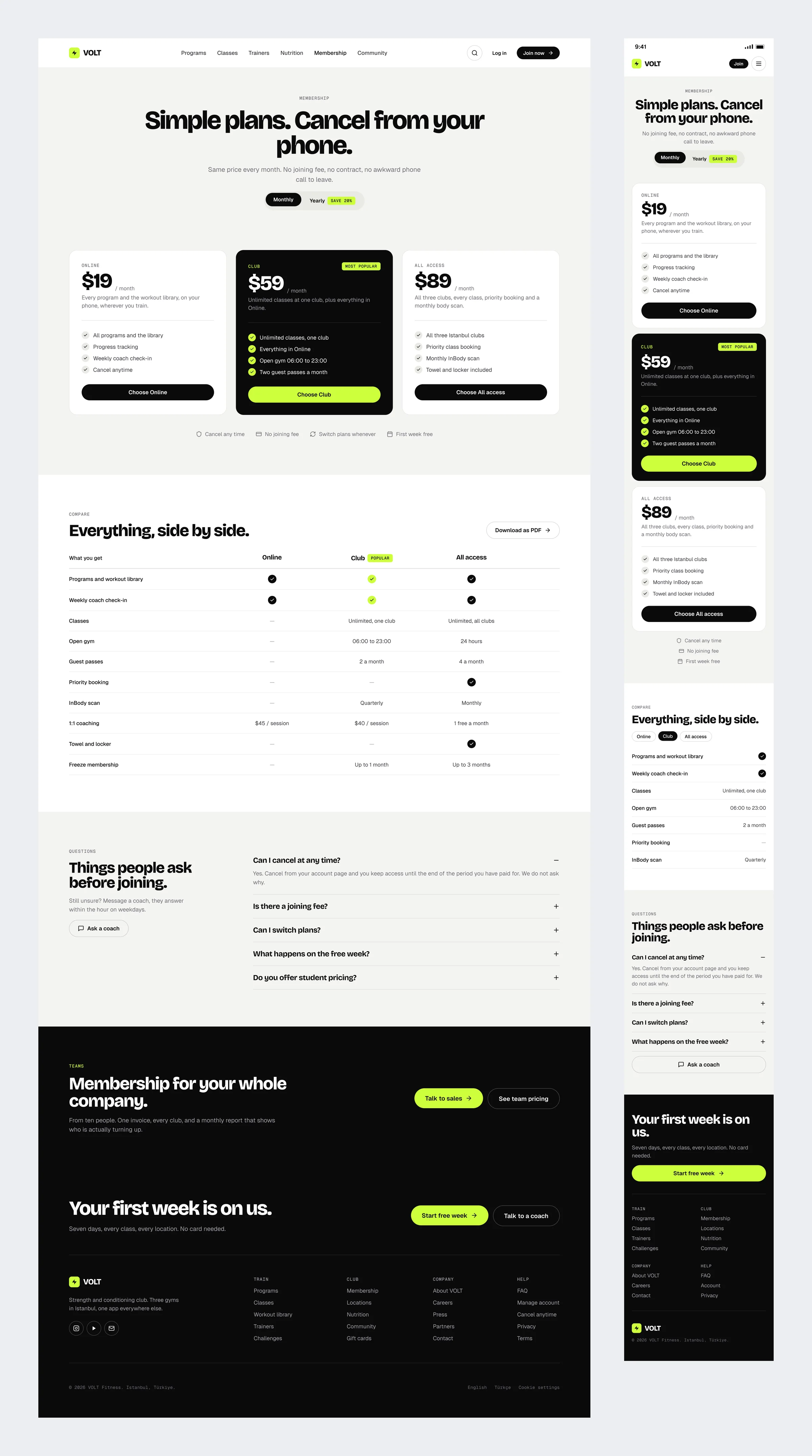
Three plans, a side by side table, and the cancellation policy written above the price instead of under it. The questions people actually ask before joining are answered right there, without a sales call.
Member Dashboard
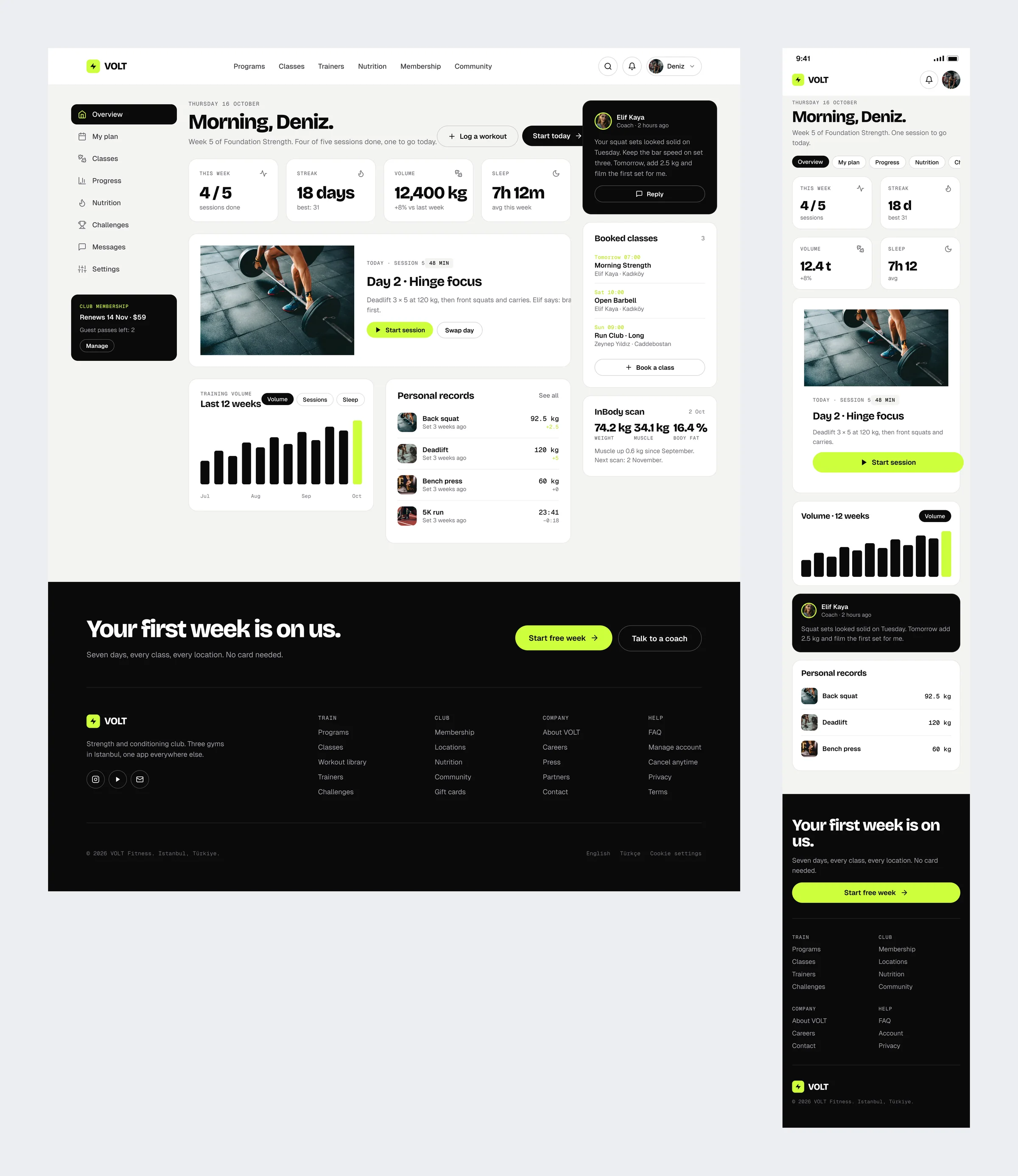
The member area is a dashboard, not a feed. This week’s sessions, a note from the coach, the next booked class and the latest body scan all sit on one screen.
Community
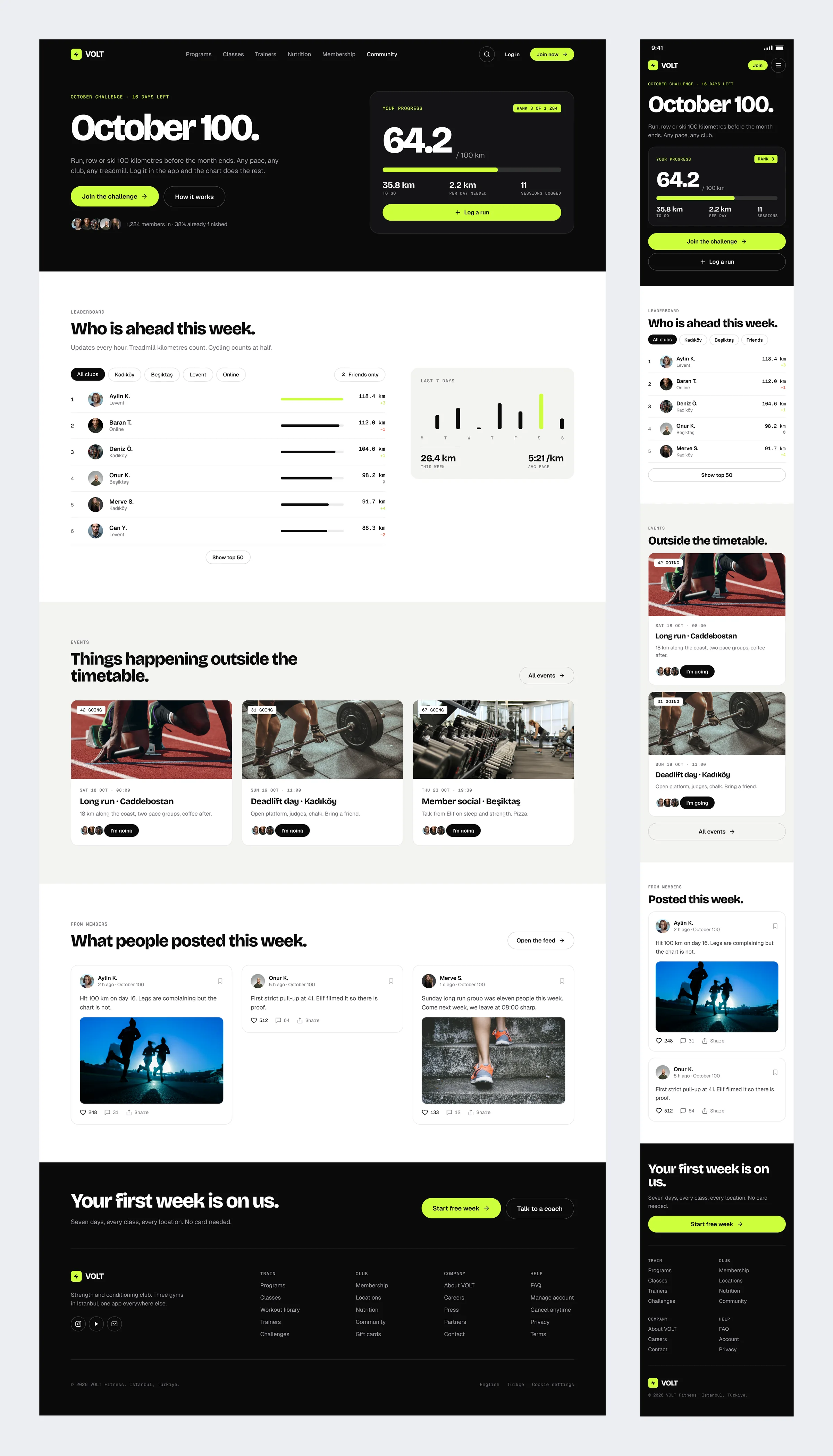
A monthly challenge with a public leaderboard, events outside the timetable, and a feed where members post their personal records rather than selfies. October’s challenge is a hundred kilometres of running, rowing or skiing.
Journal
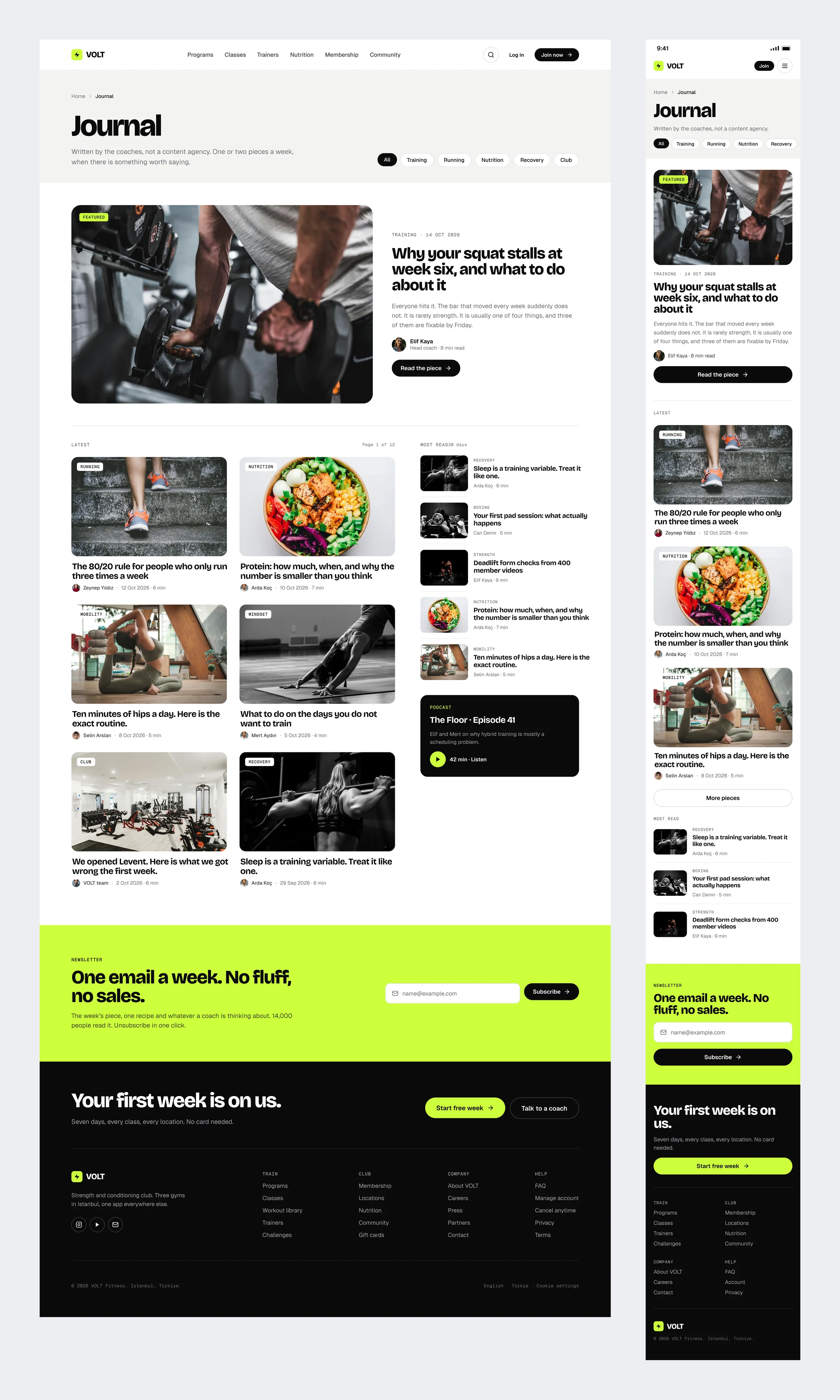
Written by the coaches, one or two pieces a week. A featured story, a most read list and a newsletter box that promises exactly one email a week.
Sign Up
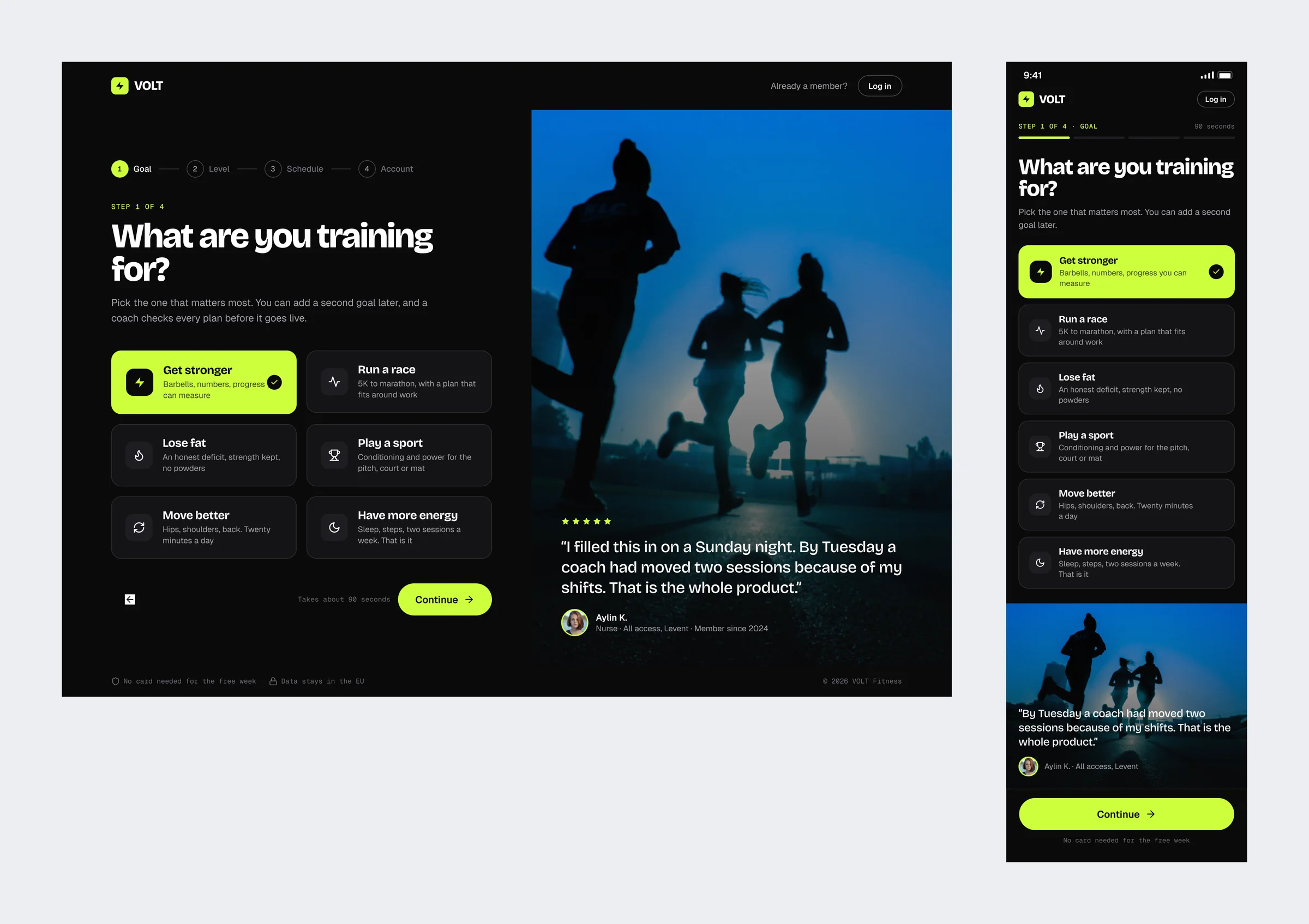
Four steps that take about ninety seconds. The first question, what you are training for, is the only one that really matters. The right half of the screen is a member explaining why she stayed.
Locations
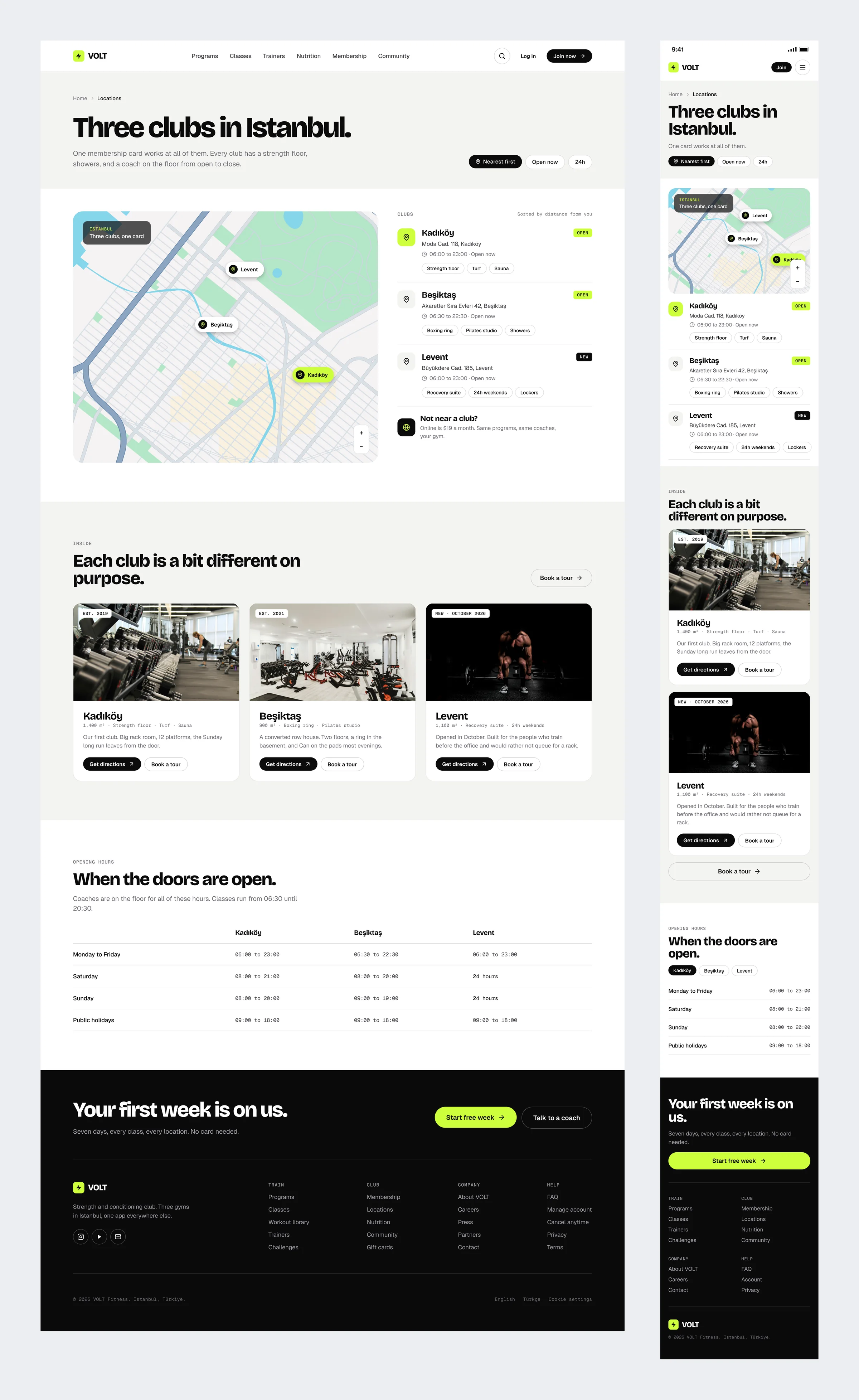
Three clubs on a map, opening hours in a plain table, and a card for everyone who does not live near one. The online plan costs $19 and comes with the same coaches.
Outcome
Keeping lime for a single job was the rule I leaned on most. When everything else is black, white and grey, one colour is enough to show what matters on a screen, from the next class on the home page to the set you are logging mid workout. Designing every desktop section next to its phone version from the first screen also meant nothing useful ended up hidden behind a menu. VOLT is a personal concept: the club, the coaches and the members are invented, while the booking rules, class formats and membership terms are borrowed from real gyms.