An Interface Can Be Readable and Still Be Hard to Read
A screen can pass the obvious readability checks and still make me work too hard. I am interested in that gap, because it sits somewhere between typography, language, attention, and interface design.

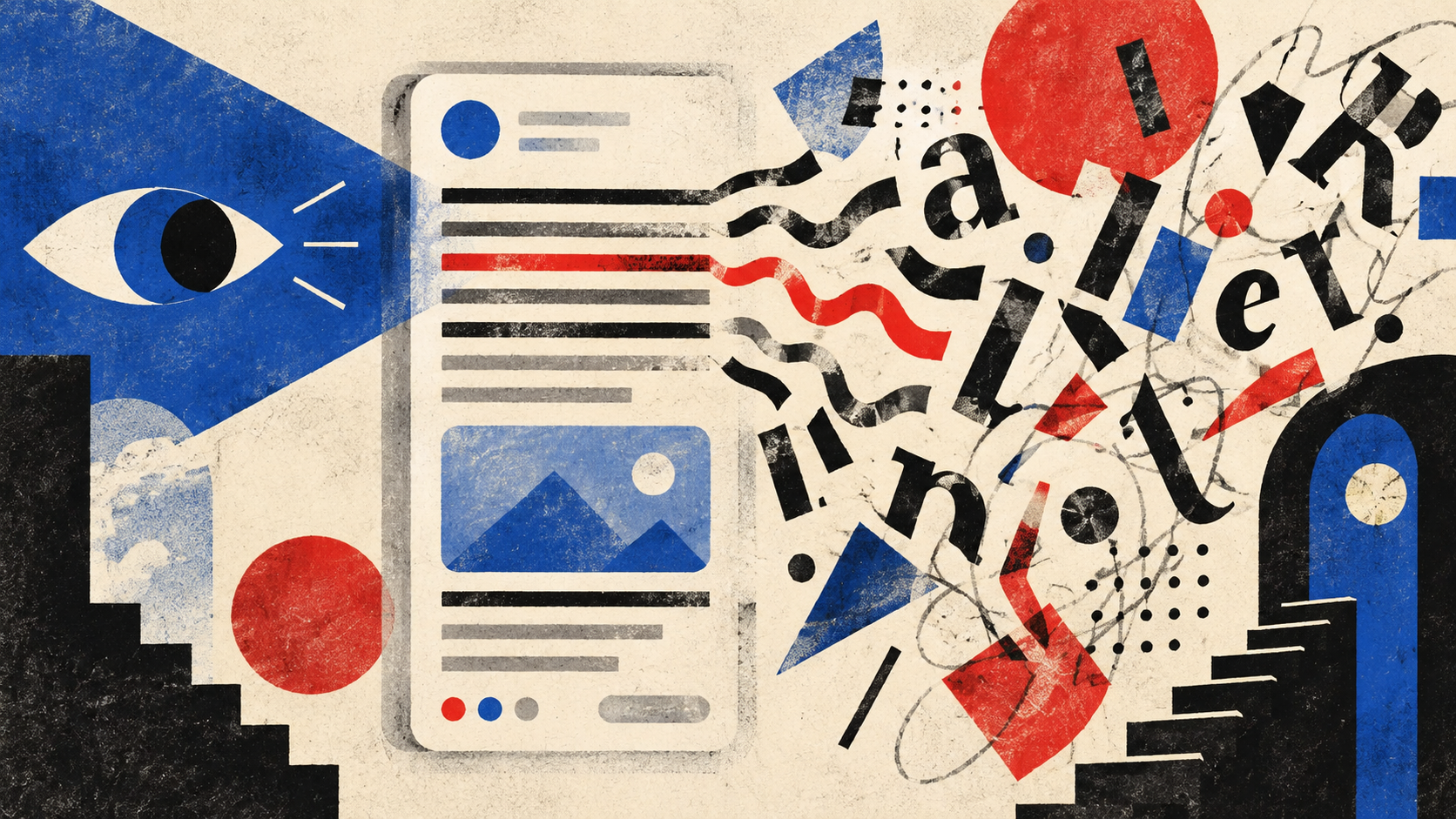
A paragraph can be large enough, dark enough, and technically accessible. I can still lose my place halfway through it. A button can have a clear label. I can still need a second to understand what will happen after I press it.
That distinction keeps bothering me. I like interfaces with personality, but text I cannot comfortably read can stop the visit entirely. Readability is not only about whether the letters are visible. It is also about how much work the interface asks me to do before the meaning arrives.
Readable is not the same as easy to read
Design reviews often reduce readability to a few visible properties. Is the type large enough? Is the contrast acceptable? Is the line height reasonable? Those are useful questions, and some of them are directly covered by WCAG.
They are not the whole experience.
Imagine two screens with the same typeface, size, and colour contrast. One says, “We could not save your changes. Check your connection and try again.” The other says, “Your requested operation could not be completed due to a network-related service interruption.”
Both are readable. Only one lets me move on quickly.
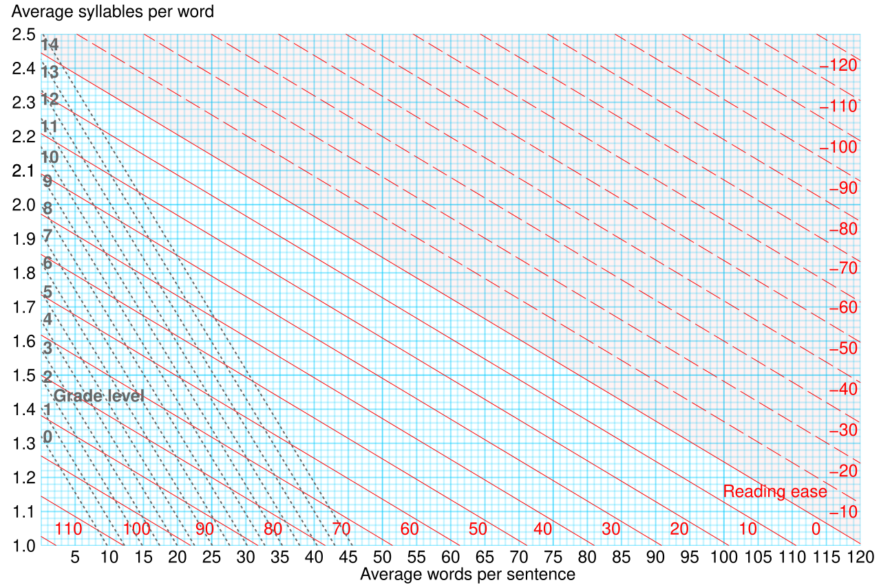
Readability formulas try to put part of this difficulty into numbers. The Flesch-Kincaid model, for example, relates sentence length and syllable density to reading ease. That can reveal unnecessarily difficult copy, but it still cannot tell us whether a button label makes sense in the task around it.
That difference becomes more important when someone is tired, stressed, reading in a second language, or trying to finish a task while something else is demanding attention. I do not think we need a medical label before we take that effort seriously.
A passing contrast check does not measure effort
WCAG 2.2 gives us important minimums for contrast, resizing, and text spacing. Its guidance on visual presentation also discusses line width, justification, and spacing because text layout can interfere with reading.
I find that useful because it separates compliance from comfort.
A contrast ratio can tell me whether foreground and background are sufficiently distinct. It cannot tell me whether the sentence is overloaded with qualifiers, whether five labels compete for the same attention, or whether a warning appears between two pieces of promotional copy.
An interface can therefore satisfy a measurable rule and still feel mentally expensive. That does not make the rule weak. It means the rule is measuring one part of the problem.
For me, accessibility checks are a floor. They are not a substitute for asking somebody to complete the task while I watch where they hesitate.
Line length and spacing change the work
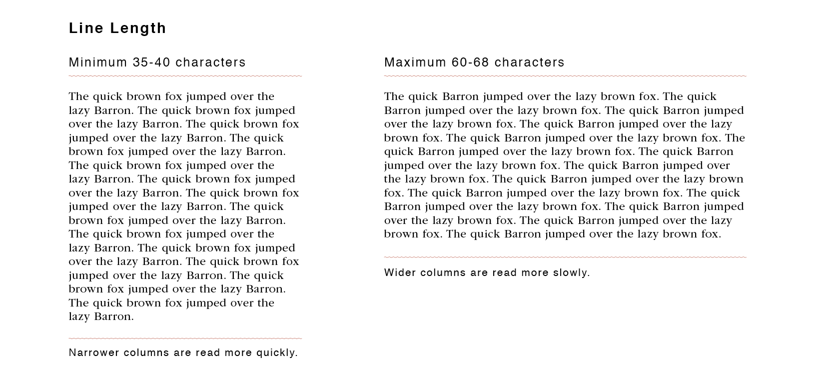
Long lines make my eyes travel farther. Tight paragraphs make it harder to see where one thought ends and the next begins. Fully justified text can create irregular spaces between words.
W3C's guidance around visual presentation addresses all three. It includes a mechanism for limiting blocks of text to 80 characters or glyphs, avoiding full justification, and allowing more generous line and paragraph spacing.
I would not turn those numbers into a universal Figma recipe. A short label, an article, and a dense control panel do not have the same job.
The more useful question is whether the layout helps the reader keep their place. Sometimes that means a narrower column. Sometimes it means breaking one explanation into two pieces. Sometimes the answer is removing a sentence that was only there because the interface was not clear enough.
The words can be the hardest part
Typography gets most of the visual attention, but language can create more friction than the font.
W3C's cognitive accessibility guidance recommends clear words, short sentences, succinct text, and simple structures. Digital.gov's plain language guidance makes a similar point from a content perspective: people should be able to find what they need, understand it, and use it.
That sounds obvious until an interface is full of terms that make sense to the team and nobody else.
“Authenticate”, “authorise”, “sync”, “submit”, “verify”, and “confirm” can all be correct in a product. They are not interchangeable to the person using it. If the distinction matters, the interface needs to make it visible. If it does not matter, I would rather use the simpler word.
I also try to be careful with helper text. Adding another sentence feels like the safe solution when a field is confusing. At some point the explanation becomes a second problem to read.
A good label often saves more effort than a good paragraph.
Icons are not a shortcut if users have to decode them
Icons can reduce visual clutter, but they do not automatically reduce reading effort. A familiar symbol may be recognised almost instantly. An unfamiliar one becomes a small puzzle.
W3C's cognitive accessibility guidance explicitly recommends familiar icons, terms, and patterns. That matters because the user should not need to learn the designer's private visual language before completing a task.
I notice this most in mobile interfaces where space pressure encourages us to remove labels. A row of five elegant icons can look cleaner than five words. If two of those icons make me pause, the cleaner design has transferred work from the screen to my memory.
Labels can also teach icons. When the same symbol and word appear together several times, the icon may become useful on its own later.
I would rather spend a little more space than make someone guess.
Interfaces become harder when attention is interrupted
Reading in an interface is rarely like reading a book. A notification arrives. Someone speaks to you. You switch apps to find a code. You come back to a form and have to work out where you were.
This is where readability starts to overlap with memory and attention.
W3C's cognitive accessibility guidance recommends helping users maintain focus and avoiding processes that rely heavily on memory. I think that is a useful product design principle even outside accessibility work.
A screen should leave enough evidence for the user to reconstruct the task. A clear heading, visible selection, persistent input, and specific error message can all help.
The relationship between mental load and working memory is a useful reminder here. When a task occupies more of the available working-memory capacity, there is less room for the user to remember what happened one screen ago.
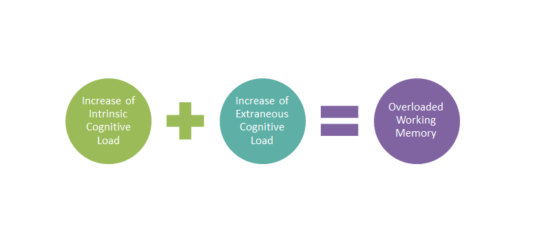
The worst version is a screen that was easy to understand the first time but gives no clue what happened when you return thirty seconds later.
Shorter is not always clearer
There is a temptation to solve every readability problem by cutting words. I do not think that works either.
“Continue” is shorter than “Review your order”. It is also less specific. “Error” is shorter than “Card number is incomplete”. It gives me less help.
Plain language is not the same as tiny language.
Sometimes an extra word removes uncertainty. Sometimes a short explanation is more useful than an icon. Sometimes a sentence needs to be longer because the consequence of an action genuinely matters.
I would judge the copy by the decision it helps someone make, not by its character count.
This is also why I am cautious with readability scores. They can reveal unusually complex sentences, but they do not know what the interface is asking the user to understand. A payment warning and a marketing headline should not be simplified in exactly the same way.
I would design for the return, not just the first read
When I look at a screen now, I want to ask a slightly different question. Not “Can I read this?” but “How much do I need to hold in my head while I read this?”
That changes the details I notice.
I look at whether labels describe the action. I look at whether paragraphs have one job. I look at what remains visible after an error. I look at whether a person can leave the screen and understand it again when they return.
I would still check contrast, type size, spacing, and zoom. Those things matter. I just would not stop there.
The interface I want is one that does not make the reader prove they can understand it.
Sources
- WCAG 2.2 W3C accessibility requirements for text, contrast, resizing, and presentation.
- Understanding SC 1.4.8: Visual Presentation W3C guidance on line width, justification, spacing, and text presentation.
- Understanding SC 1.4.12: Text Spacing W3C guidance on supporting changes to line, paragraph, word, and letter spacing.
- Making Content Usable for People with Cognitive and Learning Disabilities W3C guidance on clear words, focus, memory, familiar patterns, and usable content.
- How Users Read on the Web Nielsen Norman Group research on scanning and web reading behaviour.
- Plain Language Guide U.S. government guidance on making information easier to find, understand, and use.
- Microsoft Inclusive Design Inclusive design principles and resources for designing around different human needs.