Why Some Designs Make Products Look Expensive
We form an opinion about a product before we see its price. A quiet package can feel more trustworthy. A confident typeface can feel more exclusive. A generous amount of empty space can make the same object feel more expensive. So what exactly is creating that impression?

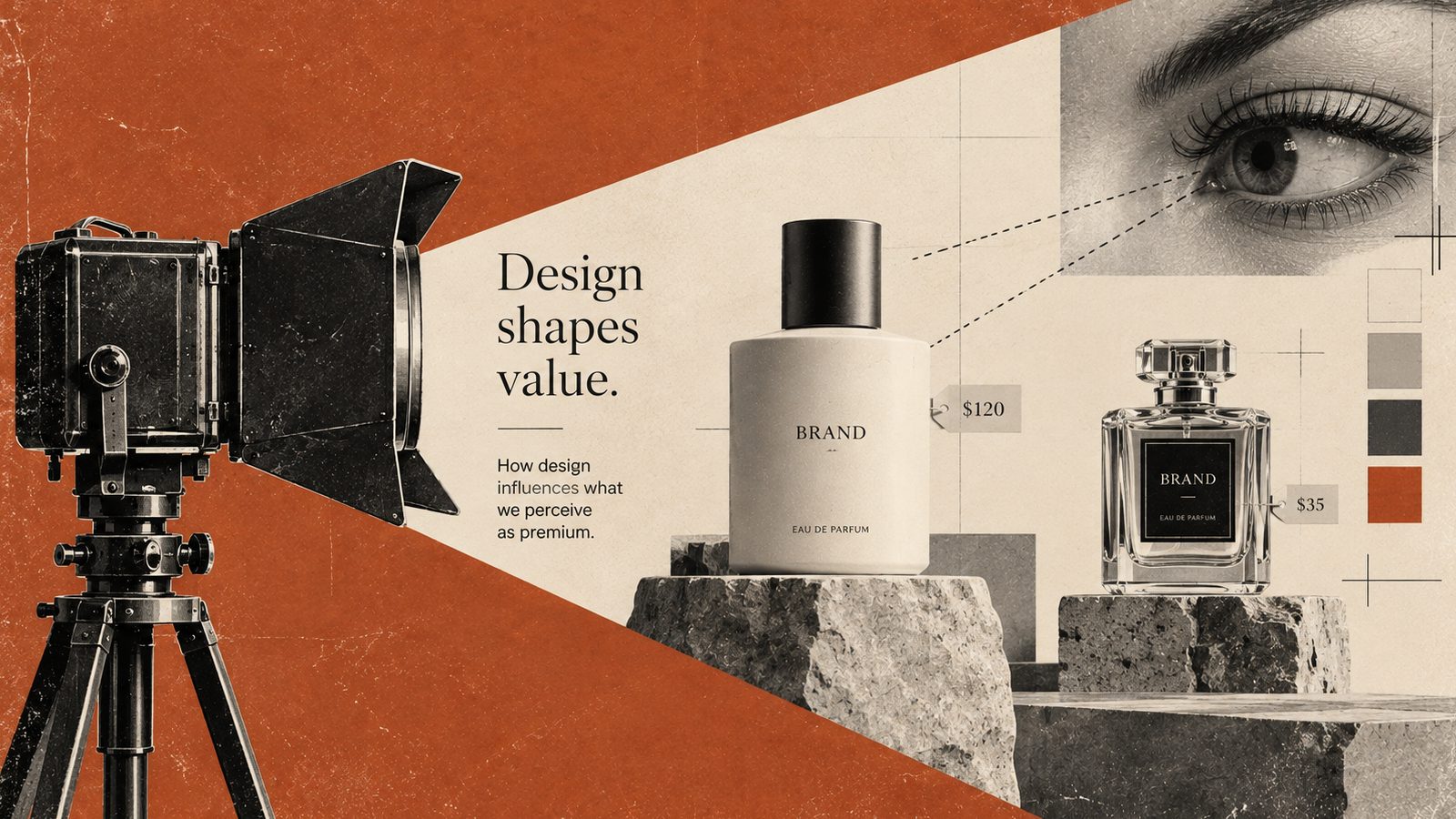
I tend to approach this question with some caution. Looking expensive and being good are different things. Still, understanding how a design creates expectations of quality is useful when you're working on a brand or a product.
While researching this article, I looked at a 2025 study on luxury perception in package design. The researchers showed 1,193 participants different package designs and found that larger areas of white space and more luxurious typefaces could affect perceived luxury and product quality. That does not mean every expensive product should look the same. The more useful question, to me, is which signals make us expect more from a product.
What does an expensive looking design promise?
We cannot know the real price of a product from its appearance. Design creates an expectation. It might suggest that the materials will feel better, that the experience will be more considered, or that the product will stay useful for a long time.
That is why I find it limiting to reduce premium design to black packaging and gold foil. The same black box can feel timeless and confident in one context, then cold and distant in another. Colour matters, but so do type, photography, material, and the promises the brand has already made.
My first distinction is simple: is the design only making the product look more expensive, or is it making the product's value easier to understand? The second goal is the one I would choose.
1. Space gives the product room to breathe
One of the clearest patterns in premium looking design is the use of generous space. When an object has more room around it, our eyes do not treat it like just another item in a crowded group. It gets a little more attention.
This does not mean making every empty area enormous. Space creates rhythm. When the title, product image, price, and description have somewhere to sit, each one becomes easier to notice. A design trying to say everything at once can make even an expensive product feel rushed.
You can see this especially clearly on an ecommerce page. Showing a product alone against a calm background creates a very different expectation from placing it beside twenty badges and competing messages. A large part of premium design is deciding what to hold back.
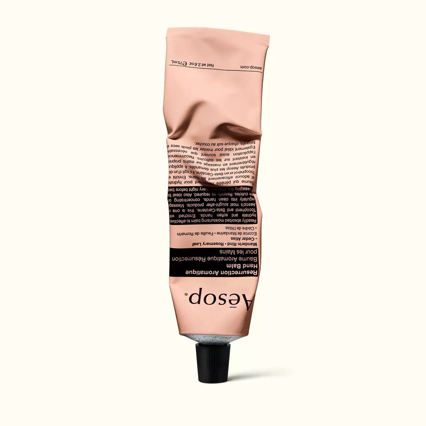
2. Type speaks about price quietly
Typography can act like a salesperson standing next to the product. A high contrast serif may feel ceremonial and established. A tightly spaced sans serif may feel technical or contemporary. These are not fixed meanings. They are possible associations created by the design.
The font itself is only the beginning. Letter spacing, line length, capitalisation, and the space around a heading all join the conversation. If every sentence in a brand is shouting, even the most elegant typeface will struggle to make it feel calm.
When a design is trying to feel luxurious, I would treat typography as the brand's voice rather than decoration. If the product is genuinely technical, choosing a classical serif just to make it look expensive may create the wrong expectation. A good choice brings the product's character and the reader's expectation closer together.
3. Material can be read through a screen
When we cannot touch a product, we use photography and light to imagine its material. A reflection along the edge of glass, a small mark on metal, or the texture of paper gives us a clue about how the object might feel.
The photograph has to feel believable. An overly glossy surface can make a product look artificial. Too much texture can become noise instead of quality. I usually prefer to leave one or two details that explain the material and keep everything else quiet.
In an interface, shadows and gradients can play a similar role. Giving every card the same shadow creates a surface where nothing really feels elevated. A restrained effect can bring one important object forward. I reached a similar point while writing about HMI colour: when every element is highlighted, nothing is highlighted anymore.
4. Colour positions the product before it makes it look expensive
Black, white, cream, deep green, and burgundy often appear alongside premium products. But their effect does not come from the colours alone. The amount used, the surface, the lighting, and the colours around them all change what we read.
A small metallic detail can feel strong on a dark background. Put that same detail on every button and heading, and it becomes decoration instead of distinction. I would first match colour to the brand and the situation, then decide how much attention it should receive.
My earlier article on colour meanings in industrial HMI design is a useful comparison here. In an HMI, colour often describes status and risk. On a fragrance page, it can create atmosphere and desire. The same visual tool carries a different responsibility when the job changes.
5. Consistency is the quiet side of premium perception
A brand feels more expensive when its parts seem to trust one another. If the heading on the website, the text on the box, the light in the store, and the photography on social media feel like they belong to the same world, the brand appears more deliberate.
That sense of control is sometimes confused with coldness. Consistency does not mean making everything identical. It means the photograph, typography, icon, and motion support the same decision. A product page can feel beautifully restrained, then suddenly fill the checkout step with colourful badges. That change can make the brand feel less certain.
When I build a design system, I therefore look beyond colour tokens and component names. I also need to understand when a component should step back, when it should come forward, and what it is meant to communicate. Visual consistency gives the user a sense that the product is being looked after.
6. Show care instead of constantly showing the price
A product does not need to remind us of its price at every opportunity in order to feel premium. Some brands create room for the product, its story, or the moment of use instead.
That brings me to another job for design: making care visible. The way a package opens, the speed and clarity of a web page, and the wording of an error message all contribute to how considered a product feels. People may not describe that feeling as a price signal, but they can still notice the attention behind it.
There is a difference between looking expensive and feeling worth the price. The first can be created with a visual trick for a short time. The second asks the product to carry the same care across every touchpoint.
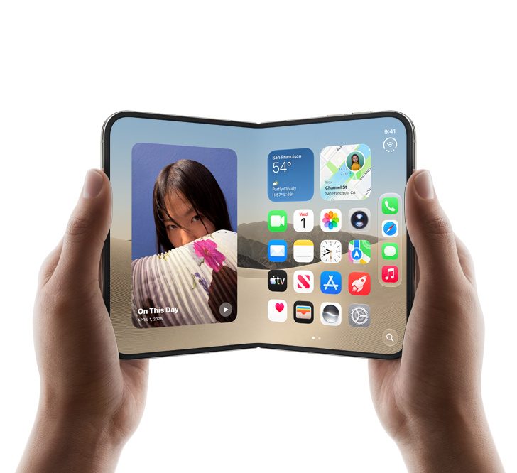
7. How does a digital product feel expensive?
An app or website has no physical material, but users still look for signs of how much thought went into it.
You can see those signs in small details. What does a form say when something goes wrong? How does a payment flow explain its next step? Do we know whether the page is still loading or whether something has stopped working? These details are not luxury styling in the usual sense. They can still make a product feel dependable and carefully made.
In my article about the foldable iPhone, I wrote about preserving a selected conversation and an unfinished draft when the screen changes size. The connection here is straightforward. The care we show by protecting someone's work can be more convincing than the most polished visual effect.
So when I design a premium interface, my first question is not which effect to add. I look for the places where the flow becomes uncertain, where information disappears, or where the user is left alone with a problem. Then I build the visual language on top of that solid experience.
Should every product look more expensive?
Not every product needs to look expensive. Some products need to feel accessible, playful, quick, or dependable. A premium aesthetic in the wrong context can make a product feel distant or more ambitious than it really is.
For me, the important thing is whether the visual decision matches the promise. A genuinely durable product can show that through material and use photography. A technical service can build trust with a clear information structure. A young brand may be better served by a lively and open voice than by an overly formal one.
The research findings need to be read in that context too. More white space or a luxurious typeface may affect perception, but if the product does not meet the expectation, the design has only created a temporary first impression.
The promise a design makes
There is rarely one trick that makes a product look expensive. Space, type, colour, material, photography, and consistency create that expectation when they tell the same story.
I would rather see design make real value easier to understand than try to disguise a weak product. Sometimes that happens through a quiet package. Sometimes through a well written error message. Sometimes it happens by leaving unnecessary things out of the interface.
In my previous articles, I looked at how colour and changing screen formats affect experience. This article approaches a similar question through perceived value. The common thread is simple: a visual decision lasts when it has a job to do.
Sources
- Iseki, Mase and Kitagami: Perception of Luxury and Product Quality in Package Design : 2025 research on white space, typeface, visual texture, and luxury perception.
- Aesop official product collection : Product photography and packaging example.
- Apple official iPhone product page : Product presentation and photography example.
- Apple Intellectual Property Guidelines : Apple media usage terms.
- Hüdaverdi Ural: What Colors Mean in Industrial HMI Design : Earlier article on colour, status, and attention in HMI design.
- Hüdaverdi Ural: The Foldable iPhone Changes the UX Brief : Earlier article on continuity across changing screen sizes.