Why Do Interfaces Hide Their Own History?
I change something in a document, close the panel, then wonder what was there before.


Most interfaces are very good at showing the present. The current value. The current file. The current setting. What they often hide is the route that produced it.
That seems small until something goes wrong.
A deleted block disappears. A renamed file gets its new name. A setting flips from on to off. The screen tells me what is true now, but not always what changed, who changed it, or whether I can safely go back.
I think that missing history affects how much I trust an interface.
The current state is only half the story
A screen usually treats the latest state as the truth. That makes sense. Nobody wants every interface covered in timestamps and old versions.
Still, there are moments when the present is not enough.
If a price changed, I may want to know when. If a document changed, I may want to know by whom. If I accidentally removed something, I care less about the current empty state than the state from ten seconds ago.
This is where version history, undo, activity logs, trash folders, and restore actions start to feel related. They all preserve some trace of the path behind the screen.
The trace does not need to be visible all the time. It just needs to exist when the user suddenly needs it.
Undo changes the feeling of an action
Nielsen Norman Group's usability heuristic on user control and freedom recommends supporting undo and redo. W3C's cognitive accessibility guidance makes a similar point: users should be able to return to a previous point without losing their work.
The interesting part for me is not the command itself. It is what the command does to the decision before I make it.
If I know an action is reversible, I am more willing to try it.
I can rearrange a block. Rename something. Change a setting. Explore.
Without that safety, even a small action can feel permanent. Then the interface starts asking for confidence before the user has enough information to feel confident.
An undo function is almost invisible when everything goes well. That is probably why it is easy to underestimate.
Version history is useful because memory is unreliable
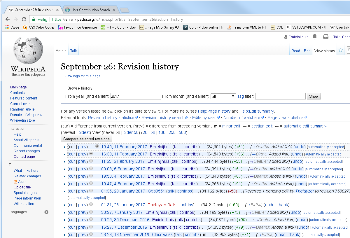
Google Docs lets editors inspect earlier versions, see who changed a file, and restore an earlier version. Wikipedia goes even further by making revision history part of the structure of the system.
Those tools are useful after mistakes, but I think they do something else too.
They reduce the need to remember.
I do not have to remember exactly which paragraph changed yesterday. The system can show me. I do not have to save twelve files called final, final2, and final-really-final. At least in theory.
That matters more in collaborative products. Once several people can change the same thing, the present state stops explaining itself.
A value of “Off” tells me almost nothing. Was it always off? Did I turn it off? Did another person change it this morning? Was it changed automatically?
Sometimes a tiny line of history answers more than another settings description ever could.
A diff can explain what actually happened
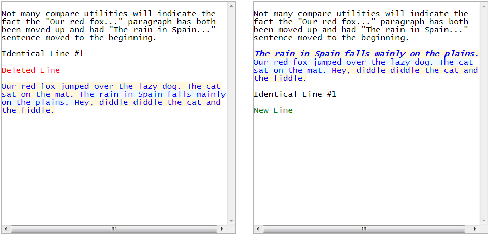
A list of versions tells me that something changed. A comparison tells me what changed.
That difference is important.
A diff view can show removed text, added text, or reordered content. It turns “this file is different” into something I can inspect.
That is useful far beyond code.
Imagine a pricing table edited by several people. A CMS article. Permissions for a team member. A dashboard configuration. In each case, the current screen may be clear while the change itself remains invisible.
I like this idea because it treats history as information design, not administration.
The goal is not to expose every database event. It is to help someone understand the change they care about.
History can become clutter very quickly
There is an obvious problem here.
If every card shows “edited 4 minutes ago”, every button keeps its last state, and every field exposes a log, the interface becomes exhausting.
History is useful because it answers uncertainty. Showing it where there is no uncertainty creates noise.
So I would not make every product look like an audit tool.
I would ask where a user may reasonably think, “Wait, what happened here?”
That might be after deletion. After a shared edit. After a setting changes. After a payment status updates. After content is published.
The rest can stay quiet.
This is one reason I like temporary undo messages after a destructive action. They keep the main interface simple while leaving a short door back. The weakness is that the door can disappear too quickly. A five-second snackbar is technically reversible, but not always comfortably reversible.
Some history should be visible, some should be recoverable
I find it useful to separate two ideas.
Visible history helps explain the present. “Edited by Maya 12 minutes ago” is useful because the change itself matters now.
Recoverable history can stay hidden until something goes wrong. A version panel or trash folder does not need to occupy the main screen every day.
That distinction can keep an interface from becoming heavy.
It also changes how I think about deletion. A confirmation dialog asks the user to be certain before the action. A trash folder allows uncertainty after the action.
For routine actions, I often prefer the second idea.
Nielsen Norman Group also recommends reserving confirmation dialogs for actions with serious consequences, especially when the action cannot be undone. If something can be restored easily, making every click feel dangerous may create more friction than safety.
The interface should remember what the user cannot
There is another connection I keep coming back to.
In older personal websites, visible traces of decisions made pages feel inhabited. A modern product needs much more consistency, but I still think traces can matter.
Not decorative traces. Useful ones.
Who changed this? What was here before? Can I recover it? Why does this state look different from yesterday?
When a product can answer those questions, the current screen feels less mysterious.
I do not want every interface to show its entire past. Most of the time I only want the present.
But when I make a mistake, or when something changes without me, I want the past to still be somewhere.
Sources
- User Control and Freedom Nielsen Norman Group guidance on undo, redo, cancellation, and user control.
- 10 Usability Heuristics for User Interface Design Nielsen Norman Group's broader usability heuristics.
- Let Users Go Back W3C cognitive accessibility pattern for predictable back and undo behaviour.
- Find what's changed in a file Google Docs guidance on viewing and restoring earlier versions.
- Screenshot Wikipedia Revision History Openly licensed example of a revision history interface.
- Diff-Text comparison screenshot Public-domain example of a visual comparison between versions.