Was Basquiat's Chaos Really Under Control?
The first thing I feel when I look at a Jean-Michel Basquiat painting is speed. Words appear before I have finished reading the previous ones. A head opens into bone and teeth. A crown sits somewhere it probably should not. Lines are crossed out, repeated, boxed in, and written over. It can look like the opposite of careful design.

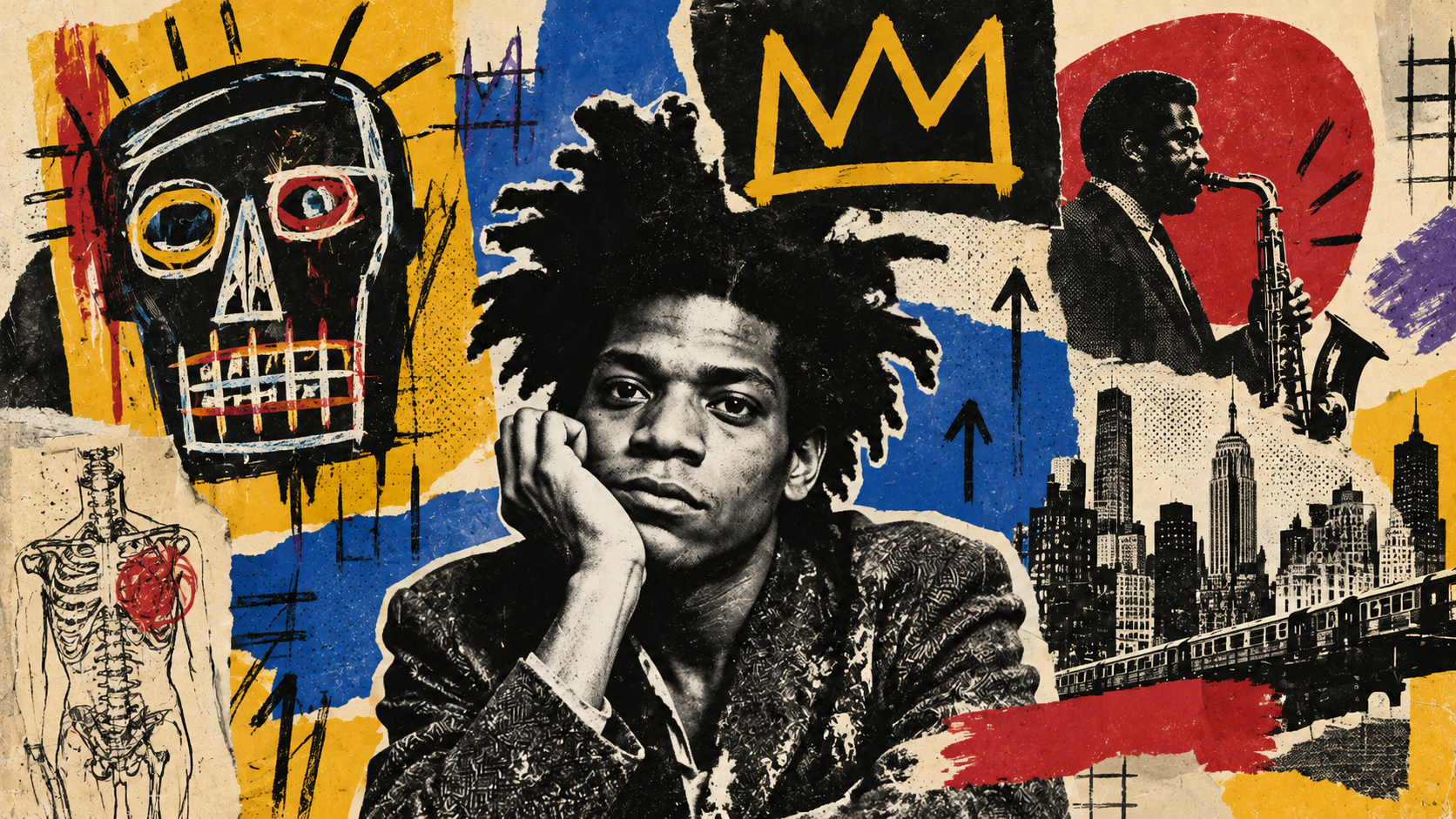
The more I look, the less random it feels. Basquiat's work does not become tidy, and I would not want it to. But patterns begin to appear inside the noise. Certain symbols return. Text behaves like image. Empty areas carry weight. Repetition creates rhythm. Something that initially feels like an explosion starts to feel closer to a visual language with its own grammar.
I am not interested in turning Basquiat into a design-system case study. That would flatten what makes the work powerful. Still, I think designers can learn something from the way he controlled attention without making the surface look controlled.
The mess is part of the structure
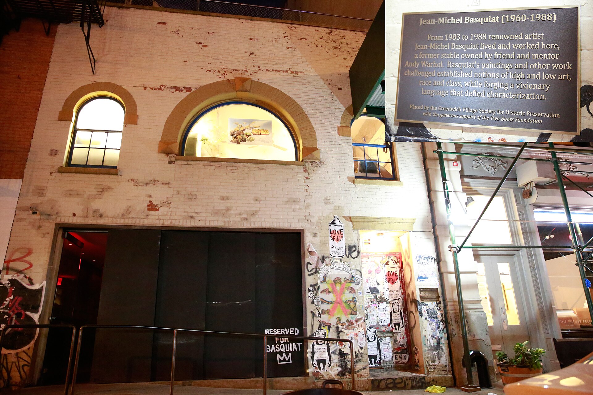
Basquiat grew up in Brooklyn and first became known through the cryptic SAMO messages he made with Al Diaz around downtown Manhattan. By the early 1980s, he had moved into galleries and onto canvas, but the street did not disappear from the work. The Whitney describes his paintings as combining words, crowns, halos, fragments of anatomy, historical material, and contemporary critique. The surface often feels layered in the same way a city wall does after posters, paint, writing, and weather have all had their turn.
A wall is never designed all at once. It accumulates. Basquiat's paintings often give me the same feeling, even when the composition is deliberate. One mark seems to answer another. A word is covered, then made more visible by being covered. A figure sits beside a list that looks unrelated until a repeated term pulls the two together.
This is different from making something messy for style. Basquiat's density keeps producing small points of tension, which is why the eye continues moving rather than giving up.
Words do not behave like normal text
One of the things I enjoy most in Basquiat's work is that reading and looking become the same activity. A word may carry meaning, but it also has size, weight, position, repetition, and rhythm. Sometimes it feels closer to a shape than a sentence.
The Brooklyn Museum's material on Basquiat's notebooks describes language as an early medium for him. His handwritten texts moved between writing and drawing, and the notebooks contain poems, wordplay, lists, observations, street signage, news references, history, music, and popular culture. That matters because the writing in the paintings is not decoration added after the image. It comes from the same thinking process.
I find that useful as a designer because we often separate copy from visual design too early. Basquiat makes that separation almost impossible. A crossed-out word can become louder than an untouched one, and a repeated phrase can create a beat. In the Whitney's discussion of Hollywood Africans, crossed-out terms do not disappear. The gesture of removal becomes emphasis. I love that contradiction.
Anatomy turns the body into a diagram
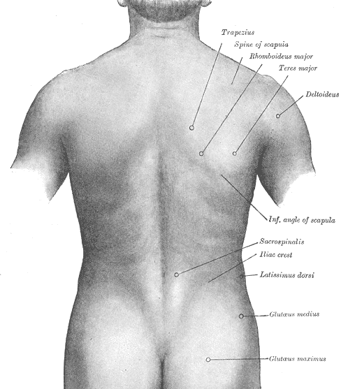
Basquiat's interest in the human body is another reason his paintings feel strangely familiar to anyone who works with information. Heads open up. Bones are labelled. Teeth become repeated marks. Organs and limbs appear somewhere between medical illustration and personal symbol.
The connection to Gray's Anatomy is well documented. The Brooklyn Museum notes that Basquiat encountered the book as a child, and anatomical imagery later became a recurring part of his work. I do not think he borrowed the calm authority of a medical textbook. He almost did the opposite. He took the diagram apart and put vulnerability back into it.
A labelled body normally promises clarity. Basquiat keeps the language of explanation but removes the comfort of certainty. The body looks exposed, unstable, sometimes almost mechanical. For me, that tension makes the anatomical references more interesting than the far more famous crown.
Repetition is doing more work than decoration
Crowns, heads, copyright signs, names, numbers, skeletal forms. Basquiat returns to things. That repetition is sometimes explained as iconography, which is true, but I also think it affects how the work feels physically. A symbol that appears once is an object. A symbol that keeps returning becomes a rhythm.
Design systems teach us to repeat elements so people do not have to relearn an interface. Basquiat's repetition is less comfortable. A crown can suggest value, power, fame, self-assertion, or something more ironic depending on what surrounds it. The sign is familiar, but its emotional meaning keeps moving.
That uncertainty interests me. Designers usually remove ambiguity for good reasons. A checkout button should not become philosophical. But in editorial or brand work, a recurring symbol can stay recognisable without becoming emotionally fixed. That may be what keeps a visual system from becoming sterile.
His empty space is not actually empty
Basquiat is usually remembered for density, but I often notice the areas where he stops. Raw canvas remains visible. A cluster of text ends and leaves a patch of colour alone. One side becomes crowded while another side feels strangely open.
Those gaps are important because they make the crowded parts feel crowded. Without them, everything would compete at the same volume. This is close to something I keep returning to in digital design: space changes what we think an object is worth and how much attention we give it. The visual logic is completely different, but the mechanism is related. A mark becomes stronger because something beside it stays quiet.
I would never describe Basquiat's work as minimalist. That would be absurd. Yet some of the same principles of contrast still apply. Loud needs quiet. Repetition needs interruption. Density needs an edge. What looks uncontrolled can depend on very controlled differences in visual pressure.
That is probably the part designers can borrow most safely. Not the crowns. Not the handwriting. Not fake scratches added to a clean layout. The useful thing is the relationship between intensity and pause.
Copying the surface misses the point
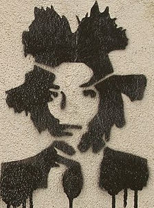
Basquiat has become easy to imitate badly. Add a crown, rough capitals, a skull, and a scratched-out phrase, and a poster can quickly become “Basquiat-inspired.” The problem is that recognition can hide what made the work specific. His imagery drew from Black history, racism, jazz, boxing, anatomy, advertising, New York street life, and his own place inside the art world. The Brooklyn Museum's notebooks show how broad that intake really was.
That is why copying the texture feels empty to me. The texture was the residue of thinking. If you remove the references, the repetition, and the argument underneath, what remains is a style filter.
The same problem happens in product and graphic design. We see a visual result and copy its most visible property. More white space becomes “premium.” Brutalist type becomes “edgy.” Handwriting becomes “human.” But personality rarely comes from one visual trick. It usually comes from accumulated decisions that belong to a specific person or context.
The unfinished feeling may be the point
His paintings often feel as if they are still thinking. A word has been reconsidered without disappearing. A line remains even after another line contradicts it. A figure can look both constructed and damaged. I do not read those things as mistakes waiting to be cleaned up. They are evidence of the work changing while I look at it.
That may be why the images still feel contemporary to me. We are used to polished outputs now. Templates correct our spacing. Software straightens lines. Brand systems protect consistency. AI can generate finished-looking images before an idea has had time to become difficult. Against that background, visible revision starts to feel almost radical.
I would not want every design to show every hesitation. Most interfaces should probably hide the mess that produced them. But creative work can lose something when every trace of searching is removed.
I do not think the lesson is to design like Basquiat
I would be suspicious of any article that ended with five rules for designing like Jean-Michel Basquiat. His work is too tied to his life, references, and historical position for that. More importantly, rules would miss the reason I wanted to look at the work in the first place.
What I take from it is smaller. A composition can be dense without being careless. Words can be images without losing meaning. Repetition can create recognition while still allowing ambiguity. Empty space can make noise louder. Visible revision can carry emotional weight instead of looking unfinished.
Most of all, I like the reminder that a strong visual language does not need to look perfectly controlled in order to be deliberate.
When I first look at Basquiat, I see chaos. A little later, I start seeing decisions. I think the distance between those two moments is where much of the pleasure is.
Sources
- Jean-Michel Basquiat, Whitney Museum of American Art Biography, recurring imagery, historical themes, and works in the Whitney collection.
- Jean-Michel Basquiat, Hollywood Africans, 1983 Whitney discussion of layering, crossed-out words, portraits, and racial stereotypes in the painting.
- Basquiat: The Unknown Notebooks Brooklyn Museum overview of Basquiat's notebooks, visual language, references, and creative process.
- Basquiat: The Unknown Notebooks press release Details on Basquiat's use of language, lists, history, music, and recurring symbols.
- Back of the Neck, Brooklyn Museum Background on Basquiat's use of Gray's Anatomy and anatomical imagery.
- Jean-Michel Basquiat, MoMA Collection overview and works held by the Museum of Modern Art.
- Gray's Anatomy plates, Wikimedia Commons Public-domain anatomical illustrations from the 1918 edition.