Blog
Things I keep
thinking about
Sometimes design, sometimes art, sometimes a purely technical curiosity. No single theme; whatever is wandering around in my head ends up here. This is my playground.

Latest
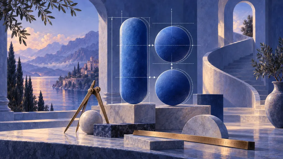
When the Numbers Are Right but the Interface Still Looks Wrong
A few days ago I came across a simple design example built around the idea “don’t trust the math.” Two groups of shapes were being compared. One was not mathematically equal, yet it looked balanced. The other used equal measurements, but somehow felt heavier on one side. It is a small example, but it points to something that happens constantly in interface design: the ruler can be right while the result still looks wrong.
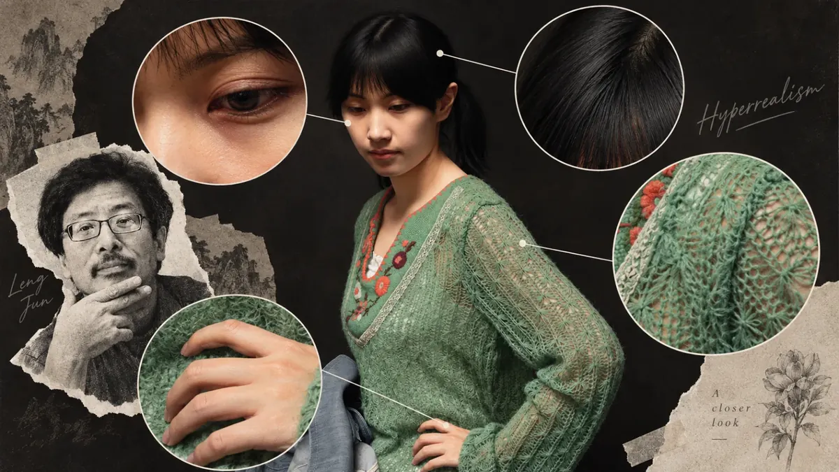
When a Painting Looks More Real Than a Photograph
Some paintings make your brain resist the fact that they are paintings. Leng Jun’s Portrait of Xiao Jiang is one of them. What caught my attention first was not the face, but the almost tangible texture of the green sweater. After a while, one question remains: why can a painting feel more real than a photograph?

Why Can You Tell When an Interface Was Designed by AI?
I keep seeing interfaces that look finished before they look considered. The spacing is clean, the cards line up, the numbers have little green badges, and somewhere there is usually a friendly insight telling me I spent too much on coffee. Nothing is obviously wrong. Still, after a few seconds, I often have the same reaction: this looks generated.
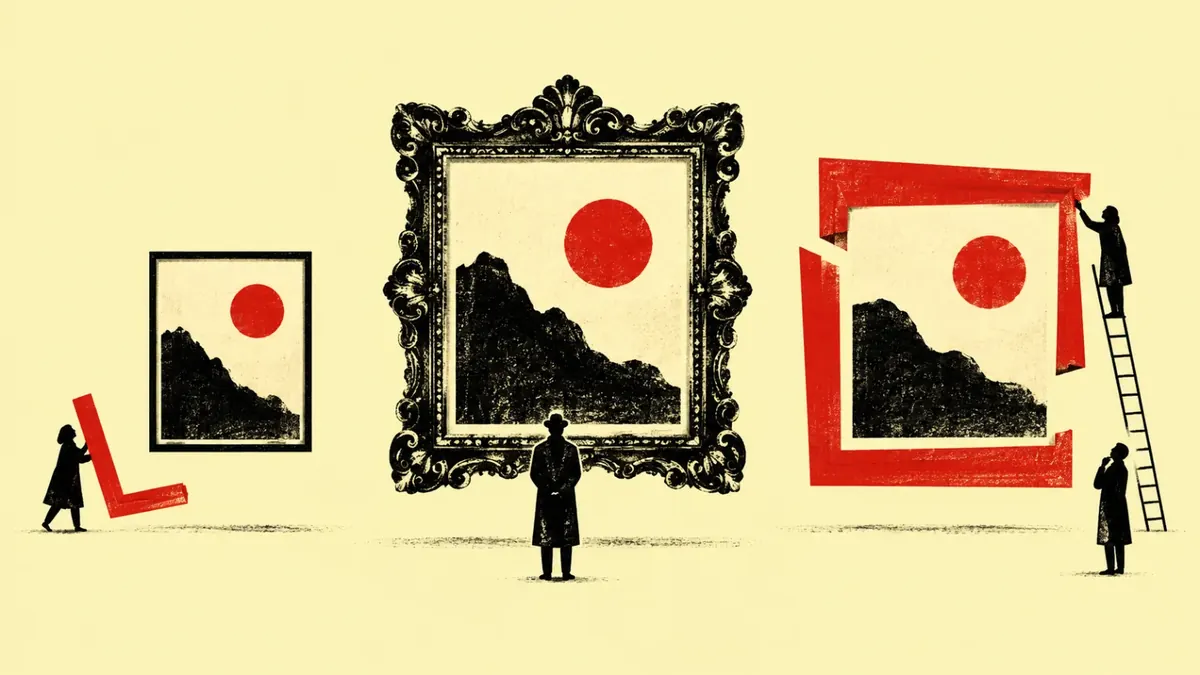
How Much Can a Frame Change an Artwork?
I usually notice the painting first. The frame arrives a second later, almost like furniture around the real thing. That habit feels natural because museums, books, and screens train us to crop the frame away. We are shown the artwork as an image, neatly separated from the object that has been carrying it for decades or centuries.
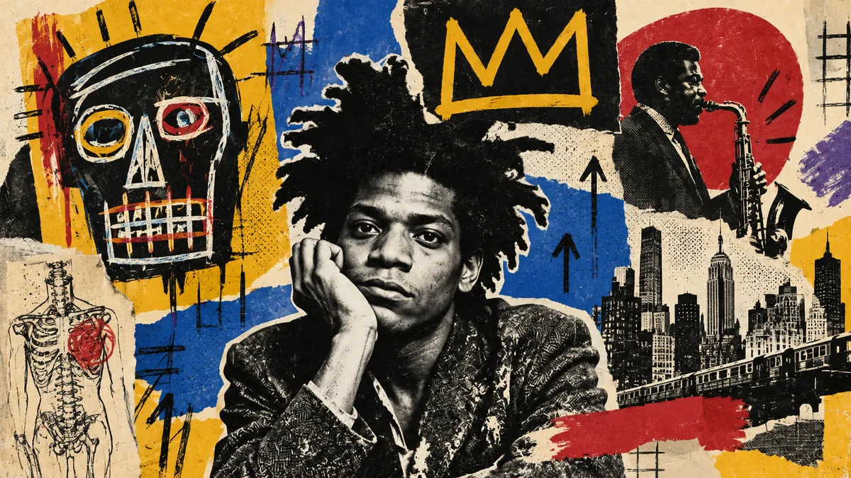
Was Basquiat's Chaos Really Under Control?
The first thing I feel when I look at a Jean-Michel Basquiat painting is speed. Words appear before I have finished reading the previous ones. A head opens into bone and teeth. A crown sits somewhere it probably should not. Lines are crossed out, repeated, boxed in, and written over. It can look like the opposite of careful design.
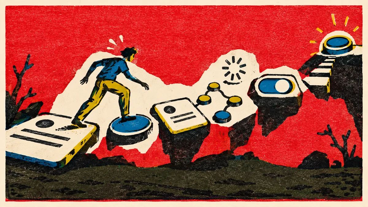
The Invisible Cost of Using an Interface
Every click, choice, scroll, wait, and remembered detail asks something from the user. Interaction cost gives us a way to see that effort before a simple-looking flow becomes tiring.
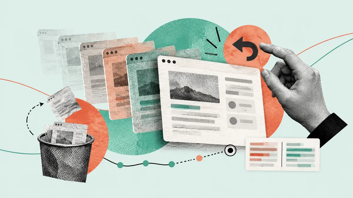
Why Do Interfaces Hide Their Own History?
I change something in a document, close the panel, then wonder what was there before.
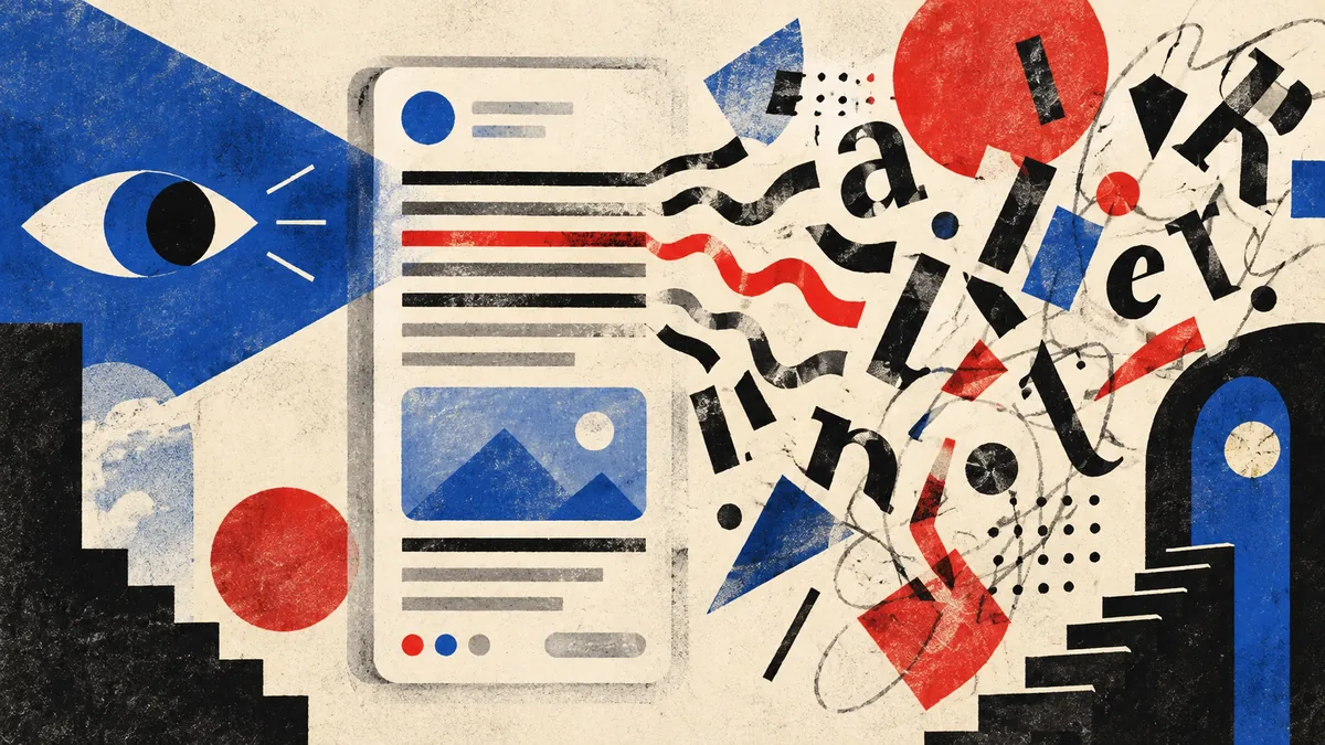
An Interface Can Be Readable and Still Be Hard to Read
A screen can pass the obvious readability checks and still make me work too hard. I am interested in that gap, because it sits somewhere between typography, language, attention, and interface design.
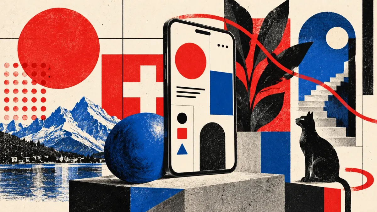
Why Swiss Design Still Shapes Modern Interfaces
A graphic language built for posters still feels at home on a screen. I keep noticing Swiss Design in grids, typography, hierarchy, and the quiet structure behind interfaces.
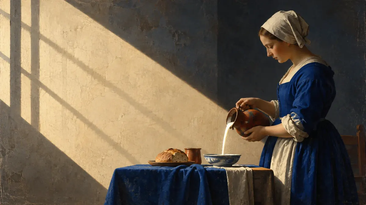
How Vermeer Designed Light to Guide Our Eyes
Vermeer’s light feels quiet, yet I rarely look away quickly. I wanted to understand how an ordinary room can hold attention without asking for it.