Why Did the Old Internet Feel More Personal?
Personal homepages, strange backgrounds, music players you could dress up yourself. I miss how much room they left for someone to make a place their own.

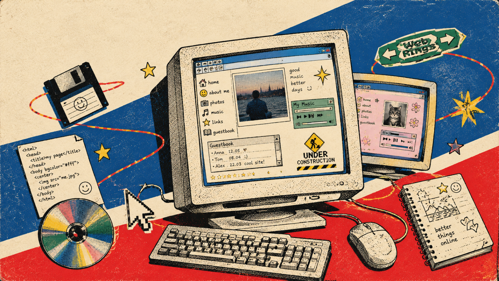
Sometimes an old personal website tells me more about its owner than a carefully written bio could. There is a list of favourite bands, an oddly specific page about a hobby, and a note apologising for a section that isn't finished. The heading is too large. The background makes the text harder to read. Somehow, I still want to look around.
As a designer, I find that slightly uncomfortable. Several things I would normally suggest fixing are part of what makes the page memorable. I wouldn't defend every decision. But I do wonder what would be left if I tidied all of them away.
We read more into an interface than its contents. Just as design can make a product look more expensive, it can make a space feel cared for, distant, playful, or unmistakably someone's. That last quality is the one I'm interested in here.
“The old internet” is a rather generous label. Personal websites in the 1990s and blogs in the 2000s belonged to different moments, and nobody experienced all of it. I'm thinking about the parts where people could build a corner of the web around their interests. There are useful ideas there, even if we have no desire to bring back the wallpaper.
You were visiting someone's place
On a personal website, I can see decisions around the writing as well as inside it. What has this person put first? Which pages have they bothered to keep? Why does an otherwise sensible website have an entire section devoted to one obscure interest?
Those decisions give the visit some context. I might arrive for an article, move to a reading list, and leave through a link to someone else's blog. Gradually, I get a sense of the person who arranged it all. Their taste starts to feel familiar.
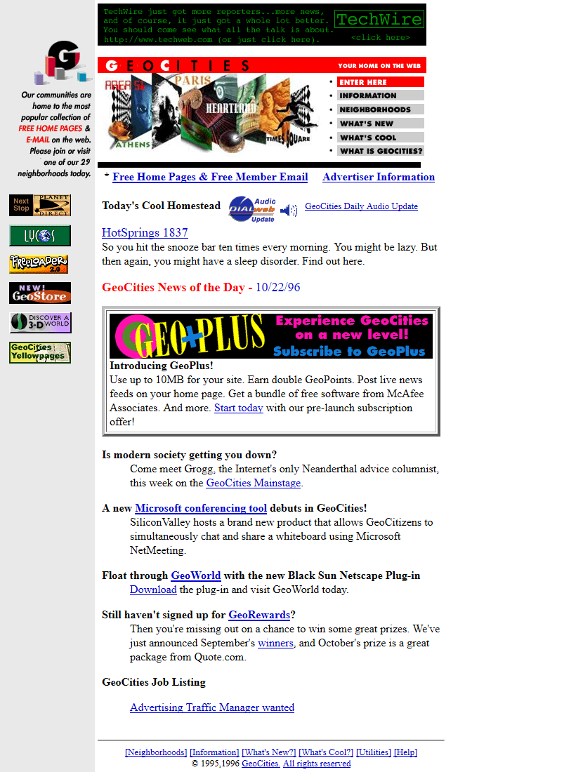
Web Design Museum's GeoCities archive documents a service that organised websites around virtual cities. The image below shows the service's own page in 1996, rather than an individual user's homepage. That idea of a place is still useful: you could establish an address and invite people to visit.
A feed gives me a different experience. Many people's posts pass through the same frame, with the same controls and roughly the same opportunities to introduce themselves. That consistency can make browsing easier. But sometimes I remember the platform much more clearly than the person whose work I just read.
I find myself missing the things that sit beside a piece of content. The little note explaining why a link matters. The unfinished project that nobody has removed. The evidence that someone made this arrangement because it suited them.
The awkward bits could tell you something
In her 2005 essay A Vernacular Web, artist and researcher Olia Lialina examines the visual and acoustic culture of the early web. She asks what its elements meant, which needs they served, and what was lost when they were treated merely as outdated design.
I like that starting point. It's easy to look at an old page and judge it against the work we produce now. It's more interesting to ask what its owner was trying to do.
A starry background might have been exactly right for the world someone wanted to build. A long list of links might have been a collection they were proud of. Looking professional may never have been the aim.
I still enjoy finding this in personal blogs. A short note beside a book. An idea the author hasn't quite worked out. A photograph that doesn't match the rest of the site but clearly belongs there for a reason. Interests rarely fit together as neatly as a portfolio presentation suggests they should.
There is a limit, of course. Text I can't read or a menu I can't use can stop me getting to know the person behind the page. I don't need a website to be difficult in order to believe it has character. I want to be a little more careful about which irregularities I call problems.
Who gets to do the personalising?
When a product recommends something based on my behaviour, it is making a choice about me. When I change how that product looks or arrange what it shows, I am making a choice myself. We use “personalisation” for both, but they don't feel the same.
Winamp makes that difference wonderfully visible. It was a desktop music player, rather than a website, but the skins people made and shared belong to the same culture of making things your own. The Winamp Skin Museum lets you explore how differently the same underlying application could appear.
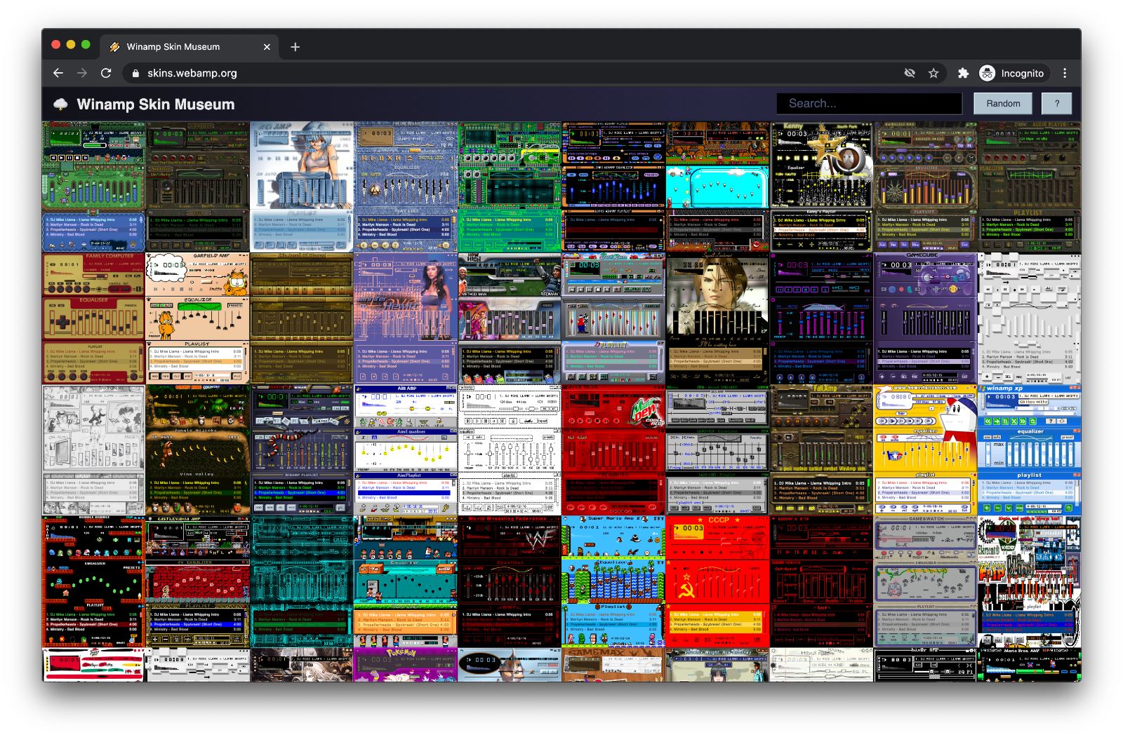
In his interview with Silvio Lorusso, Webamp creator Jordan Eldredge describes the excitement of seeing pixels he had drawn become part of an application he could use. That detail stays with me. Something you have made is now part of a tool you spend time with.
I think about smaller versions of that feeling in product design. Can someone rearrange the sections they use? Name a collection in their own words? Remove an area that means nothing to them? Choose which part of a profile deserves the most attention?
Most people probably don't want a blank code editor as the entrance to an application. I certainly wouldn't make customisation a prerequisite for using one. But there is plenty of room between changing a profile picture and building everything from scratch.
Even a small choice can be meaningful when the person gets to keep it. I would want their arrangement to survive the next visit, and I would be cautious about resetting it simply because a new default looks better in a presentation.
A list of links was a kind of introduction
Someone's favourite websites can tell you a lot about them. What keeps catching their attention? Who do they trust? Which peculiar corner of the web have they found and decided to share?
I love a link with a sentence beside it explaining why it's there. That tiny piece of editorial judgement gives me something a bare recommendation cannot. There is a person making the introduction, and I can decide whether I share their curiosity.
Anil Dash's 2012 essay The Web We Lost discusses personal identity, moving content between services, and the possibilities that narrowed as the social web changed. I read it as an argument from a particular moment, rather than a report on every platform today. Its question about how much control people have over what they build still matters.
For a personal blog, linking out is one modest way to put that idea into practice. A site can help me find something worthwhile elsewhere. I might return because I trust its author's judgement, or because the next recommendation could surprise me.
That seems like a good relationship to aim for. I would rather give someone a reason to remember the site than make leaving it feel like a mistake.
Familiar layouts solved real problems
It's tempting to stop here and blame standardisation for everything. I don't think that would be fair.
Publishing inside a straightforward form has obvious advantages. Someone with something worth saying may have no interest in designing a website. A familiar layout also saves the reader work. I don't want to solve a new navigation puzzle every time I follow a link.
As a designer, I understand why repeatable patterns are appealing. We have different screen sizes, content types, and accessibility needs to account for. A consistent system helps us handle those demands. An unusual interface is still responsible for being usable.
The question I would bring into a review is more specific: which decisions do we actually need to make on the user's behalf?
We can keep navigation predictable without deciding the order of someone's interests. We can offer readable typography while allowing a choice of colours that work with it. We can make a profile easy to understand while leaving space for something its owner considers important.
For example, I could imagine a reading app with familiar controls and shelves that people name and arrange themselves. A community profile could keep essential information in a consistent place while letting its owner feature a project, a collection, or a few favourite links.
Those are proposals I would want to explore with people, rather than assume they want. Some would prefer the default. That should be fine too. Having a choice includes being allowed to leave things alone.
There is still room to build a personal web
I don't want to end this as an obituary. Neocities describes its service as a place to create personal HTML websites, control how they look, and download their files. People can still choose to publish that way. The possibility hasn't disappeared.
Nor does a personal website need to look as though it was made in 1998. A quiet, readable page can feel deeply individual. Its character might come from what the author notices, how they organise their writing, or the little explanations they leave for visitors.
If I were starting one, I would ask a few questions before choosing colours. What do I want to collect here? What would I share even if it didn't demonstrate professional expertise? What small thing would I like a visitor to learn about me?
Some answers might have very little to do with work. Looking at films through a designer's eyes can reveal the interests behind the finished projects. I like being able to see those interests on a portfolio site, alongside the evidence that someone can do their job.
That's the part of the older web I would keep. People left visible traces of their decisions. A page could be unfinished and still feel inhabited. We can make websites faster, clearer, and easier to use while leaving room for that.
Sometimes I want to leave a website feeling that I got to know its author a little. It's a small thing to ask of a page, but a lovely thing for one to offer.
Sources
- Olia Lialina: A Vernacular Web : A 2005 essay on the visual language and cultural meaning of the early personal web.
- Web Design Museum: GeoCities in 1996 : A historical screenshot and background on the service's virtual cities.
- Winamp Skin Museum : An archive for exploring and experiencing Winamp skins.
- Jordan Eldredge: Mainlining Nostalgia : How the museum was built, and the source of the museum screenshot used here.
- Silvio Lorusso and Jordan Eldredge: This Software is Punk Rock : An interview about Winamp skins, creative ownership, and software culture.
- Anil Dash: The Web We Lost : A 2012 perspective on personal identity, portable content, and relationships between services.
- Neocities: About : The service's own description of its approach to personal websites and the independent web.