How Much Can a Frame Change an Artwork?
I usually notice the painting first. The frame arrives a second later, almost like furniture around the real thing. That habit feels natural because museums, books, and screens train us to crop the frame away. We are shown the artwork as an image, neatly separated from the object that has been carrying it for decades or centuries.


Lately I have started looking at the opposite edge of the picture. Not the centre, but the border. Once I do that, the frame stops feeling neutral. It changes scale, mood, distance, and even the period I think I am looking at. The same painting can feel ceremonial in carved gold, private in dark wood, or strangely contemporary inside a thin black line.
That makes the frame interesting to me as a designer. It is not the content, but it changes how the content arrives.
A frame is already telling me how to look
A frame creates separation before I have interpreted a single brushstroke. It says that the image ends here and the room begins there. That sounds obvious, but the strength of that boundary changes the experience. A deep gilded frame can make the painting feel like a physical object with weight and status. A shallow, quiet frame can almost disappear and let the picture sit closer to the wall.
The Getty's frame conservators describe their job partly as matching a frame to the painting's time, place, and visual character. I like that idea because it treats framing as interpretation rather than decoration. The frame can support the artwork, compete with it, or introduce a completely different voice.
This is not so different from the way a product can look more expensive because of spacing, materials, or restraint. Presentation changes the value we imagine before we have examined the object itself. A painting is more extreme, of course, but the mechanism feels familiar.
Sometimes the frame continues the painting
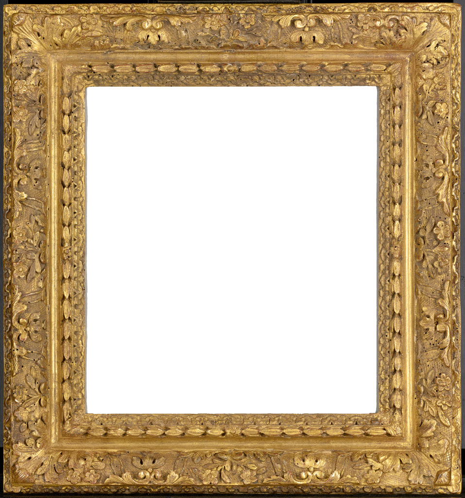
The most interesting examples are the ones where the border and the image seem to speak the same language. The Met describes a fifteenth-century Sienese cassetta frame whose punched decoration creates a rhythm that echoes the punched halos and garment borders inside the painting. I find that detail beautiful because it removes the clean division between artwork and frame.
The painting does not simply stop. Its visual logic keeps going for a few more centimetres.
That is also why artist-designed frames are so revealing. Gustav Klimt worked with his brother Georg on frames that continued the gold, ornament, and decorative rhythm of his paintings. Edgar Degas often went in another direction, favouring relatively flat frames that would not cast distracting shadows over the image. In both cases, the decision was part of how the work should be seen, not an afterthought made by whoever owned it later.
The wrong frame can quietly rewrite the period
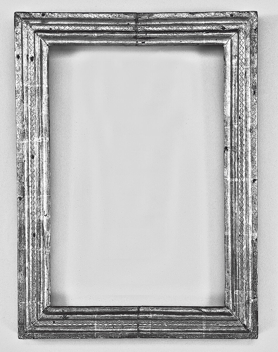
There is another layer that I had not thought much about before. A frame can change not only the mood of an artwork, but its historical voice. Put a seventeenth-century painting in a very clean contemporary frame and it may suddenly feel closer to us. Put a modern picture inside something heavily gilded and antique, and it can gain a seriousness or distance that was never part of the original intention.
This is where museums have a difficult job. Getty notes that many paintings arrive in frames added much later by collectors. Curators and conservators then have to ask whether the frame comes from the right period or region, whether there is evidence that it is original, and whether it actually helps the painting.
I like the uncertainty here. There is no universal “correct frame” button. Historical accuracy matters, but so does the relationship between two objects that may have travelled separately for years.
Empty frames make the point more obvious
Looking at an empty frame is oddly useful. Without a painting inside it, you can finally see how much visual information the frame carries by itself. Proportion, ornament, symmetry, material, colour, and depth are all doing work before any image appears.
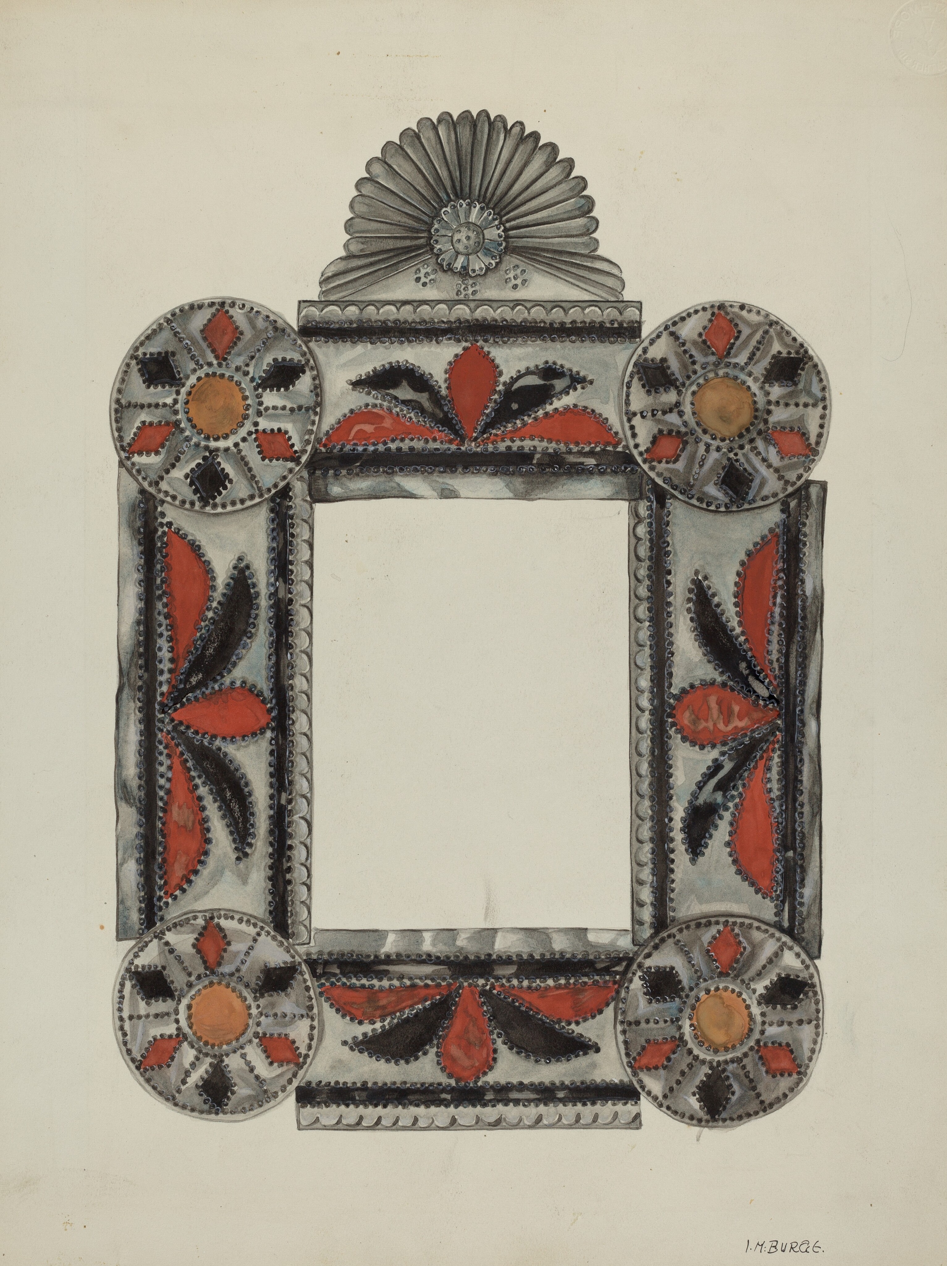
The National Gallery of Art's Index of American Design includes frame drawings that make this very clear. Irene M. Burge's 1936 study is almost a poster in its own right. The shell form at the top, circular corner details, leaf motifs, and colour accents already suggest a certain kind of picture and a certain kind of room. I can imagine placing three different paintings inside it and watching each one change.
We usually remove frames when art moves to a screen
There is a small irony in how we encounter art online. Digital archives give us incredible access to paintings, often at a resolution that would have been impossible to study from a book. At the same time, the image file usually crops away the frame. We gain detail and lose context.
On a phone, every painting also receives a new frame whether we intend it or not. The browser, the white page, the black image viewer, the margins of an Instagram post, or the bezel of the device all become part of the presentation. The original physical frame disappears and a software frame replaces it.
I do not think that makes digital viewing wrong. It just means the idea of a border never really disappears. We keep replacing one border with another.
A frame can direct attention without asking for attention
Good frames seem to have a strange balance. They are visible enough to shape the work, but they do not always want to be the first thing noticed. Getty frame conservator Gene Karraker has described the role almost like matchmaking: the frame should complement the painting without overpowering it.
That feels very close to interface design. A container can clarify hierarchy, create focus, and separate one thing from another. But if every card, border, shadow, and background treatment becomes expressive at once, the container starts competing with the content.
This is where the comparison becomes useful for me. The lesson is not “put borders around everything”. It is closer to this: what surrounds a thing is part of the thing people experience.
I now find it difficult to ignore the edge
I still do not walk into a museum and stare at frames before paintings. The artwork remains the reason I am there. But now I notice when a frame changes the temperature of a picture, when gold carries a colour outward, or when a quiet dark border gives a busy painting somewhere to stop.
And I notice the opposite too. Sometimes the frame feels too prestigious for the picture, too decorative, or simply like it belongs to another century. That mismatch can be interesting in itself because it reveals how much I expected the border to agree with what it contains.
The thing I like most about frames is that they sit in an awkward place between art and presentation. They are neither completely inside the work nor completely outside it. Maybe that is exactly why they have so much influence.
Sources
- How Frames Influence the Meaning of Artwork Jennifer Dasal on historical frames, artist-designed frames, and how framing affects perception and value.
- What's in a Frame? Getty conservators on matching frames to a painting's period, place, and character.
- How to Frame a Masterpiece Getty on the practical and visual decisions behind museum framing.
- Louis Style: French Frames, 1610–1792 Getty survey of French frame design and framed paintings.
- Cassetta frame, Sienese, ca. 1450 The Met on a frame whose punched decoration echoes the painting it surrounds.
- Picture Frame by Irene M. Burge National Gallery of Art open-access frame design from the Index of American Design.
- Getty Open Content Program Usage policy for Getty public-domain collection images.