Why Swiss Design Still Shapes Modern Interfaces
A graphic language built for posters still feels at home on a screen. I keep noticing Swiss Design in grids, typography, hierarchy, and the quiet structure behind interfaces.


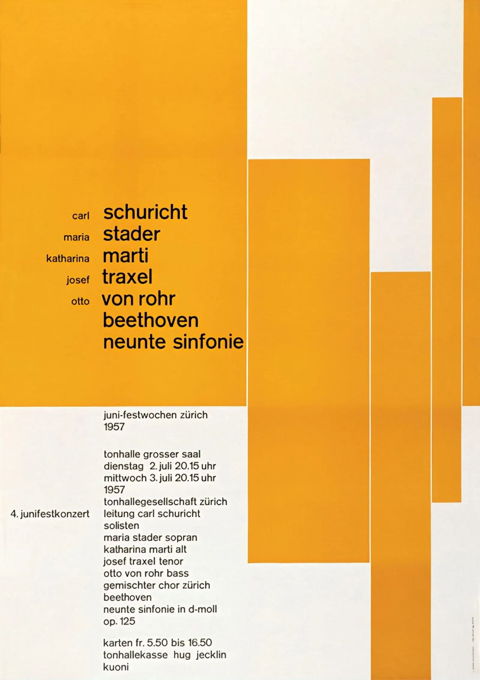
Look at a Josef Müller-Brockmann poster from the late 1950s. It clearly belongs to another era, yet the structure does not feel old. Type follows invisible edges. Empty space has a job. One element leads while the others wait their turn.
I can move from that poster to a well-made interface without changing the way I read the hierarchy very much. That is what interests me. Swiss Design feels less useful as a look to copy than as a way of deciding what should relate to what.
A poster from 1957 can still feel strangely familiar
The movement is also known as the International Typographic Style. Cooper Hewitt describes Swiss Style through traits including sans-serif typography, asymmetrical layouts, grid-based organisation, and photography used in place of illustration. Those choices became recognisable, but the useful part sits underneath them.
There is a belief that structure can make information easier to understand. That idea travels well. On an industrial screen, for example, colour works best when it has a specific job instead of decorating every normal state. A Swiss poster asks a similar question of composition. If the decoration disappeared, would the relationships between things still be clear?
That is why I would hesitate to describe Swiss Design as simply minimal. The work may look reduced, but reduction is not the goal by itself. The page is still doing a lot. It is just doing it through relationships rather than decoration.
Swiss Design’s grid was never meant to be seen
The easiest thing to copy from Swiss Design is the grid. It is also the easiest thing to misunderstand. A grid is not a pattern that has to become visible in the finished composition. It is a private agreement about where things can begin, where they can end, and how separate pieces can relate.
Müller-Brockmann turned that idea into a practical system. Niggli describes Grid Systems in Graphic Design, first published in 1981, as a working tool for organising visual solutions more reliably and quickly. The part I keep coming back to is the word “working”. The system exists to reduce arbitrary decisions.
That sounds familiar in digital product design. Columns become responsive layout rules. Baselines become spacing systems. Repeated relationships become components. The screen can change width without forgetting the logic that holds the page together.
A digital product also refuses to stay still. Text gets longer. Data disappears. Permissions change. Viewports shrink. A composition built around relationships has a better chance of absorbing those changes than one built around a single perfect frame.
I notice this most when a layout leaves Figma and starts meeting real content. A card that looked balanced with two lines may suddenly need five. A translated label can push an action sideways. The grid does not solve those problems automatically, but it gives the page somewhere sensible to bend. That feels more valuable to me than perfect alignment in the original mockup.
Typography became part of the architecture
Swiss designers treated type as material, rather than a label added after the composition was finished. Sans-serif faces fitted that approach well. Helvetica, designed by Max Miedinger with Eduard Hoffmann in 1957, later became the most famous example. Monotype still traces Helvetica back to that 1957 design, even while adapting it for contemporary screens.
What still feels current is the idea that type can build the layout by itself. Size creates priority. Weight separates levels. Position establishes a relationship before a border, shadow, or card appears.
Müller-Brockmann’s 1960 Der Film poster is a useful reminder. MoMA records the work as an offset lithograph from 1960. The title does not sit inside a decorative container. The letters themselves become the composition.
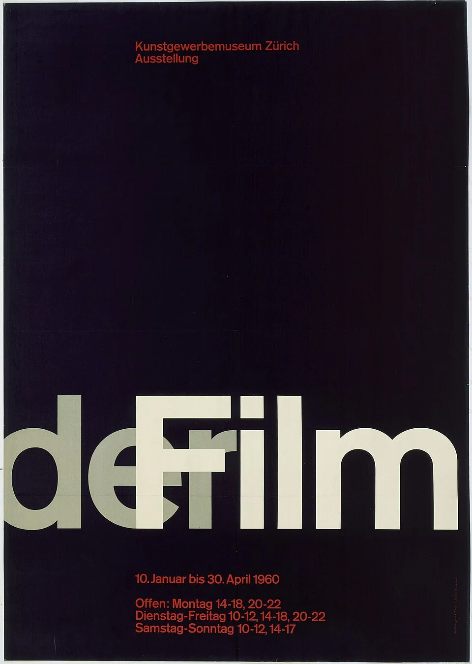
Interfaces often work the same way when they are at their best. A strong heading, a quieter description, and a clearly placed action may need very little around them. I am not against cards, dividers, or colour. I just want typography to explain most of the hierarchy before those tools arrive.
Asymmetry can feel more organised than symmetry
A lot of Swiss work looks calm without being centred. That is one of the parts I like most. The balance comes from scale, alignment, and empty space rather than mirroring the left side onto the right.
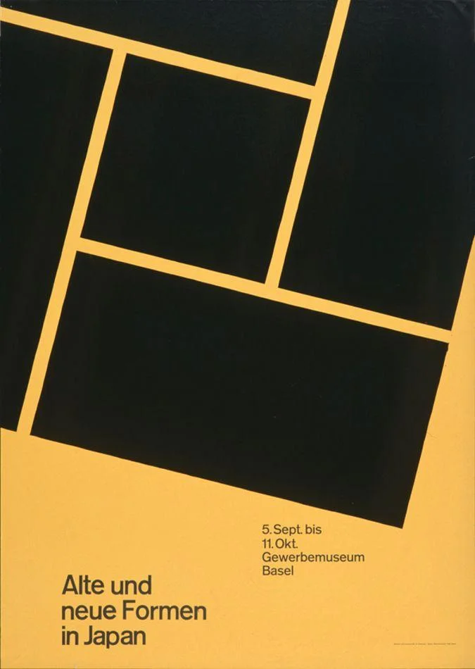
Armin Hofmann’s work makes this especially clear. Cooper Hewitt connects him directly to Swiss Style and describes how contrast activates his compositions. A large form can carry weight on one side while a smaller block of type holds the other. The page stays balanced because the visual weights have been considered.
This matters on screens too. A perfectly centred layout can become passive when every element receives the same kind of attention. Asymmetry can create a path. The eye finds the larger element first, then moves toward the supporting information. The layout starts behaving more like a sentence with emphasis.
I would not turn that into a rule that every interface should be asymmetric. Some screens benefit from obvious symmetry. The useful part is the idea that balance does not require everything to receive equal space or equal visual strength.
Less is useful only when the hierarchy survives
Swiss Design is often reduced to minimalism. I think that loses the interesting part. Removing elements is easy. Knowing what can disappear without damaging meaning is much harder.
A sparse interface can still be confusing. It can have generous white space and a fashionable grotesque typeface while every label sits at roughly the same visual strength. That is not clarity. It is simply fewer objects.
The Swiss approach works when reduction makes the structure stronger. Space can separate ideas. Scale can establish order. Alignment can show which pieces belong together. None of those moves requires the page to look empty.
This is also where I would be careful about turning the style into a recipe. A grid, black type, white space, and one bright colour can quickly become another preset. AIGA’s Eye on Design documented contemporary Swiss designers who keep parts of the tradition while deliberately breaking its older visual expectations. I find that more useful than treating the 1950s as a fixed template.
Design systems inherited more than the look
The connection to interface design becomes clearer when I stop comparing screenshots and compare processes instead. A design system is built around repeatable decisions. Type scales define relationships. Spacing tokens reduce random gaps. Components carry decisions from one context to another.
That is not a direct line from a Swiss poster to Figma. Digital products have their own history and constraints. Still, the family resemblance is difficult to ignore. The Museum für Gestaltung Zürich notes that Müller-Brockmann used constructive graphic principles as a guideline for both his work and his teaching in Zurich from 1957 to 1960.
The part I find useful is the separation between system and result. A system should make good decisions easier. It should not make every page look identical. The moment a grid becomes more important than the content inside it, the tool has started asking for obedience instead of helping.
That distinction becomes more important as a design system grows. Consistency can easily become the goal by itself. I would rather use consistency to protect attention. When familiar parts behave predictably, the unusual part of a page has more room to matter.
There is a tension here that I would not pretend to have solved. Too little structure makes a product harder to maintain. Too much structure can make new ideas feel like exceptions that need permission. The useful system is probably somewhere between those extremes. It gives the team a shared starting point without deciding every visual answer in advance.
The quietest parts may be the most durable
It is tempting to copy the obvious signs of Swiss Design. Use Helvetica. Align everything to a strict grid. Leave large areas empty. Add a red square. The result might look convincing for a moment, but it would miss the reason these ideas travelled so well.
The durable part is quieter. Information has an order. Alignment creates relationships. Space separates ideas. Typography carries meaning before decoration starts speaking. Those principles can survive inside an interface that looks nothing like a 1950s Swiss poster.
I also would not want every interface to become Swiss. Personality matters. The older personal web left much more room for visible individual decisions, and some of that irregularity is worth protecting. Systems solve real problems, but they can make everything feel interchangeable when we stop questioning them.
I still want interfaces to have a voice. I just want the structure underneath that voice to know what it is doing.
Sources
- A Harmony of Contrasts, Cooper Hewitt Swiss Style characteristics and Armin Hofmann’s use of contrast.
- The teaching activities of Josef Müller-Brockmann, Museum für Gestaltung Zürich Müller-Brockmann’s teaching period and constructive graphic principles.
- Grid Systems in Graphic Design, Niggli Publication details and the grid as a practical working tool.
- Der Film, 1960, MoMA Museum record for Müller-Brockmann’s 1960 poster.
- Helvetica Now Variable, Monotype Helvetica’s 1957 origin and its later adaptation for digital use.
- The Swiss Designers Breaking Tradition, AIGA Eye on Design Contemporary Swiss design that works with and against the historical tradition.
- Josef Müller-Brockmann 1957, Wikimedia Commons Source and licence record for image1.
- Josef Müller-Brockmann, Der Film, Wikimedia Commons Source and licence record for image2.
- Armin Hofmann, 1959 exhibition poster, Wikimedia Commons Source and licence record for image3.