Why Can You Tell When an Interface Was Designed by AI?
I keep seeing interfaces that look finished before they look considered. The spacing is clean, the cards line up, the numbers have little green badges, and somewhere there is usually a friendly insight telling me I spent too much on coffee. Nothing is obviously wrong. Still, after a few seconds, I often have the same reaction: this looks generated.

I wanted to know what I was actually noticing. So I wrote one product brief for a fictional personal-finance product called Northstar and gave the same prompt to Google Stitch, ChatGPT, Claude, and Gemini. I did not specify a colour palette, typeface, corner radius, dark mode, card style, chart style, or visual reference. I asked for the same information and the same basic product goals, then left the visual decisions open.
This is not a benchmark and it is definitely not a scientific test. It is one prompt, one round of outputs, and four tools that will change over time. But that limitation is part of what makes the comparison interesting. I was not looking for a winner. I was looking for the defaults that appear when nobody tells the model what kind of designer to be.
The first surprise is how reasonable everything looks
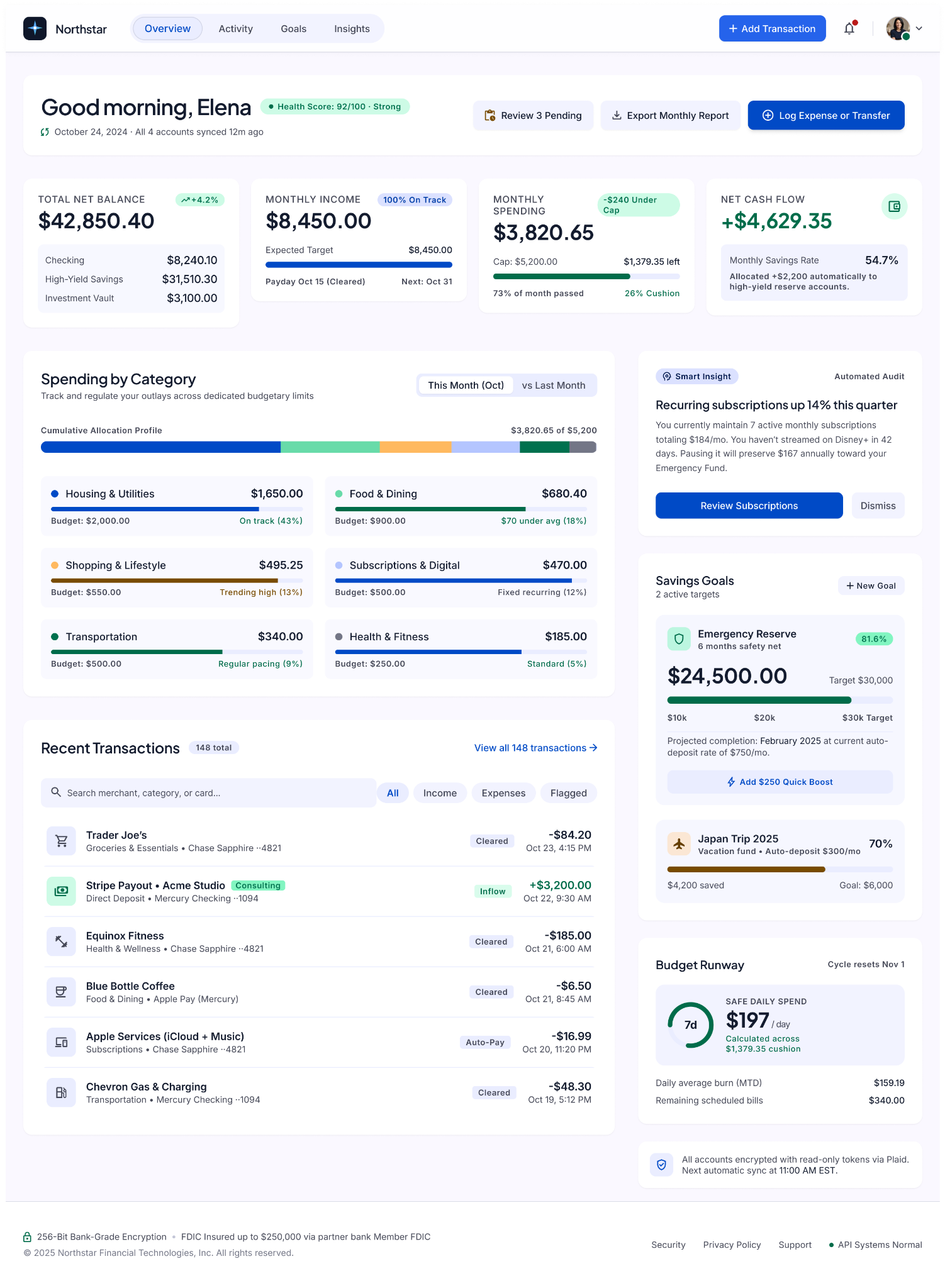
Google Stitch gave me a dense but believable finance dashboard. There is a greeting, account balance, monthly income and spending, category breakdowns, recent transactions, savings goals, a smart insight, a budget runway, and several actions. The screen feels like something that could survive a product review. It also feels like something I have seen many times before.
That second feeling is harder to point at because no single decision is strange. Blue as a finance colour is normal. Green for positive values is normal. Rounded cards are normal. Progress bars are normal. The problem only appears when the entire screen is made from safe decisions at once. The result is polished, but there is very little tension in it. Every block politely announces what it is, every metric sits in a container, every state receives its own pill.
I do not think this is bad design. That distinction matters. Calling every rounded card “AI slop” would be lazy because these patterns existed long before generative tools. The interesting question is why so many generated screens assemble the same ordinary ingredients in such similar proportions.
The prompt creates more of the similarity than I expected
There is a trap in this experiment. I asked for a balance, income, spending, transactions, categories, a goal, and an insight. Of course the outputs share a lot of structure. A designer would probably create some of the same modules too.
So I tried to separate what the brief required from what the models volunteered. None of them had to use a dashboard made from isolated rounded cards. None had to place a giant financial number near the top. None had to use blue as the main accent. None had to turn “insight” into a little callout card with an icon and supporting copy. None had to make positive numbers green or use horizontal progress bars to show goals.
Yet these decisions recur. That is where the generated feeling begins for me. The model is not only answering the product problem. It is filling every unspecified design decision with a highly probable answer.
ChatGPT reaches for the dependable product-dashboard vocabulary
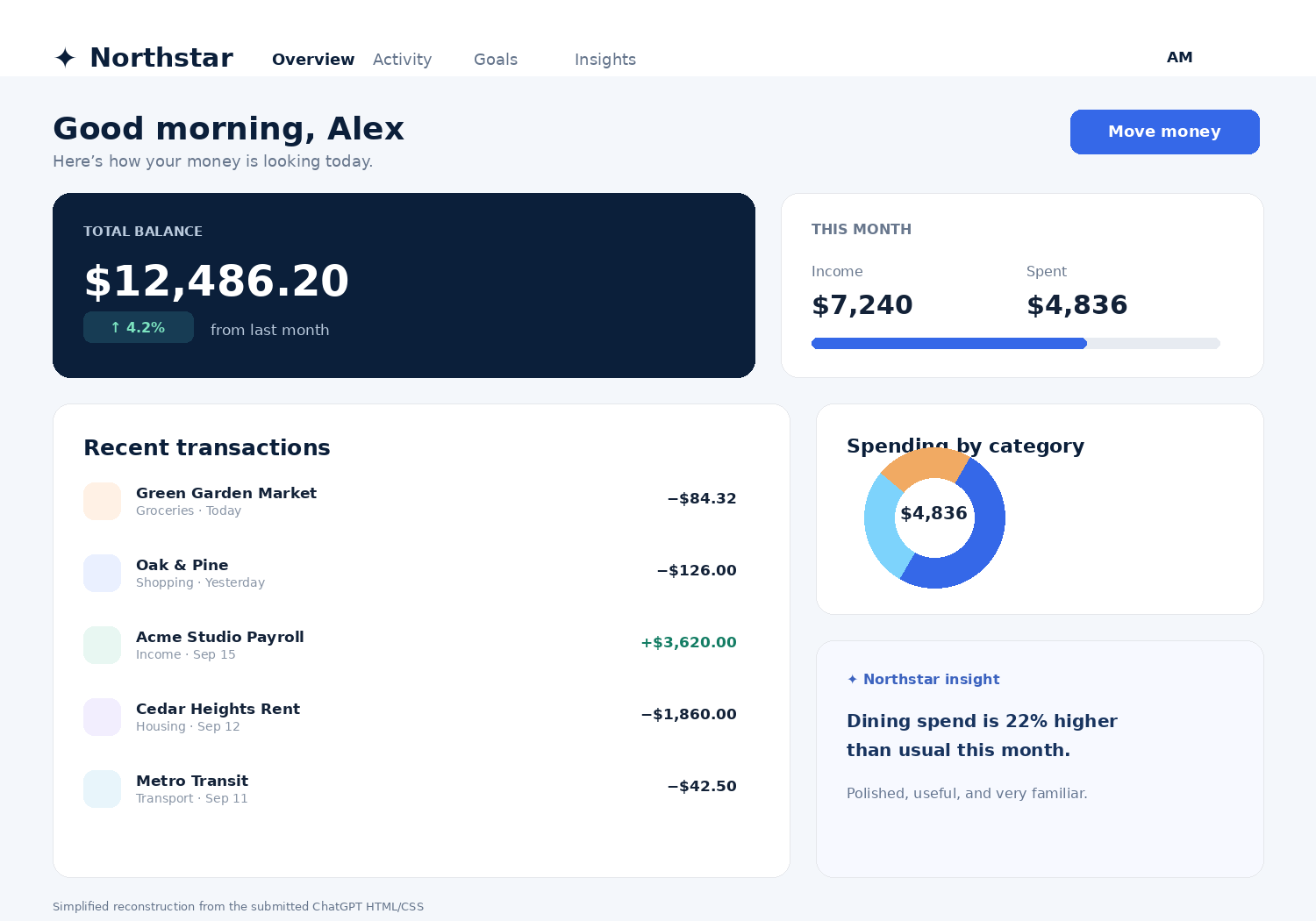
The ChatGPT output is probably the easiest one for me to describe as “competent”. It uses DM Sans and Manrope, a pale grey page, a navy balance card, a bright blue action, rounded white panels, a donut chart, progress bars, soft shadows, and small coloured category icons. The content is also tidy. “Good morning, Alex.” “Here’s how your money is looking today.” “Move money.” Nothing asks the reader to learn a new visual language.
That is also the tell.
The interface has a very broad idea of what a good fintech dashboard should look like. It understands conventions but not a particular institution, customer, or attitude toward money. A conservative bank, an investing product for teenagers, and a budgeting tool for freelancers would probably need different voices even if the information architecture overlapped. Here, the visual language sits somewhere in the middle of all of them.
I reached a similar thought while writing about why some designs make products look more expensive. A shadow, a gradient, or extra white space does not carry meaning by itself. The effect starts to matter when it supports a larger promise. Generated UI often has the effect before it has the promise.
Claude changes the styling, but the skeleton is still familiar
Claude surprised me more. Its output uses Schibsted Grotesk with Newsreader, a grey page, a dark navy hero section, brass accents, a restrained teal, and a warmer clay colour. The insight area even switches into serif type. Compared with the others, it feels less like a component-library demo and more like somebody tried to give the product an editorial voice.
I like that choice. More importantly, I can explain why I like it. The serif is not scattered everywhere. It appears where the product starts interpreting the numbers rather than simply reporting them. That gives the insight a different voice from the account balance. Whether I would keep it in a real finance product is another question, but there is at least a visible idea to argue with.
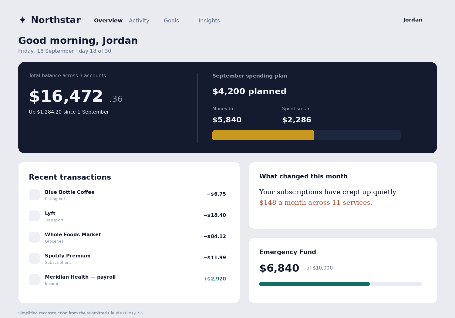
This helped me separate two things I had been mixing together. An AI-looking interface is not necessarily one with gradients or glassmorphism. Those are surface clues. The deeper clue is often that the screen feels assembled from reasonable components without enough evidence of difficult product decisions.
Gemini makes the stereotype much easier to see
Gemini's submitted HTML goes in the opposite direction. It uses Inter, a dark slate background, cyan and emerald accents, gradient buttons, blurred glass cards, glowing shadows, status chips, Lucide icons, a profile marked “Pro Member”, and an “Automated Smart Savings Active” banner. There is even an animated notification dot.
If somebody asked me to draw the stereotype of an AI-generated SaaS dashboard in 2026, I would probably draw something close to this.
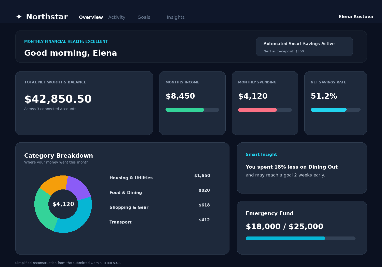
The funny part is that Gemini is also doing exactly what I asked. It gave me all the requested information and a clear primary action. The problem is not failure to follow the brief. If anything, the screen feels like it is trying too hard to demonstrate that every requirement has been completed.
This is one pattern I see often in generated interfaces: nothing is allowed to remain ordinary. A savings feature becomes “Smart Savings”. An insight gets a sparkle icon. The profile gets a membership tier. A status gets a coloured badge. A simple action gains a gradient and a shadow. The model adds signals of product maturity even though the brief never established the product's business model, brand, or level of complexity.
The real tell is that every problem becomes a component
After comparing the four outputs, this became the strongest pattern for me.
A human designer can also overuse cards, but real projects usually contain pressure that breaks the pattern. A legal requirement forces a long sentence into an ugly place. A stakeholder insists that one number must be visible before another. A legacy account type refuses to fit the new hierarchy. A user test reveals that the elegant icon is not understood. An engineering constraint turns a smooth interaction into a compromise. Then the designer adjusts the system around those facts.
Generated interfaces have no such scars unless we put them in the prompt.
That is why they can feel oddly frictionless. The category breakdown fits. The goal fits. The insight fits. The transaction list fits. Everything gets a card, and every card behaves like a good citizen of the design system. The screen is consistent before it has earned consistency.
Nielsen Norman Group makes a useful distinction between generative UI and AI-assisted design. In AI-assisted design, the tool speeds up the designer's production process. Generative UI goes further by dynamically constructing an interface for the user's context. Their broader point is important here: as AI becomes better at producing interfaces, designers have to shift attention toward outcomes and constraints rather than treating the interface itself as the final object. Their article on generative UI frames this as a move toward outcome-oriented design.
I think that is exactly where the generic look comes from today. The model is very good at producing the object. The difficult part is still giving it enough constraints that the object belongs to this product and not the next one.
Training patterns are only part of the explanation
It is tempting to explain everything with one sentence: “AI was trained on the same websites, so it copies the average.” There is probably truth in that, but I think it is incomplete.
The tools are also optimising for usefulness. Familiar layouts are easy to understand. Common component patterns are easier to generate in valid code. Popular libraries provide stable primitives. In the Gemini output, Tailwind CSS, Chart.js, Lucide icons, Inter, rounded-xl classes, and familiar slate/cyan colour tokens make it possible to produce a complete dashboard quickly. That is not an accident. Reusable systems are valuable precisely because they reduce the number of decisions required.
Designers use systems for the same reason.
The difference is that a designer can decide when the system should stop being neutral. A product team may have evidence that customers mistrust automated transfers, so the “smart” insight needs to become quieter. A bank may want to avoid the visual language of trading apps. A finance product for families may care more about shared decisions than net worth. Those constraints are not decoration. They are the source of identity.
Without them, the model reaches for patterns that are broadly acceptable. A broadly acceptable answer repeated at scale becomes a recognisable style.
“Make it less AI” is not a useful design brief
A better prompt would contain uncomfortable specifics.
For example: most customers check the product on payday and the day before rent. The primary account is often close to zero at the end of the month. Users told us they dislike language that sounds judgemental about spending. There is no investment product, so “net worth” is not our language. We already use a square 4-pixel radius in the web app. Marketing wants the product to feel calm, not premium. The insight must never interrupt the balance. The transaction list is more important than category analytics.
Now the model has something to push against.
This is where the comparison connects to something I miss in the older, more personal web. Those pages were not interesting because inconsistency is automatically good. They were interesting because you could often see the residue of choices. Somebody cared about one odd page more than the others. Somebody chose a strange colour and kept it. The site carried evidence of a person.
A product cannot simply imitate that mess. It can, however, carry evidence of decisions.
The strongest AI tell may be the absence of disagreement
When I review my own design work, the screens I remember usually contain something I argued about. Maybe the primary button moved because analytics showed a different path. Maybe I removed a card that looked useful but nobody needed. Maybe a stakeholder wanted more information above the fold and I pushed back. The final screen contains less than the conversation that produced it.
The Northstar outputs contain almost no disagreement because I gave the models almost nothing to disagree with. They filled the vacuum with convention.
That changed how I think about the phrase “AI-generated look”. I used to treat it mainly as an aesthetic category: gradients, glassmorphism, giant rounded cards, blue-purple light, generic illustrations. Those signals are real, but they are temporary. Models can learn new fashions very quickly.
The more durable tell is structural. The interface has many correct answers and very few specific opinions.
That is why Claude can look quite different from Gemini and still feel related. That is why Stitch can stay light while Gemini goes dark and both remain familiar. The issue is not that all four screens are identical. They are not. The issue is that they resolve uncertainty in similar ways: add a container, add a label, add a status, add a progress indicator, add a safe action.
I would use AI to get to the argument faster
I do not come away from this experiment thinking designers should stop generating interfaces. The opposite, actually. Getting four reasonably complete directions from one brief in minutes is useful. Nielsen Norman Group's earlier research on AI in UX also found practitioners using generative tools heavily for ideation, writing, and support tasks even while design-specific tools were still immature.
What I would not do is mistake the first coherent output for a design direction.
The generated screen is where I would start asking questions. Why is the balance the biggest object? Why is the insight a card? Why does every goal need a progress bar? Which module disappears first when the product gets tighter?
Those questions are slower than generation. That is probably the point. When screens become cheap to produce, the value of saying “no, not this one” goes up.
The next time an interface looks obviously AI-generated to me, I am going to look past the gradient. I want to find the decision that nobody had to make.
Sources
- Generative UI and Outcome-Oriented Design Nielsen Norman Group on generative UI, AI-assisted design, and designing around outcomes and constraints.
- AI UX-Design Tools Are Not Ready for Primetime Nielsen Norman Group research on how UX practitioners were using AI design tools in 2024.
- AI as a UX Assistant Survey research on generative AI use among UX professionals.
- Generative AI enhances individual creativity but reduces the collective diversity of novel content 2024 Science Advances study on individual creativity gains and reduced collective novelty.
- Homogenizing effect of large language models on creative diversity 2025 open-access study comparing diversity in human and GPT-generated essays.
- The homogenizing effect of large language models on human expression and thought 2026 review on LLMs and cognitive and stylistic homogenisation.
- What is AI slop in UI design? Design-industry discussion of generic generated interfaces and the difference between AI use and unreviewed output.
- no-slop-ui Open-source design guardrails created specifically to discourage common generated-UI defaults.