When the Numbers Are Right but the Interface Still Looks Wrong
A few days ago I came across a simple design example built around the idea “don’t trust the math.” Two groups of shapes were being compared. One was not mathematically equal, yet it looked balanced. The other used equal measurements, but somehow felt heavier on one side. It is a small example, but it points to something that happens constantly in interface design: the ruler can be right while the result still looks wrong.


An interface is not a geometry exam
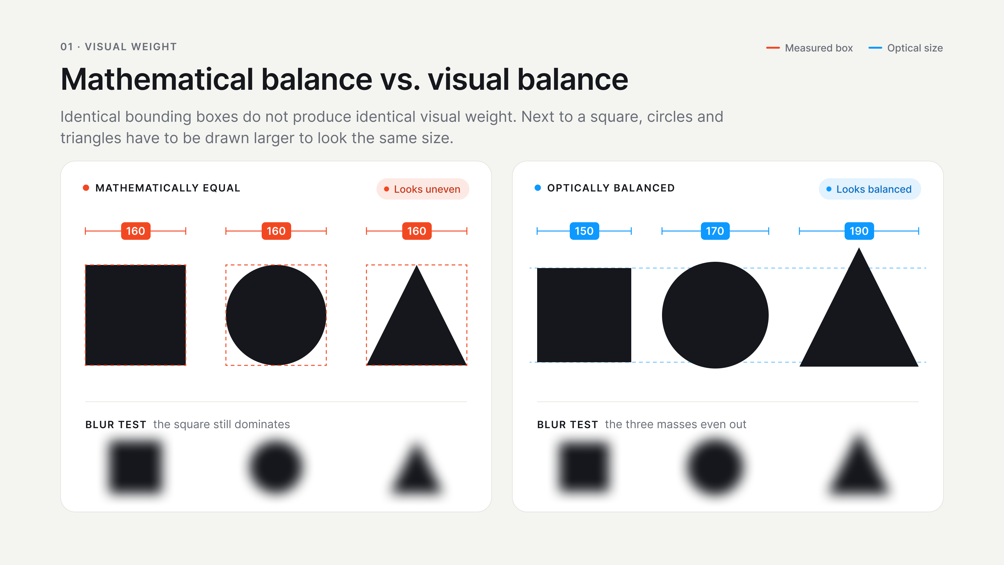
Design tools encourage us to think in clean numbers. Eight-pixel grids, equal padding, centered layers and consistent stroke values are useful because they give a system structure. Without them, a product can quickly become messy. The problem starts when we treat those numbers as the final answer instead of a starting point. What people see is not a set of bounding boxes. We see shapes, contrast, empty space, text, direction and visual weight at the same time. A large dark circle can feel heavier than a thin outlined square even if both sit inside a 24 by 24 pixel frame. A triangle can be perfectly centered by coordinates and still look slightly off because most of its visual mass is not distributed like a square.
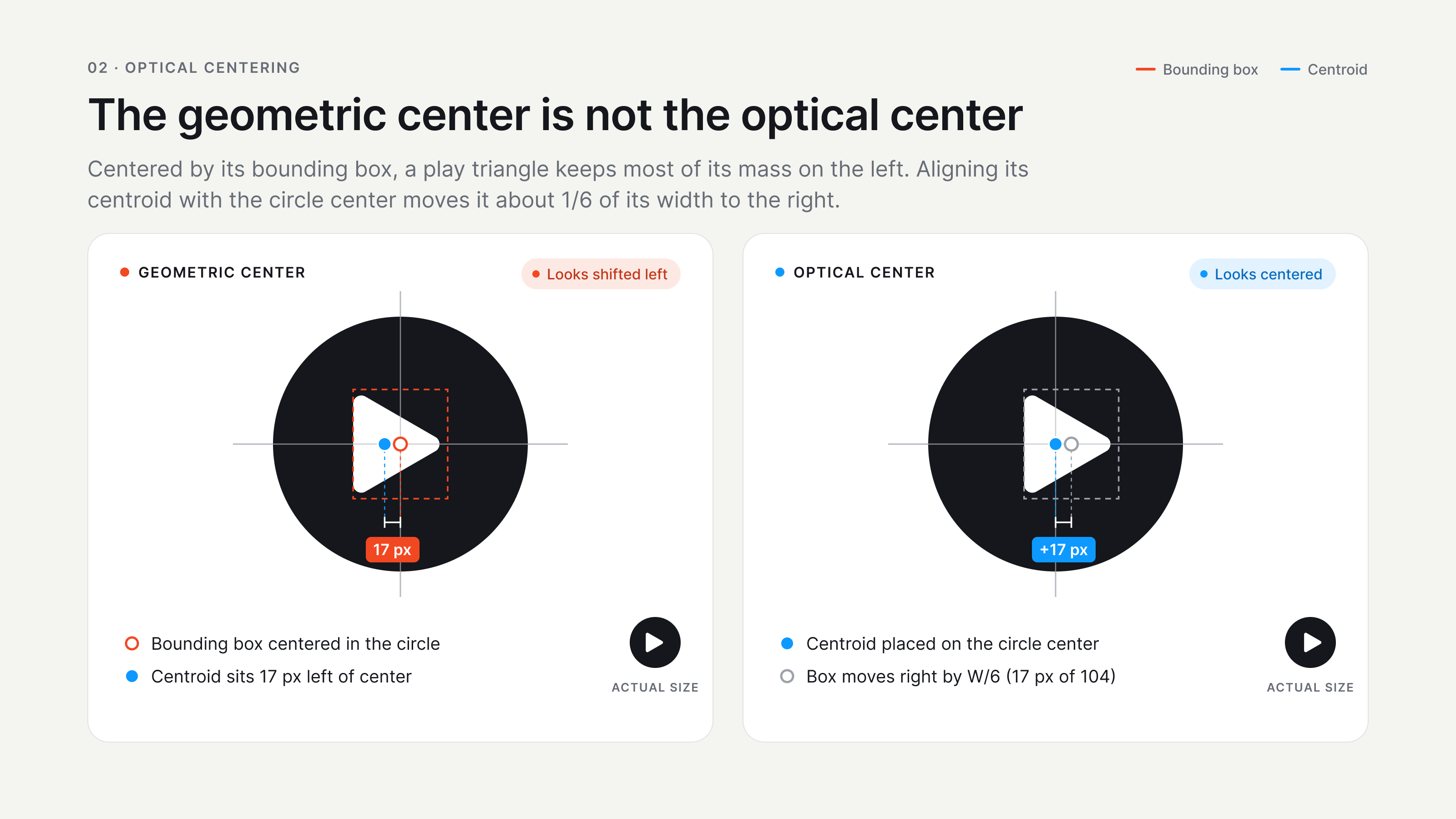
The geometric center and the optical center are different
The easiest place to notice this is a play icon. Put a triangle exactly in the center of a circular button and it often looks a little too far to the left. Move it a few pixels to the right and suddenly it feels centered, even though the geometry is now technically uneven. This is optical correction: changing the measured position so that the perceived position feels right. Apple’s guidance for SF Symbols is a useful real-world example. Apple asks custom symbols to match the system in optical weight, alignment and position, and SF Symbols even supports negative side margins when a symbol needs help lining up visually. That tells us something important: a consistent icon system is not created by forcing every drawing into the exact same visible footprint. Sometimes consistency requires controlled exceptions.
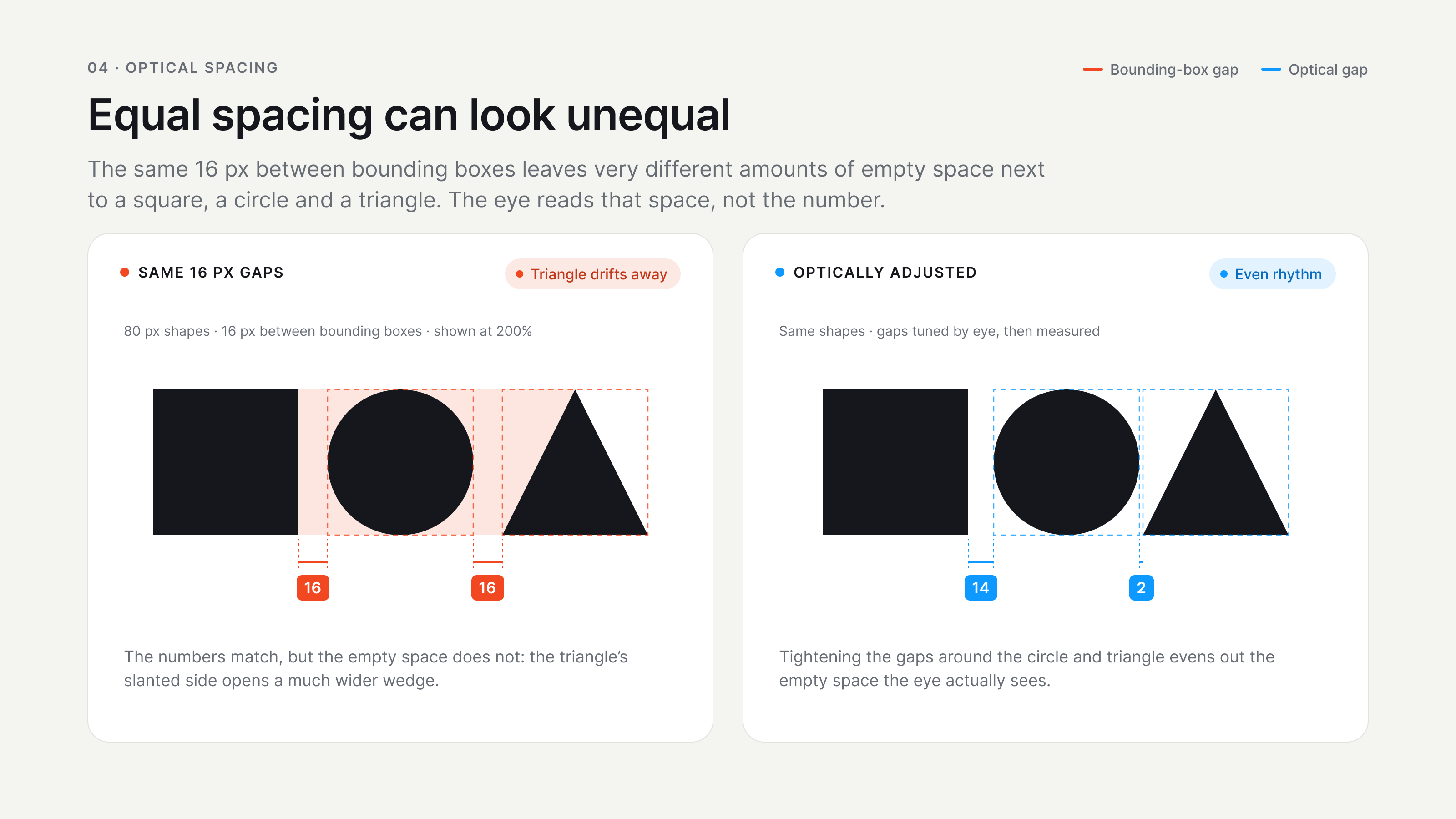
Equal spacing does not always look equally spaced
Spacing has the same problem. Imagine a square, a circle and a triangle placed in a row with exactly 16 pixels between their bounding boxes. The numbers are perfect, but the spaces may not look equal. The triangle narrows as it approaches the next object, so the visible empty area can feel larger. A circle also leaves more air near its corners than a square does. This is why I try not to judge spacing only by the red measurement labels in Figma. First I use the spacing system to get close. Then I hide the guides and look at the rhythm of the row as a whole. If one gap keeps pulling my attention, a small optical adjustment can be more correct than preserving a number just because the system says so.
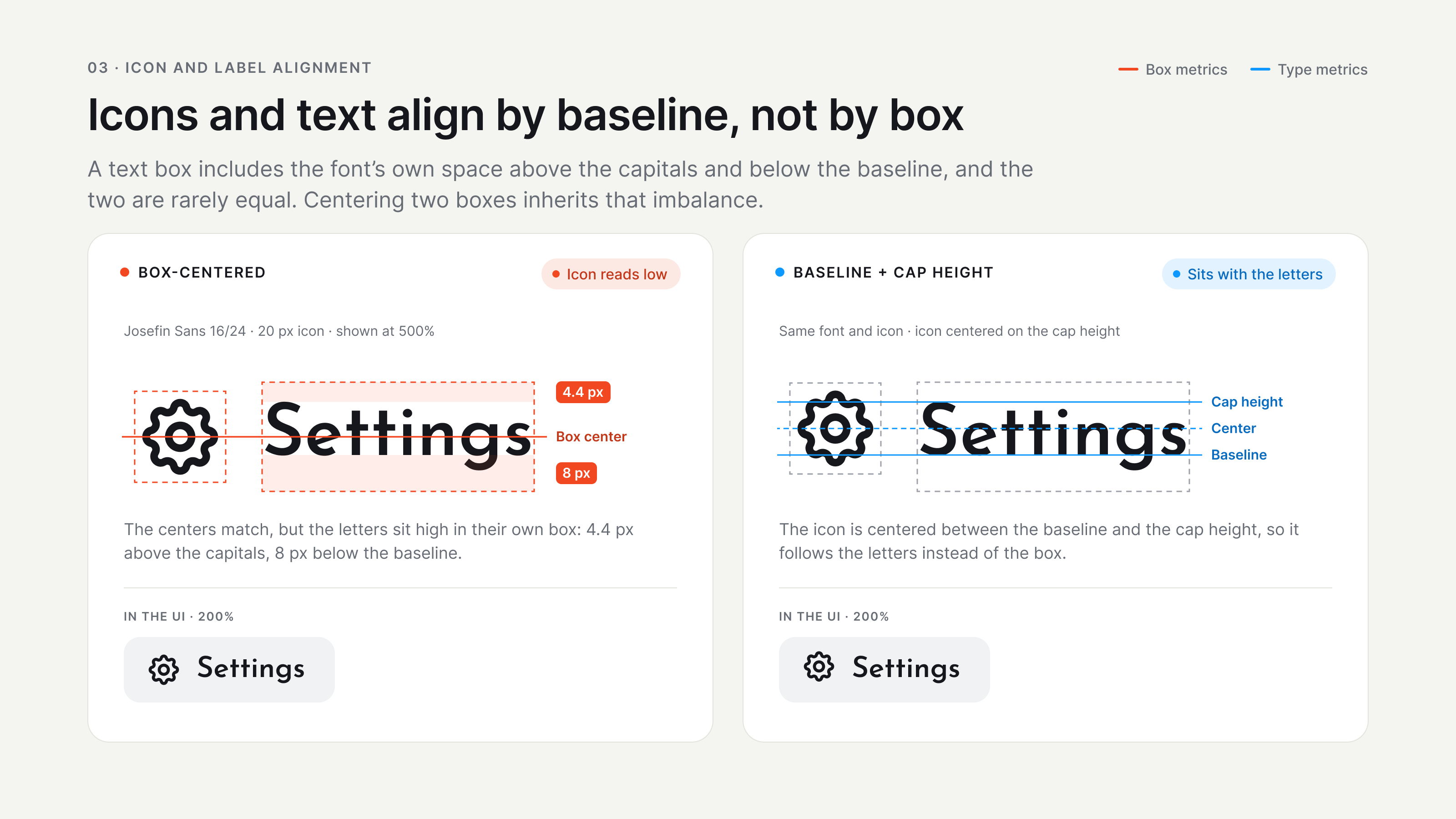
Text and icons rarely want the same kind of centering
Buttons and navigation items make this even more obvious. An icon may be 20 pixels high and the text next to it may also fit inside a similar box, but centering the two boxes does not guarantee that they sit naturally together. Letters have a baseline, ascenders, descenders and their own internal white space. Icons have a completely different silhouette. Apple explicitly recommends aligning SF Symbols with text by using a baseline rather than treating the symbol and label as two generic rectangles. In practice, the same idea applies even when you are not using SF Symbols. If an icon next to a label feels low, high or strangely detached, check the visual relationship first. Do not assume the center coordinates are innocent just because they match.
The same stroke width can still feel heavier
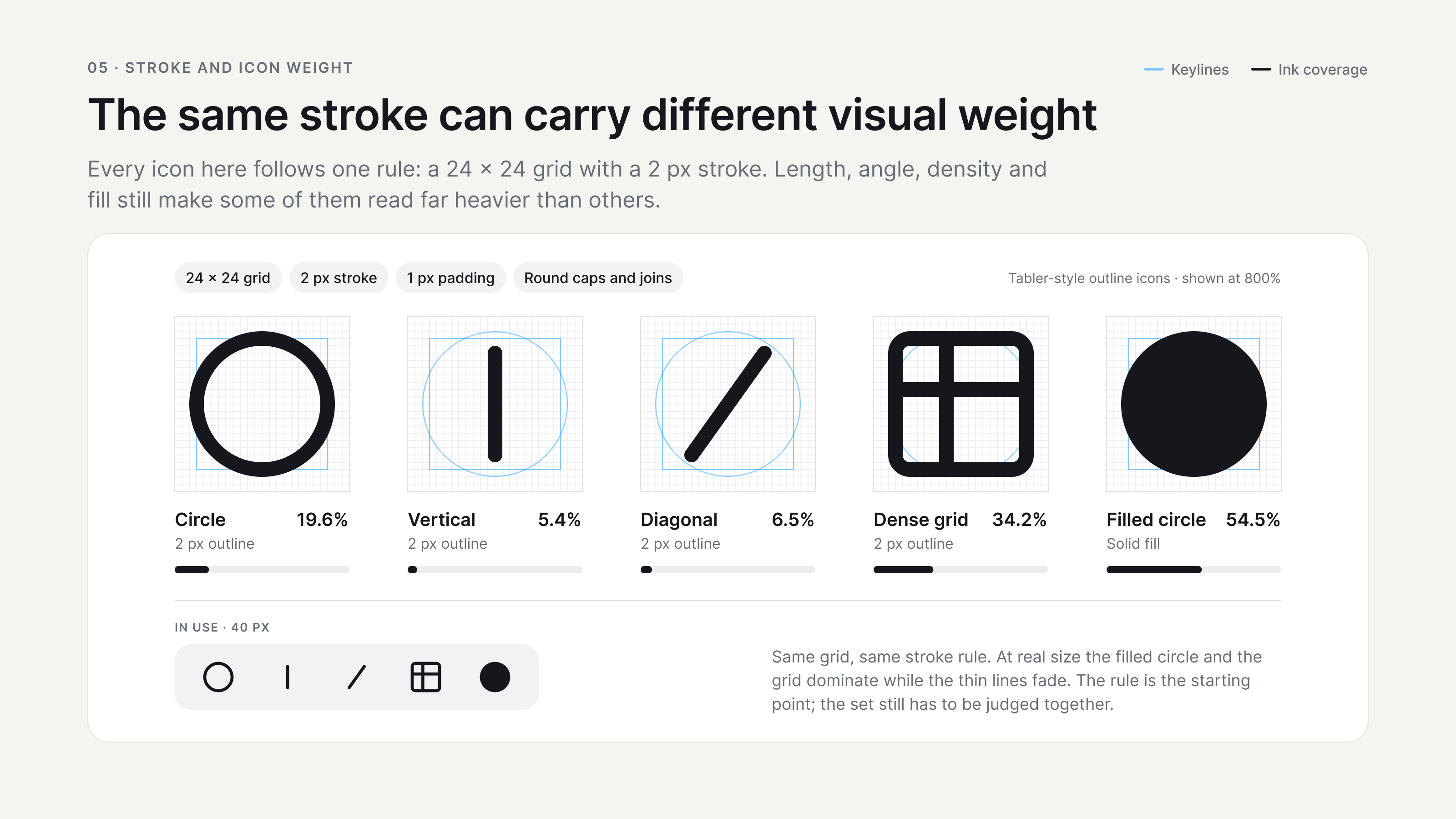
Stroke is another number that looks more objective than it really is. An icon set can use a 2 pixel stroke everywhere and still feel inconsistent. A long diagonal line can attract more attention than a short vertical one. A dense icon with several internal lines can feel darker than a simple circle, while a filled shape can dominate a neighboring outline icon even when both occupy the same frame. This is one reason good icon libraries feel consistent before you even inspect their measurements. Tabler Icons, for example, builds its outline set on a 24 by 24 grid with a 2 pixel stroke, which gives the library a strong base system. But a grid and a stroke rule do not remove the need to look at the set as a set. The final test is whether the icons appear to belong together at the size in which people will actually use them.
Visual size and interactive size are not the same thing
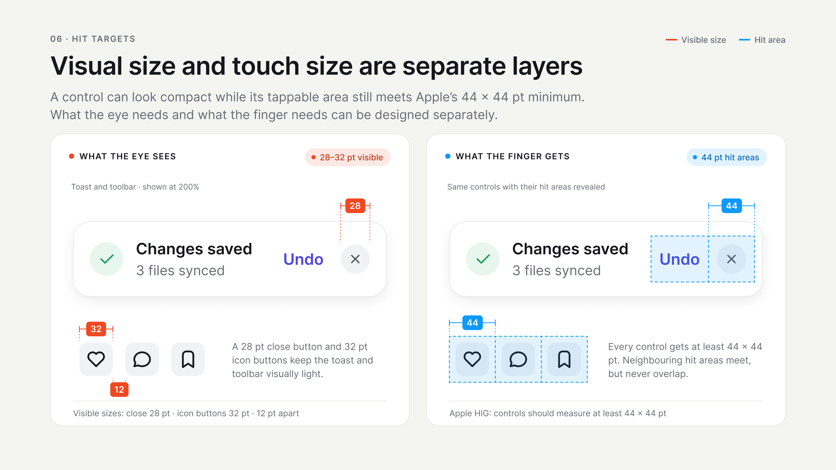
There is also a useful distinction between what looks balanced and what is easy to use. A small icon button may look cleaner at 28 or 32 pixels, but the interactive area around it can be larger. Apple’s interface guidance has long recommended touch controls with at least a 44 by 44 point target. That does not mean every visible icon needs to become a giant 44 point square. Keeping those two layers separate solves many design arguments. The visible shape can stay visually light and aligned with the rest of the interface, while an invisible hit area gives the finger enough room. The same principle works with spacing around text links, close buttons and compact controls. What the eye needs and what the hand needs are related, but they are not always the same measurement.
So when should you break the grid?
This does not mean grids, tokens or spacing systems are optional. Quite the opposite. A design system gives you a shared language and prevents hundreds of arbitrary decisions. If every designer starts moving elements by three pixels whenever something “feels nicer,” the interface will become inconsistent very quickly. Optical correction works best as a small, deliberate exception on top of a strong system. My own rule is simple: measure first, then look. I start with the grid, the component rules and the defined spacing values. After that I remove the guides, zoom out and ask whether the hierarchy still feels stable. I also check the design at its real size, because an adjustment that looks clever at 400 percent zoom can disappear or become excessive on the actual screen.
The eye is part of the measurement
The interesting part of UI design is that precision and perception are not enemies. We need both. Mathematics gives us repeatability, engineering gives us constraints, and visual judgment helps us handle the places where shapes do not behave like boxes. The best result is usually not “ignore the numbers,” but “understand what the numbers cannot see.” A perfectly measured interface can still look slightly wrong, and a visually balanced interface can contain a few values that are not perfectly equal. That is not a failure of the system. It is often a sign that someone looked beyond the bounding boxes and paid attention to what a person would actually see.
Sources
- Apple Human Interface Guidelines: SF Symbols Reference for optical weight, alignment, and the relationship between symbols and text.
- IBM Design Language: App icons Shows the difference between geometric and optical centering, including small alignment adjustments.
- IBM Design Language: UI icons usage Reference for icon and text alignment, optical centering, and usage rules.
- IBM Design Language: UI icons design Explains grid, stroke, proportion, and visual weight rules for icon design.
- Apple UI Design Dos and Don’ts Reference for touch targets, spacing, and basic interface alignment guidance.
- Adobe InDesign: Kerning and tracking Explains why fixed measurements do not always create equal visual spacing, using optical kerning as an example.