The Invisible Cost of Using an Interface
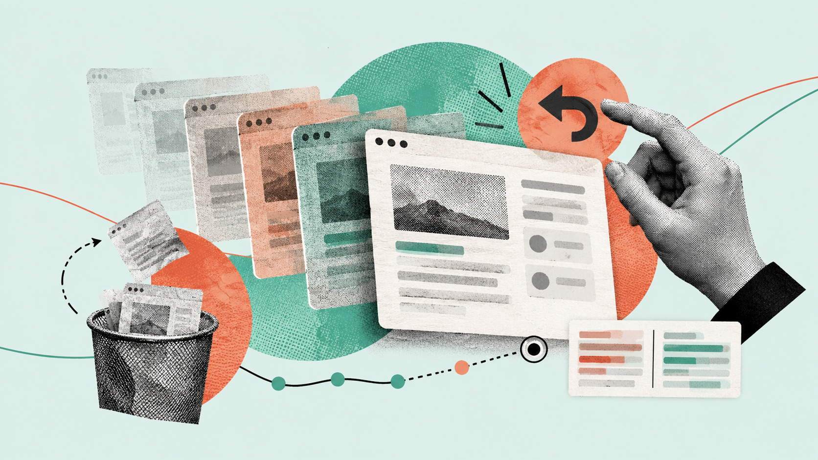
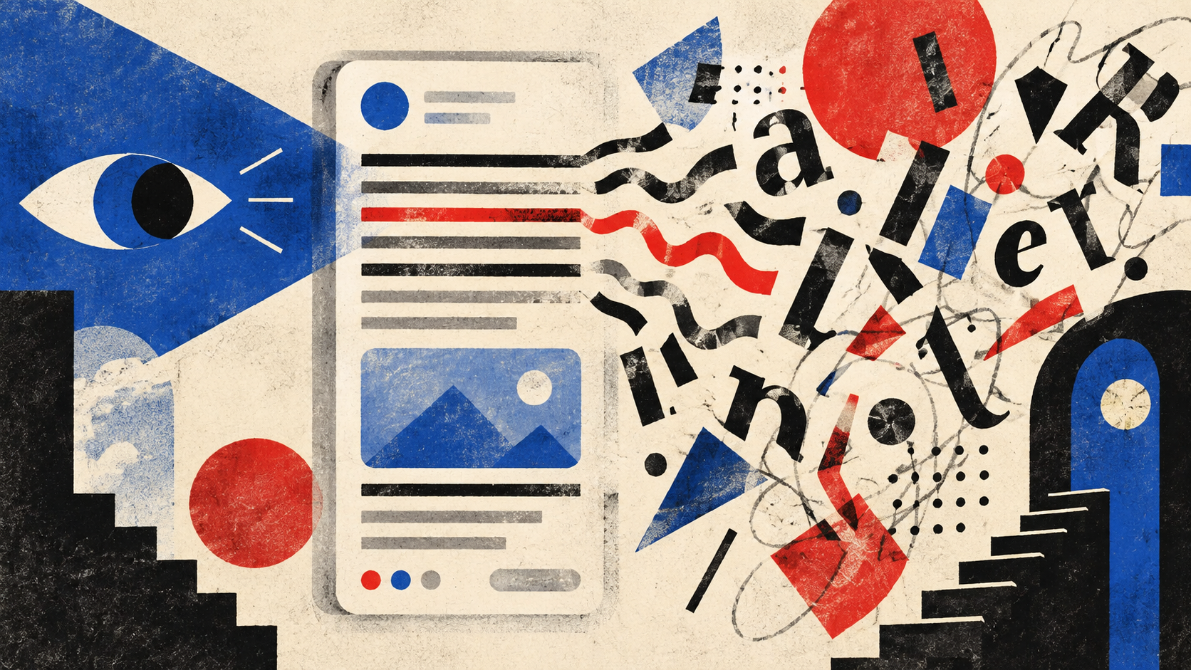
Every click, choice, scroll, wait, and remembered detail asks something from the user. Interaction cost gives us a way to see that effort before a simple-looking flow becomes tiring.

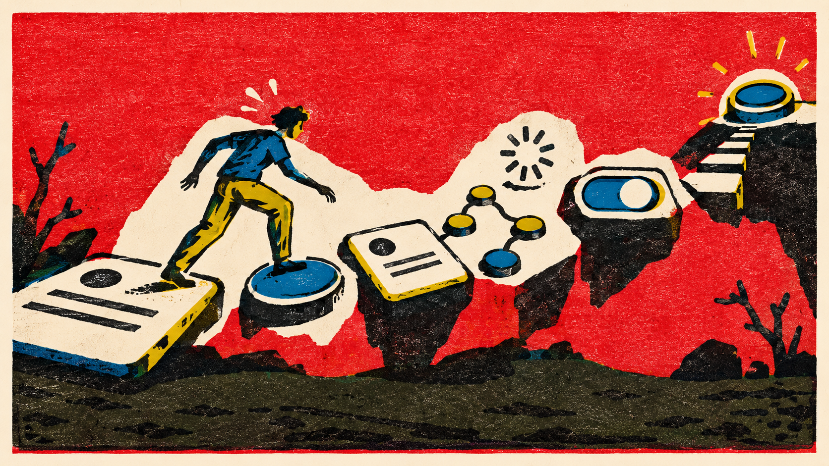
A checkout can have only three screens and still feel long.
Interaction cost gives a name to the effort between a user and a finished task. Some of it is visible: clicks, scrolling, typing, waiting. Some happens in the head: reading, comparing, remembering, deciding.
Nielsen Norman Group defines interaction cost as the mental and physical effort users spend to reach a goal in a digital product. I find the idea useful because it moves the conversation away from screen count. A short flow can still be expensive. A longer one can feel surprisingly easy.
Interaction cost is the work between intention and result
Imagine you want to change the delivery address for an order. The product may ask you to open your account, find orders, select the right order, locate the address setting, edit it, confirm it, and wait for the change to save.
Every one of those actions has a cost.
The cost is not automatically bad. A bank transfer should require more care than liking a photo. The goal is not to remove every step, but effort that does not help the user understand, decide, or stay safe.
That distinction matters. If I only count taps, I may optimise the wrong thing.
A single screen with fifteen controls can require more thinking than three simple screens with one clear decision each. The shortest path on a flowchart is not always the easiest path for a person.
Physical effort is the easiest part to notice
Clicks, taps, scrolling, dragging, and typing are physical interaction costs. They are easy to see because the interface records them.
Fitts's law gives us one way to think about pointing effort. In simple terms, targets are easier to reach when they are larger and closer. The exact equation matters less to me in everyday design than the behaviour it describes.
A small icon placed far from where the user's attention already is asks for more precision and movement. A large primary action placed near the end of a form usually asks for less.
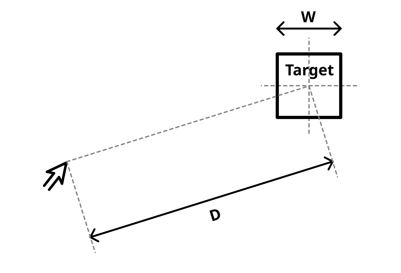
This does not mean every button should become huge. Size communicates hierarchy too. I would use Fitts's law as a reminder to look at the movement a task requires, especially on touch screens, repeated actions, and controls that are easy to miss.
Typing is another obvious cost. Asking for information that the system already knows is a good example of avoidable effort. So is forcing someone to re-enter data after an error.
Physical cost is often where teams start because it is measurable. It is not where the problem ends.
Choosing can cost more than clicking
A user can reach the correct screen and still spend most of their effort deciding what to do.
Hick's law describes how decision time tends to increase as the number of choices grows. The relationship is not simply “twice as many buttons means twice as much time”, but the broader lesson is useful: more possible responses can make a decision slower.
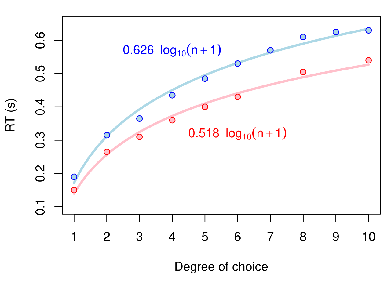
Menus make this easy to see. Five clearly separated options may be easier than twelve items with similar names. A pricing page can have only three plans and still be difficult if the differences are hidden in long feature lists.
This is why reducing choice is not just a visual-cleanup exercise. The useful work is deciding which choices need to exist at this moment.
Progressive disclosure can help. Advanced settings can stay behind an extra step if most people do not need them. The extra click technically adds physical cost, but it may reduce the cognitive cost of every visit to the main screen.
That trade is often worth making.
Memory is part of the interface too
Some products quietly ask users to carry information from one screen to another.
Remember the six-digit code. Remember which plan had the feature you wanted. Remember the total from the previous step. Remember why you opened this settings page in the first place.
W3C's cognitive accessibility guidance recommends designing processes that do not rely unnecessarily on memory. It also recommends helping users reorient after interruptions, because losing focus can make it hard to remember what they were doing.
I think this is one of the easiest interaction costs to miss in a static design file. The screens may look clear one by one. The burden appears between them.
A comparison table that keeps selected products visible can reduce that burden. So can a checkout summary that remains available while the user enters payment details. A multi-step form can show completed choices instead of asking the user to remember them.
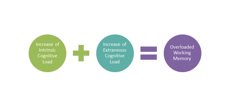
The interface is allowed to remember things for us. Usually it should.
Waiting is still interaction cost
Not every cost comes from movement or thought. Sometimes the user is simply waiting.
A page loads. A payment processes. A file uploads. An animation finishes before the next action becomes available.
A two-second wait is still part of the task. Uncertainty can make it feel longer. Did the tap work? Is the page frozen? Should I tap again?
Feedback changes that experience. A clear loading state does not remove the actual time, but it reduces the effort of interpreting the delay.
I would separate necessary waiting from decorative waiting. Network requests sometimes take time. A transition that blocks input because it looks polished is a design choice.
The same applies to animations. Motion can explain where an object went or help maintain spatial continuity. If I have to wait for it every time I repeat a common task, it becomes part of the bill.
Fewer screens can create a more expensive flow
Screen count is tempting because it gives us a clean number.
“Old flow: five screens. New flow: three.”
That looks like progress in a presentation. I would still want to know what happened inside those three screens.
Did we move six fields onto one page? Did we combine two decisions that users used to make separately? Did we hide an important explanation inside a tooltip? Did the final screen become so dense that people need to scan it twice?
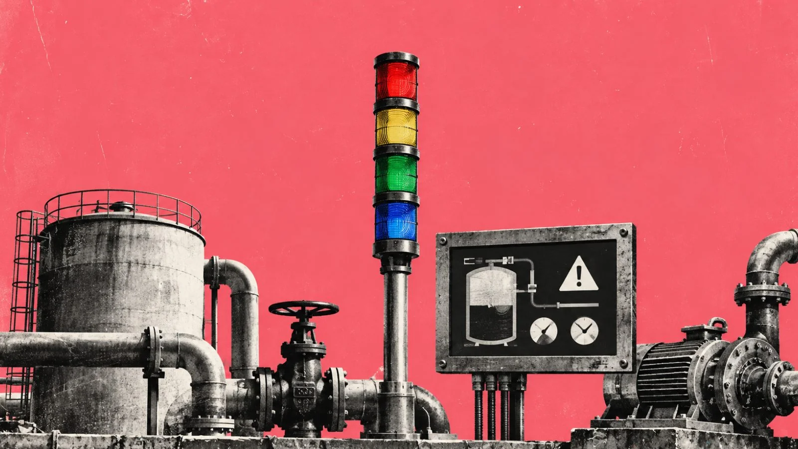
This is similar to visual hierarchy elsewhere in interface design. In an industrial HMI, every colour spends some of the screen's attention budget. Interaction has a budget too. Every field, decision, interruption, and remembered detail spends a little of it.
A longer flow can lower cost by sequencing information. One decision now. Another after that. The user does not need to understand the whole system at once.
That is why I would rather reduce effort than reduce screens.
I would audit a flow in four passes
Interaction cost becomes more useful when it turns into something I can inspect.
I would start with one real task, not an entire product. “Change the delivery address” is easier to analyse than “improve account settings”.
Then I would go through the flow four times.
First, physical cost. Count taps, clicks, scrolling, typing, precision movements, and repeated inputs. Look for controls that are too small or too far from the task.
Second, decision cost. Mark every moment where the user has to compare options or work out what a label means. Similar choices deserve extra attention.
Third, memory cost. Ask what the user must remember from earlier. If a piece of information can remain visible, the interface should probably keep it visible.
Fourth, time cost. Note waiting, loading, animations, redirects, and any point where the user cannot continue immediately.
I would not add these into one fake numerical score. Ten clicks are not directly comparable with one confusing financial decision.
The value is in seeing where the cost comes from.
The cheapest interface is not always the safest one
Reducing interaction cost can become a bad goal when taken too literally.
A one-tap purchase is convenient until the wrong tap buys something expensive. Removing confirmation from a permanent deletion may reduce steps while increasing risk. Autofilling sensitive information can save time and create another problem.
Some friction is useful.
The question I would ask is whether the friction serves the user's goal. Does it prevent a serious mistake? Explain a consequence? Give the user a chance to check something important?
If yes, I would keep it.
If a step exists because the organisation needs the same information twice, because two internal systems do not share data, or because nobody has decided which option matters most, that cost has been passed directly to the user.
That is the kind I want to remove.
Good interaction design spends effort carefully
I do not think users expect every task to be effortless.
They expect the effort to make sense.
Entering an address makes sense when the product needs somewhere to deliver. Reading the same address three times does not. Choosing between genuinely different options can be useful. Decoding five labels that mean almost the same thing is not.
Interaction cost gives me a simple way to look beyond the number of screens. What does the user have to move, read, remember, decide, and wait for?
Once I start asking that question, a clean interface can look surprisingly expensive.
And sometimes an extra step starts to look cheap.
Sources
- Interaction Cost Nielsen Norman Group's definition of mental and physical effort in digital interactions.
- Help Users Focus W3C guidance on attention, interruptions, and keeping tasks manageable.
- Ensure Processes Do Not Rely on Memory W3C guidance on reducing unnecessary memory demands.
- Make Each Step Clear W3C guidance on orienting users inside multi-step processes.
- Fitts Law.svg Openly licensed diagram of target distance and width in Fitts's law.
- Hick's law plotted data.svg Openly licensed plot illustrating response time and number of choices.
- WorkingCogLoad.png Openly licensed diagram relating cognitive load to working-memory capacity.