The Foldable iPhone Duo Changes the UX Brief
A designer’s look at the foldable iPhone, the everyday tasks a larger screen could improve, and the details that will decide whether the extra space feels useful.

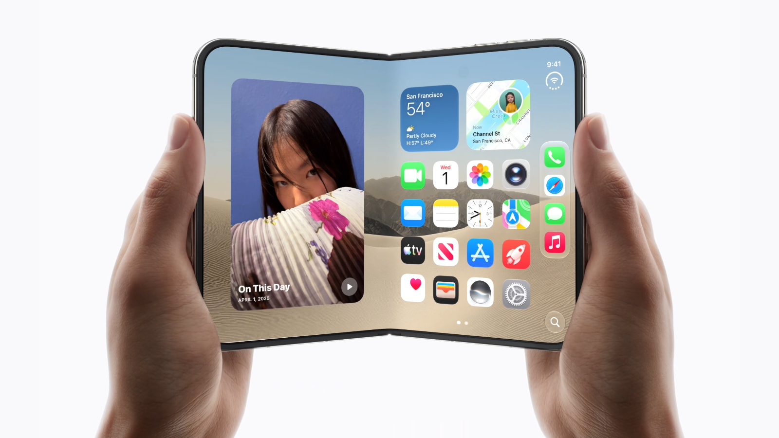
Imagine opening a hotel booking app while you are walking to the station. You check the price, save a place, and put the phone away. Later, sitting down with a coffee, you open the phone itself. Now there is room for the hotel, the map, and the dates together. Ideally, the place you saved is still selected. You do not have to explain your plans to the app a second time.
That is the version of a foldable iPhone that interests me. The hinge is impressive, of course. But as a designer, I keep coming back to the few seconds after someone opens it. Does the extra space make the next decision easier? Or does the same screen simply become a very expensive, very wide screen?
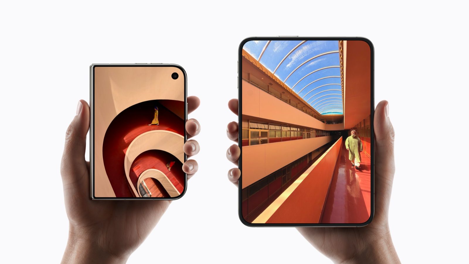
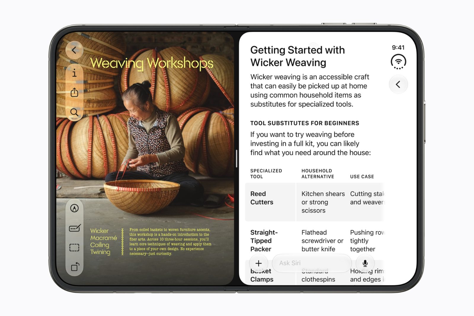
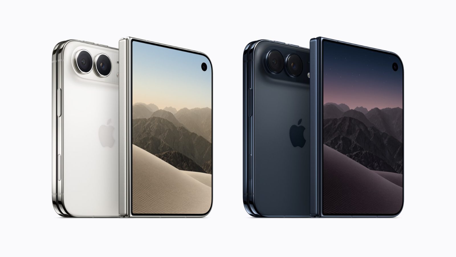
Apple announced iPhone Duo on September 9, 2026, with a 5.4-inch outer display and a 7.6-inch inner display. Its announcement also describes running two apps together in Split View. Availability is scheduled for October 23.
The screen can change halfway through a thought
We already design for phones, tablets, and desktop windows. So it is tempting to treat a foldable as another width in the Figma file. Add a frame between mobile and tablet, adjust the grid, and move on. That would cover part of the visual work. It would leave the most interesting interaction almost untouched.
Someone can start a task in one layout and finish it in another without choosing a different device. A screen change can happen after a search, during a reply, or while comparing two delivery dates. The person’s intention carries on while the container around it changes. That gives us a useful way to judge the interface: how much of the person’s thinking survives the transition?
Consider a shopping filter. If I have selected my size, a price range, and next-day delivery, opening the phone should not feel like arriving at the store again. A bigger product grid might help. Keeping the filters visible might help more. Resetting either of them would make the added space feel irrelevant. I would put these intermediate moments in the prototype before polishing the expanded homepage.
There is already useful work to learn from
Foldable interaction did not start with Apple. Samsung’s developer guidance describes app continuity as preserving the user’s state and location when the device configuration changes. Android’s layout guidance also documents familiar structures such as a list with an adjacent detail pane. These are useful starting points, with platform-specific implementation behind them. Samsung: App continuity; Android: Canonical layouts.
What Apple’s arrival changes, in my view, is the conversation inside teams that have mostly treated iPhone design as a small set of conventional phone layouts. A product can now need a more deliberate answer to “what belongs beside this?” That answer might already exist in its tablet app. It might also expose how little thought went into the tablet app beyond making cards wider.
I would resist announcing the end of ordinary phones. Plenty of tasks are already comfortable on a compact display, and opening a device takes effort. The useful question for a product team is narrower: which two or three tasks become meaningfully better when there is more room? If the answer is vague, another column will not make it clearer.
More room should reveal a relationship
My favourite opportunity is comparison. On a small display, we often make people keep one thing in memory while they look at another. Open a hotel, read the cancellation policy, go back, open the next hotel, try to remember the first price. An expanded interface could bring the relevant details together. That is a concrete benefit worth designing around.
For a travel app, I would try a result list beside a map, with the selected hotel clearly connected to its marker. Opening a result would update the detail area without losing the search context. For a finance app, a transaction could sit beside its receipt or explanation. For a recipe, the ingredients could remain visible while I read the next step. These are proposed designs, not claims about shipping iPhone apps.
The empty state deserves equal attention. If nothing is selected, should the second area show instructions, a useful overview, or nothing at all? I would avoid filling it with unrelated promotions just to balance the composition. The relationship between the areas is what makes the layout useful. Without that relationship, two columns can feel like two people talking at once.
The outer screen deserves a complete experience
It would be easy to turn the outer screen into a waiting room for the “real” app. I think that would be a mistake. A person might be carrying a bag, holding a rail, or simply unwilling to open the device. Checking a booking, replying to a message, or showing a ticket should remain a complete task in that situation.
In the hotel example, the outer screen still needs the total price, dates, cancellation terms, and a clear next action. The expanded screen can make comparison more comfortable. It should not become the only place where essential information is understandable. Otherwise the hardware’s flexibility becomes a requirement the user has to satisfy.
I would test this by asking a simple question for every feature: can someone finish without unfolding? Sometimes the answer will involve a different sequence. A map might become a separate view. A receipt might open after the transaction. That is fine if the path is clear and the selections survive. The compact experience can have fewer simultaneous elements while still respecting the whole job.
Navigation is now part of the physical experience
Apple’s design session for iPhone Duo describes controls along the sides, adaptations for the outer and inner displays, and behaviour around a partial fold. It also advises designing around compact and regular size classes rather than inventing an unrelated layout for every pose. These are specific platform recommendations, not a reason to move every mobile navigation bar sideways. Design for iPhone Duo.
For me, this raises a practical review question: if navigation changes position, what helps people recognise it immediately? I would preserve destination names, meaningful icons, selection states, and the relationship between sections. A saved hotel should not move into a mysteriously renamed category simply because the screen opened. Layout can change more freely when the product’s vocabulary stays dependable.
There is also the hand holding the device. An attractive control near the centre may be inconvenient to reach, while a control near the edge can compete with system gestures. I would want physical-device testing before declaring either placement comfortable. A Figma prototype can expose confusing hierarchy. It cannot tell me whether someone keeps adjusting their grip to reach the same button.
Continuity is more specific than “keep the page open”
Here is the scenario I would give a team: open a support conversation, scroll to an older message, type half a reply, then change the available screen space. Keep working. The valuable state includes the selected conversation, the visible message, the draft, and perhaps the cursor position. Keeping only the conversation title would miss most of the work the person had already done.
Reading has a similar problem. Preserving the same numerical scroll offset does not necessarily preserve the same paragraph when line lengths change. I would define success around a recognisable content anchor, such as the paragraph or item the reader was viewing. The precise implementation belongs with engineering, but the intended experience should be visible in the design brief.
There are awkward decisions here too. If a keyboard was open, should it remain open after unfolding? If a dialog was asking for confirmation, which part of the interface owns it now? I would write these rules down instead of allowing separate screens to imply conflicting answers. A short transition specification can be more valuable than another polished frame with perfect placeholder content.
An open device does not guarantee a wide app
This is an easy detail to miss when presenting designs on a large canvas. The app may occupy only part of the display. Android’s window-size guidance explicitly classifies the space available to the app, with width and height considered separately. That distinction is useful across platforms, even though Android’s units and breakpoints should not be copied directly into an iOS specification. Use window size classes.
Imagine researching a purchase with messages beside the store. The hardware is open, but the store still has a constrained window. I would expect it to offer a sensible compact layout there. I would not expect a compressed desktop page with a tiny comparison table. The feature that mattered on the full display may need to become a sequence again.
This also changes how I would name design variants. “Small iPhone” and “foldable” tell me which mockup was used. “Search results, one pane” and “search results, list plus detail” tell me how the content behaves. Device frames remain useful for presentation, but the component rules should explain what happens when the available room falls between those carefully chosen examples.
Folding adds posture, not just another rectangle
There is a difference between holding an open phone and resting it partly folded on a table. The viewing angle changes. So does the distance from the hands. Apple’s adaptive-layout session discusses reserved regions and moving content around the hinge; Android likewise provides fold-aware layout guidance. Neither should be read as a guarantee that every foldable exposes identical capabilities. Apple: Adaptive layouts; Android: Fold-aware apps.
For a proposed video-call interface, I would explore keeping the conversation visible while making mute and camera controls easy to identify on the surface closest to the user. For a timer, I might give the time more space and reduce surrounding choices. But I would avoid deciding that every partial fold means “meeting mode.” Physical posture gives us information; it does not fully explain intention.
The return journey matters as well. Picking up the device should not produce a completely unfamiliar app. I would prefer a small number of understandable adaptations, with the same active task visible throughout. If a new arrangement needs a tutorial every time it appears, I would first question the arrangement rather than write a better tutorial.
Reading and video need different answers
For a news product, the obvious expanded layout is an article beside a list of related stories. I would be careful with that. Someone who opens the phone to read may want a calmer view of the same article. An always-visible recommendation column could turn a reading improvement into another competition for attention. A restrained reading width, larger illustrations, and optional contents navigation might be more useful.
Video introduces a different trade-off. A wider or squarer display does not change the shape in which a video was recorded. Filling the available area can crop important content; fitting the whole image can leave unused space. I would make that choice explicit and keep captions away from controls. A portrait clip, a landscape interview, and a chart-led explainer deserve separate reviews.
There is a commercial decision tucked inside this too. A larger layout creates tempting places for recommendations, subscription prompts, and advertising. I would ask what each addition interrupts before asking whether it fits. In my HMI colour article, the central concern was what competes for attention. I find the same question useful here, even though the products and stakes are different.
The keyboard will challenge your nicest layout
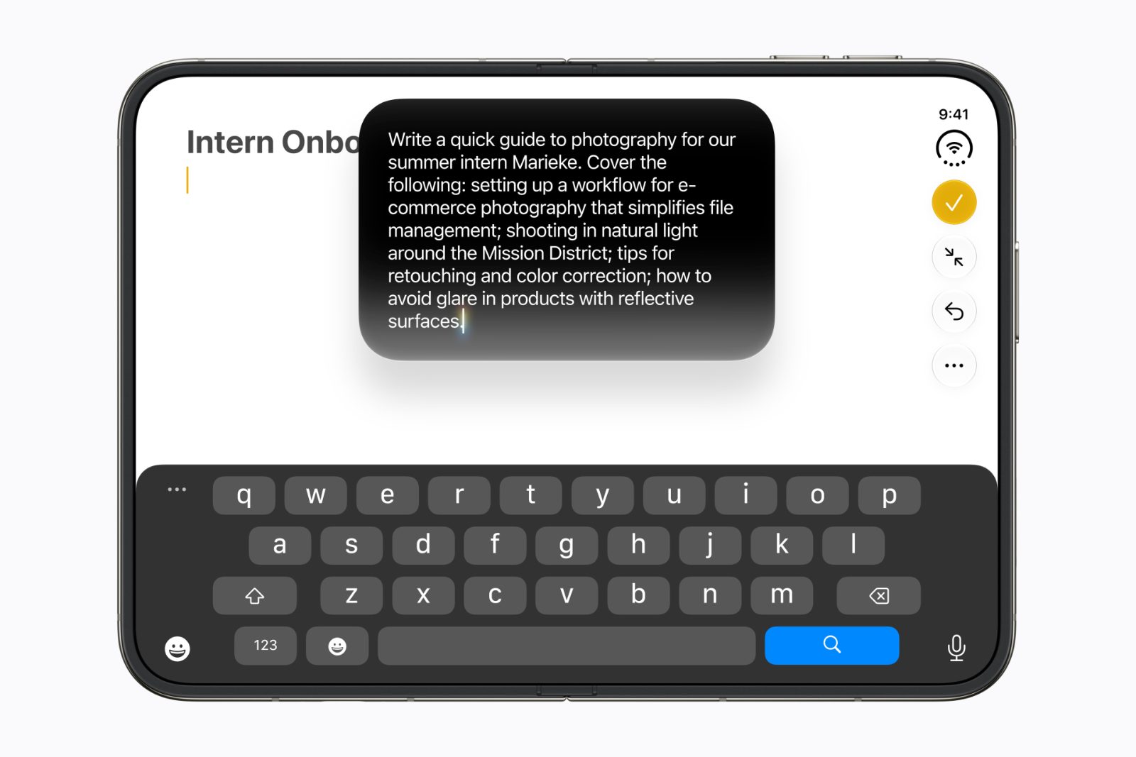
A two-pane composition can look wonderfully balanced until someone starts typing. In a booking flow, the keyboard may leave little room for the traveller’s name, a validation message, and the action needed to continue. The fact that the screen was large a moment ago offers no comfort when the active field is now difficult to see.
I would design the typing state alongside the resting state. Perhaps the supporting pane should temporarily reduce its presence. Perhaps the form needs its own scroll behaviour. Perhaps an oversized summary is simply taking space away from the job. Whatever the answer, the entered values and visible errors should remain coherent when the keyboard opens, closes, or changes the usable area.
Language makes this review more interesting. A short button label in one language can become a much longer phrase in another. Error messages can differ even more. I would review English and Turkish layouts with real copy, including long names, dates, and amounts. Text expansion is a normal property of the product, and a foldable does not make it disappear.
More space could make accessibility better
There is a promising version of this story in which people gain larger text, clearer grouping, and comfortable controls. There is another version in which we use every new pixel to squeeze in more information. I would want the first version to be a deliberate design goal. Otherwise “more capable” can become shorthand for “more crowded.”
For web content, W3C’s Reflow guidance describes retaining information and functionality when content is enlarged or the viewport narrows, with exceptions for content that needs a two-dimensional layout. That is a useful reference for the web portion of the experience, not a blanket certification of a native app. W3C: Reflow.
In a native prototype, I would also review larger text, screen-reader focus, reduced motion, and the reading order when panes appear or disappear. If I am focused on a message, an expanding sidebar should not unexpectedly take over the interaction. A brief animation may help explain a change, but the interface should remain understandable without depending on that animation to communicate everything.
What I would actually put in the Figma file
I would begin with one useful task, such as choosing a hotel, and show its full transition rather than a gallery of unrelated screens. The file would include a compact result, an expanded comparison, a constrained app window, and the return to compact. Each would use the same dates, selected hotel, and filters so that continuity is visible without explanation.
Beside those screens, I would add the uncomfortable states: a long Turkish title, no results, slow loading, an open keyboard, and an error after a submission. They often reveal whether the layout has a rule or merely looks good with one dataset. I would also note which pane owns scrolling and which selection remains active when the supporting content disappears.
The handoff would describe transitions in ordinary language. “Keep the selected hotel and dates. Show the detail when space becomes narrow. Let Back return to the existing result list.” A developer should be able to challenge or implement that behaviour without guessing what happened between frames. Once that agreement exists, spacing and motion have a much more reliable foundation.
| Situation | Layout I would explore | What should stay consistent |
|---|---|---|
| Checking a booking on the outer screen | One focused view with essential details | Hotel, dates, total price and next action |
| Comparing hotels with more room | Results beside a map or selected detail | Filters, selection and relationship to the map |
| Using the app in a narrow window | Return to a usable single-pane layout | Current task and entered information |
| Opening the device during a reply | Conversation with optional supporting navigation | Selected message, draft and input context |
| Typing into a booking form | Give the active field enough visible space | Entered values, errors and a reachable action |
| Increasing text size | Reflow content and reduce simultaneous detail if needed | Information, function and understandable reading order |
I would measure whether people have to start over
A bigger screen is easy to demonstrate. A better experience needs a task. I would ask participants to choose a hotel under a budget, check its location, and return to the booking after an interruption. Some would work compact, some expanded, and some would transition between them. The point would be to observe where the layout helps and where it adds work.
I would record completion, mistakes, repeated searches, lost drafts, unnecessary backtracking, and moments when someone asks where their selection went. I would also ask whether opening the device felt worthwhile. A person could finish successfully while still finding the expanded layout too busy. That comment would matter more to me than an impressive screenshot of two panels.
I would be cautious about treating longer sessions as automatic success. A difficult comparison can also keep someone on a screen. My starting hypothesis would be that the expanded layout reduces specific kinds of effort, and I would look for evidence against it. There are no measured results behind the examples in this article; they are the tests I would want to run.
The part I am looking forward to
I am curious about the foldable iPhone because it makes some familiar design compromises easier to question. Why do I keep returning to a list to compare two things? Why does a map disappear when I need to read an address? Why does opening more space sometimes give me more distractions instead of a clearer view?
Not every app needs a dramatic transformation. I would be happy with a booking app that remembers my choice, a reader that keeps my paragraph, and a conversation that preserves an unfinished sentence. Those improvements are small enough to sound unremarkable in a launch presentation. They are also the details that would make me want to keep using the larger screen.
When I open the device, I want to feel that I have made room for what I was already doing. That is the brief I would bring into Figma — and the standard I would use to judge the result.
Sources
- Apple unveils iPhone Duo Official announcement, display sizes and announced availability
- Design for iPhone Duo Apple’s design guidance for controls, layouts and device poses
- Strike a pose with adaptive layouts on iPhone Duo Layout adaptation and reserved regions around the hinge
- Canonical layouts — Android Developers List-detail and other adaptive layout patterns
- Use window size classes — Android Developers Designing around the space available to the app
- Make your app fold aware — Android Developers Fold-aware behaviour on supported Android devices
- App continuity — Samsung Developer Preserving user state through folding and unfolding
- Understanding Reflow — W3C Web accessibility when content enlarges or the viewport narrows