How Vermeer Designed Light to Guide Our Eyes
Vermeer’s light feels quiet, yet I rarely look away quickly. I wanted to understand how an ordinary room can hold attention without asking for it.

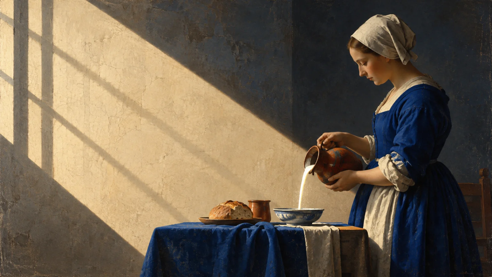
The milk is still pouring. A woman stands beside a table, focused on a task that would barely interrupt an ordinary morning. I return to The Milkmaid because my eyes settle on that small stream before I have worked out the rest of the room. Light helps me find it, but the areas that remain quiet matter just as much.
I have written about how space can shape the value we perceive in a product. Looking at Vermeer makes that thought feel less like a rule about luxury and more like a question about attention. What does a composition allow me to notice first, and what does it ask me to discover later?
We know the paintings better than the person
There is less certainty about Vermeer’s life than his fame might suggest. The Metropolitan Museum of Art’s account says that his teacher is unknown. He worked mainly for a small circle of patrons in Delft, and many of the surviving paintings stay close to domestic life. That limited record can tempt us to fill the gaps with a tidy story about a solitary genius.
I would rather start with the paintings. They show choices we can examine without guessing his thoughts. A wall was made calmer. A figure was placed against a particular patch of light. A doorway made us feel as though we had arrived a second before the scene became clear. Those choices are visible even when his private intentions are not.
The comparison with design has limits. A painting does not need to help someone complete a task. It can remain ambiguous for as long as the viewer wants. Still, I recognise the care behind deciding where attention goes. That is a question I bring to a screen, even though a screen must answer to different needs.
The Milkmaid gives a small action the whole room
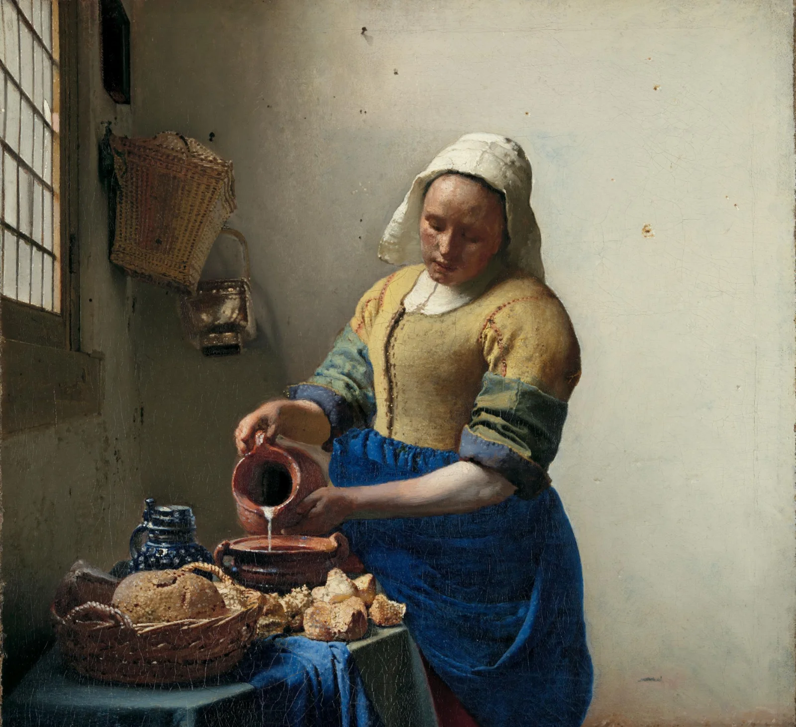
In *The Milkmaid*, the window sits to the left. Daylight catches the woman, the bread, and the edge of the jug. The room contains objects, but I do not read them as a collection of equally urgent details. The milk moves. Nearly everything else waits. That difference gives a brief action more weight than its size would suggest.
The Rijksmuseum’s exhibition text describes a pinprick used to set the painting’s vanishing point. It sits just above the woman’s right arm, so we look slightly up at her. That is a useful reminder that the feeling of importance comes from construction. The woman is not large because Vermeer simply made her large. Our position in relation to her helps create the effect.
I notice something similar when arranging an interface. A button does not become clear merely because I give it a brighter colour. Its place among the surrounding elements changes how readily it can be found. Imagine reducing the space around that same button. Its colour stays the same, but the path your eye takes to reach it may change. The analogy is mine; the painting is not a prototype for a product screen. It does, however, make me more attentive to the work done by the space around a focal point.
The empty wall was an active decision
The wall behind the milkmaid can look almost effortless. Yet Rijksmuseum research found that Vermeer first included a jug holder behind her head and a fire basket at the lower right. He later painted over both. The museum also found an underpainting in dark strokes. The calm surface was reached through changes, rather than appearing fully settled at the start.
This matters more to me than the familiar advice to remove clutter. The objects belonged in a kitchen. Keeping them might have made the setting feel fuller or more specific. Vermeer chose another balance. Once the rack disappeared, the area around the woman’s head became quieter. Her concentration is easier to stay with because the wall no longer competes for a second look.
I would hesitate to turn that into a universal instruction to delete detail. Some information is essential even when it makes a screen busier. The question I take from the painting is narrower: which detail is helping the main action, and which detail is asking for attention without earning it? I cannot answer that by counting objects. I have to look at what happens when one of them leaves.
A blue jacket can hold a composition together
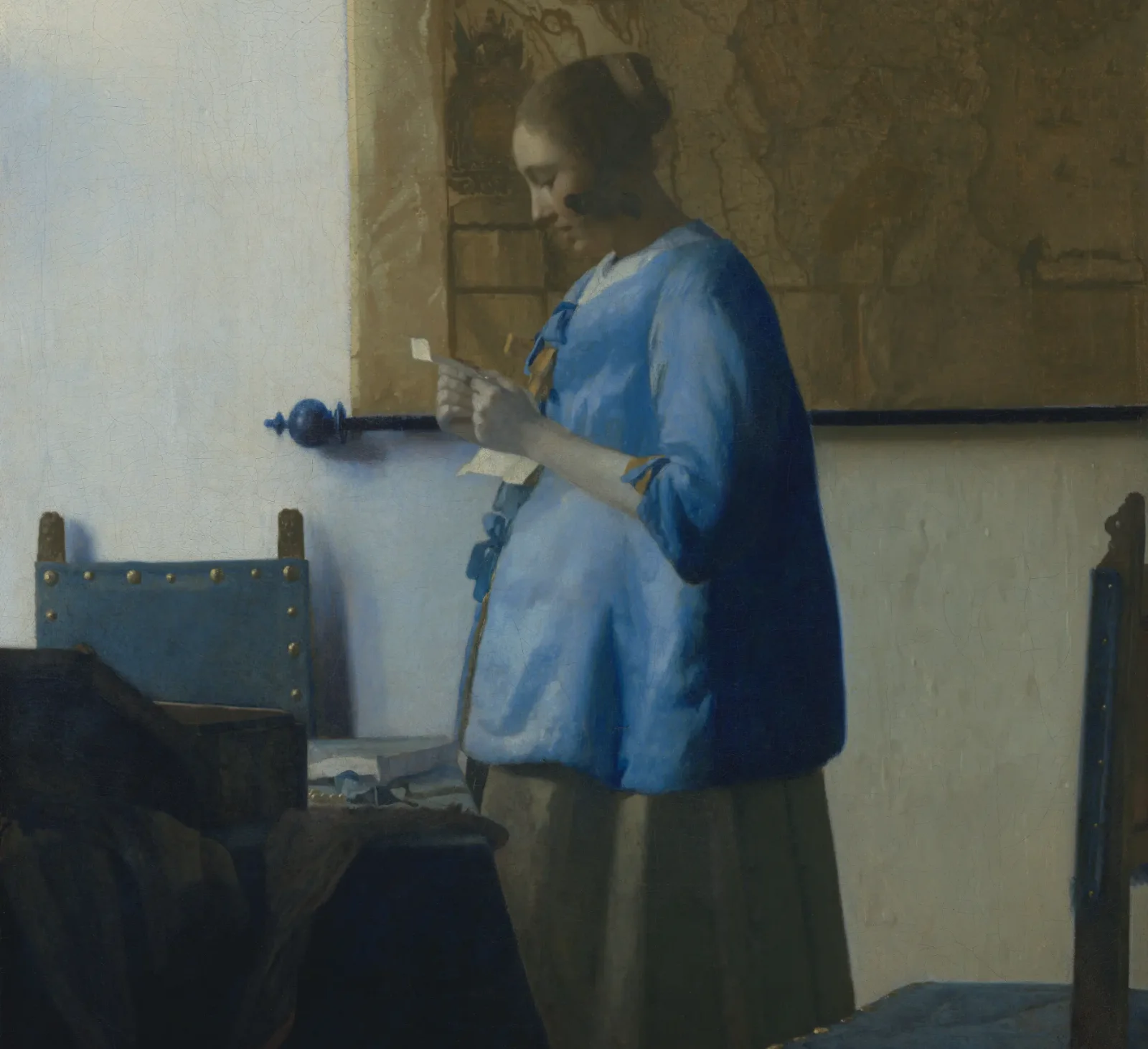
The woman in *Woman Reading a Letter* stands near the centre. A map hangs behind her. Furniture occupies the foreground. Still, I find her blue jacket before I begin to inspect those other parts. The Rijksmuseum describes the blue as the colour to which the others become secondary. It also notes pale grey in her skin and light blue in the wall’s shadows.
That use of colour feels more subtle than assigning every element a different code. The blue does not need to shout. It has enough room to be memorable because the surrounding colours are allowed to recede. I can follow the woman’s attention towards the letter, although its contents remain closed to me. I know where to look without being told what to think.
In my piece on colour in industrial interfaces, I wrote that a normal state should remain understandable in neutral tones. Strong colour then has somewhere useful to go when a state changes. I would not treat Vermeer’s blue as an alarm colour. The connection is in restraint: colour becomes easier to read when it is not asked to make every part of the picture equally important.
The Little Street lets ordinary details stay ordinary
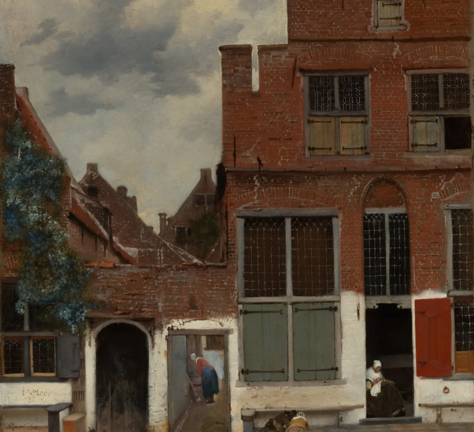
*The Little Street* gives us brickwork, a doorway, an alley, and people engaged in small activities. The Rijksmuseum calls its choice of ordinary houses unusual for its time. I like that the painting does not seem to demand one dramatic incident. It lets my eye move between surfaces and openings until the street begins to feel inhabited.
There is balance here, but there is no perfectly polished surface. The worn masonry and whitewash are part of what makes the place convincing. If every mark had been made equally smooth, I suspect I would spend less time with it. That is my response as a viewer, not a claim about a measurable effect. The painting gives an ordinary building enough care to make looking at it worthwhile.
The lesson I would borrow for design is modest. A screen needs clarity, yet it also needs enough of its subject to feel grounded. Removing every trace of context may produce a clean layout while making the thing it represents harder to understand. A threshold is a small detail in a street, yet it tells us where outside becomes inside. The Little Street makes me wonder whether a useful detail has been mistaken for noise simply because it is not the focal point.
The Love Letter makes us look through a doorway
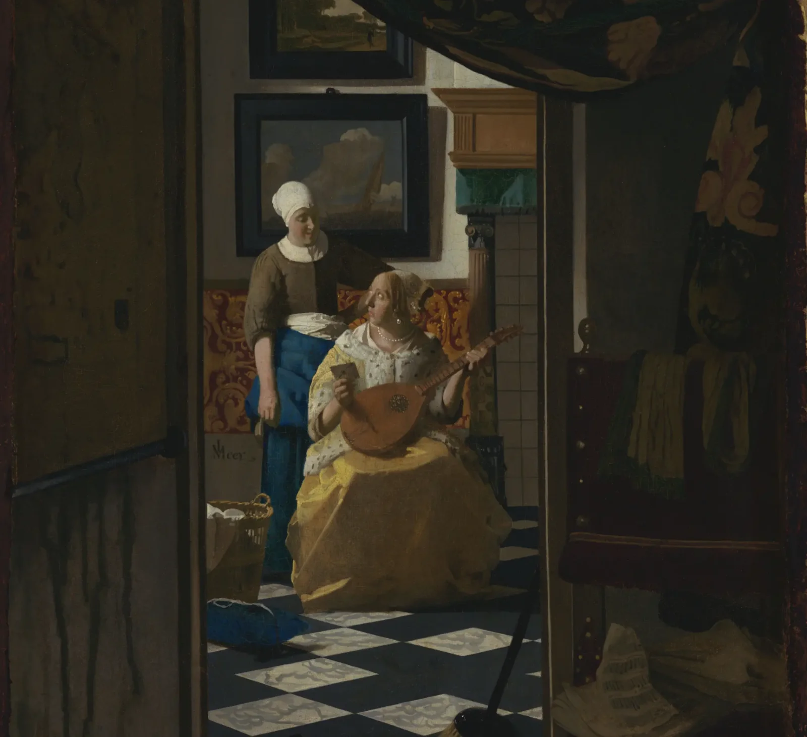
*The Love Letter* begins for me in a darker space. Beyond it, a woman looks up at a maid who has brought her a letter. The Rijksmuseum calls the viewpoint unusual. We glimpse the scene from another room, so the bright exchange seems both close and slightly withheld. I feel invited to look, but not entirely welcomed into it.
The foreground is not empty. Its darkness and framing give the inner scene a place to appear. Without that first room, I think the exchange would feel more direct and perhaps less curious. The doorway controls the order in which I learn the scene. First there is distance. Then there are people. Only after that do I begin to wonder about the letter.
It reminds me of the way a film can hold back information with a frame. In my selection of films that changed how I think about design, I was interested in what a scene makes us notice before anyone explains it. Vermeer gives me a similar experience here. My eye crosses a threshold, and the meaning arrives a little later.
Light is doing less than I first assumed
It is tempting to credit everything to light. Looking across these four paintings, I think that would miss part of their construction. Light works with position, colour, omission, and the distance between us and a figure. The Milkmaid loses a rack behind her head. A reader’s blue jacket stands against quieter tones. A street keeps its worn surfaces. A doorway asks me to arrive slowly.
The Metropolitan Museum of Art describes Vermeer’s interest in optical effects, while cautioning against exaggerating the role of the camera obscura. I appreciate that caution. An optical device may help explain an effect, but it cannot make every choice for the painter. What stays with me is the arrangement of the whole image and the judgment involved in changing it.
I do not want to turn these works into a set of interface rules. Their ambiguity is part of why I return to them. I had a similar feeling while choosing films that changed how I think about design. The question they leave with me is useful at my desk. When someone looks at what I have made, have I given their attention a place to settle? I would like to make more work that can answer quietly.
Sources
- The Metropolitan Museum of Art, Johannes Vermeer Biography, Delft patrons, and a cautious account of optical influence.
- Rijksmuseum, The Milkmaid Painting record, description, and rights status.
- Rijksmuseum, Vermeer exhibition texts Perspective, light, and composition in the paintings.
- Rijksmuseum, discoveries in The Milkmaid Research on objects Vermeer painted over.
- Rijksmuseum, Woman Reading a Letter Painting record, colour description, and rights status.
- Rijksmuseum, The Little Street Painting record, ordinary street scene, and rights status.
- Rijksmuseum, The Love Letter Painting record, unusual viewpoint, and rights status.